Vermeer used a wood palette like every painter of his time. In the 1676 probate inventory of the artist's house, in the front room of the first floor of the Oude Langendijk, there were listed "ztwee schilders eesels, drye paletten," two painters easels, three palettes." In Vermeer's time the familiar painter's palette with a hole for the thumb had replaced the older, rectangular kind with a handle. The artist held the palette with his thumb inserted into the hole leaving the rest of his fingers free to hold brushes and the mahlstick on which he steadied his hand over the canvas with wet paint.
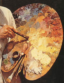
Palettes that appear in contemporary painting are surprisingly small in dimension and the relatively few pigments placed on them in an orderly fashion indicate that artists generally worked on one restricted area of a painting each day (fig. 1 & 2) . There are various reasons for this procedure. Pigments available to the artist were not so mutually compatible as they are today. Also, they did not have tubes which preserve paints from dry out quickly. Since it was a relatively long and laborious task to produce the necessary quantity of paint each day, unlike the palettes of modern painters (fig. 3), large amounts of costly unused material would have to be thrown away if the complete range of pigments were to be available.
"Many depictions of painters at work have survived. Initially, St. Luke painting the Madonna was portrayed predominantly. These paintings must contain reliable information with regard to the studio practices of the period in which they were created, or otherwise the contemporary viewer would not have recognized the representation. The same applies to the palettes shown in these paintings. When analyzing a large random sample of palettes depicted in paintings, such consistency emerged in the shape and the arrangement of the paint that one may safely argue that no well-trained painter would think of painting a fake palette.
"Generally speaking and based on studio scenes, it can be stated that prior to 1400 painters worked with separate paint trays, each of which held prepared paint of one color or hue. The first depictions of palettes stem from about 1400. They most closely resemble bread boards with a handle, used by the painter to hold the palette. Someone must have come up with the idea of making a hole in the handle that would be big enough to put one's left thumb through. The advantage of this innovation is obvious: it enabled the painter to support the palette easily in a horizontal position on the thumb; he could then hold other tools (including the maulstick while painting) with the remaining fingers of the same hand. Next, we see that the hole is no longer found in a handle-like protrusion from the palette, but that it is situated in the flat of the palette itself.
"The earliest palettes were small. Although they increased in size in the course of the sixteenth century, painters' palettes remained relatively small up to the early nineteenth century: 30 to 40 cm long. Only during the nineteenth century did they grow to the size of half a tabletop, sometimes made in such a way that they were adapted to the curve of the painter's body, in order to gain extra space for mixing paint. This rather sudden increase in the size of the palette is quite relevant to the subject."Van der Wetering, Ernst. Rembrandt: The Painter at Work (Berkeley: University of California Press, 2009).
Wood was the preferred material for artist's palettes because it was lightweight, rigid but could be shaped easily. Another advantage of wood was its natural warm brown tone. Many painters initiated their work on a canvas primed with a brownish tone that was not dissimilar to the color of the palette. Since the perception colors are strongly influenced by the dominating tone that surrounds them, the paint that was mixed on a wooden palette did not change perceptibly when applied to the canvas.
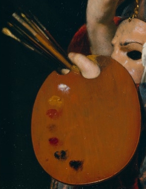
In a painting by Vermeer's contemporary Frans van Mieris, the allegorical figure representing Pictura can be seen holding a typical wooden palette. Van Mieris represented the palette necessary for painting flesh tones. The layout of the pigments, from light to dark, was common.
Fig. 1Pictura (An Allegory of Painting) Frans van Mieris
1661
Oil on copper, 5 x 3 1/2 in. Getty Museum of Art, Los AngelesFig. 2
Detail of Pictura
Roger de Piles, an influential French art critic, theorist and collector who made important contributions to aesthetic theory recommended painters (Les Elémens de Peinture Pratique, 1766) to set out not only the base pigments that would be necessary to paint flesh, but the various shades necessary to model and give the flesh its proper color.
"Before beginning to paint, all the major shades that are needed to imitate what you want to copy should be placed on the palette with the tip of the knife. The shades are made by taking a little of the principal colors that are at the top of the range with the tip of the knife and mix them together until we have found the shades that we seek. The natural flesh tones have their light, their shadows and their reflections or halftones, but to imitate these three degrees the painter mixes the colors, making different shades on the palette. They arrange them in order to each other, below the eight principal colors, always putting the brightest nearest the thumb holding the palette: as we have already said, these shades should be mixed with the knife, which would be the wrong way to do with a brush.
"Returning to the proposed head: it has its light, its shadows and halftones. To imitate the light, there are usually four light shades. The first is composed of white and a little yellow; the second, white, vermilion and lake, the latter two being added in very small quantities. The third is like the second, by putting a little more lake and vermilion; the fourth, like the third, by mixing a little more of the last two colors. It may be here that we want to make a fifth shade darker than the latter. These shades are set forth in a single row; the halftones and shadows placed underneath."
Fig. 1 A typical twentieth-century oversized palette with great quantities of paint.
In any case, while there existed a plethora of recipes for painters for rendering specific objects and lighting conditions that might be found in nature, these were not fruit of any overall theory of color or optics but were determined empirically and gradually refined over centuries. The relationship between the coloring of nature and the actual practice of painting is touched upon by De Piles when he wrote: "It is not possible to give rules on the mixture of colors, but with use and a little practice you can learn more than from long speeches, but in order to provide those who are starting to paint all the facilities that depend on us, we recommend to copy their first head from one that is beautiful, fresh and well-colored; this is the best advice we can give them, because good beginnings leave long time impressions in the mind of the things copied. There are painters who, having started to copy in gray tones, do so for their remaining lives. Suppose that it is a question of copying a head of fresh and live flesh tones."
Perhaps, more than any other Baroque painter, Rembrandt was able to capitalize on the few pigments available to artists of the time. "Yet, despite a palette that was limited even by seventeenth-century standards, he was renowned as a colorist for he managed to maintain a precarious balance between painting tonally, with light and shade, and painting in color. Just as form was suggested rather than delineated, so the impression of rich color was deceptive. Never before had a painter taken such a purely sensuous interest and delight in the physical qualities of his medium, nor granted it a greater measure of independence from the image."Waldemar Januszczak, Techniques of the Great Masters of Art (Chartwell Books, 2001).
Obviously, the palette used by Van Mieris was very different from the large, paint-encrusted palettes which are typical of twentieth-century artists.
† FOOTNOTES †
Comprehensive Resources on Vermeer's Painting Techniques
BOON, J. and OBERTHALER, E., "Mechanical Weakness and Chemical Reactivity Observed in the Paint Structure and Surface of 'The Art of Painting'" in Vermeer: Die Malkunst - Spurensicherung an einem Meisterwerk, exh. cat., Kunsthistorisches Museum, Vienna 2010, 235–53 and 328–35.
COSTARAS, Nicola. "A Study of the Materials and Techniques of Johannes Vermeer." In Vermeer Studies, edited by Ivan Gaskell and Michiel Jonker, Studies in the History of Art 55, Center for Advanced Study in the Visual Arts, Symposium Papers XXXIII. Washington: National Gallery of Art & New Haven: Yale University Press, 1998, 145–167.
DELANEY, John K., Kathryn A. Dooley, Annelies van Loon, and Abbie Vandivere. "Mapping the Pigment Distribution of Vermeer's 'Girl with a Pearl Earring'." Heritage Science 8, no. 4 (January 7, 2020). Accessed May 2, 2022.
EASTAUGH, Nicholas, Valentine Walsh, Tracey Chaplin and Ruth Siddall. The Pigment Compendium 2017. Rev. ed. (e-version). London: The Pigmentum Project, 2016.
FINK, Daniel A. "Vermeer's Use of the Camera Obscura: A Comparative Study." The Art Bulletin 53 (1971).
GIEBE, Marlies. "Johannes Vermeers 'Kupplerin': Restaurierung Und Maltechnische Befunde." In Uta Neidhardt and Marlies Giebe, eds., Johannes Vermeer: Bei der Kupplerin, 39–64. Exh. cat. Dresden: Michel Sandstein in association with Gemäldegalerie Alte Meister, Staatliche Kunstsammlungen, 2004.
GIFFORD, E. Melanie, Anikó Bezur, Andrea Guidi di Bagno, and Lisha Deming Glinsman. "The Making of a Luxury Image: Van Aelst's Painting Materials and Artistic Techniques." In Tanya Paul, James Clifton, Arthur K. Wheelock Jr., and Julie Hochstrasser, Elegance and Refinement: The Still-Life Paintings of Willem van Aelst, 80–84. Exh. cat. New York: Skira Rizzoli, 2012.
GIFFORD, M. "Painting Light: Recent Observations on Vermeer's Technique." In Vermeer Studies, edited by Ivan Gaskell and Michiel Jonker. Washington, D.C.: National Gallery of Art & New Haven and London: Yale University Press, 1998, 185–199.
GIFFORD, E. Melanie, and Lisha Deming Glinsman. "Collective Style and Personal Manner: Materials and Techniques of High-Life 'Genre Painting'." In Waiboer, Wheelock, and Ducos, Vermeer and the Masters of Genre Painting, 65–84, 270–74.
GIFFORD, E. Melanie, Dina Anchin, Alexandra Libby, Marjorie E. Wieseman, Kathryn A. Dooley, Lisha Deming Glinsman, John K. Delaney. "First Steps in Vermeer's Creative Process: New Findings from the National Gallery of Art," Journal of Historians of Netherlandish Art 14, no. 2 (Summer 2022).
GIFFORD, E. Melanie. "Fine Painting and Eloquent Imprecision: Gabriel Metsu's Painting Technique." In Adriaan E. Waiboe, Gabriel Metsu, 154–79. New Haven: Yale University Press in association with the National Gallery of Art, 2010."
GIFFORD, E. Melanie. "Lievens' Technique: 'Wonders in Smeared Paint, Varnishes and Oils.'" In Jan Lievens: A Dutch Master Rediscovered, edited by Arthur K. Wheelock Jr., 41–53. Exh. cat. New Haven: Yale University Press in association with the National Gallery of Art, 2008.
GIFFORD, E. Melanie. "Material as Metaphor: Non-Conscious Thinking in Seventeenth Century Painting Practice." In Studying Old Master Paintings: Technology and Practice, edited by Marika Spring, 165–72. London: Archetype in association with The National Gallery, 2011.
GIFFORD, E. Melanie. "Painting Light: Recent Observations on Vermeer's Technique." In Vermeer Studies, edited by Gaskell and Jonker, 185–99.
GROEN, Karin M., Inez D. van der Werf, Klaas Jan van den Berg, and Jaap J. Boon. "Scientific Examination of Vermeer's 'Girl with a Pearl Earring'." In Vermeer Studies, edited by Ivan Gaskell and Michiel Jonker. Washington, D.C.: National Gallery of Art & New Haven and London: Yale University Press, 1998, 169–183.
LAURENZE-LANDSBERG, Claudia. "Neutron-Autoradiography of Two Paintings by Jan Vermeer in the Gemäldegalerie Berlin." In Wolfgang Lefèvre, ed., Inside the Camera Obscura: Optics and Art under the Spell of the Projected Image, 213–25. Berlin: Max-Planck Institute for the History of Science, 2007.
LEVY-HALM, Koos. "Where Did Vermeer Buy His Painting Materials? Theory and Practice." In Gaskell and Jonker, Vermeer Studies, 137–43.
LIBBY, Alexandra, E. Melanie Gifford, Dina Anchin, Marjorie E. Wieseman, Kathryn A. Dooley, Lisha Deming Glinsman, John K. Delaney. "Experimentation and Innovation in Vermeer's 'Girl with the Red Hat': New Findings from the National Gallery of Art," Journal of Historians of Netherlandish Art 14, no. 2 (Summer 2022).
LIEDTKE, Walter A., Richard C. Johnson, and Don H. Johnson. "Canvas Matches in Vermeer: A Case Study in the Computer Analysis of Fabric Supports." Metropolitan Museum Journal 47 (2012): 101–8.
LOON, Annelies van, Abbie Vandivere, John K. Delaney, Kathryn A. Dooley, Steven De Meyer, Frederik Vanmeert, Victor Gonzalez, Koen Janssens, Emilien Leonhardt, Ralph Haswell, Suzan de Groot, Paolo D'Imporzano and Gareth R. Davies. "Beauty is Skin Deep: The Skin Tones of Vermeer's Girl with a Pearl Earring." Heritage Science 7, no. 102 (December 11, 2019). Accessed May 2, 2022.
LOON, Annelies van, Alessa A. Gambardella, Victor Gonzalez, Marine Cotte, Wout De Nolf, Katrien Keune, Emilien Leonhardt, Suzan de Groot, Art Ness Proaño Gaibor, and Abbie Vandivere. "Out of the Blue: Vermeer's Use of Ultramarine in Girl with a Pearl Earring." Heritage Science 8, no. 25 (February 28, 2020). Accessed May 2, 2022.
NEIDHART, Uta, and Marlies GIEBE, with essays by Albert Blankert, Chrisitne Klose, Johann Koller, Annalise Mayer-Meintsschel et al. Johannes Vermeer 'Bei der Kupplerin,' exh. cat. Dresden, 2004.
PEETERS, Natasja. "The Painter's Apprentice in Fifteenth and Sixteenth Century Antwerp: An Analysis of the Archival Sources." Mélanges de l'École française de Rome: Italie et Méditerranée modernes et contemporaines, nos. 131–2 (2019), 221–27, https://doi.org/10.4000/mefrim.6461.
POTTASCH, Carol. "Underdrawings in the Paintings of Frans van Mieris." In Quentin Buvelot, Frans van Mieris 1635–1681, 62–68. Exh. cat. Zwolle: Waanders 2005.
OBERTHALER, E., J. Boon, S. Stanek, and M. Griesser. "'The Art of Painting' by Johannes Vermeer. History of Treatments and Observations on the Present Condition." In Vermeer, Die Malkunst: Spurensicherung an einem Meisterwerk, exh. cat. Vienna: Kunsthistorisches Museum, 2010, 215–234 and 322–327. See especially illustrations 49 and 50.
SHELDON, L., and N. Costaras. "Johannes Vermeer's 'Young Woman Seated at a Virginal'." The Burlington Magazine 148 (February 2006): 89–97.
SIVEL, Valerie, Joris Dik, Paul Alkemade, Libby Sheldon, and Henny Zandbergen. "The Cloak of 'Young Woman Seated at a Virginal': Vermeer, or a Later Hand?" ArtMatters: Netherlands Technical Studies in Art 4 (2007): 90–96.
VANDIVERE, Abbie, ed., "The Girl in the Spotlight: A Technical Re-Examination of Vermeer's 'Girl with a Pearl Earring'." Special Collection, Heritage Science 7–8 (2019–20). Accessed May 2, 2022.
VERSLYPE, Ige. "The Restoration of 'Woman in Blue Reading a Letter' by Johannes Vermeer." The Rijksmuseum Bulletin 60, no. 1 (2012): 2–19.
WALD, Robert. "'The Art of Painting': Observations on Approach and Technique." In Sabine Haag, Elke Oberthaler, and Sabine Pénot, Vermeer, Die Malkunst: Spurensicherung an einem Meisterwerk, 312–27. Exh. cat. St. Pölten: Residenz in association with Kunsthistorisches Museum, Vienna, 2010.
WALLERT, Arie. "The Materials and Methods of Michiel Sweerts's Paintings." In Jansen and Sutton, Michiel Sweerts, 37–47.
WADUM, Jørgen, René Hoppenbrouwers, and Luuk Struick van der Loeff. Vermeer Illuminated: Conservation, Restoration and Research: A Report on the Restoration of the View of Delft and the Girl with a Pearl Earring by Johannes Vermeer. Wormer: V+K in association with the Royal Cabinet of Paintings Mauritshuis, The Hague, 1994.
WADUM, Jørgen. "Contours of Vermeer." In Vermeer Studies. New Haven and London, 1998, 201–223.
WIESEMAN, Marjorie E. "Acquisition or Inheritance? Material Goods in Paintings by Vermeer and His Contemporaries." In Waiboer, Wheelock, and Ducos, Vermeer and the Masters of Genre Painting, 50–63.
WIESEMAN, Marjorie E., Alexandra Libby, E. Melanie Gifford, Dina Anchin. "Vermeer's Studio and the 'Girl with a Flute': New Findings from the National Gallery of Art," Journal of Historians of Netherlandish Art 14, no. 2 (Summer 2022).