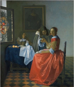
The Girl with a Wine Glass
(Dame en twee heren)c. 1659–1660
Oil on canvas, 78 x 67 cm. (30 3/4 x 26 3/8 in.)
Herzog Anton Ulrich-Museum, Brunswick
inv. 316
The textual material contained in the Essential Vermeer Interactive Catalogue would fill a hefty-sized book, and is enhanced by more than 1,000 corollary images. In order to use the catalogue most advantageously:
1. Scroll your mouse over the painting to a point of particular interest. Relative information and images will slide into the box located to the right of the painting. To fix and scroll the slide-in information, single click on area of interest. To release the slide-in information, single-click the "dismiss" buttton and continue exploring.
2. To access Special Topics and Fact Sheet information and accessory images, single-click any list item. To release slide-in information, click on any list item and continue exploring.
The background "picture-within-a-picture"

As the expert of Dutch art Wayne Franits observed, in Vermeer's paintings men "enter domestic genre scenes only as guests; or they are defined as the "absent presence" through such signs as a male portrait on the wall or a man's cloak thrown over a chair." Vermeer expert Arthur K. Wheelock Jr. posited that the deliberate positioning of the upright ancestral portrait between the two male figures emphasizes the artist's concerns about the diminishing moral restraint in the present era. Pieter Roelofs astutely observed that "knowing that Vermeer often featured paintings owned by his family in his canvases a large-scale painting of a Cupid and a Procuress by Dirck can Baburen, it is conceivable that the portrait of the man in 1630s attire in the background of The Girl with a Wine Glass was based on one of the family portraits in the hall. Based on the man's attire, it likely dates back to the 1630s. The stern pose and grave treatment of this section underscore its pronounced cautionary presence. This instance marked the sole occasion Vermeer incorporated a picture within another in his compositions that depicted a formal portrait.
During the Golden Age of Dutch art, the practice of embedding pictures-within-pictures, or "inset paintings," into genre scenes became a notable trend. One of the most salient reasons artists employed this technique was to convey moral or symbolic messages. A pictures-within-picture could serve as a nuanced counterpoint, enhancing or commenting on the primary scene to spotlight virtues, vices or societal reflections.
Furthermore, this technique allowed artists to engage in a form of visual conversation with their peers. By referencing known artworks or mimicking distinct styles within their compositions, they were not only acknowledging broader artistic discussions but also showcasing their vast knowledge and ability to navigate various techniques. It was also, undoubtedly, a method for artists to flaunt their technical acumen. Reproducing varied styles or subjects within one canvas demonstrated their versatility and command over their craft.
Who is the figure seated behind the table?
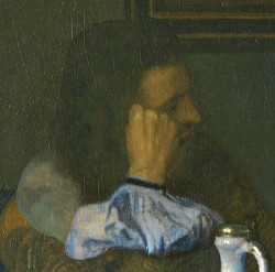
The brooding figure seated behind the table presents a challenge in interpretation, standing as one of the few overtly negative figures in the artist's body of work. The young man's despondent posture and the penumbra that envelops him have led critics to surmise that he might be suffering the pangs of unrequited love or is perhaps intoxicated. Art historian Rodney Nevitt Jr., in fact, posits that the man could be under the influence of the tobacco (as indicated by the rolled paper on the table), wine (evident from the ceramic pitcher), or he might be a jilted lover overshadowed by a rival. His demeanor and posture echo those of the girl in Vermeer's earlier painting, A Maid Asleep. Such postures were often linked to melancholia during the 17th century—a condition related to depression, introspective contemplation, artistic endeavor and forlorn romantic pursuits.
Whatever this figure's role, similarly-posed men can be found in other Dutch genre paintings of the time, such as Jan Steen's apparently benign Lute Player. The gentleman who listens to the well-dressed musician strikes a very similar pose, albeit mirrored. However, the context of the pictures gives rise to much speculation.

The Lute Player (and detail)
Jan Steen
c. 1656–1666
Oil on oak panel, 55.5 x 43.5 cm.
Enschede, Rijksmuseum Twenthe
Of course, the woman with the lute in the foreground is the key figure. But the more sketchily painted figures in the background provide further evidence of what is happening in the room. The man at the table stares into the distance, his head leaning on his left hand, while his glass is being refilled. Is he simply "intoxicated" by the charms of the young musician or her lovely melodies? Perhaps, but we might be observing a man with a broken heart seeking consolation from the sounds of the lute. In 17th-century painting, music is often represented as a remedy for a broken heart. On the other hand, the scene could also be interpretated as a brothel scene. The picture-within-a-picture with the naked putti hidden on the background wall and the woman pouring wine suggests this interpretation. The older woman, then, assumes the role of a matchmaker, mediating between the prostitute and her client.

Woman Drinking and Man
Asleep at a Table
Gerrit ter Borch
1658–1659
Oil on canvas, 39 × 34.5 cm
Private collection
At the time tobacco was believed to be just as intoxicating as alcohol. In tavern scenes, such a slumbering figure traditionally plays the role of a drunkard sleeping off his hangover amid partying revellers. In tavern scenes, such a slumbering figure traditionally plays the role of a drunkard sleeping off his hangover amid partying revellers. Gerrit ter Borch first painted this type of dozing man in the company of an elegant damsel sipping wine.
The white wine jug
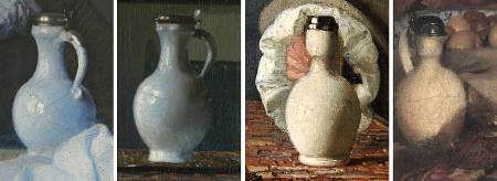
Vermeer displayed a particular affinity for this type of lead-tin glazed wine jug, as evidenced by its prominent placement in three other paintings: A Maid Asleep, The Glass of Wine and The Music Lesson. Starting in the 1550s, these jugs gained international appeal, making their way across Europe. By the latter part of the 16th century and the early 17th century, they had become a sought-after item in the Netherlands. Dutch potters, recognizing their popularity, began producing their renditions. From 1650 to 1670, they became a recurring motif in genre interior paintings. Differentiating between the Italian originals and the Dutch imitations is challenging. However, Alexandra Gaba-van Dongen, a historian specializing in Dutch decorative arts, posits that the jugs featured in Vermeer's compositions are of Italian origin.
These containers trace their origins back to the Near and Middle East, where tin-glazing was first developed. The technique migrated to Italy by the Renaissance, where it was refined and popularized. The city of Faenza in Italy became especially renowned for producing these white-glazed ceramics, and the term "faience" is derived from this city's name. The Netherlands began producing its own version of these tin-glazed ceramics in the city of Delft, which became the most significant center for this art in northern Europe.
Tin-glazing is a pottery technique where a lead glaze, rendered opaque white by the addition of tin, is applied to a shaped clay body. This white glaze acts as an ideal canvas for painted decoration, which is often applied before a second firing in the kiln.
The white cloth on the table
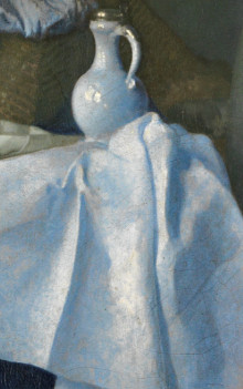
No attempt has ever been made to decipher the iconographic significance, if there is any, of the oversized white cloth draped from the table. It might have been incorporated purely for its visual appeal or, more prosaically, to address a proportion discrepancy between the seated and standing figures. Art historian John Nash observed that the woman's proportion to her chair seems somewhat unusual. Based on the perspective provided by the floor tiles, she seems to be positioned slightly forward from the table. Yet, the gentleman leaning over her to offer a glass of wine appears to be standing just past the white tablecloth. Compositionally, this element effectively links the girl, the suitor and the seated man in the background, enhancing the painting's vibrant color scheme.
A particularly notable aspect of this piece is the bluish hue of the shadows, achieved using the pigment natural ultramarine blue—a rarity in Dutch paintings of that period. In this composition, Vermeer also utilized ultramarine blue in the gray tones of the background wall, the wine jug's shadow, the blue tablecloth and even in the deeper shadow of the girl's red satin gown. The liberal use of natural ultramarine blue is somewhat atypical for Vermeer's usual technique. Many of his contemporaries typically favored azurite, a less expensive yet less vibrant alternative to the imported ultramarine.
The smiling young girl
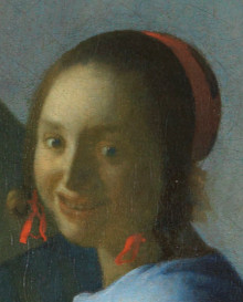
The candid expression on the young woman's face diverges from Vermeer's typical approach, where he often communicates his subjects' emotions through subtle gestures, their harmonious interaction with their surroundings, and their engaged activities. An early Vermeer scholar speculated that her intense gaze and peculiar smile might be due to overpaintings by a subsequent artist. The depiction of such a broad smile revealing the teeth was unusual in the 17th century and would have evoked associations with inappropriate behaviour. Notably, instead of engaging with her suitor, Vermeer's subject turns toward the viewer, distancing herself from him. Arthur K. Wheelock Jr. posits that her smile suggests cognizance, implying she not only understands the current situation but also maintains control over it. In this context, it is the man, rather than the woman, who appears to be the one seduced. Such a narrative, where a man is captivated by a woman adorned in luxurious attire only to face betrayal or rejection, was a popular theme among 17th-century poets. They often drew inspiration from the sonnets of Petrarch, which explored the concept of unrequited love.
Conversely, some critics interpret the girl as a more passive figure in this romantic play. Walter Liedtke suggests, "What she manages is not her suitor but her fluctuating emotions. One might assume this naive young lady is far less adept at repelling advances than the composed woman in The Glass of Wine."
The unobtrusive still life
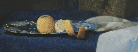
An art writer once remarked that while Vermeer never crafted a dedicated still life, the elements of still life integrated into his interior scenes rank among the finest ever rendered. The depicted fruit has alternately been identified as a lemon or an orange. Both frequently appeared in Dutch still lifes, but each bore its distinct symbolic connotation.
Lemons often accompany oysters in many ritualistic courtship scenes. In an artwork by Frans van Mieris, a young gentleman presents a lavish silver plate brimming with shucked oysters to a woman clutching a partially filled wine glass. To a 17th-century Dutch observer, the intent of Van Mieris' tableau would be evident. Given the widespread belief in oysters' aphrodisiacal properties, they were commonly linked to themes of seduction. Notably, Vermeer's composition lacks any visible oysters. Yet, their absence doesn't negate the possibility that they might have been consumed earlier. If they had, the protagonists' contrasting reactions suggest the oysters may have influenced the suitor more than the maiden.
The wine jug and glass's symbolic essence seem to underscore the painting's subtext of a ceremonious, albeit evident, seduction attempt. Yet, lemons also played a role in enhancing and balancing the taste of wine, symbolizing the importance of moderation. This interpretation contrasts with the seductive undertone. Moreover, the renowned pointillés, or luminescent dots—which some experts argue indicate Vermeer's use of a camera obscura as a painting aid—are evident on the silver tray.
The Netherlands, with its expansive coastline, has had a long history of seafood consumption. Oysters, being abundant in the estuaries and coastal waters, became a staple in the diet of both the wealthy and the common man. They were easily accessible and were consumed fresh. This reality was depicted in numerous paintings where oysters are portrayed as part of lavish feasts or simple meals. While oysters were consumed by all classes, in paintings, they often symbolized luxury, affluence and the good life—especially when depicted alongside other luxury items like fine wines or exotic fruits.
Mid-17th-century courtship

Vermeer's painting belongs to a genre of domestic scenes prevalent in mid-17th-century Holland in which the mores of contemporary life, particularly those pertaining to love and courtship, were depicted and commented upon. Many of these themes focus on the foibles of male/female relationships and man's inability to restrain his sexual appetite, even though the narrative of Vermeer's paintings are so subtly contrived as to pose serious questions of interpretation. The young suitor, draped in an elegant cape, carefully accompanies the woman's hand which delicately holds the tip of a half-full wineglass.
His intentions have been interpreted in a number of ways by Vermeer specialists, from comic monsieur, seducer or seduced. Perhaps the story being told was far more evident to the artist's contemporaries than it appears today. But in last analysis, his (and her) posture and expression are so highly formalized that they fail to furnish an unequivocal key to unlock the precise narrative meaning of the painting.
The red tabbaard

While Vermeer's body of work is celebrated for its harmonious blend of lemon-yellow and blue, the young artist dabbled with intense reds in the early stages of his career. The vivid red of the dress might suggest the concealed passions of the young woman who appears to welcome the gentleman's attention. Dutch costume authority, Marieke de Winkel, identifies the young woman's attire as a tabbaard or tabbert, typically reserved for formal events. This ensemble consists of a stiff, snug-fitting bodice laced at the back and a complementary long gown. To provide additional structure to the bodice, a rigid plank of ivory, wood, or even iron was sometimes incorporated. Given its constricting nature, the tabbaard would understandably be uncomfortable, making it less suitable for expectant mothers. Catharina Bolnes, Vermeer's spouse, possessed a similar gown crafted from black fabric, likely intended for mourning.
The stained-glass window
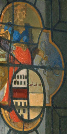
One of the most remarkable features of the painting is the colored stained-glass window, also depicted in The Glass of Wine in Berlin. The coat of arms is associated with Janetge Jacobsdr. Vogel, the first wife of Moses van Nederveen. Yet, how Vermeer obtained this emblem remains unclear. Vogel and her husband resided in Delft, relatively close to Vermeer. However, she passed away in 1624, eight years before the artist's birth.
According to traditional interpretation, the symbolism of the coat of arms is transparent and would have been easily comprehended in Vermeer's time. The female figure, holding a level and bridle, represents Temperantia or Temperance. This image bears a striking resemblance to a depiction in Gabriel Rollenhagen's Selectorum Emblematum from 1613. Accompanying Rollenhagen's illustration is the text: "The heart knows not how to observe moderation and applies reins to feelings when struck by desire." The level represents righteous actions, while the bridle signifies emotional restraint. It's likely that, paired with the solemn portrait on the opposite wall, this emblem served as a reminder of moderation—a cautionary note highlighting the central figures' apparent lack of discipline.
However, this interpretation has faced recent scrutiny from Dutch art expert Ariane van Suchtele and Huib J. Zuidervaart. Van Suchtele proposes that earlier observers misinterpreted the standing figure as embodying Temperance, assuming the item in her hand was a rein—a typical symbol of this cardinal virtue. In contrast, the woman in the window's central section holds not a rein, but the ornate straps of a coat of arms. The vibrant window bearing the elaborate family crest implies a lineage of sophistication, a trait seemingly at odds with the depicted youths.
Zuidervaart, instead, offers another theory suggesting that Vermeer's paintings The Glass of Wine and The Glass of Wine were commissioned as wedding gifts for the grandchildren of Moijses van Nederveen and Janetge de Vogel. Although there is no direct archival evidence supporting this theory, historical facts do not contradict it. The dating of the paintings aligns with the proposed scenario, and their origin and characteristics make sense within this context. The paintings feature a coat of arms, which can be explained in relation to the background of Vermeer's presumed client. Also that the presence of similar ceramic floor tiles in both paintings, differing from other Vermeer works, could be attributed to the mansion in front of the Nederveen-Van der Heul gunpowder factory, where the paintings might have been set up. This is further supported by the consistent lattice pattern in the window of the painting A Girl Interrupted in her Music, suggesting a thrid connection to the same location. Unlike the common belief that Vermeer's paintings were created in his studio, the author suggests that if Vermeer used optical equipment, it could be easily portable, similar to an optical projection device created by Johan van der Wyck in Delft in 1653.
Such variances in understanding Vermeer's ostensibly clear paintings remind us that, despite extensive research, the meanings behind Vermeer's pieces remain elusive. Subtle shifts in tone and significance remain subjects for further scrutiny.
In an case, in the 17th century, a stained-glass window such as the one in the present work would have been cosidered a luxury item, affordable only for the select few. Color was achieved by adding various metallic compounds to the glass mixture. Copper oxides produced a bluish-green hue, cobalt resulted in blue, gold chloride yielded red or pink, and manganese could either create a purple shade or decolorize the glass. Once the pieces of glass were cut, they were then assembled into a design using strips of lead, known as "cames". The cames were flexible and could be bent around the edges of the glass pieces, holding them together. Finally, the entire assembly was soldered at the joints for stability.
The ceramic floor tiles

Willemijn Fock, a historian specializing in Dutch decorative arts, has demonstrated the implausibility of the notion that the distinctive black and white marble floors frequently depicted in Vermeer's paintings and other Dutch interior scenes were captured directly from reality. These opulent floor designs were a hallmark of affluence and were only found in the residences of the wealthy elite—beyond Vermeer's financial means.
In contrast, the type of small ceramic tiles seen in the present artwork was a more commonplace feature, despite the Dutch population's general preference for practical, wide-planked wooden floors. Philip Steadman, an architect and Vermeer expert from London, points out that the intricate details of the cracks and imperfections in the foreground tiles suggest Vermeer's direct observation. By employing a process of reverse geometry, Steadman computed that these ceramic tiles are precisely half the size of the larger black and white marble tiles seen in subsequent artworks. This finding led him to posit that Vermeer could have used an underlying geometrical grid derived from real tiles to project the illusion of the luxurious marble patterns—patterns he had likely never directly encountered.
Within this painting, Vermeer depicts relatively economical ceramic tiles, which were of a smaller size and significantly more prevalent compared to the grand black and white marble floors that would recurrently grace his interior compositions. Upon close scrutiny, subtle irregularities and chips become evident—quaint narrative details that would be eradicated in Vermeer's later creations. Ceramic tiles offered the advantage of being significantly more affordable than marble tiles, yet they came with the drawback of being relatively susceptible to chipping, as evidenced by some of the tiles within this painting.
During the 17th century in the Netherlands, crafting ceramic tiles for flooring was an artistry that blended practicality with decoration. This multistep process began with clay selection and preparation, combining different clay types for durability and color stability. Shaping the clay into uniform tiles followed, achieved through hand-molding, molding with intricate designs, or extrusion. Decorative techniques included impressing patterns, using liquid clay for contrasting hues and employing stencils to create geometric or nature-inspired designs.
After thorough drying to prevent cracking, firing took place in kilns, turning the clay into robust material. Glazing, an optional step, provided a glossy finish and protection from wear and fading. Tiles were then arranged to form intereting patterns on the floor. Installation involved embedding the tiles in mortar or adhesive with precise alignment.
The ceramic floor tiles
Willemijn Fock, a historian specializing in Dutch decorative arts, has demonstrated the implausibility of the notion that the distinctive black and white marble floors frequently depicted in Vermeer's paintings and other Dutch interior scenes were captured directly from reality. These opulent floor designs were a hallmark of affluence and were only found in the residences of the wealthy elite—beyond Vermeer's financial means.
In contrast, the type of small ceramic tiles seen in the present artwork was a more commonplace feature, despite the Dutch population's general preference for practical, wide-planked wooden floors. Philip Steadman, an architect and Vermeer expert from London, points out that the intricate details of the cracks and imperfections in the foreground tiles suggest Vermeer's direct observation. By employing a process of reverse geometry, Steadman computed that these ceramic tiles are precisely half the size of the larger black and white marble tiles seen in subsequent artworks. This finding led him to posit that Vermeer could have used an underlying geometrical grid derived from real tiles to project the illusion of the luxurious marble patterns—patterns he had likely never directly encountered.
Within this painting, Vermeer depicts relatively economical ceramic tiles, which were of a smaller size and significantly more prevalent compared to the grand black and white marble floors that would recurrently grace his interior compositions. Upon close scrutiny, subtle irregularities and chips become evident—quaint narrative details that would be eradicated in Vermeer's later creations. Ceramic tiles offered the advantage of being significantly more affordable than marble tiles, yet they came with the drawback of being relatively susceptible to chipping, as evidenced by some of the tiles within this painting.
During the 17th century in the Netherlands, crafting ceramic tiles for flooring was an artistry that blended practicality with decoration. This multistep process began with clay selection and preparation, combining different clay types for durability and color stability. Shaping the clay into uniform tiles followed, achieved through hand-molding, molding with intricate designs, or extrusion. Decorative techniques included impressing patterns, using liquid clay for contrasting hues and employing stencils to create geometric or nature-inspired designs.
After thorough drying to prevent cracking, firing took place in kilns, turning the clay into robust material. Glazing, an optional step, provided a glossy finish and protection from wear and fading. Tiles were then arranged to form intereting patterns on the floor. Installation involved embedding the tiles in mortar or adhesive with precise alignment.
The white-washed wall
The white-washed walls, a recurring element in Dutch interior genre painting, often go unnoticed due to their familiarity.
Interior with a Merry Company
Joost Cornelisz. Droochsloot
1645 Oil on canvas, 98.5 x 127.9 cm.
Centraal Museum, Utrecht
From a technical standpoint, their portrayal poses one of the most intricate challenges in achieving pictorial illusion. A strategic adjustment of tone and hue becomes necessary to capture the diverse play of light upon the surface. Typically, painters followed a conventional formula, employing pure white or nearly pure white pigments for the brightest sections of the wall. The nuanced shadow gradients were attained through the addition of black and raw umber (a somewhat greenish-brown pigment), which proved to be among the most indispensable colors on the artist's palette.
Vermeer consistently adhered to these three pigments when rendering plain walls, occasionally introducing a minute quantity of ultramarine blue to impart a livelier and cleaner shade of gray. In this particular artwork, ultramarine blue has indeed been identified alongside white and raw umber. This infusion of blue bestows upon the gray a distinctly greenish tinge that interacts dynamically with the vivid red expanse of the satin attire. It is conceivable that Vermeer borrowed this technique from Carel Fabritius, who was known to have enriched the light gray backdrop of his renowned work The Goldfinch with ultramarine blue.
The blue tablecloth & table
The cool blue tablecloth, which covers a finely crafted table with ornately shaped legs, provides a soothing aesthetic effect. The table's dimensions also offer a sense of scale. If one compares the height of the table to that of the foreground gentleman, one would imagine that both he and the seated figure must be somewhat closer to the viewer, distant from the table. And yet, the gentleman's draping olive-green cloak falls behind the white tablecloth, in line with the front side of the table, whereas it should be in front of it. This is perhaps one of the few errors in Vermeer's paintings that, once seen, cannot be unseen.

The signature

Inscribed lower right window pane: IVMeer (VM in ligature)
(Click here to access a complete study of Vermeer's signatures.)
Dates
c. 1662 Albert Blankert, Vermeer: 1632–1675, 1975
c. 1659–1660
Arthur K. Wheelock Jr., The Public and the Private in the Age of Vermeer, London, 2000
c. 1659–1660
Walter Liedtke, Vermeer: The Complete Paintings, New York, 2008
c. 1661–1662
Wayne Franits, Vermeer, 2015
(Click here to access a complete study of the dates of Vermeer's paintings).
Critical assessment
The fine, plain-weave linen with a thread count of 14 x 15 per cm² retains its original tacking edges; on both left and right sides are selvedges; The support has been glue/paste lined. The double ground consists of a white layer, containing chalk, lead white and umber, followed by a reddish brown layer. The ground was left uncovered along several outlines of the figures and the wine jug. It extends a few millimeters over the tacking edges.
Parts of the window, red dress, chair and many of the highlights were painted wet-in-wet, with impasto in the highlights, the fruit and the red skirt of the figure in the window. Ultramarine is used extensively in the window, the background, the tablecloth and in the underpaint of the shadows of the girl's red dress. The position of the heads of the standing man and the girl and the bows in her hair, have been slightly altered. Some parts of the painting appear unfinished, such as the wall between the male figures, and the arm and cuff of the girl. There is degraded medium in the ultramarine mixtures and the pigment appears discolored.
* Johannes Vermeer (exh. cat., National Gallery of Art and Royal Cabinet of Paintings Mauritshuis - Washington and The Hague, 1995, edited by Arthur K. Wheelock Jr.)

Provenance
- (?) Pieter Claesz. van Ruijven, Delft (d. 1674);
- (?) his widow, Maria de Knuijt, Delft (d. 1681);
- (?) their daughter, Magdalena van Ruijven, Delft (d. 1682);
- (?) her widower, Jacob Abrahamsz Dissius (d. 1695);
- Dissius sale, Amsterdam, 16 May, 1696, no. 9;
- Anton Ulrich, Duke of Braunschweig [Brunswick], (before 1710);
- in 1714 to the Herzog Anton Ulrich-Museum, Braunschweig (inv. 316).
Exhibitions
- Berlin April–May, 1929
Die Meister des holländischen Interieurs
Galerie Dr. Schaffer
"Nachtrag" no. 103a and ill. - Schaffhausen 1949
Rembrandt und seine Zeit. Museum zu Allerheiligen
76, no. 188 and ill. - Brunswick September 6–November 5, 1978
Die Sprache der Bilder: Realität Und Bedeutung in der niederländischen Malerei des 17. Jarhunderts
Herzog Anton Ulrich-Museum
164–168, no. 39 and ill. - Tokyo April 24, 1984–June 10, 1984
Dutch Painting of Golden Age from the Royal Picture Gallery Mauritshuis
National Museum of Western Art - Washington D.C. November 12, 1995–February 11, 1996
Johannes Vermeer
National Gallery of Art
114–119, no. 6 and ill. - The Hague June 25–September 5, 1966
Johannes Vermeer
Mauritshuis - Madrid February 19–May 18, 2003
Vermeer y el interior holandés
Museo Nacional del Prado
168–169 no. 33 and ill. - Tokyo August 2–December 14, 2008
Vermeer and the Delft Style
Metropolitan Art Museum
176–178, no 28 and ill. - Brunswick December, 2009–May, 2015
Epochal
Dankwarderode Castle - Kassel November 18, 2011–February 26, 2012
Light Structure - The Light in the Age of Rembrandt and Vermeer
Museum Hessen - Rome September 27, 2012–January 20, 2013
Vermeer. Il secolo d'oro dell'arte olandese
Scuderie del Quirinale
210. no. 47 and ill. - Dresden June, 4–September 12, 2021
Vermeer: On Reflection
Gemäldegalerie Alte Meister, Dresden
(Click here to access a complete, sortable list of the exhibitions of Vermeer's paintings).
Who posed for the young girl?
Not a single sitter in Vermeer's paintings has been definitively identified. While the coat of arms belonging to Janet Vogel might stand out on the opened window, she died eight years before Vermeer's birth. Another candidate is Maria de Knuijt, the wife of Vermeer's affluent patron from Delft, Pieter van Ruijven, considering that this painting is likely to have been a part of their family collection and that De Knuijt may have been the principal collector among the couple. It is on record that Maria left a bequest of 500 florins to Vermeer in her will—an amount comparable to the cost of one to three valuable cabinet pictures. This unique bequest to a painter outside the family circle signifies a remarkable demonstration of respect and support for the artist's well-being.
While it's possible that De Knuijt's actions reflected her husband's wishes, her significant financial contribution to their marriage suggests her taste would have been influential. As a supporter of the Orthodox branch of the Reformed church, De Knuijt may have found particular affinity with the modest grace that characterizes Vermeer's portrayals of femininity. Nonetheless, the inclusion of Janet Vogel's coat of arms contradicts Maria de Knuijt's societal identity, a matter that would have held central importance in her life. While not ruling out the possibility of Vermeer's own wife, Catharina Bolnes, having posed for the painting, the identity of the sitter becomes secondary to the artwork's essence.
The identity of Vermeer’s patron is of vital importance, as they purchased half of the artist’s entire oeuvre—over 20 paintings. Equally significantly, De Knuijt began to buy his work around 1657, a time when Vermeer shifted from painting conventional religious and mythological subjects to creating his scenes centered around young women in interiors. This suggests that De Knuijt (along with her husband) may well have encouraged the artist to develop his art, shaping the Vermeer that we know and love today. Moreover, De Knuijt seems to have had a personal relationship with the Vermeer family. She grew up just a few doors away from the Voldersgracht, a canal-side street in Delft, where his family had their residence and where he spent much of his youth. It's reasonable to assume that she saw the young Johannes, and then his children, grow up on the same street. The discovery of Maria de Knuijt's role as a patron of the arts is part of a broader trend to reevaluate women's contributions to art history, extending beyond their roles solely as artists.
Love in the Netherlands
Amorum emblemata
Otto van Veen
1608
After enduring the atrocities of the war of independence with Spain, the Dutch population shifted their focus towards the more lighthearted aspects of life, most notably love. As a result, during the latter half of the century, themes of courtship and lovemaking gained significant prominence among Dutch genre artists. Painters found a wealth of inspiration in various sources, including moralistic literature, love poems, songbooks, courting etiquette manuals, plays and the increasingly popular collections of prose love stories. Many of these sources were published in Vermeer's hometown of Delft, indicating his likely awareness of them. Earlier 17th-century artworks often depicted joyous outdoor garden gatherings, featuring Dutch youths adorned in contemporary attire engaging in courtship, dance and music. These compositions traced their origins to the "garden of love" iconography, to some extent inspired by the pastoral festivals (Fêtes Champêtres) that reflected the ideals of ancient Arcadia, favored in the courts of Louis XIV and XV.
By the 1650s, when Vermeer embarked on creating his initial interior scenes, the "garden of love" motif had evolved considerably. The gatherings were now more intimate, involving only two or three individuals, and were no longer set in expansive outdoor areas, but rather within the cozy interiors of well-to-do homes. Vermeer drew extensively from the compositional and thematic conventions established by artists like Gerrit ter Borch, who masterfully captured the subtle nuances of costume and gesture, as well as Pieter de Hooch, who pioneered the depiction of these scenes in sunlit corners of interior spaces.
The smooth & rough manners
The Glass of Wine in Berlin and the present Girl with a Wine Glass appear to represent a very similar theme. And the presence of the ceramic tiles and ornate stained-glass windows in both pictures would suggest that they were painted in the same room. For this reason, Vermeer experts tend to date these two works very closely. However, on close inspection, the two compositions present notable technical disparities which may suggest that they were painted within a somewhat larger interval of time.
The Berlin painting presents a rougher surface with loaded color reminiscent of the grainy textures found in Officer and Laughing Girl and the famous Milkmaid. Instead, the Girl with a Wine Glass presents a smooth, almost polished surface. Following this work, Vermeer's paint application became ever more subtle. Art historian Mariët Westermann has suggested that Vermeer had begun to work in the so-called net, or smooth manner, which was in vogue among the most sought-after painters of the time. The new, smooth manner went along with the more genteel and elegant themes. The rouw, or rough manner of the great Rembrandt was criticized and rejected by most art writers of the time such as Samuel Hoogstraten and Gérard de Lairesse.
In the context of Renaissance and 17th-century Dutch paintings, the dichotomy between the rough and smooth styles emerged as a significant artistic contrast that reflected evolving trends, preferences and social values of the time. This juxtaposition is particularly evident in the works of artists such as Rembrandt and Vermeer, who navigated between these contrasting techniques.
The rough style was characterized by pronounced brushwork, visible texture and a tactile quality. This technique emphasized the artist's hand and the materiality of the painting, allowing the viewer to perceive the process and energy behind the creation. Rembrandt used the rough style to achieve particularly dramatic effects of light and shadow. This approach resonated with emotional depth, psychological insight and expressive intensity. The rough style conveyed a sense of humanity and the complexity of the human experience. It was particularly well-suited for narrative scenes, portraits and historical compositions, as it could convey a sense of raw emotion and individual character.
Conversely, the smooth style prioritized refined detail, delicacy and precision. This technique aimed to create an illusion of reality by minimizing visible brushwork and surface texture. Artists using the smooth style strove for meticulous accuracy in capturing textures, fabrics and surfaces. This approach was well-suited for capturing serene domestic scenes, interior settings and depictions of elegance and refinement. The smooth style conveyed a sense of order, harmony and idealized beauty.
Ambiguity in Vermeer's art
The present picture like other multi-figured scenes by Vermeer, maintains an aura of uncertainty. The standing figure depicted in the stained-glass window undoubtedly symbolizes Temperance—an emblem of virtuous behavior and emotional restraint. Similarly, the composed portrait on the rear wall likely offers a form of cautionary commentary on the unfolding scene.
Yet, what interpretation should we assign to the male figure reclining in the background? Is he, like the window, a warning against excess? Is he intoxicated, dozing, or does his posture allude to feelings of lovesickness and melancholy?
The answer to these questions remains elusive, aligning with the pervasive ambiguity often found in Vermeer's oeuvre. This ambiguity also resonates in specific 17th-century still life paintings, many of which teeter between extending an invitation and casting judgment on the pursuit of sensual pleasure.
How to hold a glass of wine
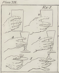
Art historian Paul Taylor has recently reexamined Vermeer's renowned compositions through the lens of 17th-century compositional concepts, known as ordinantie, as elucidated by the influential Dutch artist and art theorist Gérard de Lairesse.
Taylor's study unveils a pivotal term in Lairesse's discourse on composition: "the concept of probability," or waarschynelykheid in Dutch. De Lairesse asserts that "Probability is the most important thing to bear in mind when composing a picture." He emphasizes that this principle must be evident not only in the overall arrangement but also in each individual element, and any elements conflicting with this principle should be meticulously omitted. For instance, when portraying a dining room, de Lairesse advises clarifying whether a meal is anticipated or has concluded; in the latter case, empty vessels and disordered plates should be portrayed.
Gesture, attire, proper posture and arrangement were all strategically employed to enhance narrative clarity and reinforce the intended message. Excessive and distracting details were to be avoided, as they could dilute the overarching message. De Lairesse even provided visual examples to illustrate how an artist could convey the social status of their subject through the subtle act of holding a glass. This notion finds resonance in Position No. 5, comparable to the refined gesture depicted in the current work. As de Lairesse expounded, "A prince holds it handily and cautiously below on the foot."
What distinguishes de Lairesse's notion of composition is its apparent indifference to formal, purely aesthetic considerations—a characteristic that modern comprehension of pictorial composition often emphasizes. Instead, de Lairesse elevates the "force of narrative" above all else in his compositional philosophy.
The corner of a room
While it may often go unnoticed, a significant portion of 17th-century Dutch genre interiors are situated in the left-hand corner of a room. This positioning is characterized by a window on the side wall that provides illumination, while the background wall, in most instances, runs parallel to the picture plane, with exceptions being rare. The origins of this pictorial formula can be traced back to practical considerations and visual conventions of the time.
This formula is partly rooted in the practice of painters positioning themselves with the light source coming from the left. This arrangement allowed the artist's hand shadow to fall away from the area they were working on, avoiding any disturbance to their work. Additionally, the reading habits of western spectators, who read from left to right, play a role in reinforcing the success of this formula.
As such, the alignment of scenes in the left-hand corner of interiors was not only a compositional choice but also a strategic decision that accommodated the technical requirements of painting and capitalized on the natural reading tendencies of viewers.
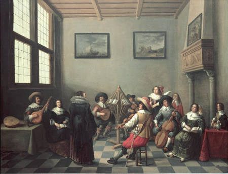
Inspiration: Pieter de Hooch
Woman Drinking with Soldiers
Pieter de Hooch
1658
Oil on canvas, 69 x 60 cm.
Musée du Louvre, Paris
It is widely acknowledged that Vermeer drew much of his compositional and thematic inspiration from his contemporaries. Notably, the painting that appears to have influenced the current work is Pieter de Hooch's Woman Drinking with Soldiers (1658).
In the 1650s, just prior to De Hooch's departure from Delft for Amsterdam in 1660 or 1661, he produced some of his most finessed works. These pieces masterfully capture the ambiance of cool daylight filtering through open windows, suffusing interiors with a gentle radiance occasionally punctuated by select figures and objects.
While earlier artists had experimented with similar arrangements of figures, De Hooch innovatively situated them within meticulously defined three-dimensional spaces illuminated by vibrant light. In a significant departure, De Hooch elevated the portrayal of space to a status as crucial as the figures themselves. Some critics argue that Vermeer extended this concept even further, elevating space and light to become the true subject of his art.
The "negligent" style
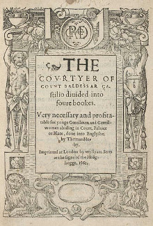
The Book of the Courtier
Baldassare Castiglione
(English translation of Il Cortegiano)
The long hair and loosely-fitting attire worn by the men depicted in this work might reflect a deliberate adoption of the "negligent" or "nonchalant" style that gained popularity among men during the 1650s. Manners books widely circulated during this period noted that overly pristine dress was deemed unmanly. The embrace of long hair cut across various social strata, possibly due to its accessibility for those who couldn't afford extravagant clothing. The trend caused such concern that it led to a church council-driven controversy known as "The Dispute of the Locks" in 1645.

Portrait of Gerolamo (?) Barbarigo
Titian
c. 1510
Oil on canvas, 81.2 x 66.3 cm.
National Gallery, London
Some of the impetus for these fashion trends can be traced to Baldassare Castiglione's book The Courtier (1528), which delineates ideals and conduct for the perfect gentleman. The term sprezzatura, which Castiglione introduced, encapsulates the appearance of effortless and offhanded elegance that the ideal courtier should embody. Peter Burke characterizes sprezzatura as "careful negligence" and "effortless ease," asserting that the epitome of a courtier is someone who "conceals art, and presents what is done and said as if it was done without effort and virtually without thought."
The formal portrait looming in the background might allude to a shift in social norms, contrasting with the more restrained ideals upheld by earlier generations of stoic Dutchmen. Over time, the term sprezzatura came to be associated with a relaxed style of painting—exemplified by artists like Giorgione, Titian, Velázquez and in the Netherlands, Rembrandt.
A hybrid image

Teasing the Pet
Frans van Mieris
1660
27.5 x 20 cm.
Mauritshuis, The Hague
One of the most distinctive characteristics of Vermeer's working method was his inclination to assimilate diverse motifs and stylistic elements derived from the works of his contemporaries. In the present composition by Vermeer, we discern echoes of Pieter de Hooch's structured interiors, the sumptuous satin attires characteristic of Gerrit ter Borch, and the communicative "body language" exhibited in the creations of Frans van Mieris. These elements are deftly woven together into an original artistic solution.
In Teasing the Pet by Van Mieris, often linked to the current work, Vermeer could have been drawn to the dynamics between the two figures—a scenario where the cavalier, in a rather unsubtle gesture, seeks to engage the young girl by playfully tugging the ear of her small dog. Van Mieris is credited with originating this motif, which was subsequently borrowed by many of his his peers.
Vermeer, as was his custom, avoids quoting his source of to directly. Instead of the innocent puppy, he refined the interaction by substituting the anecdotal canine with a more ceremonious offering of wine. While the lady in Van Mieris' rendition appears to momentarily spurn her courtier's advances, the woman in Vermeer's painting gazes toward the viewer, withholding her emotions. This openness allows each viewer to project their own reflections and anticipations into the scene, effectively becoming active participants in the narrative conveyed by the artwork.
Listen to period music
![]() Bergerette Dont vient cela (4 lutes) [892 KB]
Bergerette Dont vient cela (4 lutes) [892 KB]
from: Tilman Susato, Dansereye (1551)
https://amzn.to/4h5yxIN
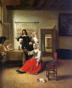
An alternative inspiration: Ludolf de Jongh
The Refused Glass
Ludolf de Jongh
1650–1655
117 x 92 cm.
National Gallery, London
While the prevailing association of the present work has been with models by De Hooch (notably Woman Drinking with Soldiers) and Frans van Mieris, art historian Roland E. Fleischer has presented evidence suggesting that Vermeer's original inspiration may have been a painting by the Dutch artist Ludolf de Jongh titled The Refused Glass. By meticulously analyzing the distinct details of attire in De Jongh's artwork, Fleischer places its creation somewhere between 1650 and 1655. This timeline implies that it could have served as inspiration not just for Vermeer's work but also for De Hooch's composition. Despite De Jongh not belonging to Delft—where Vermeer and De Hooch exchanged ideas—it is highly probable that De Hooch was instructed by De Jongh in Rotterdam prior to the latter's move to Delft. Their connection appears to have persisted even after De Hooch's relocation to Delft during the 1660s.
The thematic connection between the two paintings might be more profound than initially apparent. Although the traditional title of de Jongh's piece is grounded in the seated lady's gesture of declining the offered drink, Fleischer asserts that closer scrutiny reveals the possibility that the man's right hand, which holds the glass, delicately supports the woman's hand. Rather than rejecting the wine, the lady could be a coy recipient. Similarly, in Vermeer's composition, the woman does not display any signs of refusal.
It is noteworthy that De Jongh's piece defies the norm for genre paintings by being unusually large in size, much like Vermeer's Brunswick picture—an example of Vermeer's few large-scale interiors. Furthermore, both women don red satin dresses, and the presence of fruit is a shared motif.
Fleischer proposes the intriguing conjecture that the subject might be an interpretation of the classical theme of Venus, Ceres and Bacchus in a harmonious relationship. These three classical deities have formed a popular trio in Western thought through the ages, echoing Terence's proverb, "without Ceres and Bacchus, Venus is chilled"—that is, love loses warmth without sustenance and wine. Therefore, De Jongh and Vermeer may have endowed the depiction of everyday life with "a deeper significance by investing it with a time-honored universal truth already expressed in Ancient literature, thereby uniting the category of genre with those of allegory and history."
A new hypothesis on the origin of the painting
In a recent scholarly investigation, Huib Zuidervaart has put forth an intriguing theory regarding the genesis of Vermeer's Glass of Wine and The Girl with a Wine Glass. Zuidervaart contends that these two paintings, both featuring an open window adorned with an identical coat of arms, were commissioned as wedding gifts for two grandchildren of Moijses van Nederveen and Janetge de Vogel. Moijses van Nederveen hailed from a prominent Delft lineage deeply connected to gunpowder production, a critical supply for the Dutch army.
While prior historians had succeeded in identifying the associated families to which the coat of arms belonged—the heraldic emblem being a fusion of the Van Nederveen and De Vogel family symbols—none had elucidated the rationale behind Vermeer's deliberate inclusion of these conspicuous elements within these two intricate compositions. Zuidervaart underscores that the dates ascribed to both paintings by experts on Vermeer align with the dates of the weddings in question. Furthermore, the symbolic significance of the coat of arms—a representation of a female figure embodying virtue while bearing a crest—resonates harmoniously with the notion of a wedding gift and aligns with the anticipated backgrounds of Vermeer's putative patrons.
Given that both works not only share the same window but also feature the identical set of ceramic tiles, which Vermeer did not revisit in his other paintings, it is plausible that the artist executed both pieces within the confines of the Van Nederveen/De Vogel residence in Delft. This hypothesis offers a fresh perspective on the motivations and context behind these paintings, illuminating their potential as treasured matrimonial presents infused with familial meaning and emblematic significance.
Listen to period music
![]() Bergerette Dont vient cela (4 lutes) [892 KB]
Bergerette Dont vient cela (4 lutes) [892 KB]
from: Tilman Susato, Dansereye (1551)
https://amzn.to/4h5yxIN
Lace Cuffs

Portrait of Maria Trip (detail)
Rembrandt van Rijn
1639
Oil on panel, 107 x 82cm.
Rijksmuseum, Amsterdam
Lace was an expensive commodity in the 17th century, and wearing it was a sign of wealth and status. The 17th-century Netherlands, especially in the Protestant north, was recognized for its comparatively restrained dress sense when juxtaposed with the lavish styles of Catholic Europe.
Lace cuffs, prominently visible, served as a means for individuals to showcase their affluence and societal position. Both men and women adorned themselves with these cuffs. Yet, this modesty was counterbalanced by the incorporation of premium textiles and intricate details like lace cuffs and collars. The stark contrast of black attire with white lace became a hallmark of Dutch fashion during this era. This is evident in the portraits by artists like Rembrandt and Frans Hals, who excelled in capturing the intricate designs of lace using truly innovative techniques. Those unfamiliar with painting might not readily grasp the complexity of depicting the shadows of white objects. Such representation demands not only variations in tone (brightness levels) but also in hue (color gradations) and painting opacity.
Rembrandt and Frans Hals employed similar, intricate techniques to depict lace. Rembrandt began with a dark or black underpainting, refining its outlines with contrasting black paint. He then detailed the lace's patterns using black paint on the dried white paint. Similarly, Hals painted the white lace first, then detailed the negative space to suggest the lace's holes. When lace overlapped a lighter fabric, Rembrandt used browns and ochres to indicate patterns. He also added impasto white highlights for texture, especially evident in the Portrait of Maria Trip. The cuffs displayed a pronounced impasto technique, allowing the black underlayer to subtly show through.

In the present work, the cuffs of the gentleman are painted with a much softer technique than those of Rembrandt and Hals, in line with the overall softness of the paintings. Fine details at the borders of the lace are barely suggested. Unlike his renowned colleagues, Vermeer painted the shadows with light tones of gray, then glazed with shades of brilliant ultramarine blue. The forward cuff of the seated lady is done using the same technique; however, interestingly, the shadows of the background cuff are painted with tones of ochre.
The lace industry was significant in Europe, and while Belgium (especially Brussels and Bruges) and France were more renowned for their lace production, the Netherlands also had its lace centers. The Dutch, being major traders, also imported lace.
As with all fashion trends, the prominence of lace cuffs waned towards the end of the 17th century, giving way to other styles and forms of adornment. However, lace itself continued to be a valued textile and saw revivals in subsequent periods.
special topics
- Who Posed for the Young Girl?
- A New Hypothesis on the Origin of this Painting
- Love in the Netherlands
- Smooth and Rough Mannera
- Ambiguity in Vermeer's Art
- How to hold a Wine Glass
- The Corner of a Room
- Inspiration: Pieter de Hooch
- An Alternative Inspiration: Ludolf de Jongh
- "Negligent" Style
- A Hybrid Image
- Lace Cuffs
- Listen to Period Music