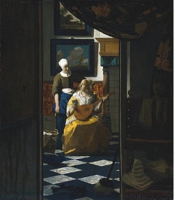
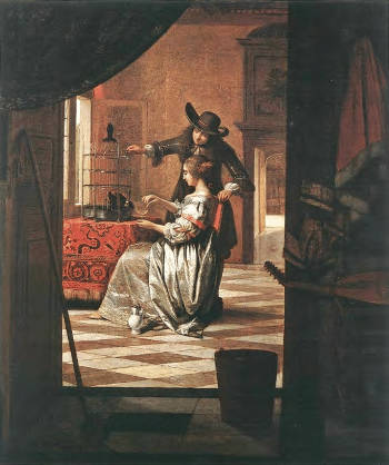
The Love Letter
(De liefdesbrief)c. 1667–1670
Oil on canvas, 44 x 38.5.cm. (17 3/8 x 15 1/8 in.)
Rijksmuseum, Amsterdam
inv. A 1595
The textual material contained in the Essential Vermeer Interactive Catalogue would fill a hefty-sized book, and is enhanced by more than 1,000 corollary images. In order to use the catalogue most advantageously:
1. Scroll your mouse over the painting to a point of particular interest. Relative information and images will slide into the box located to the right of the painting. To fix and scroll the slide-in information, single click on area of interest. To release the slide-in information, single-click the "dismiss" buttton and continue exploring.
2. To access Special Topics and Fact Sheet information and accessory images, single-click any list item. To release slide-in information, click on any list item and continue exploring.
The map on the shadowed foreground wall
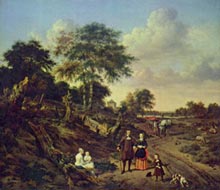
The Music Lesson
Jacob Ochtervelt
1671
Oil on canvas, 80.2 x 65.5 cm.
Art Institute of Chicago
If we trust genre interior paintings from the 17th century, Dutch houses were replete with maps. Most of these maps were decorative rather than didactic or practical. The map in the current painting, depicting Holland, must have appealed to Vermeer, as he included it in three other paintings. While the map is portrayed with limited detail, all its features are discernible in the earlier painting titled Officer and Laughing Girl, where it appears to be hand-colored or possibly colored by the painter himself.
Given that the orthogonals of the map's design and the lower hanging rod converge on the vanishing point of the painting's perspectival system, the wall it's hung on must be perpendicular to the right-hand section of the wall behind the standalone chair and sheet music. The purpose or construction of the front room remains unexplained, and it might very well be a creation of the painter.
The floral-patterned tapestry
The floral-patterned repoussoir tapestry that serves as a curtain is another element that helps distinguish the pictured scene from the observer's space, enhancing the illusion of depth and privacy. This common pictorial device engages the viewer by subtly suggesting the curtain was pulled back to reveal an unanticipated event about to unfold.
Though the tapestry wasn't mentioned in the inventory of movable items following the artist's death, it might have belonged to Vermeer, as it features in several paintings. This tapestry would have undoubtedly been a luxury, not accessible to the lower classes.
In The Lacemaker, a tapestry with a similar design rests on the tabletop beneath the still life. In the Allegory of Faith, it is positioned on the raised platform. Yet, its most striking appearance is in The Art of Painting. In The Love Letter, the tapestry's flowing floral design gives some relief to the composition's strong geometric theme.
The landscape painting on the background wall
Landscape with Family Group
Adriaen van de Velde
1667
Oil on canvas, 148 x 178 cm.
Rijksmuseum, Amsterdam
Far from merely serving as a decorative element, art-historical research by historians like Gregor Weber and Elise Goodman has revealed that the many pictures-within-pictures in Vermeer's paintings are iconographically related to the main scenes they accompany. These inner images draw their meanings from 17th-century love songs, love poems, courtesy literature, emblem books and popular sayings. The inner image in question depicts a solitary wanderer in an idyllic landscape, reminiscent of the style of Adriaen van de Velde.
This solitary figure could symbolize the separation and yearning for reunion between the refined young woman and a distant lover, suggested by the letter she holds. Goodman believes that the relationship between the seascape and the forested landscape might allude to a common theme in poetry and songs: the longing of a lover in exile who shares his wish to return with nature.
Although primarily rooted in Italy, Petrarch's influential reach extended across Europe. While Dutch literature saw a direct absorption of his ideals—such as the tension between earthly passion and spiritual love—it was in art that this influence took on a more nuanced expression. In scenes where lovers exchange glances or individuals reflect in solitude, there's a resonance with the deep emotions of Petrarchan verse. Nature, a frequent muse for Petrarch, who often depicted it as a compassionate witness to a lover's lament, finds a parallel in Dutch art, perhaps in such pictures as Vermeer's Guitar Player, The Concert and The Love Letter. Paintings often carried lessons, reflecting on the balance between earthly desires and spiritual pursuits. This is reminiscent of the constant duel between the sacred and the profane in Petrarch's poems. Finally, the play of contrasts is a theme both in Petrarchan verse and Dutch art.In Petrarchan verse and the lute songs it inspired, nature often stands as a compassionate observer of the lover's anguish and aspirations during his beloved's absence.
The seascape hanging on the background wall
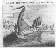
Illustration from:
Minnebeelden: toe-ghepast
de lievende ionckheyt
Jan Harmensz. Krul
Amsterdam 1632
This anonymous seascape may represent an absent loved one, presumably functioning as a pictorial stand-in for the author of the letter recently received by the seated mistress. Many Dutch women of the time likely experienced the vastness of the globe through their loved ones at sea.
A significant portion of able-bodied Dutch men earned their living from sea trade or the fishing industry, and both Dutch painters and poets drew extensively from seafaring experiences for their imagery. Conversely, the ship in this picture-within-a-picture might be linked to the emblematic motif of the suitor as a ship navigating the sea of love, seeking the safe harbor of his lady's embrace. The motto above the emblem by the poet-polemicis Jan Krul reads: "Even Though You Are Far Away, You Are Never Out of My Heart." In any event, the calm sea and blue sky in the ebony-framed seascape in Vermeer's Love Letter might indicate a positive outcome in love, suggesting the mistress's concerns are unwarranted.
Vermeer is not the only artist to show a seagoing vessel directly behind the protagonists.
The hearth
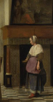
A Woman Drinking with Two Men (detail)
Pieter de Hooch
c. 1658
Oil on canvas, 73.7 x 64.6 cm.
National Gallery, London
The hearth is featured prominently in numerous Dutch interior paintings. In the arts, it stood as a primary symbol of domesticity and love, representing warmth, light and consequently, life itself.
Generally, Dutch fireplaces were open on three sides, featuring an overhanging hood and a mantle where porcelain could be displayed. In many Dutch interiors, a significant painting often adorned the space directly above the fireplace. While earlier hearths were often flanked by pilasters or carved relief's that lay flat against the wall, they now featured a pair of free-standing columns to support the overhanging mantel. In grand homes, these elements were typically crafted from white or colored marble, like the ones in the present picture. However, in more modest homes, as well as in the private rooms of the grander residences, they were made more affordably from wood or plaster.
Beyond its primary uses for cooking and warmth, the hearth served a crucial secondary role. During the lengthy Dutch nights, with candles being an expensive commodity reserved mainly for navigating between rooms, the hearth was likely the family's central gathering point.
In affluent homes, fireplaces graced the side room, the zaal (hall), the dining room and occasionally some bedrooms. However, during Vermeer's time, the specific functions of rooms in Dutch homes were often not distinct.
A more detailed view of the hearth structure, similar to the one depicted, can be seen in a work by Pieter de Hooch, who was active in Delft around the same time as Vermeer. The intricately designed hearth in Vermeer's painting suggests that the scene is set in the grote zaal (great hall), the most prestigious room in the household, typically reserved for hosting in wealthier homes.
Seven "ell" of gilded leather wall covering
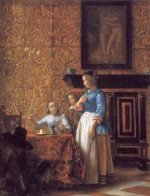
Interior with Figures (detail)
Pieter de Hooch
1663–1665
Oil on canvas, 58.3 x 69.4 cm.
Metropolitan Museum of Art, New York
Together with the elegant mantelpiece, the two framed landscapes and the costly marbled floor, the gold-tooled leather wall coverings suggest the scene likely unfolds in the grote zaal (great hall), typically used by adults or when hosting important visitors.
Cuir de Cordoue, also known as cordwain or cordovan and sometimes referred to as "gold leather" (from the Dutch term goudleer), describes painted, gilded (often embossed) leather hangings. These hangings, crafted in panels, were used to cover walls as an alternative to tapestry. This technique made its way to the Low Countries during the 15th or 16th centuries. While it was produced in several cities, including Antwerp, Brussels and Ghent, Mechelen was the major hub for gold leather, with records dating as far back as 1504. Within the Dutch Republic, the 17th century saw a boom in gold leather-making in cities like Amsterdam, The Hague and Middelburg. In Amsterdam alone, no fewer than eleven gold leather-makers operated.
In the 16th and 17th centuries in the Netherlands, wall-covering gilt panels were in vogue. They not only provided a barrier against damp walls but also offered a hygienic layer in dining areas. Tooled leather gained popularity for various items, ranging from boxes and clothing accessories to larger pieces like trunks. Gilt wall coverings were presumably prevalent in affluent homes. Based on Dutch interior paintings from that era, they often adorned entire rooms, creating a striking ambiance.
Vermeer's posthumous inventory of movable goods mentions seven ells of gilt wall coverings—an ell, in Delft, measures 68.2 cm. These same coverings appear behind the still life featuring a golden crucifix in Vermeer's Allegory of Faith.
Seven "ell" of gilded leather wall covering
Interior with Figures (detail)
Pieter de Hooch
1663–1665
Oil on canvas, 58.3 x 69.4 cm.
Metropolitan Museum of Art, New York
Together with the elegant mantelpiece, the two framed landscapes and the costly marbled floor, the gold-tooled leather wall coverings suggest the scene likely unfolds in the grote zaal (great hall), typically used by adults or when hosting important visitors.
Cuir de Cordoue, also known as cordwain or cordovan and sometimes referred to as "gold leather" (from the Dutch term goudleer), describes painted, gilded (often embossed) leather hangings. These hangings, crafted in panels, were used to cover walls as an alternative to tapestry. This technique made its way to the Low Countries during the 15th or 16th centuries. While it was produced in several cities, including Antwerp, Brussels and Ghent, Mechelen was the major hub for gold leather, with records dating as far back as 1504. Within the Dutch Republic, the 17th century saw a boom in gold leather-making in cities like Amsterdam, The Hague and Middelburg. In Amsterdam alone, no fewer than eleven gold leather-makers operated.
In the 16th and 17th centuries in the Netherlands, wall-covering gilt panels were in vogue. They not only provided a barrier against damp walls but also offered a hygienic layer in dining areas. Tooled leather gained popularity for various items, ranging from boxes and clothing accessories to larger pieces like trunks. Gilt wall coverings were presumably prevalent in affluent homes. Based on Dutch interior paintings from that era, they often adorned entire rooms, creating a striking ambiance.
Vermeer's posthumous inventory of movable goods mentions seven ells of gilt wall coverings—an ell, in Delft, measures 68.2 cm. These same coverings appear behind the still life featuring a golden crucifix in Vermeer's Allegory of Faith.
The broom & slippers
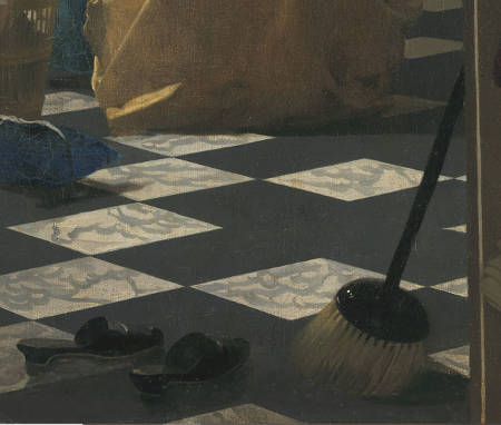
So far, specialists in Dutch painting have not been able to offer a clear iconographical explanation for the foreground broom and the discarded morning slippers, even though Vermeer's contemporaries likely understood them. The inclusion of such ordinary objects prominently at the front of the composition implies they were essential to the painting's narrative. Perhaps they hint at the emotional distraction of the mistress, who may have set aside her routine tasks. Long before Vermeer created The Love Letter, painter and art theoretician Samuel van Hoogstraten depicted both a broom and slippers in a similar see-through room painting, which might have inspired Vermeer. The broom, rendered darker than any other area in Vermeer's piece, prevents the observer from moving closer, emphasizing the atmosphere of seclusion.
Housewives usually dedicated a substantial portion of their day to household tasks, often adhering to a set weekly routine. One French traveler noted, "Women maintain homes that are impeccably clean. They constantly wash and shine their wooden furniture, including benches and floorboards... It would be unthinkable to spit in these spaces, and even using a handkerchief in such a manner is looked down upon. Those with severe colds certainly draw my sympathy." This preoccupation with cleanliness likely explains the recurrent portrayal of brooms in visual art. However, in both literature and art, brooms occasionally symbolized sex. Brooms were also believed to possess magical qualities, like ensuring a home was devoid of malevolent spirits.
In Vermeer's depiction, the broom has notably short bristles. The long-bristled broom, as we know it today, seemingly emerged in the colonies in the late 1700s. According to legend, before the Battle of Dungeness, the Dutch admiral Maarten Harpertszoon Tromp supposedly raised a broom on his vessel to signal his intent to clear the English ships from the sea.
Sheet music on the chair
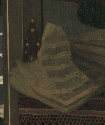
According to music expert Albert P. de Mirimonde, the crumpled piece of sheet music (tablature) does not make musical sense. It remains uncertain whether Vermeer's inaccuracy was intentional or a simple oversight.
In Vermeer's era, both lute and cittern music were notated in tablature. This form of musical notation, prevalent during the medieval and Renaissance periods, catered to any fretted string instrument, including the cittern held by the seated mistress (which many art historians have mistakenly identified as a lute in the past). Instead of traditional musical notes, tablature instructs the player on which frets to press and which strings to strum. Tablature remains in use for guitar notation today.
Music songbooks were in high demand in the Dutch Republic. French and Italian styles were particularly favored, as Dutch compositions often lacked innovation and distinctiveness.
During the 16th and 17th centuries, the cittern rose to prominence. It was highly regarded for accompanying vocals and dance music. Many complex compositions, demanding a high level of technical skill, were tailored for the cittern.
Modern citterns feature a flat back, bent ribs and a distinct neck. Since a cittern's back can be crafted from a single wood piece, in contrast to the lute's multi-ribbed bowl shape, the cittern is simpler to construct and more robust. It also possesses a notably shallow body compared to the lute and lacks internal bracing. While most citterns had four courses (strings), six-course citterns were not rare in Italy. An interesting aspect of cittern tuning is that string pitch doesn't necessarily descend from the first to the last course. Most cittern portrayals display it being played with a quill or plectrum, and all extant cittern tablature is suited for plectrum play.
The piece of fabric hanging from the foreground chair
Whatever its intended function might have been, the long piece of fabric wrapping around the foreground chair is depicted in at least three other paintings by the artist. Accounting for its portrayal, both its design and consistency seem comparable to the light-yellow cloth with a blue border that spills over the foreground table in The Art of Painting. This cloth also appears in the Allegory of Faith and might be part of the turban worn by the young girl in Girl with a Pearl Earring. From Vermeer's depiction, the fabric could be made from a reflective material like silk or caffa, a luxurious silk cloth with printed or woven patterns popular in the 16th century. Vermeer's father had training in caffa work. A similar cloth can be seen in the shadows of the Woman in Blue Reading a Letter, but its colors are difficult to discern.
A sewing pillow?
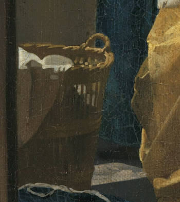
Some art historians believe that the clothes hamper and the blue naaikussen (sewing pillow) left unattended might suggest the anxiety of love that distracted the mistress from her domestic duties. Technically, the hamper in this painting stands as a remarkable example of pictorial abstraction, where the intricacies of the visual world are translated into bold, almost detached brushwork. The simplified shapes and tones support the theory that Vermeer utilized the camera obscura as an optical tool in his painting process.
A sizable clothes hamper was initially depicted behind the standing maid in Vermeer's earlier Milkmaid but was later removed by the artist for reasons that remain unclear. A sewing pillow similar to the one in this painting can also be seen in The Lacemaker's still life. Activities like lacemaking and sewing were emblematic of one of the core values of 17th-century Dutch society: domestic virtue.
Recent investigation by the Rijksmuseum conservation team has revealed that both the wicker hamper and the blue pillow were added at a later stage, after Vermeer had completed the painting of the floor tiles that now lie beneath them. Moreover, the left-hand portion of the see-through doorway once extended more the right, grazing the left-hand arm of the servant. Both additions were likely made to forestall the viewer's gaze before it met the two figures, creating a more compelling composition.
Who was the seated mistress?

We know neither the real identity of the young woman who posed for the seated mistress nor the standing maid. In fact, no sitter in Vermeer's oeuvre has been identified, even though specialists tend to believe Vermeer used his family members, as other genre painters of the time did.
Although Vermeer isn't generally credited for psychological profundity in painting faces, this picture exhibits much attention to the emotional interaction between the standing maid and her mistress. While the mistress is clearly of a higher social class, the maid's wry smile, central position and upright posture threaten to overturn the hierarchical superiority of her mistress. Art historian Lisa Vergara noted that her posture, arms akimbo, is typically reserved for men in Dutch art. She asserts that the diagonal white sash contributes to her confident demeanor (almost like a domestic, feminine version of a civic guardsman), and an exceptionally high, white head covering further elevates her stature.
The mistress's yellow satin morning jacket is likely the one listed in Vermeer's death inventory of movable goods and probably belonged to Catharina Bolnes, Vermeer's cherished wife who bore him 11 children during their twenty-year marriage. This jacket, or manteltge as it was called in Delft, allowed Dutch upper-class women to elegantly shield themselves from the cold of the relentless Dutch winters while performing household tasks. Its loose fit allowed freedom of movement. Considering how often they're depicted in Dutch interior paintings, the manteltge must have been a highly popular garment in mid-17th-century Netherlands.
The elegant gown of the mistress
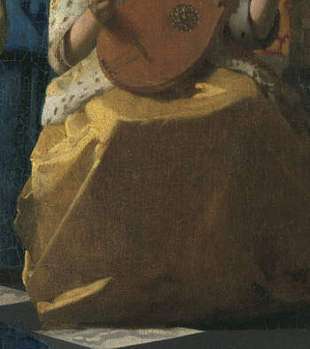
This elegant gown was likely made of caffa, a luxurious material used mainly for upholstery and fine clothing. Vermeer's father worked with caffa, leading some specialists to suppose that the artist's inclination to depict this material was tied to his familial connections.
The gown's straightforward yet elegant block-like shape is a masterful representation, capturing both the material's texture and the position of the mistress's legs using minimal tones of yellow and ochre. Its golden hue is slightly different from the more lemon-tinted color of the fur-lined morning jacket. To achieve its unique luster, Vermeer might have glazed the passage with a transparent layer of pigment known as woude (weld).
Weld, also known as Dyers Rocket or Yellow Weed, is derived from the leaves, stems, and flowering tops of the weld plant (Reseda luteola). These are harvested during the flowering season and subsequently dried. They can be stored for several years without losing their dyeing power. When it's time to produce the dye, these dried parts are boiled in water. This process releases luteolin, the chemical responsible for its distinct yellow hue. After boiling, the solution is strained to eliminate any plant matter, leaving the dye ready for use.
Weld can produce a spectrum of yellows, from a gentle lemon shade to a rich gold. The resulting hue is influenced by the mordant used (a substance that fixes dye on fabrics) and the particular dyeing procedure employed. When combined with other dyes, like woad (a source of blue), weld can yield various shades of green.
Interestingly, in Dutch, weld is sometimes referred to as schijtgeel, which directly translates to "shit yellow." This peculiar name is thought to originate from the dye's appearance and consistency during certain production phases or perhaps from the pungent odor it emits during the dyeing process.
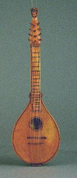
The cittern
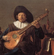
The Duet (detail)
Cornelis Saftleven
c. 1635
Oil on panel, 34 x 53 cm.
Akademie der Bildenden Künste, Vienna
As Vermeer expert Albert Blankert pointed out, music making is a sign of love in many emblem books. "Sometimes the lover is compared with a musical instrument, whose strings or keys are touched by the beloved."
The cittern—and not lute or mandolin as it has been erroneously described—held by the mistress was one of the most popular musical instruments of the 16th and 17th centuries and it was also the one most frequently depicted by Vermeer, who portrayed it in total four times, and his colleagues. Although its form may recall the more familiar lute, it has a very different history and above all, it produces a very different sound making it adapted for different music. Its brisk metallic sound, somewhat like a banjo, adapts itself perfectly to the brilliant coloring and sharp divisions between lights and darks of the present composition.
The cittern's body is flat and easily constructed while the lute's pear-shaped body demands considerable talent and experience to construct. The cittern's strings are made of metal while the lute's are made of natural animal gut. In particular, the brass strings of the cittern sound much louder, also because they are played with a plectrum. Instead, the lute is plucked by the bare fingers and produces a softer, nostalgic tone. Vermeer may have chosen to depict this particular instrument according to the painting's iconographic program. Perhaps it held a particular meaning which was more evident to his viewers, although it can certainly not be ruled out that the curious almond-like form would have struck the painter's aesthetic sensibilities.

A Boy Playing the Cittern
Godfried Schalcken
-
Oil on panel
Like many instruments of the period, there were tutors and manuals written to teach the playing of the cittern. These guides not only offered instruction but also included pieces specifically composed for the instrument.
The music for the cittern, like other art forms in the Netherlands at this time, would have absorbed influences from neighboring countries. English, French, and Italian styles and pieces would have made their way to Dutch musicians and composers. While the cittern was commonly associated with dances and popular tunes, it also had its place in more formal settings. Compositions would have ranged from simple folk melodies to more complex suites.
As the Baroque period progressed, the popularity of the cittern waned, being overshadowed by other plucked instruments like the lute and the early guitar. However, the tradition and techniques associated with the cittern did not disappear entirely; they evolved and were integrated into the playing of other instruments.
A pair of slippers
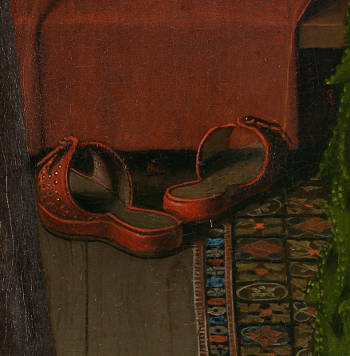
Portrait of Giovanni Arnolfini
and his Wife (detail)
Jan van Eyck
1434
82 x 60 cm.
National Gallery, London
Slippers are frequently represented in Dutch interior paintings of the time even though they had been depicted many years before by Flemish painters, Jan van Eyck's famous Portrait of Giovanni Arnolfini and his Wife, surely one of the most illustrious examples. Closer to home, a scene by Vermeer's contemporary, Samuel van Hoogstraten, portrays a see-through doorway that reveals an interior room, in which a pair of slippers is so prominently featured that they have given the title to this unique piece (The Slippers).
The painting depicts another painting-within-a-painting: a female figure with her back to the viewer, representing the absent female owner of the otherwise deserted room. Both in Vermeer's and in Van Hoogstraten's works, the views through these doorways act as a barrier, cleaving the perspective of the viewer from a secluded, intimate domain. We, the viewers, inadvertently become covert observers, peeping into the private quarters of the household.
Like many other objects which populate Northern paintings, experts have come to agree that many carried different and even contrasting symbolic meanings depending on the context in which they were portrayed. For example, a mirror, one of the most ubiquitous symbols in the history of Western painting, could allude to vanity or self-knowledge, while pearls, one of the most characteristic accessories in Vermeer's work, are linked with vanity but also with virginity, a wide enough iconographic spectrum. Discarded slippers could be used as a sexual innuendo—in Dutch painting shoes and slippers were used as a metaphor for female genitals—although in the present case, they could be a more literal sign of an unkempt house. In any case, it should be noted that slippers were worn in the bedroom. For some reason, in the present picture they are instead found in the grote zaal (great hall) used for adults and receiving important visitors.
Body language
The portrayal of the two female figures is a masterpiece of painting, body language and theater. One can almost sense a flicker of electricity that flows through their glances and the momentary upsetting of social rank. For a brief moment, it appears that it is the maid who is in control while the mistress cautiously pleas for assistance. For a fleeting moment, it seems the maid holds the reins of control, while the mistress appears to gently seek help.
The maid's body language, suggestive of having just delivered a love letter, stands in contrast to the uncertain posture of her mistress. The maid's voluminous white cap, mirrored by the clouds in the background scene, lends her an imposing stature. Her confident demeanor and self-assured smile suggest, in the words of the art historian Lisa Vergara, that the "lady's worry is likely unwarranted. The serene sea depicted in the expansive painting behind them further underscores this interpretation. However, given the letter is sealed, one might ponder how the maid came to understand its message." Dutch plays and literature of the time frequently portrayed household maids stepping beyond their traditional roles.
Although it's unlikely the two figures would physically touch in a real-world setting, Vermeer accentuates their emotional connection by linking them through a shared, extended contour on the canvas.
The black and white marble floor tiles
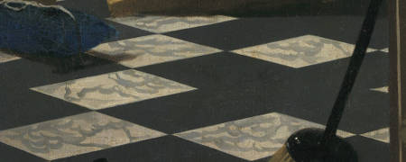
Willemijn Fock, a historian specializing in decorative arts, has shown that marble-tiled floors were quite uncommon in Dutch homes of the 17th century. Even in residences of the affluent, these floors, when present, typically appeared in more confined areas such as voorhuis, hallways, and rooms on the upper floors designated for sleeping or storage. To craft the intricate perspective of the receding tiles, Vermeer likely utilized a mathematical grid based on genuine, widely-used ceramic tiles. He then adjusted their patterns and hues to suit the requirements of his composition.
In The Love Letter, a sequence of five white tiles draws the viewer's gaze from the foreground to the central figures of the mistress and maid. Vermeer imparted a noticeable cool bluish tint to the black tiles, subtly accentuating the warmth of the figure's attire. The veins of the white tiles are rendered with calligraphic brushstrokes free from constraints of descriptive fidelity.
The soiled foreground wall
The elongated, swiftly executed brushstrokes seemingly aim to depict a stained wall, an unusual detail amidst Vermeer's otherwise immaculate interiors. Strangely, no critic has associated this feature with the painting's deeper significance, even though it's challenging to accept that such a meticulously crafted composition, in which every detail is chosen with precision, could include it without purpose.
special topics
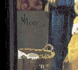
The signature

Inscribed above the basket:(IVM in ligature)
(Click here to access a complete study of Vermeer's signatures.)
Dates
1667
Albert Blankert, Vermeer: 1632–1675, 1975
c. 1669–1670
Arthur K. Wheelock Jr., The Public and the Private in the Age of Vermeer, London, 2000
c. 1669–1670
Walter Liedtke, Vermeer: The Complete Paintings, New York, 2008
c. 1668–1669
Wayne Franits, Vermeer, 2015
(Click here to access a complete study of the dates of Vermeer's paintings).
Technical report
The existing canvas may not be original. X-radiography shows a closed plain-weave with a thread count of 16.25 x 14 per cm. ².
The double ground comprises a red layer followed by a gray layer containing chalk, umber and a little lead white. Between the two is a thin, unpigmented layer. The red layer may be related to a transfer process.
The paint surface is smooth, with few individual brushstrokes discernible. The dark, gray tiles were painted first, and then the white tiles were painted before the gray tiles were dry. The chair and part of the scarf draped over it in right-hand foreground were underpainted with red lake. The maid's blue apron was painted with a blue-gray underpaint followed by a mixture of blue and white with a final blue glaze. The blue appears to be ultramarine, a lighter patch of which on the mistress' lap can be seen to extend under the bottom of the lute. The vanishing point of the composition is visible on the x-radiograph. The painting was cut off the stretcher during its theft in 1971. The resulting paint loss was mainly restricted to a band approximately 0.5 centimeters wide on either side of the cuts, although there are more serious losses in the top right corner and the center-right area. There is some surface abrasion.
* Johannes Vermeer (exh. cat., National Gallery of Art and Royal Cabinet of Paintings Mauritshuis - Washington and The Hague, 1995, edited by Arthur K. Wheelock Jr.)

Provenance
- Pieter van Lennep, Amsterdam (c.1810?-d.1850);
- his daughter, Margaretha Catharina van Lennep, Amsterdam (1850-d.1891);
- married Jan Messchert van Vollenhoven [d.1881] in 1850);
- J.F. van Lennep, Amsterdam (1892);
- Messchert van Vollenhoven/Van Engelenberg sale, Amsterdam, 29 March, 1892, no. 14 (to J. Ankersmit of the Vereniging Rembrandt);
- Vereniging Rembrandt, Amsterdam (1892–1893);
- purchased in January 1893 by the Rijksmuseum, Amsterdam (inv. A 1595).
Exhibitions
- Amsterdam 1867
Katalogus der tentoonstelling van schilderijen van oude meesters
Arti et amicitiae
18, no. 113 - The Hague 1890
Catalogus der tentoonstelling van schilderijen van oude meesters
Pulchri Studio
56, no. 116 - Amsterdam 1892
"Rembrandt." Vereeniging tot behoud in Nederland van Kunstschatten
Arti et Amicitiae
unpaginated, no. A - Amsterdam October 21–November 3, 1935
Vermeer tentoonstelling ter herdenking van de plechtige opening van het Rijksmuseum op 13 July, 1885
Rijksmuseum
30, no. 169 - New York 1954
Dutch Painting: The Golden Age. An Exhibition of Dutch Pitcures of Seventeenth Century
The Metropolitan Museum of Art
no. 86 and ill. - Toronto 1954–1955
Dutch Painting: The Golden Age. An Exhibition of Dutch Pictures of Seventeenth Century
Art Gallery of Toronto
86 and ill. - Toledo (OH) January 2–February 13, 1955
Dutch Painting: The Golden Age. An Exhibition of Dutch Pictures of Seventeenth Century
Toledo Museum of Art
87 and ill. - Rome December 1956–January 1957
Le XVII siècle Européen. Réalisme classique Baroque
Palazzo delle Esposizioni
245–246, no. 310 and pl. 27. - Oslo October 9–December 6, 1959
Fra Rembrandt til Vermeer
Nasjonalgallieret
no. 84 - London 1964
The Orange and the Rose. Holland and Britain in the Age of Observation 1600–1750
Victoria and Albertum Museum
44, no. 74 and ill. 5 - Stockholm March 30–April 30, 1967
Holländska mästare: I svensk ägo
Nationalmuseum
26 and ill. 9 - Brussels September 23–November 21, 1971
Rembrandt en zijn tijd
Palaeis voor Schone Kunsten
132–133, no. 112 and ill. - Amsterdam September 16–December 5, 1976
Tot lering en vermaak. Betekenissen van Hollande genrevoorstellingen uit de zeventiende eeuw
Rijksmuseum
268–271, no. 71 and ill.7 - The Hague March 1–June 2, 1996
Johannes Vermeer
Mauritshuis
180–185, no. 18 and ill. - Madrid February 19–May 18, 2003
Vermeer y el interior holandés
Museo Nacional del Prado
182–183, no. 39 and ill. - Dublin 1 October–31 December, 2003
Love letters: Dutch Genre Painting in the Age of Vermeer
National Gallery of Ireland
no. 38 bis, fig. 58 and ill. 185 - Frankfurt 10 February–1 May, 2005
Senses and Sins: Dutch Painters of Daily Life in the Seventeenth Century
Städelsches Kunstinstitut und Städtische Galerie - Melbourne 24 June–2 October, 20, 2005
Dutch Masters from the Rijksmuseum
National Gallery of Victoria - Rome April 27–18 June, 2006
Una lettera d'amore dall'Olanda: Vermeer a Palazzo Barberini
Galleria d'arte antica di Palazzo Barberini
no catalogue - Vancouver May 9 to September 13, 2009
Vermeer, Rembrandt and the Golden Age of Dutch Art: Masterpieces from the Rijksmuseum
Vancouver Art Gallery - Amsterdam 2 October, 2008–18 January, 2009
125 grote liefdes: Met steun van de Vereniging Rembrandt
Van Gogh Museum - Paris October 7 2009–February 7, 2010
The Dutch Golden Age: From Rembrandt to Vermeer
Pinacothèque de Paris
23, no. 126 and ill. - Doha March 11–June 6, 2011
The Golden Age of Dutch Painting, Masterpieces from the Rijksmuseum
Museum of Islamic Art - St Petersburg October 14–November 6, 2011
Love Letter by Vermeer. From the collection of the Rijksmuseum, Amsterdam
In the Masterpieces from the World`s Museums in the Hermitage series. Italian Cabinet (233),
New Hermitage. - Istanbul February 21–June 10, 2012
Where Darkness Meets Light: Rembrandt and his Contemporaries
Sakip Sabanci Museum in Istanbul
210, no. 93 - Dublin June 17–September 17, 2017
Vermeer and the Masters of Genre Painting: Inspiration and Rivalry
National Gallery of Ireland - Washington D.C. October 22, 2017–January 21, 2018
Vermeer and the Masters of Genre Painting: Inspiration and Rivalry
National Gallery of Art - Amsterdam February 10– June 4, 2023
VERMEER
Rijksmuseum
no. 31 and ill. - New York June 18, 2025–September 8, 2025
Vermeer’s Love Letters
Frick Collection
(Click here to access a complete, sortable list of the exhibitions of Vermeer's paintings).

The maid & mistress theme
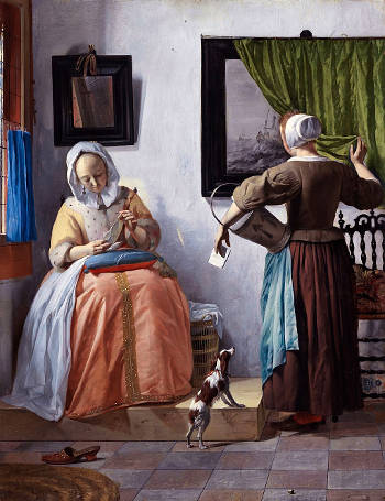
Woman Reading a Letter
Gabriel Metsu
1662–1665
Oil on canvas, 53 x 40 cm.
National Gallery of Ireland, Dublin
The theme of maid and mistress was enormously popular among Dutch genre painters. Prior to the Lover Letter, Vermeer had explored its narrative potential in one of his largest works, the Mistress and Maid. In both works, Vermeer masterfully portrays the moment in which a maid delivers (or perhaps consigns) a letter, presumably a love letter. In the present picture, the wry smile on the maid's face and the questioning expression of her mistress underline the uncertainty of love within the sanctuary of a well-appointed interior. To underscore the ambivalence of the moment, Vermeer depicted a laundry basket, morning slippers, a broom and even a crumpled piece of sheet music strewn about in apparent disorder.
Vermeer may have drawn inspiration from Gabriel Metsu's work of similar theme and composition painted years earlier, although it is equally possible that it was Vermeer's picture that inspired Metsu. According to the art historian Adriaan E. Waiboer, Vermeer may be credited to have influenced his colleagues more than is believed. He writes, "Gabriel Metsu painted some five works in the mid-1660s that reveal his knowledge of Vermeer's work. His most renowned in this respect are the companion pieces A Man Writing a Letter and a Woman Reading a Letter. In these paintings, various the presence of white plastered back wall parallel to the picture plane and the idea of creating solidity by dividing up the composition into geometrical shapes, are instantly recognizable as Vermeer-like."
In Dutch painting, maids were generally pictured in a subservient, passive role. They care for children and are dutifully supervised by the mistress of the house. Occasionally, a few painters, including Vermeer himself (see The Milkmaid, portrayed maids in a sympathetic light according to them a dignity reserved for members of more socially elevated classes. In emblematic and popular literature of the day, however, maids were frequently cast as a threat to the security of the home, the center of Dutch life.
Letters in the Netherlands
With the unparalleled surge in literacy in the Netherlands, common women, for the first time, committed their feelings to paper. First-person statements in the Dutch Republic, including letter writing, private diaries, journals, soul searching poems and self-portraits, proliferated far beyond their Renaissance role in aristocratic culture.
In the 17th century, however, writing was a skill reserved for an educated subset within the European population. Calligraphy, referred to as the "Tenth Muse," was considered an art form, and its practitioners were often trained schoolmasters. Jan Van de Velde's 1605 book Spieghel der Schrifkonste (Mirror of the Art of Writing) was published at a pivotal moment in the evolution of Dutch calligraphy. The book displays not only Van de Velde's renowned penmanship, but also provides insight into the historical evolution of writing as a learned skill. This text secured Van de Velde's reputation as a master calligrapher.

Writing Example from Literary Treasure, second part of Spieghel der Schrijfkonste (The Mirror of Calligraphy)
1605
Designed by Jan van de Velde
The widespread publication and popularity of calligraphy manuals in the 17th century indicated a growing middle-class interest in acquiring the skill of fine writing, which was seen as a marker of refinement and education. These manuals often encompassed various styles and sometimes even different languages. It was common to find scripts that were used for both vernacular Dutch and Latin, which was the language of scholarship and the church.
Many of the pages in these manuals were engraved, a process that allowed the intricate details of the scripts to be captured with precision. Engravings also allowed for wider distribution, as engraved plates could produce many more copies than handwritten ones. Beyond the functional scripts, these manuals also showcased decorative flourishes, which were elaborate designs that often adorned letters or were standalone art pieces. While the Netherlands had its unique style and tradition, there were influences from neighboring regions such as France and Belgium. The styles might vary, but the overall structure and intent of the manuals were often similar.
Letters richly evoke the thoughts, emotions and locations of the depicted figures and equally of the absent ones precisely because the viewer will never know the contents of the letter. However, the love letter was far from innocuous as it may appear at first glance. Contemporary literature declared the litterae amatoriae a proper subject of legal inquiry. A love letter might imply a promise of marriage or adultery if one were already married.
Hidden meaning in Vermeer's painting
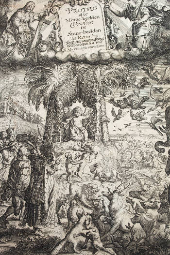
The title page of:
Proteus Ofte Minne-Beelden Verandert
In Sinne-Beelden
Jacob Cats
1627
Comprehending the symbolic content of Vermeer's paintings has proved particularly problematic. The complicated Love Letter, with its clutter of objects, has given birth to a wide variety of interpretations. But some Dutch art specialists now believe that the difficulty in explaining Vermeer's paintings may be due to the fact that the artist deliberately left his meanings open.
Dutch art historian Eddy de Jongh explains that the concepts of hidden meaning, concealment, deception (schijn sonder sijn, seeming without being) and iconographic flexibility were, in fact, characteristic features of 17th-century culture. Jacob Cats, the author of numerous popular emblem books, wrote that concealment is often more effective than saying things openly. Moreover, this "pleasing obscurity" gives the reader "a rare inner satisfaction" when he later [discovers] "the true aim and purpose." These concepts were also present in the preambles of Dutch novels and plays and it seems highly likely that painters were sensitive to them as well.
The camera obscura
It is largely, but not completely, accepted that Vermeer used a simple optical device called the camera obscura (a kind of precursor to the modern photographic camera) as an aid to his painting. The camera obscura was well known in both scientific and artistic circles and was recommended to painters for studying nature as well as tracing, to shortcut problems of drawing and perspective. Although the camera obscura leaves no physical trace on the canvas, the peculiar characteristics of its image may be found in The Love Letter and in many other paintings by Vermeer, especially the so-called pointillés. Pointillés are the pictorial translation of spherical disks of light ("halations" or "disks of confusion" as they are referred to in modern photography) that are produced by the imperfect lens of the 17th-century camera obscura in situations of strong light contrast. Halations may also occur with modern lenses when they are not in focus. Pointillés can clearly be observed on the clothes hamper and on the gilded leather wall covering behind the maid and mistress.
Detractors of the camera obscura theory note that many, perhaps the great part of, pointillés appear in Vermeer's paintings where they would have never been seen with a real camera obscura, for example, along the shadowed underside of the boats anchored on the far shore in Vermeer's View of Delft. Thus, the pointillés can be considered stylistic quirks, derived independently from observation or optical devices. Other art historians occupy a middle ground and hold that while pointillés may have been originally derived from camera obscura observation, they became a stylistic device applied discretionarily to heighten the illusion of sparkling light.
Through a dark doorway
Couple with Parrot
Pieter de Hooch
1668
Oil on canvas, 73 x 62 cm.
Wallraf-Richartz Museum, Cologne
During his 20-year career, Vermeer devised various means to establish and enhance the private spaces for his quiet bourgeois dramas. In this picture the viewer stands in another room, distant from the unfolding scene of the maid and mistress, and "sees through" the doorway. This device, called doorkijkje, offers an opportunity to create a more complicated architectural space and contemporarily expand narrative and spatial depth. It was practiced by many other Dutch genre painters besides Vermeer. The art historian Martha Hollander found that among more than 160 paintings attributed to Pieter de Hooch, only 12 do not exhibit this device. Interestingly, Hollander linked the doorkijkje device to a compositional device to force perspective called doorsien (view through), used primarily for history paintings with landscape settings which overlap secondary vignettes in the distance. On the basis of costume, some scholars hold that De Hooch's Couple with a Parrot, which is strikingly similar to Vermeer's composition, was the inspiration for The Love Letter.
It is almost certain that De Hooch's (or Vermeer's) composition was based on a third work, by Samuel van Hoogstraten, Interior with Slippers, painted at least ten years earlier. Vermeer had painted at least one other doorkijkje (which has not survived) described in the Dissius auction of twenty-one Vermeer paintings in Amsterdam in 1696: "a gentleman washing his hands through a see-through room with sculpture."
Letter delivery & "suitable" maids

Cupid with a Messanger
emblem from Otto Vaenius, Amorum Emblemata...
Antwerp, 1608
Faculty of Arts, Utrecht University Library
Although an upsurge of letter writing had given birth to a thriving postal service in 17th-century Netherlands, it was far from organized. Messengers multiplied but complaints often arose about these "hirelings" who tended to inflate postage rates. They were also noted for their impertinent behavior. Some great men and well-to-do private citizens retained their own trusted private couriers to maintain communication secret. Servant girls, who could rarely sign their name and probably could not read, provided an exceptionally discreet corps of letter delivery. The heart of the postal network was in Amsterdam, the bustling capital of commerce. From there, tendrils spread out to various parts of the nation, ensuring that even smaller towns were connected. This domestic network was extensive, and letters could be dispatched from many inns and taverns that doubled as collection points.

A Lady Teaching a Child to Read, and a Child playing with a Dog
Caspar Netscher
1670s
Oil on oak, 45.1 x 37 cm.
National Gallery, London
In percentage terms, if we consider a hypothetical average literacy rate of around 70% for Dutch urban males and perhaps a more conservative 50% average when rural areas are taken into account, this is starkly higher than the European average, which might be around 20-30% in the best of circumstances and much lower in many regions.
The high literacy rate of the Netherlands was influenced by several factors. The Protestant Reformation emphasized personal Bible reading, fostering individual engagement with scriptures. Being a major trading nation, the Dutch also needed literacy for trade documentation and international correspondence. While formal institutions were not widespread, towns still emphasized basic education, ensuring children learned essential reading and writing skills. Notably, the Dutch Republic stood out for its relatively high female literacy rates, reflecting a more progressive view on education and gender equality compared to other nations of the time.
Even though the literacy rate in the Netherlands was unusually high, females were less literate since they were usually given less formal education and were not permitted to attend Latin school. The Hague poet Jacob Westerbaen, enlarging on Ovid's Art of Love, recommended women to "show your mind with letters," to learn to hold the quill in the right hand and the lyre in the left, and to entrust letters with suitable maids.
Listen to period music
The Voice of the Ghost [1.62 MB]
Anthony Holborne
performed by Lee Santana
The Cittern
In Italian Renaissance humanist culture, the cittern was regarded as a classical revival of the ancient Greek kithara even though it seems to have its direct development from the medieval citole. It presents some similarities with the fiddle, as its plucked form.
The structure and tuning of the cittern varied almost from country to country. While in England, France and northern Europe, the small four-course instrument was commonly used, Italian musicians preferred the larger six-course instrument.
The cittern achieved the height of its diffusion in the 16th and 17th centuries. Above all, in Italy and England it was held in high esteem both as an accompanying instrument for singing or for dance music. Many compositions written expressively for it, often intricate and demanding to play.
The great number of paintings depicting citterns proves the instrument's widespread popularity in the 17th-century Netherlands. With its flat back, it was more robust in structure than the fragile lute, therefore cheaper and more portable. The cittern's playability made it the preferred instrument especially of the middle and upper classes for song accompaniment and dance music.
The cittern has a shallow round or pear-shaped body tapering from the bottom towards the neck. The body is carved from one piece of wood and only the soundboard and fingerboard were added separately. The use of metal strings plucked with a quill or plectrum gives the instrument its sprightly and cheerful sound, one of the reasons for its great popularity.
Pieter de Hooch & Vermeer

A Woman Handing a Coin to
a Serving Woman with a Child
(detail)
Pieter de Hooch
c. 1668–1672
Oil on canvas, 73 x 66 cm.
Private collection
Vermeer needn't look far for inspiration for the present work. The interplay between the mistress and maid was a recurrent theme in Dutch interior painting, especially in Southern Holland. A Woman Handing a Coin to a Serving Woman with a Child by Pieter de Hooch makes a revealing comparison. While scholars assume that the two painters assiduously interacted with each other's work, the exact nature of their give-and-take relationship is hard to define.
In both paintings, we view a seated mistress who temporarily suspends her activity and interacts with a standing maid. To the left is an elaborate fireplace, to the right a clothes basket and behind framed objects on the wall. As would be expected, the mistresses flaunt their most elegant household clothing and hairstyles while the maids wear standard working garments. De Hooch's picture allows us to imagine the nearby opened window which is concealed in Vermeer's version. Unfortunately, neither works bears a date so we cannot know who drew inspiration from whom.
De Hooch's narrative couldn't be simpler. The mistress hands a coin to the maid, who carries a shiny marketing pail looped over her arm so that she can make her purchases. The primped-up daughter of the mistress pulls at the maid's skirt, anxious to tag along to the marketplace. The scene exudes serenity and good intentions. On the other hand, as befits his more complex temperament, Vermeer investigates the psychological undercurrents at work between the two women who are linked by their sex but divided by their social standing. The tough-looking servant hovers over her mistress, her hand confidently on her hip. A wry smile informs the viewer that she may be in the know regarding the contents of the letter she has just handed over to her maid.
The role of the maid in Dutch society was ambivalent. In some instances, they were considered a sort of necessary evil, especially in popular literature. Theatrical satires and household manuals warn of their natural laziness and propensity for all sorts of mischief, from eavesdropping to drunkenness. One of their bad habits was to dress as well as their mistress. Countless stories involve enterprising maids who cunningly take advantage of the sexual advances of the mistress' foolish husband.
However, according to eye-witnesses, Dutch maids were generally treated favorably, occasionally, too much so. Written accounts describe close relationships between the mistress and maid, to the point that the maid could be mistaken for a family member. A visiting Frenchman told of a wife who scolded her husband for asking the maid to fetch something, ordering him to fetch it for himself.
In painting, Dutch maids were treated negatively and positively. Nicolas Maes shows them asleep neglecting her duties or eavesdropping on an amorous meeting in her mistress' household. On the other hand, De Hooch could show a maid working together with her mistress in cheerful serenity. In visual terms, De Hooch's pictures portray the sort of collaboration auspicated in handbooks on housekeeping. The good mistress was encouraged to keep a watchful eye on their servant but at the same time able to work alongside them as well in harmony.
How to make a cittern

As soon as a Dutchman gazed upon Vermeer's Love Letter, he would have immediately recognized the instrument the seated mistress was holding on her lap: a cittern. However, some modern art historians might still refer to it as a lute. The two instruments have distinct histories, sounds and constructions.
There was significant variability in the number of strings, tuning, and size of citterns, depending on the time period and region. Some citterns had double or even triple courses (pairs or trios of strings played together), reminiscent of a modern 12-string guitar.
The top of citterns was typically made of a softwood like spruce, known for its resonant qualities. The back and sides, often flat or slightly curved, were usually constructed from hardwoods such as maple, rosewood, or ebony. The neck and fingerboard were generally crafted from hardwoods like maple or rosewood.

The cittern produces a sound distinct from the venerable lute, somewhere between a banjo and a modern guitar. This is because they used metal strings, setting them apart from the gut-strung lute. These strings were commonly made of brass or bronze, but in later versions of the instrument, some strings might have been crafted from iron or steel. These metal strings were produced by drawing the metal to the desired thickness by pulling it through a series of progressively smaller holes in a drawplate. Unlike the lute, which had tied gut frets, the cittern featured metal frets embedded into the neck. Additionally, many citterns featured a decorative rosette around the sound hole, often intricately carved or pierced.
Some citterns had ntricately carved necks and headstocks, reflecting the aesthetic and symbolic values of their time, which might include floral patterns, mythological creatures or human figures.


