Verdigris, a copper-based green pigment, has been produced through various methods since antiquity. Historically, one common technique involved exposing copper to acetic acid vapors. For instance, Pliny the Elder described suspending copper plates over fermenting grape vapors, allowing the acetic acid to react with the metal and form a green patina, which was then scraped off and ground into pigment.
During the Middle Ages, another method entailed burying copper strips attached to wooden blocks in dung after treating them with acetic acid. The warm, moist environment facilitated the formation of verdigris, which was later collected and processed.
In eighteenth-century Montpellier, France, a notable production technique involved stacking copper plates in clay pots filled with distilled wine. The acidic content of the wine induced the development of verdigris crystals on the copper surfaces, which were periodica lly harvested.These traditional methods highlight the diverse approaches to synthesizing verdigris, reflecting its historical significance and the evolving practices in pigment production.
Verdigris has been historically significant in painting due to its vibrant hue and unique properties. It was widely used in medieval and early modern art, valued for its brilliant green color that could range from a bluish to a yellowish green depending on its preparation and the binder used. Verdigris was commonly derived by exposing copper to acetic acid, often in the form of vinegar, under controlled conditions.
While verdigris offered a striking color, it presented certain challenges for painters. It is chemically unstable and highly reactive, which often led to discoloration or degradation over time. In oil painting, verdigris could cause the paint to darken or even turn brown due to its sensitivity to moisture and its tendency to react with sulfur-containing compounds. Despite these drawbacks, its strong tinting strength and transparency made it a favored pigment for glazing techniques, where it could create luminous effects when layered over lighter tones.
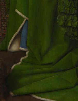
Green glazes of verdigris were commonly used in oil paintings of the fifteenth to seventeenth centuries (fig. 1) for the depiction of saturated green colours of drapery and foliage. Today, these glazes are often covered with a brown layer and sometimes the whole glaze has become brown. Verdigris was consistency mixed with the same pigments; lead white, lead-tin-yellow and yellow ochre. Leonardo da Vinci had was not in favor of the use of verdigris in oil painting given that the pigment has a certain tendency to fade. He wrote around 1492:
LOOKING OVER VERMEER'S SHOULDER
The complete book about Johannes Vermeer's and 17th-century fine-painting techniques and materials
by Jonathan Janson | 2020
Enhanced by the author's dual expertise as both a seasoned painter and a renowned authority on Vermeer, Looking Over Vermeer's Shoulder offers an in-depth exploration of the artistic techniques and practices that elevated Vermeer to legendary status in the art world. The book meticulously delves into every aspect of 17th-century painting, from the initial canvas preparation to the details of underdrawing, underpainting, finishing touches, and glazing, as well as nuances in palette, brushwork, pigments, and compositional strategy. All of these facets are articulated in an accessible and lucid manner.
Furthermore, the book examines Vermeer's unique approach to various artistic elements and studio practices. These include his innovative use of the camera obscura, the intricacies of his studio setup, and his representation of his favorite motifs subjects, such as wall maps, floor tiles, and "pictures within pictures."
By observing closely the studio practices of Vermeer and his preeminent contemporaries, the reader will acquire a concrete understanding of 17th-century painting methods and materials and gain a fresh view of Vermeer's 35 masterworks, which reveal a seamless unity of craft and poetry.
While the book is not structured as a step-by-step instructional guide, it serves as an invaluable resource for realist painters seeking to enhance their own craft. The technical insights offered are highly adaptable, offering a wealth of knowledge that can be applied to a broad range of figurative painting styles.
LOOKING OVER VERMEER'S SHOULDER author: Jonathan Janson date: 2020 (second edition) pages: 294 illustrations: 200-plus illustrations and diagrams formats: PDF $29.95
An Overview of Vermeer’s Technical & Stylistic Evolution
Fame, Originality & Subject Matte
Reality or Illusion: Did Vermeer’s Interiors ever Exist?
Color
Composition
Mimesi & Illusionism
Perspective
Camera Obscura Vision
Light & Modeling
Studio
Four Essential Motifs in Vermeer’s Oeuvre
Drapery
Painting Flesh
Canvas
Grounding
“Inventing,” or Underdrawing
“Dead-Coloring,” or Underpainting
“Working-up,” or Finishing
Glazing
Mediums, Binders & Varnishes
Paint Application & Consistency
Pigments, Paints & Palettes
Brushes & Brushwork
The green colour made of rust of copper, Green made of copper, even when this colour is mixed with oil, loses its beauty like smoke if it is not quickly varnished. It not only goes up in smoke, but if it is washed with a sponge dipped in simple, ordinary water, the verdigris will disappear from the panel on which it has been painted, especially in humid weather. This comes about because verdigris is made from salt, which dissolves easily in rainy weather, and especially when it is bathed and washed with the sponge…
"In his encyclopedia of 1694, Pomet noted that French unrefined verdigris was mainly exported to Holland. After Pekstokk had refined it into a purer product it was re-exported to France. Thus Pomet claimed that all the distilled verdigris on sale in Paris actually came from either Holland or Lyon.
Although verdigris was sometimes recommended as a drier in red lakes as well as blacks, De Mayerne’s sources note that this green pigment would muddy the colour of a red lake; instead they suggested using white copperas (zinc sulphate).
fig. 1The Arnolfini Portrait
(detail of the green robe glazed with verdigris)
Jan van Eyck
1434
Oil on oak, 82.2 x 60 cm.
National Gallery, London
"Yet, until well into the seventeenth century, it appears that artists seldom purchased this remarkably pure ready-to-use distilled verdigris. A price-list of pigments purchased by painters in the De Mayerne manuscript only mentions 'ordinary' verdigris and not the distilled pigment. Inventories of four seventeenth-century Dutch shops specializing in the sale of artists' materials suggest that there can hardly have been any demand for distilled verdigris from painters. These shops had increasingly taken over the sale of pigments from the apothecaries."M.H. van Eikema Hommes, "Verdigris Glazes in Historical Oil Paintings: Instructions and Techniques," in Discoloration in Renaissance and Baroque Oil Paintings. Instructions for Painters, Theoretical, Concepts, and Scientific Data (dissertation, 2002), 85.
In seventeenth-century Holland, verdigris was not among the most expensive pigments, such as ultramarine and high quality red lake, which ran into several guilders an ounce, but among the mid-price pigments, which included indigo and yellow lake.M.H. van Eikema Hommes, "Verdigris Glazes in Historical Oil Paintings: Instructions and Techniques," in Discoloration in Renaissance and Baroque Oil Paintings. Instructions for Painters, Theoretical, Concepts, and Scientific Data (dissertation, 2002), 86.
In modern times, verdigris has largely fallen out of use due to its instability and the availability of more stable green pigments, such as chromium oxide green or phthalo green. Nonetheless, its historical significance and its impact on the visual character of many historical artworks remain a subject of interest for art historians and conservation scientists.
Verdigris in Vermeer's Painting
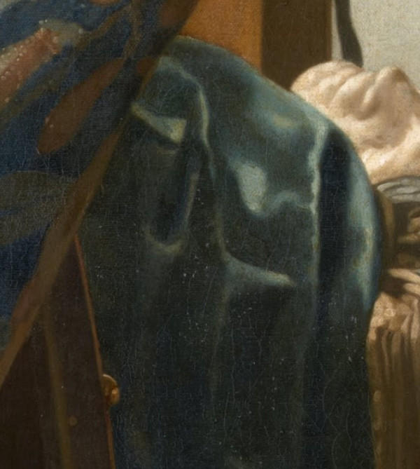
Verdigris has been found in various painting by Vermeer, once over a layer of natural ultramarine of the tablecloth of Maid and Mistress, which was orinally meant to have a green color, and again under a layer of brilliant blue paint of jacket of Woman in Blue Reading a Letter. Ige Verslype, who restored the latter work in 2010–2011, hypothesized that the underlying layer of verdigris was meant to intensify the upper layer of ultramarine of the woman's blue jacket. The conservator Robert Wald reported that the cloth (fig. 2) which drapes over the front of the massive table in the foreground of Vermeer's The Art of Painting was underpainted in virdigris and then glazed with a semi-transparent layer of ultramarine blue, giving its present teal color. Recent studies have discovered low amounts of copper. which would indicate the presence of virdigris, in some of Vermeer’s underpaints in A Lady Writing, Mistress and Maid and Woman Holding a Balance, where it seems to have been used as a drier and not a pigment.
fig. 2The Art of Painting (detail)
c. 1662–1668
Oil on canvas, 120 x 100 cm.
Kunsthistorisches Museum, Vienna
Vermeer’s use of verdigris as a drier reveals his meticulous approach to managing time and texture in his painting process. Recent analysis of Woman Holding a Balance shows that the underpaint layer of the tablecloth contained copper-based additives, likely verdigris, which accelerated the drying of slow-curing pigments.E. Melanie Gifford, Dina Anchin, Alexandra Libby, Marjorie E. Wieseman, Kathryn A. Dooley, Lisha Deming Glinsman, John K. Delaney, "First Steps in Vermeer’s Creative Process: New Findings from the National Gallery of Art," Journal of Historians of Netherlandish Art 14:2 (Summer 2022) This allowed Vermeer to move quickly through the preparatory stages without waiting for the paint to dry completely, enabling him to proceed with subsequent layers efficiently. The evidence comes from advanced imaging techniques such as XRF copper maps, which highlight areas of the painting rich in copper. These maps show that copper was concentrated in the underpaint but largely absent from the final layers. Microscopic analysis of paint samples confirmed that the copper in the underpaint was evenly dispersed, typical of verdigris used as a drier, rather than present as distinct particles of pigment. This deliberate addition of copper-containing material to the underpaint stage suggests that Vermeer tailored his materials to meet specific functional needs.
Vermeer’s technique also had aesthetic implications. The quickly applied underpaint, visible in the textured brushstrokes beneath the smooth surface, contributed to the final composition's depth and subtlety. By using less drier in the final paint, he ensured that these layers dried more slowly, allowing him to work wet-on-wet and achieve a refined, leveled finish. This careful balance between the quick-drying underpaint and the slow-drying final layers underscores Vermeer’s thoughtful approach to both the practical and artistic challenges of his craft.
† FOOTNOTES †
Comprehensive Resources on Vermeer's Painting Techniques
BOON, J. and OBERTHALER, E., "Mechanical Weakness and Chemical Reactivity Observed in the Paint Structure and Surface of 'The Art of Painting'" in Vermeer: Die Malkunst - Spurensicherung an einem Meisterwerk, exh. cat., Kunsthistorisches Museum, Vienna 2010, 235–53 and 328–35.
COSTARAS, Nicola. "A Study of the Materials and Techniques of Johannes Vermeer." In Vermeer Studies, edited by Ivan Gaskell and Michiel Jonker, Studies in the History of Art 55, Center for Advanced Study in the Visual Arts, Symposium Papers XXXIII. Washington: National Gallery of Art & New Haven: Yale University Press, 1998, 145–167.
DELANEY, John K., Kathryn A. Dooley, Annelies van Loon, and Abbie Vandivere. "Mapping the Pigment Distribution of Vermeer's 'Girl with a Pearl Earring'." Heritage Science 8, no. 4 (January 7, 2020). Accessed May 2, 2022.
EASTAUGH, Nicholas, Valentine Walsh, Tracey Chaplin and Ruth Siddall. The Pigment Compendium 2017. Rev. ed. (e-version). London: The Pigmentum Project, 2016.
FINK, Daniel A. "Vermeer's Use of the Camera Obscura: A Comparative Study." The Art Bulletin 53 (1971).
GIEBE, Marlies. "Johannes Vermeers ‘Kupplerin': Restaurierung Und Maltechnische Befunde." In Uta Neidhardt and Marlies Giebe, eds., Johannes Vermeer: Bei der Kupplerin, 39–64. Exh. cat. Dresden: Michel Sandstein in association with Gemäldegalerie Alte Meister, Staatliche Kunstsammlungen, 2004.
GIFFORD, E. Melanie, Anikó Bezur, Andrea Guidi di Bagno, and Lisha Deming Glinsman. "The Making of a Luxury Image: Van Aelst's Painting Materials and Artistic Techniques." In Tanya Paul, James Clifton, Arthur K. Wheelock Jr., and Julie Hochstrasser, Elegance and Refinement: The Still-Life Paintings of Willem van Aelst, 80–84. Exh. cat. New York: Skira Rizzoli, 2012.
GIFFORD, M. "Painting Light: Recent Observations on Vermeer's Technique." In Vermeer Studies, edited by Ivan Gaskell and Michiel Jonker. Washington, D.C.: National Gallery of Art & New Haven and London: Yale University Press, 1998, 185–199.
GIFFORD, E. Melanie, and Lisha Deming Glinsman. "Collective Style and Personal Manner: Materials and Techniques of High-Life 'Genre Painting'." In Waiboer, Wheelock, and Ducos, Vermeer and the Masters of Genre Painting, 65–84, 270–74.
GIFFORD, E. Melanie, Dina Anchin, Alexandra Libby, Marjorie E. Wieseman, Kathryn A. Dooley, Lisha Deming Glinsman, John K. Delaney. "First Steps in Vermeer's Creative Process: New Findings from the National Gallery of Art," Journal of Historians of Netherlandish Art 14, no. 2 (Summer 2022).
GIFFORD, E. Melanie. "Fine Painting and Eloquent Imprecision: Gabriel Metsu's Painting Technique." In Adriaan E. Waiboe, Gabriel Metsu, 154–79. New Haven: Yale University Press in association with the National Gallery of Art, 2010."
GIFFORD, E. Melanie. "Lievens' Technique: ‘Wonders in Smeared Paint, Varnishes and Oils.'" In Jan Lievens: A Dutch Master Rediscovered, edited by Arthur K. Wheelock Jr., 41–53. Exh. cat. New Haven: Yale University Press in association with the National Gallery of Art, 2008.
GIFFORD, E. Melanie. "Material as Metaphor: Non-Conscious Thinking in Seventeenth Century Painting Practice." In Studying Old Master Paintings: Technology and Practice, edited by Marika Spring, 165–72. London: Archetype in association with The National Gallery, 2011.
GIFFORD, E. Melanie. "Painting Light: Recent Observations on Vermeer's Technique." In Vermeer Studies, edited by Gaskell and Jonker, 185–99.
GROEN, Karin M., Inez D. van der Werf, Klaas Jan van den Berg, and Jaap J. Boon. "Scientific Examination of Vermeer's 'Girl with a Pearl Earring'." In Vermeer Studies, edited by Ivan Gaskell and Michiel Jonker. Washington, D.C.: National Gallery of Art & New Haven and London: Yale University Press, 1998, 169–183.
LAURENZE-LANDSBERG, Claudia. "Neutron-Autoradiography of Two Paintings by Jan Vermeer in the Gemäldegalerie Berlin." In Wolfgang Lefèvre, ed., Inside the Camera Obscura: Optics and Art under the Spell of the Projected Image, 213–25. Berlin: Max-Planck Institute for the History of Science, 2007.
LEVY-HALM, Koos. "Where Did Vermeer Buy His Painting Materials? Theory and Practice." In Gaskell and Jonker, Vermeer Studies, 137–43.
LIBBY, Alexandra, E. Melanie Gifford, Dina Anchin, Marjorie E. Wieseman, Kathryn A. Dooley, Lisha Deming Glinsman, John K. Delaney. "Experimentation and Innovation in Vermeer's 'Girl with the Red Hat': New Findings from the National Gallery of Art," Journal of Historians of Netherlandish Art 14, no. 2 (Summer 2022).
LIEDTKE, Walter A., Richard C. Johnson, and Don H. Johnson. "Canvas Matches in Vermeer: A Case Study in the Computer Analysis of Fabric Supports." Metropolitan Museum Journal 47 (2012): 101–8.
LOON, Annelies van, Abbie Vandivere, John K. Delaney, Kathryn A. Dooley, Steven De Meyer, Frederik Vanmeert, Victor Gonzalez, Koen Janssens, Emilien Leonhardt, Ralph Haswell, Suzan de Groot, Paolo D'Imporzano and Gareth R. Davies. "Beauty is Skin Deep: The Skin Tones of Vermeer's Girl with a Pearl Earring." Heritage Science 7, no. 102 (December 11, 2019). Accessed May 2, 2022.
LOON, Annelies van, Alessa A. Gambardella, Victor Gonzalez, Marine Cotte, Wout De Nolf, Katrien Keune, Emilien Leonhardt, Suzan de Groot, Art Ness Proaño Gaibor, and Abbie Vandivere. "Out of the Blue: Vermeer's Use of Ultramarine in Girl with a Pearl Earring." Heritage Science 8, no. 25 (February 28, 2020). Accessed May 2, 2022.
NEIDHART, Uta, and Marlies GIEBE, with essays by Albert Blankert, Chrisitne Klose, Johann Koller, Annalise Mayer-Meintsschel et al. Johannes Vermeer 'Bei der Kupplerin,' exh. cat. Dresden, 2004.
PEETERS, Natasja. "The Painter's Apprentice in Fifteenth and Sixteenth Century Antwerp: An Analysis of the Archival Sources." Mélanges de l'École française de Rome: Italie et Méditerranée modernes et contemporaines, nos. 131–2 (2019), 221–27, https://doi.org/10.4000/mefrim.6461.
POTTASCH, Carol. "Underdrawings in the Paintings of Frans van Mieris." In Quentin Buvelot, Frans van Mieris 1635–1681, 62–68. Exh. cat. Zwolle: Waanders 2005.
OBERTHALER, E., J. Boon, S. Stanek, and M. Griesser. "'The Art of Painting' by Johannes Vermeer. History of Treatments and Observations on the Present Condition." In Vermeer, Die Malkunst: Spurensicherung an einem Meisterwerk, exh. cat. Vienna: Kunsthistorisches Museum, 2010, 215–234 and 322–327. See especially illustrations 49 and 50.
SHELDON, L., and N. Costaras. "Johannes Vermeer's 'Young Woman Seated at a Virginal'." The Burlington Magazine 148 (February 2006): 89–97.
SIVEL, Valerie, Joris Dik, Paul Alkemade, Libby Sheldon, and Henny Zandbergen. "The Cloak of 'Young Woman Seated at a Virginal': Vermeer, or a Later Hand?" ArtMatters: Netherlands Technical Studies in Art 4 (2007): 90–96.
VANDIVERE, Abbie, ed., "The Girl in the Spotlight: A Technical Re-Examination of Vermeer's 'Girl with a Pearl Earring'." Special Collection, Heritage Science 7–8 (2019–20). Accessed May 2, 2022.
VERSLYPE, Ige. "The Restoration of 'Woman in Blue Reading a Letter' by Johannes Vermeer." The Rijksmuseum Bulletin 60, no. 1 (2012): 2–19.
WALD, Robert. "'The Art of Painting': Observations on Approach and Technique." In Sabine Haag, Elke Oberthaler, and Sabine Pénot, Vermeer, Die Malkunst: Spurensicherung an einem Meisterwerk, 312–27. Exh. cat. St. Pölten: Residenz in association with Kunsthistorisches Museum, Vienna, 2010.
WALLERT, Arie. "The Materials and Methods of Michiel Sweerts's Paintings." In Jansen and Sutton, Michiel Sweerts, 37–47.
WADUM, Jørgen, René Hoppenbrouwers, and Luuk Struick van der Loeff. Vermeer Illuminated: Conservation, Restoration and Research: A Report on the Restoration of the View of Delft and the Girl with a Pearl Earring by Johannes Vermeer. Wormer: V+K in association with the Royal Cabinet of Paintings Mauritshuis, The Hague, 1994.
WADUM, Jørgen. "Contours of Vermeer." In Vermeer Studies. New Haven and London, 1998, 201–223.
WIESEMAN, Marjorie E. "Acquisition or Inheritance? Material Goods in Paintings by Vermeer and His Contemporaries." In Waiboer, Wheelock, and Ducos, Vermeer and the Masters of Genre Painting, 50–63.
WIESEMAN, Marjorie E., Alexandra Libby, E. Melanie Gifford, Dina Anchin. "Vermeer's Studio and the 'Girl with a Flute': New Findings from the National Gallery of Art," Journal of Historians of Netherlandish Art 14, no. 2 (Summer 2022).
 While the book is not structured as a step-by-step instructional guide, it serves as an invaluable resource for realist painters seeking to enhance their own craft. The technical insights offered are highly adaptable, offering a wealth of knowledge that can be applied to a broad range of figurative painting styles.