
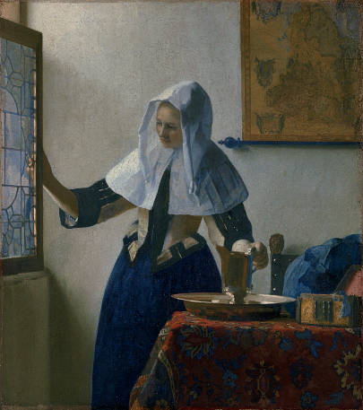
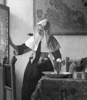
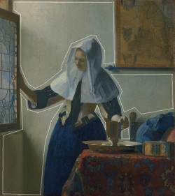
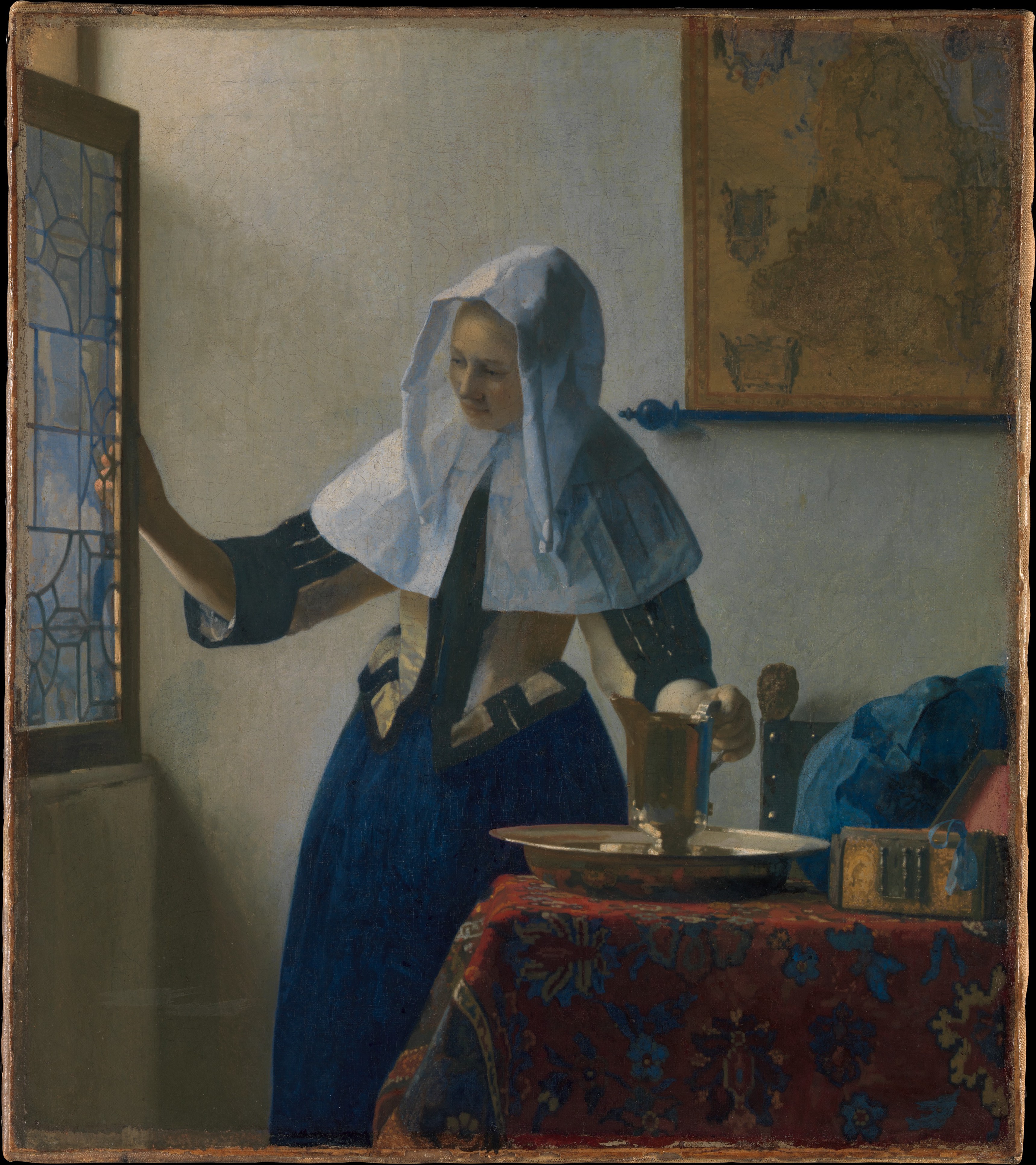
Young Woman with a Water Pitcher
(Vrouw met waterkan)c. 1662–1665
Oil on canvas, 45.7 x 40.6 cm. (18 x 16 in.)
Metropolitan Museum of Art, New York
acc. no. 89.15.21
The textual material contained in the Essential Vermeer Interactive Catalogue would fill a hefty-sized book, and is enhanced by more than 1,000 corollary images. In order to use the catalogue most advantageously:
1. Scroll your mouse over the painting to a point of particular interest. Relative information and images will slide into the box located to the right of the painting. To fix and scroll the slide-in information, single click on area of interest. To release the slide-in information, single-click the "dismiss" buttton and continue exploring.
2. To access Special Topics and Fact Sheet information and accessory images, single-click any list item. To release slide-in information, click on any list item and continue exploring.
The wall map
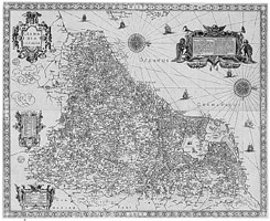
The Seventeen Provinces of the Netherlands
published by Huyck Allart
1671
This wall map of the Seventeen Provinces of the Netherlands was published by the Dutch cartographer Huyck Allart. The only known example of Allart's map, which bears the date of 1671, is preserved in the University Library, Leiden. The South is oriented to the left. The copper plates used to print the map (originated at the beginning of the century) were acquired from an earlier source. Although Allart's map is identical in its geographical contents, a few decorative cartouches seen on Vermeer's version were added to give it a new look.
Originally, Vermeer had placed the map directly behind the young girl. Its vertical edge ran down just to the left of the point where the young woman's cap meets the shoulder covering.
No convincing iconographic interpretation has been given to the map even though it plays a fundamental role in the composition. Apart from their scientific utility, maps were extensively employed as decorative elements in Dutch households and saw prolific publication.
The window
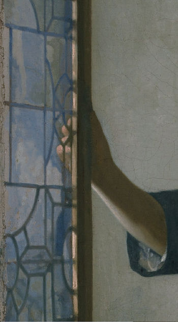
This window seems to be the same as that represented in Vermeer's earlier The Music Lesson. The window frame is hinged to the left, which means that there is a second frame behind it, even though one would imagine that the young girl is very near to the back wall.
Some observers have wished to see the young girl opening the window in order to water flowers outside, although it is unlikely that such a precious gilded pitcher would have been considered appropriate for such a menial chore.
On close inspection, it can be seen that the depiction of the glass was broken down into exquisitely shaped abstract patches of opaque paint, forming a sort of mosaic of delicately balanced color. Natural ultramarine, the most brilliant and expressive blue pigment on the artist's palette, was used extensively in this area and has even been lightly layered over the lead molding, which had been first defined in a neutral gray.
In the 17th century Netherlands, windows held significant importance in both functionality and aesthetics within domestic architecture. These windows served a dual purpose: they allowed precious natural light to permeate interior spaces, illuminating rooms and contributed to the overall design and visual appeal of buildings.
Windows of the 17th century were primarily fashioned from sturdy wooden frames. Craftsmen, known as joiners, played a pivotal role in the production of these frames. They meticulously crafted the wooden components, ensuring a snug fit and secure joints. The choice of wood often leaned towards oak due to its durability and local availability. The resultant frames comprised intricate grids, housing multiple small panes of glass that collectively formed the window's facade.
Two notable types of glass emerged as protagonists in the windows of 17th century Netherlands: crown glass and broad glass. Crown glass, which was a favored choice for larger windows, was crafted by spinning a blown glass bubble into a circular shape. The center, termed the "bull's-eye," exhibited greater thickness, imparting structural integrity to the glass. Its use was especially prevalent in windows that demanded larger panes, effectively capturing abundant light. Broad glass, instead, offered a more economical alternative, being generated by drawing molten glass into flat sheets. This variation found favor in smaller windows and situations where expansive panes were deemed unnecessary. Additionally, leaded glass made a significant appearance. Artisans meticulously cut small pieces of glass into various shapes, subsequently binding them together using slender strips of lead known as cames. This technique gave rise to captivating patterns and scenes, contributing to the decorative charm of windows. Stained glass, a subset of leaded glass featuring colored glass pieces, was particularly prevalent in churches and affluent residences.
The pearl necklace draped over the jewelry box
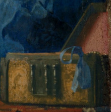
A few pearls of a necklace drape over the front side of an open, ornately decorated jewelry box. A light blue ribbon gracefully falls from its front side, perhaps the fastener of the pearl necklace, which presumably will be donned by the young woman.
The red paint of the box's velvet lining has faded somewhat although it is more intense along the edge of the canvas where it was protected by the picture's frame. The lining was probably glazed with the deep transparent ruby-red pigment called madder lake over an orange-toned layer of opaque vermilion in order to achieve a deep luminous red.
Sumptuary laws, which regulated clothing and personal adornments based on social status, played a role in shaping jewelry trends. These laws aimed to maintain social order by restricting certain materials and designs to specific classes. As a result, jewelry became a way to navigate and express social hierarchy.
The woman's white cap
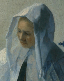
As Vermeer expert Walter Liedtke eloquently wrote: "the woman's hands and forehead are rendered as if their anatomy were unknown, in the blurred shapes suggesting slight movement and the intensity of daylight. Compared with Vermeer's other women of the 1660s, she is somewhat inexpressive, which partially accounts for her universal appeal. She is an icon of domesticity, an intangible figure from a gentleman's dream."
A similar white cap to the one worn by the young woman in this painting is represented in four other paintings by Vermeer and in countless Dutch genre paintings of the time, both tied and open. It was partly ornamental and served to protect the hairdo before and after the morning toilette. In the inventory of Vermeer's wife, Catharina Bolnes, three such caps were listed as drye witte kappen, although it was also called a hooftdoek in Delft. It was typically made of white linen, sometimes of nettlecloth or cotton.
One of the most striking passages of this painting is constituted by the abstract modeling of the cap and the ephemeral bluish tinge of its shadows, achieved with natural ultramarine, the most precious pigment available to painters, even more costly than gold. Vermeer had already exploited this technique in the earlier Girl with the Wine Glass. To create the shadows of white objects, painters of the time invariably used straightforward mixtures of white and varying amounts of black (or black and umber). While not unique to Vermeer, the use of ultramarine blue to nuance non-blue objects is highly characteristic of Vermeer's works in the late 1650s and early 1660s. The headdress takes on a freshness and radiance not seen until 200 years later when the French Impressionists began to experiment with a similar technique for rendering shadows with pure colors rather than neutral grays.
The "Turkish" carpet
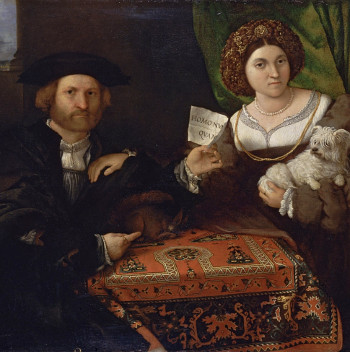
Husband and Wife (detail)
Lorenzo Lotto
1523
Oil on canvas, 98 x 118 cm.
The Hermitage, St. Petersburg
As early as the 14th century, images of carpets woven in the East began to appear in European paintings, and may be considered an intersection of two civilizations. By the 17th century, masters such as Giotto, Ghirlandaio, Crivelli, Memling, Holbein, Van Eyck, Rembrandt, Lotto and Vermeer had featured carpets from Turkey and Iran in their compositions in a conspicuous manner. Initially, carpets served to draw attention to an important person or highlight where a significant action was taking place. Christian saints and religious scenes were frequently represented on carpets. Afterward, they were inserted into secular contexts but remained linked to luxury or wealth. Painters depicted them with exceptional care, sparing no pain to render their suggestive colors, patterns and details of form and design. Their rich colors and intricate geometric patterns have been linked to both the coloring of Venetian painting of the Quattrocento and the development of linear perspective. With the rapid expansion of the foreign trade of the Netherlands, "Turkish" carpets, as the Dutch called them, became very popular in the 16th century and particularly in the 17th century as decorative objects laid on top of tables, chests or trunks with the knotted side up to minimize wear. In paintings, they are rarely represented on the floor. Few of the many rugs that arrived in Europe from the Islamic world have survived.
We do not know if Vermeer represented the design and color of the carpets seen in his paintings with absolute fidelity. For example, the rug that appears in the early Christ in the House of Martha and Mary seems to be identical in design with the one represented in the Maid Asleep. They have in common a broad, light orange border ending in a fringe, but the medallion in the former is colored yellow, while in the latter, it is green.
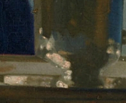
The gilded pitcher
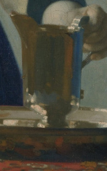
Although the present picture is universally known as Woman Holding a Water Pitcher, the figure is in reality holding an ewer, rather than a pitcher, even though both vessels are used for containing and pouring liquids. Ewers are generally more ornate and elaborate in design, often featuring intricate patterns, sculptural elements, or artistic engravings. Pitchers, on the other hand, are usually simpler in form, designed more for function than aesthetic appeal.
Ewers often have a flared spout and a more elaborate handle. The design is intended not just for pouring but also for display. Pitchers typically have a straightforward design optimized for easy pouring and handling. Ewers can be made from a variety of materials such as precious metals (gold or silver), porcelain, or glass, reflecting their status as decorative or ceremonial objects. Pitchers are often made from less expensive materials like ceramic, glass, or plastic.
The gilded ewer and its basin are one of the most exquisite passages in the artist's entire oeuvre. Its beauty alone would justify one critic who asserted that while Vermeer painted not a single still life, some of the world's most beautiful still lifes are contained within his art. The ewer appears as if it had been materially decomposed and then recomposed with the liquid light, a miraculous synthesis of observation, imagination and painting technique.
Although viewers are invariably stunned by the apparent realism of the ewer and basin, the basin's rim is not continuous as it passes behind the ewer, somewhat higher to the left. It can also be noted that the reflection of the rug's underside is not recreated with the design of the rug itself. A radiographic reflectogram, which reveals hidden layers of paint, also shows that Vermeer had originally intended the basin to be wider and of a different shape.
It has been pointed out that the gilded silver ewer—a pure gold ewer would have been astronomically expensive and wildly out of reach for the Vermeer family—was likely worth as much as a painting by Vermeer. Silverware production in 17th-century Netherlands was a highly specialized craft overseen by guilds. Skilled artisans, known as silversmiths, were responsible for crafting a variety of silver goods, such as cutlery, dishes, goblets and more elaborate items like candelabras and ewers. Silverware was typically produced in urban centers like Amsterdam, Utrecht, and Haarlem, where guilds were most prominent.
The raw silver used in production was often imported from the Spanish colonies in the New World. Techniques such as hammering, engraving, and chasing were used to achieve the desired intricate designs. Hallmarking was practiced to indicate the purity of the silver, the maker's mark, and often the city where the item was crafted.
Despite its limited audience, Dutch silverware was highly regarded and often exported to other European countries, contributing to the fame of Dutch craftsmanship abroad. The pieces were often displayed prominently during special occasions, used as diplomatic gifts, or even melted down to be re-crafted into contemporary styles.
The model for the ewer may have been owned by Vermeer's mother-in-law, Maria Thins. Vermeer expert John M. Montias believes that it was probably the one Maria gave to her daughter Catharina in one of her testaments. He argues that a gilded jug was such a rare and valuable object that it is doubtful there could have been another in the Thins household.
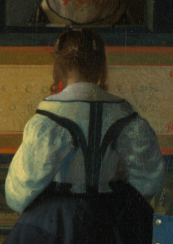
The woman's yellow satin bodice
The Music Lesson (detail)
Johannes Vermeer
c. 1662–1665
Oil on canvas, 73.3 x 64.5 cm.
The Royal Collection, The Windsor Castle
Women wear a stylish lemon-yellow satin bodice with black ornamentation in five early paintings: Girl Reading a Letter at an Open Window, Officer and Laughing Girl, The Music Lesson, The Concert and the present work. Although used for daily wear, this trim garment must have lent Vermeer's paintings a voguish contemporary look, an effect that was sought after by the upper tier of Dutch interior painters in the 1650s and 1660s. In the Netherlands, it was sometimes called a schort or a wacht, although it has been erroneously referred to in Vermeer literature as a caraco or a pet en l'air (both terms refer to a later and somewhat different type of garment).
The bodice in Vermeer's paintings fits tightly around the bust, drawing in the waist and pushing up the bosom to create an hourglass figure. It was probably internally boned or worn over a stay. The puffy three-quarter-length sleeves flutter freely to the sides and are decorated with three slightly separated parallel stripes of black cloth that run down the front side. In Officer and Laughing Girl and Young Woman Holding a Water Pitcher, the front of the jacket can be seen closed edge-to-edge, probably with hooks or interior lacings. The neck is trimmed with a very narrow border of black. The cuffs are formed by a broader and more substantial piece of non-reflective black material.
It is not clear if the bodice is the same in all five works. With respect to those of Officer and Laughing Girl, the sleeves of Woman Holding a Water Pitcher appear much less abundant. Moreover, the lateral decorative strips do not join at the bottom of the bodice but at a point midway between its bottom and neckline, and the cuffs are much wider and more open. It is not inconceivable that these variations were a product of artistic license, given the strongly abstract character of the latter picture.
The woman's yellow satin bodice
The Music Lesson (detail)
Johannes Vermeer
c. 1662–1665
Oil on canvas, 73.3 x 64.5 cm.
The Royal Collection, The Windsor Castle
Women wear a stylish lemon-yellow satin bodice with black ornamentation in five early paintings: Girl Reading a Letter by an Open Window, Officer and Laughing Girl, The Music Lesson, The Concert and the present work. Although used for daily wear, this trim garment must have lent Vermeer's paintings a voguish contemporary look, an effect which was sought after by the upper tier of Dutch interior painters in the 1650s and 1660s. In the Netherlands it was sometimes called a schort or a wacht although it has been erroneously referred to in Vermeer literature as a caraco or a pet en l'air (both terms refer to a later and somewhat different type of garment).
The bodice of Vermeer's paintings fits tightly around the bust, drawing in the waist and pushing up the bosom to create an hourglass figure. It was probably internally boned or worn over a stay. The puffy three-quarter length sleeves flutter freely to the sides and are decorated with three slightly separated parallel stripes of black cloth that run down the front side. In the Officer and Laughing Girl and Young Woman Holding a Water Pitcher the front of the jacket can be seen closed edge-to-edge, probably with hooks or interior lacings. The neck is trimmed with a very narrow border of black. The cuffs are formed by a broader and more substantial piece of non-reflective black material.
It is not clear if the bodice is one and the same in all five works. With respect to those of Officer and Laughing Girl, the sleeves of the Woman Holding a Water Pitcher appear much less abundant. Moreover the lateral decorative strips do not join at the bottom of the bodice but at a point midway between its bottom and neckline, and the cuffs are much wider and more open. It is not inconceivable that these variations were a product of artistic license, given the strongly abstract character of the latter picture.
The broadly painted petticoat
Although Vermeer was influenced deeply by the themes, compositions and illusionist qualities of the fijnschilders (fine painters) Gerrit Dou and Gerrit ter Borch, it is surprising to see how loosely he applied paint compared to their truly microscopic renderings.
This petticoat, rendered with shades of natural ultramarine and black, is painted so broadly that neither the material nor the play of light on its folds can be understood. The artist seems concerned only with conveying the simplicity and purity of its reassuring, bell-like form. Both contours are subtly blended with the white background. This technique was also used in Woman in Blue Reading a Letter. In Vermeer's single-figure paintings of the mid-1660s, detail is always subordinated to the exigencies of a unified whole, and texture is suggested rather than described.
Although we commonly think of petticoats as undergarments worn beneath skirts or dresses, in the 17th century, they could also refer to the outer skirt, particularly when it was decorative or showy. Women layered multiple petticoats beneath their outer garments, which not only added volume to their skirts but also provided warmth, modesty, and extended the life of their more expensive outer garments by protecting them from body oils and sweat.
The choice of petticoat materials and decorations varied based on a woman's wealth and status. Luxurious fabrics like silk and satin adorned with embroidery or lace were the purview of the affluent, while those of more modest means might wear simpler linen or wool petticoats. These garments typically fastened at the waist with ties or ribbons, allowing for a flexible fit.
Interestingly, while primarily an undergarment, the petticoat wasn't always hidden from view. In informal settings or during work, the hem might peek out, or women might even lift their outer skirts, revealing their petticoats. A well-maintained, light-colored petticoat was a sign of wealth and leisure; it indicated that the wearer neither toiled in manual labor nor worried about frequent laundering.
The "rollen" rod that holds the map

Woman with a Lute (detail)
Johannes Vermeer
c. 1662–1665
Oil on canvas, 51.4 x 45.7 cm.
Metropolitan Museum of Art, New York
During the 17th-century, the Netherlands was a hub of cartographic excellence, with Dutch mapmakers being revered globally. Wall maps of this period weren't just functional navigational tools; they were also emblematic of prestige, knowledge, and a cosmopolitan outlook. To display these expansive maps, the Dutch employed wooden hanging rods, known as "rollen," depicted countless times in Dutch genre interiors of the time.
These weren't merely practical implements; they were integral to the map's aesthetics and function. They were rafted meticulously, often from high-quality woods to enhance the map's longevity. The weight of the lower hanging rod maintained the map flat and the curious spherical balls on each end kept the back of the map from rubbing against the damp wall. Moreover, they allowed for easy rolling, making storage a breeze while ensuring that the maps remained in impeccable condition. Occasionally adorned with ornate finials, these rods added an additional layer of decorative flair, marrying craftsmanship with utility.
In simpler homes, maps were simply attached with tacks. Maps, which were generally composed of separate sheets, were usually glued on cloth to give them more consistency.
In Vermeer's picture, the hanging rod has a curious blue tone produced by the presence of natural ultramarine. Natural ultramarine, the most costly pigment of all, was used throughout this composition in an almost obsessive quantity, but it is uncertain if Vermeer intended it to dominate to such a degree or if the pigment has intensified over time. The position of the ball that nestles in the angle of the girl's headdress was not casual. It appears precisely in the same position in his Woman with a Lute (detail above) of the same period.
The broadly painted petticoat
The dark-blue garment in the present picture is not yet a proper skirt but a petticoat.
A petticoat is essentially an underskirt, often worn to give volume to the skirts worn over them. By the 17th century, the petticoat could also be an outer garment, worn visible underneath an open-fronted gown or dress. Women might wear several petticoats. Materials ranged from luxurious silks for the wealthy to simpler wool or linen for the common folk. The kind of material and the quality of the petticoat would give hints about the socio-economic status of the depicted person.
Although Vermeer was influenced deeply by the themes, compositions and illusionist qualities of the fijnschilders (fine painters) Gerrit Dou and Gerrit ter Borch, it is surprising to see how loosely he applied paint compared to their truly microscopic renderings.
This petticoat, rendered with shades of natural ultramarine and black, is painted so broadly that neither the material nor the play of light on its folds can be understood. The artist seems concerned only with conveying the simplicity and purity of its reassuring, bell-like form. Both contours are subtly blended with the white background. This technique was also used in Woman in Blue Reading a Letter. In Vermeer's single-figure paintings of the mid-1660s, detail is always subordinated to the exigencies of a unified whole, and texture is suggested rather than described.
The "Spanish" chair
Spanish Chair
1st half 17th century
Purplewood, varnished black, oak and pine,
upholstered in green cloth
105 x 44.5 x 41.1 cm.
Rijksmuseum, Amsterdam
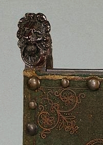
Although only a small portion of the chair appears in this composition, it seems to be very similar to ones seen in other works, such as Girl with a Flute and Girl with a Red Hat (see side-by-side images below). These so-called Spanish chairs probably derived their name from the use of leather instead of cloth, which was a common practice in Spain. They were so prized that their makers regarded themselves as a distinct and superior group within the craftsman guilds. Similar chairs can be seen countless times in genre interiors of Vermeer's time.
Being made of walnut, the Spanish chair was much lighter than the sixteenth-century chair, but adequately strong. The turned baluster legs were connected by straight stretchers at three places located one above the other. The upholstery of the seat and back was made of thick leather, fastened with decorative brass nails. Lion masks, sometimes with rings hanging from their mouths, perched at the top of the back posts. After a great deal of conflict among the various woodworkers' guilds, the new guild of the Spanish chair-makers came into existence.

A posthumous inventory of the artist's studio contained the following objects: "two Spanish chairs, a walking cane with an ivory knob, two painter's easels, three paint palettes, six panels, ten canvasses, three bundles of all kinds of prints, a writing desk and in addition to this some junk lying about that is not worthy to be mentioned separately."
The white-washed wall
In Vermeer's interior scenes, the seemingly anonymous background walls play a key role in establishing the intensity and direction of the incoming light, as well as the overall mood of the picture. But creating a believable illusion of light as it rakes across the surface of flat white plaster constitutes a particularly difficult challenge for the painter. While Vermeer's colleagues tended to treat the background walls of their pictures essentially as backdrops to be depicted with carelessness, Vermeer studied them much more carefully and varied his technique and palette to capture the particular nuances and light fall on each wall at a given time of day. A few of Vermeer's walls, such as those of The Milkmaid or The Music Lesson and Woman with a Pearl Necklace, are the most evocative examples of painted poetry in all of Dutch art.
To represent this particular motif, painters of the time used the same pigments they used for painting white objects: lead white, black and raw umber, a common dull brown used by painters from ancient times. By varying the proportions of these three components, a skilled painter was able to render the play of light and shadow. In order to capture the sensation of the cool fresh light, Vermeer often modified this basic formula by adding small quantities of natural ultramarine, a deep but exceptionally intense blue pigment, in small quantities. The particular freshness of Woman Holding a Water Pitcher pictures owes to him using natural ultramarine not only in the gray paint of the wall but in many parts of the painting where one would not expect to see blue, such as the shadows of the woman's headdress.
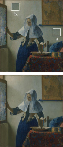
To create the illusion of the slowly diminishing intensity of light as it rakes laterally from left to right across the wall, the painter must gradually darken the light gray used to paint the passages nearest the wall. But just how much it must be darkened may be surprising to those without extensive experience at the easel. To make this more evident, in the illustration above, a patch of the wall furthest from the window (a) has been copied and pasted near the window, evidencing just how contrasted the two areas must be despite the fact that the overall lighting of the scene seems relatively even.
special topics
- The painting's meaning
- A painted-out chair & map
- Ultramarine blue: the king of pigments
- Color theory in Vermeer's art
- The cleansing of the soul
- Why don't children ever appear in Vermeer's interiors?
- Personal hygiene; hand washing
- Is the woman watering plants?
- Sunlight in Vermeer's oeuvre
- Artistic transformation
- "Negative space" & pictorial design
- Evidence of the camera obscura: the disks of confusion
- Listen to period music
The signature
No signature appears on this work.
(Click here to access a complete study of Vermeer's signatures.)
Dates
1662
Albert Blankert, Vermeer: 1632–1675, 1975
c. 1664–1665
Arthur K. Wheelock Jr, The Public and the Private in the Age of Vermeer, London, 2000
c. 1662
Walter Liedtke, Vermeer: The Complete Paintings, New York, 2008
c. 1662–1665
Wayne Franits, Vermeer, 2015
(Click here to access a complete study of the dates of Vermeer's paintings).
Technical report
The support is a plain-weave linen with a thread count of 14 x 14 per cm². The canvas has been lined and the original tacking edges have been removed.
The ground is pale gray and contains lead white, chalk and umber. In the brightly lit areas of the wall is a thin gray layer, slightly paler than the ground, containing some ultramarine. Yellow ocher was added to this layer in the shadows and half-shadows. The left shaded side of the basin has a red underpaint that extends under the adjacent part of her skirt. It is visible as a red outline describing the top edge.
The composition has been altered. There once was a chair with lion's head finials in the lower left foreground and the map on the back wall was located further to the left in line with the left edge of the woman's headgear. The red velvet lining of the jewelry box lid has faded, though the color is still intense where it has been shaded by the frame. Abrasion along all edges and in thin-glazed shadows, as well as scattered flake losses, are present.
* Johannes Vermeer (exh. cat., National Gallery of Art and Royal Cabinet of Paintings Mauritshuis - Washington and The Hague, 1995, edited by Arthur K. Wheelock Jr.)

Provenance
- Robert Vernon, Cambridgeshire and London (1801?-d.1849);
- Vernon sale, London [Christie's] 21 April, 1877, no. 97, as by Metsu (to M. Colnaghi);
- [Colnaghi, London, 1877–1878; sold (as by Metsu) to Wingfield];
- Mervyn Wingfield, 71th Viscount Powerscourt, Ireland (1878-?87, as by Vermeer);
- [Agnew, London];
- [Bourgeois Frères, Paris];
- [Charles Pillet, Paris, 1887; to Marquand];
- Henry G. Marquand, New York (1887–1889);
- The Metropolitan Museum of Art, New York, Marquand Collection, Gift of Henry G. Marquand, 1889 (acc. no. 89.15.21).
Exhibitions
- London June 1838
Catalogue of Pictures by Italian, Spanish, Flemish, Dutch and French Masters
British Institution
no. 29, as "A Female at a window," by Metsu, lent by R. Vernon, Esq. - London 1878
Winter Exhibitition
Royal Academy of Arts
50, no. 267, as "Lady at a Casement," by Jan van der Meer, lent by Viscount Powerscourt - New York 1888–89
Exhibition of 1888–89
The Metropolitan Museum of Art
no. 29, as "Young Woman Opening a Casement" - New York April 1906
Temporary Exhibition
The Metropolitan Museum of Art
no. 40, as "Young Woman at a Window" - New York September 25–October 9, 1909
The Hudson-Fulton Celebration
The Metropolitan Museum of Art
138, no. 137, as "Girl with Water Jug" - Rotterdam July 9–October 9, 1935
Vermeer, Oorsprong en Invloed Fabritius, De Hooch, de Witte
Museum Boijmans-Van Beuningen
37, no. 85 and ill. 66 - Amsterdam October 21–November 3, 1935
Vermeer tentoonstelling ter herdenking van de plechtige opening van het Rijksmuseum op 13 July, 1885
Rijksmuseum
29, no. 167 and ill. 85 - The Hague June 25–September 5, 1966
In Het Licht van Vermeer
Mauritshuis
no. 4 and ill. - Paris September 24–November 28, 1966
Dans la lumière de Vermeer
Orangerie des Tuileries
no. 5 and ill. - Boston 16 September–1 November, 1970
Masterpieces of Painting in The Metropolitan Museum of Art
Museum of Fine Arts
45, unnumbered catalogue - New York November 15, 1970–February 15, 1971
Masterpieces of Fifty Centuries
The Metropolitan Museum of Art
no. 283 - Washington D.C November 12, 1995–February 11, 1996
Johannes Vermeer
National Gallery of Art
146–151, no. 11 and ill. - The Hague March 1–June 2, 1996
Johannes Vermeer
Mauritshuis
146–151, no. 11 and ill. - New York March 8–Mayn 27, 2001
Vermeer and the Delft School
The Metropolitan Museum of Art
no. 71 and ill. - London Junen20–September 16, 2001
Vermeer and the Delft School
National Gallery
no. 71 and ill. - Madrid February 19–May 18, 2003
Vermeer y el interior holandés
Museo Nacional del Prado
170–171, no. 34 and ill. - Boston 19 November, 2003–22 February, 2004
Dutch Interiors in the Age of Vermeer: A Rare Vermeer Comes to Boston
Museum of Fine Arts - New York 18 September, 200 7–6 January, 2008
The Age of Rembrandt: Dutch Paintings in The Metropolitan Museum of Art
The Metropolitan Museum of Art
no catalogue - New York 9 September–29 November, 2009
Vermeer's Masterpiece "The Milkmaid"
Metropolitan Museum of Art
no. 7 - Kyoto 24 October–5 January, 2015
Vermeer and Painters of the Dutch Golden Age
Kyoto Municipal Museum of Art
no. 48
(Click here to access a complete, sortable list of the exhibitions of Vermeer's paintings).
| Vermeer's life |
In a death inventory of the English sculptor Jean Larson, who lived in the Hague, is listed "a head by Vermeer." Some critics believe it may have bee the Girl with a Pearl Earring. In the early to mid-1660s Vermeer refined all the qualities of his mature style. In his orderly designs, Vermeer gave new life to familiar patterns of contemporary genre painting by closely studying the subtleties of appearance. |
| Dutch painting |
Pieter de Hooch paints Young Woman Weighing Gold Jan Steen: paints The Christening Feast. Frans Hals, one of the most fashionable portraitists of his time and now in his late sixties, paints two of his most significant group portraits, the Regents and Regentesses of the Old Men's Alshouse at Haarlem. Owing to his dire poverty he will be given a small allowance by the town of Haarlem. |
| European painting & architecture |
Nicola Poussin paints Apollo and Daphne John Vanbrugh, Eng. architect and dramatist, is born. Christopher Wren: Sheldonian Theatre, Oxford. Francisco de Zurbaran, Spanish painter, dies. |
| Music |
The French horn becomes an orchestral instrument. Oratorio: Christmas Oratorio by Heinrich Schütz at Dresden. |
| Literature |
William Shakespeare - the second impression of the Third Folio, which added seven plays to the thirty-six of the First Folio and the Second: Pericles, Prince of Tyre and six works from the Shakespeare Apocrypha. Thomas Killigrew and the King's Company stage Killigrew's The Parson's Wedding with an all-female cast. Killigrew attempts a similar all-female production of his play Thomaso, though the project is never realized. |
| Science & philosophy |
Robert Hooke discovers the Great Red Spot (an extremely persistent storm) on Jupiter and uses it to determine the period of Jupiter's rotation, which is astonishingly less than ten hours despite Jupiter's great size. Giovanni Alfonso Borelli, calculates the orbit of a comet and finds that it is a parabola (not a circle, ellipse, or line as expected in various earlier theories). Descartes' Traité de l'homme et de la formation de foetus (treatise on man and the formation of the fetus), printed posthumously, describes animals as purely mechanical beings; that is, there is no "vital force" that makes animals different from other material objects. Christiaan Huygens proposes that the length of a pendulum with a period of one second should be the standard unit for length. |
| History |
Aug 29, Adriaen Pieck/Gerrit de Ferry patented a wooden firespout in Amsterdam. New Amsterdam handed over by Peter Stuyvesant to the English, who renames the city New York Amsterdam passes a regulation banning the sale of "rotten, spoiled, or defective spinach, cucumbers, and carrots, ears of corn, radishes, or other fruits [vegetables] because pride could not be taken in or from such things." Slavery is introduced into the Caribbean island of Montserrat and will not be abolished until 1834. The Black Death kills 24,000 in old Amsterdam while the English are taking Nieuw Amsterdam. The plague spreads to Brussels and throughout much of Flanders, and in December it kills two Frenchmen in London's Drury Lane. Men who put the dead into the deadcarts keep their pipes lit in the belief, now widespread, that tobacco smokers will somehow be spared. Samuel Pepys buys forks for his household, but most Englishmen continue to eat with their fingers and will continue to do so until early in the next century lest they be considered effete or, in the opinion of some clergymen, even sacrilegious. A man going out to dinner has for centuries brought his own spoon and knife, the spoon being folded into the pocket and the knife carried in a scabbard attached to the belt; more men now carry folding forks as well. The Kronenbourg Brewery founded in Alsace will continue into the 21st century to produce beer. |
| Vermeer's life | Pieter van Ruijven and his wife Maria Knuijt leave 500 guilders to Vermeer in their last will and testament. This kind of a bequest is very unusual and testifies a close relationship between Vermeer and Van Ruijven that went beyond the usual patron/painter one. It would seem that in his life-time the rich Delft burger had bought a sizable share of Vermeer's artistic output. |
| Dutch painting |
Rembrandt paints The Jewish Bride. Adriaen van Ostade paints The Physician in His Study. c. 1665 Gerrit Dou painted Woman at the Clavichord and a Self-Portrait in which he resembled Rembrandt. |
| European painting & architecture |
Bernini finishes high altar, Saint Peter's, Rome (begun 1656). Murillo: Rest on the Flight into Egypt. Nicolas Poussin, French painter, dies. Known as the founder of French Classicism, he spent most of his career in Rome which he reached at age 30 in 1624. His Greco-Romanism work includes The Death of Chione and The Abduction of the Sabine Women. Compagnie Saint-Gobain is founded by royal decree to make mirrors for France's Louis XIV. It will become Europe's largest glass-maker. Francesco Borromini completes Rome's Church of San Andrea delle Fratte. |
| Music |
Molière: Don Giovanni. Sep 22, Moliere's L'amour Medecin, premiered in Paris. |
| Literature |
Philosophical Transactions of the Royal Society begins publication. |
| Science & philosophy |
Giovanni Cassini determines rotations of Jupiter, Mars, and Venus. Peter Chamberlen, court physician to Charles 11, invents midwifery forceps Pierre de Fermat, French mathematician, dies. His equation xn + yn = zn is called Fermat's Last Theorem and remained unproven for many years. The history of its resolution and final proof by Andrew Wiles is told by Amir D. Aczel in his 1996 book Fermat's Last Theorem. Fermat's Enigma: The Epic Quest to Solve the World's Greatest Mathematical Problem by Simon Singh was published in 1997. In 1905 Paul Wolfskehl, a German mathematician, bequeathed a reward of 100,000 marks to whoever could find a proof to Fermat's "last theorem." It stumped mathematicians until 1993, when Andrew John Wiles made a breakthrough. Francis Grimaldi: Physicomathesis de lumine (posth.) explains diffraction of light. Isaac Newton experiments on gravitation; invents differential calculus. Robert Hooke's Micrographia, with illustrations of objects viewed through a microscope, is published. The book greatly influences both scientists and educated laypeople. In it, Hooke describes cells (viewed in sections of cork) for the first time. Fundamentally, it is the first book dealing with observations through a microscope, comparing light to waves in water. Mathematician Pierre de Fermat dies at Castres January 12 at age 63, having (with the late Blaise Pascal) founded the probability theory. His remains will be reburied in the family vault at Toulouse. |
| History |
English naval forces defeat a Dutch fleet off Lowestoft June 3 as a Second Anglo-Dutch war begins, 11 years after the end of the first such war. General George Monck, 1st duke of Albemarle, commands the English fleet, Charles II bestows a knighthood on Irish-born pirate Robert Holmes, 42, and promotes him to acting rear admiral, giving him command of the new third-rate battleship Defiance, but the Dutch block the entrance to the Thames in October. Feb 6, Anne Stuart, queen of England (1702–1714), is born. At least 68,000 Londoners died of the plague in this year.
The second war between England and the United Provinces breaks out. It will last until 1667 and devastate the art market. Mar 11, A new legal code was approved for the Dutch and English towns, guaranteeing religious observances unhindered. Nov 7, The London Gazette, the oldest surviving journal, is first published. Ceylon becomes important trade centre for the VOC |
The painting's meaning
Woman Washing Her Hands (detail)
Eglon van der Neer
1675s
Oil on panel, 49 x 40 cm.
Mauritshuis, The Hague
Art historians have advanced no convincing explanation regarding an eventual symbolic meaning of the present work although all agree that it is one of Vermeer's most intensely poetic works. It would seem that by the 1660s Vermeer almost completely removed narrative from his paintings. Furthermore, as of yet, no clear-cut composition model in Dutch painting has been found.
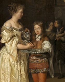
The washing of hands could have various meanings depending on the context in which it takes place. For example, the flashy interior painter Eglon van der Neer represented a woman washing her hands in what is probably a chic brothel—note the woman in the background attempting to tame a customer—presumably after a customer leaves. Is she washing herself to indicate that the sins of the world are not her responsibility? Or does the fancily dressed boy who holds a sumptuous silver basin and ewer mean to warn the spectator of the dangers of unrestrained luxury?
In any case, in Vermeer's painting, the ewer and string of pearls, which issue from the jewelry box to the right, might be linked to the concept of purity. But such an interpretation would seem irrelevant to the background map of Holland, one of the painting's most conspicuous composition elements. Whatever meaning, or lack of it, Vermeer may have intended, as Walter Liedtke pointed out, "a contemporary viewer would have recognized the head and shoulder coverings, the silver-gilt basin and ewer (with which one would not normally water plants) and the jewelry box as the accouterments of a well-to-do woman's toilette. That she opens or looks out the window does not disturb, indeed enhances, the sense of unselfconscious activity. Vermeer represents but a moment of private life, and a patrician ideal."
A painted-out chair & map
This virtual reconstruction of Young Woman with a Water Pitcher provides a speculative hypothesis of the artist's original pictorial concept. The map that today appears to the right of the figure originally reached behind the standing woman and occupied more of the background. If one observes carefully, a barely perceptible shift in tone along the original left-hand edge of the map may be noted. Likewise, the silhouette of the back of a second Spanish chair with a lion-head finial has left a barely observable pentimento underneath the young woman's outstretched arm.
The changes in composition may have been made during an early phase of the painting procedure, called underpainting, before the final color and detail had been introduced. In the simplest terms, an underpainting is a monochrome version (usually brown or neutral gray) in which the artist fixed the layout of the composition, created volume and distributed lights and darks to create the effect of a coherent, overall illumination. With a minimum of effort, a great part of the artist's composition ideas could be envisioned. The parts of the underpainting that did not match the artist's expectations could be corrected with relative ease. The virtual reconstruction is based on naked-eye observation and infrared reflectograms which reveal hidden layers of black-containing pigment.
The painting can be virtually reconstructed to an acceptable degree since we know the real dimensions of the two objects that Vermeer altered.
Ultramarine blue: the king of pigments
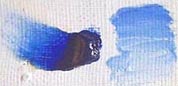
Ultramarine blue on canvas.
The use of natural ultramarine, a pigment made of crushed lapis lazuli imported from Afghanistan, in Vermeer's oeuvre could easily constitute a study in itself. Although it can be detected in almost every work by the artist, it is truly surprising to what extent he actually employed this most noble of all pigments. Not only is it found in blue-colored objects, but upon close inspection, we find traces of it in areas where it cannot be perceived by the naked eye, such as the shaded portions of white drapery, black marble tiles, green foliage, white-washed walls and even in the shadows of the brilliant orange gown in The Glass of Wine. A superlative example of the use of natural ultramarine can be seen in the satin gown of Woman in Blue Reading a Letter. The gem-like depth of the maid's wrap in The Milkmaid is another. In this case, the painting's excellent state of conservation allows us to appreciate fully the chromatic brilliance of the highest grade of pure lapis lazuli.
Vermeer realized early in his career that by admixing discreet quantities of natural ultramarine in the grays (traditionally composed of lead white, charcoal black and raw umber in varying proportions) used to depict the shadows of white objects, he could effectively enhance the effect of natural daylight, which is generally cooler than painters acknowledge. An analogous technique was to be employed many years later by the French Impressionists.
One of the most remarkable examples of Vermeer's use of natural ultramarine can be found in Young Woman with a Water Pitcher. Although, as might be expected, it was the principal pigment used to depict the folded blue drapery on the table, natural ultramarine was also employed to suggest daylight passing through the glass panes of the window. The artist applied delicate admixtures of white and semi-transparent natural ultramarine over the warm tone of the canvas preparation. Observed with care, we can see that even the dark brown lead molding has been overpainted with a deep shade of ultramarine. No other Dutch painter dared so much, and yet these passages are striking for their absolute naturalness.
Natural ultramarine has been detected in the light gray paint of the background wall. The combined effect of the aged varnish and the blue in the wall mixture produces a subtle green undertone which may not have been the artist's intentions.
Color theory in Vermeer's art
The Card Players
Gerrit ter Borch
Oil on canvas, 46.7 x 36.8 cm.
Private collection
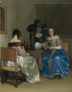
Although scores of scholarly studies have been penned about the symbolic content of Vermeer's motifs, no one has ever addressed the symbolic meaning, if any existed, of color in his art. Did the artist select his colors according to purely aesthetic concerns or because they might confer extra meaning to his motifs? Or did he simply paint the real colors of the objects he observed?
The following is drawn from an interesting study of color symbolism by the art historian Arthur K. Wheelock Jr.
Color symbolism, which goes back to antiquity, was still very much alive in the 17th century. Two important Dutch artists/art theorists, Karel van Mander and Samuel van Hoogstraten, drawing largely on antique and Italian sources, devoted significant attention to color symbolism. Cesare Ripa's Iconologia, an important emblem book well known to Dutch artists, offered detailed advice on how to adopt color in painting to enhance meaning.
Van Hoogstraten noted that white means innocence, purity and truthfulness. He associated red with highness, courage and boldness, blue with fidelity and skillful science (the intellect), green with beauty, greatness and joy and black was equated with evilness and melancholy. In his assessment of yellow, for example, he explained how the ancient Greeks used this color in the interiors of temples because of its association with the sun. Yellow, thus, means wisdom, nobility or high-mindedness. Many of these associations have remained surprisingly stable through the ages and in geographical distribution.
However, the most intriguing example of interest in color symbolism in the Netherlands is a list of color symbols which has been found amidst a large number of drawings, sketchbooks and letters of an important family of Dutch artists, the Ter Borchs of Deventer. This record, compiled in the mid-to-late 1650s by Gerrit ter Borch's step-sister, Gesina and her brother Harmen, lists a series of colors and their symbolic associations.
In the sheets penned by Harmen, appropriately colored hearts introduce each line. The hearts refer to the types of symbolic associations given to the colors, those related to love. Light blue means constancy, green hope, black steadfastness, gray spitefulness, white pureness, blue jealousy, carnation revenge or cruelty, pink love, yellow gladness or joy, seagreen instability and unsteadfastness, brown discretion, prudence and truth. Finally, ash gray means sorrow and suffering.
Gesina had a very close relationship with Gerrit and became his favorite model by the early 1650s. She was an accomplished poetess and draughtsman profoundly enthralled by Petrarchan concepts of love and the complexities, worries and disappointments that accompanied the search for a true and lasting love. It seems certain that the great painter and his step-sister saw artistic matters eye to eye. It seems likely that Gesina very well transmitted, or at least shared, her concerns with Gerard whose delicate interior paintings constitute some of the most lasting pictorial tributes and subtle variations on the fine points of contemporary love. According to the Dutch art expert Arthur K. Wheelock Jr., the symbolism of the colors given to the remarkable silk dresses worn by Ter Borch's women seems to directly relate to the narrative scenario being depicted in agreement with Gesina's color list.
Ter Borch's groundbreaking treatment of interior themes must have been a direct and profound influence during the course of Vermeer's pictorial evolution. However, since color has a deeply personal and complex function in the art of painting, it is uncertain how far-reaching his interest in color symbolism was.
What we do know is that Vermeer generally favored the three primary colors, blue, red and yellow, for the colors of the principal protagonists of his interiors. These colors are perceived as unambiguous and positive and generally communicate strength. Ter Borch, on the other hand, along with the primary colors, gaily experimented with ethereal shades of pale velvety colors, combining them in an original and evocative manner that Vermeer never approached.
The cleansing of the soul
Woman Washing Hands (detail)
Gerrit ter Borch
c. 1655
Oil on canvas, 53 x 43 cm.
Gemäldegalerie, Dresden
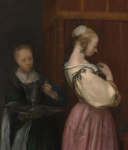
Although art historians are undecided on exactly how to interpret all the motifs of this work, they generally agree that Vermeer intended to represent a moment of the young woman's morning toilette. This subject had been previously exploited by other genre painters, including one of the most refined compositions by Gerrit ter Borch, a work of utmost delicacy that would have appealed to Vermeer's sensitivity. In Ter Borch's composition, a young servant attends with a ewer and basin (similar to the ones in Vermeer's work) for the final touches of her toilette. In pictorial and emblematic tradition, the wash basin and ewer evoke innocence, purity and cleanliness. The washing of hands had Biblical associations with the concept of spiritual cleansing. The idea of cleanliness is reinforced by the young lady's hooftdoek and nightrail as well as the bright light streaming through the window, casting its clear blue light on everything it encounters.
Vermeer evidently attached a particular significance to the act of hand washing. In the Amsterdam Dissius sale of 1696, in which 21 Vermeer paintings were auctioned, item no. 5 was described as, "In which a gentleman is washing his hands in a perspectival room with figures, artful and rare." This lost composition must have been highly considered since it fetched the handsome sum of 95 guilders or about half the price of the large-scale View of Delft and more than double the price of the Officer and Laughing Girl, both retained among the artist's finest works.
Curiously, no Dutch picture of a man washing his hands has ever been discovered, and one cannot help but wonder how Vermeer conceived and executed such a theme, especially if we consider that the man was not alone but "with figures." The "perspectival room" most likely refers to a common see-through device Vermeer had first experimented within his early A Maid Asleep and later refined in the late Love Letter.
Why don't children ever appear in Vermeer's interiors?

Interior with a Family and Two Nurses before a Fire
Cornelis de Man
1670s
Oil on panel, 52 x 45 cm.
Private collection
A contemporary visitor to the Netherlands once noted that the Dutch prized three things above all else: first, their children; second, their homes; and third, their gardens. From Pieter Brueghel onward, Netherlandish painters portrayed children more than any other European nation. Anyone familiar with Dutch painting is aware of the empathetic treatment reserved for children by Jan Steen, who studied the relations of children with grown-ups with great insight and charm, and, closer to Vermeer, Pieter de Hooch, who explored the theme of maternity with evident participation.
Many Vermeer enthusiasts wonder why Vermeer never included his own children in his interiors if his works are truly "slices of daily life." After all, Vermeer's wife, Catharina, gave birth to 15 children. A meticulous inventory of household goods taken after Vermeer's death describes a different picture of the Vermeer household, full of cribs and worn furnishings. The simplest explanation for the lack of children in Vermeer's art is that his paintings were never intended to be snapshots of an extant reality. As Vermeer expert Walter Liedtke writes, "In a broad view, the essential subject of Vermeer's mature work is an ideal woman in an ideal home. The image, of the intended male viewer, was an icon of private life and personal feeling, concerns that flourished in a time of postwar prosperity and peace." In his house full of children, it is obvious that Vermeer drew from art and literature for his motifs rather than from his day-to-day life experience.
The scenes that Vermeer depicted were carefully composed in his studio on the top floor of his well-to-do mother-in-law's house, away from the bustle of his oversized family. The true appearance of Vermeer's downstairs household must have been much more similar to a painting by Cornelis de Man.
Personal hygiene: hand washing

A Lady Washing her Hand
Caspar Netscher
1657
Oil on panel, 49.3 x 40.3 cm.
The Kremer Collection, Fondation Aetas Aure
Historians have ruled out the possibility that the young woman is watering plants outside the half-opened window. The elegant gilt ewer, instead, would have been employed at the end of the young girl's morning toilette to wash her hands. Caspar Netscher depicted an analogous scene of hand-washing when he was still working in the studio of Gerrit ter Borch.
While the Romans and Greeks associated well-washed hands with clean bodies, in the medieval and Renaissance times, there was little interest in washing beyond the wrist. Monastery cloisters featured a stone trough for hand-washing, and medieval paintings of interiors often show an ewer, a basin and a cloth for drying hands in a corner of the room. Etiquette books ordered hand-washing before and after meals, and people who neglected it inspired scorn. Among the upper class, unless you washed your hands, you had no claim to gentility.
That belief persisted through the 17th century, even as body cleanliness worsened. Doctors assured people that they were more susceptible to the plague if they opened their pores in warm water, and terrified Europeans shunned water and washing, except for their hands. Since forks were not in general use until the 18th century, hand-washing still had a practical function as well as a symbolic one: the Dutch in the age of Rembrandt scandalized French visitors by eating without first washing their hands.
Is the woman watering plants?

Old Woman with Jug at a Window
Gerrit Dou
c. 1660–1665
Oil on panel, 28.3 x 22.8 cm.
Kunsthistorisches Museum, Gemäldegalerie, Vienna
There is good reason to believe that the woman was not watering flowers, as has been occasionally suggested in the past. The gilt silver jug and basin would have been prized luxury items maladapted for such a mundane task. For that purpose, a rustic terracotta jug such as the one depicted in Gerrit Dou's Old Woman with Jug at a Window would have been utilized.
The theme of giving water to plants is rare in 17th-century Dutch painting prior to Dou's treatment, although the many copies and versions of Dou's composition attest to its subsequent popularity. Watering plants most likely had a moral meaning in 17th-century Netherlands. In a French emblem book of 1553, a verse teaches us that "Just as too much water makes plants die, / Too much labor destroys many a thing, / but, if moderate, brings relief."
Sunlight in Vermeer's oeuvre
One of the most extraordinary aspects of Vermeer's art is the way light is channeled, diverted and reflected with total logic from one surface to another, infusing space, color and form with a luminous unity. Although Dutch painters of the Golden Age had distinguished themselves from their European counterparts precisely for their scrupulous rendering of natural appearances, Vermeer took Dutch naturalism one step further. We might say that light itself had become his subject.
With Vermeer, light is always clear and transparent, diffusing itself evenly in the space. Never once did he succumb to the flicker of a candle, torch or the ghostly moonbeams of night, as did so many of his colleagues. Vermeer also avoided painting the characteristic patches of direct sunlight on floors or walls, as his contemporaries De Hooch and Pieter Janssens Elinga had done.
Although rarely considered, it is amazing that Vermeer was able to describe Dutch light with such extraordinary fidelity. Then, as today, on average, there are more than three hundred rainy days in the Netherlands. Furthermore, the natural light that could have penetrated into the depths of Dutch homes must have been extremely limited, particularly during the winter. Windows were made as large as possible, sometimes occupying two-thirds of a wall, but intense direct sunshine must have been a rarity. Thus, we must admire all the more Vermeer's powers of observation and his ability to extrapolate such accurate renderings of specific lighting conditions, which would have only sporadically presented itself before the artist's eyes.
Artistic transformation
In the early 1660s, Vermeer turned away from the hollow cube-type painting of Pieter de Hooch and other artists of Southern Holland to a new type of composition which had been successfully pioneered by Gerrit ter Borch and Frans van Mieris, both extraordinarily successful artists.
Vermeer's former preoccupation with three-dimensional space, created by a complex orchestration of architectural features, linear perspective and overlap, suddenly gave way to four compositions of incomparable simplicity. Each of these works presents a single female figure absorbed in some mundane activity, captured unaware in a shallow middle ground inundated by natural light. Motifs, whether animate or inanimate, are treated impartially and stripped of any anecdotal detail that might distract the viewer. Contours are no longer uniformly sharp as in the early works, but softly blurred and daringly simplified. The aesthetic result is a tender, luminous tremor unequaled by his contemporaries, whose works seem frozen rather than motionless. The shapes described by the contours of the individual objects, which Walter Liedtke eloquently termed "luminous silhouettes," are gauged and aligned one to another on the painting's surface, rather than in depth, as if they were part of some grand, meaningful puzzle.

In Vermeer's paintings, the surface qualities of objects lose much of their natural textures and assume a curious optical character that many experts credit to Vermeer's experimentation with camera obscura vision. Like few other artists, Vermeer adapted his painting technique to his themes. Gone are the uneven textures of the canvas surface and the knotty build-up of impasto paint. To evoke the uncluttered optical world, form is built up by applying sequential layers of thin, semi-transparent paint. The canvas surface recalls the sheen of the luxurious materials worn by the artist's models.
Vermeer's figure strikes poses that could be held for a considerable length of time. However, if attentively observed, the figure in the present work leans to the right, a bit off balance, introducing a note of expectancy into the rectangular composition. The "imbalance" is anchored by a strong axial line that runs down from the vertical edge of the map through the upright jug.
That Vermeer's compositions are among the most highly determined in the history of easel painting is rendered more astonishing by the fact that they never interfere with the naturalistic reading of the scene.
"Negative space" & pictorial design
Vermeer's sensitivity to pictorial design finds no parallel in Western art. Each and every element of the picture plane is determined with the utmost care in order to create a perfectly balanced, yet subtly dynamic composition, which, unlike abstract paintings of today, were not meant to appreciated in themselves but to focus and activate the scene which is represented. One of Vermeer's most notable achievements was the manipulation of the so-called negative spaces, or those areas of in between the solid objects, which are generally perceived as empty spaces. Normally, the viewer senses these negative spaces as leftovers, and thus, without meaning. Oppositely, Vermeer lends each one a clear simple, yet interesting shape capable of exerting its own influence.
The negative shapes represented in the present work (areas of light background wall) interlock with the foreground objects as if some sort of grand puzzle. The resulting unity lends an unsuspected resonance to the temporal gesture of the woman.
Listen to period music
![]() Francesco Geminiani
Francesco Geminiani
Concerto grosso op. 3 no. 5, Adagio II [1.39 MB]
http://www.amazon.de/Geminiani-Six-Concerti-grossi-Op-3/dp/B001SSDOGA/ref=sr_shvl_album_1?ie=UTF8&qid=1260103552&sr=301-1
Evidence of the camera obscura: the disks of confusion
Of the ten or so stylistic features that have been cited to connect Vermeer's painting with the camera obscura image, only the pointillés are universally accepted. These globular dots of light paint, which presumably imitate the camera's sequin-like halations or disks of confusion, as they are alternately termed, are created when a pinpoint highlight passes through the camera's lens and spreads onto the camera's translucent screen. Disks of confusion occur only when strong light shines on polished materials such as silk and metal. They are not observable in shadows. The circular form of these disks is a result of the camera's imperfect lens.
Pointillés make their debut in Vermeer's early work, Girl Reading a Letter at an Open Window, and are generously scattered through subsequent works. They are most prominently present in View of Delft, The Milkmaid and The Lacemaker. Many of the pointillés that Vermeer painted would not logically have appeared on the camera obscura screen, such as those along the bottom side of the shadowed hulls of boats in the View of Delft. It's likely that the artist did not aim to create a literal transcription of what the camera showed him but applied them based on aesthetic criteria, sometimes embracing the "optical truth" of the camera and other times diverging from it.
Vermeer's pointillés seem to dissolve the tactile substance of the underlying motif and transform it into light. The underside of the sun-kissed silver ewer in Young Woman Holding a Water Pitcher appears to be painted with liquid light, with the pointillés dancing upon the canvas surface. When observed from life, this passage exhibits breathtaking delicacy that no reproduction can capture.
We do not know why Vermeer chose to reproduce rather than suppress a "flaw" of the camera obscura. This choice probably wouldn't have been understood outside the small circle of connoisseurs and art collectors familiar with the workings of the camera obscura. In today's context, Vermeer's pointillés are less striking due to our familiarity with the quirks and peculiarities of a wide array of mechanically produced images.


