Art is filled with specialized language that can often puzzle the lay reader. Many terms used by artists, historians, and critics carry meanings that differ significantly from their everyday use, while others are so particular to the field that they remain virtually unknown outside it. This online glossary aims to clarify these distinctions, offering clear definitions enriched by historical and visual context.
Each entry begins by examining the term within the broader history of art—tracing its development, significance, and changing interpretations across time and cultures. When relevant, the discussion shifts to the term’s role in the Dutch Golden Age, a period of extraordinary artistic innovation, technical refinement, and market-driven production. Here, the glossary highlights how concepts were understood and applied by Dutch painters, collectors, and theorists, situating them within the intellectual and social fabric of the seventeenth century.
Given the focus of this website, many entries also include a dedicated section marked with Vermeer’s distinctive monogram. These sections examine how each concept relates specifically to Vermeer’s work—his use of perspective, light, and material texture, or his place within broader Dutch artistic practices. In doing so, the glossary functions not only as a reference tool, but as a framework for understanding Vermeer’s enduring contribution to the history of art.
With more than 700 carefully curated terms and a network of over 30,000 internal links, the glossary allows users to navigate across multiple facets of art, revealing unexpected connections and deeper layers of meaning. Designed to function as both a structured reference and an open-ended journey, it encourages readers to move beyond isolated definitions—tracing the evolution of artistic ideas across disciplines and centuries. Whether used by scholars or by curious enthusiasts, this glossary offers an extensive, interconnected resource for anyone wishing to deepen their understanding of visual art.
- Aanleggen
- Abrasion
- Abstract / Abstraction
- Academy / Academic Art
- Accelerated Perspective
- Accent
- Accession Number
- Acrylics
- Aerial Perspective
- Aesthetics
- After
- Algemeen Licht
- Align / Alignment
- All-Over Painting
- Alla Prima
- Allegory
- Allusion
- Altarpiece
- Alterstil
- Amateur
- Ambient Light
- Ambiguity
- Anamorphic Art
- Anatomical Proportion
- Anecdote
- Animal Painting
- Antique
- Antiquity
- Apprentices
- Architectural Painting
- Ars
- Art
- Art Academies
- Art and Visual Perception
- Art and Science
- Art Appreciation
- Art Auction
- Art Center
- Art Collection
- Art Collector
- Art Criticism
- Art Criticism / Criticism
- Art Critic
- Art Dealer
- Art Exhibition
- Art for Art's Sake
- Art Gallery
- Art Historian
- Art History
- Art in Antiquity
- Art Manual / Art Treatise
- Art Market
- Art Materials
- Art Movement
- Art Museum
- Art of Painting
- Art Philosophy
- Art Production
- Art Scholar (as opposed to Art Historian or Critic)
- Art Theory
- Art Writer
- Art Writing / Critial Writing
- Artisan / Craftsman
- Artist
- Artist Gentlemen
- Artistic Collaboration
- Artistic Development
- Artistic License
- Artistic Output
- Balpoot (Dutch draw-leaf table)
- Bamboccianti
- Banketje (little banquet piece)
- Baroque Art
- Battle Scene
- Beach Scene
- Beauty
- Bentveughels
- Bias
- Biblical Subject Matter
- Binder
- Blending / Overblending
- Blistering
- Blockbuster Exhibition
- Blocking In
- Bloom
- Blur / Out of Focus
- Body Color
- Bole
- Bordeeltje / Bordello Scene
- Borrowing
- Botegga
- Bourgeois
- Bravura
- Brightness / Brilliant
- Broken Color
- Brush
- Brushstroke
- Brushwork / Brush Handling
- Buitenpartijen (garden party paintings)
- Burgerlijk (burger-like)
- c. / ca. / circa
- Cabinet of Curiosities / Kunstkabinett or Kunstkammer
- Cabinet Paintings
- Caffa
- Calligraphic (style of brushwork)
- Calligraphy
- Camera Lucida
- Camera Obscura
- Candle Light Scene
- Canvas
- Capriccio (caprice)
- Caravaggism
- Carpet
- Cartellino
- Cartoon
- Catalogue Numbers
- Catalogue Number
- Catalogue Raisonnés / Complete Catalogue
- Catchlight
- Chalk
- Chance
- Charcoal
- Chiaroscuro
- Chronology
- Chronology
- Church Painting
- Cinematic
- Cityscape
- Classical
- Classicism
- Claude Glass
- Cognoscenti
- Color
- Color Harmony
- Color Perception
- Color Symbolism
- Color Temperature
- Color Theory
- Color Wheel
- Colorito
- Commercial Art
- Commission
- Competition / Rivalry
- Complementary Colors
- Composition
- Compositional Line
- Communication
- Confraternity / Confraternity of Artists
- Connoisseur / Connoisseurship
- Conservation
- Contemporary
- Content
- Context
- Continuous Narrative
- Contour
- Contraposto
- Contrast
- Contrast of Light Masses against Dark Masses in Composition
- Conversation Piece
- Cool Colors
- Copying / Copy
- Core Shadow
- Costume
- Counterpoint
- Courship Scenes / Gezelschapjes / Conversaties
- Courtyard Scene
- Craft / Craftsman
- Craquelure / Cracks
- Creative Process / Experimentation
- Creativity
- Cropping
- Cross Section
- Crosshatching / Hatching
- Crushed Impasto
- Cupid
- Culture
- Curator
- Cusping
Aanleggen
Aanleggen is a Dutch term for the painting technique called "maniera lavata," that describes a method of dead-coloring (underpainting) in which each specific area of the painting is first approximated in a flat tint—a relatively light wash—before creating the final nuances of form, hue, and light.
In the 17th century, underpainting appeared in various forms, and it is clear that the defunct term was somewhat flexible. Sometimes the underpainting was executed in sftrict monochrome, or grisaille, and at others as an assembly of evenly blocked-out areas of dull colors that anticipated the final color with a flat tint (localized underpainting). For most painters, the underpainting was not so much a transitional stage, but a provisionally completed whole.
In an English manuscript—the Commonplace-Book compiled by Thomas Marshall c. 1640–50—there is a text cited in Dutch that can be linked to the Flemish master Antony van Dyck. It describes a method of dead-coloring in which the final color for each individual area is approximated with a flat tint: "'Dead-coloring' is called the maniera lavata, that is to say, the washed manner, because it fills in the area within the outline with only one color."
In an earlier passage in the same manuscript, bearing the title "dead-coloring" in the margin, it appears that a "light-applied color"—most likely the "one color" referred to in the quotation above—was applied over what was termed the "scheme," in Dutch stelsel. The Dutch words stellen (to place) and ordineren (to arrange) were used to describe the organizing of the composition, which, according to the manuscript, occurred before the dead-coloring.
Abrasion
Abrasion, in the context of art and painting, refers to the physical wearing away or erosion of a surface due to friction, handling, or environmental factors. This can occur naturally over time or be the result of intentional interventions, such as cleaning or restoration efforts. In paintings, abrasion often affects the uppermost layers of pigment and varnish, leading to a loss of detail, softening of forms, or exposure of the underlying ground or preparatory layers. This issue is particularly relevant in oil painting, where delicate glazes and fine brushwork can be compromised through excessive or improper cleaning methods. Throughout history, works of art have suffered from abrasion due to a combination of factors, including overzealous restorations, repeated rolling or folding of canvases, or the rubbing of framed works against their surroundings.
In the 17th-century Netherlands, abrasion was a known concern among painters and collectors, though the terminology for it may not have been as explicit as it is today. The widespread use of thin oil glazes in Dutch painting, particularly in works that employed a refined sfumato technique or delicate transitions of light, made certain areas of paintings vulnerable to surface wear. Artists such as Gerrit Dou (1613–1675) and Frans van Mieris the Elder (1635–1681), who specialized in fine, meticulously detailed genre scenes, relied heavily on thin layers of translucent paint. If these layers were subjected to repeated cleanings, they could lose their depth and subtlety. Vermeer's works, which often feature soft tonal gradations and precisely rendered surfaces, have also been affected by abrasion over time, particularly in passages of shadow or where delicate glazes were used to create luminosity. In some cases, areas of paintings by Dutch masters exhibit a dull or chalky appearance due to the loss of original glazes, a direct consequence of historical cleaning practices that did not yet account for the long-term effects of abrasive methods.
Art dealers and collectors in the Dutch Republic were acutely aware of issues related to surface damage, as paintings were frequently bought, sold, and transported across cities and international markets. The rise of connoisseurship during this period meant that discerning buyers scrutinized works for their state of preservation, and excessive wear could diminish a painting's desirability. The presence of abrasion in 17th-century Dutch paintings today often provides insight into the painting's history, revealing not only the artist's original technique but also the interventions and misfortunes that the work has endured over centuries.
Yes, abrasion is a major issue in several of Vermeer's paintings, affecting both their aesthetic quality and our ability to fully appreciate his original technique. Some works, such as Diana and Her Companion , have suffered particularly severe damage, while others, like Woman with a Lute, have nearly been lost due to excessive cleaning or mishandling over time. The state of preservation varies widely among his works—A Lady Seated at a Virginal retains certain passages in near-pristine condition, such as the face and the foreground bass viol, while the frame of the large picture-within-a-picture in the background is heavily abraded. In Woman in Blue Reading a Letter, the raised edges of the paint surface have been slightly worn, a typical sign of repeated cleaning.

Johannes Vermeer
c. 1653–1656
Oil on canvas, 98.5 x 105 cm.
Mauritshuis, The Hague
One of the most telling examples of abrasion is found in A Maid Asleep, where the remnants of a large Dutch roemer (a drinking glass) lying on its side, just in front of the white ceramic jug, have been largely worn away. This loss affects not only the physical state of the painting but also its compositional meaning, as Vermeer likely included the overturned glass as a subtle narrative element. The Concert, a mid-career work, also shows signs of damage, particularly in the delicate glazes Vermeer employed to achieve his signature luminosity. The wear in these areas diminishes the full effect of the light modulations that were once more pronounced.
One of the most debated cases of abrasion in Vermeer's oeuvre concerns Saint Praxedis, a work whose attribution remains contested. Conservator Jørgen Wadum has argued that the signature on the painting is not integral to the work, pointing out that it remains visible despite the heavy abrasion of the surrounding paint. He further notes that the knobs of the canvas weave are partly visible beneath the signature, suggesting that the paint layer was worn down before the inscription was added. The presence of the signature, rather than confirming Vermeer's authorship, has instead fueled skepticism about the painting's authenticity. The lower right inscription, reading something like "Meer N R[..]o[.]o," is so rudimentary that any definitive interpretation would be speculative.
The effects of abrasion in Vermeer's paintings illustrate how conservation history can shape our perception of an artist's work. In many cases, overzealous cleaning has compromised Vermeer's carefully constructed surfaces, leaving behind a record of past restoration practices rather than the artist's original intentions. Some of his paintings, however, have fared better than others, allowing us to glimpse the extraordinary subtlety of his technique where the paint surface remains relatively untouched.
Abstract / Abstraction
The abstract qualities in art are those which are independent of a artwork's resemblance to external reality. The arrangement of lines, forms, tone and color, even in a painting depicting an aspect of the known world, can be viewed as a series of non-representational relationships. Such patterning has often been appreciated for its own sake; music without vocal narrative elements tends to be enjoyed in a similar manner.
From the late-nineteenth century onwards, visual abstract or formal qualities were increasingly emphasized, analyzed and finally isolated by painters.
Visual abstraction is not merely an aesthetic quest; it is a biological necessity. By reducing visual complexity abstraction increases perceptual efficiency allowing us to recognize objects, evaluate movement, and orient ourselves in space with great rapidity. Without abstraction, the brain would be enslaved to the particular because it would have to recall every detail in order to make sense of the contents of the visible world. In daily life, most visual information is redundant. In the case of photographic images, it has been calculated that this redundancy may be as high as 90%. The ability of the human mind to abstract may also be linked to the limitations of its memory system.
Throughout the twentieth century, the term "abstraction" was regularly summoned to describe certain aspects of Vermeer's style. However, abstraction, which we inevitably associate with twentieth-century abstract painting, has no exact correspondence in seventeenth-century art discussion. The closest concept is that of idealization, by which Classically oriented painters sought to divest the world of imperfections and transmit fundamental religious and ethical truths that were considered the only worthy objectives of the art of painting. The fundamental difference between the two concepts is that abstraction seeks to extract an underlying "truth" of reality on a general level, such that it can be true of many cases, while idealization involves a premise, which can skew reality to a predetermined result making it potentially misleading.

Johannes Vermeer
c. 1667–1670
Oil on canvas, 44 x 38.5 cm.
Rijksmuseum, Amsterdam
In Vermeer's paintings, shapes are abstracted, on a few occasions to the point of becoming unrecognizable. Volumes are reduced to their simplest geometric components. Complicated folds of drapery are untangled. For example, the block-like gown of the seated mistress of The Love Letter is defined with only a few essential planes, while the carpet-covered table in The Music Lesson has been transformed into nothing less than a geometrical fortress, which may have entailed considerable manipulation given that such carpets were probably not stiff enough to produce such simple, structural folds by themselves. Props and figures are often set perpendicular or at 45 degrees to the picture plane. The limp contours of real satin, which remind the viewer of the fragility of luxury, are "ironed out" into crisp, angular folds with sharp chiaroscural contrasts that can be more easily assimilated by the visual system. The dark blue gown of Young Woman with a Water Pitcher, whose inner creases and folds are barely indicated, is transmuted into a pure, bell-like shape which is understood only through its two graceful external contours. The surfaces of objects are sometimes so abstracted that they are cleansed of their natural texture, for instance, the reflections that would be expected to be observed.
Vermeer's abstraction may have in part been inspired by the generalized image of a camera obscura. Moreover, history painters had long simplified modeling, form and texture in order to create more universal visuals, and in almost every painting and drawing manual of the time painters were warned against getting lost in distracting detail. However, the true broadness in Vermeer's rendering is adequately appreciable only when his paintings are compared to analogous works of his contemporaries. It may have resulted from a confluence of external influences, some of which just mentioned above, but the type of unsparing geometrically based abstraction that so deeply characterizes his method mode of rendering must have sprung from the artist's deepest personal inclinations, as there is no real comparable rendering in painting of the time in neither the Netherlands nor the rest of Europe.
The abstract quality of Vermeer's painting may be so appreciated today not only because it is consistent with contemporary taste, but because, perhaps, abstraction reveals something of the mechanics of vision and renders assimilation more efficient, and therefore more pleasurable. Just as the brain searches for constancies and essentials, so does the artist. In fact, a growing number of perceptual scientists hold that aesthetics are neurobiologically based, and that the artistic process shares vital similarities with physiological processes. Neuroaesthetics is a term that has been coined to refer to the project of studying art using the methods of neuroscience.
Academy / Academic Art

Raphael
1511
Fresco, 550 x 770 cm.
Vatican Museums, Vatican City
An academy, in general terms, is an institution dedicated to the advancement of learning, often focusing on the arts, sciences, or both. Originating from Plato's Academy in ancient Greece, the concept evolved significantly in Europe during the Renaissance and Baroque periods. Academies provided a structured environment for education, fostering discussions on artistic theory, philosophy, and the refinement of skills through systematic training. For guild, academies offered an alternative to the traditional guild-based apprenticeships, emphasizing anatomy, perspective, and life drawing based on Classical ideals. The curriculum often included lectures on aesthetics, history, and literature, aiming to elevate the status of artists from craftsmen to intellectuals.
The first academy of art was founded in Florence on 13th January 1563 by Cosimo I de Medici at the suggestion of Giorgio Vasari, (1511–1574) named as Accademia delle Arti e del Disegno (Academy and Company of the Arts of Drawing). Another academy, the Accademia di San Luca (named after the patron saint of painters, Saint Luke), was founded in 1577 in Rome. The Roman Accademia reflects the modern notions of an artistic academy rather than a perpetuation of the medieval guild system. Although not initially in direct competition with the local guilds, the academies eclipsed and eventually supplanted the guilds.
"The curriculum of the Accademia di San Luca was, as least as far as technique is concerned, designed to combat the abhorrent practices followed by Caravaggio (1571–1610) and the Bamboccianti,Group of relatively small, often anecdotal, paintings of everyday life, made in Rome in the mid-17th century. The word derives from the nickname "Il Bamboccio" ("Large Baby"), applied to the physically malformed Dutch painter Pieter van Laer (1592/95–1642). Generally regarded as the originator of the style and its most important exponent, Van Laer arrived in Rome from Haarlem about 1625 and was soon well known for paintings in which his Netherlandish interest in the picturesque was combined with the pictorial cohesiveness of Caravaggio's dramatic tenebrist lighting. Because van Laer and his followers depicted scenes of the Roman lower classes in a humorous or even grotesque fashion, their works were condemned by both court critics and the leading painters of the classicist-idealist school as indecorous and ridiculous. The painter Salvator Rosa was particularly savage in his comments about the later followers of the style, whom he criticized for painting "baggy pants, beggars in rags, and abject filthy things." The Bamboccianti (painters of Bambocciati) influenced such Dutch genre painters as Adriaen Brouwer and Adriaen van Ostade. (from the excellent online art resource the Web Gallery of Art. a group of Dutch painters who depicted low-life subjects in alla prima painting technique. The academy's training programme included instruction in perspective, foreshortening and anatomy, and it stressed imitation of the Antique, by way of drawing from ancient sculpture or plaster casts."Arie Wallert and Willem de Ridder, "The Materials and Methods of Michael Sweerts," in Michael Sweerts (1618–1664), ed. Guido Jansen and Peter C. Sutton (Zwolle: Waanders Books, 2000), 373. The Academia di San Luca later served as the model for the Royal Accademy of Painting and Sculpture founded in France in 1648. The French Academy very probably adopted the term "'arti del disegno," which is translated into "beaux arts," from which is derived the English term " Fine Arts."Christopher L. C. E. Witcombe, "Art & Artists: The Renaissance and the Rise of the Artist
Nevertheless, there was an academic influence in the Netherlands, especially in cities like Utrecht, where the exposure to Italian art and the influence of the Utrecht Caravaggists reflected a more systematic approach to composition, chiaroscuro, and narrative. In Amsterdam, art theorists such as Samuel van Hoogstraten (1627–1678), who had studied in Italy, advocated for a balance between scholarly theory and painterly practice, blending academic ideals with local traditions Although the Dutch Republic did not embrace academies in the same institutionalized manner as its southern and Catholic neighbors, the exchange of ideas and informal networks of artists served a similar function in cultivating a high level of artistic discourse and innovation.
Academics held that since art was a scientific and intellectual pursuit and not a craft, art instruction should be systematic. Drawing was considered to be the essential requirement for painting. Thus, the manipulation of the so-called porte-crayon was more important than that of the brush.
In the mid-1660s, the guilds of Saint Luke, which had been in charge with regulating the commerce of artists and artisans on a local level, and to a certain degree the education of their members, had already had begun to lose hold on painters. Instead, brotherhoods, whose membership was restricted to master painters, began to spring up in various parts of the Netherlands: Dordrecht in 1642, Hoorn in 1651, Amsterdam in 1653 and The Hague in 1656. The Saint Luke Guild in Delft (where Vermeer was born and spent his entire career) was one of the few guilds in Holland that comprised the same trades (with the exception of the scabbard makers) in 1550 as in 1750.John Michael Montias, "The Guild of Saint Luke in 17th-century Delft and the economic status of artists and artisans," Simiolus: Netherlands Quarterly for the History of Art 9, no. 2 (1977)104.
Vermeer probably began his artistic training in the late 1640s. It is not known, however, either where or with whom he studied. In this period there are no records that testify to his whereabouts. Various cities and masters have been proposed. Since his earliest works show certain affinities with the paintings of two established painters, Jacob van Loo (1614–1670) and Jan-Erasmus Quellinus (1634–1715), both of whom worked in Amsterdam, it is possible he was sent there to study by his father, himself a member of the Delft guild. Carel Fabritius (1622–1654), considered Rembrandt's (1606–1669) finest student, resided in Delft but at the time Vermeer would have begun to study when Fabritius was not yet a registered guild member. Newly accepted guild members had to wait two years before they were allowed to accept apprentices. Leonard Bramer (1596–1674), a family friend of the Vermeers and one of the most esteemed painters in Delft, has been cited as a possible candidate but the elder artist's eccentric Italianate history paintings share very little with anything in Vermeer's work.
One thing seems to be certain; Vermeer's master must have been versed in Classical painting since his early works indicate an awareness of Classical art theory and practice.
Accelerated Perspective

Carlo Crivelli
1486
Egg and oil on canvas, 207 x 146.7 cm.
National Gallery, London
Accelerated perspective is an intentional exaggeration of perspective often in a stage set to permit a shallower than appears actual stage depth. Accelerated perspective was developed in stage scenery in 16th-century theater productions. It shows objects as if they were farther away than they really are by diminishing their size or by elevating the visual horizon so that the stage appears sloped upwards to accelerate effects of perspective diminution. The term is also used to describe a non-mathematically derived perspective that creates an exaggerated sense of spatial depth, drawing the spectator violently in the space of the painting.
Accent
In general terms, the word accent refers to a feature that draws attention or provides emphasis within a larger whole. It can apply across many fields: in speech, an accent might highlight a particular syllable or reflect regional pronunciation; in music, an accent stresses a particular note or beat; in design and the visual arts, an accent typically denotes an element that stands out through color, light, form, or placement. The idea of accent is tied closely to the broader concept of composition—it helps guide the viewer's eye, adds rhythm, and can balance or activate a scene. Historically, the use of accents in visual art can be traced back to antiquity, where artists and craftsmen used contrasting colors, precious materials, or dynamic poses to draw attention to key parts of an image or object. During the Renaissance, the understanding of compositional balance matured, and the strategic use of accents became a conscious tool for leading the viewer through a painting or sculpture.

(detail)
Johannes Vermeer
c. 1666–1668, Oil on canvas
90.2 x 78.7 cm., Frick Collection, New York
In 17th-century Dutch culture and painting, the notion of accent took on particularly refined and varied expressions. Dutch artists, working within a culture that prized realism, subtlety, and close observation, used accents sparingly but decisively to guide interpretation and emotional response. An accent could be a glint of light on a wine glass, a vivid patch of fabric in an otherwise muted room, a shimmer on a pearl earring, or a sudden dash of red among browns and grays. In the quiet domestic interiors painted by Vermeer, accents are often created through masterful touches of reflected light or carefully chosen bursts of saturated color, such as a brilliant blue jacket or the sharp white of a letter. Pieter de Hooch (1629–c.1684) made strategic use of accents through doorways and window frames, where light floods into darker spaces and creates points of emphasis that structure the entire composition. In the genre scenes of Gabriel Metsu (1629–1667), accents often come in the form of small luxurious objects—fur-lined jackets, glistening metallic vessels, or richly patterned carpets—that punctuate the narrative and infuse a quiet scene with vitality.
Accession Number
Accession number control number unique to an object used to identify it among the other objects in that collection. It is part of the numbering system encompassing the permanent collection of an individual or an institution and reflects the transaction making an object a part of that collection. An accession number is assigned based on the order in which it was acquired, not on its kind, and typically consists of the year of accession and the serial number within that year.
Acrylics
Acrylics are a class of fast-drying synthetic paints first developed in the 20th century, fundamentally different from traditional oil or tempera paints in both chemistry and behavior. The key innovation behind acrylic paint is the use of an acrylic polymer emulsion as the binder, rather than oil or egg yolk. When water is added, the emulsion holds the pigment in suspension, and as the water evaporates, the polymer particles coalesce into a stable, flexible film. This allows for rapid drying times—typically minutes to a few hours depending on thickness and ambient conditions—while still providing a durable surface.
Acrylic paints were introduced commercially in the 1950s and quickly gained popularity among modern artists for their versatility, ease of use, and compatibility with a wide variety of surfaces. They can be applied thickly like oils or thinned with water for watercolor-like effects, and they do not yellow or crack with age the way oil paints sometimes do. Their rapid drying makes them especially suited to techniques involving layering, glazing, and mixed media, where time is a constraint.
Acrylics did not exist during the 17th century, so they have no direct connection to Dutch Golden Age painting.
In terms of visual and material character, acrylic paint lacks the depth, translucency, and subtle luster that traditional oil painting can achieve through glazes and layered effects. For 17th-century Dutch artists, who often used glazing to achieve rich luminosity and depth in shadows, acrylics would likely have seemed limited in comparison. Yet for underpainting or rapid decorative work, or for artists like Adriaen Brouwer (1605–1638), whose loose and expressive brushwork carried an emotional immediacy, acrylics might have offered a different but potentially appealing mode of expression.
Aerial Perspective
See also: Spatial Depth.

Leonardo da Vinci
Oil on panel
37 x 42.7 cm., National Gallery of Art
Washington D.C.
Aerial perspective is a pictorial convention that enables the painter to create a forceful illusion of distance in a landscape by using paler colors (generally tinged with light blue), less pronounced tonal variation and vaguer forms to define those objects that are farthest from the viewer, especially near the horizon. The painterly technique replicates a natural phenomenon that depends on the quantity of moisture in the air between the viewer and the objects. In order to enhance the effect of aerial perspective, painters depicted foreground objects with sharp outlines, brilliant or warm colors that contrast with those reserved for the background. Aerial perspective had been firmly established as a mimetic device by the 15th century, and explanations of its effects were written by polymaths such as Leon Battista Alberti (1404–1472) and Leonardo da Vinci (1452–1519). The landscape in the background of da Vinci's portrait of Ginevra de Benci provides an early example of aerial perspective. Samuel van Hoogstraten (1627–1678), a 17th-century Dutch painter and art theoretician, took aerial perspective further and remarked that "it appears that [in nature] the air forms a body even over a short distance, and clothes itself in the color of the heavens." Ernst van der Wetering, (Rembrandt: The Painter at Work, 2000) hypothesized that Rembrandt (1606–1669) had applied Van Hoogstraten's insight to the figures in his Anatomy Lesson of Dr. Nicolas Tulp, even though aerial perspective is normally only associated with the great distances typical of landscape painting.
Vermeer did not make use of aerial perspective in his interiors, although he was aware that warm colors appear to advance toward the viewer while cool colors seem to recede. In three pictures, the artist used a strong red for the figures in the foreground (Officer and Laughing Girl, The Girl with a Wine Glass and Girl Interrupted in her Music), which make them appear closer to the spectator. The only painting in which one might have expected to find evidence of aerial perspective is the View of Delft, but it does not occur.
Aesthetics
Aesthetics (also written "æsthetics") is a branch of philosophy dealing with the nature of art, beauty and taste, with the creation and appreciation of beauty. It is more scientifically defined as the study of sensory or sensorial-emotional values, sometimes called judgments of sentiment and taste. More broadly, scholars in the field define aesthetics as "critical reflection on art, culture and nature."
Originally, that which pertains to the beautiful, as conceived variously by artists and, especially, philosophers with reference to noble aspects of experience beyond superficial appearance or mere prettiness. Beauty is a profound quality that evokes admiration and a sense of the sublime, often tied to harmony, proportion, and deeper meanings that resonate intellectually and emotionally. Prettiness, on the other hand, is a more superficial and pleasing appearance, marked by charm and delicacy but lacking the depth and complexity that characterizes true beauty. The theme preoccupied philosophers in ancient Greece, but the term "beauty" itself first appeared in the eighteenth century. It is sometimes still used to indicate a certain imprecise distinction between art and life, or as a rough synonym for "artistic."
"The concept of the aesthetic descends from the concept of taste. Why the concept of taste commanded so much philosophical attention during the Eighteenth Century is a complicated matter, but this much is clear: the eighteenth-century theory of taste emerged, in part, as a corrective to the rise of rationalism, particularly as applied to beauty. Against rationalism about beauty, the eighteenth-century theory of taste held the judgment of beauty to be immediate."James Shelley, "The Concept of the Aesthetic," in The Stanford Encyclopedia of Philosophy, Spring 2012 ed., ed. Edward N. Zalta.
After
When used in relation to an artwork, after means that artwork was modeled on the work of another artist. It may be either nearly identical to the other's work or differ to some degree from it.
Algemeen Licht
The term algemeen licht (common light) in 17th-century Dutch art refers to diffuse, neutral daylight—typically the soft northern light entering a studio from high windows on the left—that does not imply a specific time of day or visible source. The painter and influential art theoristGerard de Lairesse (1640–1711) recommended this kind of lighting for portraits, landscapes with clear skies, low-horizon scenes, and large interior paintings fixed to architecture (zaal- en kamerstukken). In such lighting, transitions between light and shadow are subtle, shadows lack sharp contours, and the loss of color through aerial perspective is minimal.
De Lairesse stressed that in settings where light sources are present—such as interiors with windows or doors—light should correspond logically to the depicted setting and not behave as though a wall had been removed. For life-sized figures, he preferred gemeen kamerlicht (ordinary room light) over theatrical lighting, advising the use of frontal light from above to enhance three-dimensionality, especially against dark backgrounds. He pointed to Leonardo da Vinci (1452–1519), not Rembrandt (1606–1669), as a model in this context, likely because sitters generally disliked the dramatic shadows characteristic of Rembrandt's portraits.
Align / Alignment
In design, to align is to line up type and other graphic elements on the same vertical, horizontal, or diagonal line. Alignment is the positioning of the characters in a line of type in exact juxtaposition with each other and with accompanying lines.
In 17th-century Dutch painting, alignment played a crucial role in structuring compositions, particularly in genre scenes and domestic interiors. Artists like Pieter de Hooch (1629–1684) and Vermeer carefully aligned architectural elements, such as floor tiles, window frames, and ceiling beams, to establish depth and spatial recession . This practice, often influenced by linear perspective, was not only a technical exercise but also a means of reinforcing narrative clarity and spatial coherence. In history painting, alignment helped direct focus to the central figures, while in still life, it controlled how objects were arranged on a tabletop to create a convincing illusion of space. Painters like Willem Claesz. Heda (1594–1680) and Pieter Claesz (1597–1660) used diagonal alignments of plates, knives, and overturned cups to introduce movement and subtle tension in otherwise quiet compositions. In portraiture, alignment often followed an established hierarchy, ensuring that a sitter's face and hands received the most prominence. Whether subtly guiding the eye or creating an illusionistic space, alignment in Dutch art of this period reflected the broader emphasis on precision, order, and optical realism.
Alla Prima

Jean Onoré Fragonard
Oil on canvas
81.1 x 64.8 cm., National Gallery of Art
Washington D.C.
Alla prima is an Italian term meaning "at first attempt." It indicates a method of painting in which a picture is completed by painting on the entire surface of the canvas all-over at once, rather than by the traditional method that required a methodical building-up of the image in piecemeal fashion with successive layers of paintAlla prima painting is generally referred to as direct painting, as opposed to indirect painting. In French it is called premier coup.
The curriculum of the Italian Accademia di San Luca, (founded in Florence in Italy in 1577) was, as least as far as technique is concerned, designed to combat the "abhorrent" practices followed by Caravaggio (1571–1610) and the Bamboccianti of painting low-life subjects done in the direct alla prima mode.
Some artists of Vermeer's time practiced alla prima painting. The direct method was just the same deprecated by the history painter Gérard de Lairesse (1641–1711), a painter-gone-blind and one of the most influential art theorists of the time: he referred to the technique as "smudging" and "rummaging." According to the Dutch painter and art theoretician, it took "someone with a steady hand and a quick brush to complete his concept at one go…" but still, he described them as "clever characters who to get some recognition by novelties."
Samuel van Hoogstraten (1627–1678) another Dutch painter and art writer, lamented that those artists who turned to ras schilderen ("rapid painting") did so for profit and much as fame as much as for the love of art. Evidently, economic and artistic preoccupations were inextricably linked.
Among the many Baroque painters who practiced the alla prima technique was Diego Velázquez (1599–1660). In the Rococo era, connoisseurs appreciated bold alla prima painting, as exemplified in the works of artists such as Jean-Honoré Fragonard (1732–1806), Francesco Guardi (1712–1793) and Thomas Gainsborough (1727–1788). Both Frans Hals (c. 1582–1666) and Rembrandt (1606–1669) occasionally painted alla prima, although technically their works are more complex and stand at a midway point between traditional multi-step methods and true alla prima. Among the most able practitioners of the alla prima method in the Netherlands were Jan Porcellis (1580/8–1632), and Jan van Goyen (1596–1656), who were exceptionally successful in attaining high artistic standing in little time. While the paintings of these two artists were not expensive, they still commanded relatively high prices proportionate to their scant production costs. Van Goyen is known to have painted more than 1,000 pictures in his life.
In the case of the Great Masters, we should always remember that we are dealing with a preconceived, clearly thought-out pictorial project, where every phase of the painting process executed according to a schedule. Seventeenth-century Dutch painters, especially "fine painters" like Vermeer, generally divided the painting process into four distinct steps: "inventing" or drawing, "dead-coloring"(underpainting), "working-up" and "finishing" and lastly, "retouching."
Paint was applied in layers, each of which varied in consistency, density and transparency. The final optical result depends on the combined effect of these layers and different paint qualities. The rationale behind this system was that, unlike today, the problems of composition, form and color were addressed separately. Far from stifling artistic inspiration, the step-by-step system allowed the most talented painters to "program" masterworks of exceptional artistic level in considerable numbers and sometimes vast dimensions while less talented artists fashioned dignified, well-crafted paintings. As the Dutch art historian Ernst van de Wetering pointed out, the work of art of a Great Master may be likened to a game of chess, in which many moves have to be considered in advance and for which a remarkable combination of calculation and creativity is required if the final outcome is to be a success.
Allegory
An allegory is the description of a subject in the guise of another subject. An allegorical painting might include figures emblematic of different emotional states of mind, for example, envy, love or personifying other abstract concepts, such as sight, glory, or beauty. These are called allegorical figures. The interpretation of an allegory, therefore, depends first on the identification of such figures, but even then the meaning can remain elusive.

Domenico Guidobono
c. 1710–1720
Oil on canvas, 144.1 x 234.3 cm.
Metropolitan Museum of Art, New York
Allegorical subjects were frequently painted from the Renaissance until around 1800, although they were probably most often used in engraved frontispieces for books and in medals. Still life paintings, particularly before 1700, often contained religious and allegorical symbolism relating to the objects depicted. In 17th-century Dutch painting, allegories were frequently used to communicate complex ideas about virtues, vices, religion, or the fleeting nature of life through carefully arranged objects, figures, and settings, often requiring the viewer's knowledge of emblematic literature and symbolism to decode their messages.
Although allegorical subject matter had been one of the principal vehicles of history painters, by the late 1700s the use of allegory had already received critical attention. Roger De Piles (1635–1709), an influential French art theoretician of the late 17th century, criticized some painters for their improper use of allegory.
"The allegorical consists in selecting objects to represent in a painting ...something else than what they are...The ancient authors...cite numerous examples of allegories; and since the revival of Painting, Painters had used them rather frequently; if some of them had done so too often, it is because, ignoring that the allegory is the kind of language which must be common to several people and which is based on an established usage,...they preferred...to imagine a particular allegory which, though clever, could only be understood by themselves."
"Underlying the essential realism of Dutch art, thus, is an allegorical view of nature that provided a means for conveying various messages to contemporary viewers. The Dutch, with their ingrained Calvinist beliefs, were a moralizing people. While they thoroughly enjoyed the sensual pleasures of life, they were aware of the consequences of wrong behavior. Paintings, even those representing everyday objects and events, often provide reminders about the brevity of life (see: vanitas) )and the need for moderation and temperance in one's conduct. Subjects drawn from the Bible, mythology, and ancient history, likewise, were often chosen for their moralizing messages or for establishing parallels between the Dutch experience and great historical, literary and political events of the past.""Dutch and Flemish Painting of the 16th and 17 Centuries," National Gallery of Art, (webpage no loonger available).
It is generally held that Vermeer painted three allegorical works: The Art of Painting (where the standing model is presumed to be Clio, the muse of fame), the Allegory of Faith, and the Woman Holding a Balance, whose allegorical meaning has been somewhat more vexing to decipher than the first two. In the Allegory of Faith, the "idealized figure is the Catholic Faith adores heaven in the form of a glass sphere and dominates the globe (its mundane nature seems suggested by realistic description). In the foreground, the cornerstone of the church (Christ) crushes a serpent (the Devil) near the apple of original sin, which required the Savior's sacrifice. On the table, a crucifix, a chalice, a long silk cloth (perhaps a priest's stole), a large book (presumably the Missale Romanum), and a crown of thorns refer to the sacrament of the Eucharist, which was especially denigrated by Protestant critics of the time. The setting resembles a small chapel set up in a private house, as Catholic hidden churches' were in the Dutch Republic."
According to the art writer Daniel Arasse, the Allegory of Faith "is an allegory explicitly declared as such, and the woman's gesture, the furniture and especially the serpent of heresy crushed in the foreground indicate; it is a 'public allegory' in response to a specific commission Vermeer had been given.""Vermeer's Private Allegories," in Vermeer Studies, ed. Ivan Gaskell and Michiel Jonker (National Gallery of Art Washington D.C.; New Haven and London: Yale University Press, 1998).
We know that The Art of Painting was intended as an allegory since Vermeer's wife described the painting as De Schilderconst (The Art of Painting). Vermeer and his wife, Catharina, must have been particularly attached to this work since it is was kept in the artist's studio until his death and that his wife afterward went to great lengths to save it from her creditors.
All-Over Painting

Jackson Pollock
1948
Oil and enamel paint on canvas, 172.7 x 264.2 cm.
Museum of Modern Art, New York
All-over painting is when a surface is treated as a continuous and indivisible surface, paint applied so that every portion receives equal attention. The first painter to use the described method was Jackson Pollock (1912–1956), an Abstract Expressionist who, by distributing paint in a significantly uniform way, dripping and spattering it onto canvas spread on his floor, abandoned traditional means of composition. Contrary to this technique, 16th- and 17th-century paintings were worked up using sequential layers and in a largely piecemeal fashion.
Allusion
Allusion is a subtle or indirect reference within a work of art to another work, idea, person, or event. Unlike direct citation or illustration, an allusion relies on the viewer's familiarity with the source being referenced and often gains its effect through suggestion rather than declaration. The term comes from the Latin alludere, meaning "to play with" or "to refer to indirectly." In literature, allusion often appears as a fleeting mentionA of a classical myth or biblical episode. In visual art, it can manifest through a pose, a motif, a background detail, or the structure of a composition, quietly echoing an earlier source while maintaining the illusion of independence.
Throughout art history, allusion has served multiple purposes. It can flatter the viewer's knowledge, layer a work with historical or moral significance, or position the artist within a lineage of admired predecessors. During the Renaissance, allusion was often used to demonstrate learning and link the present to the ancient world. In the Baroque period, it continued to be a mark of sophistication, but it also allowed artists to shape how their work was understood—sometimes ironically, sometimes reverently.
In 17th-century Dutch painting, where overt religious themes were less dominant than in neighboring Catholic regions, allusion became an especially valuable tool for conveying layered meanings in domestic or secular settings. A seemingly ordinary scene might allude to a well-known emblem or proverb, to a biblical episode reimagined in contemporary clothing, or to another work of art. These references were often subtle, intended for an audience that prized visual wit and cultural literacy.
For example, a painting of a woman reading a letter might allude not just to private communication but to stories of fidelity, longing, or betrayal drawn from classical literature or moral emblem books. Gerard ter Borch (1617–1681) often infused his quiet interior scenes with gestures or glances that seem to carry echoes of larger narratives. Pieter de Hooch (1629–c.1684), in his compositions of women standing in sunlit doorways, sometimes inserted pictorial allusions to earlier architectural or religious imagery. The effect is often one of familiarity laced with ambiguity: the viewer senses a deeper meaning without always being able to articulate it fully.
Vermeer employed allusion in his own way, often through compositional reference or symbolic suggestion. In The Art of Painting, the figure of Clio, muse of history, is based on Cesare Ripa's Iconologia, a widely used emblem book. The map on the back wall may refer not only to Dutch territorial pride but also to historical reflection. Even a painting like Woman Holding a Balance, which appears serene and balanced in its surface composition, contains in the background a depiction of the Last Judgment, creating a quiet but profound moral allusion to the weighing of one's soul.
Allusion and symbolism are both methods of indirect communication in art, but they operate differently and serve distinct purposes, even though they often coexist within the same image.
Allusion refers to an external reference—something outside the artwork itself. It points beyond the immediate content to something that the viewer is expected to recognize: a famous painting, a mythological figure, a historical event, a line from the Bible, or even a work by another artist. Allusions rely on the viewer's prior knowledge. They are not self-contained; their meaning is activated by what lies outside the picture. For example, a Dutch painting of a woman writing a letter may allude to classical images of Penelope awaiting Ulysses, or to a specific poem about love and longing. These allusions remain hidden unless the viewer is able to detect the connection.
Symbolism, on the other hand, involves objects, figures, or settings that carry meaning within the context of the image itself. A symbol is not necessarily a reference to something outside the painting but is instead a sign that stands for an idea—virtue, transience, temptation, wealth, or redemption. Symbols can be conventional or culturally specific, and their meaning can shift depending on how they are used. A skull, a snuffed-out candle, and a wilting flower in a vanitas still life are not allusions to other works; they are symbols of mortality and the passage of time.
In 17th-century Dutch painting, both strategies were widely used, sometimes even simultaneously. A domestic interior might include a mirror (symbol of vanity or self-knowledge), a dog (symbol of fidelity), and a musical instrument (which could symbolize harmony or erotic desire). These are symbols. But if the pose of the central figure is based on a famous classical sculpture or a prior painting by another artist, it would be considered an allusion.
Vermeer frequently used both. In Woman Holding a Balance, the scales are symbolic—they suggest judgment, balance, and moral reflection. The Last Judgment painting in the background is an allusion, a reference to a larger theological framework that enhances the scene's symbolic meaning. The viewer's interpretation is enriched by recognizing both the internal language of symbols and the external references brought in through allusion.
In short, a symbol means something in and of itself within the image; an allusion points to something outside the image that informs or deepens the meaning. Symbols speak their own language; allusions whisper someone else's.
Altarpiece
An altarpiece is an artwork such as a painting, sculpture or relief representing religious subject matter made for placing behind the altar of a Christian church. Though most commonly used for a single work of art such as a painting or sculpture, or a set of them, the word can also be used of the whole ensemble behind an altar, otherwise known as a reredos, including what is often an elaborate frame for the central image or images. Altarpieces were one of the most important products of Christian art especially from the late Middle Ages to the era of the Counter-Reformation.

Workshop of Robert Campin
c. 1430
Oil on oak panel, center panel: 64.1 x 63.2 cm; each wing: 64.5 x 27.3 cm.
Metropolitan Museum of Art, New York, The Cloisters Collection
An altarpiece is a picture or relief representing a religious subject and suspended in a frame behind the altar of a church. The altarpiece is often made up of two or more panels, which can be hinged together. It can be constructed from various materials, including wood, metal, and ivory, and can be sculpted, painted, or a combination of both.
There are various types of altarpieces, including:
- Triptych: This is an altarpiece of three panels. The center one is usually the largest, and the two on either side can often be folded inwards.
- Diptych: An altarpiece consisting of two panels, hinged together.
- Polyptych: An altarpiece composed of more than three sections.
- Retable: An altarpiece placed on a shelf or raised structure behind the altar.
- Reredos: A decorative screen or partition wall behind the altar, which can stretch from the altar to the ceiling.
A large number of altarpieces are now removed from their church settings, and often their elaborate sculpted frameworks, and displayed as more simply framed paintings in museums and other places.
Alterstil
The Dutch term alterstil used to describe a style of an older artist who no longer conforms to any current or prevailing style. Such a style is often seen as visionary, for example, the late style of Rembrandt (1606–1669) or Titian (c. 1488/1490–1576), or Beethoven's late string quartets.
Amateur
See also: Dilettante.
An amateur (French from Classical Latin amator, lover from past participle of amare, to love) who engages in an art, science, study or athletic activity as a pastime rather than as a profession, who generally is lacking the skill of a professional, as in an art. In the context of art, an amateur artist may or may not have formal training in art. His skill level may vary widely, from those just starting out to those with considerable talent and expertise.The primary distinction between amateur and professional artists is often motivation. Amateurs create art for the love of it, personal satisfaction, or as a form of artwork as a primary source of income, in contrast to professional artists.While professional artists often seek and achieve broader public recognition or pursue art as a career, amateur artists generally not actively seek such acknowledgment.
It is essential to note that the term "amateur" does not necessarily denote a lack of skill or quality in the work of art . Many amateur artists produce works of high quality, comparable to those of professionals. The distinction is more about intent, motivation, and professional engagement rather than talent or skill level.
In recent years, two Dutch painters previously deemed amateurs, Jacobus Vrel (c. 1630–c. 1667) and Adriaan Coorte (c. 1665–c. 1707), have been re-evaluated. They are no longer viewed as obscure provincial artists but are now recognized as competent artists in their own right. The exact dates of birth and death for Vrel are uncertain although he is believed to have been active between 1654 and 1662 based on the dates found on his paintings. A recent exhibition has been dedicated to Vrel linking his sparse interior scenes to those of Vermeer. Coort was active mainly between the late 1670s and 1707. His exact birth and death dates are not definitively known, but he is believed to have lived from around 1665 to after 1707.

Jacobus Vrel
Between 1654 and 1662
sOil on panel, 55.9 x 40.6 cm.
Detroit Institute of Arts, Detroit
Vermeer and Vrel not only portrayed similar subjects but also shared the initials "JV". Due to these similarities, some artworks by Vrel were mistakenly attributed to Vermeer in the past. There have been instances where Vrel's full signatures were fraudulently altered to appear as Vermeer's. Vrel's Street Scene with a Bakery by the Town Wall, probably Waterstraat in Zwolle, and Old Woman Reading, with a Boy behind the Window from a private collection, were acquired in 1888 under the belief they were by Vermeer's hand.
Ambient Light
Ambient light means the light that is already present in a scene before any additional lighting is added. It usually refers to natural light, either outdoors or coming through windows or other sources. It can also mean artificial lights such as normal room lights. Ambient light, in both photography and general terms, can be thought of as the general illumination that fills an environment, as opposed to specific sources of light such as spotlights, flashlights or other targeted lighting instruments.
In the visual arts, it is a term also used to describe general, even illumination of a scene from no apparent direction, as opposed to directional or localized lighting.
Ambiguity
Ambiguity is something which admits of interpretation in two or more possible senses. In logical and critical texts, ambiguity is usually something to be avoided, but many creative works capitalize on it effectively. Iin art, ambiguity generally refers to the deliberate use of unclear or multiple meanings within a work of art , inviting diverse interpretations and engaging the viewer's imagination and intellect. In 17th-century Dutch painting, artists like Vermeer often employed ambiguity through subtle gestures, expressions, and spatial definition.
Since the rediscovery of Vermeer in the mid-1860s by Thoré Bürger (1807–1869), his painting has inspired an impressive number of interpretations. Although Bürger himself had dubbed Vermeer "the Sphinx of Delft" (for the different styles the artist seemed to have worked in). Lawrence Gowing (Vermeer, 1952) was the first critic to stress what he viewed as a pervading sense of ambivalence in Vermeer's art, so much, that the artist's presumed "reticence" became the focal point of his penetrating examination of the artist's oeuvre. Almost every interpretation that followed, in one way or another, has taken into account Gowing's observations even though they are ultimately subjective. In Gowing's words:
However definite and recognizable the weave of paint in the style of Vermeer, inside it is something hidden and compressed. There is a curious note in many of his pictures. It is to be seen in the vocabulary of representation that he applies to the simplest form, the fold of a bodice or a finger. It is a note of ambiguity, a personal uncertainty that one cannot help feel about the painter. His detachment is so complete, his observation of tone so impersonal, yet so efficient. The description is always exactly adequate, always completely and effortlessly in terms of light. Vermeer seems almost not to care, or even to know, what it is he is painting. What do men call this wedge of light? A nose? A finger? What do we know of its shape? All should be well. Such might be the constitution of the simplest painters. Yet something keeps us wondering. What kind of man was Vermeer? Here is the ambiguity. We may examine the pictures from corner to corner and still be uncertain.
And again, "There is in his thought the paradoxical accompaniment of its clarity, a deep character of evasiveness, a perpetual withdrawal."
After the 1950s, perhaps in reaction to the Hans van Meegeren (1889–1947)debacle of forged Vermeer paintings, critics began to search for more objective ways of explaining the intricacies of Vermeer's art. His pared-down oeuvre was reexamined within the context of contemporary Dutch painting and in particular in relation to genre painters such as Gerrit ter Borch (1617–1681), Nicolaes Maes (1634–1693), Gabriel Metsu (1629–1667) and Pieter de Hooch (1629–1684) (see Albert Blankert, Vermeer, 1976). A number of iconographical studies that followed attempted to unlock presumed hidden meaning in the artist's seemingly straightforward scenes of daily life.
Symbolic and emblematic readings, in theory, should be a more objective tool for understanding Vermeer's (and Dutch painting of the period as well) in that, in order to be comprehensible, symbols must be common to many people and based on an established usage. However, after years of research, no single key for unlocking hidden meaning in Vermeer's paintings was found.
In the last decades, some Vermeer experts have attempted to come to grips with the presumed ambivalence in Vermeer's oeuvre in another way. In 1984, Jan Bialostocki was among the first to suggest that 17th-century artists had been deliberately ambiguous in their use of symbol. A number of Vermeer scholars have followed his lead. Art historian Arthur K. Wheelock Jr. states, "The range of interpretation possible for Vermeer's paintings is part of their poetic qualities." Daniel Arasse later stated that "the uncertainty of meaning is deliberate in Vermeer."
In 1998, Eddy de Jongh, the leading figure of the iconographical school as applied to Dutch art, offered a finely balanced analysis ("On Balance," in Vermeer Studies, 1998) of the progress and the problems that lay open in the field of iconographical interpretation of Vermeer's painting. He has noted that even though there is still great debate as to exactly what meaning Vermeer may have invested in his work, there has been "a remarkable agreement about Vermeer's artistic stature. Many authors have done their best to capture Vermeer's exceptional subtleties in words. 'Done their best,' because there is a high 'je ne sais quoi' and many critics have strove tirelessly to capture in words the exceptional subtlety of his works. The closer one gets to the artistic essence (if such a thing exists) the more one thinks one is fathoming that strange fusion of immobility of and movement, of poised animation and frozen action, the more one finds oneself stammering. Finally, the ineffable secret remains thus ineffable." De Jongh came to the conclusion that the iconographical vein of interpretation of Vermeer's painting has run its course even though in his opinion much has been learned from this approach.
The ambiguity in Vermeer's work lay not only in symbolic and allegorical reading of the painting but in the dichotomy between the illusionist image and the means by which the image is realized. Looking at Vermeer's The Art of Painting we have an example of the miraculous duality of painting: at the very same instant we perceive an illusion of reality and the material evidence that we are in front of a painted illusion.
Anamorphic Art
Anamorphic works of art are a distorted or monstrous projection or representation of an image on a plane or curved surface, which, when viewed from a certain point, or as reflected from a curved mirror or through a polyhedron, appears regular and in proportion; a deformation of an image.
In one common form of anamorphosis—usually termed "oblique"—the unconventionality arises from the fact that the image must be viewed from a position that is very far from the usual in-front and straight-ahead position from which we normally expect images to be looked at.
In another common form—sometimes termed "catoptric"—the image must be seen reflected in a distorting mirror (typical shapes being cylindrical, conical and pyramidal). Leonardo's Eye (Leonardo da Vinci (1452–1519) is the earliest known definitive example of perspective anamorphosis in modern times. The prehistoric cave paintings at Lascaux may also use this technique because the oblique angles of the cave would otherwise result in distorted figures from a viewer's perspective.
Hans Holbein the Younger (c. 1497 –1543) is well known for incorporating an oblique anamorphic transformation into his painting The Ambassadors. In this artwork, a distorted shape lies diagonally across the bottom of the frame. Viewing this from an acute angle transforms it into the plastic image of a human skull, a symbolic memento mori. During the seventeenth century, Baroque trompe l'oeil murals often used anamorphism to combine actual architectural elements with illusory painted elements. When a visitor views the artwork from a specific location, the architecture blends with the decorative painting. The dome and vault of the Church of St. Ignazio in Rome, painted by Andrea Pozzo (1642–1709), represented the pinnacle of represntational illusionism. Due to neighboring monks complaining about blocked light, Pozzo was commissioned to paint the ceiling to look like the inside of a dome, instead of building a real dome. As the ceiling is flat, there is only one spot where the illusion is perfect and the dome appears undistorted.

Hans Holbein the Younger
1533
Oil on oak, 207 x 209.5 cm.
National Gallery, London
(Right: Detail of the skull when viewed from the correct angle.)
According to Philip Steadman, "the landscapes on the lids of Vermeer's A Lady Standing at a Virginal and A Lady Seated at a Virginal appear quite normal as regards their perspective geometry. In truth, they are most unusual. We see the lids in both instances at very shallow angles. If we reconstruct what the two landscapes would look like when seen frontally, we find that the scenes become excessively stretched out. These are anamorphic landscapes that only look realistic when seen very obliquely." Steadman believes that "the explanation for these anamorphoses might be that Vermeer traced the outlines of the virginals in both cases, or studied their camera obscura images, and found that the appearance of the actual painted decoration on the lid—in reality perhaps unlike either of the landscapes—was quite disturbingly foreshortened and distorted. Therefore, he decided to fill in the quadrilateral within the outline of the lid in each case with a composition suited to the surface of his painting, ignoring the steep perspective of the real surface of the instrument itself. We are not visually disturbed by this mild deception—indeed no Vermeer scholar seems ever to have remarked on it."
Anatomical Proportion

Leonardo da Vinci
c. 1490
Pen, brown ink
and watercolor over metalpoint on paper, 34.4 × 24.5 cm., Gallerie dell'Accademia, Venice
Anatomical proportion refers to the relative measurements and relationships between different parts of the human body. Since antiquity, artists have sought to understand and represent these proportions to create figures that appear natural and harmonious. The concept was codified in classical sculpture, particularly in works from ancient Greece and Rome, where idealized ratios were established to reflect beauty and symmetry. During the Renaissance, figures such as Leonardo da Vinci (1452–1519) and Albrecht Dürer (1471–1528) systematically studied human proportions, producing treatises and diagrams that influenced generations of artists. These studies often relied on mathematical formulas and ratios to determine ideal measurements, reinforcing the belief that the human body adhered to a rational order.
In the context of 17th-century Dutch painting, anatomical proportion played a crucial role, though not always in the way it was approached by Italian Renaissance masters. Dutch artists, particularly those working in portraiture and genre painting, emphasized observational accuracy over idealized proportions. Rembrandt van Rijn (1606–1669), for example, was more concerned with conveying human expression and psychological depth than with strict adherence to Classical ideals. His figures often exhibit naturalistic variations in proportion, sometimes appearing robust or elongated in a way that enhances their individuality. In a different approach, Gerard Dou (1613–1675) and other fijnschilders, or "fine painters," maintained an almost microscopic precision in their renderings of figures, ensuring that hands, faces, and limbs were minutely detailed and proportionally sound. Artists engaged in anatomical studies, particularly those influenced by scientific advancements, such as the work of Andreas Vesalius (1514–1564), whose anatomical drawings provided artists with an empirical basis for depicting the human body. This knowledge was especially relevant in the depiction of medical scenes, such as Rembrandt's The Anatomy Lesson of Dr. Nicolaes Tulp, where an understanding of skeletal and muscular structures added to the painting's realism. While some Dutch artists embraced proportional accuracy in their religious and historical paintings, in everyday genre scenes, a looser approach prevailed, prioritizing realism and narrative clarity over mathematical precision.
Human Anatomy / Anatomy
Anatomy is the branch of biology concerned with the study of the structure of organisms and their parts. It is an old science, having its beginnings in prehistoric times.
Prior to the Renaissance, Christianity held that the naked human body was inherently evil and so shameful that man was rarely represented in the nude in the visual arts. Therefore, there was little interest or incentive for the artist to understand anatomy. The study of human anatomy was restricted to those who managed the cadavers of condemned criminals, and the goal of dissection was essentially to learn ways to prolong suffering during the execution. Over time, the autopsy began to be utilized to determine the cause of death and by the 1300s it had a role in forensics.
The Renaissance preoccupation with the body presented a stark contrast to medieval tradition. Valuing spirit over flesh, medieval artists had worked in an abstract, two-dimensional linear style that deemphasized corporeality. Unsatisfied by this approach, fifteenth-century artists emulated the body-conscious quality of ancient Greek and Roman sculpture, drawing inspiration from the prevalent depiction of nudity and the use of drapery as a means of articulating the body, simultaneously revealing and concealing the torso and limbs. According to Classical authors such as Pliny (AD 23–79) and Vitruvius (born c. 80–70 B.C., died after c. 15 B.C.), the ideal beauty of antiquity was achieved by adapting natural forms to a perfected system of mathematical ratios. Known as the Classical canon of proportion, this system became a subject of tremendous fascination to Renaissance artists who endeavored to unlock its secrets through analysis of ancient texts and surviving works of art.
With the revival of the humanistic values of Classical Antiquity in the Renaissance, artists desired to portray man in a more positive light and in doing so needed to understand the human form completely—it was also held that if the artist could draw the human figure correctly, he could draw anything. As European artists turned towards more lifelike portrayals of the human body, they sought an understanding not only of the surface of the body but how the muscles and bones worked together. Artists and anatomists worked together to investigate the body through dissection and produced images of the body that combined medical knowledge and an artistic vision of humanity's place in the world.

Leonardo da Vinci
c. 1510
Pen and ink with wash, over traces of black chalk on paper
29.2 x 19.8 cm., Royal Collection, Windsor
The relationship between artists and anatomists was reciprocally advantageous. Artists like Michelangelo (1475–1564) and Leonardo Da Vinci (1452–1519) observed physicians at work to learn the layers of muscle and bone structures that formed certain parts of the body. In turn, physicians contracted artists to draw illustrations for the high volume of texts coming out in the field of anatomy. Some artists even forged partnerships with specific physicians. Titian (c. 1488/1490–1576) and Andreas Vesalius are perhaps the best-known examples, in which the physicians would allow the artists to assist in dissections (highly restricted at the time) in exchange for anatomical drawings and illustrations. Nonetheless, opportunities for direct anatomical dissection were very restricted during the Renaissance. Giorgio Vasari's (1511–1574) Lives of the Artists states that the great Florentine sculptor, painter and printmaker Antonio Pollaiuolo (c. 1432–1498) was the "first master to skin many human bodies in order to investigate the muscles and understand the nude in a more modern way." Most artists limited their investigations to the surface of the body and observed live, nude subjects.
Academies of art established across Europe from the 1600s had anatomy on the curriculum well into the 1900s. Specialist professors of anatomy were normally appointed from the medical world to demonstrate to students. If no bodies were available for dissection, pictures and three-dimensional wax models were used by medical and art students alike. These models were prized as much for their artistic value as for their anatomical value.
After the law prohibiting the dissection of dead bodies in the Netherlands was rescinded, among those most interested were painters. At first, difficulties were placed in their way, and even at Leiden, where there was a "dissecting-place" as early as 1592, the painters complained in 1641 that they had no means of pursuing this study. But, not long after, anatomical schools were established at Leiden, Amsterdam and Delft, on the plan of the famous Theatrum Anatomicum at Leiden, where artists might occasionally look on at a dissection and draw from the human skeleton. Those who could not avail themselves of this opportunity made use of the Anatomy of Meester Heynderick and Meester Cornelis van Haerlem, which contained écorchés from plaster casts for lack of others," as to acquire some knowledge of the nude. Anatomy books were widely available. Jacob van der Gracht's Anatomy of the Outer Parts of the Human Body (1634) was also in use, and the works of Vezalius, Cabrolius, and others. At a later date Godfried Bidloo's Anatomia humani corporis, with illustrations by Gérard de Lairesse (1641–1711), was most in demand.
In Vermeer's earliest work, the Diana and her Companions, which was presumably executed soon after he terminated his apprenticeship, the drawing of anatomy and drapery is noticeably unsophisticated. Furthermore, there is no evidence of foreshortening to speak of, another fact which would be in conflict with the assumption that he had trained with a history painter. On the other hand, in the following work, Christ in the House of Martha and Mary, the young artist produced one of the most eloquent examples of foreshortening of his career, the head of the seated Mary who lifts her head upwards to hear Christ's words. With respect to the Diana, the drawing in this work has improved considerably, perhaps too much if we remember that some art historians hold that the two works were painted within the span of only a year or two. In later years of his career, Vermeer more than occasionally disregarded anatomical correctness altogether, or, as Philip Hale, an accomplished painter and author of the first American monograph on Vermeer, seems to think, was unable to achieve it.
The bulbous hand of the seated artist in The Art of Painting is one of the most noted anatomical distortions in the artist's oeuvre. Lawrence Gowing, like Hale himself a painter, whose highly regarded assessment of Vermeer's drawing is quoted below, excused the artist for this and claimed that it was obtained deliberately, in obedience to "optical authenticity." But in other pictures, it is more difficult to accept Gowing's point of view. For example, the fingers and wrists of the figure of Allegory of Faith are so poorly defined that they look more like rubber gloves filled with water than real hands. The extended arm and claw-like hand of the seated figure in the Lady Writing a Letter with her Maid can be pardoned only because it was painted by Vermeer, and the arms and fingers of A Lady Seated at a Virginal are so crudely rendered that one prominent Dutch art historian appointed them "pig trotters," despite Gowing's interpretation quoted at length below.
Perhaps the plainest sign of peculiarity is the frequently almost complete absence in the darker passages of [Vermeer's late] pictures of that linear realization which we call drawing. Many who have glanced at the hands which rest on the keyboards of the virginal in the pictures in the National Gallery may have passed on thinking that they have caught the master in a weaker moment. But these details are quite characteristic; Vermeer's shadow does not only obscure line, it interrupts and denies it. Where fingers turn away from the light or an eye casts its hemispherical shadow Vermeer refuses, as it were, to admit to us that he knows what the darkened forms are, how they are divided, where lie their bounding lines. In the servant in the Dublin picture, it is the mouth which is submerged, in her mistress the eye as well, in the lady seated at the virginal the whole form of finger and hand, a disappearance which becomes very clear when we turn even to a picture as close to Vermeer's influence as Gabriel Metsu's The Music Lesson which often hangs beside it. If we compare the arm of the letter writer resting on the table, with a similar detail Gabriel Metsu's (1629–1667) in the conventional vocabulary in such a picture as Gerrit ter Borch's (1617–1681) Woman Reading a Letter at Buckingham Palace, the gulf is plain. In Vermeer, we have to deal with something quite outside the painterly fullness of tone which was so often the burden of pictorial evolution between Masaccio (1401–1428) and Rembrandt (1606–1669). His is an almost solitary indifference to the whole linear convention and its historic function of describing, enclosing, embracing the form it limits, a seemingly involuntary rejection of the way in which the intelligence of painters has operated from the earliest times to our own day. Even now, when the photographer has taught us to recognize visual as against imagined continuity, and in doing so no doubt blunted our appreciation of Vermeer's strangeness, the feat remains as exceptional as it is apparently perverse, and to a degree which may not be easy for those unconcerned with the technical side of a painter's business to measure. However firm the contour in these pictures, line as a vessel of understanding has been abandoned and with it the traditional apparatus of draftsmanship. In its place, apparently effortlessly, automatically, tone bears the whole weight of formal explanation.
It is instructive to quote Hale on the subject of the greater or lesser degree of anatomical understanding in the paintings of Vermeer (Philip L. Hale, Vermeer. Boston: Small, Maynard, 1937, 73–74).
Evaluation of Vermeer's drawing is difficult because while, in one sense of the word, he was an excellent draughtsman, there is another viewpoint from which his drawing was not remarkable. He did not draw structurally at all. While many of the Netherlands painters knew their anatomy and constructed their figures understandingly, it is questionable if Vermeer really understood the construction of the arm, the wrist, the hand, the knee, the foot. By sheer keenness of perception he sometimes rendered wonderfully well the general shape and size of a hand; this by indication of the way the light slid over it. He often drew heads well, as if they were still life. His accessories were delineated about as adequately as by anyone. There is occasionally a little faltering in getting one side of a jug even with the other side, but, practically speaking, Vermeer, working always from the appearance of things, delineated still life—chairs, crumpled rugs and his famous lion's heads—quite adequately.
In respect both of the excellences and the limitations of his draughtsmanship Vermeer was decidedly a painter of old Holland. It is fashionable to speak of Rembrandt (1606–1669) and his contemporaries as impeccable draughtsmen; Fromentin and Kenyon Cox, the latter an accomplished draughtsman himself, have written to that effect. Yet, as must appear to anyone looking sympathetically through portfolios of old drawings, a wild scribble by Cellini, or by almost any one of the Baroque imitators of Michelangelo, contains more adequate suggestion of construction than can be noted in any Netherlands work. This is not to say that the Baroque scribbles are altogether good; one indicates merely that their makers knew something of anatomical structure, of attachments and flexions of muscles. They got at the drawing of an arm or of a torso from intimate perception of its construction, whereas the men of Holland sought to render it as it looked by studying its proportions and the effect of light and shade upon it. The latter got what they were after, generally, but their drawing was not necessarily constructive.
Anecdote
An anecdote refers to a small, often personal or historical narrative embedded within a work of art, either through the subject matter itself or the context in which the artwork was created. Anecdotal elements can appear in genre painting, historical compositions, portraiture, and even still life, offering glimpses into daily life, specific events, or the personalities of the figures depicted. Artists have long used anecdotal details to add layers of meaning, engage the viewer, or convey moral, humorous, or sentimental messages.
The difference between anecdote and symbol in art lies in their function and scope within a composition. While both can add layers of meaning, an anecdote is a narrative element that suggests a small, often personal or historical story, while a symbol is a visual sign that conveys a broader, more abstract concept or idea.
An anecdote in art refers to a momentary, often incidental detail that enriches a scene by providing insight into the lives, emotions, or actions of the figures depicted. It is often tied to a specific event, experience, or story, inviting the viewer to speculate on the underlying narrative. For example, in Jan Steen's (1626–1679) genre paintings, small details like a discarded lute, an overturned jug, or a mischievous child contribute to the storytelling, often suggesting humor, moral lessons, or human folly. Similarly, in Vermeer's (1632–1675) The Love Letter, the slight smirk on the woman's face and the distant look of the maid add anecdotal elements that hint at the nature of the letter's contents.
A symbol, on the other hand, is a universally or culturally recognized sign that conveys an idea beyond its literal appearance. Unlike anecdotes, which are usually specific to a particular scene, symbols carry broader, often abstract meanings that transcend the immediate context. For example, in Christian art, a lamb often symbolizes Christ's sacrifice, while an hourglass in Dutch still-life paintings represents the passage of time and mortality (vanitas themes). In Rembrandt's (1606–1669) portraits, a skull or candle might symbolize the transience of life, while in Frida Kahlo's (1907–1954) self portraits, animals and plants serve as symbolic extensions of her identity and emotional state.
During the Dutch Golden Age (17th century), anecdotal storytelling flourished in genre painting, where artists such as Vermeer, Jan Steen (1626–1679), and Gerrit ter Borch (1617–1681) depicted everyday domestic scenes filled with subtle narratives. Vermeer's Love Letter, for instance, is not just an image of a woman receiving a letter—it invites the viewer to speculate on the sender's identity, the woman's emotions, and the deeper social context behind the interaction. Jan Steen's often humorous and chaotic household scenes are filled with anecdotal details that suggest moral lessons about excess, indulgence, and human folly.

Hans Holbein the Younger
1532
Oil on panel, 97.5 x 86.2 cm.
Gemäldegalerie, Berlin
Portraiture has also been a vehicle for anecdotal elements, where artists include objects, gestures, or background details to hint at the sitter's life or personality. Rembrandt (1606–1669), in his self portraits and commissioned works, frequently incorporated anecdotal touches—whether through expressive facial details, the play of light on aging skin, or the presence of symbolic items that hinted at his profession or financial struggle . Similarly, Hans Holbein the Younger (c. 1497–1543) painted intricate details in his portraits of the Tudor court, embedding visual clues about the ambitions, power, and status of his subjects.
Historical and religious paintings have often used anecdote to humanize grand narratives. In Caravaggio's (1571–1610) The Calling of Saint Matthew, for example, the moment Christ gestures toward Matthew is filled with small, vivid details that bring the biblical story to life: the confusion on the tax collectors' faces, the dimly lit interior, and the anachronistic costumes that make the scene feel immediate and real. Similarly, Jacques-Louis David (1748–1825), in works like The Death of Marat, introduced personal and political anecdotes into history painting, using carefully placed details—a letter, a bloodied bathtub—to turn revolutionary martyrdom into a powerful, intimate scene.
Animal Painting
Animal painting, as an independent artistic category, developed gradually in European art and was not widely practiced or appreciated before the 17th century. In earlier centuries, animals appeared regularly in biblical, mythological, and allegoricalcompositions—think of lions in martyrdom scenes, horses in battle paintings, or symbolic animals in depictions of the Evangelists—but they were usually subordinate to human narratives. However, from the late 15th century onward, individual artists in various parts of Europe began to observe and depict animals with increasing realism and sensitivity, foreshadowing the full emergence of animal painting as a distinct genre.

Pisanello
1430–1440
Watercolor on paper, 14 x 21.4 cm.
Musée du Louvre, Paris
In Italy, one of the earliest and most devoted observers of animals was Pisanello (c. 1395–c. 1455), whose detailed studies of horses, dogs, and birds suggest a genuine fascination with the natural world. His drawings, now dispersed in collections such as the Codex Vallardi, were admired by humanists and courtly patrons alike. These were not paintings in the conventional sense, but they reflect an early impulse to treat animals as worthy subjects in their own right. In Flanders, Jan Brueghel the Elder (1568–1625) painted lush Paradise landscapes, menageries, and scenes of Noah's Ark, filled with scores of species rendered with striking specificity. While these works usually had a religious or allegorical framework, the sheer number and variety of animals—many of them exotic—indicate not just decorative intent but also an empirical interest in nature and classification. His frequent collaborations with Peter Paul Rubens (1577–1640) included many dramatic and carefully observed animals, such as lions, horses, and elephants.
Other painters, such as Joachim Beuckelaer (c. 1533–c. 1574), incorporated animals into bustling market scenes and kitchens. Chickens, fish, game, and livestock appear not as moral emblems, but as the bounty of daily life, rendered with the clarity and immediacy of direct observation. In Spain, Juan Sánchez Cotán (1560–1627) placed dead birds and game in stark, meticulously arranged still lifes, and Diego Velázquez (1599–1660) portrayed hunting dogs and horses with remarkable sensitivity, especially in royal hunting scenes and equestrian portraits. In the German-speaking world, Hans Hoffmann (c. 1530–1591), associated with the tradition of natural history illustration, painted squirrels, monkeys, and birds with a level of care that aligns more with scientific illustration than decorative art. These examples show that even before the rise of animal painting as a self-contained genre, individual artists across Europe were already testing the expressive and descriptive possibilities of animals in visual art.

Juan Sánchez Cotán
1600–1603
Oil on canvas, 67.8 x 88.7 cm.
Art Institute of Chicago, Chicago
It was in the 17th-century Netherlands that animal painting became a recognized and popular category, shaped by the country's agricultural affluence, global trade networks, and empirical culture. Dutch painters increasingly treated animals not as props or emblems, but as primary subjects. Cows, horses, sheep, birds, dogs, and more exotic creatures were depicted with careful attention to anatomy, posture, and environment. This mirrored the growing pride in rural productivity, the fascination with nature inspired by scientific developments, and the taste for collecting rare animals and natural curiosities among the wealthy.
Jan Asselijn (c. 1610–1652), know for the famous Threatened Swan, was a Dutch artist active during the first half of the 17th century. He was born in Dieppe to a French Huguenot family but became part of the Dutch artistic community, particularly known for his Italianate landscapes and animal paintings. The painting shows a life-sized swan defending its nest, wings raised and beak open, as if preparing to strike an unseen enemy. The bird is placed against a sparse background with a strip of land and water, emphasizing its powerful silhouette and aggressive stance. What makes the work especially notable is that it was later inscribed with political overtones, identifying the swan as a symbol of Johan de Witt (1625–1672), the Dutch statesman, defending the Republic from its enemies. These inscriptions were probably added after Asselijn's death and reflect how the painting came to be interpreted as an allegory of political resistance, though there is no evidence that Asselijn intended this meaning.
Asselijn had spent time in Italy as part of the so-called Bentvueghels, a group of Dutch and Flemish artists who worked and socialized in Rome. His nickname in that group was "Crabbetje," due to a deformed hand. In Italy, he absorbed the influence of classical landscapes and southern light, which later informed his Dutch views and pastoral scenes. In The Threatened Swan, however, his focus turns from the picturesque to the monumental and dramatic, showing how even a single animal, carefully rendered, could hold symbolic and emotional weight.
Though not prolific, Asselijn helped establish animal painting as a serious subject in Dutch art, and The Threatened Swan became one of the earliest paintings acquired by what would later become the Rijksmuseum in Amsterdam.

Jan Asselijn
c. 1650
Oil on canvas, 144 x 171 cm.
Rijksmuseum, Amsterdam
Paulus Potter (1625–1654) stands out as one of the first artists to treat animals with the same visual dignity as human figures. His large-scale painting The Young Bull presents a life-sized cow as a monumental subject, set against a bright landscape with accompanying human and animal figures. The painting may appear eccentric by later standards, but in its time, it suggested a new way of seeing rural life as both noble and emblematic of Dutch values. Karel Dujardin (1626–1678), working both in the Netherlands and Italy, often painted goats, sheep, and donkeys in idealized pastoral settings that blended animal study with Arcadian nostalgia. Melchior d'Hondecoeter (1636–1695) specialized in bird painting—both domestic and exotic species—composing them in elaborate garden settings with theatrical flair. His paintings, frequently owned by the upper classes, testify to a taste for spectacle as well as a curiosity about the diversity of global fauna.
These artists worked within a broader cultural framework that valued observation, classification, and naturalism. Scientific thinkers like Jan Swammerdam (1637–1680) and collectors of naturalia helped shape a world in which painters and viewers alike found meaning in the close study of living creatures. Animal painting in the Dutch Republic thus reflected more than just affection for the countryside or the exotic; it formed part of a visual culture that celebrated realism, exploration, and a deep engagement with the natural world. While it may not have carried the intellectual prestige of history painting, it held a respected place in the art market and in the homes of those who saw in it a mirror of their environment, values, and aspirations.
Although Vermeer is known never to have painted animals as independent subjects, there are several instances in which animals appear in his work, either as living presences or decorative motifs. A small hound is present in the early Diana and Her Companion, and the same dog originally appeared in the open doorway of A Maid Asleep, though Vermeer later painted it out (pentimento). In the late Allegory of Faith, a serpent is shown crushed beneath a large stone. The snake, symbolizing Satan, hell, and death, spits blood onto the floor as it is pinned beneath a marble slab. This stone refers to the cornerstone upon which Christ instructed Simon Peter to build His Church, thus alluding to the foundation of the papacy. In the foreground, Vermeer follows Cesare Ripa’s Iconologia by depicting the Devil in the form of a snake, defeated beneath the Church’s cornerstone—Christ himself—echoing scriptural references found in Matthew 21:42, Mark 12:10, and Luke 20:17, all drawn from Psalm 118:22. Nearby, a bitten apple signifies original sin. In the same composition, what appears to be a stylized camel led by a man on foot is visible on the repoussoir curtain to the left.
Antique
From: National Gallery website.

Filippo Brunelleschi
c. 1442–1470s
Architecture with glazed terracotta decoration, Basilica of Santa Croce
Florence
Antique is an Italian term meaning "in the manner of the ancients;" used for works of art, architecture and literature that sought to revive the style and principles of the Classical past, especially those of Ancient Rome. The origins of this style can be seen as early as the 14th century, but it became especially widespread in the 15th century. In architecture, the style is distinguished by its use of antique ornament, particularly the Classical Orders, and symmetry. It was based upon the study of antique buildings and upon the only surviving Ancient Roman architectural manual, On Architecture by Vitruvius. Prominent early examples include the buildings of Filippo Brunelleschi (1377–1446), including the Pazzi Chapel and the Loggia degli Innocenti.
In the Groot Schilderboek, the Dutch painter and art theorist Gérard de Lairesse (1640–1711) distinguished between the two modes of painting which he termed "the Antique" and "the Modern." According to de Lairesse, "the Antique" persists through all periods while "the Modern constantly changes with fashion." Therefore, the most appropriate subject matter for great painting should be drawn the Bible, historical, mythological or allegorical literature. Pictures should represent appropriate dress and settings and not modern scenes such as those of Vermeer. De Lairesse believed that viewers would become eventually estranged by contemporary dress owing to continual changes in fashion.
In the 1740 edition of de Lairesse's treatise, Vermeer was cited among other "modern" Dutch masters whose art was destined to perish along with "the old Mieris" (Frans van Mieris) and "Metzu" (Gabriel Metsu (1629–1667).
Antiquity
Antiquity is a broadly applied term that refers to the history and culture of a period of Western civilization. It is primarily used in an art-historical context to describe Greco-Roman life and art in Europe prior to the decline of the Roman empire.

Design attributed to Pheidias
438–432 BC
Marble, 123 x 233 cm.
British Museum, London
The literary, cultural and architectural remains surviving from antiquity were particularly valued during the Renaissance. Artists might depict Roman ruins in the background or use Classical inscriptions and Roman lettering within a picture. They also sought archaeological exactness in dress.
It is generally believed that from the onset of his career, unlike many Dutch contemporary painters who considered themselves little more than artisans, Vermeer seemed to have conceived the role of the artist in its most lofty sense. His first pictures were large-scale history paintings of religious or mythological subjects. These subjects were considered most suitable for expressing the noble goal of art: the elevation of the human spirit. For an unknown reason, soon after the first large-scale history paintings, Vermeer abruptly began to depict contemporary interiors which, according to art theorists of the time, belonged to the "modern" mode, considered inferior because only transitory values were expressed.
However, for modern art historians, only Vermeer among Dutch "modern" genre interior painters was able to imbue paintings of daily life with a sense of timelessness, and express the moral seriousness associated with history painting.
The most explicit testimony of Vermeer's elevated concept of art is announced in his ambitious The Art of Painting. Whether the allegorical message of the painting refers to the nobility of art or its capacity to bestow fame upon its creator is uncertain, it is clear that the work displays a knowledge of Classical ideals which dominated European art theory, but which in the Netherlands had lost their hold on the great part of painters.
Apprentice
An apprentice is someone who learns a trade or craft by working under the guidance of an experienced master, typically for a fixed period. This system of training was fundamental to the transmission of skills and knowledge in various professions, including painting, during the Renaissance and Baroque periods. Apprenticeship agreements usually involved a formal contract where the apprentice would live with the master, assist with routine tasks, and gradually acquire the techniques and secrets of the craft, often in exchange for a modest fee or the promise of future employment.

Jan Miense Molenaer
1631
Oil on canvas, 86 x 127 cm.
Staatliche Museen, Berlin
The history of apprenticeship dates back to Classical Antiquity, with roots in ancient Egypt, Greece, and Rome, where young artisans were trained through informal systems of mentorship within workshops. However, the structured form of apprenticeship that became widespread in medieval Europe emerged with the rise of craft guilds around the 12th century. These guilds, which regulated trades such as masonry, metalwork, and painting, formalized the apprenticeship system to ensure the transmission of skills, maintain quality standards, and protect the economic interests of their members. Typically, apprenticeships began in early adolescence and lasted for several years, during which time the apprentice would live in the master's household, assist with daily tasks, and gradually learn the craft's intricacies through hands-on experience and observation.
By the late Middle Ages and the Renaissance, the apprenticeship model was well established in European cities, particularly in Italy and the Low Countries, where it played a crucial role in the artistic and economic life of urban centers. Workshops of renowned artists like Andrea del Verrocchio (c. 1435–1488) in Florence and Rogier van der Weyden (c. 1399–1464) in Brussels became famous for producing skilled apprentices who would go on to establish their own workshops. The contracts binding apprentices to their masters often outlined not only the skills to be taught but also moral conduct and living arrangements, emphasizing loyalty and discipline. This system not only facilitated the spread of stylistic and technical innovations but also ensured a steady supply of skilled artisans to meet the growing demand for art and craftsmanship in both religious and secular contexts.
As John Walsh pointed out (Jan Steen: The Drawing Lesson, 1996) most 20th-century ideas of art education are based on the modern assumptions that the painter's job is to communicate his subjective states of mind rather than to transmit traditional values, or that the artist ought to be independent, choosing a financially risky life on the fringe of society if necessary. These ideas would have seemed strange ideas to Vermeer and his contemporaries, because "in our time painting has become primarily an intellectual or spiritual activity that is no longer constrained by the labor and discipline of imitating nature or expected to embody learning. Painting in the seventeenth century, by contrast, was practiced entirely within the social and economic boundaries of the system that supported it."
There seems to have been no rigid limitation on the time apprentices spent in the botegga. Cennino Cennini (c. 1370–c. 1440) recommended at least six years. The relationship between master and apprentices was very flexible, geared to the economics of the art market. Once the apprentice had become a master he could set up a shop for himself and take on his own apprentice or apprentices. The number of apprentices in a master's studio appears to have been directly related to his popularity, although guilds sometimes limited the number of apprentices he might hold. There is strong evidence that Rembrandt (1606–1669) took on an unusually large number of pupils during his career, especially in the 1630s and early 1640s, which some contemporaries and later commentators viewed critically. Although there was no official guild rule limiting how many apprentices a master could take, the practice raised eyebrows, particularly among Rembrandt's peers in Amsterdam, who may have felt that his studio operated more like a commercial enterprise than a proper place of artistic training.
The system of apprenticeship first developed in the later Middle Ages and came to be supervised by craft guilds and town governments. A master craftsman was entitled to employ young people as an inexpensive form of labor in exchange for providing food, lodging and formal training in the craft. Most apprentices were males, but female apprentices were found in crafts such as seamstress, tailor, cordwainer, baker and stationer. Apprentices usually began at ten to fifteen years of age, and would live in the master craftsman's household. Most apprentices aspired to become master craftsmen themselves on completion of their contract, but some would spend time as a journeyman and a significant proportion would never acquire their own workshop.

Jan Steen
c. 1665–1666
Oil on panel, 23.8 x 20.3 cm
Museum of Fine Arts, Boston
In the Netherlands, boys customarily began their apprenticeship at the age of ten or twelve through the signing of a detailed contract by the father of the apprentice, who paid specified fees to the master to whose studio the boy was to be attached. Although some female Dutch painters are known, they received training from their fathers or husbands. Training was sometimes harsh: the adolescent apprentice learned his craft, literally, from the ground up. He swept floors, ran errands and cleaned brushes each evening. He was obliged to keep regular hours, which made for a long day, dawn to dusk at a minimum. He learned how to grind paint, purify drying oils, handle dangerous substances, stretch canvases and make panels because most of the artist's material had to be produced by the painter himself. This made painting more time-consuming and physically taxing than it is today. Paint, for example, was not sold in convenient off-the-shelf, ready-to-use tubes. Each morning, the artist had to hand grind paints necessary for the day's work and no more. This practice, however, allowed him to create the optimum texture and viscosity for each paint and avoid wasting precious raw materials. Today, instead, artists use paints manufactured by specialized firms who strive for a uniform behavior across all paints. Among the other chores, during the Renaissance apprentices posed for both male and female figures; the use of women models was extremely rare and probably limited to the master's own wife or daughters.
The apprentice sat for long hours drawing, and only once he had proved his mettle was he allowed to take a brush in hand other than to clean it. And even then, it was probably to fill in anonymous background foliage, secondary draperies of his master's current labor or to make a copy of another master's work. On the other hand, the master was obligated by contract to "provide instruction, to the best of his ability and as he himself practices it, in the art of painting and all that goes with it," or words to that effect, "without concealing anything" is sometimes added. It was a recognized custom for the pupil's work to be sold as the master's. Sometimes the master signed his pupil's work with his own name. Even though the initial years of training taxed the apprentice's physical and creative energies, he acquired an intimate, hands-on knowledge of his craft with the additional advantage of being exposed to a solid business model.
Training with a recognized master was expensive. On average, the family of a young apprentice, who continued to live with his parents, paid between twenty and fifty guilders per year. Without board or lodging, the apprentice could disburse fifty to one hundred guilders in order to study with a famous artist such as Rembrandt or Gerrit Dou (1613–1675), although highly productive pupils might be exempted from paying fees. Some even received wages. If we consider that school education in the Netherlands generally cost two to six guilders a year and that apprenticeship generally lasted between four and six years, the financial burden of educating a young artist was considerable. The parents had to do without their son's potential earnings because everything he made was the property of his master. Evidently, the allure of social advancement and future earnings must have been significant for many families.
Architectural Painting
Architectural painting is a form of genre painting where the predominant focus lies on architecture, both outdoors views and interiors. While architecture was present in many of the earliest paintings and illuminations, it was mainly used as background. In the Renaissance, architecture was used to emphasize perspective and create a sense of depth, like in Masaccio's (1401–1428) Holy Trinity from the 1420s.
In Western art, architectural painting as an independent genre developed in the 16th century in Flanders and the Netherlands, and reached its peak in 16th- and 17th-century Dutch painting. Later, it developed into a tool for Romantic paintings, with, a for example, views of ruins becoming very popular. Closely related genres are architectural fantasies and trompe-l'oeil, especially illusionistic ceiling painting, and cityscapes.
In the 17th century, architectural painting became one of the leading genres in the Dutch Golden Age, together with portrait painting, Pieter Jansz. Saendredam (1597–1665), Gerard Houckgeest (1600–1661), Dirck van Delen (1605–1671), Hendrick Cornelisz. van Vliet (1612–1675, Emanuel de Witte (1617–1692), Jan van der Heyden (1637–1712), Gerrit Adriaenszoon Berckheyde (1638–1698) and Caspar van Wittel (1652 or 1653–1736) became among the most sought-after artists.

Dirck van Delen
1633
Oil on panel, 128 × 196 cm.
Private Collection
During the first years of the 1650s, a small group of Delft church painters began to emphasize visual experience over fantasy. In a few years, they brought the art of church painting to its apogee. Although Saenredam had no pupils or close followers, some art historians believe his works may have been a common source of inspiration for Houckgeest and De Witte, Delft's most accomplished practitioners of the specialization. Their close-up portrayals of Delft's two venerable churches, the Nieuwe and Oude Kerk, are flooded with a cool, crystal clear daylight suggested by delicately modeled patches of diaphanous grays. Huge columns are placed off-center in the very forefront of the painting, partially obscuring the viewer's access to the rest of the church. The spectator is no longer overwhelmed by the vacuous space of the earlier church scenes but feels as if he were able to move comfortably in and around these monumental man-made constructions, the vaunt of Delft's citizenry.
For the first time, figures, which had been previously employed as decorative filler (staffage), become an integral part of the composition. The Dutch men, women and children who inhabit the churches appear dignified and self-possessed, not stylized dolls. The reduced dimensions of the Delft church views—the architectural paintings of the nearby Hague were generally much larger to suit the exigencies of the princely patronage—may have been determined by the desire to create more intimate scenery, by specific demands of the art-buying public in Delft or by both.

Emanuel de Witte
Probably 1650
Oil on wood, 48.3 x 34.6 cm.
Metropolitan Museum of Art, New York
De Witte and Houckgeest revolutionized the spatial construction of their church interiors by employing two-vanishing points which form a corner at the nearest foreground column, from which the perspectival orthogonals recede to both sides of the composition. Both lateral vanishing points are located outside the composition. This innovation creates a natural, and intriguing spatial recession that appears to expand "behind" the picture frame creating the sense of spatial breadth as well as spatial depth. By lowering the height of the vanishing point, which had been placed higher in earlier church paintings in order to create a wide panoramic view of the scene, the viewer of De Witte's and Houckgeest's works feel as if he is located "in" the picture, with his feet firmly on the church's pavement rather than suspended at an undetermined height somewhere above the ground.
In various Delft church interiors, De Witte, Houckgeest and Van Vliet, the latter a Delft painter of minor talent, placed hanging curtains, sometimes brilliantly colored, to the side of the composition in order to increase the sense of spatial illusion. Sometimes the curtain's hanging rod is also represented creating the illusion that the curtain does not belong to the space of the church itself, but is located in front of the painting, imitating curtains that were hung over precious paintings to prevent them from collecting dust. The luxuriously colored green curtain which appears on the right-hand side of Vermeer's Girl Reading a Letter at an Open Window was almost certainly inspired by the church painter's trompe-l'oeil motif. The art historian Sergiusz Michalski traced this motif to Rembrandt (1606 –1669), who had used it occasionally in representations of mythological or biblical scenes.
Due to the unquestionable naturalness of their works, most critics agree that De Witte and Houckgeest worked from life, although most likely in the form of drawing. Painters of the time rarely set up their easels to paint in oils outdoors while records of painters drawing outdoors are relatively abundant. The exact sequence of church paintings created by Houckgeest and De Witte in the crucial first years of 1650–1654 is still open to argument. The so-called "Delft-type" of church interior painting had a significant impact on the development of the artistic types in the Gouden Eeuw, the Golden Age of Dutch painting.
Vermeer painted two architectural landscapes which have survived, or more precisely, one cityscape, View of Delft and one cityscape, The Little Street. A surviving document informs us another cityscape existed.
The View of Delft is Vermeer's largest and most time-consuming work of his oeuvre, except perhaps, the elaborate Art of Painting. Since nothing has come down to us concerning the artist's intentions in regards to this—or for that matter, any other work—art historians have felt obliged to somehow fill the gap. Walter Liedtke believes that the view could have been commissioned by Vermeer's patron, Pieter van Ruijven (1624–1674)who had collected more than half of the artist's artistic production including The View of Delft. Furthermore, the art historian point out that Van Ruijven's collection had two ( already mentioned) small-scale cityscapes as well as three architectural paintings by Emanuel de Witte, including a patriotic view of William the Silent's tomb in the Nieuwe Kerk which Vermeer spectacularly highlighted in his View of Delft. Van Ruijven would have also been aware of the historically proclaimed relation between an artist's reputation and the fame bestowed on his city. Dutch citizens strongly identified not only with their republic but with their city of birth as well. Their civic pride is testified by innumerable Dutch cityscapes many of which are so similar to one another that they are virtually indistinguishable except for a few characteristic church towers or large civic buildings.
Curiously, even the earliest reference to The Little Street describes it as a "house" rather than a "street." As in few other Dutch townscapes, the intimacy of domestic life prevails over mere architectural features. In those times, Vermeer's house was not the kind of luxurious townhouse that was going up on the fashionable Oude Delft but a modest house from a distant past which had somehow resisted the misfortunes of the city, old but not dilapidated. To any seventeenth-century Dutchman who gazed upon the Little Street, the now-unfamiliar term, schilderachtig, would have come to mind. Schilderachtig, which means "picture worthy" or "worthy of painting" corresponds fairly well to today's "picturesque." However, in the 17th century, Italian concepts of art, one of which was that the worth of a painting was indivisible from the value of its subject, continued to weigh heavily upon European painting. Accordingly, an old woman, a dilapidated farmhouse, a village peasant scene or Vermeer's humble house would have drawn sneers since only grand Biblical or historical narratives were truly worthy of great art.
Ars
The Latin word ars—meaning skill, craft, or technique—forms the root of our modern word "art," but its original significance was both broader and deeper. In Classical Antiquity, ars referred not only to the creation of beauty but to any disciplined and teachable method of doing something well—whether medicine, rhetoric, architecture, or painting. It was grounded in structure, learning, and refinement. The fine arts, as we now call them, inherited not just the name but the moral and philosophical weight of this concept.
A number of Latin maxims centered on ars had profound consequences for how artists and intellectuals in the West understood the value, purpose, and practice of art. These sayings were passed down through medieval manuscript culture and reasserted with full force during the Renaissance and early modern periods.
- Ars longa, vita brevis
Art is long, life is short.
—Adapted from a Greek aphorism by Hippocrates (c. 460–c. 370 BCE), it entered Latin philosophical discourse via translations and paraphrases in late antiquity. This expression asserts that true mastery of any art form outlives the artist. In the context of Western painting, it helped elevate the artist's vocation above mere craftsmanship, implying that artistic creation aimed at permanence and universal value. The brevity of human life contrasted with the enduring legacy of an artist's work provided moral justification for lifelong dedication and discipline. In Renaissance Italy and the Dutch Republic alike, it underpinned the artist's pursuit of immortality through mastery and excellence. - Ut pictura poesis
As is painting, so is poetry.
—From Ars Poetica by Horace (65–8 BCE).
This comparison between painting and poetry was central to Renaissance and Baroque art theory. By equating the visual and literary arts, Horace offered a framework in which painting could be seen as a liberal art rather than a mechanical one. The phrase encouraged painters to think narratively and symbolically, just as poets did, and it gave rise to a long-standing tradition of interpreting paintings as texts—full of allegory, metaphor, and layered meaning. In the 17th century, the idea supported the growing status of history painting, which aspired to moral seriousness and intellectual depth on par with classical epic. - Ars est celare artem
True art is to conceal art.
—A saying commonly attributed to Ovid (43 BCE–c. 17 CE), though not found verbatim in his works. This maxim articulated a key aesthetic ideal from antiquity through the Enlightenment: that true artistic mastery hides its own effort. The artist who could make the artificial seem natural was praised above one who called attention to their technique. In Western painting, this had two major implications. First, it fostered the pursuit of illusionism—techniques like linear perspective and subtle modeling were refined to render visible brushwork invisible. Second, it aligned painting with Classical rhetoric, in which persuasive speech avoided drawing attention to its own devices. Dutch painters of the 17th century often practiced such restraint, aiming for an art that concealed its own labor behind seamless realism. - Nulla dies sine linea
Not a day without a line.
—Attributed to the ancient Greek painter Apelles by Pliny the Elder (23–79 CE), and popularized in Latin among Renaissance theorists.
This phrase underscored the importance of daily, disciplined work. Far from the modern myth of the artist as a spontaneous genius, this principle affirmed the role of habit, repetition, and humility in the development of artistic skill. In Western art philosophy, it placed the emphasis on constancy and perseverance. In the studios of early modern Europe, where apprentices copied and refined endlessly, the idea helped justify long years of training and positioned art as a learned pursuit. It also gave moral weight to the artist's labor—each line was a form of progress toward mastery.
Together, these sayings shaped Western attitudes toward painting, sculpture, and the graphic arts by grounding them in the ideals of permanence, analogy, discipline, and restraint. They offered both a philosophical foundation and a daily ethic for artistic life. Through them, ars became not only a matter of making, but of thinking, striving, and enduring.
Art
According to the Online Etymology Dictionary, the word art came into use as an English word in the thirteenth century, having been borrowed from the Old French in the tenth century which meant "skill as a result of learning or practice." However, in its earlier usage, it can be traced further back because the word "Art"actually originated from the Latin word 'artem' (ars) which means "work of art, practical skill, a business or a craft." The Greek term for art did not specifically denote the "fine arts" in the modern sense but was applied to all kinds of human activities that we would call crafts or sciences. Moreover, whereas modern aesthetics stresses the fact that art cannot be learned, and thus often becomes involved in the curious endeavor to teach the unteachable, the ancients always understood by art something that can be taught and learned.
Any simple definition of art would be profoundly pretentious, but perhaps all the definitions offered over the centuries include some notion of human agency, whether through manual skills (as in the art of sailing or painting or photography), intellectual manipulation (as in the art of politics), or public or personal expression (as in , rhetoric, the art of conversation). In any case, many modern art philosophers hold that the definition of art has become so expansive as to be vacuous.
Art Academies
The evolution of art academies across Europe marked a significant shift in how artists were trained, evaluated, and perceived, particularly in relation to the older system of guilds. During the Middle Ages and well into the Renaissance, the visual arts were governed by craft guilds—local associations that regulated training, quality, and market access. Painters were grouped alongside other manual trades such as house painters, glaziers or saddlemakers, and their status was defined by technical competence and workshop affiliation. To become a master, who take on apprentices, an artist typically had to complete an apprenticeship, pass a test, and pay a fee to the guild. This model prevailed across the Dutch Republic, where institutions like the Guild of Saint Luke oversaw the affairs of painters in cities such as Delft, Haarlem, and Utrecht. The guild ensured economic regulation and professional credibility, but it did not concern itself with artistic theory, historical knowledge, or philosophical ambition.
Beginning in the late 16th century in Italy and France, a new idea emerged: that painting and sculpture were not just mechanical crafts but liberal arts requiring formal education, intellectual engagement, and classical grounding. This idea led to the founding of art academies, beginning with the Accademia del Disegno in Florence and the French Royal Academy in the 17th century. These institutions emphasized drawing from the antique, life study, and the hierarchy of genres, placing history painting at the pinnacle. The academy model spread to other countries and slowly began to displace or coexist with guild structures. In the Dutch Republic, however, the integration of academies into artistic life was more tentative. Some cities founded small drawing schools or informal academies, such as the Leiden academy associated with Jan van Goyen (1596–1656) and others, but these remained limited in scope. The guilds still held authority over who could sell or teach, and their economic role endured well into the 18th century.
The development of Italian art academies in the late Renaissance and Baroque periods reflected a growing ambition to redefine painting, sculpture, and architecture as intellectual disciplines governed by principles and theory, rather than as mechanical trades. Each of the major Italian academies had its own structure, emphasis, and ideological orientation, reflecting regional identities and shifting cultural priorities.
The Accademia del Disegno in Florence, founded in 1563 under the patronage of Cosimo I de' Medici and led initially by Giorgio Vasari (1511–1574), is generally regarded as the first true art academy in Europe. Its creation marked a decisive effort to professionalize the training of artists, emphasizing disegno—not merely drawing, but the mental conception behind it—as the foundation of all visual arts. The academy promoted classical ideals, life drawing, and architectural studies, and it functioned both as a teaching institution and a body that regulated artistic practice in Florence. It maintained close ties with the Medici court and became a model for later academies in its effort to integrate art with learned discourse and civic prestige.
In Rome, the Accademia di San Luca, formally organized in 1593 with papal approval, served as both a teaching institution and a cultural authority. Named after Saint Luke, the traditional patron of painters, the academy sought to establish painting and sculpture on equal footing with poetry and philosophy. Its founding members included prominent artists such as Federico Zuccari (c. 1540–1609), who helped shape its intellectual mission. The Roman academy emphasized the study of antiquity, anatomy, and ideal beauty, drawing from the classical tradition and the Renaissance heritage of Raphael (1483–1520) and Michelangelo (1475–1564). It also hosted lectures, exhibitions, and competitions, which helped to institutionalize critical discourse about art. Rome's role as the spiritual and artistic capital of Italy gave the Accademia di San Luca an enduring influence on European academic art.
The Accademia Carrara in Bergamo, founded in the late 18th century by Count Giacomo Carrara (c. 1714–1796), represents a later stage in the evolution of Italian academies but continued the tradition of combining artistic instruction with collecting and connoisseurship. It functioned as both a school and a museum, and its holdings, especially of Venetian and Lombard painting, were intended to provide students with direct access to models of excellence. Other notable academies included the Accademia Clementina in Bologna, associated with the Carracci family and their reformist emphasis on nature, observation, and classical balance; and the Accademia di Belle Arti di Venezia, founded in 1750, which became central to Venetian artistic education and the professionalization of painters and architects in the Republic.
The French and Dutch art academies evolved along different lines, shaped by their political systems, cultural priorities, and relationships to the existing guild structures. While both types of institutions shared the goal of elevating the visual arts beyond mere craftsmanship, their forms and functions reflected distinct national temperaments and ambitions.
In France, the most influential institution was the Académie Royale de Peinture et de Sculpture, founded in 1648 under the auspices of Cardinal Mazarin and officially sanctioned by King Louis XIV (1638–1715). Its purpose was to assert royal control over the arts, centralize artistic training, and define academic standards for taste and technique. The French academy rejected the authority of the medieval guilds and sought to professionalize artists through a hierarchical curriculum that placed history painting at the top. Students were trained in drawing from the antique, anatomy, perspective, and composition, with rigorous standards and public competitions. The academy also codified artistic discourse through lectures and theoretical texts, notably those by André Félibien (1619–1695), who articulated the hierarchy of genres, and later by Charles Le Brun (1619–1690), who developed a system for expressing emotion through facial expression and gesture. French academic theory emphasized ideal beauty, decorum, and clarity, and it shaped the international norms for art education well into the 19th century. The academy was also closely linked to the Salon, an annual public exhibition that defined official taste and granted visibility and status to selected artists.
In the Dutch Republic, by contrast, no single national academy ever emerged during the 17th century. The decentralized, urban-based political structure of the Republic meant that each city developed its own mechanisms for training and regulating artists, primarily through the Guilds of Saint Luke. While some cities established drawing schools or informal academies, these institutions typically operated in conjunction with the guild system rather than replacing it. In Amsterdam, for example, the Tekenacademie (drawing academy) provided life drawing classes and occasional lectures, but it had limited institutional power. Similarly, in Haarlem, a small academy was active during the second half of the century, involving figures like Cornelis van Haarlem (1562–1638) and Salomon de Bray (c. 1597–1664), but its function remained pedagogical rather than regulatory. The closest approximation to an academic theorist in the Dutch context was Samuel van Hoogstraten (1627–1678), whose Inleyding tot de Hooge Schoole der Schilderkonst combined practice, classical theory, and philosophical reflection. However, his work remained personal and literary rather than institutional.
Although there was an art academy in Leiden during the 17th century, it was not a formal academy in the grand sense of the French or Italian institutions. Rather, it was an informal and intermittent drawing school, often associated with local artists and supported by the city magistrates or artistic societies. Leiden, while known primarily for its university and intellectual life, had a strong tradition of painting, especially during the early decades of the 17th century, with figures such as Jan van Goyen (1596–1656), Jan Lievens (1607–1674), and Rembrandt (1606–1669) active there in their formative years. The most concrete reference to a drawing academy in Leiden dates to the 1640s, when a small group of artists began organizing life drawing sessions. These gatherings were loosely structured and allowed artists and advanced pupils to study from nude models—an opportunity that could not be provided through the standard guild apprenticeship system. This kind of initiative reflected a broader trend across Dutch cities, where informal academies or tekenkamers (drawing rooms) sprang up to supplement practical training with more theoretically oriented study. The influence of academic ideals was also felt through the university culture of Leiden, where painters had access to scholars, collectors, and humanist discourse. This intellectual environment may have shaped the careers of more theoretically inclined artists such as Gerard Dou (1613–1675), whose meticulous technique and refined genre scenes often suggested a kind of pictorial erudition.
In short, Leiden's academy was modest in scale and informal in structure, but it served as a valuable supplement to the guild system, particularly for those artists who aspired to elevate their work through drawing, study of the nude, and exposure to learned culture.
Dutch artists in the 17th century largely found success by responding to market demand rather than through court patronage or academic approval. Painters such as Jan Steen (1626–1679), Pieter de Hooch (1629–c. 1679), and Vermeer thrived in a climate that valued technical mastery, variety, and innovation over adherence to a formal hierarchy of genres. Unlike their French counterparts, they were not expected to justify their work through classical narrative or theoretical authority. The academy in the Netherlands gained greater prominence only in the 18th century, when the influence of French academic models began to take hold, and painters increasingly sought recognition through institutional channels.
In sum, the French academy was centralized, hierarchical, and court-oriented, providing a model that shaped the European academic tradition, while the Dutch approach remained more decentralized, pragmatic, and market-responsive, with occasional theoretical reflections but no dominant academic infrastructure.
Together, the Italian academies fostered an environment where art was theorized, systematized, and debated. They contrasted sharply with the guild-based approach of the Northern Netherlands, where artistic training remained workshop-centered and responsive to market forces. While Dutch painters may have engaged with Italian academic ideas through prints, travel, or treatises, they generally worked outside such institutional frameworks. The Italian academies, by contrast, laid the groundwork for the codification of art education across Europe, establishing hierarchies of genres, canons of taste, and formal methods of critique that would shape artistic production and teaching well into the 19th century.
In practice, guilds and academies often represented two different ideals. The guild embodied local regulation and practical mastery, while the academy aspired to elevate the status of the artist through theory, classical learning, and alignment with courtly taste. Artists like Samuel van Hoogstraten (1627–1678), who advocated for the painter as a man of reason and cultivated mind, bridged these two worlds. In Dutch culture, where the market valued technical skill and innovation over grand academic ambition, the guild system continued to play a dominant role throughout the 17th century. Painters such as Gerard ter Borch (1617–1681) or Pieter de Hooch (1629–c. 1679) found success not through academic patronage but by appealing directly to private collectors. Vermeer himself was a member of the Guild of Saint Luke in Delft and even served as one of its headmen, indicating that the guild remained a central institution in his professional life. The academy's influence in the Netherlands would grow in the following century, but during the 1600s, the guild remained the principal structure through which Dutch painters worked, taught, and maintained their place in society.
Art and Visual Perception
Rudolf Arnheim's Art and Visual Perception: A Psychology of the Creative Eye (1974) is a foundational text that seeks to explain how perception—the process of seeing and understanding what we see—shapes the making and viewing of art. Arnheim argued that vision is not passive but an active form of thinking. His central thesis is that every act of visual perception is a form of reasoning, and that the formal elements of art (shape, balance, direction, weight, movement, and structure) are rooted in psychological principles that also govern how we experience the world.
In general terms, Arnheim proposed that the mind perceives the world not as isolated pieces of data but as wholes—what the Gestalt psychologists called Gestalten, or organized structures. These wholes are perceived through dynamic relationships: we do not merely register the presence of a circle on a square field, but sense whether it is balanced or off-kilter, central or peripheral, stable or restless. For Arnheim, these visual forces are as real as color and line. In art, the formal structure of a composition arises from how these forces are distributed and reconciled within the pictorial field. His experiments and observations show that the viewer responds to these structures intuitively: a disk placed off-center in a square, for example, creates tensions that can feel unresolved or unstable unless counterbalanced. These tensions are not symbolic; they are intrinsic to how the mind organizes perception.
Historically, Arnheim's work stems from the Gestalt school of psychology, especially the thinking of Max Wertheimer (1880–1943), Wolfgang Köhler (1887–1967), and Kurt Koffka (1886–1941), who emphasized the mind's tendency to seek order and form. Arnheim adopted their principles and applied them to the visual arts, arguing that the formal aspects of a painting—the layout, weight, symmetry, orientation—are not decorative or secondary but are essential to its meaning. This approach was a challenge to the idea that form and content could be separated. Instead, he insisted that form is content, and that the structure of an image reveals the psychological and expressive intention behind it.
Arnheim's theory helps explain why these paintings feel not only composed but resolved, and why even scenes of everyday life or stillness carry a weight of meaning. The visual structure itself—not just the depicted content—communicates thought. For the Dutch painters, this kind of clarity and visual logic aligned with broader cultural values: order, intelligibility, and the quiet dignity of the observable world. Arnheim thus offers a way to understand the Dutch Golden Age not merely as a stylistic period, but as a moment in which vision, structure, and thought were deeply intertwined.
Art and Science
Art and science have long been intertwined, influencing one another in ways that extend beyond mere representation. Science has provided artists with a deeper understanding of perspective, optical phenomenons, color theory, and anatomy, while artistic observation has, in turn, contributed to scientific advancements in fields such as botany, physics, and human anatomy. The Renaissance saw the emergence of a systematic approach to perspective and proportion, with artists such as Leonardo da Vinci (1452–1519) applying scientific principles to achieve naturalic appearances n painting and sculpture. With the rise of empirical observation in the 17th century, art and science became even more closely aligned, as both disciplines relied on careful study, experimentation, and precise documentation of the world.
In the Dutch Republic of the 17th century, the relationship between art and science was particularly strong. The era was marked by a flourishing of scientific inquiry, often referred to as the Dutch Golden Age of science, which coincided with a period of extraordinary artistic achievement. Optical studies, cartography, microscopy, and developments in natural philosophy all found their way into Dutch painting. The microscope, pioneered by Antoni van Leeuwenhoek (1632–1723), opened up new ways of perceiving the natural world, while advances in lens grinding and optics contributed to more accurate depictions of light and reflection in painting. Artists became fascinated with how light behaved as it passed through glass, water, and atmospheric haze, leading to an increasing realism in their work.

Cornelis de Man
c. 1670
Oil on canvas, 81 x 68 cm.
Hamburger Kunsthalle, Hamburg
Cartography, another scientific field in which the Dutch excelled, played an important role in art as well. The precision with which mapmakers charted coastlines and landmasses paralleled the careful attention to detail in Dutch landscape painting. Vermeer, whose interiors often included large, detailed maps hanging on the walls, incorporated these scientific artifacts into their compositions, reflecting both the intellectual curiosity of the time and the increasing global awareness brought about by Dutch trade and exploration.
Still-life painting, particularly the works of artists such as Rachel Ruysch (1664–1750) and Jan Davidsz. de Heem (1606–1684), also demonstrates the intersection of art and science. These painters exhibited an almost botanical precision in their depiction of flowers, insects, and fruits, reflecting contemporary advancements in natural history. Ruysch, whose father was a renowned anatomist and botanist, had access to scientific collections that informed her highly detailed floral arrangements, which were often composed with an understanding of both aesthetic balance and botanical accuracy.
Anatomy and the study of the human body also found expression in Dutch art. Rembrandt van Rijn's The Anatomy Lesson of Dr. Nicolaes Tulp (1632) captures the merging of artistic skill with medical science, as it depicts a public dissection conducted by a leading physician. Such works not only commemorated the practice of medicine but also demonstrated the artist's ability to observe and render the human form with precision.
The Dutch fascination with optics extended to trompe-l'oeil painting, a genre that played on the viewer's perception by creating illusions of three-dimensionality . Trompe-l'oeil paintings wer created through a combination of empirical observation and mathematical principles.
While many of the effects relied on the artist's keen eye for detail and an intuitive understanding of how light and shadow create depth, there was also a strong theoretical foundation in linear perspective and foreshortening. Artists such as Samuel van Hoogstraten (1627–1678) experimented with perspective and foreshortening to create effects that blurred the boundaries between painted space and reality. These experiments were closely related to contemporary discussions in optics and visual perception, which sought to understand how the eye perceives depth and form.
Vermeer's paintings provide a striking example of this synthesis between art and science. His fascination with light and optics suggests that he may have been aware of the camera obscura, an optical device that projected an image onto a translucent surface, allowing for the study of compositon, perspective, and tonal gradations. While no direct evidence confirms that he used one as a tool for painting, the soft focus and diffused highlights that dissolve into the so-called disks of confusion in his works suggest an understanding of how light was refracted and intensified through lenses. His meticulous rendering of reflections on metallic surfaces, glassware, and pearls further demonstrates a painterly approach informed by scientific observation.
Art Appreciation

Art appreciation, in general terms, refers to the understanding and enjoyment of visual art. It involves not only recognizing what is depicted in a painting, sculpture, or other artwork, but also grasping the techniques, ideas, and emotions that inform it. This appreciation may develop through study or simply through attentive viewing, and it often deepens as the viewer becomes more familiar with different styles, historical contexts, and artistic intentions. Art appreciation is not limited to experts—it can be experienced by anyone willing to look closely and respond thoughtfully to what they see.
Historically, the way people have appreciated art has changed significantly over time. In classical antiquity, appreciation was often tied to ideals of proportion and harmony. During the Renaissance, viewers began to value individual expression and innovation, while in later centuries, new movements such as Romanticism and Impressionism introduced a more emotional or sensory kind of engagement with art. The 19th and 20th centuries brought museums to the forefront, turning art appreciation into a more public and often more formalized activity.
In the Renaissance, art appreciation took on a new intensity and complexity, reshaping the relationship between artist, patron, and viewer. This period marked a turning point in how art was valued and understood—not only as decorative or devotional but as a humanist expression of intellect, individuality, and culture. As classical texts were rediscovered and interest in antiquity flourished, a new class of educated elites emerged who saw in art a mirror of their philosophical ideals, social status, and worldly knowledge.
At the heart of Renaissance art appreciation was the connoisseur—the discerning viewer who had the education and sensitivity to judge quality, style, and meaning. Connoisseurs were often patrons themselves or closely tied to those who were. Their taste could shape artistic production, encouraging painters to push boundaries in both technique and subject matter. Patrons such as the Medici family in Florence or Isabella d'Este (1474–1539) in Mantua did not merely commission works; they cultivated relationships with artists, supported their development, and helped elevate their social status. Artists were no longer anonymous craftsmen; figures like Leonardo da Vinci (1452–1519), Raphael (1483–1520), and Titian (c.1488–1576) became celebrities in their own right, known for their intellect as much as their manual skill.
This system of mutual reinforcement—where artists gained prestige through elite patronage, patrons gained cultural capital through their collections, and connoisseurs added layers of interpretation and refinement—formed the backbone of a broader cultural milieu that increasingly celebrated artistic achievement as a pillar of civilization. Art appreciation in this context was cultivated and performative, a sign of one's education and refinement.
In contrast, art appreciation today operates within a more fragmented and commercialized landscape. Museums, collectors, critics, curators, and social media influencers all play roles in shaping what is appreciated and why. Art fairs, biennials, and auctions have become stages where value is established not only aesthetically but financially, and this commerce exerts a powerful influence on artistic trends. Institutions like the Tate, the Museum of Modern Art, or the Venice Biennale set standards, but so too do galleries, celebrity endorsements, and viral online images. Artists can achieve sudden fame through platforms like Instagram, while collectors and investors may drive demand based on market potential rather than aesthetic conviction.
Yet, as in the Renaissance, appreciation is not evenly distributed. A significant portion of the public remains distanced from formal art discourse. For many, the experience of art remains deeply personal and immediate, shaped less by theory than by instinct. The often-quoted phrase, "I don't know much about art, but I know what I like," expresses this sentiment: a resistance to intellectual authority paired with a sincere, if subjective, engagement. This perspective has its own validity—it affirms that art still speaks directly to emotion and memory, even outside formal education.
At the same time, others actively seek a more informed engagement, attending lectures, taking museum tours, or reading about art history to deepen their understanding. Technology has made such access easier than ever, yet it has also accelerated the pace and breadth of what people are exposed to, sometimes at the cost of reflection.
Ultimately, while the conditions of art appreciation have changed dramatically since the Renaissance, certain dynamics remain: the importance of informed spectatorship, the interplay of money and taste, and the enduring tension between personal reaction and public consensus. Whether through a princely court in Florence or an online feed in 2025, the value of art continues to be negotiated among those who make it, those who present it, and those who look.
In the 17th-century Dutch Republic, art appreciation was widespread and deeply embedded in daily life. Unlike the more hierarchical systems in Italy or France, where art was often confined to the church or aristocracy, Dutch art reached a broad middle class. Paintings hung not only in civic buildings and churches but also in private homes, taverns, and town halls. Buyers were educated enough to recognize references, symbols, and painterly techniques, and they often selected paintings based on personal taste, moral values, or social aspirations.
Art appreciation in this setting could take many forms. A Leiden collector might admire the astonishing detail of a still life by Willem Claesz. Heda (1594–c.1680), recognizing the virtuosity required to paint a glass half-filled with beer. A Delft merchant might appreciate the quiet dignity of a household scene by Vermeer, not only for its visual beauty but also for its reflection of domestic virtue. In some cases, paintings were appreciated as conversation pieces, capable of prompting reflection or amusement among guests.
Thus, in the Dutch Golden Age, art appreciation was part of a broader cultural literacy. It reflected a society that took pride in observation, interpretation, and the pleasures of looking—qualities that continue to shape how we engage with art today.
In their own time, the appreciation of Vermeer, Rembrandt, and Gerrit Dou followed markedly different paths, shaped by the cultural expectations of the Dutch Republic and the particular art markets in which they worked.
Gerrit Dou (1613–1675), a pupil of Rembrandt, was one of the most admired and highly paid painters of the 17th century. He specialized in fijnschilderij—"fine painting"—a style characterized by extraordinary technical precision, smooth surfaces, and meticulous attention to light and texture. His small-scale genre scenes, often painted on copper or wood, were praised for their jewel-like quality and were collected eagerly by elite patrons, including foreign royalty. In Leiden, where he worked, Dou commanded prices far above those of many of his contemporaries, and he was a founding figure of the Leiden school of fine painters. His paintings were considered paragons of technical mastery and virtuous content, reflecting the high value placed at the time on refinement and control.
Rembrandt (1606–1669), by contrast, had a far more tumultuous relationship with public opinion. He was celebrated in his youth for his dramatic history paintings and portraits, full of vitality and rich psychological insight. He achieved great fame in Amsterdam, attracting prominent commissions and teaching a large number of pupils. But as his style evolved—becoming looser, darker, and more introspective—he fell out of step with prevailing tastes. By the time of his death, he was no longer considered fashionable and had suffered personal and financial ruin. His work was admired by some, especially those who appreciated his expressive power, but it did not hold the consistent prestige that Dou's did during the same years.
Vermeer, working in Delft, occupied a different space entirely. He painted few works and sold them mostly to a small circle of local collectors. His meticulous handling of light, space, and everyday subjects echoed some of Dou's values, but without the same finish or widespread recognition. Vermeer was respected by some connoisseurs, such as the theorist and painter Samuel van Hoogstraten (1627–1678), but he was not a major figure in the larger Dutch art market. He died in debt, with no known pupils and little influence beyond his immediate surroundings. His name faded into obscurity soon after his death.
Today, the reputations of these three painters have shifted dramatically. Vermeer is now regarded as one of the supreme artists of the Dutch Golden Age. The quiet radiance of his interiors, the psychological presence of his figures, and the subtle calibration of space and light are seen as uniquely poetic achievements. His limited oeuvre adds to the sense of rarity and mystery, and his paintings attract intense admiration from scholars and the general public alike.
Rembrandt, likewise, has become one of the most universally revered figures in Western art. His self-portraits, biblical scenes, and group portraits are studied for their human depth and technical innovation. Where his contemporaries might have prized polish and external harmony, today's viewers often value Rembrandt for his exploration of imperfection, aging, emotion, and spiritual gravity. He is now considered more profound than many of his more polished peers.
Gerrit Dou, however, has experienced a relative decline in stature. Though his technical skill is still admired, his paintings are often seen as overly precious or artificial by modern standards. The very smoothness and exactitude that won him acclaim in the 17th century now strike some viewers as cold or lacking emotional depth. While he remains a key figure in the study of fijnschilders and 17th-century taste, his fame has been eclipsed by the very artists whose broader visions were underappreciated in his day.
In sum, the arc of appreciation has reversed. Dou, once the star, is now a specialized interest; Rembrandt, once admired and later dismissed, has risen to near-universal acclaim; and Vermeer, once nearly forgotten, is now cherished as a master of light and intimacy. Their shifting fortunes reveal not only changes in aesthetic taste but also the evolving priorities of art history itself—what we value in art, and why.
Art Center
In general terms, an art center refers to a place dedicated to the production, study, exhibition, or promotion of the arts. These institutions vary widely, from museums and academies to informal workshops and artist collectives. Some focus on fostering artistic education, while others serve as cultural hubs where artists, patrons, and the public engage with the arts. The significance of an art center is not only in its physical space but also in the intellectual and social networks it facilitates, shaping artistic movements and trends.
In Classical Antiquity, artistic centers were closely tied to political and religious power. Athens, in the 5th century BCE, was one of the most significant art centers of the ancient world. Under Pericles' leadership, monumental projects such as the Parthenon, designed by Phidias (c. 480–430 BCE), showcased the role of art in reinforcing civic identity and divine order. Artistic production was largely state-sponsored, with sculpture, architecture, and vase painting serving both public and religious functions. In contrast, Rome, as the center of the Roman Empire, absorbed and adapted Greek artistic traditions, using art primarily as an instrument of imperial propaganda. Roman patrons commissioned grand frescoes, mosaics, and statues to glorify military victories and assert political legitimacy. Workshops operated under an atelier system, where artists remained largely anonymous, with the emphasis placed on craft and execution rather than individual creativity.
During the Renaissance, art centers shifted toward a system of elite and institutional patronage, with cities such as Florence, Rome, and Venice dominating artistic production. Florence, under the Medici family, became the heart of Renaissance innovation, with artists like Leonardo da Vinci (1452–1519) and Michelangelo (1475–1564) benefiting from a flourishing intellectual climate that valued humanism, scientific inquiry, and artistic mastery. Here, the bottega (workshop) model structured artistic training, with younger apprentices learning from established masters. The formation of the Accademia del Disegno in 1563 by Giorgio Vasari (1511–1574) marked a shift towards formalized art education, reinforcing the idea that artists were not just craftsmen but intellectuals.
Rome, as the seat of the papacy, functioned as another dominant art center. The Vatican's patronage led to some of the most ambitious artistic commissions in history, such as Michelangelo's frescoes in the Sistine Chapel and Raphael's (1483–1520) Vatican Stanze. Unlike Florence, where private families played a central role in fostering the arts, Rome's artistic agenda was largely dictated by the church, with popes using monumental projects to assert religious authority and respond to Protestant critiques during the Counter-Reformation.
Venice, by contrast, developed a unique artistic character shaped by its maritime empire and commercial wealth. Artists like Titian (c. 1488–1576) and Tintoretto (1518–1594) excelled in oil painting, pioneering new techniques in color and light. The Venetian School differed from the more linear and sculptural Florentine approach, favoring expressive brushwork and atmospheric effects, anticipating later developments in Baroque painting.

Hendrik de Leth
1736-1737
Engraving, Dimensions unknown
Private collection
In the 17th-century Dutch Republic, art centers played a crucial role in the development and dissemination of painting, printmaking, and other visual arts. Unlike the centralized academies of Italy or France, the Dutch artistic landscape was decentralized, with different cities emerging as key centers of artistic production. Amsterdam, Leiden, Utrecht, Haarlem, and Delft each had thriving artistic communities, supported by local guilds, collectors, and an expanding art market.
By the 17th century, the Dutch Republic's art centers emerged within a fundamentally different social and economic context. Unlike classical Athens or Renaissance Florence, where artistic production was centralized and largely controlled by elite patrons, Dutch cities such as Amsterdam, Haarlem, Utrecht, Leiden, and Delft operated within a competitive and decentralized market. The absence of a dominant monarchy or religious authority dictating artistic taste meant that artists catered to a diverse clientele, from wealthy merchants and civic institutions to middle-class collectors. This shift in patronage resulted in the proliferation of genres such as portraiture, still life, and domestic interiors, which reflected the values of a prosperous and increasingly secular society.
Amsterdam, the commercial capital, was the most dynamic center, attracting artists such as Rembrandt van Rijn (1606–1669), who ran a highly productive studio there. The city's wealth and international trade networks created a demand for portraiture, large-scale history paintings, and refined still lifes, catering to both local and foreign buyers. The influence of Italian and Flemish art was also strong in Amsterdam, where painters like Gerard de Lairesse (1641–1711) promoted classicizing styles inspired by French and Italian traditions.
Haarlem, another major artistic hub, was known for its innovative approach to portraiture and genre scenes. The city was home to painters such as Frans Hals (c. 1582–1666), whose lively, spontaneous brushwork distinguished him from his contemporaries. Haarlem also played a significant role in the early development of Dutch landscape painting, with artists like Jacob van Ruisdael (c. 1629–1682) contributing to a tradition that emphasized dramatic skies, vast open spaces, and symbolic references to national identity.
Utrecht, influenced by the Caravaggisti—a group of painters who adopted the dramatic lighting and naturalism of Caravaggio (1571–1610)—was another important center. Painters such as Hendrick ter Brugghen (1588–1629) and Gerrit van Honthorst (1592–1656) brought a more theatrical and dynamic quality to Dutch painting, influencing artists across the Republic.
Delft, while smaller in population, became renowned for its refined, atmospheric interior scenes, particularly those of Vermeer. The city's art production was also shaped by its ties to the court in The Hague and by the presence of sophisticated patrons, including the Jesuits, who played a role in commissioning religious works despite the dominance of Protestantism.
Leiden developed a distinctive school of fine, meticulously detailed painting, exemplified by artists such as Gerrit Dou (1613–1675), a pupil of Rembrandt, who specialized in small-scale, highly polished works. This so-called Leiden fijnschilders tradition emphasized precision and minute detail, appealing to elite collectors who prized technical perfection.
These centers were not isolated but interconnected through artists, commissions, and the expanding art market. The Dutch Republic's wealth and social mobility encouraged a culture in which art was accessible beyond the aristocracy, leading to an unprecedented demand for paintings. Unlike the patronage systems of Italy or Spain, where royal courts and the church dictated artistic production, Dutch art centers thrived in a competitive market, with artists tailoring their work to meet the tastes of a broad clientele.
The concept of an art center in the Dutch Golden Age thus differed from that of a centralized academy or royal court. Instead, multiple cities functioned as artistic hubs, each with its own character and strengths, contributing to the diversity and richness of Dutch painting. The decentralized nature of these centers, combined with economic prosperity and cultural openness, helped make the 17th-century Dutch Republic one of the most prolific and innovative artistic landscapes in European history.
The influence of earlier artistic centers on Dutch painting was indirect but significant. The tradition of Classical idealization, championed by artists like Raphael (1483–1520), resurfaced in the Dutch Golden Age in the works of Gerard de Lairesse (1641–1711), who advocated for a more classicizing, academic approach. The Venetian emphasis on color and atmosphere (colorito) can be seen in the luminous interiors of Vermeer, whose masterful use of light evokes the painterly richness of Titian and Giorgione (c. 1477–1510). Meanwhile, the Utrecht Caravaggisti, led by Hendrick ter Brugghen (1588–1629), imported the dramatic chiaroscuro of Caravaggio (1571–1610), adapting it to Dutch tastes in genre scenes and religious imagery.
Despite these connections, the Dutch model of multiple, competing art centers represented a fundamental departure from the hierarchical systems of Cassical Antiquity and the Renaissance. Whereas Athenian sculptors or Roman fresco painters worked within rigid patronage frameworks, and Renaissance artists navigated elite commissions, Dutch painters operated within a freer, though often more precarious, market system. The resulting diversity in artistic production—from grand history paintings to small-scale domestic scenes—was a direct reflection of the unique social and economic structure of the Dutch Republic.
Art Dealer
An art dealer is a professional who buys, sells, and promotes artworks, often acting as an intermediary between artists and collectors. The role of the art dealer emerged prominently during the Renaissance, when increased patronage and a growing market for paintings transformed art into a profitable commodity. The beginnings of art dealing can be traced back to the late Middle Ages and early Renaissance in Italy, where the rise of wealthy merchant classes and a flourishing urban culture created a demand for artworks beyond religious commissions. Initially, artworks were sold directly by artists or through intermediaries such as guilds, but by the 15th century, specialized merchants began to emerge, managing transactions between artists and patrons. In cities like Florence and Venice, these early art dealers often combined the sale of paintings with other luxury goods, capitalizing on the growing appreciation for art as a status symbol. They played a crucial role in shaping tastes, advising patrons, and sometimes even directing artists to produce works that catered to the market's preferences. This early evolution of art dealing laid the groundwork for a more structured and professional art market that would later flourish in the Dutch Republic and other parts of Europe during the 17th century.

Frans Francken the Younger
Early 1600s
Oil on copper, 29 x 40.5 cm.
Hallwyl Museum, Stockholm
Art has been traded ever since art was made. The Phoenicians were already active traders, and ancient Rome imported large amounts of Greek art. Auctions were held in imperial Rome and art dealers carried on their trade in well-known quarters. The structure of the demand and the social position of the artist in the Middle Ages was such that there was no space for an art trade outside relics and luxury items such as ivory combs and chessboards.
New forms of art trade arose only at the end of the Middle Ages owing to social changes and an increasing demand for art. The growing bourgeoisie class began to buy and collect art by the end of the 16th century joining the church and the aristocracy, although they were unable to finance major works of art as the patrons had done before. In addition to religious painting, portraiture and profane art, often more marketable than religious art, created a new market, easier to appreciate. The creative status of the visual artist began to supplant the role of the painter as a mere workman although it did not disappear entirely. These accumulated factors facilitated the position of an intermediary between artist and buyer and spawned new forms of art trade in the works of living artists.
The birthplace of the art trade as we know it today was in the seventeenth-century Netherlands. While commissions by nobility and the church stagnated, members of the increasingly wealthy bourgeoisie were able to afford oil paintings for the first time. Following the demands of the new market, the motifs and techniques changed, lowering costs and producing new motifs. Lofty history paintings and mythological scenes were replaced by more down- to-earth still lifes, landscapes and genre images. Prices ranged from a few guilders to vast sums. The explosive rise of art production in the Netherlands made it the leader of European art trade in the seventeenth and eighteenth centuries.
The first art dealers often were the painters themselves—almost every one of them in fact—supplementing the income of their own works with the sales of artworks of their colleagues. Even Rembrandt (1606–1669) and Vermeer acted as dealers. Apart from artists, book traders, printers and general merchants traded with art. Despite the fact that guild tried to protect local production by prohibiting the sale of artworks from non-member paintings, there were many ways to get around this limitation, such as public raffles. Interested clients visited the dealer's studio. Some paintings were commissioned but the overwhelming of paintings were produced in response to market demand and sold on spec. Professional art dealers, including Vermeer's father, Reynier Jansz. (c. 1591–1652), and Abraham de Cooge (c. 1630–1683), another dealer located in Delft, dealt not only in their hometown but the latter, presumably as far away as Antwerp and Amsterdam. The dealer had an advantage over the artist/dealer in that he could furnish a range of styles and subject matter much wider than what was available at an individual artist's workshop. He could also sell the work of artists who did bot belong to the Guild of Saint Luke.
A successful art dealer had to know which paintings were the most desired during a certain period. If he were also an artist he could either paint such works himself or arranged for them to be copied in his studio. As there existed no copyright protection for creative artworks, particularly salable paintings and subjects were copied time and time again by an army of young painters, who worked from dawn to dusk. In Antwerp, one of the most important art markets in Europe, paintings were made to order in great quantities, and sometimes pictures were sold by weight.
Today, many art dealers own their own galleries in order to exhibit and sell art in a setting that encourages comparison and open discussion, but the reputation of the category has been and remains equivocal. The role of an art dealer has been said to be a mix of nursemaid, fixer, connoisseur and capitalist. Eugène Delacroix (1798–1863), called them "financiers du mystère." Marcel Duchamp (1887–1968) said they were "lice on the backs of the artists."
It is known that just like many other Dutch painters Vermeer dealt in the works of his colleagues. In a probate inventory of his living quarters, various paintings by his colleagues are listed, including those of Carel Fabritius (1622–1654). In his time Hendrick Gerritsz van Uylenburgh (c. 1587–1661) was an influential art dealer who helped launch the careers of Rembrandt and other painters. In 1671, Van Uylenburgh organized an auction of Gerrit Reynst's art collection and offered thirteen paintings and some sculptures from among those which had not sold at the auction to Frederick William, Elector of Brandenburg. However, Frederick accused them of being counterfeits and sent them back. Van Uylenburg then organized a counter-assessment, asking a total of 35 painters to pronounce on their authenticity, including Jan Lievens (1607–1674), Melchior d'Hondecoeter c.1636–1695), Gerbrand van den Eeckhout (1621–1674), Barend Graat (1628–1709) and Vermeer. In 1675, Van Uylenburgh had financial problems, as a result of the war with France, falling art prices, and possibly due to the damage to his reputation from the Brandenburg affair. His business went bankrupt and he moved to London, where Peter Lely (1618–1680) exerted his influence at court and secured him the post of Surveyor of the King's Pictures. In general, art dealers had to become guild members to work legally.
There is solid evidence that Vermeer worked not only as a painter but also as an art dealer, a common practice for artists of his time, especially in Delft, where the market was relatively small. The clearest statement about his difficulties as a dealer comes from his widow, Catharina Bolnes (c. 1631–after 1687), in a petition she submitted after Vermeer's death. She wrote that during the Franco-Dutch war (beginning in 1672), the art market collapsed so dramatically that "he was unable to sell any of his own works or even the paintings he dealt in." This crisis, she explained, left Vermeer so distressed that he fell into a deep depression and died within a day or two.
This statement is significant for two reasons. First, it confirms that Vermeer was actively engaged in the art trade beyond his own paintings. Second, it highlights the broader economic collapse of the early 1670s, when the invasion of the Dutch Republic triggered a severe contraction in luxury spending, including the purchase of paintings. For an artist with a slow production rate like Vermeer, this collapse would have been especially ruinous.
Vermeer had some family connections to the art world that likely facilitated his dealing. His father, Reynier Jansz. (c. 1591–1652), was both an art dealer and an innkeeper, and Vermeer likely inherited both the business contacts and the commercial instincts associated with this trade. After his father's death, Vermeer took over the operation of the inn Mechelen, which may have doubled as a site for showing and selling paintings. While we lack detailed inventories of what he sold, it is plausible that he dealt in works by other contemporary Dutch painters, and perhaps even Italian or Flemish pictures, which were in demand among Delft's wealthier clients. The fact that Vermeer left behind debts and no record of ownership of many paintings suggests that his commercial dealings, like his career as a painter, were tightly bound to a modest and ultimately vulnerable market.
Economy (among professional Dutch 17th-century artists)
In the 17th-century Netherlands, the economic conditions of artists varied widely, with some achieving significant financial success while others struggled. Successful artists, particularly those who managed large workshops or catered to affluent patrons, could amass considerable wealth. For example, Michiel van Miereveld (1567–1641), a prominent Delft painter, left an estate valued between 25,000 and 30,000 guilders, placing him among the wealthiest in Delft's upper class.On the other hand, artists working on the lower commercial tier, worked under grueling conditions for art dealers, painting from dawn to sunset on whatever the dealer commissioned. These painters were often paid poorly and had little control over their artistic output, leading to a sense of exploitation similar to that of a "galley slave." Prices could range from a few guilders for simpler works to higher amounts for larger or more detailed pieces, but they were generally affordable to the middle class. According to Michael North, approximately 70,000 paintings were produced annually, leading to an estimated total of around 5 million paintings being sold throughout the century.Michael North, Art and Commerce in the Dutch Golden Age (New Haven: Yale University Press, 1997), 7. This figure highlights the vast scale of art production during this period, reflecting the significant role that art played in Dutch society and economy. The art market included a wide range of works, from high-end commissions to more affordable, mass-produced paintings?.
Paintings were typically priced lower than some of the more expensive luxury items, such as silverware, jewelry, and high-end furniture, but more accessible types of paintings were still considered significant household investments. For instance, while simple paintings could be acquired for as little as a few guilders, more elaborate works by famous artists could reach several hundred guilders. These prices varied greatly depending on the artist's reputation, the painting's size, and its subject matter. In contrast, high-end luxury items like musical instruments or silverware were often more expensive and signified even greater wealth and status. Moreover, paintings were frequently used as currency for bartering or paying debts, particularly in the art market, where painters might trade their works for other goods or services. This practice highlights how paintings, while valuable, were more fluid in their economic role compared to more rigidly defined luxury objects.
The market for paintings also experienced shifts in demand, with genres like landscapes becoming more affordable due to innovations in painting techniques, which reduced production time and costs. This shift made paintings more accessible to a broader segment of the population, whereas the demand for more exclusive luxury items remained confined to the wealthiest social classes?.
However, while astronomical numbers of paintings were sold in 17th-century Netherlands, not all artists fared as well. Many painters experienced financial decline later in life, despite earlier successes. This was true for notable figures like Rembrandt van Rijn(1606–1669), Frans Hals (c. 1582–1666), and Vermeer, who, despite their mid-career fame, faced financial difficulties in their later years. The income of a typical painter often exceeded that of most craftsmen, with some artists earning significantly more, reflecting their higher social standing within the middle class. Many artists were the sons of craftsmen, merchants, or other skilled tradesmen, which placed them in the lower to middle ranks of society. However, there were also artists who came from wealthier backgrounds, which allowed them to pursue their careers with greater financial security. The social mobility within the art world was somewhat fluid, as successful artists could achieve significant social and economic status, moving up the social ladder over time.
Dutch artists employed various commercial strategies to sell their works. One of the most common methods was through art dealers who played a significant role in the distribution and sale of paintings. Artists also participated in local fairs and markets where they could reach a broad audience. Some artists created multiple versions of popular themes to appeal to a wider customer base, while others formed collaborations with printers to produce engravings of their works, making art more affordable and accessible.
Additionally, many artists cultivated relationships with patrons and collectors, which often ensured steady commissions and financial support. These strategies were crucial in an increasingly competitive and commercialized art market, allowing artists to sustain their careers and achieve varying levels of success.
Artists' economic fortunes were closely tied to the art market's commercialization, where market forces often dictated success. Painters who adapted to market demands and maintained large workshops, such as Gerrit Dou (1613–1675), Frans van Mieris (1635–1681), often secured long-term patronage, ensuring a stable income. However, those who failed to adapt or lost favor with patrons could quickly fall into poverty.
The overall economic environment was competitive, with artists needing to balance creative output with the demands of the market. The diversity in economic outcomes among artists illustrates the precarious nature of their profession during the Dutch Golden Age, where success was not guaranteed and could be fleeting.
Art for Art's Sake
Art for art's sake refers to number of positions related to the possibility of art being autonomous. The term is usually used by artists and art writers of the second half of the 19th century: in France, the prime promoters of art for art's sake were Charles Baudelaire and Théophile Gautier; in England, J. A. M. Whistler and Oscar Wilde; in the United States, Edgar Allan Poe. In the 20th century, the notion has been sharply critiqued by Walter Benjamin, among others.
As the 19th century progressed, the exercise of artistic freedom became fundamental to progressive modernism. Artists began to seek freedom not just from established artistic conventions the rules of academic art, but from the demands of the public. Soon it was claimed that art should be produced not for the public's sake, but for art's sake.
In its heyday, art for art's sake is basically a call for release from what was perceived as the tyranny of meaning and purpose. It was also a ploy, another deliberate affront to a bourgeois sensibility which demanded art with meaning or that had some purpose such as to instruct, or delight, or to moralize, and generally to reflect in some way their own purposeful and purpose-filled world.
In his 1891 essay The Soul of Man Under Socialism, Oscar Wilde wrote:
A work of art is the unique result of a unique temperament. Its beauty comes from the fact that the author is what he is. It has nothing to do with the fact that other people want what they want. Indeed, the moment that an artist takes notice of what other people want, and tries to supply the demand, he ceases to be an artist, and becomes a dull or an amusing craftsman, an honest or dishonest tradesman. He has no further claim to be considered as an artist.
In the late-19th century, we find art beginning to be discussed by critics and art historians largely in formal terms which effectively removed the question of meaning and purpose from consideration. From then on, art was to be discussed in terms of style—color, line, shape, space, composition—ignoring or playing down whatever social, political, or progressive statements the artist had hoped to make in his or her work.
Thoré Bürger (1807–1869), who is generally credited for having recovered Vermeer's painting in the mid-1800s, deeply conditioned the perception of Vermeer's art for the decades that followed. As a leftist politician, Thoré believed that the primary function and value of Dutch art was to reflect the daily experience of the life of common people. The Dutch made, in Thoré's eyes, art for a people of common virtues; "l'art pour l'homme" (art for the people).
However, with the rise of the modernist school of painting in the early 1900s Vermeer's art began to be appreciated for its formal qualities which seemed to reflect the revolutionary concerns of avante-garde contemporary painting. Wilhelm Valentiner, an expert of Dutch painting, maintained that Vermeer focused primarily on the "purely aesthetic."
Philip Hale, Boston painter and art teacher, was the first American to write a monograph on Vermeer in 1913. Hale was deeply struck by what he perceived as "Vermeer's modernity." According to Hale, "if ever a man believed in art for art's sake it was he. He anticipated the modern idea of impersonality in art...he does not comment on the picture. One does not see by his composition what he thought of it all."
Some years later, P. T. A. Swillens, a Dutch art historian whose monograph on Vermeer was published in 1950, was to have an important impact on the study of Vermeer. He shared Hales' opinions and wrote that the artist had no interest in the "inner life" of his sitters and that he "reveals only what is of value to him as a painter." Vermeer, thus, was not interested in what intrigued him as a human being or thinker but as a painter.
However, Swillen's overriding emphasis on the aesthetic content of a picture, which typifies the concept of art for art's sake, may miss one of the most compelling aspects of Vermeer's work: the emotional intensity of his figures. Lawrence Gowing only two years after the publication of Swillens' monograph, exposed a new point of view. While recognizing Vermeer's extraordinary capacity of pictorial organization—Gowing was a painter himself—he held that when the artist's perfect style is understood, his paintings "yield their strangely emotional content."
Art Gallery
A private gallery is a commercial art space owned and operated by individuals, collectors, or businesses, rather than by public institutions, museums, or governments. Unlike public museums, which focus on education, conservation, and scholarship, private galleries primarily serve as venues for exhibiting and selling works of art, often representing a selection of contemporary artists, estates, or historical pieces. These galleries function as intermediaries between artists and collectors, fostering relationships that contribute to the commercial and critical success of artists.
The idea of a private art gallery, distinct from religious, civic, or princely collections, began to take shape in the Renaissance, when wealthy patrons started displaying their art in dedicated spaces within their residences. Before this period, artworks were primarily found in churches, public buildings, or the homes of the elite, where they served devotional, political, or decorative functions. The transition toward private viewing spaces reflected the growing status of art as a collectible commodity and an expression of personal taste rather than merely an instrument of religious or civic identity.
One of the earliest examples of a private collection organized as a gallery was that of Isabella d'Este (1474–1539), the Marchesa of Mantua, who assembled a studiolo, a small, private room filled with paintings, sculptures, and rare objects. Her collection included works by Andrea Mantegna (c. 1431–1506) and Giovanni Bellini (c. 1430–1516) and set a precedent for later aristocrats and intellectuals who sought to create intimate spaces for contemplation and display.
In Florence, the Medici family established some of the first true private art galleries, distinct from their political and civic patronage. Cosimo I de' Medici (1519–1574) arranged his collections in the Palazzo Pitti and the Uffizi, with the latter eventually becoming one of the world's first public museums. However, in its early form, the Uffizi served as a private gallery for Medici guests, scholars, and diplomats, showcasing the family's extensive art holdings.
In the Dutch Republic, the 17th century saw an expansion of private art collecting among the wealthy merchant class. Unlike aristocratic collections, which emphasized grand historical and mythological paintings, Dutch collectors often favored smaller-scale works, including still lifes, landscapes, and genre scenes. Art dealers and connoisseurs began displaying their collections in private homes, sometimes allowing select visitors to view and purchase works. This was an important step toward the modern concept of the private gallery, where art was arranged for viewing rather than solely for decoration or status.
By the 18th century, the concept of a dedicated space for viewing art had spread across Europe. In England, the Grand Tour fueled a demand for galleries where connoisseurs could view and discuss works of art in a controlled environment. The Dulwich Picture Gallery, founded in 1811, was one of the first buildings specifically designed as a public gallery, but it was built upon the tradition of private collecting. Meanwhile, in France, the salon culture provided an alternative space for private exhibitions, often held in aristocratic residences before shifting to public institutions.

The 19th century marked the true expansion of private galleries as commercial enterprises. Dealers such as Paul Durand-Ruel (1831–1922) in Paris and Joseph Duveen (1869–1939) in London helped transform private galleries into professional exhibition spaces, where artists, collectors, and buyers could interact. These galleries played a crucial role in promoting modern art, with Durand-Ruel championing the Impressionists and Duveen shaping American collections that would later become the core of major museums.
By the early 20th century, the rise of commercial galleries, such as those of Ambroise Vollard and Daniel-Henry Kahnweiler, further solidified the private gallery as a central institution in the art world. Today, private galleries serve both as spaces for selling art and as curated environments where collectors and the public can engage with artistic trends, bridging the historical divide between private collecting and public exhibition. The 20th century saw the rise of influential private galleries such as Leo Castelli's in New York, which helped establish the careers of artists like Jasper Johns (b. 1930) and Andy Warhol (1928–1987).
Heirarchy of Subject Matter
Art hierarchy refers to the structured ranking of artistic genres and subject matter, often based on their perceived intellectual, moral, or technical value. The concept has its roots in Classical Antiquity, where philosophers such as Plato (c. 427–c. 347 BCE) and Aristotle (384–322 BCE) distinguished between different forms of artistic expression, favoring those that elevated the mind over those that merely imitated nature. This hierarchy became more formally codified during the Renaissance and Baroque periods, particularly through the influence of the Italian academies and art theorists like Giorgio Vasari (1511–1574), who emphasized the primacy of history painting. By the 17th century, the concept of art hierarchy played a crucial role in shaping artistic production across Europe, influencing commissions, critical discourse, and the status of individual artists.
In the Dutch Republic, where there was no centralized academy dictating artistic values as in France or Italy, art hierarchy functioned somewhat differently. Nevertheless, Dutch artists and collectors were still aware of traditional rankings, even if market forces and local preferences sometimes subverted them. The highest category in the European academic tradition was istoria or historiestuk (history painting), which included biblical, mythological, and allegorical subjects. This genre was considered the most intellectually and technically demanding, requiring mastery of human anatomy, perspective, and complex composition. In Italy and France, history painting dominated large-scale commissions, particularly for churches, palaces, and state institutions. Raphael (1483–1520) and Nicolas Poussin (1594–1665) exemplified this ideal, creating carefully composed scenes imbued with classical restraint and moral gravity.
However, in the Dutch Republic, history painting struggled to dominate the art market. While some painters, such as Gerard de Lairesse (1641–1711), sought to elevate the genre in accordance with classical ideals, Dutch patrons generally favored smaller-scale, secular works. Biblical and mythological subjects were still painted by artists like Rembrandt van Rijn (1606–1669) and Jan Steen (1626–1679), but these works often took on a more dramatic, emotionally expressive character rather than adhering to the grand idealism of Poussin or Guido Reni (1575–1642). Rembrandt's The Blinding of Samson (1636) demonstrates this difference—his theatrical use of light, dynamic composition, and raw physicality depart from the polished academic approach seen in Italy and France.
Below history painting in the traditional hierarchy was portret (portraiture), which occupied a high but secondary rank due to its association with individual likeness rather than universal themes. In countries with strong aristocratic traditions, portraiture was a marker of power and lineage, as seen in the courtly elegance of Anthony van Dyck (1599–1641), whose portraits of Charles I of England (1600–1649) set a standard for royal iconography. Dutch portraiture, however, reflected a more egalitarian, middle-class society, focusing on civic leaders, prosperous merchants, and family groups. Frans Hals (c. 1582–1666) brought extraordinary vivacity to the genre, painting his sitters with expressive, fluid brushwork that conveyed personality and status without the rigid formality of court portraiture.
Landschap (landscape painting) occupied a lower rank in traditional European hierarchies because it was seen as a depiction of nature rather than an intellectual construct. However, in the Dutch Republic, landscape flourished as an independent genre, reflecting the country's deep connection to its land and waterways. Jacob van Ruisdael (c. 1629–1682) elevated the landscape to new levels of complexity, infusing his scenes with a sense of grandeur, melancholy, or national pride. While landscapes in Italy and France were often relegated to backgrounds for historical or pastoral themes, in Dutch painting, they were central subjects, celebrated for their observational precision and poetic atmosphere.
Even lower in the traditional hierarchy was stilleven (still life), which was often dismissed by theorists as mere decoration rather than serious intellectual art. Yet in the Dutch Republic, still life painting reached an extraordinary level of sophistication. Artists such as Willem Kalf (1619–1693) and Pieter Claesz (1597–1660) transformed still life into a vehicle for both technical mastery and symbolic depth, whether through sumptuous displays of luxury goods or humble breakfast scenes. The vanitas still life, in particular, carried profound moral messages, reminding viewers of the fleeting nature of wealth and earthly pleasures.
At the bottom of the hierarchy was genrestuk (genre painting), which depicted everyday life—domestic interiors, tavern scenes, and peasant festivities. In France and Italy, genre painting was often viewed as an amusing but minor art form, but in the Dutch Republic, it became one of the most celebrated genres. Artists such as Vermeer and Pieter de Hooch (1629–c. 1684) elevated the depiction of everyday life to a level of refinement that blurred the lines between genre and history painting. Steen, with his humorous and often satirical depictions of Dutch households, demonstrated that even the lowest genre could be infused with wit and complexity.
Despite the persistence of art hierarchy in theory, the Dutch market largely determined artistic value based on demand rather than academic ranking. Without a royal court dictating artistic trends, Dutch artists found success in appealing directly to collectors, which allowed so-called "lower" genres like still life, landscape, and genre painting to thrive. This stands in contrast to France, where the Académie Royale de Peinture et de Sculpture, founded in 1648, strictly enforced hierarchical distinctions, ensuring that history painting remained the most prestigious genre.
Art Historian

Anton Raphael Mengs
c. 1777
Oil on canvas, 63.5 × 49.2 cm.
Metropolitan Museum of Art, New York
An art historian is a scholar who studies the visual arts within their historical, cultural, social, and material contexts. This includes the analysis of paintings, sculpture, architecture, prints, and other forms of visual expression, considering not only how they were made and by whom, but also how they were viewed, interpreted, and valued over time. Art historians examine style, technique, iconography, patronage, and the circulation of artworks, often combining visual analysis with archival research, theory, and interdisciplinary methods. Their work may involve attributing authorship, dating works, uncovering meanings, or situating art within larger movements, ideologies, or social structures. Whether working in academia, museums, libraries, or cultural institutions, the art historian contributes to the understanding and preservation of visual culture and offers insights into how images reflect and shape human experience across time.
The earliest surviving writing on art that can be classified as art history are the passages in Pliny the Elder's Natural History (c. A.D. 77–79), concerning the development of Greek sculpture and painting. However, the beginnings of art history as a distinct intellectual pursuit lie in the humanist culture of the Renaissance, when writers began to treat painting, sculpture, and architecture not simply as manual crafts but as forms of intellectual and cultural expression. Giorgio Vasari (1511–1574), often considered the first true art historian, set the tone with his Lives of the Most Excellent Painters, Sculptors, and Architects. In that collection, he chronicled artists' biographies and promoted the idea of a developmental arc in art, from primitive beginnings to what he saw as perfection in the work of Michelangelo. This biographical and progress-oriented approach defined much of the field for centuries, framing art in terms of stylistic innovation, influence, and individual genius. Vasari's model, however, was focused on central Italy and suffused with his own cultural and aesthetic judgments, leaving much of northern Europe's artistic development outside his scope.
In the 17th and 18th centuries, art collecting and connoisseurship began to play a central role in shaping the foundations of art history. Patrons, dealers, and collectors sought expert opinions to assess attribution and value, giving rise to a form of visual expertise that emphasized the artist's hand—the so-called maniera. Figures such as Filippo Baldinucci (1625–1696) in Florence and Roger de Piles (1635–1709) in France began to write about artistic taste, style, and national character. These writings were often colored by personal or political preferences, but they also contributed to the classification and comparative analysis of art. By the 18th century, with Johann Joachim Winckelmann's (1717–1768) the discipline took a more philosophical and historicizing turn and is widely regarded as the father of modern art history. His History of the Art of Antiquity (1764) established a systematic, chronological approach to the study of classical art and introduced the idea that artistic styles reflect the spirit of their time. Winckelmann idealized ancient Greek art, especially the sculpture of the classical period, which he praised for its "noble simplicity and quiet grandeur." His writings deeply influenced European taste, encouraging a turn toward neoclassicism in the late 18th century. More than just a stylistic historian, Winckelmann proposed that art was shaped by cultural and moral forces, and he was among the first to suggest that beauty in art was not merely an aesthetic category but a philosophical and historical one. Though focused almost exclusively on antiquity, his influence extended far beyond, establishing principles that would guide the writing of art history for generations.
The modern role of the art historian emerged in the 19th century, alongside the institutionalization of museums, academies, and universities. In this period, art historians like Jacob Burckhardt (1818–1897) treated art as an integral part of cultural history, bound to broader forces such as politics, religion, and economics. Connoisseurship also became more specialized, with scholars such as Giovanni Morelli (1816–1891) developing forensic methods for attribution based on minor details—like the rendering of ears or hands—to distinguish one master from another. These methods shaped the work of early Dutch art historians, who sought to identify and catalogue the many unsigned or misattributed paintings circulating in Europe's collections. In this environment, figures like Thoré Bürger (1807–1869) played a decisive role in restoring Vermeer to visibility by assembling dispersed works, comparing them, and attributing them to a forgotten master.
Thoré, who was a French journalist, critic, and political exile who played a decisive role in the 19th-century rediscovery of Vermeer. Deeply engaged with the liberal politics of his time, Thoré wrote extensively under the pseudonym "Bürger" burger or citizen) after fleeing France in the wake of the 1848 revolution. During his years in the Low Countries, he visited collections and became captivated by a then largely forgotten painting in The Hague's Mauritshuis, View of Delft, which he later identified as the work of Vermeer. Through careful study and comparison, he began to reassemble Vermeer's oeuvre, attributing to him works scattered across European collections, many of which had been assigned to more famous artists. His publications were passionate and evocative, shaped as much by Romantic idealism as by scholarly rigor. While his attributions were not always accurate, his efforts brought Vermeer back into public and academic awareness, laying the foundation for all subsequent Vermeer scholarship. Thoré Bürger's approach also helped shift the focus of art history from grand historical narratives to the quiet poetry of everyday life captured in genre painting.
In the late 19th and early 20th centuries, the discipline was expanded and transformed by figures such as Heinrich Wölfflin (1864–1945), Erwin Panofsky (1892–1968), and Aby Warburg (1866–1929). Wölfflin introduced formal analysis as a foundational method in art history, emphasizing shifts in visual language rather than iconography. His comparison of Renaissance and Baroque styles, expressed through oppositions like linear versus painterly or closed versus open form, created a vocabulary for describing visual style independently of subject. Panofsky developed iconology, a method that interprets images in layers—formal, symbolic, and cultural—arguing that artworks are structured like texts and must be read accordingly. His work on Renaissance art and its philosophical underpinnings brought intellectual depth to the study of iconography. Warburg, working somewhat outside the academic mainstream, pioneered a cultural-historical approach to images, emphasizing the survival and transformation of ancient motifs across time. His vast and idiosyncratic archive of visual material, the Mnemosyne Atlas, sought to trace the transmission of expressive gestures and symbols from antiquity into Renaissance and modern imagery. Together, these thinkers shaped the intellectual backbone of 20th-century art history, balancing visual scrutiny with historical, philosophical, and psychological insight.
In the context of 17th-century Dutch painting, the art historian plays a uniquely reconstructive role. Much of the surviving evidence—inventories, guild records, sales catalogues, and contemporary treatises—is fragmentary and often silent on individual painters. The historian must navigate these silences using visual analysis, technical examination, and cultural context. Painters such as Carel Fabritius (1622–1654), Jan van der Heyden (1637–1712), and Pieter Janssens Elinga (1623–after 1682) have all required careful reassessment, as their reputations were either eclipsed or entangled with better-known figures. The work of the art historian, then, is not just to describe or admire, but to question, verify, and situate. Art history becomes an active form of cultural memory, one that mediates between past objects and present understanding.
The role of the art historian is complex, partly because few contemporary sources provide direct commentary on artists like Vermeer. Much of what is now considered Dutch art history was assembled retrospectively, through early biographers such as Arnold Houbraken (1660–1719), who worked in the early 18th century, relying on anecdotes and judgments shaped by his own artistic values. Later, in the 19th century, scholars like Thoré Bürger (1807–1869) rediscovered painters who had fallen into obscurity, including Vermeer, whose work Bürger identified and championed. Art history in this context became not just a scholarly endeavor but a form of cultural recovery, reshaping the canon and public taste.
Arnold Houbraken (1660–1719) and Karel van Mander (1548–1606) stand as two of the most important early writers on Dutch art, each shaping how artists of their own time and earlier generations were understood. Van Mander, often called the "Dutch Vasari," wrote Het Schilder-boeck in 1604, a combination of artists' biographies, moral instruction, and poetic meditations on painting. His work was deeply indebted to classical rhetoric and humanist ideals, drawing on ancient sources such as Pliny the Elder, Horace, and Ovid. He viewed the painter not merely as a craftsman but as a learned figure capable of expressing complex allegories, elevating the status of painting as a liberal art. Van Mander's accounts of northern artists, including Jan van Eyck and Lucas van Leyden, are mixed with references to mythological and historical topoi, revealing his conviction that artistic greatness involved both technical mastery and moral refinement. Although Vermeer is not mentioned—likely due to his youth at the time—Van Mander laid the intellectual groundwork for the genre and narrative painting that would flourish later in the century.
Arnold Houbraken continued and expanded Van Mander's project with his De Groote Schouburgh, published in three volumes between 1718 and 1721. Like Van Mander, Houbraken borrowed from classical models and rhetorical tropes, often portraying artists through the lens of virtue, diligence, or tragic downfall. His tone is more anecdotal and sometimes moralizing, as he sought not only to inform but to edify. Houbraken evaluated many of his contemporaries and near-contemporaries, often favoring artists with fine draughtsmanship and academic ambition over those who worked in quieter or more tonal modes. He had little to say about Vermeer and entirely omitted some now celebrated painters such as Carel Fabritius, whose reputations have risen sharply in modern scholarship. Houbraken's preferences reflect the values of his time: emphasis on history painting, technical skill, and visible labor. Today's art historians, by contrast, are more likely to value understatement, optical innovation, and cultural resonance, qualities often overlooked in early critical accounts. The distance between Houbraken's judgments and current evaluations reminds us that art history itself evolves, shaped by shifting aesthetic criteria, new archival discoveries, and changing conceptions of what constitutes artistic value.
Art historians of Dutch painting have often focused on iconography, technique, and patronage, interpreting still lifes, genre scenes, and interiors not merely as depictions of everyday life but as coded reflections on morality, transience, social class, or religious belief. Painters like Pieter de Hooch (1629–c. 1679), Jan Steen (1626–1679), and Gerrit Dou (1613–1675) have been studied not only for their compositional skill but for what their works reveal about domestic life, virtue, and visual culture in the Republic. In Vermeer's case, the art historian must piece together a fragmentary record, relying on inventories, stylistic comparisons, and close visual readings, often in the absence of written testimony or secure dating. The role of the art historian here is interpretive, provisional, and always subject to revision as new discoveries are made.
Art historians studying Dutch painting have also explored how images functioned within their social and moral worlds. Still lifes, genre scenes, and domestic interiors were once seen as mere records of daily life, but are now read for their symbolic resonances, class messages, and religious undercurrents. Painters such as Jan Steen (1626–1679), Pieter de Hooch (1629–c. 1679), and Gerrit Dou (1613–1675) have all benefitted from this deeper interpretive approach. In Vermeer's case, the challenges are even greater. His small oeuvre, lack of documented pupils, and scarce archival references force scholars to rely on style, technique, and material clues. The art historian's task is therefore not just to describe or attribute, but to build meaning around the work—to understand what the paintings reveal about their time, their makers, and their afterlives. Art history, in this sense, is as much about intellectual curiosity and historical recovery as it is about appreciation.
In the 17th and 18th centuries, the accumulation of artworks in princely collections and the growth of connoisseurship gave rise to new forms of visual expertise. Scholars and amateurs alike began to identify, classify, and attribute paintings, often by comparing minute details believed to reveal an artist's hand. This early form of art historical thinking was motivated by taste and market value as much as scholarship. Figures like Roger de Piles (1635–1709) in France and Filippo Baldinucci (1625–1696) in Italy contributed to emerging vocabularies of style and national schools, while Johann Joachim Winckelmann (1717–1768) introduced a more philosophical and historicist perspective. For Winckelmann, art expressed the moral climate of an age, and its evolution reflected the broader development of civilization. This marked a turning point, shifting art history from a record of artistic personalities to a history of cultural expression.
By the 19th century, the discipline had begun to take on its modern shape, closely tied to the growth of museums, universities, and academic publishing. Scholars like Jacob Burckhardt (1818–1897) approached art as part of a wider history of ideas and society, while Giovanni Morelli (1816–1891) developed forensic methods of attribution based on unconscious habits in an artist's brushwork or draftsmanship. In the context of Dutch painting, this was a period of rediscovery and reclassification. Thoré Bürger (1807–1869), a French critic and political exile, played a pivotal role in recovering the reputation of Vermeer, whose works had been scattered, misattributed, or simply ignored. Art historians working on 17th-century Dutch art must piece together fragmentary records—guild documents, inventories, sales catalogues—and interpret them in light of the paintings themselves. Because Dutch artists rarely theorized their own work and often left few personal writings, the historian's role becomes partly reconstructive, blending visual analysis with contextual reading.
Today, the training and education of art historians is rooted in university study, typically beginning with a bachelor's degree in art history or a related field such as history, literature, or archaeology. Undergraduate programs emphasize visual literacy, historical analysis, and writing, while introducing students to a broad chronological and geographical range of art—from ancient to contemporary, Western and non-Western traditions alike. Students are taught to analyze images not only formally, in terms of composition, color, and technique, but also contextually, considering social, religious, political, and economic factors that shape both the creation and reception of artworks. Courses often include museum visits and exposure to primary sources, fostering a close engagement with objects and their historical settings.
Graduate study, at the master's or doctoral level, deepens this foundation through specialization. Students select a specific area—such as Italian Renaissance painting, Islamic manuscript culture, or Dutch Golden Age art—and develop expertise through coursework, language study, and independent research. Doctoral training involves years of focused inquiry culminating in a dissertation based on original analysis, often supported by archival research, technical examination, or theoretical critique. Art historians today are also trained to consider materiality, conservation, collecting histories, and the politics of display. Increasingly, digital tools, such as image databases, virtual reconstructions, and GIS mapping, are part of the scholarly toolkit. Beyond academia, many art historians work in museums, galleries, libraries, and cultural institutions, where their training supports curatorial work, conservation planning, public education, and the stewardship of cultural heritage. The field has become both broader in scope and more interdisciplinary, engaging with anthropology, philosophy, and visual studies to interpret the role of art in human experience.
A bachelor's degree is sufficient for many entry-level positions, but for advancement in an area of specialization an advanced degree may be required. Regardless of career choices, art historians must learn to seek out alternative perspectives and compare contrasting interpretations, convey complex information and in some cases, advocacy. Cultural awareness, flexibility and openness to new ideas are necessary. Careers in museums, art galleries and auction houses as curators or managers in conserving, valuing or auctioning works of art, antiques and other collectibles are among the most commonly pursued. Other careers include arts administrator, archivist, museum education officer, picture editor or researcher, journalist, teacher or lecturer, exhibition or events organizer and antique dealer.
Art History
From: Wikipedia.
Art history is the study of objects of art in their historical and stylistic contexts, i.e. genre, design, format and style. This includes the "major" arts of painting, sculpture and architecture as well as the "minor" arts of ceramics, furniture and other decorative objects. Much emphasis is given to the original context of their making and reception, as well as their subsequent circulation, collection, conservation and display.
As a term, art history (its product being the history of art) encompasses several methods of studying the visual arts; in common usage referring to works of art and architecture. Aspects of the discipline overlap. As the art historian Ernst Gombrich once observed, "the field of art history [is] much like Caesar's Gaul, divided in three parts inhabited by three different, though not necessarily hostile tribes: the connoisseurs, the critics, and the academic art historians."
As a discipline, art history is distinguished from art criticism, which is concerned with establishing a relative artistic value upon individual works with respect to others of comparable style, or sanctioning an entire style or movement; and art theory or "philosophy of art," which is concerned with the fundamental nature of art. One branch of this area of study is aesthetics, which includes investigating the enigma of the sublime and determining the essence of beauty. Technically, art history is not these things, because the art historian uses historical method to answer the questions: How did the artist come to create the work?, Who were the patrons?, Who were his or her teachers? Who was the audience? Who were his or her disciples? What historical forces shaped the artist's oeuvre, and how did he or she and the creation, in turn, affect the course of artistic, political and social events? It is, however, questionable whether many questions of this kind can be answered satisfactorily without also considering basic questions about the nature of art. Unfortunately, the current disciplinary gap between art history and the philosophy of art (aesthetics) often hinders this inquiry.
The historical backbone of the discipline is a celebratory chronology of beautiful creations commissioned by public or religious bodies or wealthy individuals in western Europe. Such a "canon" remains prominent, as indicated by the selection of objects present in art history textbooks. Nonetheless, since the twentieth century, there has been an effort to redefine the discipline to be more inclusive of non-Western art, art made by women, and vernacular creativity.
Art and Philosophy in Antiquity
The art and philosophy of antiquity were foundational to the development of Western art, not simply as a distant model to be admired, but as a conceptual framework that shaped how art was understood, produced, and evaluated from the Renaissance through the 19th century. Their influence operated on multiple levels—technical, theoretical, moral, and even institutional.

After Lysippos (c. 390–c. 300)
after 330 BC
Marble, 55 x 40 cm. (approximate)
National Roman Museum, Rome
At the core was the belief that art (ars) was a rational activity. Classical thinkers like Plato (c. 427–c. 347 BCE) and Aristotle (384–322 BCE) debated the nature of imitation (mimesis), beauty, and expression. Plato saw art as a mere copy of a copy—an imitation of the material world, which was itself a shadow of the ideal forms. Aristotle, by contrast, allowed for a more constructive role: imitation in his view could be a way of arriving at truth, particularly in poetry and tragedy, by portraying universal human actions and emotions. These opposing positions were revived in early modern theory, influencing whether artists sought ideal beauty (Raphael [1483–1520]) or expressive realism (as in Caravaggio [(1571–1610)]).
The ancient practice of copying and refining nature according to ideal principles shaped artistic education. Greek sculptors and Roman architects aimed at proportion, balance, and harmony—principles that would be codified during the Renaissance as la maniera antica (the antique manner). Classical Statuary provided models of anatomical perfection, which became the standard in academic drawing for centuries. Painters like Nicolas Poussin (1594–1665) and theorists like Leon Battista Alberti (1404–1472) openly sought to recover the gravitas and formal clarity of antique models.
Equally important was the transmission of rhetorical theory. Just as a good orator must please, instruct, and move (docere, delectare, movere), so too should a good painter. This triadic goal, derived from Cicero (106–43 BCE) and Quintilian (c. 35–c. 100 CE), became a cornerstone of art theory. It led to the idea that art had moral and civilizing functions—it should uplift, educate, and reinforce virtue, particularly through the great themes of history painting.
Moreover, the ancient hierarchy of subject matter—established in Roman criticism and rearticulated in the Renaissance—ranked the arts based on intellectual labor. History painting was considered the highest form, followed by portraiture, genre scenes, landscapes, and still life. This hierarchy shaped the careers of artists and the structures of academies across Europe.
Philosophically, the classical belief in techne—art as learned skill—clashed productively with later Romantic notions of inspiration. But even as new movements challenged the norms of classical idealism, they did so in dialogue with it. The Enlightenment's neoclassicism, for example, was a direct reengagement with antique rationality and virtue, seen in painters like Jacques-Louis David (1748–1825). And even the Impressionists, who broke from academic models, were educated in traditions that traced back to Classical Art.
Ancient aesthetics, while never codified into a single system, emphasized ideals of proportion, harmony, and imitation of nature. The Roman architect Vitruvius (1st century BCE), for instance, linked beauty in architecture to mathematical order and human anatomy, influencing Renaissance artists like Leonardo da Vinci (1452–1519) and Albrecht Dürer (1471–1528), who believed that understanding nature's design was the key to great art.
In practice, Classical sculpture and painting (mostly known through Roman copies and ruins) were held up as models of technical perfection. During the Renaissance, the rediscovery of classical statuary provided artists with anatomical models and compositional ideals. The grandeur of ancient forms influenced the development of perspective, idealized proportions, and the hierarchy of genres. Renaissance artists and theorists did not just admire the grandeur of Classical Antiquity; they attempted to systematically recover and codify the principles they believed lay behind its success. Proportion was at the heart of this effort, and it was approached through both mathematical reasoning and empirical study of surviving artworks, particularly ancient sculpture.
In practice, ancient sculpture and painting (mostly known through Roman copies and ruins) were held up as models of technical perfection. During the Renaissance, the rediscovery of classical statuary provided artists with anatomical models and compositional ideals. But beyond imitation, there was a determined effort to understand why these works appeared so balanced and harmonious.
This led to intense debate and investigation into proportion, especially the ratios thought to govern the human body and architectural form. Artists such as Leonardo da Vinci (1452–1519), Albrecht Dürer (1471–1528), and later theorists like Giovanni Paolo Lomazzo (1538–c. 1600) and Piero della Francesca (c. 1412–1492) tried to systematize the measurement of the body, believing that geometry—particularly ratios derived from whole numbers—was the key to beauty. The most famous result is Leonardo's Vitruvian Man, which attempts to map ideal human proportions to both the circle and the square, inspired by the writings of Vitruvius (active 1st century BCE), Rome's most influential architectural theorist.
These ratios were not invented arbitrarily; many were deduced from study and comparison of ancient statues, particularly those of Polykleitos (active c. 450 BCE), who had written a now-lost treatise called the Kanon that was believed to define a set of ideal proportions. Though Polykleitos' actual text was lost, his statues—copied by the Romans—offered a physical demonstration of his rules. Renaissance artists studied such works in detail, treating them as visual mathematics.
In architecture, Leon Battista Alberti (1404–1472) developed a similar approach. In his De re aedificatoria, he argued that beauty arises from "the rational correspondence of all parts to the whole," and he proposed specific proportional systems based on Classical Orders and harmonic ratios, echoing musical theory. This idea that beauty was measurable and harmonious extended into painting, especially in the use of perspective grids and compositional schemes based on diagonals and geometric subdivisions of the canvas.
The use of the golden ratio (approximately 1:1.618) became especially popular in later theory, though whether it was consciously applied in Antiquity remains debated. In the Renaissance, however, it was actively explored and discussed, sometimes exaggerated in its importance, but always seen as a potential key to natural and aesthetic harmony. Proportion, thus, became not merely a tool of representation but a metaphysical statement about order in nature and the cosmos. In this way, the study of ancient forms was not passive admiration—it was a critical, ambitious project to recover the lost science of beauty.
Artisan
Drawn from: Wikipedia.
An artisan (from Fr.: artisan, Italian: artigiano) is a skilled craft worker who makes or creates things by hand that may be functional or strictly decorative, for example, furniture, decorative arts, sculptures, clothing, jewelery, food items, household items and tools or even mechanisms such as the handmade clockwork movement of a watchmaker. Artisans practice a craft and may through experience and aptitude reach the expressive levels of an artist.
It is worth noting that the line between artist and artisan can sometimes be blurry. A potter, for example, might be considered an artisan when creating traditional, functional pottery but might be viewed as an artist when crafting purely decorative or conceptually-driven pieces. The distinction often lies in the intent and context of the work rather than the technical skills employed.
Artist
An artist is a person engaged in an activity related to creating art, practicing the arts, or demonstrating an art. The common usage in both everyday speech and academic discourse is a practitioner in the visual arts only. "Artiste" (the French for artist) is a variant used in English only in this context. The Greek word "techne," often translated as "art," implies mastery of any sort of craft. The adjectival Latin form of the word, "technicus," became the source of the English words technique, technology, technical.
Most often, the term describes those who create within a context of the fine arts or "high culture," activities such as drawing, painting, sculpture, acting, dancing, writing, filmmaking, new media, photography and music—people who use imagination, talent, or skill to create works that may be judged to have an aesthetic value. Art historians and critics define artists as those who produce art within a recognized or recognizable discipline. An artist is someone who engages in an activity deemed to be an art. An artist also may be defined unofficially as "a person who expresses him- or herself through a medium." The word is also used in a qualitative sense of, a person creative in, innovative in, or adept at, an artistic practice and is also used in the entertainment business, especially in a business context, for musicians and other performers (less often for actors).
During the Renaissance, the word "artist" as a generic term was not often used: a painter was called a painter, a sculptor and so on. What we call today artists were seen as members of a particular occupation, not as people with a special vision and a calling. They had no special title which implied that, either by vocation or inspiration, they were different from any other group of craftsmen.
Drawn from:
"The Biography, Saylor.org website, http://www.saylor.org/site/wp-content/uploads/2011/04/The-Biography.pdf
The identity of the artist has been regarded as one of the most important facts about a work of art for centuries in the West. Beginning with the Greeks, names of great artists have seemed to be worth recording, and stories about them exist even when their works do not. Pliny the Elder and Pausanias, two Romans whose writings are among the richest sources of information about Greek art, approached their subjects as today's art historians do–from the distance of centuries, gathering what was said in older sources without necessarily having seen the original works. The first history of art in the post-Classical World, , published in Italy in the mid-sixteenth century, also organizes the art in terms of the biographies of its mGiorgio Vasari's (1511–1574) Lives of the Artistsakers. Since Vasari was a contemporary or near-contemporary of the artists, his vivid anecdotes suggest the authority of personal knowledge.
Even assuming that the identity of the artist is an essential part of understanding a work of art, however, different artists suggest different questions, and different historians write very different kinds of studies. For one scholar, the artist's life consists of an orderly succession of opportunities and achievements, with his or her relationship to the works determined by conscious choices made in response to external events. For another, perhaps even writing about the same person, every scrap of work reveals the genius of the artist, and obstacles that have been surmounted demonstrate the power of the person's talent.
Artist Gentlamen
The term artist gentlemen historically referred to artists who, due to their social standing, education, or financial independence, distinguished themselves from craftsmen, artisans, and professional fine painters. Unlike guild-affiliated painters who relied on commissions for income, these individuals often approached art as an intellectual pursuit rather than a necessity, engaging with scholars, aristocrats, and broader cultural currents. Their work reflected not just technical skill but also erudition and aesthetic refinement.

Abraham Bosse
c. 1642
Etching on paper, 25.6 x 32.8 cm.
Rijksmuseum, Amsterdam
In the 17th-century Dutch Republic, where painting was largely seen as a trade governed by the guild system, the concept of the artist gentleman was less common but not absent. A few painters positioned themselves apart from their more commercially driven peers, emphasizing theoretical knowledge and social connections over sheer marketability. One of the most prominent figures to embody this idea was Constantijn Huygens (1596–1687), a diplomat, poet, and secretary to the House of Orange, whose deep engagement with the arts revealed an aristocratic view of painting as an intellectual rather than a purely technical discipline. Though not a painter himself, Huygens played a crucial role in shaping artistic discourse, corresponding with painters and advocating for artistic refinement.
Gerard de Lairesse (1641–1711) was another figure who styled himself as an intellectual artist. A painter and theorist, he championed Classical ideals and sought to elevate painting beyond the everyday realism that dominated much of Dutch art. His treatise Het Groot Schilderboeck (1707) positioned painting as a noble pursuit governed by academic principles. Similarly, Samuel van Hoogstraten (1627–1678), a pupil of Rembrandt, moved beyond the role of an artist to become a respected theorist. His Inleyding tot de Hooge Schoole der Schilderkonst (1678) framed painting as a learned discipline, linking it to philosophy and rhetoric.
While the majority of Dutch painters operated within the structures of the art market and guilds, figures like Huygens, De Lairesse, and Van Hoogstraten sought to elevate painting to a more intellectual and aristocratic sphere, distancing it from purely commercial or decorative functions. Their writings and careers reflect an effort to align Dutch painting with the broader European tradition of art as a learned and philosophical endeavor.
Artistic Collaboration
Artistic collaboration has been a fundamental part of artistic production across cultures and time periods, shaped by the demands of large-scale commissions, workshop traditions, and the division of labor based on specialized skills. In the ancient world, collaboration was essential in the creation of monumental works, particularly in architecture, sculpture, and decorative painting. Greek and Roman artists often worked in teams, with master sculptors designing statues while assistants carved drapery, backgrounds, and ornamental details. In fresco painting, such as that found in Pompeii, workshops executed complex decorative schemes, following standardized patterns and color conventions under the direction of a master. Artistic production in Antiquity was rarely attributed to a single individual; instead, it reflected a collective effort that emphasized continuity of style and technical proficiency.

David Ryckaert III
1638
Oil on panel, 59 x 95 cm.
Louvre Museum, Paris
During the medieval period, artistic collaboration was deeply embedded in the guild system, where masters, journeymen, and apprentices contributed to works of art, often over extended periods. This was particularly true in manuscript illumination, where different artists specialized in script, illustration, marginalia, and ornamentation. The production of altarpieces, fresco cycles, and stained-glass windows required the coordination of painters, sculptors, carpenters, and gilders. In Gothic cathedrals, the integration of architecture, sculpture, and painting was a collaborative endeavor spanning generations. The idea of the lone artist engaging in self expression was almost nonexistent in this period; instead, artistic identity was tied to workshop traditions, and the completion of a major commission often involved multiple contributors working within a hierarchical system.
The Renaissance brought a shift in the perception of artistic authorship, but collaboration remained essential, particularly in large-scale projects. In the workshops of masters such as Leonardo da Vinci (1452–1519), Raphael (1483–1520), and Michelangelo (1475–1564), assistants played a critical role in executing paintings, frescoes, and sculptures. Raphael's studio, in particular, was known for its efficient division of labor, with pupils and collaborators producing preparatory drawings, transferring cartoons, and even completing portions of paintings under his direction. While the master was responsible for the design and key elements, the workshop system ensured that large commissions could be completed efficiently without sacrificing quality. The Sistine Chapel frescoes by Michelangelo, although often romanticized as a solitary achievement, involved significant assistance in their preparation and execution, particularly in the later stages. Similarly, in Venice, the studios of Titian (c. 1488–1576) and Tintoretto (1518–1594) functioned as well-organized collaborative spaces, where compositions were sometimes blocked in by assistants before the master refined the final details.
In the 17th-century Dutch Republic, artistic collaboration was both a necessity and an opportunity for painters to refine their specialization. The system of artistic labor remained rooted in the workshop model, but many artists also engaged in independent collaborations, particularly in the production of complex compositions that required multiple areas of expertise. Peter Paul Rubens (1577–1640) exemplifies this practice, managing a vast studio in Antwerp where assistants and fellow artists executed different aspects of his paintings. He frequently partnered with Jan Brueghel the Elder (1568–1625), in which Rubens painted the figures while Brueghel added landscapes, staffage, flowers, or animals. This method allowed each artist to play to his strengths while ensuring a level of refinement that would have been difficult to achieve alone.
Rembrandt van Rijn (1606–1669) also maintained a large workshop in Amsterdam, where pupils and assistants contributed to paintings under his supervision. Some works traditionally attributed to Rembrandt have since been recognized as collaborative efforts, where he may have designed the composition and painted the most significant areas while leaving secondary details to his pupils. The degree of workshop participation varied; in some cases, Rembrandt would heavily rework a student's painting, integrating it fully into his own artistic vision, while in others, the distinction between his hand and that of his assistants is more pronounced.
Dutch artists also engaged in collaborations that extended beyond the confines of a single workshop. Genre painters, portraitists, and still-life specialists sometimes worked together to produce elaborate compositions, each handling the section that best suited their expertise. A figurative painter might enlist a landscape artist to complete a background, or a still-life specialist to render the objects within a domestic interior. Frans Francken the Younger (1581–1642) frequently collaborated with still-life and landscape painters to produce complex, multi-figured compositions. In portraiture, artists such as Thomas de Keyser (c. 1596–1667) and Bartholomeus van der Helst (1613–1670) occasionally brought in other specialists to refine details of luxurious textiles, elaborate furnishings, or decorative motifs.
Vermeer, while not known to have directly collaborated on paintings, was nevertheless part of an artistic network in Delft that facilitated exchanges of technique and subject matter. His relationship with Pieter de Hooch (1629–1684) suggests a mutual influence in their approach to perspective, interior space, and the depiction of light. The shared visual language among Dutch artists of the period reflects an environment where ideas and methods were disseminated through guilds, workshops, and professional relationships, even when formal collaboration was not documented.
Vermeer's Guitar Player is a celebrated work, depicting a young woman engrossed in playing a guitar. The painting is renowned for its vibrant depiction of musical engagement and is considered one of Vermeer's final masterpieces, completed around 1672. In 1927, another version of The Guitar Player, A Lady with a Guitar, surfaced in London, in dreadfulcondition, leading to debates about its authenticity.The work is in the Philadelphia Museum of Art. The Philadelphia painting was eventually dismissed as a work of a later hand, in the early 1700s.
In March 2023, however, researcher Arie Wallert proposed that the Philadelphia painting might be an authentic Vermeer, altered over time by aggressive cleaning that removed much of the artist's finishing layers causing near-disaterous abrasion This hypothesis is based on the analysis of pigments and materials consistent with 17th-century techniques. Traditionally, Vermeer has been viewed as an artist who worked alone, with no documented assistants or apprentices. However, the existence of two similar paintings raises questions about his workshop practices. Wallert's research suggests that the Philadelphia version could have been produced in Vermeer's workshop, either by the master himself or with the assistance of a collaborator. This theory challenges the long-held belief that Vermeer worked in isolation and opens up possibilities regarding his studio practices. Ongoing technical analyses and scholarly debates aim to shed more light on the origins of the Philadelphia painting and Vermeer's methods.
Artistic Development
Development in a painter's work refers to the gradual, uneven shaping of style and technique over time. It is rarely a straight line of improvement or refinement. Instead, it emerges from the interaction of many forces: training and early models, prevailing artistic norms, material conditions, patronage and market demand, personal temperament, and the accumulation of experience at the easel. Change may be deliberate or unconscious, slow or abrupt, and is often visible only in hindsight, when works are set side by side across years.
In early modern Europe, painters typically began within a shared visual language. Workshop practice, apprenticeship, and local tradition imposed strong frameworks on young artists. Early works often show close adherence to accepted formulas of composition, color, and subject matter. Yet even within these constraints, individual preferences begin to surface—choices of emphasis, handling of paint, or attention to certain motifs. What later appears as a personal style often starts as a slight deviation rather than a declared intention.
Market pressure played a significant role in shaping development. In the seventeenth-century Netherlands, painters worked in a competitive environment where buyers favored recognizable subjects and dependable effects. Artists who wished to earn a living often repeated successful formulas, which could slow visible change. At the same time, subtle technical adjustments—refined brushwork, more controlled lighting, altered spatial arrangements—were ways to deepen quality without alienating patrons. Development here is less about radical shifts than about quiet recalibration.
Broader stylistic currents also exerted influence. Exposure to new approaches, whether through travel, prints, or the work of peers, could redirect an artist's course. Rembrandt van Rijn (1606–1669), for example, moved from highly finished early works toward a freer handling of paint later in life, a change shaped by artistic conviction as well as shifting fortunes. Such developments were not always applauded in their own time and could carry professional risk.
Chance, too, must be counted. Illness, financial strain, access to materials, or the sudden loss or gain of a patron could redirect an artist's path. External events might interrupt a promising line of inquiry or force practical compromises. Development, then, is not purely the outcome of intention but also of circumstance.
Personal drive is another decisive factor. Some painters pursued consistency, refining a narrow range of effects across decades, while others embraced experimentation. Development does not always imply expansion; it can also involve reduction—paring down means to achieve greater concentration. In this respect, Vermeer's trajectory is instructive: rather than broadening his subjects, he narrowed them, deepening his control over light, color, and spatial stillness. The changes across his career are modest in appearance yet profound in effect. However, overtures to the idyllic world are also quietly present in Vermeer's choice of background pictures-within-pictures. In works such as The Love Letter, The Guitar Player, The Glass of Wine, and The Concert, landscape imagery appears not as a dominant motif but as a secondary, reflective layer within the scene. These inserted images often allude to an idealized realm beyond the immediate interior, suggesting openness, harmony, or emotional distance without interrupting the self-contained nature of the main composition.
In The Concert, this strategy becomes especially pointed. An idyllic landscape is placed to the left, while to the right appears a frankly coarse brothel scene. The juxtaposition is deliberate and uneasy: the calm promise of pastoral order is set against moral ambiguity and worldly appetite. This contrast demonstrates that Vermeer's engagement with the idyllic is never naive. Even when he borrows or quotes idealized imagery, he resists simplification, allowing opposing registers—refinement and crudity, aspiration and reality—to coexist within the same pictorial space.
Seen in this light, the evolution of a painter's style is best understood not as a march toward an ideal end point, but as a record of decisions made under specific conditions. Each stage reflects a balance between ambition and limitation, freedom and constraint. What survives on the canvas is the trace of that balance—an ongoing negotiation between the artist, the world, and the possibilities of paint itself.
Artistic Intention
The question of artistic intention has long stood at the heart of how we understand painting. Intention may imply a fully formed mental image of a completed work, but in practice, the process is often far more fluid and uncertain. Artists may begin with only a rough conception of their goal—a visual effect, a subject, a client's wish, or a narrative they wish to convey. As they work, their decisions about composition, color, and detail evolve. The painting becomes a dialogue between what the artist envisions and what the materials, tools, and technical skill permit.
In traditional practice, particularly in the early modern period, intention did not appear fully shaped at the moment of inspiration. Rather, it became more substantive during the preparatory phases—through sketches, compositional drawings, and the artist's dialogue with his own body of experience, including both formal training and the artistic environment in which he worked. A painter might begin with a sketchy idea that gradually gained clarity as he studied poses, worked through lighting effects, or reconfigured narrative elements. This period of preparation was not merely a technical stage but often the moment in which intention crystallized, tested by drawing and reshaped through study and visual reasoning. Exchanges with other artists, exposure to prints, and even conversation with patrons could significantly contribute to sharpening or redirecting intention.
Historically, the very notion of a personal and original intention was often intertwined with tradition and expectation. Artists were trained to operate within established formats—whether devotional imagery, civic portraiture, or genre scenes. Even so, the process was never mechanical. In the Renaissance and Baroque periods, theorists such as Leon Battista Alberti (1404–1472) emphasized the importance of idea (concetto) and design (disegno), but even he allowed that invention unfolds during the labor of execution. An artist might discover new balances, harmonies, or visual poetics as the image took shape on the panel or canvas.
In the 17th-century Dutch Republic, artistic intention was frequently framed within the expectations of a diverse and active market. Unlike in Italy or France, where ecclesiastical or royal commissions were predominant, Dutch painters worked largely for a bourgeois clientele. A painter such as Gerard ter Borch (1617–1681) might conceive an interior scene of refined domestic life, but the final tone, wardrobe, or gestures of his figures would be guided by what prospective buyers were thought to prefer. His subtle handling of glance and posture implies a process of discovery during painting—working through the image until its mood and meaning reached balance.
Technical means and limitations also played a defining role in shaping artistic intention. Pieter de Hooch (1629–c.1684), for instance, developed his tranquil courtyard and interior scenes through gradual exploration of light and space. His early works suggest tentative handling; only through repeated effort did his intention—to create calm, geometrically ordered scenes—become fully realized. The pigment quality, the absorbency of his ground, even the shape of his brushes, formed a world of constraints through which he had to negotiate his aims.
Vermeer, likewise, seems to have found his intention not fully formed at the outset, but through prolonged engagement with the image. While optical tools like the camera obscura may have helped him examine visual phenomena, he did not merely record what he saw. He translated, simplified, and sometimes idealized. The soft glow of a window, the blur of a foreground jug, or the subtle shift in a wall's color might not have been foreseen at the outset, but were gradually found. The tools served his eye; they did not dictate his outcome.
Some artists, like Jan van Goyen (1596–1656), restricted themselves technically, often due to practical considerations. His limited tonal palette and rapid handling reflected both aesthetic decisions and a need to produce paintings quickly and affordably. His artistic intention—evoking the Dutch landscape in moody, atmospheric light—emerged not in spite of these constraints but through them.
Finally, the artist's purpose was often shaped or even dictated by patronage. Commissions required specific subjects, formats, or inclusions, and the artist's intention was required to fit within those bounds. In the group portraits of Frans Hals (c.1582–1666), for instance, each sitter had to be treated with care, dignity, and a certain individuality. Within these limits, Hals managed to express something dynamic and living. His spontaneous brushwork and alert expressions suggest that, though the framework was fixed, his intention matured and changed as the work progressed.
In all these cases, intention cannot be seen as a static idea waiting to be expressed. It was a mobile, evolving force—first vague, then shaped by preparatory sketches, artistic dialogue, technical trial, and the shifting push and pull of material and patron. What begins as a plan becomes a process, and what appears on the canvas is not simply the execution of a concept but the visible trace of a struggle to discover it.
in any case, the gap between artistic intention and ability to realize them, or "friction between intention and ability" has been addressed by several scholars, though the phrase itself is often paraphrased. One influential voice in this direction is the German art historian Heinrich Wölfflin (1864–1945), who, while not using that exact phrase, frequently explored the tension between what an artist wants to express and what their technique or historical situation allows them to achieve. Wölfflin's method of comparing visual styles—linear vs. painterly, closed vs. open form—implied that formal choices could sometimes stem not only from intention but also from constraint, whether personal or cultural. Later thinkers, particularly in the 20th century, gave sharper voice to this tension, especially in discussions of "failure" or "awkwardness" in art, not always as flaws but as revealing signs of struggle between conception and execution.
In practical terms, this friction was a daily reality for many painters, especially those without exceptional skill or broad training. Not every artist in the 17th-century Netherlands had the draughtsmanship of a Goltzius or the compositional genius of Rubens. For lesser painters, one of the ways to cope with technical limitations was not to overcome them through relentless study, but to find quiet evasions. The rendering of hands, for example, is notoriously difficult. Artists with limited drawing skill might position hands behind drapery, inside gloves, holding objects that obscure them, or cropped off by the edge of the composition. In genre painting, where naturalness was key but precision was not always demanded, these omissions could go unnoticed unless one looks closely.
This sort of workaround—what we might call a strategy of visual concealment—allowed painters to continue producing salable and sometimes admired works without mastering every technical challenge. Many minor painters depended more on effect than on structure. Some made clever use of lighting to obscure weak modeling; others leaned heavily on copying motifs from prints or more accomplished peers. In Haarlem, for instance, there were dozens of artists working in the wake of more prominent figures like Adriaen van Ostade (1610–1685) or Jan Steen (1626–1679), whose stylistic templates could be imitated without full understanding.
It is also worth noting that even relatively successful painters might have gaps in their competence. The line between intentional style and convenient limitation is not always easy to draw. Dirck van Baburen (c.1595–1624), working under strong Caravaggist influence, shows a flair for theatricality and bold form, but his anatomical modeling can be stiff, even awkward. Yet that awkwardness does not prevent the work from being expressive—sometimes the very tension between what he aims to convey and what he can physically do gives the painting a kind of urgency.
So while great artists often use preparatory drawings and long labor to align intention and ability, many others learn to live with gaps—lacunae not in meaning, but in execution. In some cases, this leads to formulaic, uninspired results. But in others, it can result in oddly compelling, even charming works, where the attempt itself—the reach beyond grasp—becomes part of the painting's character. The Dutch tradition, with its broad spectrum of skill and its lively market, gives us not only masterpieces but also hundreds of quiet negotiations between ambition and limitation.
Artistic License
Artistic license refers to the freedom artists take in deviating from strict realism, historical accuracy, or conventional representation to achieve a desired aesthetic, emotional, or conceptual effect. This can manifest in altered proportions, imaginative compositions, selective omission of details, or even anachronisms in historical scenes. The term applies across various artistic disciplines, including painting, literature, theater, and film, where it allows creators to prioritize expression over factual precision.
In the context of 17th-century Dutch painting, artistic license played a crucial role, though it often operated within the constraints of a society that valued observational accuracy and detail. Dutch artists, particularly those engaged in genre painting, frequently adjusted reality to enhance narrative clarity or compositional harmony. Vermeer, for instance, is believed to have modified spatial relationships and light effects to produce compositions that feel both natural and idealized, even though they might not fully correspond to the actual interiors he depicted. Similarly, Pieter de Hooch (1629–1684) created meticulously structured domestic spaces but sometimes rearranged architectural elements to achieve greater balance. Even painters of still lifes, such as Willem Claesz. Heda (c.1594–1680) and Jan Davidsz. de Heem (1606–1684), manipulated perspective and object placement to create more harmonious and engaging compositions.
Artistic license was also evident in historical and biblical scenes, where painters like Rembrandt (1606–1669) and Gerard de Lairesse (1641–1711) employed dramatic lighting, exaggerated gestures, and theatrical staging to heighten emotional impact. Even in portraits, a genre often associated with documentary precision, painters sometimes idealized their subjects or emphasized certain attributes to reflect status or character. The Dutch tradition, with its emphasis on empirical observation, often tempered artistic license with a high degree of naturalism, but the best painters knew how to balance accuracy with invention to create works that were both convincing and compelling.
Artistic Output
Artistic output refers to the body of work produced by an artist over time, encompassing paintings, drawings, prints, sculptures, or any other creative medium. It is often used to assess an artist's productivity, stylistic evolution, and overall contribution to their field. Some artists are known for their vast output, while others, like Vermeer, produced a relatively small number of works, yet each one is carefully considered and executed. The term can also imply the external factors that influence production, such as patronage, material availability, and personal circumstances.
The most prolific Old Masters were those who produced an exceptionally high number of paintings, drawings, or prints over their lifetimes, often working within established workshops or with numerous assistants to meet demand. Productivity was influenced by artistic methods, market forces, patronage systems, and even an artist's chosen medium. Some painters had vast outputs due to their reliance on workshop assistants, while others, through sheer diligence and longevity, left behind an immense body of work.
Lucas Cranach the Elder (1472–1553) and his workshop produced thousands of paintings, particularly portraits and religious subjects, many featuring the distinctive elongated figures and strong colors associated with his style. His efficiency in portrait production was crucial in securing commissions from European courts.
Titian (c. 1488–1576), one of the great Venetian masters, was also highly productive, maintaining a long career that spanned over 60 years. He executed numerous altarpieces, mythological paintings, and portraits, adapting his style over time to meet evolving tastes. Peter Paul Rubens (1577–1640) is widely regarded as one of the most prolific painters of the Baroque era, producing thousands of works with the help of his well-organized workshop. His large commissions for European courts and churches required rapid production, and his assistants, including Anthony van Dyck (1599–1641), played crucial roles in executing his designs. Despite this, Rubens personally contributed significantly to his paintings, particularly in key areas like faces and hands.
Jan Brueghel the Elder (1568–1625), the son of Pieter Bruegel the Elder (c. 1525–1569), was another remarkably productive artist, particularly in landscape and floral still lifes. His finely detailed paintings, often created in collaboration with other artists like Rubens, were highly sought after, leading to an extensive oeuvre.
Among Dutch painters, Frans Hals (c. 1582–1666) was prolific in portraiture, developing a loose, energetic style that allowed for rapid execution. His ability to convey character with quick, expressive brushwork set him apart from his contemporaries.
Jan van Goyen (1596–1656) was among the most prolific Dutch landscape painters of the 17th century, producing over 1,200 paintings and at least 1,000 drawings. His output was driven not only by artistic ambition but also by financial necessity, as he was frequently in debt due to unsuccessful business ventures, including real estate speculation and tulip trading. His rapid, economical painting technique—characterized by thin layers of paint, a restricted palette dominated by ochers, earthy browns and greens, and fluid brushwork—allowed him to work efficiently, completing works at a remarkable pace.This approach, however, did not secure him lasting financial success, and he died in debt. His prolific nature stands in contrast to artists like Vermeer, who produced far fewer paintings but with an obsessive focus on refinement.
Rembrandt van Rijn (1606–1669) had a vast output, producing around 300 paintings, 300 etchings, and over 2,000 drawings. Unlike Rubens, Rembrandt's output was deeply personal, and although he ran a workshop, he maintained a strong individual style. His self-portraits alone number around 80, providing an extraordinary visual record of his life and artistic evolution.
On the other hand, Vermeer, with only about 35 paintings attributed to him, stands as a counter example to these highly productive artists. His meticulous technique, slow working method, and focus on perfection rather than quantity make his artistic output relatively small but extraordinarily refined.
Artistic Training
Artistic training has undergone significant changes over time, evolving from the medieval workshop system to more formalized institutions in the early modern period. In general terms, the training of an artist was initially based on the apprenticeship model, in which a young aspirant, often from a modest background, entered the workshop of a master to learn the craft. This training encompassed not only drawing and painting but also the preparation of materials such as grinding pigments, stretching canvases, and making panels. The process could last several years, during which the apprentice gradually moved from menial tasks to more complex exercises, eventually producing their own work under the master's guidance. This system ensured that artistic skills were passed down in a highly structured way, reinforcing continuity and technical refinement within a given school or tradition.
By the 16th and 17th centuries, this model persisted but was increasingly supplemented by academies, particularly in Italy and France, where theoretical instruction played a greater role. In contrast, the Netherlands retained a workshop-centered approach, although the role of guilds became more prominent. The Guild of St. Luke, present in many Dutch cities, functioned as both a regulatory body and a professional network. Membership was necessary for those wishing to practice as independent artists, and it established standards for training and quality. The system had advantages, particularly in cultivating technical skill and ensuring a high level of craftsmanship, but it also introduced rigid structures that could lead to disputes, particularly over issues of originality, competition, and the right to practice within a given city.
In the Dutch Republic of the 17th century, artistic training reflected the pragmatic and commercial nature of the art market. Unlike in Catholic countries, where large commissions from the Church dominated, Dutch artists had to appeal to private buyers. As a result, many painters specialized early in their careers, focusing on genres such as portraiture, still life, or landscape. Training typically began at a young age, often within the family if the father was a painter, as in the case of Willem van de Velde the Younger (1633–1707), who learned marine painting from his father, Willem van de Velde the Elder (c.1611–1693). Others entered the workshop of an established master, such as Pieter de Hooch (1629–1684), who may have trained under Nicolaes Berchem (1620–1683) in Haarlem before developing his distinctive interiors.
This system created highly skilled artists, but it also had drawbacks. Because guilds controlled entry into the profession, conflicts occasionally arose, especially when foreign-trained artists or those without official guild status sought to sell their work. One such case involved Rembrandt (1606–1669), who, despite his immense success, faced difficulties with the Amsterdam guild over the number and right of his students to work independently. The emphasis on specialization also meant that some artists became locked into specific genres, which could limit their opportunities if fashions changed.
Rembrandt (1606–1669) had an unusually large number of students over the course of his career, which created tension with the Amsterdam guild regulations. The Guild of St. Luke, which governed artistic practice in most Dutch cities, had strict rules regarding the number of apprentices a master could take on and how they were trained. These regulations were designed to prevent oversaturation of the market and to ensure that young artists followed a proper course of study under guild supervision. When Rembrandt moved to Amsterdam in 1631, he did not immediately join the guild, likely because he initially worked under the name of the art dealer Hendrick Uylenburgh. However, after establishing himself as an independent master, he took on a large number of pupils, far exceeding what was typical. Unlike other masters who often had only a few apprentices at a time, Rembrandt trained dozens over the years, including Ferdinand Bol (1616–1680), Govert Flinck (1615–1660), and Carel Fabritius (1622–1654). His studio functioned not just as a training ground but as a workshop that produced paintings in his style, many of which were sold under his name. This situation created a problem for the Amsterdam guild because it disrupted the established hierarchy and economic control of the profession. By having so many students, Rembrandt was seen as undercutting other masters who followed the guild's rules. The guild required that apprentices train for several years before becoming independent, but Rembrandt's pupils often emerged from his workshop fully capable of working on their own, which threatened the established structure of professional advancement.
Tensions came to a head in 1652 when the Amsterdam guild changed its regulations, introducing stricter rules for who could teach students and limiting the number of apprentices a single master could take. This was likely aimed at controlling Rembrandt's influence and preventing him from dominating the market with students who could produce work in his style. These new rules may have contributed to Rembrandt's financial difficulties, as training students was one of his sources of income.
Unlike other painters, such as Gerrit Dou (1613–1675), who carefully maintained a workshop system that adhered to guild expectations, Rembrandt's disregard for these rules created professional friction. His students benefitted from his training, often becoming successful in their own right, but the guild's attempt to regulate his teaching reflects the broader struggle between artistic freedom and institutional control in the Dutch art market of the 17th century.At the highest levels, an artist's education often included exposure to Italian art. Many Dutch painters, including Gerrit van Honthorst (1592–1656) and Dirck van Baburen (c.1595–1624), traveled to Rome to study Caravaggio's use of light and dramatic composition. However, not all Dutch artists followed this path.
The system of artistic training, while effective in producing technically accomplished painters, also contributed to disputes about artistic authorship. The process of copying, essential in training, sometimes blurred the line between original work and imitation. This issue was particularly contentious when it came to workshop production. Painters like Frans Hals (c.1582–1666) and Rubens (1577–1640) ran large studios where assistants contributed to paintings, sometimes leading to questions about authenticity. A similar problem arose with painters like Gerard Dou (1613–1675), whose students closely mimicked his meticulous style, making it difficult to attribute some works definitively.
Art historians have traditionally believed that Vermeer worked in isolation, without assistants or apprentices, due to the absence of documentary evidence and the lack of artists in Delft who continued his distinctive style. However, recent research challenges this perception, suggesting that Vermeer may have operated a workshop with collaborators.
A pivotal study by the National Gallery of Art in Washington, D.C., examined the painting Girl with a Flute, previously attributed to Vermeer. Through technical analysis, researchers determined that this work was likely created by a close associate within Vermeer's studio rather than by the master himself. The brushwork and pigment application differ from Vermeer's known techniques, indicating the hand of another artist familiar with his methods but lacking his precision. This finding implies that Vermeer may have mentored younger artists or worked alongside collaborators, revising the long-held belief of his solitary practice.
Further supporting this notion, one scholar propose that Vermeer's eldest daughter, Maria, might have been his apprentice. Around 1672, at approximately eighteen years old, Maria could have begun assisting her father in the studio. This hypothesis is based on analyses of certain paintings where Maria's features appear as models, suggesting her involvement in the creative process. While any documentary evidence is lacking, this perspective opens, theoretically at least, the possibility of familial collaboration within Vermeer's studio.
Additionally, research by Aiere Wallert examines the painting Girl with a Guitar, housed in the Philadelphia Museum of Art. The study suggests that this piece may be a workshop copy of The Guitar Player in the Kenwood House rather than an original by Vermeer. Technical analyses reveal differences in technique and materials compared to authenticated Vermeer works, indicating it could have been produced by a pupil or collaborator within his studio. This finding further supports the existence of a workshop environment where multiple artists contributed to the creation of artworks under Vermeer's supervision.
In October 2022, the National Gallery of Art (NGA) in Washington, D.C., announced that their painting Girl with a Flute, previously attributed to Vermeer , was likely created by an associate in his studio rather than by Vermeer himself. However, the NGA's conclusions are not universally accepted. During the 2023 Vermeer retrospective in a Amsterdam, the Rijskmuseum exhibited the Girl with a Flute firmly attributing it to Vermeer.
This conclusion emerged from an in-depth examination during the museum's closure in the COVID-19 pandemic. The NGA's team of conservators, curators, and scientists employed microscopic pigment analysis and advanced imaging technology to scrutinize the painting's materials and techniques. They discovered that, although the artist was familiar with Vermeer's methods, the execution lacked his characteristic precision and finesse. Notably, according to the NGA team, the brushwork appeared awkward, and the pigments in the final paint layers were coarsely ground, giving the surface a granular texture. This contrasts with Vermeer's practice of using finely ground pigments for final layers to achieve delicate surfaces.
The investigation also revealed that Girl with a Flute shares compositional similarities with Vermeer's Girl with a Red Hat, such as the use of a wood panel support and similar subject matter. However, the differences in paint application and quality led researchers to attribute Girl with a Flute to someone within Vermeer's immediate circle. The NGA suggests that this individual could have been a pupil, an amateur paying for lessons, a freelance painter, or even a member of Vermeer's family. One hypothesis is that Vermeer's eldest daughter, Maria (born 1654), might have been involved, as she would have been in her late teens during the painting's creation.
This finding challenges the long-held belief that Vermeer worked in isolation, indicating that he may have collaborated with others in his studio. Consequently, the NGA has reclassified Girl with a Flute as a work from the "Studio of Johannes Vermeer."
These insights collectively challenge the traditional view of Vermeer as a solitary genius, instead portraying him as a mentor who engaged with assistants, including possibly his own daughter, in a collaborative workshop setting. There is, however, no documntary evidence in favor of this hypothesis
Artistic Vision
Artistic vision refers to the personal, often distinctive way an artist sees and interprets the world. It encompasses not only what the artist chooses to depict, but how it is presented—through choices of form, color, composition, perspective, mood, and technique. Artistic vision is not limited to style or subject matter; it involves a deeper sense of coherence and intentionality that gives a work of art its character and expressive force. Historically, the concept has evolved with the role of the artist. In the medieval period, artistic vision was often subordinate to religious doctrine or workshop tradition. With the Renaissance came a growing awareness of the individual artist as a creative agent with a unique eye. This development continued into the early modern era, when artists began to be recognized not only as craftsmen but as thinkers and interpreters of the world around them. The rise of self portraits, personal signatures, and theoretical writings during the 15th and 16th centuries all testify to the growing importance of the artist's personal vision.
Artist in a Picture / Self-Conscious Address/ Fictional Narrator
The term self-conscious address, fictional narrator or appeal to the viewer, refers to when artists depict themselves in a way that actively engages the spectator, either by making direct eye contact, gesturing outward, or positioning themselves as if they are inviting the viewer into their world. This practice has been used throughout art history as a means of asserting the artist's presence, crafting a personal narrative, or even challenging the viewer's role as an observer. Self- portraits, in particular, often incorporate this technique to reinforce the artist's authority, personality, or status.
One of the most striking examples of this is Diego Velázquez's (1599–1660) Las Meninas (1656), where the artist includes himself within the grand scene, painting at his easel while looking directly at the viewer. This self-conscious placement turns the viewer into an essential part of the composition, as the painting seems to reflect their own presence. Velázquez's gaze suggests both confidence and an invitation, subtly positioning himself as a court insider and an intellectual, rather than merely a craftsman.
Similarly, Rembrandt (1606–1669) frequently used direct eye contact in his self- portraits, creating a sense of psychological engagement. In works such as Self- Portrait with Two Circles (c. 1665–1669), he stares out with an intense, almost confrontational gaze, emphasizing both his artistic identity and his command of the viewer's attention. His extensive series of self portraits across his career offers an evolving exploration of self-representation, often incorporating expressions that suggest contemplation, challenge, or vulnerability.
Another notable example is Artemisia Gentileschi (1593–c. 1656) in Self- portrait as the Allegory of Painting (c. 1638–1639). Here, she depicts herself in action, dynamically engaged in painting, rather than in a static, traditional pose. The composition not only asserts her skill but also involves the viewer, as if they are witnessing her process. Her direct gaze and posture emphasize her active role as a creator, countering traditional depictions of female artists as passive or secondary figures.
Art Materials
The relationship between an artist's materials and their creative ideas is a complex interplay where materials both enable and limit the expression of artistic vision. This dual nature of materials as both facilitators and constraints has been a central concern throughout the history of art, influencing not only what artists can depict but also how they conceptualize their subjects and convey meaning.
Materials enable artists by providing the means to translate abstract ideas into tangible forms. The introduction of oil paints in the 15th century, for example, significantly expanded the possibilities for European painters. Unlike the faster-drying tempera, oil paint's extended drying time allowed artists to build up paint layers through glazing, achieving subtle gradations of light and shadow, depth, and luminous effects that were previously unattainable. This capability directly influenced the subjects and techniques of painters such as Jan van Eyck (c. 1390–1441) and later Vermeer, who exploited the medium's potential for detail and realism. Similarly, the adoption of canvas over wood panels enabled larger compositions, broadening the scope of history painting and monumental works. The development of new pigments also expanded the artist's palette, allowing for richer and more diverse color schemes that could evoke particular moods or convey symbolic meanings more effectively.
At the same time, materials impose limitations that shape the way artists think about and execute their work. Technical constraints, such as the opacity or transparency of certain pigments, the drying time of oils, or the brittleness of fresco plaster, dictate how quickly and confidently artists must work and influence decisions about composition and detail. For instance, the limitations of fresco, which requires artists to work in sections on wet plaster, influenced Michelangelo's use of bold outlines and simplified forms in the Sistine Chapel. In printmaking, the resistance of wood or metal plates dictates the direction and type of lines that can be engraved or carved, thereby shaping the style and intricacy of the resulting prints.
Furthermore, the availability and cost of materials have historically limited artists' choices and ambitions. In the 17th-century Netherlands, for instance, ultramarine, derived from lapis lazuli, was more expensive than gold and was thus used sparingly, often reserved for significant elements such as the Virgin Mary's robes. The scarcity and cost of such pigments not only constrained how artists could depict certain subjects but also carried symbolic implications tied to wealth and piety. Artists' resourcefulness in adapting their ideas to these material limitations often led to significant innovations. For example, Rembrandt's use of a restricted palette—relying heavily on earth tones and manipulating light and texture—demonstrates how limitations can foster a distinctive style.
In essence, artists' materials act as both the medium through which ideas are realized and as boundaries that shape and define those ideas. The interaction between creative intention and material properties is a dialogue that requires both technical mastery and conceptual flexibility, underscoring the integral role of materials in the evolution of artistic styles and practices.
Artistry
Artistry refers, in general, to the skill, imagination, and expressive ability involved in producing works of art. It is not limited to technical competence but includes the subtle judgments and personal vision that elevate a work beyond mere craftsmanship. Historically, the notion of artistry has evolved alongside changing ideas about the role of the artist. In the Middle Ages, artists were often viewed as artisans or skilled laborers, working anonymously and within guild systems. By the Renaissance, a shift occurred in which certain individuals—such as Leonardo da Vinci (1452–1519) or Michelangelo (1475–1564)—were celebrated not only for their technique but also for their creative genius. This transformation helped lay the foundation for the later conception of artistry as an expression of personal insight and style.
In the context of 17th-century Dutch culture, artistry was shaped by a largely secular society that valued precision, realism, and moral resonance over idealized beauty. Painters in the Dutch Republic worked in a competitive open market, producing images for a wide spectrum of buyers, not just the court or the church. Artistry, in this setting, was often associated with the painter's ability to render everyday subjects with extraordinary finesse and to imbue ordinary scenes with layers of meaning.
Artists such as Gerrit Dou (1613–1675), a pupil of Rembrandt, were admired for their astonishing technical skill—his tiny, jewel-like genre scenes were the result of patient, meticulous labor and were prized for their surface beauty as well as their symbolic richness. Pieter de Hooch (1629–c.1684) and Vermeer exemplified artistry through their sensitive treatment of light and space, transforming simple domestic interiors into quiet harmonies of composition and atmosphere. In these cases, artistry resided not only in how things were painted but in how subtly they revealed the values and rhythms of Dutch life.
Thus, within 17th-century Dutch painting, artistry often emerged through restraint, clarity, and control—qualities that mirrored a society deeply invested in order, observation, and the tangible world.

Anonymous pupil of Rembrandt
c. 1630
Oil on panel, 53 × 64.5 cm.
The Kremer Collection, Amsterdam
Artists' Travel
Drawn from: Filip Vermeylen and Karolien De Clippel
"Rubens and Goltzius in dialogue: Artistic exchanges between Antwerp and Haarlem during the Revolt", De Zeventiende Eeuw
In general, a great mobility existed among early modern artists, more so than we generally assume today. Not only did many of them travel to Italy to complete their training, or migrated in the wake of military conflict and economic hardship, for reasons of religion or lured by better opportunities elsewhere. In addition, artists did not hesitate to travel great distances on a temporary basis to complete a commission or visit with colleagues, friends or relatives. Artists appear to have been particularly eager to move between towns in the Low Countries. There were many reasons for this, but improved transportation facilities without a doubt acted as a catalyst.
The province of Holland offered an unrivaled infrastructure in terms of roads and canals, facilitating relatively cheap and safe travel. The Dutch Republic was an easy place to get around in thanks to an extensive network of canals and overland connections by coach. Particularly, barges provided a comfortable and reliable mode of transportation with regular services between the major cities, a network that would be developed in the course of the seventeenth century. Canals were being dug from Haarlem to Leiden and Amsterdam in the 1630s and 1640s that greatly enhanced each city's accessibility, but good connections with Antwerp existed prior to that.
The relative ease with which people traveled within the whole of the Low Countries emanates from travel books which mention timetables, costs and frequency of both overland connections and those via waterways, in addition to suitable inns where travelers could spend the night, and even places of interest in the respective towns. The early modern travel guides were widely disseminated allowing travelers to conveniently plan their trips. Using these and other sources, Jan de Vries and more recently Gerrit Verhoeven, have established that travel on these barges was particularly user friendly. Verhoeven's research shows that by comparison to other European countries, travel in the Dutch Republic was the cheapest per kilometer. Furthermore, the perceived safety was equally high in the Low Countries, in other words, travelers were far less worried that they would fall victim to robbers compared to elsewhere.
Surely there were impediments to swift travel, besides the fact that it was time-consuming and cumbersome, and it always involved costs. After the re-opening of hostilities in 1621, passports were required once more to cross the frontline, but even then, the archives reveal many instances of artists traveling from South to North and vice versa. For instance, Jacob Jordaens (1593–1678) and members of the Teniers family requested passports to travel to the Republic in the thirties and forties of the seventeenth century.
Vermeer is documented to have traveled twice, once to Amsterdam on the part of his mother-in-law, Maria Thins, and to The Hague with a committee of experts to judge the value of a disputed collection of Italian master paintings.
No evidence exists that might suggest that Vermeer traveled to Italy as other Dutch painters had done.
Art Lover (Liefhebbers van de Schilderkonst)

Pieter Codde
c. 1635
Oil on panel, 38.3 x 49.3 cm.
Staatsgalerie, Stuttgart
In Vermeer's day, there was a fast-growing but distinct interest in art and artists, with a public that was designated as Liefhebbers van de Schilderkonst (Lovers of the Art of Painting), composed principally of gentlemen from the upper classes.
Liefhebbers van de Schilderkonst read treatises like Conversations sur la connaissance de la Peinture by Roger de Piles (1635–1709), which linked the present with the grand traditions of arts of the past. Liefhebbers often took drawing classes and some even learned to paint. However, the key to understanding the secrets of art was to visit artists' studios and meet other connoisseurs. Some joined the Guild of Saint Luke alongside practicing painters, whose works they may have bought. As guild members, painters could probably resell the works they had purchased from their collegues.
"A small painting on copper by Antwerp artist Hendrick van Steenwijk the Elder (1550–1603) satirizes the overly worshipful nature of art lovers, as the allegorical figure of Fama opens the door to an artist's studio while a crowd of elegantly dressed gentlemen in tall hats and gallant capes push through the threshold. Some liefhebbers were interested only in the fame of the artist, and not his art. Rembrandt's (1606–1669) pupil and art theorist Samuel van Hoogstraten (1627–1678) disparaged the naem koopers (name buyers) in his 1678 Inleyding tot de hooge schoole der schilderkonst (Introduction to the Art of Painting) or those who purchased art simply because of the status of the artist, the result of uneducated art devotees and a consequence of the spread of individual fame and name recognition of Dutch artists."Ingrid A. Cartwright, "Hoe schilder hoe wilder: Dissolute Self Portraits in Seventeenth- Century Dutch and Flemish Art" (PhD diss., University of Maryland, College Park, 2007), 104, Link to complete paper.

Attributed to Hendrick van Steenwyck the Younger
?
Oil on copper, 9.6 x 18.5 cm.
Private collection.
"At a time when the public wanted images of famous people, the rise of the art lover and his interest in the artist increased the demand for images of the artist as well. Prints became an important medium by which images could be produced. Because prints were inexpensive to make and series of prints could be bound together in books, they were widely distributed and easy to collect. Of course, the art lover, who wanted to link himself to the artist, formed the perfect market for these collections of prints. Prints also were ideal for propagating the image of the artist's new status in society. The artists' own image could now be circulated to potential patrons and collectors as a reputable and even distinguished member of society."Carissa Di Cindio, "Portrait of Peter Paul Rubens after Anthony van Dyck, 1665.
Other than that of the Frenchman Baron Balthasar de Monconys (1611–1665), the only written eyewitness account of Vermeer's paintings was penned by liefhebber Pieter Teding van Berckhout (1643–1713), a young scion of a landed gentry family. In his diary, May 14, 1669, he wrote:
"Having arrived in Delft, I saw an excellent painter named Vermeer," stating also that he had seen several "curiosities."
Van Berckhout had arrived in Delft accompanied by Constantijn Huygens (1596–1687) and his friends—member of parliament Ewout van der Horst (c. 1631–before 1672) and ambassador Willem Nieupoort. Huygens was an artistic authority in his own day, maintaining contacts with the famous Flemish painters Rubens (1577–1640) and Anthony van Dyck (1599–1641), and recording in his own diary some remarkably insightful comments about the art of, among others, Rembrandt (1606–1669). However, it is doubtful that Huygens visited Vermeer's studio along with Van Berckhout.
Art Manual / Art Treatise
An art manual and an art treatise are both written works that deal with artistic practice and theory, but they differ in their purpose, audience, and approach.
An art manual is primarily instructional. It is meant to provide practical guidance on artistic techniques, materials, and methods, often aimed at students or practicing artists. These manuals may include step-by-step instructions on perspective, color mixing, composition, or figure drawing. They focus on how to create art rather than on theoretical discussions. Examples from the early modern period include Il libro dell'arte by Cennino Cennini (c. 1370–c. 1440) and later handbooks that taught methods of painting and engraving .

Published in 1726
Engraving
Private Collection, (Italian translation - Della Pittura
1436. First published editions: Latin - Basel, 1540; Italian - Venice, 1547; English (trans. from Italian) - Leoni, 1726, Trans. from Latin by C Grayson as On Painting, Phaidon, London, 1972)
An art treatise, on the other hand, is more theoretical and discursive. It seeks to define, analyze, or elevate the status of art, often engaging with aesthetic philosophy, the role of the artist, or the intellectual underpinnings of artistic creation. Treatises were often written for a learned audience, including other artists, patrons, and scholars, rather than for practitioners seeking technical guidance. Thus, while an art manual focuses on the practical side of art, an art treatise engages with the intellectual and theoretical dimensions of artistic practice.
An art manual is a book or written guide that provides instructions, principles, or theoretical discussions on artistic techniques, materials, and styles. These manuals have been used for centuries to educate artists, both formally trained and self-taught, offering guidance on proportions, perspective, color theory, and the preparation of pigments and supports. Some focus on specific mediums, such as oil painting or engraving, while others provide broader theoretical reflections on art's purpose and function.
In the 17th-century Dutch Republic, art manuals played an essential role in shaping artistic education, reflecting the practical and theoretical concerns of the time. Unlike Italy, where formal academies flourished, the Dutch artistic tradition was largely based on the workshop system, with apprentices learning directly from masters. However, printed manuals became an increasingly valuable supplement to this hands-on training. One of the most influential Dutch art manuals of the period was Karel van Mander's (1548–1606) Het Schilder-Boeck (1604), which served as both a historical account of artists and a practical guide for painters. It introduced Dutch artists to the theories of Italian Renaissance masters, particularly those of Michelangelo and Raphael, and provided instructions on anatomy, perspective, and composition. Van Mander's emphasis on deftighe manier (a refined manner) and naar het leven (painting from life) aligned with the Dutch preference for naturalistic representation. Another key text was Samuel van Hoogstraten's (1627–1678) Inleyding tot de Hooge Schoole der Schilderkonst (1678), which blended practical instruction with theoretical discourse. Van Hoogstraten, a pupil of Rembrandt, sought to elevate painting by comparing it to poetry and philosophy. He emphasized doordachtigheid (thoughtfulness) in composition and encouraged artists to consider the intellectual and moral dimensions of their work.
Art manuals also intersected with the broader culture of 17th-century Dutch painting, which valued technical skill and observation. With the rise of genres such as portraiture, still life, and landscape, manuals provided guidance on rendering textures, light effects, and perspective. The emphasis on fijnschilderij (fine painting), as practiced by Gerard Dou (1613–1675) and Frans van Mieris (1635–1681), made precise technique and detailed execution crucial, reinforcing the need for technical treatises. These manuals were not limited to professional artists; collectors and connoisseurs also consulted them to refine their understanding of painting. With the increasing sophistication of the Dutch art market, theoretical discussions on style and meaning became relevant not just for painters but also for buyers and critics.
The influence of art manuals in the Dutch Republic was part of a broader European tradition. Several important art manuals from Italy, France, Germany, and Spain shaped artistic discourse in the 16th and 17th centuries. One of the earliest surviving manuals was Cennino Cennini's (c. 1370–c. 1440) Il Libro dell'Arte (c. 1400), which provided detailed instructions on the techniques of tempera painting, fresco, and panel preparation. Though written in the early Renaissance, its influence persisted into the 17th century. Leon Battista Alberti's (1404–1472) De Pictura (1435) laid the foundation for perspective in painting and was highly regarded throughout Europe. It influenced Dutch artists who sought to integrate Italian spatial concepts with their naturalistic style. Giorgio Vasari's (1511–1574) Le Vite de' più eccellenti pittori, scultori, e architettori (1550, revised 1568), although primarily a collection of artist biographies, shaped artistic ideals and introduced the concept of artistic progress. It reinforced the supremacy of Italian painters, which Dutch artists later both emulated and challenged.
Another key work was Giovanni Paolo Lomazzo's (1538–1600) Trattato dell'arte della pittura (1584), which emphasized the relationship between painting, mathematics, perspective, and symbolism. Its emphasis on artistic theory rather than technique made it significant for artists across Europe, including in the Dutch Republic. Federico Zuccaro's (c. 1540–1609) L'Idea de' Pittori, Scultori ed Architetti (1607) proposed that painting was a liberal art rather than a mechanical craft, an argument that resonated with artists seeking to elevate their status.
In Spain, Francisco Pacheco's (1564–1644) Arte de la Pintura (1649) combined artistic technique with Counter-Reformation ideology. It influenced artists such as Diego Velázquez and had some indirect influence on Dutch artists who engaged with Spanish art through trade and diplomatic ties. In France, Charles-Alphonse du Fresnoy's (1611–1668) De Arte Graphica (1668) provided guidance on composition, color, and artistic philosophy. This Latin poem, later translated and annotated by Roger de Piles (1635–1709), shaped artistic discussions in both France and the Netherlands. De Piles' Cours de Peinture par Principes (1708), though published after the 17th century, synthesized earlier theories and contributed to debates on color versus drawing, a subject of relevance in the Dutch artistic discourse between the fijnschilders and the more painterly tradition of Rembrandt.
These European manuals, in combination with Dutch texts, formed a network of artistic knowledge that influenced painters across borders. Dutch artists, while deeply invested in their own traditions, absorbed and adapted ideas from these treatises, resulting in a painting culture that was both highly original and conversant with international artistic discourse. Thus, the art manual in 17th-century Dutch culture was more than a technical handbook—it was a conduit for artistic education, a bridge between theory and practice, and a reflection of the Republic's intellectual engagement with painting.
Art Market

Leonaert Bramer
?
Brush and black ink, 200 x 160 mm.
Prentenkabinet der Rijksuniversiteit Leiden, Leiden
The art market is a physical or figurative venue in which art is bought and sold. Until the end of the Middle Ages, art transactions took place outside what is now understood as an art market. Most transactions involved the artist, or artisan, and a patron, who was a private individual but more often the Roman Catholic Church. Being site-specific in form and meaning —as with large-scale frescoes and altarpieces—many artworks could not trade hands easily. In a sense, the owner of the artwork was never the artist himself but the patron with whom the artist drew up a contract in which the subject matter, the number of figures and the prices of the materials, were always determined before the artist set out to work. Nonetheless, an open market of portable commodities, such as ivory comb, chessboards, textiles, curiosities and antiquities began to take shape. Pilgrims often bought relics, but major artworks were not an object of commercialization.
About 1450, Rome began to challenge the supremacy of Florence and Venice as the center of artistic patronage, primarily because of its powerful popes. There was also an astonishing boom in the collecting of antiquities discovered in the city itself. In the art fever that ensued Michelangelo (1475–1564) died leaving real estate valued at over 12,000 florins while just a generation earlier the Sandro Botticelli (c. 1445–1510) had received only 100 florins for an altarpiece, an increase which reflects the unprecedented rise in the status of artists. In the 16th century, dealers and agents emerged. Since the 17th century, these professional intermediaries have dominated the art market.
Given the importance of the French Academy (Académie Royale de Peintre et de Sculpture founded in Paris in 1648), the art trade in France had to orient itself around the Academy system. Members of the Academy were prohibited to sell their artworks stimulating an independent art trade, with art dealers acting as an intermediary between artist and collector. That is why the art trade in France developed earlier as an independent commercial branch and in contrast to other European countries, where for a longer period of time the art trade was handled mostly by the artists themselves. Artistic patronage and collecting in seventeenth-century Rome was spurred by notable commissions by cardinals such as Scipione Borghese, who patronized Gian Lorenzo Bernini (1598–1680) and was also an avid collector of Classical antiquities and Old Master paintings. Caravaggio (1571–1610) started his career by creating still-life paintings for the open market in the 1590s. By 1635, picture dealers were sufficiently numerous to be worth taxing, and by the 1650s the Neapolitan painter and etcher Salvator Rosa was exhibiting his works for sale in his own studio. By the end of the 17th century, a variety of annual sales exhibitions had been established in Rome.
The evolution of the art market as it is conceived today depended on a growing group of collectors, movable works of art and mechanisms for trading artworks: fairs, markets and exhibitions in artists' shops and studios, or via art dealers and auctioneers. Auctions, which were relatively infrequent before the 17th century, have become major determinants of art values in today's art market, which has expanded enormously through globalization.

Dirck de Bray
c.1620–1640
Pen on paper, 7.6 x 7.6 cm.
Rijksmuseum, Amsterdam
The first great free-market economy for art was born in the Netherlands of the 1600s. The Netherlands was the wealthiest and most urbanized nation in Europe at the time. Its wealth was based largely on textiles and breweries, as well as the domination of the global trade market by the Dutch East India Company. Such economic power produced a significant urban middle class with disposable income to purchase art. As a result of the Protestant Reformation, and the scarcity of liturgical painting in the Protestant Churches, religious patronage was no longer a major source of income for artists, and the House of Orange was a modest patron. Furthermore, since most of the Dutch aristocrats had been Catholic they moved south after the Reformation. However, to some degree, public patronage did exist in the form of militia portraits, battle paintings, cityscapes, maritime paintings made for town halls and other public buildings. Thus without substantial patronage and working on commission, artists sold their paintings on an open market through their studios, in bookstores, fairs and through dealers. Paintings were made and consumed on an unprecedented scale: it has been estimated that between five and ten million works of art had been produced during the century of the Golden Age of Dutch art. Very few of these, perhaps less than 1%, have survived. The average upper-class house in Amsterdam contained 53 paintings, while even the lowest class averaged seven.
The proliferation of the open art market led to the development of four categories of painting, the latter three of which were not formerly practiced as an independent motif: portraiture, genre (scenes of everyday life), landscape and still life. History painting, which had dominated European art production for centuries, was, at least theoretically, the most prized, most expensive, and often largest in scale, often with biblical or allegorical, mythological themes. But without the financial security of commissions, many artists specialized in very specific categories, such as only painting nocturnal landscapes or flower still lifes, which meant that artists could hone an individualized style and create numerous paintings in little time. Furthermore, each category of painting was subdivided into even more specific categories. Seventeenth-century Netherlanders had developed a particular passion for depictions of city and countryside, either real or imaginary unfound in other parts of Europe. Landscape painters, for example, produced naturalistic views of the Dutch countryside, cityscapes, winterscapes, imaginary landscape, seascapes, Italianate, nocturnal scenes and even birds-eye view of the sprawling Amsterdam metropolis. Some artists, such as landscape artists, cultivated an abbreviated style that allowed them to have a high turnover of painting stock. Other artists, such as Gerrit Dou (1613–1675, Frans van Mieris (1635–1681 and Vermeer, catered to the upper end of the market and worked in a painstaking style that required they charge more for their paintings. The vicious market economy and the low profit margin for paintings sent some of the artists to take other jobs or at least, act as art dealers for the work of their colleauges.
The cost of paintings varied greatly in quality and price. A cheap engraving, for example, could be had for about a third of the price of a small fish or flower still life painting—and for about a seventh of the price of a more elaborate, high-finish banketje still life. On the other hand, a cutting-edge fijnschilder (fine painting) work of Dou might trade hands for 1,000 guilders or more, the cost of a small Dutch house. The Italianate landscape painters and the sumptuous still life artists also used the lavishness and exclusivity of their work to market themselves to a wealthier client. While acknowledging the abundance of paintings in the Netherlands, the art historian Mariët Westermann believes that the foreigners' accounts should not be taken literally because laborers and small peasants surely could not afford more than a few mediocre prints, if that.
In any case, just as today, in 17th-century Netherlands the most successful artists marketed not only technical skill and creativity, but were able to position themselves on the market most effectively. Thus, the worlds of "art" and the "market" are not as separate as is often believed, but in a constant state of interaction.
Art Movement
An art movement is a collective term for a style or tendency in art that emerges within a specific period, often characterized by shared ideas, techniques, or themes among a group of artists. Art movements frequently arise in response to cultural, social, political, or technological changes and are often associated with particular geographic regions or philosophical outlooks. While some movements develop organically through shared influences, others are consciously defined by manifestos, critical writings, or exhibitions.
Throughout history, art movements have played a crucial role in shaping artistic innovation. The Renaissance (c.1400–1600), for example, was driven by a renewed interest in Classical Antiquity, perspective, and naturalism, with figures such as Leonardo da Vinci (1452–1519) and Michelangelo (1475–1564) leading its development. This was followed by Mannerism (c.1520–1600), which exaggerated Renaissance ideals, and Baroque (c.1600–1750), which introduced dramatic contrasts, emotional intensity, and grandeur, as seen in the works of Caravaggio (1571–1610) and Peter Paul Rubens (1577–1640).
By the 17th century, regional differences in artistic movements became more pronounced. The Dutch Golden Age (c.1580–1670) gave rise to highly specialized genres, including portraiture, landscapes, still lifes, and scenes of everyday life, exemplified by artists like Rembrandt van Rijn (1606–1669) and Vermeer. In contrast, the Flemish Baroque, led by Rubens and his workshop, maintained a more dynamic, theatrical style.
During the 18th and 19th centuries, movements such as Rococo (c.1700–1780), with its lighthearted and decorative approach, and Neoclassicism (c.1750–1830), which emphasized order and classical ideals, reflected shifts in European culture and politics. The early 19th century saw the rise of Romanticism (c.1780–1850), championed by artists like Francisco Goya (1746–1828), who prioritized emotion, the sublime, and individual expression over rigid academic tenants.
With the onset of modernity, art movements became increasingly experimental and fragmented. Realism (c.1840–1900) rejected idealized representations in favor of everyday subjects, while Impressionism (c.1860–1890), pioneered by Claude Monet (1840–1926), explored the effects of light and color through loose brushwork. The late 19th and early 20th centuries saw a surge of radical artistic shifts, from Post-Impressionism (c.1885–1910), led by Vincent van Gogh (1853–1890) and Paul Cézanne (1839–1906), to the abstract and geometric approaches of Cubism (c.1907–1920), developed by Pablo Picasso (1881–1973) and Georges Braque (1882–1963).
The 20th century was marked by an explosion of avant-garde movements, including Futurism (c.1909–1940), Dada (c.1916–1924), Surrealism (c.1924–1940s), and Abstract Expressionism (1940s–1950s), each reacting to the social, political, and technological transformations of their time. As the contemporary art world expanded, movements became increasingly global and diverse, ranging from Minimalism (1960s) and Conceptual Art (1970s) to newer digital and interdisciplinary forms.
While some movements lasted only a few decades, others laid the groundwork for artistic traditions that persist to this day. Art movements not only provide a framework for understanding stylistic evolution but also reflect the broader intellectual, social, and political landscapes in which they emerged.
Art Museum
An art museum is an institution dedicated to collecting, preserving, and displaying artworks for public education and enjoyment. It serves as a cultural repository, offering access to paintings, sculptures, drawings, and other forms of artistic expression, often accompanied by interpretive information to help viewers understand historical, social, and aesthetic contexts. Unlike commercial art galleries, art museums typically do not sell artworks but instead focus on curating exhibitions, conducting research, and fostering appreciation for both contemporary and historical art through lectures, publications, and educational programs.
Humans have long preserved artifacts of the past. The ancient Greeks coined the term mouseion when they first built a temple to "the Muses," goddesses who protected the arts and sciences. The Greeks filled their temples with both sculptures and scholars. The tradition was copied in the kingly treasure houses that followed—spoils of war were displayed in the halls of royal palaces and the cages of royal zoos.
The precursor of the modern art museum was called cabinet of curiosities (Kunstkabinett or Kunstkammer): a bizarre, encyclopedic assemblies of paintings, sculptures, fine furniture, maps, globes, stuffed animals, mineral specimens, shells and exotic imports, with no real order or organization. The cabinet of curiosities was regarded as a microcosm or theater of the world. Cabinets of curiosities were limited to those who could afford to create and maintain them. Many monarchs, in particular, developed large collections.
An art museum, or art gallery as we also know it today, is a building or space for the exhibition of art, usually visual art. Art museums can be public or private, but what distinguishes a museum is the ownership of a collection. Paintings are the most commonly displayed art objects; however, sculptures, decorative arts, furniture, textiles, costumes, drawings, pastels, watercolors, collages, prints, artist's books, photographs and installation art are also regularly displayed. On the other hand, a "private gallery" refers to an essentially commercial enterprise dedicated to the propagation of new or old artists and the sale of their art. The rooms in museums where art is displayed for the public are often referred to as galleries as well.

The question of the function of the art museum has long been under debate. Some see art museums as elitist institutions, while others see them as institutions with the potential for social education and uplift. Today, art museums are a major business, attracting millions of art lovers and tourists each year. The world's most visited are: National Museum of China (Beijing), Louvre (Paris), Metropolitan Museum of Art (York City), British Museum, (London), National Gallery (London), Vatican Museums (Vatican City), Tate Modern, (London), National Palace Museum (Taipei) and National Gallery of Art (Washington D.C.), which tally from 7,550,000 to 4,260,000 visitors a year. Many art museums hold temporary art exhibitions, which present artworks by individual artists, groups of artists, collections or specific forms of art. Particularly successful exhibits are often referred to as "blockbusters."
Privately established museums open to the public were first established in the 17th century onward, often based around the former cabinet of curiosities type. In the eighteenth century, in Rome there existed a long tradition of private collections that became a sort of "semi-public" museum open to the elite. They were among the premier sights for aristocratic European travelers on the Grand Tour, who went to Rome expressly to visit them. The widespread notion that the first public art museum was the Louvre, which opened in 1793, is generally associated with the values of the French Revolution, but it is not true. In 1734, almost 60 years before the Louvre made its debut in Paris, the Museo Capitolino (Capitoline Museum) opened in Rome. Established under Pope Clement XII, it was the first public art museum of international importance and served as the model for such institutions as we know them today. The British Museum, established in 1753 as one of the earliest national collections open to the public. In the second half of the eighteenth century, many private collections of art were nationalized and opened to the public. Until the age of the public museum and collection, the overwhelming majority or artworks was accessible only to an elite.
Anastasia Filippoupoli (World History Encyclopedia, Era 7: The Age of Revolutions, 1750–1914, 2010)
In the middle of the 18th century, the underpinnings of the Enlightenment valued encyclopedic knowledge and the ability of human reason to organize this knowledge according to general principles. Thus, the main purpose of collecting was geared toward systematic classification and exhibition according to scientific guidelines. The accumulation of natural and man-made curiosities gradually shifted to ordered groups of objects. At that point, the definition of the museum became tied to the specific building that housed collections for public view. Private collections, sold or bequeathed to public museums, formed the core of these institutions. Yet what was "public" remained ambivalent, since access was initially intended for respected groups of the upper-middle class and the aristocracy on an intermittent basis. The British Museum in London was the main example of the transitional phase from private to public viewing of collections. The British Museum, which was founded in 1753 by an act of Parliament, was on the threshold of the process of democratization of museums.
The 35 paintings universally accepted by Vermeer are divided between Europe (22) and America (14). Vermeer's Concert, once housed in the Isabella Stewart Gardner Museum in Boston, was stolen on March 18, 1990 and has not been recovered.
Between Amsterdam and The Hague (60 kilometers apart) there are seven Vermeer paintings including some of his finest works. Between New York and Washington (350 kilometers apart) there are 12 paintings.
If you are traveling especially to view one or more paintings by Vermeer, always contact the museum beforehand to be sure the painting(s) you wish to see are on display at the moment. Paintings can be on temporary loan or in restoration. Please check the Essential Vermeer COMPLETE CATALOGUE to find out where each work is presently located.
Art of Painting
The Art of Painting, as distinct from painting in general, refers to the conscious elevation of painting as an intellectual and creative discipline rather than a mere craft or technical skill. This distinction became particularly significant during the Renaissance and the early modern period, when painters sought recognition not just as skilled artisans but as thinkers and innovators engaged in a refined, intellectual pursuit. Unlike the mechanical act of applying paint to a surface, the Art of Painting implied mastery of composition, perspective, color theory, and the ability to convey narrative, emotion, or allegory with depth and subtlety.
In the 17th-century Dutch Republic, this distinction was particularly relevant in a society where painting flourished as a commercial enterprise. While many painters worked to meet market demands, others sought to align painting with the liberal arts, asserting its value beyond mere decoration or visual record-keeping. The most explicit reflection of this idea is Vermeer's Art of Painting, an allegorical work that elevates the profession itself. In this painting, an artist, dressed in historical attire, works meticulously at an easel while a model poses before him, draped in Classical robes and crowned with laurel, likely representing Clio, the muse of history. The painting suggests that true artistry is not just about skillful representation but about intellectual engagement with history, symbolism, and artistic tradition.
The Art of Painting in the Dutch context also intersected with ideas about illusionism and the power of visual representation. Many painters, such as Gerrit Dou (1613–1675) and Samuel van Hoogstraten (1627–1678), experimented with trompe-l'oeil techniques, emphasizing painting's ability to deceive the eye and challenge perception. Hoogstraten, who wrote extensively on painting's theoretical aspects, argued that a great painter must understand not only form and color but also the psychology of the viewer. Similarly, Rembrandt van Rijn (1606–1669) and Carel Fabritius (1622–1654) expaslored how light, texture, and brushwork could transcend mere depiction, creating an experience that engaged the viewer on an intellectual and emotional level.
For Dutch painters, the Art of Painting was not just a technical skill but a way of seeing, understanding, and interpreting the world. Whether through allegory, portraiture, or everyday scenes, they demonstrated that painting could hold philosophical, poetic, and historical significance, cementing its place among the higher arts rather than relegating it to the realm of craftsmanship.
Art Philosophy
Art philosophy and art history are two distinct but often overlapping disciplines concerned with understanding works of art, yet they approach their subjects from different perspectives and with different methods. Art philosophy, also known as the philosophy of art or aesthetics, investigates fundamental questions about the nature of art itself—what qualifies as art, what makes something beautiful or meaningful, how art communicates, and what role intention, perception, and context play in the experience of art. These questions are typically posed in abstract or universal terms and often engage with long-standing philosophical traditions, from Plato (c. 428–c. 348 BCE) and Aristotle (384–322 BCE) to Immanuel Kant (1724–1804) and Martin Heidegger (1889–1976). Art philosophy tends to treat art less as a historical artifact and more as a phenomenon that reflects human consciousness, creativity, and systems of value.
Art history, on the other hand, is rooted in the study of artworks within specific cultural, historical, and material contexts. It seeks to understand when, where, why, and by whom a work was made, what it represented to its original audience, and how it has been received or reinterpreted over time. Rather than seeking universal truths about art, art historians examine particular cases, using visual analysis, archival sources, and theoretical tools to reconstruct the environment in which an artwork was created. In the 17th-century Dutch Republic, this difference is especially important. While philosophical ideas about beauty, imitation, and artistic excellence circulated through treatises and were sometimes reflected in painting, most Dutch artists—including Vermeer, Gerard ter Borch (1617–1681), and Pieter Saenredam (1597–1665)—were not concerned with abstract theory. Their work responded to market forces, cultural values, and everyday life. Art historians looking at Dutch painting might ask how economic prosperity influenced genre painting, how Calvinist culture shaped iconography, or how artists learned their craft. An art philosopher, by contrast, might ask how Vermeer's work expresses a particular conception of truth or perception, or how the act of seeing is structured in his compositions. The two disciplines can complement each other, but they operate with different aims—one grounded in time and place, the other in thought and principle.
Several modern philosophers have significantly influenced both art history and broader thinking about art, especially in the 20th and 21st centuries. While not always art historians themselves, their theories have reshaped how scholars interpret art's meaning, function, and reception. Among the most important are Theodor W. Adorno (1903–1969), Maurice Merleau-Ponty (1908–1961), Michel Foucault (1926–1984), Jacques Derrida (1930–2004), and Arthur Danto (1924–2013). Each approached art through different lenses—critical theory, phenomenology, structuralism, deconstruction, and analytic philosophy—yet all offered insights that deeply affected the discipline of art history and the way art is understood in both academic and public contexts.
Adorno, associated with the Frankfurt School, saw modern art as a form of resistance to commodification and ideological control, capable of preserving critical distance through formal difficulty and ambiguity. Merleau-Ponty's phenomenology brought attention to the embodied nature of perception, particularly through his writings on painting and vision, influencing interpretations of artists like Cézanne and, more broadly, how art is experienced. Foucault challenged traditional narratives of stylistic progression by focusing on the systems of knowledge and power that shape how art is produced, displayed, and classified; his work has become essential for understanding institutions like the museum. Derrida introduced the idea of textuality and instability into the study of images, complicating notions of presence, originality, and authorship. Danto, writing from a more analytic tradition, famously declared the "end of art" as a historical narrative and argued that after Warhol, art could no longer be defined by style but only by philosophy. These thinkers, though diverse, all contributed to the understanding that art is not simply an object of aesthetic contemplation but a site of social, intellectual, and philosophical engagement.
One of the most influential modern thinkers to shape the philosophy of art in the 20th century was Walter Benjamin (1892–1940), whose essay The Work of Art in the Age of Mechanical Reproduction (1935) examined how emerging technologies—especially photography and film—transformed the nature of artistic experience. Benjamin argued that traditional works of art possess an "aura," a quality rooted in their uniqueness, historical position, and physical presence. This aura, he claimed, is irreversibly diminished when artworks are reproduced on a mass scale. Mechanical reproduction, unlike manual copying, detaches the image from its original context, making it infinitely repeatable, relocatable, and available to the public in ways previously unimaginable. The result is a shift in the function of art from ritual and tradition toward exhibition, consumption, and political deployment.
Benjamin's argument did not simply lament the loss of aura but opened up a nuanced reflection on modernity and the evolving place of art within it. Reproduction, he noted, had the potential to democratize culture, giving access to artworks once confined to palaces, churches, or private collections. But it also meant that the authenticity of the work—its connection to a specific time, place, and tradition—could be effaced, turning art into a commodity or an instrument of propaganda. This tension between accessibility and loss, between liberation and commodification, continues to inform debates about the role of images in contemporary life. Benjamin's ideas have been foundational not only for art philosophers but also for art historians, curators, and media theorists, particularly in the study of photography, cinema, digital reproduction, and the museum's changing role in the age of the screen.
Art Production

Hans Burgkmair
1512–1516
Carving on laid paper, 33.9 x 23.1 cm.
Museo del Prado, Madrid
Art production refers to the entire process of creating visual works of art, encompassing the conceptualization, materials, techniques, and labor involved in making art. This includes both individual artistic practice and the broader systems of patronage, workshop organization, and market distribution that shape how art is made and consumed. Throughout history, different cultures have developed distinct approaches to art production, influenced by factors such as economic structures, social hierarchies, religious beliefs, and technological advancements. In some periods, art was largely produced in workshop settings under the guidance of a master, while in others, independent artists took on commissions or created works for speculative sale. The nature of art production also varies by medium, with painting, sculpture, printmaking, and decorative arts each requiring different materials and levels of specialization.
In 17th-century Dutch culture, art production was deeply intertwined with the commercial and social structures of the Dutch Republic. Unlike in Italy, where large-scale commissions for churches and noble patrons remained dominant, Dutch art was largely driven by a thriving middle-class market. Artists frequently worked independently or in small workshops rather than large studios, producing paintings on speculation for an open market rather than exclusively by commission. The sheer volume of paintings produced in the Netherlands during this period was unprecedented, with estimates suggesting that millions of works were created over the course of the century. The high demand for paintings, particularly in urban centers like Amsterdam, Haarlem, and Delft, allowed for a remarkable diversification of genres, including landscapes, still lifes, portraiture, and genre scenes.
Vermeer, working in Delft, produced paintings at a notably slow pace compared to many of his contemporaries, suggesting a meticulous and highly refined approach to art production. His output, limited to only about three dozen known works, contrasts with that of prolific artists like Rembrandt van Rijn (1606–1669) or Frans Hals (c. 1582–1666), who ran larger workshops and completed numerous commissions. Some Dutch painters, such as Gerrit Dou (1613–1675), developed highly specialized techniques that required extraordinary patience and precision, leading to a model of art production that valued quality over speed. Still-life painters like Willem Kalf (1619–1693) and Pieter Claesz (c. 1597–1660) carefully arranged objects to achieve exquisite effects of light and texture, catering to a clientele that appreciated both the artistry and symbolic meaning of such works.
Printmaking also played an important role in Dutch art production, allowing for the widespread dissemination of images, both as independent works of art and as illustrations for books. The ability to produce multiple copies made prints a highly effective means of artistic and commercial distribution, with figures such as Rembrandt and Hercules Segers (c. 1589–c. 1638) exploring innovative techniques in etching and mezzotint. Meanwhile, large-scale tapestry workshops and fine decorative arts, including ceramics and glasswork, contributed to the broader artistic economy, ensuring that art production extended beyond painting alone. The Dutch approach to art production was ultimately shaped by the Republicìs mercantile culture, fostering an environment in which artistic skill, market demand, and personal innovation played equally significant roles.
Art Theory
Art theory, in its broadest sense, is the set of ideas and principles that guide how art is understood, created, and evaluated. Over the centuries, these theories have evolved through philosophical discourse, artistic practice, and cultural shifts, shaping not only the production of art but also how it is perceived and interpreted. In its earliest forms, art theory was deeply connected to Classical Philosophy, with thinkers like Plato (c.428–c.348 BCE) and Aristotle (384–322 BCE) debating the role of art in society. Plato viewed art as an imitation () of an ideal reality, often suspecting its ability to distort truth, while Aristotle argued that art could be a powerful means of emotional and moral engagement. These ideas continued to influence artistic thought well into the Renaissance, when theorists such as Leon Battista Alberti (1404–1472) and Giorgio Vasari (1511–1574) formalized principles of perspective, proportion, and beauty, placing history painting at the pinnacle of artistic achievement.
By the 17th century, art theory became more diversified and regionally distinct. In Italy, academic debates focused on the rivalry between disegno (drawing and intellectual design) and colore (color and painterly expression), epitomized by the contrast between Nicolas Poussin (1594–1665) and Peter Paul Rubens (1577–1640). In France, the foundation of the Académie royale de peinture et de sculpture (1648) reinforced a rigid hierarchy of genres, where historical and mythological subjects were considered superior to still life or genre painting. However, in the Dutch Republic, art theory developed in a markedly different direction, shaped by the commercial art market, the absence of an official academy, and a strong emphasis on realism, observation, and everyday subject matter.
In the 17th-century Netherlands, there was no centralized institution dictating artistic ideals, nor a strict hierarchy that elevated history painting above other genres. Instead, Dutch painters catered to a diverse middle-class market, producing works that ranged from landscapes and seascapes to portraits, genre scenes, and still lifes. This shift in artistic production influenced the way art was theorized. Rather than focusing on Classical narratives or idealized beauty, Dutch art theory emphasized technical mastery, illusionistic effects, and the moral or symbolic potential of everyday imagery.
One of the most influential early theorists in the Dutch Republic was Karel van Mander (1548–1606), whose Schilder-boeck (1604) provided both a biographical account of artists and practical advice on painterly technique and composition. Modeled after Vasari's Lives, Van Mander's work helped shape the identity of Dutch painters by blending humanist ideals with a growing emphasis on naturalism. His treatise encouraged artists to study Classical examples while also advocating for the careful observation of nature, a principle that would become central to Dutch painting.
Later in the century, Samuel van Hoogstraten (1627–1678), a pupil of Rembrandt van Rijn (1606–1669), expanded upon these ideas in his Inleyding tot de Hooge Schoole der Schilderkonst (1678), one of the most comprehensive Dutch discussions of art theory. Van Hoogstraten stressed the power of illusionism, perspective, and the ability of a painting to engage the viewer's senses and emotions. He believed that a successful painting should not only replicate reality but should also captivate the spectator, a principle evident in the works of his teacher Rembrandt and contemporaries like Johannes Vermeer (1632–1675).
A key concept in Dutch art theory was the power of illusion (schijn). Many Dutch painters aimed to create works that were so convincing in their realism that viewers might mistake them for actual objects or spaces. This was especially prevalent in trompe-l'œil paintings, where objects like letters, coins, or insects appeared to rest on the surface of the canvas, defying expectations of two-dimensional representation. The pursuit of optical realism was not merely a technical exercise but also a demonstration of artistic skill and intellectual engagement with the nature of perception.
Another central idea in Dutch art theory was liveliness (levendigheid)—the ability of a painting to convey movement, spontaneity, and a sense of life. This principle was particularly important in portraiture and genre scenes, where animated facial expressions, dynamic poses, and informal compositions made the figures appear more immediate and engaging. The paintings of Frans Hals (c.1582–1666), with their loose, expressive brushwork, exemplify this approach, capturing fleeting moments and lively gestures that made his portraits feel strikingly natural.
Despite the everyday subject matter of many Dutch paintings, moral and symbolic content remained an essential component of artistic theory. While Italian and French artists often embedded allegorical themes within historical or religious narratives, Dutch painters infused genre scenes, landscapes, and still lifes with moralizing messages. The influence of emblem books, which paired images with poetic or proverbial lessons, encouraged viewers to interpret paintings in a symbolic manner. Jan Steen (c.1626–1679), for example, painted scenes of revelry and disorder that, while humorous, often carried warnings about excess and vice. Similarly, vanitas still lifes, featuring skulls, wilting flowers, and extinguished candles, served as reminders of the transience of life and the futility of earthly pleasures.
Dutch art theory also grappled with the status of painting as an intellectual pursuit. While painters in Italy and France sought to elevate their craft through academic discourse, Dutch artists had to assert their profession's legitimacy in a society that often viewed painting as a trade rather than a learned discipline. The works of Rembrandt demonstrate how Dutch painters engaged with this challenge, using expressive light and shadow to convey psychological depth, elevating portraiture beyond mere likeness to a study of human character and emotion.
Another critical aspect of 17th-century Dutch art theory was the role of perspective and spatial mastery. Dutch painters were pioneers in the use of both linear and atmospheric perspective, creating compositions that felt immersive and architecturally precise. Pieter Saenredam (1597–1665), for example, specialized in church interiors, employing meticulous perspective techniques to create a sense of vast, luminous space. Similarly, Vermeer manipulated spatial relationships in his domestic interiors, subtly guiding the viewer's eye through his carefully composed scenes.
Unlike the theoretical debates of the Italian and French academies, which were often centered on grand themes and historical idealism, Dutch art theory was grounded in observation, technical refinement, and the painter's ability to engage the viewer. Figures like Van Mander and Van Hoogstraten helped define Dutch artistic values, emphasizing illusionism, liveliness, and the moral potential of painting. Their ideas, though less rigidly structured than those of their European counterparts, played a crucial role in shaping one of the most innovative and influential periods in art history. The Dutch approach to art theory—pragmatic, observational, and deeply engaged with everyday life—remains a defining characteristic of 17th-century Dutch painting and continues to influence how we understand the period today.
Artwork / Work of Art
The term artwork or work of art refers to any creative visual expression produced by an artist, whether a painting, sculpture, print, drawing, or other medium. In the broadest sense, it encompasses anything crafted with artistic intention , from prehistoric cave paintings to contemporary digital compositions. While the term can apply to any time period or style, its use often implies a distinction between objects created for aesthetic or intellectual engagement and those made primarily for utility.
In the context of 17th-century Dutch painting, the idea of a work of art was closely tied to the burgeoning art market and the unique status of artists within Dutch society. Unlike in Italy, where many commissions came from the church or aristocracy, Dutch painters often created works for an open market, with buyers ranging from wealthy merchants to middle-class collectors. The notion of a painting as a product of an artist's skill and intellect, rather than merely a decorative or devotional object, became increasingly significant. Writers such as Karel van Mander (1548–1606) and Samuel van Hoogstraten (1627–1678) discussed painting as a noble pursuit, emphasizing the distinction between mechanical craftsmanship and the intellectual engagement required of a true meester-schilder. The Dutch also had a heightened appreciation for different genres, including landscapes, still lifes, and genre scenes, which were celebrated for their technical mastery and ability to capture the essence of daily life. Vermeer's works, for instance, were admired for their exquisite rendering of light and atmosphere, elevating scenes of domestic tranquility into something beyond mere representation.
Art Writer
An art writer in a general historical sense refers to someone who writes about art, including criticism, theory, and documentation of artistic practices. In the 17th-century Netherlands, art writing was a developing field, closely tied to humanist scholarship, connoisseurship, and the growing art market. Writers on art produced treatises, biographies, and theoretical discussions that helped shape the understanding of painting and its various genres.
One of the most influential Dutch art writers of the period was Karel van Mander (1548–1606), whose Schilder-boeck (1604) provided biographical accounts of artists and theoretical discussions on painting. His work introduced Italian Renaissance ideals to Dutch painters while also celebrating local traditions. Later in the century, Samuel van Hoogstraten (1627–1678), a painter and theorist, wrote Inleyding tot de Hooge Schoole der Schilderkonst (1678), a theoretical work discussing perspective, illusionism, and the intellectual status of painting. Gerard de Lairesse (1641–1711), another painter-theorist, wrote Het Groot Schilderboek (1707), advocating for Classical ideals over the naturalism that had defined much of Dutch Golden Age art.
Art writing in this period often served both as practical guidance for painters and as a means of elevating painting as an intellectual discipline. These texts provide valuable insight into contemporary artistic debates, technical concerns, and the status of painters in 17th-century Dutch society.
Art Writing
Art writing refers to the various forms of written expression that engage with the visual arts, encompassing everything from formal analysis and criticism to historical interpretation and catalog descriptions. Throughout history, art writing has evolved alongside artistic movements, adapting to new modes of visual representation and shifting intellectual concerns. In Greek Antiquity, figures like Pliny the Elder (c. 23–79) chronicled artists and their works in a manner that blended historical documentation with anecdote. During the Renaissance, Giorgio Vasari (1511–1574) elevated the biography of artists to a literary form in Lives of the Most Excellent Painters, Sculptors, and Architects, establishing a model that combined technical discussion with storytelling. The Enlightenment brought a more systematic approach, with figures such as Johann Joachim Winckelmann (1717–1768) emphasizing stylistic evolution and historical context. By the 19th century, the emergence of modern art criticism saw writers like Charles Baudelaire (1821–1867) engaging directly with contemporary painting, using evocative prose to interpret artistic intention and social meaning. In the 20th and 21st centuries, art writing has further expanded, incorporating theoretical perspectives, semiotics, and interdisciplinary methods.
In the 17th-century Dutch Republic, art writing played a significant role in shaping artistic reception, though it differed from the grand theoretical treatises of Italy and France. The Dutch had a pragmatic and commercial approach to painting, and much of the writing about art was found in the form of treatises on technique, auction catalogues, and emblem books rather than highly theoretical discourse. Karel van Mander (1548–1606), a painter and poet, provided one of the most important Dutch texts on painting with his Schilder-boeck (1604), which included biographies of artists as well as practical advice on artistic technique. Later, Samuel van Hoogstraten (1627–1678), who was both a painter and a writer, expanded on these ideas in his Inleyding tot de Hooge Schoole der Schilderkonst (1678), a book that attempted to bridge the gap between the technical and the theoretical, discussing illusionism, perspective, and the moral purpose of painting.
Dutch art writing was also influenced by emblematic literature, which combined images with short moralizing texts. Works such as Jacob Cats' (1577–1660) Sinne- en minnebeelden (1618) helped shape the interpretative lens through which Dutch audiences viewed paintings. Unlike the more rhetorical and grandiose writing of contemporary French and Italian critics, Dutch descriptions of art were often practical and focused on the market. Auction catalogues, such as those compiled by Gerard Hoet (1648–1733) in the early 18th century, provided insight into how paintings were classified and valued. Writers such as Arnold Houbraken (1660–1719) continued the biographical tradition with his De Rroote Schilderboek, which chronicled the lives of Dutch painters, offering valuable anecdotal evidence, though often with a strong moralizing tone.
In the Dutch Golden Age, painting was closely linked to civic pride and commercial success, and art writing reflected these concerns. While theoretical debates were not as central as in Italy, discussions of technique, trompe-l'oeil effects, and the role of optics in painting were of considerable interest. Artists such as Gerrit Dou (1613–1675) were praised for their meticulous technique, and his refined fijnschilder style was often described in terms of its illusionistic perfection. Van Hoogstraten's writings on perspective directly related to his own experiments with trompe-l'œil and architectural views, underscoring how Dutch art writing often emerged from practical concerns. The fascination with the camera obscura, evident in the work of Vermeer, was also discussed in theoretical texts of the time, reflecting the Dutch interest in the intersection of art, science, and optics.
Unlike in other European art traditions, Dutch art writing was not dominated by grand manifestos or theoretical treatises but rather by practical, descriptive, and commercial texts. These writings, though sometimes lacking in philosophical speculation, provide invaluable insight into how 17th-century Dutch audiences understood and valued art.
Aspect Ratio
Aspect ratio in painting refers to the proportional relationship between the width and height of a canvas or painted surface. It is expressed as a ratio, such as 4:3, 16:9, or 1:1, indicating how many units of width correspond to each unit of height.
In the context of painting, the aspect ratio influences composition, balance, and how the viewer's eye moves across the work of art . For example, a wide aspect ratio may enhance panoramic landscapes or scenes with multiple focal points, while a more vertical ratio can emphasize height, grandeur, or single figures.
In 17th-century Dutch painting, artists often selected aspect ratios carefully to suit the subject matter: tall, narrow canvases were typical for full-length portraits or religious scenes, while more horizontal ratios were common for landscapes and genre scenes. The choice of aspect ratio also affected the framing, placement in interiors, and the viewer's interaction with the work.
Vermeer's paintings generally follow a width-to-height ratio of approximately 1:1.2 or slightly less. Even those works that appear to be in a landscape format often adhere to this ratio, indicating a preference for a more vertical composition. This ratio was common in portrait-oriented paintings of the period. In contrast, seascapes typically had a ratio of 1:1.6, while landscapes often used 1:1.4.
The study of Vermeer's canvases has also shown that several of his works cluster around specific dimensions, suggesting a preference for certain standard sizes available in Delft or other cities where he may have purchased prepared canvases. For example, The Guitar Player (51.4 x 45 cm) matches exactly 20 x 17.5 Amsterdam duim (an old Dutch unit of measurement). Other works, including A Lady Seated at a Virginal, Woman with a Pearl Necklace, and The Astronomer, fit within this same measurement system. Some paintings also align with 17 x 15 Rhineland duim, indicating the possible use of different sources for strainers.
These findings suggest that Vermeer likely worked with pre-prepared canvases of standard dimensions rather than stretching and preparing them himself. Moreover, the analysis of thread counts and canvas structures has helped identify similarities between his works, reinforcing the notion that he sourced materials from specific suppliers.
Studio Assistant / Assistant
A studio assistant is an individual who works in an artist's studio, providing support in various capacities depending on the time period, artistic practice, and scale of production. In the Renaissance and Baroque periods, studio assistants were often apprentices who trained under a master, working within the structured atelier system. These assistants followed a progression of roles, from apprentices, who learned the fundamentals of drawing and materials, to journeymen, skilled workers who could execute more complex tasks and even contribute significantly to a master's commissions. Some assistants, particularly collaborators, specialized in specific elements of a composition, such as drapery, landscapes, or still-life details. In large workshops, such as those of Peter Paul Rubens (1577–1640) and Rembrandt van Rijn (1606–1669), assistants played a vital role in the production process, sometimes executing entire sections of a painting based on the master's designs. Others, like Vermeer, appear to have worked with little to no assistance, possibly relying on family members or informal helpers rather than a structured studio staff.

Jan Josef Horemans the Elder
c.18th century
Oil on canvas, 49 x 60 cm.
Nationalmuseum, Stockholm
During the 17th-century Dutch Golden Age, the structure of artistic workshops varied widely. Some painters, such as Frans Hals (c.1582–1666), employed assistants to help meet the high demand for portraits, with journeymen and pupils handling background elements or fabric details while the master concentrated on the sitter's face and expression. In some cases, experienced assistants became principal studio hands, overseeing the work of younger apprentices and managing commissions when the master was occupied. Beyond in-house assistants, many artists relied on external specialization to contribute particular elements to their compositions. This practice was especially common among landscape and genre painters, who often hired staffage painters to add small human figure, i.e., staffage, to their landscapes or cityscapes, ensuring a livelier composition. Similarly, some painters called in specialists for animals or vegetation, such as Jan Brueghel the Elder (1568–1625), renowned for his detailed floral arrangements and lush landscapes, which were sometimes integrated into the works of figure painters. This type of collaboration blurred the line between assistant and independent artist, with many specialists achieving great recognition for their contributions.
Atelier

An atelier (French: [at?lje], "workshop" or "studio") is, in English, the private workshop or studio of a professional artist in the fine or decorative arts field, where a principal master and, sometimes with a number of assistants, students and apprentices can work together producing pieces of fine art or visual art released under the master's name or supervision. Today, in addition to designating an artist's studio, atelier is used to characterize the studio of a fashion designer. Atelier also has the connotation of being the home of an alchemist or wizard. Atelier is often used in the place of studio and botegga, although each term has a historical meaning of its own.
Toward the end of the 18th century, the ateliers of successful painters became lavish spaces, replete with gilded frames, Japanese screens and elaborate wooden furniture ceremoniously displayed by painters such as John Singer Sargent (1856–1925), Albert Aublet (1851–1938) and Mihaly Munkacsy (1844–1900). These spaces feed into a myth of the workspace: the artist is not just a creator but is surrounded by beauty so that he may create it.

Gustave Courbet
Oil on canvas
361 x 598 cm., Musée d'Orsay
Paris
One of the most grandiose representations of the artist's atelier is Gustave Courbet's The Painter's Studio: A Real Allegory Summing up Seven Years of my Artistic and Moral Life. Following his visit to Courbet's one-man exhibition in 1855, Eugène Delacroix (1798–1863) commented on The Painter's Studio in his 3 August, 1885 diary entry:
I went to the Courbet exhibition. He had reduced the price of admission to ten sous. I stayed there alone for nearly an hour and discovered a masterpiece in the picture which [the Exposition universelle jury] rejected; I could scarely bear to tear myself away. He has made enormous strides…In …[The Painter's Studio] the planes are well understood, there is atmosphere, and in some passages the execution is really remarkable, especially the thighs and hops of the nude model and the breasts—also the woman in the foreground with the shawl. The only fault is that the picture, as he has painted it, seems to contain an ambiguity. It looks as though there were a real sky in the middle of a painting. They have rejected one of the most remarkable works of our time, but Courbet is not the man to be discouraged by a little thing like that.
Atmosphere

John Singer Sargent
1886–1887
Oil on canvas, 61.6 x 38.1 cm.
Metropolitan Museum of Art, New York
Atmosphere, in the context of visual art, refers to the depiction or suggestion of the surrounding air and the spatial quality it creates. It encompasses not only the literal appearance of air—its density, transparency, or movement—but also the emotional or sensory impression that the air imparts to a scene. The concept evolved gradually. In earlier periods of painting, particularly during the Middle Ages and early Renaissance, space was often flat and symbolic, with little concern for the way air alters appearances. However, as painters began to observe nature more closely, they noticed that distant forms appear less distinct and cooler in color—a phenomenon we now call atmospheric perspective. Leonardo da Vinci (1452–1519) famously described how distant mountains appear blue and less detailed due to the intervening air. This observation marked a key moment in the history of realism in art: the recognition that the environment is not neutral or invisible but has visual and emotional weight.
The representation of atmosphere became more refined in the sixteenth and seventeenth centuries, particularly in the works of landscape painters and those concerned with natural light. Painters learned to use soft transitions, subtle color modulation, and variations in light intensity to create not only depth but also a mood—tranquil, melancholic, radiant, or ominous—by suggesting the presence of light-diffusing air. The idea of atmosphere is closely linked to light: one cannot represent atmosphere without addressing the source and behavior of illumination.
In 17th-century Dutch painting, atmosphere played a central role, especially in interior scenes, landscapes, and still lifes. Dutch painters were deeply invested in capturing the specificity of their environment—the low horizon of the northern landscape, the cool and often overcast light, and the quality of air in enclosed spaces. The flat geography and watery terrain of the Netherlands allowed for expansive skies, where cloud cover and diffuse light dominated. This light shaped the way objects appeared and how spaces were felt. In the paintings of Jacob van Ruisdael (c. 1628–1682), one senses not only the vastness of sky but also the humidity and movement of air, as wind moves across water or rustles through trees. His cloudscapes are not merely backdrops but active presences, contributing to the tone of the scene.
In his treatise Inleyding tot de Hooge Schoole der Schilderkonst (1678), Samuel van Hoogstraten (1627–1678) emphasized that a painting must not only be accurate in its outlines and proportion but also in how it suggests depth and atmosphere. He refers to the tussen-lucht, or intervening air, as a necessary element in making a picture appear natural and convincing to the eye.
Van Hoogstraten argued that the space between the viewer and the object in a painting should be visually perceptible, and that failing to render this space would cause even the most precisely drawn figure to appear flat or false. This air was not merely emptiness—it had to be rendered with subtlety, as a medium that softens contours and colors with distance, envelops light, and introduces the sensation of spatial recession. His remarks echo earlier Renaissance discussions on atmospheric perspective, but his approach was deeply practical, tied to the actual challenges of making a painting look "true to life."
In Dutch painting, this idea of the tussen-lucht was essential to achieving the illusion of realism. Painters like Vermeer and Pieter Saenredam (1597–1665), who portrayed interiors flooded with light, understood that space was not made convincing solely through geometry or linear perspective but through this enveloping air that mediates vision. Saenredam's depictions of church interiors, for instance, convey a sense of stillness and clarity not only through architectural precision but also through the atmosphere—light filtering down through high windows, shadows that fall gently, and a cool, almost tactile transparency in the air itself.
Van Hoogstraten's insistence on painting the intervening air also reinforces the Dutch preoccupation with sensory fidelity—not only how things appear in detail, but how they appear as part of an environment, filtered through perception. The viewer must not only see the object, but sense the space between themselves and the image, which gives the illusion its emotional weight. His remarks on atmosphere, then, are not only technical but philosophical: to deceive the eye, the painter must understand how the world presents itself to sight—not in isolated facts, but through a veil of light and air.
In domestic interiors, painters such as Pieter de Hooch (1629–c. 1684) and Vermeer became especially adept at conveying atmosphere. The air inside their rooms is neither empty nor inert; it catches and softens the light, giving volume to space and a quiet stillness to the activities of everyday life. In Vermeer's paintings, light enters through windows, spreads gently across walls and furniture, and seems to hang in the air, enveloping figures in a tender calm. This effect is not created through dramatic shadows or theatrical gestures, but through minute tonal transitions and careful observation of how light moves through space. The viewer feels the air as something physical—cool, quiet, and luminous.
Attribute

Johannes Vermeer
c. 1653–1656
Oil on canvas, 98.5 x 105 cm.
Mauritshuis, The Hague
In art, an attribute is an object or animal associated with a particular personage, often a saint, god or goddess. Christianity has used attributes from its very origins. In European history painting, images of Christian saints are traditionally identified by an attribute which they carry in their hands or which is placed nearby. Attributes were used so that the illiterate could recognize a scene. Saint Agnes might carry a lamb, Saint Bartholomew the Apostle a knife or human skin, Saint Catherine of Alexandria a wheel or Saint Peter a key or boat. Many attributes are reminders of how a saint was martyred, while others recall important actions or events from their life.
On the other hand, doves are attributes of Venus, the goddess of love. Thus, a painter might identify a nude in his painting as Venus by representing a dove nearby the figure. A bow and arrows, together with hounds, are traditional attributes of the goddess Diana. Since she was also the goddess of the moon, a painter could identify a particular figure in his composition as Diana by placing a crescent moon in her hair, like the yellow-clad figure in Vermeer's Diana and her Companions.
Attributed To
In a general sense, "attributed to" is a phrase used to indicate that a work, idea, or statement is believed to originate from a particular individual, but without absolute certainty. Attribution becomes necessary when direct evidence, such as a signature or documentation, is missing, unclear, or contested. In the history of art, literature, and philosophy, attribution is an essential but delicate task. Over centuries, scholars have used stylistic analysis, historical research, and increasingly technical methods like pigment analysis or handwriting comparison to attribute works to specific creators. Attribution can change over time as new evidence emerges or scholarly perspectives evolve, affecting not only historical understanding but also the value of artworks and documents.
In 17th-century Dutch painting, attribution plays a crucial role because of the volume of artwork produced and the collaborative practices in many workshops. It was common for a master painter to oversee a studio where assistants or pupils contributed to paintings, sometimes completing significant portions of a work. Consequently, many paintings were unsigned or bear signatures added later, making firm attributions challenging. For instance, paintings once attributed to Frans Hals (c. 1582–1666) have later been reassigned to pupils or imitators based on closer stylistic scrutiny. Similarly, works previously thought to be by Vermeer have been reclassified after technical analysis revealed inconsistencies with his known techniques and materials. The complexities of attribution in this period are not limited to questions of authorship but also reflect broader issues of reputation, market demand, and the period's notions of authorship and artistic originality, which differed significantly from modern expectations.
Art Auction
An art auction is a public or private sale where artworks are offered to the highest bidder. This system allows prices to be determined by competition rather than set agreements, making it a dynamic and sometimes unpredictable marketplace. Auctions can be organized by specialized auction houses, dealers, or collectors looking to sell individual works or entire collections. The practice has been central to the circulation of art for centuries, creating opportunities for both buyers and sellers to engage in transactions outside of direct commissions or gallery sales.
In the 17th-century Dutch Republic, art auctions played a crucial role in the open art market. They were often held in taverns, inns, and even private residences, sometimes following an individual's death as part of an estate sale. The competitive nature of auctions made them a popular way for buyers—including merchants, collectors, and dealers—to acquire works at what they hoped would be fair or advantageous prices. This system also allowed artists and their families to liquidate unsold inventory or distribute paintings more widely.
One of the most notable aspects of Dutch art auctions was the presence of "orphan chamber" sales. When a household head passed away, the local orphan chamber (weeskamer) often took charge of the estate if there were underage children involved. To settle debts or provide for the orphans, paintings and other valuables were auctioned off. These sales, recorded in detailed inventories, have provided modern scholars with valuable insight into both the types of paintings that were owned by different social classes and the functioning of the art market itself.
Auction catalogs, though still in their early stages, began to appear in the Netherlands during this period, listing available works with brief descriptions and sometimes attributions. Buyers could preview paintings before bidding, much as they do today. Some artists, particularly those with large outputs or financial difficulties, saw their works frequently appear at auction. This was the case with Jan van Goyen (1596–1656), a prolific landscape painter whose financial troubles led him to produce paintings in great numbers, many of which entered the market through public sales.
The Dutch art auction system was also influenced by local trade practices, including the "Dutch auction" method, where bidding starts high and decreases until someone accepts the price. However, traditional ascending auctions were more common for paintings. These events not only provided opportunities for wealthy collectors but also created an avenue for middle-class buyers to access art, further democratizing ownership.

Hermanus Petrus Schouten (designer and printmaker)
Simon Fokke (publisher)
1774, Etching on paper
35.7 x 28.8 cm., Rijksmuseum, Amsterdam
The success and volume of these auctions were unparalleled in Europe at the time, reflecting the Dutch Republic's robust economy and deep cultural appreciation for art. Many of the works that passed through 17th-century auctions have since become prized museum pieces, illustrating how these sales contributed to the long-term survival and appreciation of Dutch painting.
On 16 May 1696, 134 paintings from unnamed sources were auctioned at the Oude Heeren Logement (Old Men's Lodging House) in Amsterdam, perhaps in the building's courtyard where auctions were usually held. Included were listed twenty-one paintings by Vermeers that brought a total of 1,503 guilders and 10 stuivers, then a substantial sum, enough to buy a comfortable house. The auction lists more than ninety other paintings, some of which fetched higher prices than Vermeer's works, although we do not know whether all the paintings in the catalog came from Dissius. Included were three church interiors by Emanuel de Witte).
The Dissius auction stands as one of the most significant moments in the posthumous history of Vermeers work. The auction, named after Jacob Dissius (1653–1695), a printer from Delft, featured 21 paintings attributed to Vermeer—a remarkably high number given the artist'>s modest known output. These paintings had belonged to Dissius and his wife, Maria de Knuijt (1638–1681), who was the daughter of Vermeer'>s principal patron Pieter van Ruijven (1624–1674). Van Ruijven had acquired most of Vermeer's paintings during the artist's lifetime, effectively supporting his career. Upon Maria's death and Jacob's a decade later, the couple'>s estate passed to extended family members, who chose to liquidate the collection, which also included works by other prominent Dutch painters.
The auction catalogue listed the works by brief descriptions rather than titles, typical for the period, making it challenging to match each item definitively with known paintings today. Descriptions such as "A maid pouring out milk, extremely well done..." or "A drunken sleeping maid at a table, by the same." strongly suggest works now known as The Milkmaid and A Maid ASleep. Scholars have succeeded in identifying several of the lots, while others remain uncertain. The auction reveals that Vermeer'>s work commanded relatively high prices, often exceeding those of his better-known contemporaries, suggesting that within a certain elite circle in Delft and Amsterdam, Vermeer'>s quiet, meticulously composed interiors were held in unusually high esteem.
The Dissius auction had a lasting effect on the dispersal and historiography of Vermeer's oeuvre. Paintings once concentrated in a single household were dispersed across private collections in the Netherlands and abroad, fracturing a body of work that might otherwise have remained intact and better preserved. This fragmentation contributed to the artist's disappearance from public and critical view for nearly two centuries. Only in the 19th century, with the rediscovery efforts of critics such as Thoré-Bürger (1807–1869), was Vermeer's legacy pieced back together. The 1696 sale remains a cornerstone in Vermeer scholarship, offering a rare glimpse into the early reception of his paintings and the mechanisms of collecting in the Dutch Republic.
Authenticity
Authenticity in art has various meanings related to the ways in which a work of art is considered authentic. The most important refers to the correct identification of its author. Another refers to the degree of sincerity, genuineness of expression or passion the artist puts into the work. Authenticity may also refer to the viewing experience, which, for a modern visitor to a museum may be entirely different from context that the artist intended. It is doubtful that a fully authentic experience is possible to recapture.
In modernity, authenticity has acquired a deeply moral dimension although such an intense interest in authenticity is relatively recent and largely confined to the western world. In the medieval period, and even the Renaissance and Baroque, authenticity was not as important as it is today. Prior to the Age of Enlightenment and the Renaissance, most artworks were produced by unknown craftsmen. Signatures were rare. However, during the Cinquecento artists began to develop their own recognizable styles rather than attempt to copy a prototype as closely as possible.
The determination of authenticity, once the province of connoisseurs, is now determined by museum curators with the aid of conservators who are able to provide curators with objective information. Art-historical documentation, stylistic connoisseurship and technical or scientific analysis which complement each other, are the three necessary aspects of best practices for authentication and attribution.
However, to speak of "authenticating" a work of art through scientific analysis gives a false impression of what science can accomplish. "Any scientific analysis of art, cannot establish the truth of provenance, just as science cannot prove any particular hypothesis to be true. Expert analysis can only 'de-authenticate' a work by proving it anachronistic or incoherent as to style or substance."Lydia Thompson, "Authentication and the Art Market," Thompson and Martinez Fine Art Appraisals, August 2, 2012. Once a forgery has been exposed, no matter how highly the work was praised when it was thought to be "authentic" there is rarely any interest in evaluating the work on its own merit.
"Because of the increasingly litigious environment in the art world, and the high costs of defending opinions of authenticity, it is becoming more difficult to get artist's foundations, authentication boards and independent experts to render opinions. One high-profile example is the Andy Warhol Foundation which recently announced that it is disbanding its authentication board. Other artist's foundations are reviewing their liability in the event of disputes over the authenticity of specific works. These cases are impacting the creation of catalogue raisonnés, the authoritative catalogues that document an artist's production of works over a lifetime. Consequently, provenance, the history of ownership of an artwork, is more important than ever as an element of authenticity."Ronald D. Spencer, "How Decisions on the Authenticity of Visual Art are made by Courts." (website no longer accessible).
With the advent of powerful digital technology, computational tools may be able to provide new insights into and techniques for the art and science of art authentication. Fractal analysis and various computational techniques have been applied to the analysis and classification of "craquelure," the crack lines that appear over time in a painting. Nevertheless, "objective scientific truth" is a practically unattainable goal. Scientific facts are still dependent upon their reading and interpretation.
Using high-resolution digital scans of the original works, various computational techniques for authenticating works of art are under development, specifically paintings and drawings. A statistical model of an artist, including pen or pencil stroke patterns and other elements that represent an artist's style or aesthetic signature, is built from the scans of a set of authenticated works that are compared against other works. This signature may be utilized to discover consistencies and inconsistencies within a single piece of artwork or among works by the same artist,. Similar methods, called stylometry, have been used to identify characteristics of works of literature and music such as the subtle choice of words or phrasing and cadence that are characteristic of a certain writer.
"It is common knowledge that the "fear of authenticity lawsuits has a dampening effect on opinions in the art world. Scholars, curators, dealers and other experts are often unwilling to pronounce on authenticity, for fear of being sued for product disparagement, negligence, breach of contract, or defamation—by a buyer, seller or owner. This fear is aggravated by the fact that a scholar authenticating a work may not ethically charge a fee related to the work's value, even though he or she may be risking suit by giving the opinion. More publicly, an art expert who believes that a museum is about to buy a fake at vast expense may be reluctant to volunteer that opinion, for fear of being sued by the seller or donor."Ronald D. Spencer, "Authenticity and connoisseurship: How do we know it's real?" The Art Newspaper, February 1, 2000.
Specialists use the following terms to identify the level of authenticity of a given work of art (some of the information below is drawn from "Categories for the Description of Works of Art," eds. Murtha Baca and Patricia Harpring, The Getty Research Institute website, 2009.
- "atelier of" (a named artist) - A term used for a work by an unknown artist working for a named studio that called itself an atelier, generally reserved for those studios located in France, or in Britain after the eighteenth century.
- "attributed to" (a named artist) - On the basis of style, the piece is believed to be by the hand of the artist, but with less certainty than the above category.
- "by" - The term "by" is not usually seen in catalogues. The listing of the artist's name in bold letters and without qualifiers generally means that the piece is accepted as the work of the named artist.
- "circle of" - A term used for a work by an unknown artist who appears to be associated with the named artist, he or she is living at the same time as the named artist, and probably had some contact with him or her, but not is necessarily his or her pupil.
- "follower of" - Use for a work by an unknown artist or architect whose style is strongly influenced by the named artist or architect, and who is living at the same time as or shortly after the named artist, but is not necessarily his or her pupil.
- "formerly attributed to" - A term used to refer to an attribution that had been accepted in the past, but is no longer generally held to be valid.
- "probably by" - A term used to express minor uncertainty regarding the attribution, generally indicating a slightly stronger probability than attributed to.
- "school of" - A term used for a work by an artist or architect whose style is influenced by the named artist or architect or by the associates of the named artist, who is living at the same time or shortly after the named artist, but is not known to be a pupil or direct follower of the named artist.
- "school of" (a named artist) - An artwork is considered to be by the hand of an artist closely associated with the named artist, but not necessarily a pupil.
- "studio of" (a named artist) - A term used for a work by an unknown artist working for a named studio that called itself an atelier, generally reserved for those studios located in France, or in Britain after the eighteenth century.
- "style of" or "follower of" (a named artist) - A direct copy of a known work of the named artist by any unknown hand and produced at any time after the production of the original.
- "workshop of" - A term that indicates authorship by an unknown individual working directly for the named master, probably under his supervision. The distinction between "workshop of," and "studio of" typically depends upon the historical period in which the artwork is created. "workshop of" is used for groups of artists working under a master's name, generally in a system of apprenticeship common from ancient times until the nineteenth century.
Authorship
In Classical Antiquity, authorship in the arts, including painting, was largely anonymous or attributed within the context of broader traditions rather than to individual creators. Unlike poetry, philosophy, or historical writing—where figures like Homer, Plato, and Herodotus were recognized by name—visual arts were often seen as skilled crafts rather than intellectual or individual artistic pursuits. This perspective shaped the way painting, sculpture, and architecture were created and valued.
The earliest accounts of individual painters in Greece come from later historical sources, particularly Pliny the Elder (23–79 CE) in his Natural History, who recorded the names of painters such as Apelles (4th century BCE), Zeuxis (5th century BCE), and Parrhasius (5th century BCE). These artists were celebrated for their technical skill, ability to create illusionistic effects, and innovations in perspective and shading. Apelles, for instance, was said to have been the preferred painter of Alexander the Great, and his reputation for blending colors with an unmatched delicacy became legendary. Despite these accounts, no original Greek paintings survive, and much of what we know about them comes from Roman copies, literary descriptions, and occasional traces of wall painting, such as those found in Pompeii.
The Romans inherited Greek artistic traditions but placed a greater emphasis on decorative and commemorative functions. Roman frescoes, particularly those in the villas of Pompeii and Herculaneum, suggest a sophisticated level of pictorial composition, yet the identities of the artists remain mostly unknown. Unlike poets or orators, painters were not seen as intellectual figures but as skilled artisans, often working in workshops that produced images on commission. Signatures on paintings were rare, and artistic fame, when it did occur, was largely tied to patrons rather than creators.
This attitude toward authorship in the visual arts contrasts sharply with later developments in the Renaissance and beyond, when the individual artist was increasingly recognized and celebrated. In antiquity, while figures like Apelles were admired, the broader cultural framework did not place the same emphasis on personal authorship as later periods did. Painting was, in many ways, closer to a craft tradition, where technical mastery and the fulfillment of patrons' expectations were more important than personal expression or innovation.
In this sense, the concept of artistic authorship in Classical Antiquity was deeply tied to function, tradition, and social status. Artists, even when recognized, did not achieve the same intellectual standing as writers, philosophers, or architects. This distinction persisted for centuries, influencing the way artistic labor was perceived in the medieval period and only gradually shifting with the Renaissance elevation of the artist to the status of an intellectual and creative individual.
The medieval tradition saw artists as craftsmen, and many works remained unsigned or attributed to anonymous masters. This changed significantly during the Renaissance when artists such as Leonardo da Vinci (1452–1519), Michelangelo (1475–1564), and Raphael (1483–1520) became celebrated figures, with their names carrying as much weight as the works themselves.
By the 17th century, particularly in the Dutch Republic, the notion of authorship was deeply intertwined with the economic realities of the art market. Painters operated within guild structures, such as the Guild of Saint Luke, which regulated artistic production but also reinforced the idea of individual artistic identity. The Dutch Golden Age saw artists like Rembrandt (1606–1669), Frans Hals (c. 1582–1666), and Vermeer establishing their names as brands, yet many artists also relied on studio assistants and sometimes signed works that were partially executed by others. Authorship, therefore, could be complex, with some paintings featuring the master's signature even if certain elements were executed by pupils.
The 18th and 19th centuries brought further emphasis on the artist as a singular genius, with figures like Francisco Goya (1746–1828) and J.M.W. Turner (1775–1851) crafting highly personal styles. Romanticism in particular elevated the idea of the artist as an isolated visionary, working independently of market demands. However, even in these periods, many artists relied on workshops, printmakers, and patrons to sustain their work.
The 20th and 21st centuries saw a radical shift in authorship, particularly with movements such as Dada and Conceptual Art, where the idea behind a work often took precedence over its execution. Figures like Marcel Duchamp (1887–1968) challenged traditional notions of artistic labor, while movements like Pop Art and Minimalism blurred the line between individual authorship and mass production. Andy Warhol (1928–1987), for instance, embraced the idea of art as a factory-like process, delegating much of the physical production to assistants. More recently, authorship has been further complicated by digital media, AI-generated art, and the collaborative nature of contemporary artistic practices.
Autograph
An autograph painting is one that is thought to have been painted entirely by the specified artist, rather than being, for instance, partly, or wholly, by studio assistants.
Avante Garde
The term avant-garde refers to innovative, experimental, and often radical movements in art, literature, music, and culture that challenge traditional norms and push boundaries. Originating from the French military term meaning "advance guard" or "vanguard," it came to describe artists and thinkers who rejected convention in favor of new, often provocative ideas.

Eric Sutherland
1965
Photograph, Walker Art Center
Minneapolis
In art history, avant-garde movements have emerged in opposition to established traditions, particularly in the late 19th and early 20th centuries. Figures such as Édouard Manet (1832–1883), Pablo Picasso (1881–1973), and Kazimir Malevich (1879–1935) were instrumental in redefining artistic expression, often sparking controversy in their time. Movements such as Impressionism, Cubism, Futurism, Dada, and Surrealism each broke with past conventions, introducing new visual languages that sought to challenge aesthetic, social, or philosophical norms.
Avant-garde art is frequently associated with resistance and rejection before gaining wider acceptance. Marcel Duchamp's (1887–1968) Fountain, a readymade urinal submitted as sculpture, was initially dismissed as a provocation but later became a cornerstone of modern conceptual art. Similarly, Malevich's Black Square represented a radical departure from representational painting, pushing art toward abstraction.
At its core, the avant-garde is not just about style but about redefining artistic possibilities. It thrives on risk, experimentation, and the belief that art should provoke thought, inspire change, or disrupt expectations. Many avant-garde ideas, once seen as extreme, have since been absorbed into the mainstream, proving that what begins as rebellion can ultimately reshape cultural history.
Axis
In general terms, the axis in art refers to an imaginary line that organizes a composition, guiding the viewer's eye and structuring the spatial relationships between elements. An axis can be vertical, horizontal, or diagonal, and it plays a crucial role in achieving balance, symmetry, or dynamism in a work of art. In architecture and design, the concept extends to the alignment of structures and perspectives, reinforcing harmony, unity, and visual coherence.
In 17th-century Dutch painting, the use of the axis was particularly important in structuring compositions, especially in genres such as interior scenes, portraiture, and landscape painting. Many Dutch artists employed a strong vertical or diagonal axis to organize space and direct attention toward key focal points. In Vermeer's work, for example, vertical and diagonal axes often structure the relationship between figures and architectural elements, creating a sense of calm order. His Woman Holding a Balance subtly relies on a vertical axis that runs through the woman's hand and the balance she holds, reinforcing the painting's theme of equilibrium and contemplation.
In architectural painting, artists like Pieter Saenredam (1597–1665) used strong linear axes to emphasize the depth and perspective of church interiors. His compositions often featured central vanishing points along a receding axis, creating a striking illusion of space. Similarly, Gerrit Berckheyde (1638–1698), known for his depictions of Dutch cityscapes, organized his views with carefully aligned axes that structured the relationship between streets, buildings, and figures.
The concept of the axis was also fundamental in Dutch landscape painting, particularly in the compositions of Jacob van Ruisdael (c. 1628–1682), who used diagonal and horizontal axes to guide the eye through vast expanses of countryside, rivers, or dramatic cloud formations. These carefully arranged lines of sight gave his paintings a structured yet naturalistic feel, reinforcing the Dutch emphasis on capturing atmospheric depth and spatial realism.
In still-life painting, particularly the pronkstilleven (luxury still life) tradition, artists such as Willem Kalf (1619–1693) structured their compositions around a central vertical axis, often defined by tall objects like goblets or vases. The arrangement of objects along these lines created a sense of harmony while also drawing attention to the intricate textures and reflections within the scene.
The use of axes in Dutch art reflects a sophisticated understanding of composition and perspective, influenced by contemporary developments in optics and geometry. Whether subtly organizing an intimate interior scene or structuring the vast depth of a landscape, the axis played an essential role in the visual coherence and narrative strength of 17th-century Dutch painting.

Johannes Vermeer
c. 1662–1665
Oil on canvas, 45.7 × 40.6 cm.
The Metropolitan Museum of Art, New York
Vermeer was very conscious of the stabilizing impact of vertical axes in his compositions. In the Woman with a Water Pitcher , the woman's leaning position is steadied by an axis that follows the vertical left-hand contour of the map and runs directly through the center of the water pitcher. This visual anchoring gives the woman's momentary gesture an air of permanence and balance.
Background
See also: Spatial Depth and Overlap.
From the picture plane (the surface of the painting) moving into the picture the different areas are called the foreground, the middle ground and the background respectively. If an artist has attempted to give an impression of space receding into the picture, then parts of that illusory space will seem closer to the viewer and other parts further away. The background is the furthest away.
In classical painting, the background serves several essential functions, both visual and conceptual. It is not merely a passive space behind the main figures or subject but an active element that shapes meaning, focus, and composition.
Traditionally, the background provides spatial depth, helping to establish a convincing three-dimensional setting through the use of perspective, atmospheric effects, and tonal gradation. In Renaissance and Baroque painting, for instance, linear perspective was often employed to organize space, guiding the viewer's eye toward a vanishing point or framing the main action. The background can also be used to control lighting and tonal contrasts, creating a sense of harmony or dramatic tension.
Beyond spatial concerns, backgrounds often serve symbolic or narrative purposes. In religious painting, a landscape might allude to Eden or the wilderness, while architectural elements may evoke Roman grandeur, divine order, or civic virtue. In portraiture, backgrounds frequently include objects or vistas that reflect the sitter's status, intellect, or personal history.
Although rarely discussed, the prosaic white-washed walls that set the stage for the artist's quiet little dramas are crucial components of Vermeer's interiors. These walls not only mark the limit of the picture's implied three-dimensional space; they silently orchestrate the mood of each scene and establish the broader scheme of illumination by which the chiaroscural and chromatic relationships of the architectural features, figures and movable objects can be appropriately gauged. In Vermeer's interiors, the background walls are always perfectly parallel to the picture plane.
The fact that the background is parallel to the picture plane aids the artist in achieving a more accurate illusionist effect of depth since the painting's implied three-dimensional spaces are easier to calculate for the spectator. Too, the many pictures-within-a picture and maps adorn the walls permit the artist to sub-frame the figures within a geometrical structure of the canvas and create a sense of rational order.
Other interiors painters, such as Pieter de Hooch (1629–1684), who was active in Delft and most likely anticipated Vermeer in his depictions of upper-middle-class interiors, situated the background wall parallel to the picture plane, as Vermeer did. Only rarely do we find the background walls of Dutch interiors set obliquity to the picture plane (see The Gold Weigher by Cornelis de Man (1621–1706). Some Delft painters of church interiors of the 1650s placed the picture plane at an oblique angle to the walls of the church. Their compositions achieve a less formal, but more dynamic effect.
Backlight
Backlight or back lighting describes light coming from behind a subject to be represented. In painting, backlighting is used much less frequently than oblique lighting because it tends to flatten volume and destroy the sense of spatial depth, two fundamental prerequisites in sixteenth- seventeenth- and half of eighteenth-century painting. English speakers sometimes use the equivalent in French, contre jour. In photography, back lighting creates a certain glow effect at the edges or at the back of the subject.
Painters have generally avoided backlighting because it presents significant technical and compositional challenges that make it difficult to achieve clarity, depth, and detail. When a primary subject is lit from behind, it often appears as a silhouette or in deep shadow, making it harder to render fine details. Since much of Western painting, particularly portraiture and history painting, relies on clear modeling of form, backlighting was usually seen as impractical. Local colors in backlit scenes are often overwhelmed by the intensity of the light source, with midtones and highlights—essential for defining volume, relief, and material qualities—suppressed, making surface textures more difficult to represent convincingly.
Backlighting also complicates composition by creating visual ambiguity, as it tends to flatten figures and blend edges into the surrounding light. Traditional academic painting emphasized clear compositions where figures and objects were well-defined against their backgrounds, while contre-jour lighting often leads to a less distinct separation between elements. Renaissance and Baroque painters developed sophisticated systems for rendering light that relied on primary illumination from the front or side, ensuring a balance between light, shadow, and reflected light. Backlighting disrupts this logic by placing shadows where highlights are conventionally expected, making forms more difficult to read.
Before the 17th century, most paintings aimed for a stable, harmonious sense of space and depth. Backlighting, with its extreme contrasts, can introduce a more dramatic or even unsettling effect, which is why it was more commonly found in Romantic or atmospheric paintings rather than in the balanced compositions of classical traditions. Technical challenges also played a role in its avoidance. Oil painting techniques rely on carefully built layers of transparency and opacity to create convincing light effects, but backlighting demands extremely subtle transitions between brightness and shadow, which can be difficult to achieve with traditional glazing and impasto applications of paint.
It was not until the 17th century, with artists like Aert van der Neer (c. 1603–1677) and Jan van der Heyden (1637–1712), that more painters began to explore its potential. Pieter de Hooch (1629–1684) sometimes lit parts of his courtyard and interior scenes with light from behind creating exceptionally strong contrast and exceptionally dramatic compositons. Vermeer never used backlighting.
Later, in the 19th century, Impressionists and Romantic painters like Joseph Mallord William Turner (1775–1851) and Claude Monet (1840–1926) fully embraced backlighting as a means of capturing fleeting light effects and atmospheric depth. Tthe entire foreground of Van der Heyden's The Dam and Damrak is enveloped in deep shadow, with figures casting long shadows toward the viewer. This effect reveals that the light source—the setting sun—is positioned opposite the spectator's eye.

Jan van der Heyden
c. 1663
Oil on canvas, 61.9 x 71.1 cm.
Harvard Art Museums, Cambridge
Badger Brush
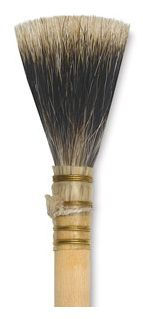
The badger brush is a flat fan-shaped brush used to smooth out visible brushstrokes in layers of paint and to create almost smooth transitions between adjacent tones. However, paint itself is not applied with the badger brush. The badger brush is also used to spread out thin glazes of transparent paint over a dry monochrome underpainting. Over-use of the badger brush creates a mechanical, rubbery effect. Fingers, the palm of the hand and birds' feathers and were also used to smooth and blend paint.
It is probable that Vermeer did not use the badger brush as much as many of his contemporaries who painted in the fijnschilder style. By contrast, his earlier paintings are built up with relatively thick layers of paint with brush visible strokes throughout. Perhaps Vermeer used the badger brush for the blending the flesh tones of the faces of some of his models, especially in the mid-1660s, and in particular, the Girl with a Pearl Earring and Study of a Young Woman.
Balance

Raphael
c. 1504
Oil on wood, 24.1 x 28.9 cm.
National Gallery of Art, Washington, D.C.
Pictorial balance is an arrangement of parts aimed at achieving a state of visual equilibrium between opposing forces or influences. Balance may be achieved by various methods including symmetry and asymmetry. Renaissance painters such as Raphael (1483–1520; Le Stanze della Segnatura) and Leonardo da Vinci (1452–1519; The Last Supper), balanced some of their works around a rigorous symmetrical design. Raphael placed the most important figure in the middle of the composition, with balancing figures on each side, a standard arrangement for all Classically balanced pictures. The doubling of the figures not only gives the main subject a certain importance; it contributes to the peaceful atmosphere and the solemnity appropriate of religious feeling and decorum.
Artists achieve balance by carefully arranging elements like color, form, light, and space, ensuring that no part of the artwork overwhelms another. There are several mechanisms of visual balance, including symmetrical balance, where elements are mirrored across a central axis, and asymmetrical balance, which relies on contrasting yet equivalent weights, such as a small, bright object counteracting a larger, darker one. Radial balance extends from a central point, while crystallographic balance distributes similar elements uniformly across the composition. The use of color, contrast, and implied lines also guides the viewer's eye, helping to maintain balance by directing focus across different parts of the artwork.
One of the most distinctive characteristics of Vermeer's painting is balance. However, the artist usually did not employ symmetry as a means to balance his compositions as did Raphael and other painters of the Renaissance. The great part of his compositions are organized around perpendicular lines which divide the canvas into simple areas of light and dark. Such a simplified organization of the painting's two-dimensional composition (i.e., design) contributes to an overall sense of repose, permanence and purposefulness.

Cornelis de Man
c. 1670
Oil on canvas, 82 x 68 cm.
Private collection
There is scarce evidence that Vermeer planned his compositions using any sort of predetermined mathematical scheme. It is likely that he first determined the poses, positions and attitudes of his figures, as well as the objects which surround them. Afterward, he carefully manipulated each of these compositional elements as well as the distribution of the main masses of lights and darks in order to achieve visual balance, largely in an intuitive manner.
In a recent lecture, Vermeer, Lairesse and Composition,Paul Taylor, "Vermeer, Lairesse and Composition," Hofstede de Groot-lezing (Rijksbureau voor Kunsthistorische Documentatie, The Hague, 2010), 7. the art historian Paul Taylor (click here for an interview) advanced a rather unsettling hypothesis regarding the way Vermeer composed his pictures. Taylor argues that the concept of compositional balance, nowhere mentioned in period art literature, was "unavailable" to the seventeenth-century Dutch artist. "Although Dutch authors wrote at some length about composition, ordinantie, they never suggested that 'visual balance' was a part of the concept as they understood it."
Balpoot (Dutch draw-leaf table)

2nd half 17th century
Oak
rosewood and ebony, 78.5 x 125 x 84 cm.
Rijksmuseum, Amsterdam
The balpoot, whose origin can be traced to the beginning of the seventeenth century, is a draw-leaf table that had evolved from a solid everyday object into richy ornamented veneered showpiece. One of the most characteristic features of the draw-leaf table are its bulbous spherical legs, which are most clearly visible in Vermeer's The Art of Painting. Rather than waste an extremely thick piece of wood, the cabinet maker added wood blocks to all four sides of each leg before turning them. Thus, the leg was thickened only at the position of the ball. This process also reduced the chance of splitting the wood. The stretchers between the legs strengthen the table. In the first half of the seventeenth century, they form a rectangle; in the second half of the century, the stretcher moved to the middle of the table with a V-shaped connection at the two ends, a so-called double-Y form. The tables that appear in Vermeer's paintings appear to have the stretchers of the later type.
Cornelis de Man
c. 1670
Oil on canvas, 82 x 68 cm.
Private collection
The extendable table seen in the Woman Holding a Balance various times in Vermeer interiors, as was represented many times in Dutch painting of the time and would have been considered a luxury item. One painted example is featured in A Man Weighing Gold (c. 1670) by Cornelis de Man (1621–1706).
The Rijksmuseum possesses a similar table. The legs have a striking bulbous form. The remarkable bun-shaped feet later provided the Dutch name of this style of furniture—balpoot. The frame below the tabletop is decorated with volutes. Under this, the legs are joined by a double Y-frame stretcher. A thin veneer of rosewood has been cemented to the oak. Some parts have been decorated with ebony. The table measures 78.5 x 125 x 84. cm.
Tables were very expensive in the seventeenth century. Many families made do with a few planks placed on two barrels.
Bamboccianti

Jan Miel
1653
Oil on canvas, 68 x 50 cm.
Museo del Prado, Madrid
The term Bamboccianti refers to a group of painters active in Rome in the 17th century who specialized in scenes of everyday life, particularly focusing on the lower classes, peasants, and soldiers. The name derives from the nickname of Pieter van Laer (c.1599–c.1642), a Dutch artist who was small in stature and called "Il Bamboccio"(meaning "puppet" or "doll"). Van Laer developed a style of painting that depicted the daily existence of common people in a detailed and often humorous way, a contrast to the grand historical and religious themes favored by many of his contemporaries. His approach was adopted by other Northern European artists working in Rome, particularly Dutch and Flemish painters, creating a loosely affiliated school of genre painters known as the Bamboccianti.
These painters rejected the idealized vision of Italianate landscapes and grand historical narratives that dominated Roman art, instead embracing a more naturalistic approach. Their works, often small in scale, presented lively and anecdotal scenes of Roman street life—markets, taverns, bandits, beggars, and drunken revelry—depicting the rawness of everyday existence with sharp observation and skillful execution. Despite the realism, the Bamboccianti were sometimes accused of being too vulgar or lacking in nobility, leading to mixed critical reception in their time. However, their influence persisted, and their depictions of street life can be seen as precursors to later European traditions of genre painting.
In the context of 17th-century Dutch art, the Bamboccianti were part of a larger trend in which artists from the Northern Netherlands traveled to Italy, absorbing and transforming Italian styles while maintaining distinctly Dutch sensibilities. Many Dutch artists who spent time in Rome returned home and continued to paint in a manner influenced by their experiences abroad. Among them was Jan Both (c.1618–1652), who, while not a strict Bambocciante, adapted the Italianate landscape style into a more Dutch idiom. Artists like Johannes Lingelbach (1622–1674), who spent years in Italy, painted animated market and street scenes that reflect the influence of Van Laer and his circle.
While the Bamboccianti were primarily active in Rome, their influence reached the Dutch Republic, where genre painting flourished. Dutch artists such as Adriaen van Ostade (1610–1685) and Jan Steen (1626–1679) also depicted scenes of lower-class life with humor and detail, though in a distinctly Dutch setting rather than an Italian one. Steen, in particular, shared the lively and sometimes chaotic compositions seen in the works of the Bamboccianti, though his figures often carried moralizing or satirical undertones.
Although Vermeer did not engage directly with this style, the broader Dutch fascination with capturing everyday life in art—whether through domestic interiors, tavern scenes, or street life—owes something to the approach pioneered by the Bamboccianti. Their insistence on the artistic value of ordinary people and everyday activities helped shape the evolving notion that genre painting could stand alongside history painting as a worthy artistic pursuit.
Michael Sweerts (1618–1664) is sometimes associated with the Bamboccianti, but he does not fit neatly within the group. Though he lived in Rome during the 1640s and painted scenes of everyday life, his approach was more refined and classical compared to the raw, often exaggerated realism of artists like Pieter van Laer (c.1599–c.1642) and Johannes Lingelbach (1622–1674). Sweerts' genre scenes often have a quiet dignity, with carefully composed figures and a sensitivity to light and atmosphere that set his work apart from the more boisterous and anecdotal style of the Bamboccianti.
Unlike the Bamboccianti, who focused on street life, beggars, and rough tavern scenes, Sweerts also painted elegant genre subjects, as well as history paintings and allegorical works. His depictions of artists' studios and young men in various states of contemplation suggest an intellectual and philosophical engagement with painting, quite distinct from the more informal storytelling of Bamboccianti works. His use of soft, diffused light and balanced compositions shows an awareness of classical ideals that was less common among the Bamboccianti.
That said, some of his paintings, such as those depicting lower-class figures and soldiers, do show a connection to the themes of the Bamboccianti. His ability to capture the individuality and psychological depth of his sitters, however, points to a broader range of artistic influences, including Caravaggio and the Flemish tradition of figure painting. In this sense, while Sweerts intersected with the Bamboccianti movement in Rome, his work remained more independent and difficult to categorize.
Banketje (little banquet piece)
A banquet piece—in Dutch a banketje—is a still life painting that features a lavish arrangement of expensive foodstuffs and serving pieces. A typical banquet piece might include such luxury items as lobsters, oysters, exotic fruits and decorated pies in raised crusts. Banketje translates literally from the Dutch as "little banquet." These works often carried moral and symbolic undertones, subtly reminding viewers of the impermanence of earthly pleasures.
Willem Claesz Heda (1593/1594–c. 1680/1682), one of the greatest Dutch still-life artists, was noted particularly for breakfast and banketje pieces. Claesz is believed to have pioneered the development of the monochrome banketje, a sort of quietly restrained still life composed in sober tones but imbued with an extraordinary sense of naturalism.
Baroque

Gian Lorenzo Bernini
1647–1652
Marble, Life-size
Santa Maria della Vittoria, Rome
The word Baroque is elusive; it does not accurately define or even approximate the meaning of the style to which it refers. It may have been derived from a medieval philosophical term connoting the ridiculous or the strange, or from the Portuguese "barocco" or the Spanish "barueco" to indicate an irregularly shaped pearl.
Once a term of disapproval, Baroque has come to signify a taste for extravagant forms, often heavy ornamentation and dynamic effects, whether in architecture or in other media. The Baroque period in art history is from about 1600 to about 1750. The term covers a wide range of styles and artists. In painting and sculpture there were three main forms of Baroque: (1) sumptuous display, a style associated with the Catholic Counter Reformation and the absolutist courts of Europe (Gian Lorenzo Bernini (1598–1680), Rubens (1577–1640); (2) dramatic realism (Caravaggio (1571–1610); and (3) everyday realism, a development seen in particular in Holland (Rembrandt (1606–1669) and Vermeer). In architecture, there was an emphasis on expressiveness and grandeur, achieved through scale, the dramatic use of light and shadow, and increasingly elaborate decoration. In a more limited sense, the term "Baroque" often refers to the first of these categories. Conventional wisdom has it that Baroque emotionalism was a response to the last meeting of the Council of Trent (1563), which fought the developing Reformation by enjoining artists to show spiritual truths as realistically and expressively as possible to keep viewers faithful to the Church of Rome.

Peter Paul Rubens
c.1621–1625
Oil on canvas, 394 x 295 cm.
Louvre Museum, Paris
Baroque was the first style to have a significant worldwide impact. It spread from Italy and France to the rest of Europe, then traveled via European colonies, missions and trading posts to Africa, Asia and South and Central America. The style was spread through international trade in fashionable goods, through prints, and also by traveling craftsmen, artists and architects.
Chinese carvers worked in Indonesia; French silversmiths in Sweden; Italian furniture makers in France; sculpture was sent from the Philippines to Mexico as well as Spain; London-made chairs went all over Europe and across the Atlantic; French royal workshops turned out luxury products in the official French style that were both desired and imitated by fashionable society across Europe. However, Baroque also changed as it crossed the world, adapting to new needs and local tastes.
Battle Scene
Battle scenes are works of art that depict armed conflict, either real or imagined, often highlighting dramatic moments of violence, strategic engagement, or heroic confrontation. As a subject, battle painting has ancient origins, appearing in Greek and Roman art, and later in medieval manuscripts, where it usually served narrative or commemorative functions. During the Renaissance, artists began to portray battles with more realism and spatial coherence, aligning with humanist interests in Classical history and the rediscovery of antique military valor. Italian artists such as Paolo Uccello (1397–1475) and Leonardo da Vinci (1452–1519) pursued the challenge of organizing complex bodies of figures in perspective, capturing movement and chaos without losing visual order. Elsewhere in Europe, particularly in the Holy Roman Empire and Flanders, battle scenes became important vehicles for dynastic glorification, often monumental in scale and theatrical in tone.

Paolo Uccello
c. 1438
Tempera on panel, 182 x 317 cm.
National Gallery, London
In the 17th-century Netherlands, battle scenes formed a distinct but relatively modest branch of painting, influenced both by local military experience and by the wider European tradition. The Eighty Years' War, which stretched from 1568 to 1648, played a significant role in shaping the cultural memory of conflict, and painters responded by depicting engagements on land and sea, sieges, cavalry charges, and the everyday lives of soldiers. However, unlike the grand historical canvases of Catholic courts or absolutist monarchies, Dutch battle scenes were often smaller in scale and focused more on observation (naer het leven) than on triumphalism. They were more likely to be purchased by private citizens than commissioned by the state, and as such, they sometimes emphasized spectacle or anecdote over political allegory.
Artists such as Jan Martszen de Jonge (1609–c. 1647) specialized in cavalry skirmishes and land battles, often set in open terrain with scattered trees and distant villages. His scenes balance action with order, giving attention to armor, horse poses, and banners, all painted with crisp detail. Another key figure was the Flemish-born Sebastiaen Vrancx (1573–1647), who painted many ambushes, battlefield camps, and plundering episodes, often infusing them with a narrative tone. Though Vrancx worked primarily in Antwerp, his paintings were collected in the Dutch Republic and had a strong influence on northern artists. Pieter Snayers (1592–1667), also Flemish, was known for panoramic depictions of military campaigns, sometimes based on actual topography, which gave them the flavor of visual reportage.
Naval battles formed a particularly Dutch variant of the genre, reflective of the Republic's maritime ambitions and repeated engagements with England and other sea powers. Willem van de Velde the Elder (c. 1611–1693) and Willem van de Velde the Younger (1633–1707) created detailed representations of naval encounters that combined dramatic movement with rigorous ship portraiture. Their works were grounded in firsthand observation, and they sometimes accompanied Dutch fleets to record events as they unfolded. This directness of approach distinguishes Dutch marine battle scenes from more allegorical treatments elsewhere in Europe.
A curious and particularly unique offshoot of battle painting in the Dutch context was the guardroom scene. These paintings depict soldiers not in the heat of combat, but at rest or at leisure—drinking, gambling, polishing weapons, or engaged in conversation in domestic interiors or makeshift barracks. Though seemingly removed from the battlefield, these works offered a parallel reflection on military life, one that balanced bravado and misbehavior with moments of quiet humanity. Artists such as Pieter Codde (1599–1678), Jacob Duck (c. 1600–1667), and Willem Cornelisz Duyster (1599–1635) excelled in this genre, which merged the figure painting of daily life with military costume and subtle moral undertones. Guardroom scenes may have offered gentle critiques of military idleness, or simply amused viewers with scenes of swaggering soldiers and sly barmaids, but they also extended the vocabulary of battle imagery into the realm of peacetime observation.

Anthonie Palamedesz.
1632
Oil on wood panel, 43.34 x 78.74 cm.
Minneapolis Institute of Art, Minneapolis
Although Vermeer never painted a true battle scene, he did respond—indirectly and with considerable subtlety—to one of its more domesticated offshoots: the guardroom scene. Known in Dutch as the kortegaard (guardroom scene), this genre emerged in the 1620s and was pioneered by painters such as Willem Cornelisz Duyster (1599–1635) and Pieter Codde (1599–1678). These artists shifted the setting from the battlefield to the interior, portraying soldiers at ease in taverns or makeshift barracks, engaged in drinking, card-playing, or flirtation. While often lighthearted, these scenes sometimes carried a quiet moralizing tone, pointing to idleness, vanity, or the transient nature of worldly pursuits.
Whatever narrative Vermeer intended in Officer and Laughing Girl, the imposing male figure—marked by his sash, feathered hat, and confident posture—clearly represents a military officer, quite possibly affiliated with the Delft Civic Guard. As in nearly all his works, Vermeer built upon established pictorial models, yet he transformed them through his distinctive sensibility. While the composition borrows from the visual vocabulary of the guardroom scene, Vermeer eliminates its boisterous, crowded atmosphere in favor of quiet intimacy and psychological presence. The result is a painting that gestures toward one of the most commercialized genres in mid-century Dutch art, while simultaneously standing apart from it.
Beach Scene
In general terms, beach scenes in art refer to depictions of coastal landscapes, seaside leisure, or marine labor. While the sea had long been a subject in painting, beach scenes as a distinct genre gained prominence in European art during the 16th and 17th centuries, especially in areas where the coast played a critical economic or cultural role. These works could highlight natural beauty, maritime activity, or the dynamic interaction between land and sea. In earlier periods, artists often portrayed the sea in religious or mythological contexts—such as the stories of Jonah or Saint Jerome—or as dramatic backdrops for shipwrecks and storms, drawing on a tradition rooted in classical antiquity. However, by the early modern period, especially in the Netherlands, depictions of real beaches, fishermen, and coastal towns became more common, reflecting the growing importance of seafaring and trade, as well as a new appreciation for the everyday.
In 17th-century Dutch culture, beach scenes took on a variety of meanings that went beyond simple landscape painting. The Dutch Republic, with its extensive coastline and thriving maritime economy, had a population intimately tied to the sea. Artists portrayed beaches near Scheveningen, Katwijk, and other coastal villages, capturing both the daily lives of fishermen and the recreational habits of urban visitors. These works could serve as quiet meditations on the rhythms of nature or, alternately, as subtle reflections on transience and mortality—especially when the sea appeared stormy or ships were wrecked offshore.
Hendrick van Anthonissen (1605–1656) painted several beach scenes that show fishermen hauling nets, beached vessels, or calm seas, often with small figures dwarfed by expansive skies. Such images blend observational detail with a restrained, almost poetic atmosphere. Jan van Goyen (1596–1656), though better known for riverscapes, also painted coastal views with wind-blown dunes and distant ships, using a muted palette and delicate brushwork to evoke the hazy light of the Dutch shore. These artists were less interested in dramatizing the sea than in portraying it as part of the lived environment—integral to the Republic's prosperity and identity.

Hendrick van Anthonissen
c. 1630s
Oil on panel, 56.8 x 102.8 cm.
Fitzwilliam Museum, Cambridge
Occasionally, beach scenes also incorporated moral or emblematic content. In some paintings, figures gathered around a stranded whale or shipwreck might suggest divine punishment, human folly, or the fleeting nature of fortune. In others, finely dressed townspeople strolling along the shore contrasted with laboring fishermen, hinting at the complex social layers of Dutch life.
After the Dutch Golden Age, beach scenes experienced a notable resurgence in the 19th century, particularly in France, where they were reimagined through a modern lens. The most important forerunner was Eugène Boudin (1824–1898), often credited with elevating the seaside genre to a new level of artistic sophistication. Boudin painted the fashionable beaches of Normandy, especially at Trouville and Deauville, capturing light, atmosphere, and the genteel leisure of the emerging bourgeois class. His rapid brushwork and focus on changing skies had a direct impact on Claude Monet (1840–1926) , who later acknowledged Boudin's influence on his early development. Boudin's beach scenes bridged the Dutch tradition of coastal painting with the emerging concerns of modernity—transience, tourism, and the interplay between man and nature.
Among the Impressionists, Monet and Boudin stand as the principal painters of beach scenes, though others contributed as well. Monet painted numerous coastal views at Sainte-Adresse, Étretat, and Pourville, emphasizing shifting light and mood rather than narrative or social detail. Edgar Degas (1834–1917) occasionally depicted bathing women on the shore, though more as formal studies than plein-air scenes. Berthe Morisot (1841–1895) also painted beach outings, often focusing on women and children in a domestic, sunlit setting. These painters transformed the beach from a working environment or picturesque backdrop into a space for leisure, fleeting impressions, and personal experience—marking a key transition in the history of coastal painting.
Though Vermeer did not paint beach scenes as such, in his late Love Letter, an anonymous seascape picture-within-a-picture hangs on the background wall, offering commentary on the scene that unflods in the foreground. According to art historians, it may represent an absent loved one, presumably functioning as a pictorial stand-in for the author of the letter recently received by the seated mistress. Many Dutch women of the time likely experienced the vastness of the globe through their loved ones at sea.
A significant portion of able-bodied Dutch men earned their living from sea trade or the fishing industry, and both Dutch painters and poets drew extensively from seafaring experiences for their imagery. Conversely, the ship in this picture-within-a-picture might be linked to the emblematic motif of the suitor as a ship navigating the sea of love, seeking the safe harbor of his lady's embrace. The motto above the emblem by the poet-polemicis Jan Krul reads: "Even Though You Are Far Away, You Are Never Out of My Heart." In any event, the calm sea and blue sky in the ebony-framed seascape in Vermeer's Love Letter might indicate a positive outcome in love, suggesting the mistress's concerns are unwarranted.
Vermeer is not the only artist to show a seagoing vessel directly behind the protagonists.
Beauty

Titian
c. 1515
Oil on canvas, 79.7 x 63.5 cm.
Uffizi Gallery, Florence
Beauty is a characteristic of an animal, idea, object, person or place that provides a perceptual experience of pleasure or satisfaction. Beauty is studied as part of aesthetics, culture, social psychology, philosophy and sociology. An "ideal beauty" is an entity that is admired, or possesses features widely attributed to beauty in a particular culture, for perfection. Ugliness is considered to be the opposite of beauty.
The experience of beauty often involves an interpretation of some entity as being in balance and harmony with nature, which may lead to feelings of attraction and emotional well-being. Because this can be a subjective experience, it is often said that "beauty is in the eye of the beholder."
There is evidence that perceptions of beauty are evolutionarily determined, that things, aspects of people and landscapes considered beautiful are typically found in situations likely to give enhanced survival of the perceiving human's genes.
The earliest Western theory of beauty can be found in the works of early Greek philosophers from the pre-Socratic period, such as Pythagoras. The Pythagorean school saw a strong connection between mathematics and beauty. In particular, they noted that objects proportioned according to the golden ratio seemed more attractive. Ancient Greek architecture is based on this view of symmetry and proportion. Plato considered beauty to be the Idea (Form) above all other Ideas. ] Aristotle saw a relationship between the beautiful (to kalon) and virtue, arguing that "Virtue aims at the beautiful."
The question of beauty has long been one of the most persistent and debated topics in Western philosophy. Alongside inquiries into the nature of art, it stands as one of the two central concerns in the history of philosophical aesthetics. Traditionally, beauty was ranked among the highest values, together with goodness, truth, and justice. It occupied a key position in the writings of ancient Greek, Hellenistic, and medieval philosophers, and remained central to 18th- and 19th-century thought. Major figures such as Anthony Ashley-Cooper, 3rd Earl of Shaftesbury (1671–1713), Francis Hutcheson (1694–1746), David Hume (1711–1776), Edmund Burke (1729–1797), Immanuel Kant (1724–1804), Friedrich Schiller (1759–1805), Georg Wilhelm Friedrich Hegel (1770–1831), Arthur Schopenhauer (1788–1860), Eduard Hanslick (1825–1904), and George Santayana (1863–1952) each contributed significantly to the discourse. By the early twentieth century, however, beauty had begun to lose its status as a central topic in philosophy and as a dominant aim of the visual arts. A renewed interest emerged in the 1980s, especially through the lens of feminist philosophy, which both reexamined and critiqued the concept.
Beauty is also studied by psychologists and neuroscientists in the field of experimental aesthetics and neuroesthetics respectively. Psychological theories see beauty as a form of pleasure. But since the late 18th century, beauty has lost prestige, and those who taught it in serious art discussion may appear naïve, silly and out of style. In any case, the concept of beauty in art, particularly modern art, is no longer the prime value by which a work of art is appreciated judged.
Modern art historians tend to shy away from the term beauty because it carries a long history of philosophical, cultural, and ideological baggage that makes it difficult to use objectively or universally. The idea of beauty has traditionally been tied to fixed standards—often derived from Classical Antiquity or Renaissance ideals—which emphasized harmony, proportion, symmetry, and moral goodness. These standards were once thought to be universally valid, but over time, they came to be seen as culturally specific and often exclusionary.
In the 20th and 21st centuries, especially after the rise of modernism and postmodernism, artists and scholars increasingly questioned whether beauty should be a central goal of art at all. Many modern and contemporary works aim instead to provoke, disturb, question, innovate, or disrupt. Beauty, in that traditional sense, came to be viewed by some as complicit in systems of power or as a distraction from more urgent social, political, or conceptual concerns.
Moreover, the term beauty suggests a subjective experience—what one person finds beautiful, another may not—and this subjectivity makes it difficult to define or analyze in scholarly terms. Instead, art historians prefer more precise language to describe visual qualities, emotional effects, or cultural meanings. They might talk about composition, visual tension, materiality, or affect, avoiding the more loaded and historically normative term beauty.
Finally, there is also a wariness of the word because it has often been used to devalue art made outside of Western traditions or outside the canon. By rejecting beauty as a universal standard, modern art history seeks to open up a broader, more inclusive field of analysis.
Bentveughels
Bentvueghels (Dutch: "Birds of a Feather") were members of a tightly knit club of Dutch artists in Rome, also known as Schildersbent. The members of the group gathered in a building they believed to be the ancient Temple of Bacchus (but was in fact the Mausoleum of Constantia near the Sant' Agnese), and were notorious for their drinking excesses. In 1720, Pope Clement XI ordered that the group be dissolved.
The Bentvueghels were frequently at odds with Rome's Accademia di San Luca ("Academy of Saint Luke"), whose purpose was that of elevating the work of artists above that of craftsmen. For this reason, before setting off for Italy, artists would first try to become members in their local Guild of Saint Luke so they would have papers to show on arrival. Travel to Italy became a rite of passage for young Dutch and Flemish artists after the publication of Karel van Mander's (1548–1606) Schilder-boeck in 1604.
Often a difficult and in many cases dangerous journey, artists would spend years getting to Italy, using their artistic talents to pay their way. Many never made it all the way to Italy, and many never attempted the trip back once they got there.
Perceptual bias
Perceptual bias in the visual arts refers to systematic tendencies in how viewers interpret images based on habitual patterns of seeing rather than on the image alone. These biases arise from physiology, cultural conventions, and learned behaviors, and they quietly shape how balance, movement, emphasis, and meaning are perceived in a painting. Artists have long worked with such biases, often intuitively, using them to guide attention, regulate mood, and structure visual experience.
One of the most pervasive perceptual biases in Western culture is directional reading bias. Because Western viewers are accustomed to reading from left to right, visual movement in that same direction often feels natural, progressive, or open. Figures that face or move toward the right can appear more active, confident, or forward-oriented, while figures facing left may register as resistant, introspective, or withdrawn. This asymmetry is not inherent to vision itself but emerges from learned habits of scanning images, texts, and scenes. Painters have exploited this bias to create subtle psychological effects without altering subject matter.
Closely related is the bias toward entry-point attention. Western viewers tend to begin reading an image near the upper left quadrant and proceed diagonally or horizontally across the surface. Compositional elements placed early along this visual path carry disproportionate weight. A dominant figure facing into the pictorial field can invite the viewer inward, while one facing outward or toward the edge can interrupt visual flow, creating tension or detachment. Artists used these tendencies to control how quickly a scene unfolds and where the viewer lingers.
Perceptual bias also operates in judgments of weight and stability. Forms placed lower in a composition feel heavier and more grounded, while those higher appear lighter or less secure. Similarly, darker masses are perceived as heavier than lighter ones. Painters rely on these expectations to stabilize compositions or to introduce imbalance deliberately. Such biases are not rules but shared perceptual expectations that make visual organization intelligible at a glance.
In Renaissance art, these tendencies were increasingly systematized. Theories of composition assumed a rational viewer whose eye could be guided through ordered space. Artists such as Leonardo da Vinci (1452–1519) wrote explicitly about directing the viewer's attention through gesture, light, and spatial arrangement, anticipating later understandings of visual cognition. Although not framed in modern psychological terms, Renaissance practice reflects an acute awareness that perception follows predictable paths.
In 17th-century Dutch painting, perceptual bias became a tool of quiet refinement rather than overt display. Painters designing intimate interior scenes relied on the viewer's habits to sustain stillness and inward focus. Figures often face into the pictorial space rather than toward the viewer, encouraging prolonged looking rather than immediate engagement. Subtle asymmetries—such as light entering consistently from one side or objects aligned along a habitual visual path—create compositions that feel effortless precisely because they accord with perceptual expectation.
Vermeer's interiors offer especially clear examples. His consistent placement of windows on the left side of the canvas aligns incoming light with the viewer's natural scanning direction, allowing illumination to unfold gradually across the scene. When figures turn away from the viewer, the resulting lack of eye contact reinforces privacy and absorption. These effects depend less on symbolic meaning than on perceptual bias: the painting feels calm, balanced, and self-contained because it cooperates with how viewers instinctively see.
In the visual arts more broadly, perceptual bias does not limit artistic freedom; it enables it. By working with shared tendencies of vision—directional flow, attentional entry points, perceived weight, and orientation—artists can achieve clarity, tension, or restraint with minimal means. Understanding perceptual bias helps explain why certain compositional choices recur across periods and why small adjustments in direction or placement can profoundly alter the emotional and psychological character of an image.
Biblical Subject Matter
Paintings based on the Bible have a history that stretches back nearly two millennia, evolving alongside changes in theology, patronage, and the status of the artist. The earliest Christian art appeared during the late Roman Empire, when believers—often persecuted—decorated catacombs and sarcophagi with scenes like Jonah and the whale, Daniel in the lions' den, or the Good Shepherd. These images were symbolic, simple, and often ambiguous enough to pass as non-Christian in a hostile environment. They were not meant to be narrative in a detailed sense, but rather to affirm faith and salvation through recognizable visual shorthand.

Unknown Byzantine artist(s)
10th century CE
Mosaic, Hagia Sophia
Istanbul
With the legalization of Christianity and especially after the fall of the Western Roman Empire, biblical imagery found a place in church decoration throughout the early medieval world. During the Byzantine period, icons and mosaics depicted Christ, the Virgin Mary, and key saints or biblical events with a focus on solemnity and divine timelessness. In the West, the Romanesque and later Gothic styles expanded the use of biblical painting across cathedral walls, altarpieces, and illuminated manuscripts. Artists used these images to teach, since most viewers were illiterate, and the visual structure of biblical stories followed didactic principles. Narrative cycles became popular, with scenes from the life of Christ, the Passion, and stories from Genesis or the lives of the apostles depicted in vivid, often hierarchical arrangements.
During the Gothic period, particularly from the 13th century onward, biblical painting began to shift toward greater emotional expressiveness and naturalistic detail. Giotto (c. 1267–1337), working in early 14th-century Italy, gave biblical scenes a new sense of gravity, space, and human emotion. Figures like the Virgin Mary or Christ began to inhabit more believable spaces, with gestures and expressions that spoke directly to the viewer's experience. This development laid the groundwork for the Renaissance, during which biblical painting became one of the highest forms of visual art.
Throughout the 15th and 16th centuries, artists like Fra Angelico (c. 1395–1455), Leonardo da Vinci (1452–1519), Michelangelo (1475–1564), and Raphael (1483–1520) reimagined biblical scenes with dramatic composition, anatomical precision, and intense psychological depth. These works were largely produced in Catholic contexts, where the Church remained a dominant patron and religious art continued to adorn chapels, altars, and cloisters. Northern European artists such as Jan van Eyck (c. 1390–1441) and Rogier van der Weyden (c. 1399–1464) brought a different kind of precision to biblical subjects—rich in texture, symbolism, and detail—often intended for private devotion as well as public display.

Rogier van der Weyden
Before 1443
Oil on oak wood, 220 x 262 cm.
Museo del Prado, Madrid
The Protestant Reformation in the early 16th century marked a turning point. While Catholic regions continued to sponsor biblical art, often in more emotionally charged and theatrical Baroque styles, Protestant territories became more restrained. In places like the Dutch Republic, churches were stripped of religious images, and public religious painting effectively ceased. However, this did not mean the end of biblical art. Instead, it became more personal, more narrative, and in some cases more moralistic, shifting from public worship to private reflection.
In 17th-century Dutch painting, biblical scenes were often integrated into domestic formats, handled with a sense of restraint or psychological intimacy. They were no longer grand declarations of faith in a communal setting but carefully chosen narratives meant to provoke thought, meditation, or quiet admiration in the home. Pieter Lastman (1583–1633), trained in Italy but active in Amsterdam, helped bridge the more dramatic traditions of Catholic Europe with the subtler, more narrative concerns of Protestant patrons. Rembrandt, his student, would later take biblical themes into new territory, not only in painting but also in prints and drawings, emphasizing internal emotion, moral ambiguity, and deeply humanized portrayals of sacred figures.
Other Dutch artists explored these themes with varying tone and focus. Jan Lievens (1607–1674), who sometimes worked alongside Rembrandt, offered biblical works marked by theatrical gesture and expressive contrast. Nicolaes Maes (1634–1693), though later known for domestic interior paintings, began his career with biblical subjects depicted with warmth and clarity. Even painters who are more commonly associated with genre scenes, like Jan Steen, occasionally took on biblical stories and reframed them in everyday contexts, offering gentle satire or didactic overtones. Scenes such as The Prodigal Son or Susanna and the Elders allowed artists to balance the sacred with the familiar, often clothing their figures in contemporary Dutch dress and placing them in recognizable interiors.
By the end of the 17th century, biblical painting in the Dutch Republic had become one of many genres available to collectors, often appreciated as much for its storytelling or moral tone as for its religious content. While the grandeur of earlier altarpieces and cathedral frescoes had no place in Dutch civic or religious life, the biblical tradition continued in new forms, adapted to a society that prized individual reflection, private ownership, and visual sophistication. It remained a deeply rooted visual language, reinterpreted across centuries to suit the shifting boundaries between faith, art, and public life.
Vermeer is known to have painted one clear biblical scene, Christ in the House of Martha and Mary , which, though based on a New Testament episode, is staged within a 17th-century Dutch interior, lending the sacred event a contemporary, domestic setting. Another work, The Allegory of Faith, while allegorical rather than narrative, contains direct biblical references and symbols drawn from Christian tradition. A third painting, Saint Praxedis, is often considered a youthful work and, although based on an Italian model, may reflect early interest in religious subject matter, though its attribution and intention remain debated.
The motivation behind the young Vermeer's choice of blantanly religious subject matter such as Christ in the House of Martha and Mary is shrouded in uncertainty, possibly stemming from a deeply personal religious conviction. Alternatively, it is plausible that the picture was commissioned by a Jesuit patron, potentially facilitated through Maria Thins (1593–1680)—Vermeer's mother-in-law—who maintained strong ties with Delft's entrenched Catholic circles. Notably, Thins seems to have provided sustenance for the painter and his family throughout his artistic journey.
Nearly every scholar concurs that the Allegory of Faith was commissioned, presumably, by someone with Catholic ties. Some believe that a Jesuit publication that contains the only contemporary reference to a glass ball (which hangs from the ceiling) and the indisputable Jesuit leanings of Vermeer's strong-willed mother-in-law point towards the Jesuits themselves. But, as Walter Liedtke points out, Jesuits were more inclined towards conventional imagery. He suggests Michiel van der Dussen, a well-to-do Catholic and important supporter of the Delft Bagijnhof, a community of Catholic lay-women, as a likely candidate. These women lived like nuns but didn't take formal vows, dedicating themselves to prayer and charitable works.
Other than the presnt painting and, perhaps, the Saint Praxedis, Vermeer painted at least one other painting with Biblical subject matter, a so-titled The Visit to the Tomb, which ppeared in the 1657 inventory list of Amsterdam art merchant Johannes de Renialme, indicating it was produced that year or earlier. Unfortunately, this painting has since been lost, with no known descriptions or visual evidence of its existence. Gregor Weber posits that while it's believed the painting portrayed the discovery of Christ's empty tomb on Easter, it is uncertain which biblical account Vermeer was inspired by—the more dynamic description in the Gospel of Saint Matthew (28:1–6) or the subdued retellings by Saint Mark (16:1–6), Saint Luke (24:1–6), and Saint John (20:2–20)—it's plausible that the artist was inclined towards the latter, more commonly depicted narrative.
Although the Bible had been one of the most important sources of inspiration for European painters, by the mid-17th century, still life, portraiture, landscape and interiors had largely replaced traditional religious and historical subjects in the Netherlands. Just the same, contemporary art theorists still defended the intellectual and moral superiority of istoria, or history painting and many of the most ambitious painters, like Rembrandt, devoted their energies to its mastery.
Binder
See also Drying Oil.
Binder is a substance in a paint that holds together (binds) the pigment—the actual coloring substance of paint—and makes the paint stick to whatever it is painted on, in oil painting, an unctuous natural drying oil such as linseed, walnut or poppy oil.
The history of binders in paint stretches back to prehistoric times, when early humans in caves used natural materials to create pigments and mix them with binders to make them adhere to surfaces. The earliest known binders were organic in nature, including animal fats, blood, and plant sap, which were combined with earth pigments like ochre, charcoal, and iron oxides. These primitive paints, applied with fingers, brushes made from animal hair, or blown through hollow bones, were remarkably durable, as evidenced by the well-preserved cave paintings of Lascaux and Altamira. The choice of binder was practical, dictated by what was available locally and what could best fix the pigments to the rock walls.
As civilizations advanced, so did the sophistication of binders. In ancient Egypt and Greece, artists commonly used egg tempera, a mixture of pigments and egg yolk, which provided a smooth and fast-drying medium ideal for panel paintings and wall frescoes. Wax-based encaustic paints were also popular in Egypt, particularly for funerary portraits, offering rich colors and a durable finish. In Rome, binders expanded to include a wider range of animal-based glues and milk-based casein, which were mixed with pigments for frescoes and mosaics.
During the medieval period, egg tempera continued to dominate in Europe, particularly for religious iconography on wooden panels. Artists prepared their own paints by grinding pigments and blending them with egg yolk or glair, a binder made from egg white, which dried rapidly to a hard, matte finish. The use of oil as a binder, although known earlier, was refined in Northern Europe by the 15th century. The development of linseed oil as a binder, particularly in the Low Countries, marked a significant turning point. Oil not only allowed for smoother blending and richer, more translucent colors but also extended the working time for artists, facilitating greater detail and spatial depth. This innovation reached its peak during the Renaissance, with painters like Jan van Eyck (c. 1390–1441) perfecting the oil medium to achieve unprecedented realism and luminosity. By the time of the Italian Renaissance, oil paint had largely supplanted egg tempera, enabling artists to create lifelike textures, subtle gradations of light and shadow, and complex compositions that would define the era's masterpieces.
Precious little is known about the binders in Vermeer's paints. It is generally believed that he used linseed and walnut oil, although like all Dutch painters, he must have known stand oil as well. The value of stand oil for fine painting has long been recognized and it seems that it was commonly employed by Dutch and Flemish painters. No traces of stand oil have been found in the works of Vermeer but this is probably because specific tests must be performed to detect it and most of the artist's canvases have not been examined in depth.
Blending / Overblending
Blending refers to the technique of smoothly transitioning between colors, tones, or shades to create a seamless and natural appearance. It is an essential skill for achieving realistic effects, particularly in rendering skin, fabric, skies, and other surfaces where gradual shifts in light and shadow are necessary. Blending can be accomplished using various mediums—by feathering strokes in drawing, smudging pastels, or using a soft brush and wet-in-wet techniques in painting. The goal of blending is to eliminate harsh lines and create a convincing illusion of depth and form by mimicking the way light interacts with surfaces in the real world.
One of the most common traits of the amateur painter is to overblend the transitions between lights and darks in the belief that the smoother the modeling, the greater will be the illusion of reality. However, overblending produces exactly the opposite result; color becomes tired, the sensation of natural light disappears and form becomes mushy and heavy. Much as modern art teachers do today, 17th-century art writers admonished against overblending time and time again. Willem Goeree (1635–1711) wrote "young Draughtsmen at the beginning of their studies almost always have a dislike for firm edges and flatness, seeming instead to take more delight in, indeed, to be drawn by nature towards, a soft and spongy (voose) haziness (dommeligheid)." Samuel van Hoogstraten (1627–1678) wrote, "if you fiddle about with trying to smooth everything sweetly away, you run the risk of getting lost entirely." "It is above all desirable that you should accustom yourself to a lively mode of handling, so as to smartly express the different planes or surfaces (of the object represented); giving the drawing due emphasis, and the coloring, when it admits of it, a playful freedom without ever proceeding to polishing or blending: for this annihilates feeling, supplying nothing in its stead but a sleepy constraint, through which the legitimate breaking of colors is sacrificed. It is better to aim at softness with a well-nourished brush, and, as Jacob Jordaens (1593–1678) used to express it, 'gaily lay on the color,' caring little for the even surface produced by blending; for, paint as thickly as you please, smoothness will, by subsequent operations, creep in of itself." And while distinct edges may make sometimes make modeling appear inordinately stiff, they can always be smoothed, while the modeling done in the "spongy manner" must be rubbed out and restarted. Blending is sometimes called feathering.
Roger de Piles (1635–1709) railed against overblending as well: "We must use them [colors] cleanly and in layers,...the main colors each in their place, without blending with a small paintbrush or with a wide brush..." "To avoid this problem, there are two things to observe: the first is to get accustomed to paint and blend colors promptly and with lightness of brush, with strength, if possible not pass the same place twice. The second is that, after so slightly mixing colors together, we must take care not to brush over pure and fresh colors, which are correct for the places where they are placed, and which are the same tones as those that have already been painted and mixed underneath. To learn how to paint with strength, there is nothing better to do than to copy a few works byr Correggio (1489–1534) or Anthony van Dyck (1599–1641) for the lightness of their brush strokes, and others, Paulo Veronese (1528–1588) and Rubens (1577–1640), for the purity of colors (colorito )."
Blistering
In painting and art conservation, blistering refers to the formation of raised bubbles or distortions on a painted surface, typically caused by moisture, heat, or poor adhesion between layers of paint and the substrate. This phenomenon can occur in oil, acrylic, fresco, and tempera paintings, as well as in murals and decorative finishes, often leading to long-term deterioration if not addressed.Blistering is primarily a result of mechanical or chemical instability in the painting's structure. It often occurs when moisture becomes trapped beneath the paint layer and, upon expansion (due to heat or humidity), forces the paint film to lift. In oil painting, it can also result from improper layering techniques, such as painting over a surface that has not fully dried, leading to adhesion failure. This issue is exacerbated when fatty layers are applied over lean ones, violating the "fat-over-lean" principle, which ensures proper drying and flexibility in oil paintings.
In fresco painting, where pigments are applied to wet plaster, blistering can occur if the plaster was poorly prepared or if moisture infiltration damages the bond between pigment and wall. In tempera painting, which relies on an egg-based binder, blistering can be caused by environmental fluctuations that disrupt the delicate balance of adhesion.
Environmental conditions play a significant role in blistering. Excessive humidity, fluctuating temperatures, or direct exposure to sunlight and heat can cause expansion and contraction, leading to the formation of blisters. This is particularly problematic in panel paintings, where wooden supports naturally expand and contract with changes in humidity. Over time, this movement can weaken the adhesion of the paint, causing blisters or even flaking and delamination.
In art conservation, blistering is a critical issue requiring careful intervention. Conservation methods often include moisture control, re-adhesion of lifted paint layers, and structural stabilization of the support. Treatments may involve the use of heat, pressure, or injected adhesives to secure the compromised areas. However, aggressive restoration techniques can sometimes worsen the problem, so interventions must be carried out with precision.
Historically, many works of art have suffered from blistering due to environmental exposure or improper materials. Mural paintings in humid climates, such as frescoes by Giotto (c. 1267–1337) or Michelangelo (1475–1564), have often required extensive conservation to prevent further damage. In oil painting, works from the Baroque and Rococo periods, which employed multiple layers of varnish and glazes, are particularly prone to blistering if stored in unsuitable conditions.
Blistering remains a concern for both historic and contemporary artworks, underscoring the importance of proper painting techniques, material compatibility, and environmental control in the preservation of paintings.
Blockbuster Exhibition
See also: Exhibition/Art Exhibition and Exhibition Catalogue.

Blockbuster, a word not usually associated with fine art, has now entered the lexicon as a term applied to art exhibitions of particular success and public attendance. Although as early as 1930 (Italian Art 1200–1900, London) art exhibitions had begun to generate wide-reaching public acclaim, the term "blockbuster" became associated with special and spectacular exhibitions in a museum or art gallery in the 1980s. Historically, the London 1972 "Treasures of Tutankhamen" was the grandfather of all blockbusters. Though the show was scheduled to run from April until September, its duration was extended to December. Endless lines formed when exhibits traveled to the U.S. in 1976. In 1995 and 1996 there were several notable blockbusters: various were devoted to the Impressionists and Postimpressionists. The public attendance was massive: 965,000 at the 1995 Claude Monet retrospective at the Art Institute of Chicago. For better or worse, by 1996 blockbuster exhibitions had become mainstream cultural events by no means limited in appeal to art cognoscenti.
Blockbusters became increasingly controversial among professionals in the field. Museums claimed that despite their high costs and nightmarish organizational logistics, blockbusters bring the uninitiated public closer to the art experience, keep regulars coming back and gather critical finances necessary to keep them running. Detractors, who are routinely accused of snobbery, hold the blockbuster has more to do with fast food than haute cuisine, and, in real measurable terms, do not benefit the public: on the contrary. In any case, the era of blockbuster has come to an end if not for other than for fact that the business model on which thye are based has proven ultimately unsustainable.
Blocking In
Before starting a painting, an artist may block in the composition of the painting using rough outlines or geometric shapes to show him how everything fits on the canvas. Today, virtually all portrait painters use this blocking-in method. The artist roughly maps out the composition by laying down simplified forms, tonal masses, and areas of light and dark. It is not concerned with detail or precision but rather with establishing the basic structure, proportions, and balance of the picture. The technique has its roots in classical traditions of preparatory drawing and underpainting, where artists would use a neutral or earth-toned ground and add general shapes before moving to more refined modeling. Blocking in allows the painter to test the overall arrangement of the composition before committing to finer details or final layers of paint.

Jean-Baptiste Camille Corot
1852
Oil on canvas, 32.5 x 40.8 cm.
Kunstmuseum Basel, Basel
Bloom
Bloom is a dull, progressively opaque, white effect caused on varnished surfaces by damp conditions It is caused by vegetable oils and animal fats are the main materials that are saponified.
Blur / Out of Focus
The intentional use of blur or out-of-focus effects in painting stands in contrast to the long-standing tradition of precise contour and linear clarity that dominated Western art from antiquity through much of the Renaissance. In classical and early Renaissance theory, clarity of outline was often associated with intellectual rigor and visual truth. Artists such as Leonardo da Vinci (1452–1519), however, began to challenge this assumption by exploring the use of sfumato, a softening of edges and transitions to evoke atmosphere and a more lifelike perception of depth. This approach allowed for greater naturalism, particularly in rendering the way the human eye perceives space—not as a set of crisply delineated forms, but as a continuous field in which nearer objects appear clearer and more detailed, and distant ones more diffuse.

Attributed to Giorgione
c. 1505
Oil on panel, 48 x 42 cm.
Kunsthistorisches Museum, Vienna
The use of blur or out-of-focus effects in painting represents a subtle but meaningful deviation from the long-dominant ideal of clear contour and precise line, a standard rooted in both classical theory and Renaissance practice. Traditionally, sharp outlines were valued not simply for their aesthetic appeal but because they reflected an intellectual framework: that the world is composed of discrete, knowable objects, each with clearly defined boundaries. The painter, in this view, was expected to render the world with rational clarity, offering the viewer an image in which forms are separated and articulated with precision.
However, this clarity is as much a cognitive construct as a visual one. Our eyes do not perceive the world as a uniformly sharp field. Instead, vision is dynamic. The eye constantly refocuses, shifting from object to object, pulling individual elements into sharpness while allowing the rest of the field to fade slightly or blur. In truth, we never see the entire visual field clearly at once. The crispness of outlines is based not on simultaneous optical perception but on accumulated knowledge—our brain's synthesis of what we expect objects to be. In nature, blur is ever-present in the margins of our vision, though we rarely register it consciously.
Painters, sensitive to these subtleties, appear to have arrived at the solution of blur pragmatically. Rather than trying to reproduce what the eye knows, they began to simulate how the eye sees. In 17th-century Dutch painting, this insight surfaces in quiet but significant ways. Artists like Vermeer began to soften the contours of background objects, allowing them to recede gently from attention, while keeping the focus sharp where the viewer's gaze is meant to rest. This not only creates a more atmospheric and believable space but aligns with actual perceptual behavior. Painters such as Samuel van Hoogstraten (1627–1678) advocated for a calculated distribution of clarity and vagueness, whereby the most important elements are sharply defined and secondary ones remain subdued. This practice mirrored the shifting focal awareness of human vision and allowed paintings to feel both more natural and more composed.
Thus, the selective use of blur was not a break from fidelity to nature but a refinement of it. It acknowledged that vision is a process, not a fixed state, and that pictorial coherence could be built from this understanding. By letting some contours soften, painters created a visual rhythm that mimicked the ebb and flow of seeing—guiding the viewer's attention, suggesting form through light rather than edge, and rendering not just what things are, but how they appear in time and space.
In 17th-century Dutch painting, this tension between sharp contour and atmospheric diffusion was negotiated in diverse ways. Many Dutch artists prized clarity and precision in drawing and detail, especially in works that aimed to display technical skill or provide visual information—qualities highly valued in a culture that associated painting with truth-telling. Artists like Gerrit Dou (1613–1675) and Frans van Mieris the Elder (1635–1681) exemplify this clarity, producing meticulously rendered surfaces with almost microscopic precision, particularly in genre and still life scenes.
Dutch painters, and particularly Gerard de Lairesse (1640–1711), were acutely aware that when the edges of objects are rendered too sharply, the result can be a flattening of the image. A hard contour tends to isolate a form from its surroundings, making it appear as though it ends abruptly at the outline rather than occupying real space. De Lairesse advised artists to avoid such overly crisp boundaries, especially in the foreground, where form should feel more dimensional and integrated into the pictorial environment. He encouraged the subtle softening of contours so that objects might gently "melt" into the background, enhancing the sense of volume and natural recession. This approach promotes roundness and atmosphere, allowing the viewer to perceive forms as turning in space rather than as cutouts on a flat surface. The goal was not to obscure structure, but to create a convincing visual transition between object and environment, echoing how the eye perceives form in the real world—fluidly, with edges that modulate rather than abruptly terminate.
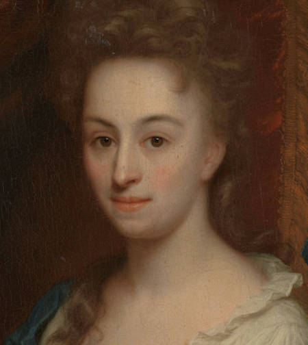
Godfried Schalcken
1699–1706
Oil on canvas, 30 × 25 cm.
Rijksmuseum, Amsterdam
Yet others, including Vermeer, began to adopt subtle blurring effects to modulate depth, guide the viewer's eye, and imbue their compositions with a sense of atmosphere. In Vermeer's paintings, one often finds background elements or secondary objects rendered with a softness that contrasts with the sharper focus of the central figure or object. This optical strategy mimics the behavior of human vision, where attention sharpens one part of the visual field while the rest falls into gentle recession. Such handling can suggest rounding of form, atmospheric depth, or the spatial separation between viewer and object. It is not necessarily a sign of imprecision, but a conscious decision to evoke visual perception as it occurs in real time.
Samuel van Hoogstraten (1627–1678), who wrote extensively on the art of painting, praised the painter who knew how to distribute clarity and vagueness according to the hierarchy of importance within a composition. This idea of visual economy—making some parts of a picture more defined than others—served not only to heighten realism but also to create mood and direct attention. Vermeer's background walls, for instance, are often painted with broad, almost powdery strokes, suggesting plaster texture while remaining out of focus enough to keep the viewer's attention on the foreground.
This selective use of blur, whether to mimic depth of field or to reinforce compositional structure, reveals a sophisticated understanding of perception and pictorial construction. Rather than diminishing clarity, it enhanced the painting's ability to evoke the richness and complexity of visual experience. It allowed Dutch painters to move beyond mere depiction into the realm of quiet suggestion, where motion, breath, and atmosphere are felt as much as seen.Certainly. Here's a refined version of your glossary entry on blur in art, focused on its use to suggest motion, written in the same tone as your other entries.
In the history of Western painting, the use of blur to suggest motion was largely absent until the 17th century, and even then, it appeared only in isolated details. Artists typically relied on sharp contours and stillness to convey clarity and form. Yet in rare cases, slight blurring was employed to imply physical movement. In The Spinners by Diego Velázquez (1599–1660), the blurred rotation of the spinning wheel evokes mechanical motion and continuous activity. Likewise, in The Guitar Player, Vermeer rendered the vibrating strings of the instrument with softened lines, hinting at the unseen force of sound in action.
More systematic uses of blur to express motion did not emerge until the 19th century, spurred by the invention of photography. The motion studies of Eadweard Muybridge (1830–1904) and Étienne-Jules Marey (1830–1904) revealed how the human eye perceives movement in sequence, which deeply influenced the visual arts. In the early 20th century, Futurist painters such as Giacomo Balla (1871–1958) began incorporating this new visual understanding into painting. His Dynamism of a Dog on a Leash (1912) repeats legs and leash in arcs across the canvas, mimicking the multiple exposures of a moving figure. Marcel Duchamp's Nude Descending a Staircase, No. 2 (1912) followed a similar logic, layering overlapping contours to convey continuous descent.
Blur as a symbolic and expressive device reached a new stage in comic art. Rather than softening edges, comic artists often used trailing lines, duplications, or partial transparency to simulate rapid motion. These graphic conventions became part of a standardized visual language, particularly in superhero and action genres, where characters are frequently shown "blurring" across a scene to indicate extreme speed or force.
Unlike the subtle modeling used to round forms or soften transitions, blur in the context of motion serves a distinctly different purpose: to collapse time into a single frame, condensing movement into visible traces. Its presence in early painting is rare and often overlooked, but it prefigures a modern fascination with speed, rhythm, and time-based perception.
Body Color
Body color in art refers to the use of opaque pigments that provide solid, non-transparent coverage on a surface, as opposed to translucent glazes or washes. This technique allows artists to achieve richer, denser colors and to build up layers that can conceal or modify what lies beneath. Body color is particularly effective for rendering textured surfaces, giving a sense of solidity and substance to depicted objects or figures. Opaque paint that has the covering power to completely conceal the underlying color.
Bole

Correggio
1520s
Tempera on canvas, 149.5 × 85.5 cm.
Galleria Doria Pamphilj, Rome
In general terms, bole refers to a type of fine, earthy clay that is traditionally used as a preparatory layer beneath gold leaf in painting, sculpture, and decorative arts. Typically red or reddish-brown in color, though sometimes available in other shades, bole is applied over a gessoed surface before the gold leaf is laid down. Its soft, absorbent quality allows the gold to adhere properly, while its warm tone gives the gilded surface a rich, mellow glow, softening the brightness of the metal and creating depth beneath its reflective finish. The practice of using bole dates back to Antiquity and became highly refined during the medieval and Renaissance periods, particularly in Italy, where gold backgrounds and ornamented surfaces were prized for their symbolic and aesthetic qualities. Bole was often burnished to a high sheen before the application of gold, and after gilding, artists could selectively reveal small patches of the red underlayer through tooling or wear, producing subtle tonal variations that added life and warmth to the overall effect.
In 17th-century Dutch culture and painting, the use of bole was far less common than it had been in the earlier traditions of Gothic and Renaissance art, largely because the aesthetic priorities had shifted. The Protestant ethos, along with the Dutch taste for realism and material modesty, led artists to favor painted illusions of gold rather than actual gilded surfaces. However, bole did not disappear entirely. It continued to be used in certain contexts, particularly in frame-making and luxury decorative arts. Dutch picture frames, often richly carved and gilded, employed bole layers to ensure the gold leaf adhered properly and to achieve the desired warmth and depth in the gilding. The contrast between the gleaming, ornate frames and the subdued, naturalistic paintings they surrounded was deliberate, underscoring both the value of the work and the virtues of restraint and realism within the image itself.
Within painting itself, artists who depicted gilded objects in still life compositions—such as Willem Kalf (1619–1693) and Pieter Claesz (1597–1660)—would have been acutely aware of how light interacted with real gilded surfaces layered over bole. Although they recreated these effects purely with oil paints, their nuanced understanding of how warm undertones affect the appearance of gold allowed them to simulate the radiance of gilded vessels, picture frames, and furnishings with extraordinary fidelity. The ability to convey the presence of bole underneath gold leaf through mere paint speaks to the technical sophistication of Dutch still life painters, who often captured the quiet interplay between luxury and craftsmanship with unmatched subtlety.
Technical studies have shown that red bole was used in the ground layer of The Love Letter by Vermeer. Scientific analysis, including X-radiography and microscopic examination, has revealed that beneath the surface paint layers of Vermeer's The Love Letter, the preparatory ground is a warm reddish color, produced by mixing chalk with a reddish earth pigment, essentially a type of red bole.
This is quite interesting because Vermeer usually worked on grounds of a different color, typically a pale gray or light ochre tone in many of his paintings. However, for The Love Letter, as well as a few other works like The Guitar Player, he seems to have deliberately chosen a warmer underlayer. The red ground would have subtly influenced the tonality of the entire painting, making the warm colors more vivid and giving a gentle glow to the lighter passages, even through the cooler blue and gray elements.
The decision to use a red bole ground in The Love Letter likely helped unify the interior scene, lending it a richness and warmth that harmonizes the complex interplay of textiles, gilded frames, and the soft, atmospheric light. It is another example of how carefully Vermeer manipulated the technical aspects of his materials to produce effects that feel effortless but are in fact the result of very deliberate choices.
Bordeeltje / Bordello Scene

Dirck van Baburen
1623
Oil on canvas, 110 x 154 cm.
Gemäldegalerie, Mainz
The bordello scene genre (in Dutch bordeeltje) which dealt in mercenary love had long been popular with Netherlandish artists. In the 16th century, the pictorial tradition of the brothel was closely associated with the New Testament parable of the Prodigal Son (Saint Luke 15:11-32) who squandered his inheritance on wine, women and song. However, like many other traditional genre themes, during the first decades of the 17th century, the brothel scene became gradually distanced from its religious origins and took on a life of its own.
Brothel scenes became popular in 17th-century Dutch painting for several reasons, reflecting a complex interplay of social, moral, and economic factors. As the Dutch Republic experienced unprecedented prosperity and urbanization, a wealthy and increasingly secular middle class emerged, eager to acquire art that depicted familiar aspects of daily life with a mix of realism, humor, and moral undertones. Brothel scenes, often categorized as genre paintings, catered to this market by presenting lively and sometimes satirical views of human behavior, particularly the follies and vices associated with lust and excess.
These scenes were not merely titillating but served a didactic function as well. Influenced by emblematic literature and Calvinist moral teachings, many brothel paintings contained subtle warnings about the dangers of moral decay and the consequences of succumbing to temptation. Artists like Jan Steen (1626–1679), known for his chaotic and often humorous depictions of taverns and brothels, infused his works with symbols of transience and folly, such as extinguished candles, musical instruments, or coins, which audiences could readily interpret. The combination of moral lesson and lively depiction of everyday life made such scenes appealing to buyers who could enjoy the humor and recognize the moral subtext.
In 1658, the 26-year-old Vermeer painted his first dated work, The Procuress, different in atmosphere, execution and subject matter in respects to the history works. It is not known why the young artist changed so abruptly his artistic course and embraced the so-called bordeeltjes subject. Perhaps, after expected commissions from the nearby court of The Hague failed to materialize, the young painter may have wished to be more in tune with his times even though the motif had already been exploited for decades.
Although the subject of prostitution seems entirely out of key with respect to his later production, it should be remembered that Vermeer was brought up in his father's inn where drinking, shouting and betting must have been the norm. Sex peddling, if not witnessed directly on the premises of Mechelen, must have been unavoidable to some degree for anyone who moved about urban centers.

Gerrit van Honthorst
1625
Oil on panel, 71 x 104 cm.
Centraal Museum, Utrecht
The Procuress, which had close precedents in the Loose Company by Dirck van Baburen (c. 1590–1624) (see image above-left) and A Concert by Jan Gerritsz van Bronkhorst (1603–1661), is perhaps the first of a long line of borrowed compositions on which Vermeer would elaborate his works according to his own sensitivity.
Particularly notable is the Delft painter's detached treatment of the hot-blooded convention. Although the cocky and/or drunk rake makes no secret of his intentions—his hand is unceremoniously plopped flat upon the young prostitute's breast—never was a member of the world's oldest profession was decked out with such fine lace, chaste headgear and a dress pulled so tightly around the young prostitute's neck that it leaves literally everything to be imagined. Compare Vermeer's rendition to The Procuress by Gerrit Van Honthorst (1592–1656), one of the most successful exemplars of the motif.
Borrowing
Artistic borrowing is a long-established practice in the history of art, referring to the conscious or unconscious use of motifs, compositions, techniques, or entire subjects from other artists or traditions. It can take many forms, from direct imitation to subtle adaptation, and has played a crucial role in the transmission of styles across regions and periods. In the Western tradition, the idea of borrowing was not only accepted but expected within certain boundaries. Artists were trained by copying the works of masters, and even innovation often began with reworking established models. In many periods, borrowing from admired sources was seen as a tribute or a way to engage in a dialogue with the past, rather than an act of deception or lack of originality.
The distinction between borrowing and stealing has often been discussed in both critical and popular circles. "Stealing," particularly in modern discourse, can imply a lack of acknowledgment or an exploitative use of another's work. However, in earlier centuries, especially before the codification of modern copyright laws, the boundaries were more fluid. The Renaissance concept of imitatio encouraged artists to learn through emulation, with the goal of eventually surpassing the model—a process known as emulatio. The line between influence and appropriation was not fixed; it depended on context, intention, and execution.
In the Dutch Republic of the 17th century, artistic borrowing was widespread and often sophisticated. The term rapen, which literally means "to gather" or "to pick up" was sometimes used in 17th-century art discourse to describe the act of collecting or borrowing motifs, ideas, or elements from other artworks. It carries the suggestion of casually picking up something that is already available—like fallen fruit—rather than inventing it oneself. In this sense, rapen reflects an attitude toward artistic borrowing that was neither condemnatory nor overly reverent; it was a practical, even natural, aspect of the painter's practice.
Within Dutch culture, where pragmatism and commerce shaped many artistic decisions, rapen could suggest that an artist drew from an existing visual vocabulary much as a merchant selected wares. The value lay not in the raw material but in how it was assembled, reinterpreted, and made fresh. When artists borrowed poses, gestures, or themes, they were raping from a shared cultural field of images—whether Italian prints, local genre scenes, or older religious works—and adapting them for new contexts. The term thus encapsulates a non-dramatic, workmanlike view of influence, in contrast to the modern anxiety about originality and plagiarism.
Dutch painters regularly looked to Italian art for inspiration, particularly the works of Caravaggio, whose dramatic use of light and shadow influenced artists like Dirck van Baburen (c.1595–1624) and Hendrick ter Brugghen (1588–1629). These Utrecht painters did not merely replicate Caravaggio's style but adapted it to their own cultural context, integrating it into scenes of everyday Dutch life or moral allegory.
At the same time, borrowing took place among local artists. Pieter de Hooch (1629–c.1684) and Vermeer both painted quiet domestic interiors, often with similar motifs such as open doors, tiled floors, and figures bathed in gentle light. Their mutual influence is difficult to disentangle, but neither could be said to have "stolen" from the other. Rather, their work reflects shared concerns and visual strategies circulating among Delft artists of the time.
In some cases, borrowing served economic or strategic purposes. Painters might adopt popular formats or themes—like the merry company, the milkmaid, or the letter reader—to align with market demands. Gerard ter Borch (1617–1681), for example, developed a highly refined genre of interior scenes showing figures in elegant attire, often engaged in ambiguous social rituals. Other painters, such as Caspar Netscher (1639–1684), followed this model closely, adapting its aesthetic to attract similar clientele.
Vermeer himself may have borrowed the figure of the lute player in The Concert from a composition by Dirck van Baburen that once hung in his mother-in-law's home, suggesting a layered relationship between private possession and visual quotation. This kind of borrowing was not unusual. The presence of familiar visual motifs helped viewers interpret a painting's message while offering the artist a framework for personal variation.
The concept of "stealing" in this context would have made little sense. Art was part of a shared language, and even recognizable patterns or gestures could be reshaped into something new through subtle shifts in tone, lighting, or composition. Originality lay not in complete invention, but in the artist's ability to breathe new life into what was already known.
Botegga
An artists' shop of the Renaissance, called a botegga, was similar to those of many other crafts. Usually located together in the same area of town, the botegga was usually a small room opened to the street by the raising of heavy wooden shutters, making it a semi-public shop. A number of similar structures still survive on the Ponte Vecchio in Florence, although these are now filled with the stores of some of the world's most exclusive jewelers.
The production of art was a cooperative venture, organized and efficient, with the master, journeymen and apprentices working to satisfy the needs of society, rather than the inspiration of the master; for although art was meant to be beautiful, one of its main goals was to be useful, with patrons who determined not only the size, subject matter, eventual location and the quality of the materials, but the date for delivery as well, although there are many records of disputes regarding the delivery. With each new commission, the master took charge of the overall design. The apprentices did menial tasks until they proved themselves talented enough to learn the art of their masters. The more advanced apprentices and specialized journeymen cooperated with the master attempting to meet the requirements of the commission as envisioned by the master as efficiently as possible. The model of the botegga produced many artists of great stature. Assistants occasionally outgrew their master artistically even during the apprenticeship period. Michelangelo (1475–1564) was formed in the botegga of Domenico Ghirlandaio (1448–1494), Raphael (1483–1520) was formed in the botegga of Perugino (c. 1446/1452–1523) and Leonardo da Vinci (1452–1519 sprung from the botegga of Verrocchio (c. 1435–1488). If the master died after beginning a work, then other members of the workshops immediately took over the completion.

There were generally two or three assistants in a botegga but large-scale operations, which entailed a division between design and the execution, many laborious execution procedures, and many technical preparatory and subsidiary tasks, involved numerous personnel. For example, the construction of the first bronze doors in the Florentine Battistero di San Giovanni by Lorenzo Ghiberti (1378–1455). With perhaps, eleven assistants in 1403. For the great works, In the succeeding Mannerist period, the workshops refined their operating techniques to become even more entrepreneurial, with an army of collaborators and specialists available to speed the execution of works.
The botegga was eventually overcome by the studio, which was reflexive space, a combination of the workroom and a study in which the act of contemplation was incorporated into the process of painting itself.

After: Jan van der Straet
c. 1580–1605 (published in Antwerp)
Engraving, 20.4 x 27.1 cm.
Bourgeois
Bourgeois, was originally related to the word"burgher" (i.e., a citizen of a burg) and now generally taken to mean a typical middle-class person with middle-class moral, economic and other values. Bourgeois, instead, is the standard form used in English for both men and women, functioning as noun and adjective, while bourgeoise is the feminine French form, rarely used in English except in specific historical or literary contexts.
However, while bourgeois refers to the urban, property-owning class whose cultural ideals emphasized order, modest prosperity, and domestic virtue, the term middle class is a broader socioeconomic category that includes a range of non-noble individuals with financial means but does not necessarily imply a specific set of cultural values.

Emanuel De Witte
c. 1660
Oil on canvas, 77.5 x 104.5 cm.
Museum Boijmans van Beuningen, Rotterdam
"Vermeer's paintings of the1660s and early 1670s present the bourgeois domestic interior as a space for polite social ritual and introspective quiet. These paintings have come to define the image of the Dutch middle class: prosperous, private, morally upstanding and self-aware. This picture of bourgeois accomplishment accords well with the aims and ambitions of the Dutch citizen elite, however difficult they were to attain in practice in the bustle of urban life. Some of Vermeer's paintings hint at this tension; others paint it away. It animates his paintings of women writing, reading and delivering letters, which never quite tell us just what is being written or read."Mariët Westermann, "Vermeer and the Interior Imagination," in Vermeer and the Dutch Interior, ed. Alejandro Vergara (Madrid: Museo Nacional de Prado, 2003), 229.
Bravura
The term bravura in the context of painting refers to a confident, masterful execution that draws attention to the artist's technical skill. The word originates from Italian, where it connotes boldness or virtuosity, and it has long been used to describe displays of skill that are meant not only to serve the subject matter but also to impress the viewer with the sheer ability of the painter. Although the term was adopted in musical and literary criticism as well, in painting it tends to refer to fluid, expressive brushwork and seemingly effortless control of complex visual effects—reflections, textures, dramatic lighting, and spatial illusion. Bravura does not necessarily serve realism alone; often, it flirts with a kind of pleasurable excess, a flourish that stands apart from sober naturalism and enters the domain of performance.
While bravura painting is often associated with Italian and Spanish traditions—most famously with artists like Titian (c.1488–1576) and Diego Velázquez (1599–1660)—it found distinctive expression in 17th-century Dutch art, where some painters combined the precision expected of northern naturalism with a heightened sense of technical flair. Nicolaes Berchem (1620–1683), for instance, brought an astonishing elegance to his pastoral scenes, marked by deft handling of foliage, distant light, and the anatomy of animals and figures alike. His touch was fast yet refined, producing atmospheric effects that suggest both control and spontaneity. In the case of Gerrit van Honthorst (1592–1656), his early Caravaggesque work already showed command of dramatic illumination and theatrical staging, but it was in his portraits and large-scale genre scenes where his sure, swift execution became a hallmark of bravura. His ability to modulate light over complex drapery or animate a face with a few precise strokes allowed him to maintain a sense of vivacity even in large commissions.

Nicolaes Pietersz Berchem
Early 1660s
Oil on canvas, 48 x 59.5 cm.
National Gallery of Art, Washington, D.C.
Adam Pynacker (c.1620–1673), though less famous today, was another painter whose technical command verged on bravura. His Italianate landscapes are full of glowing light, intricately rendered reflections on water, and figures absorbed naturally into their surroundings. His treatment of foliage, sky, and the warm diffusion of sunlight across terrain was executed with such confidence that the technical prowess becomes part of the viewer's delight. These painters—while all operating within different genres—demonstrate how Dutch painting was not limited to subdued domesticity or minute detail, but could also rival the grandeur and virtuosity of their southern contemporaries. Bravura, in their hands, became a way to command attention through mastery, all while remaining within the naturalistic and market-oriented framework of the Dutch Republic.
The term bravura is generally not associated with Vermeer, whose work is more commonly linked with restraint, clarity, and the quiet calibration of light and form. Yet in his late paintings, one detects a notable shift in manner, where bravura elements begin to emerge—not overtly, but as subtle demonstrations of technical command. In The Lacemaker, for instance, Vermeer adopts a calligraphic brush style that verges on abstraction. The threads and lace spill into a blur of dabs and pointilles, where the paint itself begins to assert its material presence over the clear depiction of forms. The visual subject—an absorbed girl at her needlework—becomes almost secondary to the astonishing surface display, in which dots, flicks, and strokes of thick color dissolve into passages of near-irrecognizability. Without the broader context of similar domestic themes, the image might be difficult to parse.
This tendency toward painterly display is also visible in the handling of linen sleeves in works like Lady Seated at a Virginal and Lady Standing at a Virginal. In these passages, Vermeer seems to indulge in a freedom that breaks from the descriptive realism of his middle period. The folds, reflections, and textured surfaces are not just rendered but celebrated. The hand becomes visible in the act of painting, and the enjoyment of paint as substance competes with its function as representation. In these moments, Vermeer allows the viewer to witness not only what is painted but how it is painted, suggesting a late-career confidence that flirts, at times, with the bravura traditionally ascribed to more demonstrative artists. Though he remains distant from the overt flamboyance of a Nicolaes Berchem (1621–1683) or a Gerrit van Honthorst (1592–1656), Vermeer's late works show a quiet assertion of mastery—a painter who no longer felt bound to suppress the pleasure of the brush for the sake of visual clarity alone.
Brightness / Brilliant
Brightness is a subjective attribute of light to which we typically assign values such a dim, very dim, bright or very bright (brilliant). Brightness, therefore, is perceived, not measured. For example, the same light emitted by a flashlight may seem very bright in the evening but very dim in the day. Brightness is what is perceived when lumens fall on the rods and cones of the eye's retina. This response is non-linear and complex. The term "brightness" is different than luminance, which, instead, is the objective measure of light that an object gives off or reflects from its surface, measured in objective units such as candela per square meter (cd/m2).
Broken Color
The following is drawn from an abstract of the lecture entitled: "Broken Colours: A Key Concept in Seventeenth-century Colour Theory," by Ulrike Kern, in Colour in the 17th and 18th centuries: Connexions between Science, Arts, and Technology, TU Berlin, 28–30 June 2012)
Broken color was a key concept in 17th-century color theory. The concept of broken colors was most relevant in early modern art theory. The idea of broken colors (corruptio colorum) was derived from antiquity by the Dutch writer Franciscus Junius in his treatise on art of 1641. It refers to color harmonies created by combinations of muted tones that were achieved either by mixtures of pigments or gradations local color. The importance of broken colors was promoted with the help of both aesthetic and scientific arguments, using optical knowledge available at the time.
Charles Alphonse Dufresnoy (1611–1668), in his poem De arte graphica of 1668, attributed the idea of broken colors to the Venetians of the 16th century, especially the circle around Titian (c. 1488–1576), although no such concept existed in Italian art theory. By relating broken colors to reflections of colors, however, Dufresnoy could show that the Venetians must have had a notion of broken colors that derived from antiquity as Junuis had argued. The origination of broken colors in antiquity and Italian Renaissance art was important as an argument for their artistic validity in the seventeenth century.
The concept of broken colors was linked to optical science with the explanation that they were caused by reflections of colors: reflected light that transports the color of the reflecting surface to a differently colored surface, thereby creating a mixture of colors. By relating the artistic concept to a natural light phenomenon, the idea of broken colors and color law were connected.
Concepts related to the idea of broken colors, "friendly" or "related colors," were discussed in Dutch art theory of the 17th century. These concepts describe the ways in which artists would use gradations of similar hues to apply smooth connections of colors to their pictures. Ideas of broken colors include a broad range of possible combinations of color that extends from the work of painters who used a restricted palette of hues such as Rembrandt, to those who, like Rubens, employed contrasts of bright and subdued colors. By applying the method of "breaking" pigments painters were able to create color harmonies and contrasts, as well as the muted tone that was sought after in painting between the sixteenth and the nineteenth centuries.
Brush
(It. penello, old English pencill or pensill)
The brush is a tool used to apply paint to a surface, often consisting of a gathering of bristles held together by a ferrule attached to a handle. The bristles may come from hairs of a variety of animals including boar, squirrel and badger, although today they are often produced synthetically. Red sable hairs are generally considered the finest of hairs. Different shapes are desirable for different paint types and techniques. Large, relatively indistinct areas of paintings, such as the sky or a blank background behind a portrait, were often painted with rugged flat or round-tipped hog's hair brushes. Details were obtained with finely hand-shaped pointed sable brushes. Badger brushes and feathers were commonly used to smooth out areas of paint and subtly blend adjacent areas of paint.
Each artistic medium prescribes the way in which the features of a given object may be most advantageously represented. For example, a round object can be satisfactorily represented by a thin pencil line. The velvety blacks of engraving make it adapted for chiaroscural effects. Oil painting (the most flexible and all-inclusive medium) with the brush can represent almost any kind of object. In the course of painting history, artists gradually favored the so-called "painterly" style. Crosshatching, the only means for rendering precisely in the tempera medium, favored in medieval times, was immediately discarded for the dry graphic effect it tends to produce. Unhindered by the difficulties of working with an inadequate medium, the artist's brush could flow as his mind and eye and knowledge directed. Without the distractions that are caused by any technical limitations, he was free to give his entire attention to the expression of his ideas and the exercise of his abilities.
Curiously, brushes had evolved little over the centuries and only in the 19th century when artist's materials underwent drastic changes, did painters' brushes change as well. In general, painters no longer made their own paints and began to rely on colormen who, in order to ensure shelf-life, added extra materials to paints (fillers) making them much thicker. The soft pliant round brushes used by the old masters to work the thinner, more liquid pigments, were no longer practical. For the application of a dense pigment, stiffer brushes became a necessity and brushes made with hog-bristle became more popular.
In modern painting, particularly in the works of abstract expressionists such as Willem de Kooning (1904–1997), the brush becomes more than a tool of execution—it becomes a protagonist in the visual narrative. The stroke left behind is no longer meant to vanish beneath illusion; instead, it proclaims itself, laden with paint, dragging pigment in such a way that its movement and materiality are inseparable from the meaning of the work. The direction of the stroke, its breadth, its pressure, and even the trace of the individual bristles all remain visible, asserting the presence of the painter's hand and the act of painting itself. The surface ceases to be a window and becomes a field of physical engagement, where the residue of the gesture—the swipe, pull, or jab—captures energy, hesitation, or resolve. The brushstroke, in this context, is both mark and metaphor. Yet while this overt celebration of the brush as a sculptural and expressive tool reached its height in modern expressionism, its physical evidence—whether bold or subtle—has long been part of painting's language. The surface of a painting carries more than an image; it preserves the movements and decisions of the artist, sometimes hidden beneath the veil of illusion, sometimes proudly exposed, but always traceable to the action of hand, tool, and medium.
During the recent restoration of Vermeer's The View of Delft, fragments of coarse hog's hair were found embedded in the paint of the sky area. The artist had evidently used a sturdy brush adapted to apply thick impasto paint.
Brushstroke
The brushstroke occupies a central place in the history of painting, not only as a technical means of applying paint but as a mode of visual communication. In modern painting, its importance became paramount. Painters began to shift away from concealing the means of production and instead made the act of painting itself part of the content. The brushstroke became visible, intentional, even self-aware. Rather than hiding the artist's hand, as was the case in much traditional painting, these modern artists invited viewers to witness the performance of making—a performance embedded directly into the painted surface.

Diego Velázquez
c. 1640/1650
Oil on canvas, 74 x 60 cm.
National Gallery of Art, Washington, D.C.
Diego Velázquez (1599–1660) was one of the first to systematically explore the expressive capacity of the brushstroke. While his early works show the refinement and polish expected of a court painter, his mature style—especially in portraits like Las Meninas or The Needleworker—reveals a confidence in loose, abbreviated strokes that suggest more than they describe. At a distance, the effect resolves into a lifelike image, but up close, the mark-making retains its autonomy. This duality, where the viewer oscillates between image and gesture, draws one directly into the act of seeing and, by extension, into the artist's presence.
Rembrandt (1606–1669) pushed this further. In his late self portraits and biblical scenes, he often applied paint thickly and roughly, allowing the brushstroke to take on a material life of its own. In these works, the paint is not only a medium but a message. It tells of the body, of aging, of struggle, and ultimately of presence. His technique becomes increasingly tactile, and one senses the artist's fingers nearly shaping the flesh of his sitters. Rather than seeking optical illusion, Rembrandt used the stroke to mediate an intimate relationship with the viewer—one built on vulnerability and revelation rather than polish.
Frans Hals (c.1582–1666) brought a sense of immediacy to his portraits with quick, animated strokes that seem to capture the sitter mid-speech or mid-thought. His method was perceived by some contemporaries as unfinished or even reckless, but later painters would recognize its extraordinary energy and clarity. His brushwork does not obscure the subject; it animates it, and in doing so, it draws the viewer into a shared, lively moment.
Adriaen Brouwer (c.1605–1638), though less celebrated today, made striking use of visible brushwork in genre scenes filled with raw emotion and physicality. In his tavern scenes and studies of laughing or shouting peasants, the texture of the paint matches the coarseness of the subject. Here, too, the viewer is not simply observing but almost participating in the image, as if the very bristles that created it still echo in the gestures on canvas.
In contrast, traditional painting—especially within academic circles—often suppressed the visibility of the stroke. The ideal was to render the surface so smooth and uniform that no trace of the artist's labor remained. The viewer was meant to see through the painting to the subject, as though peering through a clean window. This approach emphasized illusion, but it also distanced the viewer from the artwork's making. The painting became an object of contemplation, not of dialogue.
Édouard Manet (1832–1883) played a crucial role in bridging these two attitudes. Deeply influenced by Velázquez, he recognized how visible brushwork could produce a sophisticated, modern aesthetic. His works, such as Olympia or Bar at the Folies-Bergère, confront the viewer not only with their subjects but also with their own painterly construction. Manet's strokes, while not flamboyant, assert themselves as part of the experience, challenging the seamlessness of traditional representation.

Édouard Manet
1882
Oil on canvas, 96 x 130 cm.
Courtauld Gallery, London
John Singer Sargent (1856–1925), though trained in academic methods, mastered the brushstroke in a way that allowed for both economy and brilliance. In works like his Portrait of Madame X or his watercolors, each stroke seems inevitable, effortless, and full of vitality. Sargent was not interested in excessive texture but in the clarity of expression. His brushwork is fast yet precise, capable of suggesting fabric, light, and flesh in a single gesture.
On the more provocative end of the spectrum, contemporary painters such as the Italian portraitist you referred to—likely a figure like Giovanni Boldini (1842–1931), often referred to as the "Master of Swish"—have turned the brushstroke into an overt spectacle. In such works, the strokes are no longer serving the subject but often dominate it. While technically dazzling, this approach can risk collapsing into self-reference. Instead of inviting the viewer into a dialogue, it can become a monologue about skill—a form of aesthetic narcissism in which the brushstroke becomes a display of ego more than communication.
Thus, the power of the brushstroke lies in its dual capacity: it can either connect or isolate, reveal or conceal. In modern and early modern art, it became the bridge between artist and viewer, the trace of thought made visible. When used with sensitivity and purpose, it speaks across centuries. When used only to impress, it can drown out the very subject it was meant to serve./
In Vermeer's later paintings, the brushwork becomes increasingly assertive, though not in the sense of expressive gesture or dynamic motion as seen in artists like Hals or Rembrandt. Instead, Vermeer begins to apply paint in a way that fragments form into distinct, often oddly shaped marks—some elongated, others curled or dabbed, occasionally even impastoed. These brushstrokes do not simply describe a surface; they begin to attract attention to themselves as autonomous elements within the composition. Scholars have observed that in certain passages, particularly in textured fabrics, reflective objects, or background pictures-within-pictures, the marks appear strangely calligraphic—each with a kind of rhythm or flourish that reads almost like a visual shorthand.
This development is curious within the context of 17th-century Dutch painting, which largely favored illusionistic surfaces and subtle technique. Vermeer's earlier works are renowned for their polished calm, where light models form so gently that the transitions are nearly invisible. By contrast, in works such as the The Guitar Player, the paint handling becomes more variable, and at times startlingly modern. Rather than merging into the forms they describe, some strokes assert themselves as independent pictorial gestures, leading to an uneasy balance between illusion and materiality.
In The Lacemaker, Vermeer brings this calligraphic brush technique to its most intense and concentrated application. Nowhere else in his oeuvre does the surface of the canvas so openly revel in the painterly act. The foreground still life—often cited and endlessly studied—contains a scattered arrangement of sewing implements, threads, and perhaps a lace cushion. But these objects are rendered not with clarity or polish, but with a flurry of squiggles, dots, curls, and dashes in various hues: reds, ochres, whites, blues. These marks flow into one another in a rhythm that borders on abstraction.
Removed from context, these brushstrokes defy direct identification. It is only through their placement in relation to the girl's hands, the table, and the larger structure of the painting that the forms resolve into the paraphernalia of lace-making. In effect, Vermeer asks the viewer to "trust" the image. There is no clear delineation, no literal rendering of shape. Instead, he substitutes suggestion for description, letting pure paint—applied with a freedom rarely seen in Dutch painting—do the work of the eye and mind.
This passage has long fascinated critics and historians, not least because it anticipates modes of seeing and painting that would not become widespread until the 19th and even 20th century. The strokes are so loose and free that they recall the touch of artists like Manet or even Monet, who sought to capture the fleeting impression of a scene rather than its precise representation. Yet Vermeer, centuries earlier, uses a similar strategy not to dissolve form altogether, but to invite the viewer into a more participatory act of perception. The eye is not simply given an object; it is asked to construct it from strokes of color.
The result is a small area of astonishing complexity, where representation hovers at the edge of dissolution. It feels experimental, almost playful, yet utterly controlled in its placement and effect. This brushwork does not convey movement or energy in the sense of Hals or Rembrandt, nor does it signal emotional turmoil. Instead, it serves as a meditation on how form is built from vision, and how painting itself can oscillate between recognition and abstraction. In The Lacemaker, Vermeer appears to have reached a personal summit of painterly innovation, quiet and understated, but utterly radical in its implications.
Why Vermeer adopted this more tactile and at times idiosyncratic approach remains an open question. It has been suggested that he may have been consciously searching for a distinctive signature to set himself apart from his peers—painters like Pieter de Hooch (1629–c.1684) or Gabriel Metsu (1629–1667)—who were operating within a similar stylistic territory. Another, more practical theory holds that the increased visibility of the stroke may have allowed him to work more quickly, possibly to meet pressing financial needs during the later years of his life, when his household faced growing debt.
Whatever the motivation, these late passages of calligraphic paint introduce an unusual ambiguity between form and technique. The viewer is caught between reading the stroke as a representation of cloth, wood, or shadow, and seeing it as a material flourish placed with conscious design. This curious tension lends Vermeer's late work a quality rarely seen in Dutch painting of the time—where the process of painting quietly steps into the foreground, not to dramatize itself, but to suggest another layer of meaning.
Brushwork / Brush Handling
Brushwork or brush handling refers to the characteristic way an artist applies paint onto a support with a brush. The intends term not only the movement of the brush but the thickness or thinness of the paint applied. It is understood that brushwork, like handwriting, can be highly individual and can be an important factor in identifying an artist's work. Brushwork encompasses the direction, texture, and visibility of the strokes. It is a fundamental aspect of painting that reveals an artist's style, skill, and intent, influencing the emotional impact of a work. Brushwork can range from smooth and barely noticeable to vigorous and expressive, with techniques such as glazing, scumbling, and impasto offering different effects. Fine, controlled brushwork is often used for detailed rendering and realism, while loose, visible strokes can convey dynamism, atmosphere, or a focus on the painterly process itself.
In modern art theory, emphasis is placed on the idea that a painting should have its own reality rather than attempting to imitate the three-dimensional world. Value is therefore placed on distinctive brushwork because it asserts the two-dimensional surface of the work and the reality of the paint itself. Distinctive brushwork is also seen as valuable because it foregrounds the role of the medium itself. Today, it is often thought that brushwork in itself can be highly expressive, playing a role in conveying the emotion or meaning of the work.
Period art literature of the Netherlands testifies that in the 17-century brushwork was considerably appreciated in itself, even though one of the most important art theorists of the time, Gérard de Lairesse (1641–1711), exhorted painters to use paint as "evenly and lushly" (gerlijk en mals) as possible. He wrote,
PENCILING [brushing], or the management of the pencil [brush], is two-fold, and the two manners resulting very different from each other; the one is fluent and smooth, the other expeditious and bold; the former is proper for neat and elaborate painting, and the latter for bold compositions, as large as the life. But he who practices the former manner has this advantage above the other, that being accustomed to neatness, he can easily execute the bold and light manner, it being the other way difficult to bring the hand to neat painting; the reason of which is, that, not being used to consider and imitate the details of small objects, he must therefore be a stranger to it; besides, it is more easy to leave out some things which we are masters of than to add others which we have not studied, and therefore it must be the artist's care to learn to finish his work as much as possible.
It is ridiculous to hear the disciples of great masters boast, that, by copying large pictures, they shall certainly acquire a great and firm manner, with a fat and bold pencil; and therefore are induced to disrelish every thing that is neat and elaborate; but, after all they can say, it is certain, that he who can pencil best, will study that manner which most exactly exhibits the different natures of the objects which he is to represent; and there are no other pencilings of advantage to a painter.
But further, to convince any one, that a great and bold style of penciling contributes nothing to the art, let us place a work thus painted at a due distance, and then see whether the penciling makes it look more natural: this one advantage it may perhaps have, it may bring in more money; since so rapid a master can dispatch double the work of another, if the vigor of his imagination be equal to the expedition of his hand. Each branch, however, has a peculiar penciling adapted to the nature of the objects to be represented; as the landscape painter, in the leafing of the trees; the cattle painter, in the expression of wool and hair; the ornament painter, in foliage, branching, &c. and the flower-painter, in apparent thinness of texture.

Hendrick ter Brugghen
1627
Oil on canvas, 102.9 x 90.2 cm.
Getty Center, Los Angeles
One of the best examples of the even and smooth type of brushwork can be observed in the works of the 17th-century Dutch painter Hendrick ter Brugghen (1588–1629). This overlooked-by-the-general-public master possessed one of the most sophisticated techniques in the Netherlands, so much that Rubens (1577–1640) acquired several of his works for his personal collection. Furthermore, we know that when the great Flemish master visited the Netherlands he paid a visit to Ter Brugghen neglecting the studio of the upcoming Rembrandt (1606–1669). Closer to Vermeer in brush handling were Pieter de Hooch (1629–1684), Gabriel Metsu, Frans van Mieris, Gerrit ter Borch (1617–1681) and Gerrit Dou (1613–1675), all of whom of which possessed subtly distinctive brushwork. While Pieter de Hooch 's (1629–1684) brushwork is somewhat crude, except in a handful of works executed in Delft, the brushwork of Gerrit Dou is so refined that individual brushstrokes cannot be distinguished except with the aid of a magnifying glass.
Our present-day appreciation of painting technique has been strongly influenced by the 20th-century expressionist understanding of art. As the late art historian Ernst van der Wetering pointed out, it is now a matter of course that, when art lovers draw close up to paintings, they do so with the intent of "reading" the artist's handwriting. Instead, most period discussions evidence that the principal characteristics of paintings executed in the so-called "rough manner," where brushwork is evident, was that they had to be viewed from a distance. The apparent looseness would be read as a convincing, coherent image, superior to one executed in the fine manner. Rembrandt (1606–1669) himself, explicitly warned a client from viewing his painting from too close a range. Period texts approached visible brushwork in relation to the illusionistic, rather than the stylistic quality of the painted image. By varying brushwork, the painter strove to emphasize the sense of "hereness" of the scene and extend the range of optical qualities or textural substances of each object of his composition.
Vermeer's brushwork varied throughout his 20-year career. His earlier religious and genre paintings display a surprisingly broad application of paint. By the mid 1660s, however, all traces of evident brushwork have disappeared in favor continuous modeling and an almost enamel-like surface. In the later paintings, Vermeer's brushwork again becomes visible assuming a curious calligraphic aspect, while the actual paint layer remains extremely thin.
Although Vermeer never sought the microscopic level of detail or the mirror-like smoothness of the fijnschilderen, even his most evident brushwork is extremely subdued with respect to the gestural brush handling of the great Baroque masters Rembrandt, Frans Hals (c. 1582–1666), Velázquez and Rubens (1577–1640). When Vermeer's brushwork is evident, rather than suggesting the emotional state of its maker, it is strangely impersonal. Perhaps only in some details (see the marble veining of the spinet in A Lady Seated at a Virginal) of his latest paintings can we detect more spontaneous gesture, which, however, is confined to the movement of the fingers.
Without fear of exaggeration, the still life of The Milkmaid is among the most satisfying technical passages in Western easel painting. Both the texture of the wicker basket and the fractured bread crust of the still life are captured with exquisite sensitivity and disarming directness. Even the most competent realist painter may scrutinize this passage for hours fail to comprehend exactly how it was created. The play of light is recorded with such fidelity that light seems to emanate from within the canvas itself. The thick impasto of the white-washed wall is enlivened by energetic brushwork that mimics the unevenness of the wall's surface, set of by thin glaze. The maid's head seems to be sculpted with the tiniest of chisels rather than painted with a brush. Minuscule dots and dashes of lead-tin yellow, ochre and a dark mixture of dull brown coagulate into the robust shape and gnarly texture of the young maid's humble garment. In some of the most delicate passages, paint seems to have been "patted on" with the tip of the brush rather than brushed out horizontally.
Soon after this dazzling performance in painting technique, Vermeer's brush-handling became more controlled, or "gentrified," in compliance with the new haute bourgeoisie themes. The Glass of Wine marks the break between the early material paint surface and the "spiritual" surfaces of the following period. Here, conspicuous signs of paint would be at odds with the lacquer of furniture or the sheen of satin. It has been said that the controlled brushwork of these works parallels the ritualized behavior of the protagonists of his scenes.
As is often said, form is suggested rather than described. Paint is applied smoothly in thin, translucent layers. There are passages, such as the head of the Woman in Blue Reading a Letter, that are so exquisitely modeled that no trace of brush can be perceived. Modeling is subtly blurred and the whole seems to be painted with something less substantial than unctuous paint. The uplifted eye of the mistress in the Mistress and Maid is nothing more than an exquisite smudge, a tiny cloud of paint that tells the viewer all he needs to know about the young woman's thoughts.
Buitenpartijen (garden party paintings)

Master of the Prayer Books of around 1500 (fl. from 1485 until 1520)
c. 1490–1500
Illumination on parchment, Dimensions unknown
British Library, London
Dutch paintings of outdoor revelers are today most often referred to as "love gardens" or "garden parties." In Dutch, they were known as buitenpartijen. However, in an inventory listing of 1627 a garden party by Esaias van de Velde ((baptized)–1630 (buried) is recorded as "a little piece depicting a plaisance," a term derived from French which was used in the 16th century to describe Flemish tapestries representing gardens of love. This suggests that 17th-century audiences perceived a relationship between paintings of garden parties and earlier depictions of related subject matter. It is thought that the themes originated in the Middle Ages—of the pleasure-garden—a dream world with various references to love, such as a love castle, the chateau d'amour, mostly in illuminated manuscripts and prints rather than panel paintings, and often as part of calendar series showing the months, or book illustrations. In the Renaissance, such scenes tended to be given specific settings from religion or Classical Mythology, such as the Feast of the Gods which, unlike merry company scenes, was an excuse for copious amounts of nudity. In 16th century, Dutch and Flemish Renaissance painting traditions of genre painting of festivities or parties began to develop, most famously in the peasant scenes of Pieter Brueghel the Elder (c. 1525–1530–1569), which were the first large paintings to have peasant life as their sole subject.

Dirck Hals
1627
Oil on panel, 77.6 x 135.7 cm.
Rijksmuseum, Amsterdam
The action of the Dutch 17th-century garden party motif takes place in an idyllic garden landscape, with an idealized house, with figures a small fountain depicted there symbolic of fertility is one of the classic elements of this motif. Elegant youths congregate and engage in restrained ritualized forms of courtship in the utmost relaxed elegance and luxury framed by a Classical portico before a park setting, frequently with a statue of Cupid. In addition to the well-dressed young couple these pictures usually included, musical instruments, especially lutes, songbooks, wine and a servant. The women wear silky dresses, expensive lace collars, and elaborate hairdos that complement their idealized beauty. The beauty of women was often compared to the beauty of nature. The garden settings were designed to complement the women, and although they are themselves scarcely individualized, they convey an atmosphere of refined gallantry through posture and attire. Another common theme of courtship paintings is the spurned lover. Although By the mid-17th century, many successful Dutch burghers had bought country houses as bucolic retreats and venues for garden parties and social gatherings, garden party paintings cannot be considered attempts to document the actual country houses, gardens or couples.
The garden party garden, which appeared on the cover of a number of songbooks and demonstrated the close links between courtship, art and amatory literature. The widespread popularity of the garden party motif suggests that, counter to what is often suggested, Calvinism did not dominate all aspects of Dutch society of the period, especially, popular culture. The amatory literature of the period advocated moral restraint but also portrayed innocent pleasure in its promotion of courtship.

(detail)
Jean-Antoine Watteau
c. 1718–1719, Oil on canvas
61 x 75 cm., Gemäldegalerie Alte Meister, Staatliche Kunstsammlungen Dresden, Dresden
David Vinckboons (baptized 13 August 1576–c.1632), Dirck Hals (1591–1656), Esaias van de Velde (baptized)–1630 (buried), Willem Buytewech (1591/1592–1624) and Adriaen van de Venne (1589–1662) were masters of the musical party theme, which, in the following decades gave birth to myriad forms of Dutch genre painting. The Dutch garden party, which was eventually re-baptized the fête galante, reached its apex of popularity in the first half of the eighteenth century in France with painters such as Jean-Antonie Watteau (1684–1721) and Nicolas Lancret (1690–1743).
Burgerlijk (burger-like)
Burgerlijk is the Dutch word for "burghers." Though it is notoriously difficult to assign firm class divisions to Golden Age Dutch society, the burgerlijk was a roughly bourgeois grouping to which Netherlanders of a wide range of professions—from modest artisans to well-to-do regents—belonged.
Cabinet of Curiosities
A Cabinet of Curiosities, also known as a Kunstkabinett or Kunstkammer, was a collection of rare, exotic, or extraordinary objects, assembled to reflect the owner's knowledge, curiosity, and social status. These collections, which originated in the Renaissance and flourished in the early modern period, were precursors to modern museums. They typically contained a mix of natural specimens (such as fossils, shells, and taxidermy), scientific instruments, ethnographic artifacts, antiquities, and works of art. Unlike later museum displays, cabinets of curiosities often presented their objects in an eclectic and visually striking manner rather than organizing them by strict scientific classification.
In the 17th-century Dutch Republic, Kunstkammern became particularly popular among wealthy merchants, scholars, and collectors, reflecting both the Netherlands' global trade connections and the intellectual interests of the period. The economic prosperity generated by overseas commerce, particularly through the Dutch East India Company (VOC), enabled collectors to acquire goods from distant lands, including coral from the Mediterranean, porcelain from China, and shells from the Indian Ocean. The combination of scientific inquiry and aesthetic appreciation made these collections highly desirable among the elite.

Frans Francken the Younger
1619
Oil on panel, 56 x 85 cm.
Royal Museum of Fine Arts Antwerp, Antwerp
One of the most famous Dutch collectors of the time was Bernardus Paludanus (1550–1633), a physician and scholar whose Kunstkammer in Enkhuizen contained an extensive array of natural wonders and artifacts from Asia and the Americas. His collection, frequently visited by travelers and intellectuals, demonstrated the intersection of global exploration, trade, and scientific curiosity that characterized the Dutch Golden Age.
Paintings from the period sometimes depicted these collections, emphasizing the intellectual and cultural aspirations of their owners. For example, the work of Frans Francken the Younger (1581–1642), though Flemish, often featured detailed representations of Kunstkammern, showcasing walls lined with paintings, cabinets filled with exotic objects, and scholars admiring rare specimens. These depictions reflected not only the wealth of collectors but also their engagement with contemporary discussions about nature, art, and the wonders of the world.
Dutch Kunstkammern also influenced the way artists approached still-life painting. The careful arrangement of rare and precious objects in pronkstilleven (luxury still lifes) by artists such as Willem Kalf (1619–1693) mirrored the visual and intellectual appeal of collectors' cabinets, highlighting imported goods like Venetian glass, Chinese porcelain, and Persian carpets. The connection between art and collecting was particularly strong, as many Kunstkammern contained both natural wonders and paintings, reinforcing the idea that artistic skill and nature's marvels belonged to the same sphere of human appreciation.
These collections played an important role in the scientific and artistic culture of the Dutch Republic, reflecting its engagement with global trade, intellectual exploration, and artistic refinement. While originally personal displays of status and knowledge, the most significant Kunstkammern eventually formed the foundation of some of Europe's greatest museum collections, preserving the legacy of 17th-century curiosity and collecting.
Cabinet Painting
A cabinet painting (or "cabinet picture") is a small painting, typically no larger than about 50 cm. in either dimension, but often much smaller. The term is especially used to describe paintings that show full-length figures at a small scale—as opposed to a head painted nearly life-size—and that are painted very precisely. From the fifteenth century onward wealthy collectors of art would keep such paintings in a cabinet, a relatively small and private room (often very small, even in a very large house), to which only those with whom they were on especially intimate terms would be admitted.
Later such paintings might be housed in a display case, which might also be called a "cabinet," but the term arose from the name (originally in Italian) of the room, not the piece of furniture. Other small precious objects, including miniature paintings, "curiosities" of all sorts (see cabinet of curiosities), old master prints, books, small sculptures and so on, might also be in the room.
Most of Vermeer's paintings were considered cabinet paintings. One of his pictures, Woman Holding a Balance, listed in the posthumous 1696 Dissius auction in Amsterdam (which included in all 21 paintings by Vermeer) is described as being" in a box." Most likely this box served as a protective device for the most precious works.
Caffa
Caffa is a rich silk cloth with printed or woven designs with ferret silk warp and a linen weft popular in the 16th century. It was originally called satin caphart, satin caffard or capha, by the Flemish. Waves of specialized artisans from Antwerp, Bruges, Rijssel and other weaving centers of southern Flanders eventually migrated to Holland around 1615, 1644, 1655 and 1669 brightening their skills with them. Reynier Jansz. Vermeer, Vermeer's father, produced caffa and was also active as an art dealer.
Calligraphic (style of brushwork)
Calligraphic brushwork refers to a painting technique in which brushstrokes resemble the fluidity, expressiveness, and precision of calligraphy. This approach emphasizes the movement, rhythm, and varying thickness of lines, often creating a sense of spontaneity and vitality. The technique is particularly associated with East Asian ink painting traditions, where the brush is used to create dynamic, gestural forms that balance control and freedom. In Chinese painting, shufa (書法), or calligraphic brushwork, plays a fundamental role, with artists using the same tools and techniques for both writing and painting. Masters such as Guo Xi (c. 1020–c. 1090) and Shitao (1642–1707) applied calligraphic principles to landscape painting, using expressive, energetic strokes to suggest texture and movement.
In the West, calligraphic brushwork appears in various artistic traditions, particularly in Baroque and Rococo painting, where loose, flowing strokes conveyed dynamism and elegance. Artists such as Frans Hals (c. 1582–1666) and Diego Velázquez (1599–1660) used quick, confident brushstrokes to capture movement and emotion, creating lively portraits that appear spontaneous yet meticulously composed. Later, Impressionist and Expressionist painters, including Vincent van Gogh (1853–1890) and Wassily Kandinsky (1866–1944), further embraced a gestural approach, often applying paint with a rhythmic, calligraphic quality.
Across cultures, calligraphic brushwork merges technical skill with expressive freedom, transforming individual strokes into integral elements of composition, form, and meaning.
Calligraphy
In general terms, calligraphy refers to the art of beautiful, stylized, and expressive handwriting. It involves not just the legibility of words but their aesthetic presentation, with an emphasis on rhythm, flow, and balance. Historically, calligraphy has occupied an important place in many cultures, from Islamic manuscripts to Chinese scrolls and medieval European illuminated texts. In Western Europe, the Renaissance brought renewed attention to the classical traditions of writing, and fine penmanship became a cultivated skill among scholars, clerics, and aristocrats. Calligraphy was regarded not merely as a means of communication but as an intellectual and artistic discipline, combining the technical mastery of writing instruments with an awareness of proportion, elegance, and compositional harmony. The best calligraphers often trained as or alongside painters, sharing a sense of precision, design, and creative invention.
In 17th-century Dutch culture, calligraphy held a respected place within the broader world of fine arts. The Protestant Reformation, with its emphasis on individual reading of the Scriptures, further elevated the importance of literacy and thus the appreciation of fine handwriting. Writing masters flourished, producing books of copy examples, called spiegels, to teach penmanship to students and professionals alike. Calligraphy was often practiced as a polite art, something that well-educated men—and to some extent women—were expected to master, particularly among the merchant and professional classes. The aesthetic qualities of calligraphy were valued alongside its practical uses, and skilled penmanship was considered a mark of personal cultivation and social refinement.
This respect for writing skill is evident in Dutch painting. Artists sometimes depicted figures engaged in writing, not simply as a representation of literacy but as an evocation of intellectual and moral virtues. In works by Gerit ter Borch (1617–1681), such as The Letter, the act of writing is rendered with delicate attention to posture, concentration, and the careful handling of the pen, reinforcing the association between writing and personal refinement. Vermeer's interiors also often include young women writing letters, where the graceful bend of a wrist or the precise placement of the pen suggests an unspoken but profound link between the act of writing and the cultivation of inner life.
There were even instances where calligraphy itself entered the realm of fine art in a more literal sense. Some Dutch artists specialized in "pen paintings" (penschilderijen), where the brush was used to imitate the delicate, flowing lines of pen and ink, producing images that mimicked the virtuosity of calligraphic script. Nicolaes Berchem (1620–1683) and Willem van de Velde the Elder (c.1611–1693) both experimented with such techniques, blurring the boundary between painting and drawing.

Jan van de Velde engraved by Simon Frisius
1605
Engraving on paper, dimensions unknown
Collection unknown, location unspecified
In all these ways, calligraphy was deeply intertwined with the ideals of 17th-century Dutch painting: discipline, mastery of technique, understated beauty, and the quiet display of personal and civic virtue through acts of skillful creation.
Camera Lucida
The camera lucida, a device patented by William Hyde Wollaston in 1807, played a pivotal role in the intersection of optics and artistic practice. Unlike the earlier camera obscura, which projected an inverted image onto a surface inside a darkened room or box, the camera lucida employed a prism to superimpose a real-world scene onto the artist's drawing surface. This allowed for more direct tracing while maintaining the ability to view both the subject and the drawing simultaneously.
Although its construction was relatively simple—consisting of a four-sided prism mounted on an adjustable arm—the implications for artistic precision and academic study were profound. By reflecting light at precise angles, the device gave draftsmen, illustrators, and scientists a tool to achieve near-photographic accuracy without relying on cumbersome darkroom setups.
From a historical perspective, the camera lucida emerged at a time when the empirical study of nature was reaching new heights. It appealed to naturalists and anatomists, who used it to document botanical specimens, anatomical structures, and geological formations with remarkable fidelity. Artists, however, maintained a more ambivalent relationship with it. Some embraced it as a means of achieving proportional accuracy, while others, particularly in the Romantic era, dismissed it as a mechanical crutch that stifled artistic intuition.
Among those believed to have used the camera lucida was Jean-Auguste-Dominique Ingres (1780–1867), a painter renowned for his extraordinary draftsmanship and meticulous approach to portraiture. His highly detailed drawings, often noted for their precise contours and delicate shading, suggest an interest in optical aids, though the extent of his reliance on the device remains a subject of debate. Other artists, particularly those engaged in academic and scientific illustration, adopted the camera lucida as a means of ensuring accurate likenesses, though many were reluctant to acknowledge its use.
Despite such debates, the camera lucida remained in use well into the 19th and 20th centuries, even as photography began to eclipse traditional methods of visual documentation. Today, it occupies a fascinating niche in the history of visual technology, embodying both the artistic and scientific aspirations of its era.
While on honeymoon in Italy in 1833, the photographic pioneer William Fox Talbot used a camera lucida as a sketching aid. He later wrote that it was a disappointment with his resulting efforts which encouraged him to seek a means to "cause these natural images to imprint themselves durably."
In 2001, artist David Hockney's book Secret Knowledge: Rediscovering the Lost Techniques of the Old Masters was met with controversy. His argument, known as the Hockney-Falco thesis, is that the notable transition in style for greater precision and visual realism that occurred around the decade of the 1420s is attributable to the artists' discovery of the capability of optical projection devices, specifically an arrangement using a concave mirror to project real images. Their evidence is based largely on the characteristics of the paintings by great artists of later centuries, such as Jean-Auguste-Dominique Ingres (1780–1867), Jan van Eyck (before c. 1390–1441), and Caravaggio (1571–1610).
The camera lucida is still available today through art-supply channels but is not well known or widely used.
Despite the fact that Vermeer literature is full of references to the optical timbre of his work and pro and contra evidence that he used the camera obscura, no one has convincingly argued that he might have used a camera lucida as it was invented many years after the artist's death.
Camera Obscura
The camera obscura is an ancestor of the photographic camera. The Latin name of this device means "dark chamber," and the earliest versions, dating to antiquity, consisted of small darkened rooms with light admitted through a single tiny hole. The result was that an inverted image of the outside scene was cast on the opposite wall. For centuries the technique was used for viewing eclipses of the sun without endangering the eyes and, by the 16th century, as an aid to drawing; the subject was posed outside and the image reflected on a piece of drawing paper for the artist to trace. Portable versions were built, followed by smaller and even pocket models; the interior of the box was painted black and the image reflected by an angled mirror so that it could be viewed right side up. The introduction of a light-sensitive plate by J.N. Niepce created photography.

This mechanical means of recording images is known to have been employed by Canaletto (1697–1768), Vermeer and other Dutch painters of the time, including Torrentius (Johannes van der Beeck,; 1589–1644). It has also been hypothesized that Carel Fabritius (1622–1654), employed the camera obscura as an aid for their painting.
It has been long supposed that Vermeer used the camera obscura as an aid for his paintings although scholars are still in disaccord as to exactly what extent he relied on the device. In recent years, there is a tendency to accept that he did so systematically.
Although the question of if and how Vermeer might have employed the camera obscura has been heatedly debated for decades, in 2002 Philip Steadman put many doubts to rest, clearly demonstrating that this device was indeed an integral, if not indispensable, part of Vermeer's studio practices. This does not mean that Vermeer could not have painted his motifs without a camera obscura, he certainly could have. His talent was notable and there were countless Dutch paintings to learn from, but without the aid of the camera, his paintings would not have displayed those peculiar optical characteristics and nuances of daylight that had gone unnoticed by other artists of his time and make his work so highly treasured today. The camera obscura permitted the artist to explore the planimetric organization of his motifs as the world carefully constructed in the artist's studio laid itself flat on the device's screen.
It is not hard to imagine the effect of camera's image had on an artist so sensitive to the actions of light as Vermeer. Contemporaries who knew the device were stunned by its seemingly magical powers to display nature even as it moves. Constantijn Huygens (1596–1687), a key figure of Dutch artistic culture who had contacts with some of the most important Dutch painters of the time and seems to have been aware of Vermeer's work as well, bought a camera obscura in 1662 in London. He wrote: "It produces admirable effects by reflecting on a wall in a dark room. I cannot describe its beauty in words, but all painting seems dead by comparison...." Huygens took the device back to the Netherlands where he enthusiastically recommended it to painters. Samuel van Hoogstraten (1627–1678), the Dutch painter and art theorist stated: "I am certain that seeing these projections in the dark will give the vision of young painters no small light, for beside acquiring knowledge of nature, one sees here what on the whole or in general a truly natural painting ought to have." For Vermeer, the camera presented alternatives hitherto unexplored venues in pictorial illusionism.
Candle Light Scene
Candlelight paintings, also referred to as nocturnes or night scenes lit by candle or firelight, emerged from a long-standing fascination with the effects of light and darkness in art. These works typically depict interior scenes or night settings illuminated by a single candle, a fireplace, or occasionally moonlight, emphasizing the stark contrasts between illuminated forms and surrounding shadows. The technical challenge of rendering subtle gradations of light, along with the evocative mood created by such lighting, drew painters to explore these compositions across Europe, particularly in the Baroque period. The use of chiaroscuro—strong contrasts between light and dark—became a defining feature of this kind of painting, building on the innovations of earlier masters like Caravaggio (1571–1610), whose dramatic use of tenebrism had a profound effect on many northern painters.

Gerrit van Honthorst
c. 1616
Oil on canvas, 129 x 94 cm
The Cleveland Museum of Art, Cleveland
In the 17th-century Netherlands, candlelight scenes became especially prominent in genre painting, where they offered both a display of painterly skill and a stage for intimate or morally charged narratives. These scenes were not just technically impressive; they also carried associations with secrecy, transience, or introspection. Dutch artists brought a unique sensibility to the motif, often showing everyday interiors or social gatherings touched by a single warm source of light. Gerrit Dou (1613–1675), a student of Rembrandt, was one of the most meticulous painters of such scenes, often using layered glazes and finely controlled detail to create a jewel-like surface that captured the glow of a candle or oil lamp with astonishing delicacy. His work Old Woman Reading by Candlelight is a good example of how light was used to heighten both realism and symbolic overtones—here, the candle becomes a symbol of both wisdom and the fleeting nature of life.
Another example is Godfried Schalcken (1643–1706), who specialized in candlelit scenes that often emphasized sensuality, seduction, or the quietude of night. Schalcken frequently painted figures holding candles close to their faces or bodies, using the light source as a way to intensify flesh tones and emotional atmosphere. His Young Woman with a Candle captures the blend of psychological presence and technical bravura that made these works popular among collectors. Unlike religious night scenes in Catholic countries, Dutch candlelight paintings were generally more secular, aligned with middle-class tastes and domestic settings, though they still often conveyed vanitas themes or moral ambiguities.
Vermeer, though not known for nocturnes in the traditional sense, shared an intense interest in the effects of indoor lighting. While his rooms are more often illuminated by daylight from a window, the careful modulation of light and shadow in his compositions resonates with the goals of candlelight painters, showing the Dutch fascination with capturing the quiet drama of interiors. In short, candlelight painting in the Dutch Golden Age was both a technical challenge and a way of engaging with ideas about perception, time, and the domestic world, all filtered through the intimate glow of a flame.
Canvas
See also: Thread Count and Support.
Canvas is a closely woven cloth, usually linen, used as a support for paintings. A painting executed on canvas may also be referred to as a canvas.
Although canvas as a support for painting was known to the ancients, it became widely used in Italy for oil painting by the end of the 15th century. Until then, both tempera and oil painting had been done primarily on wood panels. The word canvas does not refer to any specific material in the field of textile fabrics; it is applied to a number of closely woven materials of relatively coarse fibers. Linen is preferred for its superior strength; it tears with great difficulty. It is also less hygroscopic than other fabrics which, instead, draw moisture from the air and, upon drying, throw it off. This creates a continual expansion and contraction in which the dry pigment cannot participate, eventually causing the paint to crack.
In Vermeer's time, canvas was not made specifically for the fine arts but principally for bed sheets, sails and clothing.
It is now held that many, if not most, 17th-century painters bought ready-to-use canvases from specialized artisans. Their dimensions may sometimes be associated with local units of measure. The width of a roll of cloth was governed by the width of the 100m: most looms in Twente and Brabant, the main sources for canvas in the Northern Netherlands were two ells (c. 138 cm.) wide, whereas the widths of Italian canvases tend to range between 106 and 110 cm.
Vermeer used fine woven linen canvas for his paintings. For example, Woman Holding a Balance is painted on a plain woven linen with a thread count of 20 x 16 per square cm. Since many of Vermeer's paintings are similar in dimension and proportion to the canvases of many Dutch artists, it has been conjectured that he too may have preferred pre-prepared canvases rather than face the laborious task of preparing them by himself.
Capriccio
In Italian capriccio (plural, capricci) means that which is capricious, whimsical or fantastic. In relation to painting the term is usually used to describe imaginary topographical scenes. A capriccio may be an imaginative composition that blends real and fictional architectural elements, landscapes, or figures in a way that transcends strict topographical accuracy. Emerging as a distinct genre in the late Renaissance and flourishing particularly in the 17th and 18th centuries, capricci were exercises in artistic freedom, where painters could rearrange historical ruins, fantastical structures, and dramatic landscapes to create an evocative mood rather than a faithful representation of reality. The intent was often to elicit a sense of wonder, nostalgia, or contemplation rather than to document an actual place.
In the Netherlands of the 17th century, capriccio-like elements occasionally appeared in the work of landscape painters and architectural specialists, though the Dutch tradition tended to favor realism and careful observation. Artists such as Hendrick van Steenwijck the Elder (c. 1550–1603) and Pieter Saenredam (1597–1665), who painted highly detailed church interiors, generally avoided outright invention, instead adhering to mathematically precise perspective and recognizable structures. However, their manipulation of spatial depth and use of light sometimes introduced a dreamlike quality that bordered on the fantastical.
The painter Dirck van Delen (c. 1604–1671) moved closer to the capriccio tradition in his architectural fantasies, filling his compositions with elegant Renaissance palaces and colonnades that bore little relation to actual Dutch buildings. His work reflected an admiration for Italian architecture, much like the later Venetian capricci of artists such as Marco Ricci (1676–1730) and Giovanni Paolo Panini (1691–1765). Another related figure was Bartholomeus Breenbergh (1598–1657), who, inspired by his time in Italy, often included romanticized ruins in his landscapes, anticipating the more fully realized capriccio style of later painters.

Marco Ricci
Opaque watercolor on paper
37.2 x 61 cm., Morgan Library and Museum
New York
While capricci never became a dominant mode in Dutch painting, the imaginative combination of architectural and landscape elements can be seen in some works by painters like Jan Baptist Weenix (1621–c. 1660) and Johannes Glauber (1646–1726), whose Italianate landscapes sometimes blurred the line between observed reality and artistic invention. Unlike their Italian counterparts, Dutch painters generally tempered their fantasy with a degree of naturalism, ensuring that even their most imaginative compositions retained a plausible sense of depth and atmosphere.
The broader Dutch preference for realism, empirical observation, and precise depictions of cityscapes meant that the full development of the capriccio genre was left to artists elsewhere, particularly in Italy. However, the Dutch fascination with ruins, foreign landscapes, and atmospheric perspective occasionally gave rise to compositions that, while not pure capricci, hinted at a similar impulse to manipulate space and architecture for artistic effect.
The Venetian landscape painter Francesco Guardi (1712–1793) recombined capricci with natural architectural elements, drawn from actual sites, to create inventive relationships for decorative effects.
Caravaggism
Caravaggio's (1571–1610) style consists of a rejection of idealization in favor of a seeming realism vividly depicted in contemporary costumes and settings. Solidly defined figures are represented with expressive and often violent gestures, in unusual and dramatically arresting groups composed within a shallow foreground space. His pictures are realized in a powerful chiaroscuro that emphasizes three-dimensional form. His method of painting was regarded as revolutionary. Instead of following the traditional procedure of working from drawings and sketches (no secure drawings by Caravaggio exist), it is believed he painted directly from the model making modifications as he advanced. As a consequence, his works succeed in creating an immediate and sometimes startling effect on the beholder.
Caravaggio pushed the figures up against the picture plane and used light to give them a sense of immediacy. His style was widely imitated and quickly spread throughout Europe. As a contemporary critic noted, "A characteristic of this school [of painting] is to use a focused light source from high up, without reflections, as though in a room with a [single] window and the walls painted black. In this fashion, the lit and shadowed areas are very light and very dark and give enormous three-dimensionality to the painting, but in an unnatural fashion neither done or even conceived before by such artists as Raphael (1483–1520), Titian (c. 1490–1576), Correggio, or others." What was at issue was not a descriptive naturalism, but a provocative insistence on the physical reality of the scene portrayed.
Vermeer's ties with Italian painting, no longer held in account today, were strongly suspected in the first half of the 20th century. Some scholars believed that the artist traveled to Italy in his early formative years. However, no proof has ever surfaced in regards. Just the same, the Delft artist may have been aware the lessons of Caravaggio through the Utrecht Caravaggists: Gerrit Van Honthorst (1592–1656), Hendrick ter Brugghen (1588–1629) and Jan van Bijlert (1597 or 1598–1671).
John Michael Montias has hypothesized that the young Vermeer may have passed his period of apprenticeship with the elderly Abraham Bloemaert (1566–1651), a not-so-distant relative of his future mother-in-law, Maria Thins (c. 1593–1680). Thins had in her private art collection a number of paintings from the Utrecht school, some of which Vermeer portrayed as so-called pictures-within-pictures on the back walls of his own compositions. Although Bloemaert had never himself been to Italy, various students of his had gone to Rome, where they were strongly influenced by the Caravaggist school of painting. When they came back to Utrecht they familiarized Bloemaert with the new school. Afterward, Bloemaert painted some pictures that display characteristics of Caravaggio's style.
Often cited in reference to Vermeer's supposed familiarity with Italian painting, in May 1672, the artist took part in a committee of artists which was called to The Hague (at the time Vermeer was the head of the Delft Guild of Saint Luke) which had been charged to judge the authenticity of a dubious art collection of Italian master paintings offered to the Grand Elector of Brandenburg. According to Vermeer and his colleagues, the paintings were not Italian at all, on the contrary, "great pieces of rubbish not worth much."
Turkish Carpet
A Turkish carpet in painting refers to the depiction of handwoven carpets produced in the Ottoman Empire, particularly those originating from Anatolia. These carpets, known for their intricate geometric or floral patterns and deep, vibrant colors, were highly valued luxury items in Europe from the late Middle Ages onward. Their presence in paintings often served as a symbol of wealth, global trade, and refined taste. Artists took particular care in rendering the elaborate designs, often emphasizing the textures and folds of the drapery to showcase their technical skill. While some painters depicted these carpets with remarkable accuracy, others altered or simplified their patterns to suit the composition of the work.
In the 17th-century Dutch Republic, Turkish carpets held a special significance in painting, reflecting the broader economic and cultural landscape of the time. As the Dutch became a dominant force in global trade through the VOC (Dutch East India Company), they had direct access to luxury goods from the East, including fine textiles. Turkish carpets often appeared in still life paintings, domestic interiors, and portraits, draped over tables rather than used on the floor, which was the common practice in wealthy Dutch households. Their presence in a scene subtly conveyed affluence and engagement with international commerce, as these carpets were expensive and often passed down as heirlooms.
Artists such as Willem Kalf (1619–1693) incorporated Turkish carpets into their sumptuous still lifes, where they complemented other objects of wealth, such as Chinese porcelain and Venetian glass. In genre painting, Vermeer and his contemporaries frequently included these carpets as table coverings, adding a tactile richness to their carefully staged domestic interiors. The intricate patterns provided opportunities to explore texture and light, and their deep reds and blues often formed a visual contrast with the muted tones of Dutch furnishings and attire. Unlike earlier Renaissance painters, who sometimes distorted carpet designs for decorative effect, Dutch artists strove for a more faithful representation, reflecting their broader interest in realism and material specificity.

Willem Kalf
c. 1660
Oil on canvas, 111 x 84 cm.
Museo Thyssen-Bornemisza, Madrid
Turkish carpets in Dutch painting thus functioned as both aesthetic elements and markers of status, trade, and global interconnectedness. Their meticulous depiction reveals the technical precision of Dutch painters and the society's fascination with luxury goods from distant lands.
The surviving carpets from the 17th century offer valuable insight into the trade, craftsmanship, and aesthetic preferences of the period. Many of these carpets, particularly those woven in Ottoman Turkey, Persia, and the Caucasus, have been preserved in museums and private collections. They are often in remarkable condition, owing to their high-quality wool, intricate knotting techniques, and the natural dyes that have retained their brilliance over centuries. The primary surviving categories of 17th-century carpets include Ottoman Ushak and Lotto carpets, Persian Isfahan and Kirman carpets, and Caucasian rugs, each distinguished by regional weaving traditions and specific design motifs.
Among the best-preserved are the Ottoman Ushak carpets, which feature large-scale floral or geometric patterns. These carpets, woven with a soft pile, were prized across Europe and frequently appear in 17th-century paintings, especially in Dutch interiors. The so-called Lotto carpets, named after their frequent appearance in paintings by Lorenzo Lotto (c. 1480–1556), continued to be produced well into the 17th century and are identifiable by their repeating arabesque designs in red, yellow, and blue. Many of these carpets survive today, found in European cathedral treasuries and aristocratic collections where they were preserved as prized possessions.
Persian carpets from Isfahan and Kirman of the Safavid period (1501–1736) are some of the most refined examples that have survived. These carpets are often characterized by intricate floral and hunting scene motifs, made with silk and fine wool. Many were exported to Europe and can still be found in major collections, including the Victoria and Albert Museum in London and the Metropolitan Museum of Art in New York. The Polish-Lithuanian nobility were particularly fond of Persian carpets, commissioning luxury pieces that later became known as Polonaise carpets due to their European patrons.
From the Caucasus, surviving examples of 17th-century carpets include the so-called Dragon and Star Kazak designs, which feature bold geometric patterns and highly stylized animal motifs. These carpets, often woven in villages and smaller workshops, were exported through Armenian and Ottoman trading networks, reaching markets in the Netherlands and beyond.
One of the reasons we have a relatively large number of surviving 17th-century carpets is their use in religious and ceremonial contexts. Many Ottoman and Persian carpets were gifted to churches, mosques, and royal households, where they were carefully maintained rather than subjected to daily wear. In some cases, fragments of carpets have been preserved in tombs or among ecclesiastical vestments.
While some carpets have survived in excellent condition, others bear the marks of centuries of use, repairs, and alterations. Despite this, they provide an invaluable historical record, allowing scholars to compare their designs with those depicted in paintings. The study of these surviving textiles not only enriches our understanding of 17th-century material culture but also confirms the accuracy and significance of their representations in Dutch painting.
It is generally assumed that the carpets featured in Vermeer's paintings were painted from real models, although some liberties were taken with coloring. The level of detail varies considerably as the late renditions are reduced to abstract pattern, without a single knot visible. Carpet expert Onno Ydema has shown that the carpet in The Music Lesson is a 16th-century Medallion Ushak type, from Turkey, and is faithfully described by the artist.The carpet of The Procuress is of a similar type. The carpet that appears in the Christ in the House of Martha and Mary seems to be almost identical with the one represented in A Maid Asleep, painted a few years later. Both have a broad, light orange border ending in a fringe, but the medallion in the former is yellow, in the latter green, which suggests the artist used one rug as a model and painted imaginary variations of it. Observing the bold but uninspired facture of Vermeer's early carpets (Martha in the House of Martha and Mary The Procuress and A Maid Asleep), the vitality of those in his later interiors is surprising. Another carpet which appears in Vermeer's painting is the so-called Lotto typ. Unlike Dou and the most meticulous Dutch fine painters, Vermeer was not obsessed by the individual knots of the carpets, but the broad patches of color. The patterns were then punctuated with a series of small, roundish splotches (pointillés), which should not be mistaken for literal representations of physical knots but painterly renditions of the camera obscura's disks of confusion.
Cartellino

Carlo Crivelli
c. 1480
Tempera and gold on wood, 37.8 x 25.4 cm.
Metropolitan Museum of Art, New York
A cartellino (Italian for a small piece of paper) was a piece of parchment or paper painted illusionistically, often folded and as though attached to a wall or parapet in a painting, commonly with the artist's name or that of a sitter.
Giovanni Bellini's The Virgin and Child and The Doge Leonardo Loreda in the London National Gallery are among a number of examples of this artist's work with a cartellino, painted as a piece of unfolded paper with creases still visible, attached to the center of the parapet. It creates the illusion of being almost real.
The cartellino signature of Carlo Crivelli's (c. 1430–1495) Madonna and Child appears to be fixed on the foreground cloth with bits of red sealing wax on three of its corners, which enhance the illusion of its illusory presence by casting tiny shadows that anchor it firmly to the cloth. A truly spectacular cartellino is that of the Francisco de Zurbarán's (1598–1664) Martyrdom of Saint Serapion, which bears the name of the saint and the artist's signature below in much smaller but elegant script. The crumpled paper hovers somewhat ambiguously next to the lifeless body of the robed saint, although it is presumably "attached" to the surface of the canvas with a slender nail that projects a slight cast shadow on the paper enhancing its illusionist presence.

Francisco de Zurbarán
Oil on canvas
120 × 103 cm., Wadsworth Atheneum
Hartford, CT
Cartoon
See also: Squaring Method / Spolvero / Doortekenin.
The term cartoon is derived from the Italian word "cartone" which means a large sheet of paper. A cartoon is a full-size and usually detailed preparation on paper for a painting (in fresco, on canvas or panel) or a tapestry.
There are different methods for transferring the composition. The composition could be traced with a stylus thus leaving a faint indentation on another surface. If the reverse was covered with chalk or some other substance, the design traced would be transferred in distinct lines. The reverse could also be rubbed with chalk and the composition then run over with a stylus, so recording the design on the desired surface. Alternatively, the lines of the composition could be pricked with tiny holes; charcoal is then "pounced" through to transfer the design. A third method is for the outlines to be incised with a stylus without anything on the reverse of the sheet.
In some cases, the compositions of cartoons for tapestries, such as those of Raphael (1483–1520) in the Victoria and Albert Museum (Royal Collection), have to be conceived in reverse because of the process of manufacture. This can also apply to engravings.

Raphael
c. 1515–1516
Bodycolour over charcoal on paper, mounted on canvas, 319 x 399 cm.
Royal Collection, London
Catalogue Raisonné
The typical catalogue raisonné is a monograph giving a comprehensive catalogue of artworks by an artist, either in a particular medium or all media. The essential elements of a catalogue raisonné are that it purports to be an exhaustive list of works for a defined subject matter describing the works in a way so that they may be reliably identified by third parties. They may provide some or all of the following:
- Bibliography/Literature that discusses the work
- Catalogue number
- Condition of the work
- Critical assessments and remarks
- Current location/owner at the time of publication
- Date of the work
- Dimension/Size
- Essay(s) on the artist
- Exhibition history
- Full description of the work
- Medium
- Provenance (history of ownership)
- Signatures, Inscriptions and Monograms of the artist
- Title and title variations
- Reproduction of each work
Other terms that may be used in place of catalogue raisonné are: Oeuvre, Catalogo Razonado, Catalogo Ragionato, Catalogo Generale, Opera Completa, Werkverzeichnis, Leben und Werk, Complete Works and Critical Catalogue.
The most recent catalogue raisonné of Vermeer's work are Walter Liedtke's, Vermeer: The Complete Painting, (2008), Vermeer, by Wayne Franits (2015) and Vermeer, Karl Schûtz (2016).
Catalogue Number
Catalogue number is a term used in a variety of ways in museums and other collecting entities. In some museums, a catalogue number is assigned to a work based on its class, so that the number's purpose is description. In some museums, the accession number is called a catalogue number, in which case its purpose is identification. A catalogue number may also be the number assigned to an object in a printed publication or catalogue of a special exhibition or collection.
Since only three of Vermeer's paintings were dated by his own hand, the catalogue numbers given in the Essential Vermeer website are derived from a synthesis of the dates as estimated by four authoritative scholars of Dutch art and Vermeer: Albert Blankert (Vermeer: 1632–1675, 1975), Arthur K. Wheelock Jr. (Vermeer: The Complete Works, 1997), Walter Liedtke (Vermeer: The Complete Catalogue, 2008) and Wayne Franits (Vermeer, 2015).
Catalogue Raisonné
A catalogue raisonné is a comprehensive, scholarly listing of all known works by a particular artist, including details on their provenance, history, and variations. Unlike a simple inventory or exhibition catalogue, a catalogue raisonné is a critical tool for authenticating and studying an artist's oeuvre, offering meticulous documentation of each work's attribution, dimensions, materials, and historical context. These publications are essential for art historians, collectors, and dealers, as they establish a definitive reference for an artist's body of work and help prevent forgeries or misattributions.
In the 17th-century Dutch Republic, while the modern concept of a catalogue raisonné had not yet fully emerged, there were early attempts at documenting artists and their works, often motivated by commercial, scholarly, or reputational interests. The closest parallel from this period can be found in the biographies and artist compendia produced by writers such as Karel van Mander (1548–1606) and later Arnold Houbraken (1660–1719), whose De groote schouburgh der Nederlantsche konstschilders en schilderessen (1718–1721) provided biographical accounts and discussions of artistic merit, though without systematic cataloging of individual works of art.
A more direct forerunner to the catalogue raisonné was the practice of auction and collection inventories, which sometimes listed paintings by specific artists along with ownership details. In the Dutch Republic, as the open art market flourished, detailed estate inventories and auction catalogues became crucial for documenting artworks and their values. Wealthy collectors, such as Constantijn Huygens (1596–1687), often kept records of their acquisitions, sometimes including descriptions of paintings and their attributions. These documents have since provided invaluable information for reconstructing the provenance of works by artists like Vermeer and Rembrandt van Rijn (1606–1669).
One of the most significant Dutch figures associated with the systematic documentation of paintings was Cornelis Hofstede de Groot (1863–1930), who in the early 20th century compiled extensive catalogues of Dutch and Flemish painters, building upon earlier works by John Smith (1781–1855). These publications laid the foundation for modern catalogues raisonnés, which continue to be refined through ongoing scholarship, scientific analysis, and provenance research.
For Vermeer, no comprehensive catalogue raisonné existed in his own time, but later scholarship, particularly the work of Abraham Bredius (1855–1946) and more recently Walter Liedtke (1945–2015), has been instrumental in establishing an authoritative record of his paintings. Because of Vermeer's relatively small output, his works have been closely studied, leading to debates over attributions and the occasional emergence of disputed paintings.
The evolution of the catalogue raisonné reflects broader changes in the art world, from 17th-century inventories and collection records to the rigorous, scholarly publications of today. These works remain indispensable for ensuring the accurate documentation and appreciation of an artist's legacy.
Catchlight
See also: Portrait Lighting / Luster / Highlight / Studio Light / Lighting.
A catchlight is simply the specular highlight of a light source reflected off the surface of the eye. This highlight lightens the iris and adds humidity, depth, sparkle and roundness to the eye, and notwithstanding its tiny dimension, it bestows life in a portrait or photograph. Without catchlights, the eyes will appear dark, opaque and lifeless. At least one eye should have a catchlight to give the sitter life.

Anthony van Dyck
c. 1620
Oil on oak wood, 37.5 x 32.5 cm.
National Gallery, London
Catchlights come in all shapes and sizes, depending on the shape and size of the light source, and its distance from the subject. The reason why most catchlights are positioned at 10 or 2 o'clock is unknown, but the earliest portrait painters found that the most pleasing balance resulted when either of those positions was used. However, it may be that early artists used the sun or light from a large open window in their studios with the result of light originating from above and causing a high catchlight. In any case, catchlights below 9 o'clock, as well as the 3 o'clock position, create relatively unnatural images, because when the sun is down and it is dark, there are no catchlights.
Cinema audiences tend to perceive eyes without catchlight to be lifeless or evil, and for this reason many cinematographers specifically eliminate catchlights on antagonistic characters. Catchlights are a characteristic vocabulary in anime, usually used in an over-dramatized manner as a means to convey exaggerated expressions. Modern portrait photographers go to great lengths to manipulate their lighting equipment in order to ensure the right catchlights.
Chalk
The term chalk, when applied to an instrument for drawing, is used loosely to describe various natural substances formed into sticks for the purpose of drawing or writing.
White chalk is limestone-based. In contrast, black chalk is made from carbonaceous shale found in northern Italy and France. A further variety, red chalk, is a rare form of clay. This last form, introduced in the late 15th century, was favored by the artists of the High Renaissance, and later especially in the 18th century. Since chalk has a low refractive index, when oil paint is superimposed it disappears and can no longer be detected. Chalk was mixed with animal skin glue as a preparatory coating, called priming, in order to seal raw canvas.
Despite the fact that scholars do maintain that Vermeer's The Art of Painting is not a faithful raccount of how he himself painted, the seated painter appears to have used chalk, or white paint, to introduce the basic outlines of the figure on his upright canvas.
Chance / Improvisation
The concept of chance has played a subtle but persistent role throughout the history of art, challenging the common assumption that the making of art is always the product of precise planning and controlled execution. In classical antiquity, artists and writers occasionally acknowledged the intervention of fortune in the success of a work. Pliny the Elder recounts tales of painters whose errors unexpectedly improved their pictures, and such stories suggest that even in highly idealized artistic cultures, there was room to value the unforeseen. During the Renaissance, the dominant ideal was that of mastery—of intellect and hand—but even then, the idea of serendipity or an unplanned result contributing to the beauty of a piece never entirely disappeared. Leonardo da Vinci (1452–1519), for instance, urged artists to look at stains on walls or the forms of clouds as a means of stimulating imagination, implicitly inviting random forms into the creative process.
The Baroque period, including the art of 17th-century Netherlands, was marked by strong pictorial structure and theoretical ideals like welstand and het wel schicken, which emphasized balance and deliberate composition. Nonetheless, Dutch painters sometimes embraced spontaneity within these constraints. Artists like Frans Hals (c.1582–1666), for example, painted with a visible looseness and freedom of brush that introduced elements of unpredictability into the final image. His swift, animated strokes conveyed vitality and immediacy, and while certainly grounded in intention, they also allowed for what modern viewers might interpret as accidents or improvisation. This openness to the unplanned also appears in genre painters such as Jan Steen (c.1626–1679), whose bustling domestic scenes seem to flirt with disorder, even though they were carefully constructed. The appearance of chance served to create a feeling of naturalism, simulating the unpredictability of real life.
In the medium of watercolor, which was not a major vehicle for 17th-century Dutch painters but gained importance in later centuries, the idea of the "happy accident" became almost doctrinal. The unpredictable behavior of water and pigment—how they spread, mingle, or dry—means that artists must often adapt to what the material offers them, rather than rigidly controlling every step. This notion took on particular relevance in the 19th and 20th centuries, when Romantic and modernist movements further questioned the supremacy of calculated design in favor of intuition, gesture, and the unexpected. Artists such as Paul Klee (1879–1940) and later the American abstract expressionists made chance a central part of their working method. Jackson Pollock (1912–1956), for instance, deliberately relinquished the brush in favor of dripping paint, a practice that embraced randomness as an active force within the composition.
Paul Klee (1879–1940)
1914
Watercolor and graphite on paper, 23.8 × 22.2 cm.
The Metropolitan Museum of Art, New York
Even today, digital artists, conceptual artists, and installation practitioners may incorporate chance into their work by using algorithms, physical decay, or participatory systems that introduce unpredictable outcomes. What unites these different moments is a shared recognition that art need not always be the product of firm control. Instead, it can emerge through an open interaction between intention and surprise. In this way, chance has remained a fertile concept—sometimes feared, often embraced—for artists across centuries. In the Dutch Golden Age, where clarity and compositional harmony were prized, it found its place in the flicker of brushwork, the casual turn of a figure, or the slight irregularity that made a scene feel alive.
Charcoal
Charcoal is one of the oldest drawing materials known to humans, made from the slow-burning of wood in low-oxygen conditions to produce a black, crumbly carbon stick that can be sharpened to a point or used broadside. It has been used since prehistoric times—evident in Paleolithic cave paintings—and was prized in antiquity and the Middle Ages for sketching and underdrawing. Charcoal allows for a wide range of marks, from deep black lines to soft smudges, and can be easily blended, erased, or reworked. Unlike graphite, which tends to reflect light and give a silvery sheen, charcoal provides a matte, velvety surface that absorbs light. Because of this, it's often preferred for serious artistic work, especially in academic training and figure drawing.
There are different types of charcoal: vine or willow charcoal, which is soft and light, and compressed charcoal, which is darker and more permanent. Artists often fix charcoal drawings with a light adhesive spray to prevent smudging. The medium's adaptability—its ability to make both delicate gestures and bold, sweeping strokes—has ensured its place in studios for centuries, whether for preparatory sketches, studies, or finished drawings.
In 17th-century Dutch culture, charcoal was a foundational medium in artistic training and compositional planning. Before committing to oil, painters would often begin with a compositional sketch in charcoal, adjusting figures, architecture, or light effects. While few charcoal drawings from this period survive in great number—because they were often private or utilitarian—they played a vital role behind the scenes. In addition, some artists created autonomous drawings in charcoal, particularly for study or sale.
Charcoal was essential for large-scale compositional studies, particularly among painters of ambitious narrative or allegorical scenes. Pieter Lastman (1583–1633), an early influence on Rembrandt, and Jan Lievens (1607–1674) made vigorous preparatory studies in chalk and charcoal, combining line and volume in dramatic ways. For landscape painters such as Allaert van Everdingen (1621–1675), charcoal allowed for quick notation of complex views and tonal effects when working en plein air or from imagination. Charcoal was also useful for life drawing, and artists associated with academic circles or informal drawing groups used it to study the nude or draped figure under controlled lighting. While charcoal was seldom the final medium for a gallery picture, it underpinned the structure and spirit of many Dutch works from the golden age, helping artists visualize light, mass, and movement before brush touched canvas.
Charcoal can be held in a number of ways depending on the type of charcoal and the effect the artist wants to achieve. When using vine or willow charcoal—those long, lightweight, and often fragile sticks—it is common to hold it more loosely and at a slight angle to the paper, somewhat like holding a piece of chalk. This grip gives the artist flexibility for broad, sweeping gestures and helps maintain a light touch. The side of the charcoal stick can be used to shade large areas quickly, while the tip can be used for more defined lines. This approach encourages the use of the whole arm, not just the wrist or fingers, and allows for greater freedom in gesture and line.
Compressed charcoal, which is denser and darker, is often encased in a pencil-like wooden barrel or wrapped in paper, and it can be held much like a modern pencil, especially for detailed work or fine lines. Some artists will still use the side of the compressed stick, especially for shading, but the grip is tighter and more controlled.
In the 17th century, Dutch artists using charcoal would likely have adopted both methods depending on the stage of their drawing. For initial sketching, a lighter, more open grip allowed for fluid exploration of form and composition. For refining contours or adding detail, they would shift to a more controlled hand position, similar to how one holds a pen. Because charcoal is easily smudged, artists often avoided resting the hand directly on the paper, or they used a scrap sheet beneath the hand to protect the drawing. The way charcoal is held is less about rigid rules and more about adaptability to the demands of the image: delicate modeling, energetic movement, or bold tonal contrast.
Chiaroscuro

Leonardo da Vinci and others
1495–1508
Oil on panel, 189.5 x 120 cm.
National Gallery, London
Chiaroscuro is an Italian term that literally means "light-dark." In painting chiaroscuro generally refers to clear tonal contrasts used to suggest the sense of volume and relief of the objects depicted rather than relying solely on line. Although chiaroscuro is often used in association with Caravaggio's (1571–1610) strongly contrasted paintings, the term also may be used to describe any relationship between light and dark in a painting. Artists who are famed for the use of chiaroscuro include Leonardo da Vinci (1452–1519) and naturally, Caravaggio. Leonardo employed it to give a vivid impression of the three-dimensionality of his figures, while Caravaggio also used it for the sake of drama.
In 17th-century Dutch painting, chiaroscuro was used in a variety of ways, reflecting both the Caravaggesque tradition and more subtle approaches suited to domestic and genre scenes. The Utrecht Caravaggisti, a group of Dutch painters including Hendrick ter Brugghen (1588–1629), Gerrit van Honthorst (1592–1656), and Dirck van Baburen (c. 1595–1624), were among the most direct adopters of Caravaggio's theatrical lighting, creating works with sharply defined contrasts and dramatic spotlight effects. These painters often depicted religious or mythological subjects in which figures emerged forcefully from darkened backgrounds, evoking a heightened sense of immediacy.
In contrast, many Dutch painters employed chiaroscuro with more restraint, adapting it to the needs of everyday scenes. Rembrandt van Rijn (1606–1669) made masterful use of light and shadow, not just for dramatic effect but also to convey psychological depth, as seen in his portraits and biblical narratives. His manipulation of chiaroscuro extended beyond strong contrasts, incorporating a warm, enveloping darkness that suggested both intimacy and mystery, sometimes termed tenebrism .
Chiaroscuro was also essential in Dutch still life painting, where artists such as Willem Kalf (1619–1693) used controlled lighting to highlight the textures of objects—glistening glass, reflective silver, or the velvety skin of fruit—against dark backgrounds. This technique, often referred to as tonal painting in the Dutch context, allowed for an illusionistic rendering of materials that enhanced their tactile appeal. Whether applied dramatically, as in the work of the Utrecht Caravaggisti, or subtly, as in Vermeer's interiors, chiaroscuro remained a fundamental means of achieving depth, realism, and visual interest in 17th-century Dutch painting.
In Vermeer's work, chiaroscuro plays a different role, used not for theatrical impact but to create an almost imperceptible transition between light and shadow, lending his figures and interiors a soft, luminous quality. Rather than emphasizing deep contrasts, he often bathed his subjects in diffused light, as in Girl with a Pearl Earring and The Milkmaid, where gentle shadows give form to faces and fabric folds without breaking the overall harmony of the composition.Vermeer's use of chiaroscuro was closely linked to the objective description of light's activity, although it also played an important part in the organization of his compositions. In Vermeer's work, chiaroscuro plays a different role, used not for theatrical impact but to create an almost imperceptible transition between light and shadow, lending his figures and interiors a soft, luminous quality. Rather than emphasizing deep contrasts, he often bathed his subjects in diffused light, as in Girl with a Pearl Earring and The Milkmaid, where gentle shadows give form to faces and the folds of drapery without breaking the overall harmony of the composition.
Chronology
Chronology, in general, refers to the arrangement of events in their order of occurrence in time. It is an essential tool for art historians, scholars, and researchers, allowing them to establish sequences, relationships, and causal connections between historical events, artistic movements, and cultural developments. Chronology can be absolute, based on exact dates and well-documented records, or relative, relying on comparisons and contextual evidence when precise dates are unknown. It is particularly significant in the study of art history, where stylistic evolution, influences, and shifts in artistic trends often depend on an accurate understanding of when works were created
In the context of 17th-century Dutch culture and painting, chronology is fundamental to understanding how the Golden Age of Dutch art unfolded. The organization of painters, movements, and stylistic transitions helps clarify influences and the development of individual artists. For example, Caravaggio's influence on Dutch painters such as Hendrick ter Brugghen (1588–1629) and Dirck van Baburen (c. 1595–1624) came through exposure to his work in Italy, but their adaptation of Caravaggism in Utrecht occurred in the first decades of the 17th century, well before the height of Vermeer's career. Similarly, the chronology of patronage, commissions, and the art market in cities such as Amsterdam, Delft, and Haarlem provides insights into why certain themes became popular at specific times. The shift from the dramatic lighting of the Utrecht Caravaggists to the refined tranquility of artists like Pieter de Hooch (1629–1684) and Vermeer in Delft is best understood in its chronological context, reflecting broader cultural and economic changes. Additionally, chronology plays a role in distinguishing authentic works from later imitations or misattributions, particularly in cases where stylistic development or materials suggest an anachronism. In a period where artists did not always date their works, establishing a coherent chronology requires a combination of documentary evidence, stylistic analysis, and technical examination.
Since the recovery of Vermeer's art in the mid-1860s, determining both the exact number of works and the chronological order in which they were painted, has posed many problems. Only one (or perhaps two if the date on The Geographer is authentic as not all critics claim) of his paintings bears a date; the early Procuress (1656).
The present-day chronology of Vermeer's paintings is the fruit of stylistic analysis and comparisons to works of other Dutch genre artists whose styles are similar and whose dates are more reasonably established. Some dates have been proposed by analyzing the dress and hairstyles of his models.
Since Vermeer experimented with different styles of painting, the problem of dating his works is even more complicated. Arthur K. Wheelock Jr., one of the most authoritative Vermeer scholars, believes that owing to stylistic and technical inconsistencies, a chronological order for Vermeer's paintings cannot be definitively determined. Nonetheless, Vermeer's paintings are generally grouped in three or four relatively distinct periods.
Even though the exact date of all but three works (The Procuress, The Astronomer and The Geographer) must be considered hypothetical, their sequential order has remained much the same since the 1960s and 1970s when Vermeer's oeuvre had been begun to be systematically studied with greater attention towards historical and scientific evidence. This task was considerably facilitated by the fact that Vermeer's oeuvre had been definitively purged in the early 1950s of a number of fakes and false attributions.
Church Paintings
Church painting, in general, refers to works of art created for or within churches, often depicting biblical narratives, saints, or devotional themes. These paintings could be frescoes, altarpieces, or panel paintings, serving didactic, inspirational, or decorative purposes. Throughout Europe, church painting played a crucial role in shaping religious identity and conveying theological messages, particularly during periods of reform. Techniques varied widely depending on the materials and settings, with fresco painting dominating Southern Europe, while oil painting on panel or canvas was more common in the North.
Early forms of church painting in Europe were closely tied to the architecture and liturgical needs of Christian worship. In the Middle Ages, much of the religious art was integrated into the structure of the church itself: frescoes on walls and ceilings, carved altarpieces, and stained glass windows served both didactic and devotional functions. As literacy was limited, images provided a vital narrative function, illustrating biblical stories and moral lessons. These works often lacked the illusion of space or naturalism but carried symbolic weight and emphasized hierarchy and spiritual meaning.

Jan van Eyck
c. 1434–1436
Oil on canvas, 90.2 x 34.1 cm.
National Gallery of Art, Washington D.C.
By the early 15th century, artists in the Low Countries began to develop a new approach to religious painting, one that fused the sacred with a heightened sense of reality. Jan van Eyck (c. 1390–1441) played a crucial role in this transformation. His religious paintings, such as the Annunciation or panels from the Ghent Altarpiece, often placed biblical scenes within elaborate Gothic interiors resembling contemporary cathedrals or chapels. These settings gave the viewer a sense that the divine could be imagined within familiar earthly spaces. The floors, windows, and furnishings are painted with such precision and detail that they appear almost tangible, inviting the viewer into a sacred drama occurring within their own world.
This tradition of staging sacred scenes within recognizable architecture influenced generations of painters, especially in the Netherlands. In the 17th century, the Protestant Reformation had dramatically altered the religious and artistic landscape of the Dutch Republic. Calvinist doctrine discouraged religious images in churches, so the public role of religious painting diminished. Nonetheless, biblical subjects continued to appear in private homes and collections, though often with a more understated or narrative focus than in earlier centuries.
In this context, artists like Pieter Lastman (1583–1633), a teacher of Rembrandt (1606–1669), specialized in history paintings that included biblical scenes placed in richly imagined architectural settings. These were no longer meant for church interiors but for educated patrons interested in moral, historical, or scriptural narratives. Lastman's compositions show the lingering influence of Italian classicism and earlier Northern traditions in their attention to setting and costume.
At the same time, other painters adapted the older tradition in subtler ways. For instance, in works by Jan Steen (c. 1626–1679), biblical stories might be cloaked in domestic scenes, sometimes even humorously staged within 17th-century every-day Dutch homes. This blend of the sacred and the familiar echoes van Eyck's approach but translates it into the everyday world of the viewer. Nicolaes Maes (1634–1693), originally a pupil of Rembrandt, also painted quiet, introspective biblical scenes that took place in warmly lit domestic interiors, reinforcing the idea that moral or spiritual reflection could occur in the intimacy of home life.
Thus, while the Dutch Republic no longer used churches as primary settings for religious art, the impulse to blend the divine with the familiar endured. The architectural spaces of van Eyck's world evolved into the interiors of Dutch homes, taverns, and townscapes, becoming new stages for interpreting religious ideas, whether overtly or allegorically.
In the 17th-century Dutch Republic, church painting took on a unique character due to the dominance of Calvinism, which largely rejected religious imagery within churches. Following the waves of iconoclasm in the late 16th century, many churches were stripped of their Catholic artworks, and their interiors were left starkly bare, emphasizing simplicity and rejecting the former visual richness of religious spaces. This radical change in church aesthetics had a profound effect on painters who turned their attention to the architectural forms themselves. The essential bareness of these interiors inspired artists to explore linear perspective with exceptional precision, as the unobstructed views of vaults, columns, and arches allowed for an unprecedented clarity in spatial depiction. Without the distraction of elaborate decoration, these painters could fully engage with the geometric order of the churches, creating compositions that highlighted the immense depth and vastness of these reformed spaces.
The most notable masters of Dutch church interior painting were based in Delft, a city known for its mathematically sophisticated approach to perspective. Pieter Saenredam (1597–1665) was a pioneer in this genre, carefully measuring church interiors on-site and translating them into luminous, meticulously constructed oil paintings. His works, such as those depicting the St. Bavo Church in Haarlem and the Oude Kerk in Amsterdam, emphasize the rational, almost meditative quality of these spaces, where light and structure merge into a serene visual harmony.

Hendrick Cornelisz. van Vliet
c. 1650–1660
Oil on canvas, 102 x 85 cm.
Liechtenstein Museum, Vienna
Emanuel de Witte (c. 1617–1692), another leading figure in Delft, approached church interiors with a different sensibility. While he maintained architectural accuracy, he introduced figures and an awareness of atmospheric depth, manipulating perspective to guide the viewer's eye through the space. His renderings of the Nieuwe Kerk and Oude Kerk in Delft reveal how Protestant churches, despite their stripped-down decor, possessed a striking interplay of light and shadow that challenged painters to explore the subtleties of illumination.
Hendrick Cornelisz. van Vliet (c. 1611–1675) also specialized in Delft church interiors, but with an emphasis on deep vanishing points and grand, cavernous spaces that heightened the sense of solemnity. His paintings frequently included funerary monuments and figures in mourning, reinforcing the contemplative atmosphere of these interiors.
One of the greatest challenges for these painters was interpreting the infinite variations of white plaster surfaces under different lighting conditions. The predominantly whitewashed interiors of Dutch churches, illuminated by large windows, required a mastery of tonal gradation and an acute sensitivity to light. These artists had to capture the way light played across the walls, shifting subtly from warm to cool tones depending on the time of day and the weather outside. This challenge was further compounded by the different textures of plaster, stone, and wood, all of which reflected light in distinct ways. Through delicate shifts in hue and precise control of tonal contrast, painters like De Witte and Saenredam were able to create a sense of depth and realism that went beyond mere architectural documentation, transforming their compositions into studies of space, perception, and atmosphere.
While large-scale biblical paintings were rare in Protestant churches, some exceptions existed, particularly in Catholic enclaves such as Utrecht, where artists like Abraham Bloemaert (1566–1651) continued to produce religious works for clandestine chapels and private devotion. Additionally, history painters such as Gerard de Lairesse (1641–1711) created biblical scenes that, while not intended for church interiors, appealed to a cultured Protestant audience that still appreciated religious narratives in a classical or allegorical manner.
The methods employed by Dutch church painters reflected the broader artistic climate of the Republic. Perspective grids and precise geometric layouts were fundamental tools, particularly in Delft, where mathematical precision played a crucial role in painting. The study of light effects was equally essential, with artists like De Witte exploring how sunlight filtered through stained glass or high nave windows, casting long shadows or diffusing into soft luminosity. Their color palettes tended to be restrained, emphasizing whites, grays, and muted earth tones to mirror the sober yet elegant aesthetic of Protestant church interiors.
Even though Vermeer is not known to have ever painted a church interior, his meticulous interest in capturing the finest nuances of light as it skims across whitewashed background walls suggests a possible affinity with the Delft church painters' approach to light and space. The exceptional ability of artists such as Saenredam , De Witte, and Van Vliet to render the subtlest variations of tone on bare plaster surfaces, adjusting their palettes to account for the complex interplay of daylight filtering through vast windows, may have influenced Vermeer's own sensitivity to atmospheric effects. In his interiors, the delicate gradations of light and shade across plain walls, as well as his controlled use of color to suggest subtle shifts in illumination, echo the same technical challenges that church painters confronted in their depictions of Delft's vast, luminous sacred spaces. Whether directly influenced or not, Vermeer's paintings demonstrate a similar preoccupation with the most refined subtleties of light and space, qualities that were central to the church interior painters' achievements.
Cinematic
Pertaining to devices, usually visual, characteristic of films and film-making.
C. / Ca. / Circa
C. or ca. are abbreviations for the word circa, usually in conjunction with dates, meaning about; approximately.
On the Essential Vermeer website, only "c." is used for dates.
Cityscape
Cityscape in art terminology refersto paintings or drawings that depict urban environments, capturing the architecture, streets, canals, and daily life of cities. Unlike landscapes, which focus on natural scenery, cityscapes emphasize the built environment and often reflect the character, prosperity, or historical significance of a particular place. Artists use various techniques to portray the spatial complexity of cities, including linear perspective, atmospheric effects, and attention to architectural details, aiming to convey both the grandeur and the everyday realities of urban life. Cityscapes can range from panoramic views that celebrate civic pride to more intimate scenes that explore the rhythms of urban living.

Jan van der Heyden
1670s
Oil on panel, 41 x 59 cm.
Wallace Collection, London
Although slices of cityscapes commonly appear as settings for Flemish peasant gatherings in the 16th century or through background windows of secular portrait painting or religious interior scenes, art historians hold that the origins of the Dutch cityscape genre may be traced back to the cartographic tradition in the Netherlands, in which elaborately decorated maps show cities in silhouetted skylines, so-called profile views, which the early cityscapes strongly resemble. The cityscape motif includes not only broad views of famous cities and less illustrious towns usually pictured from a great distance, some of whose skylines that are still recognizable today, but more intimate alleys, courtyards, prominent streets, cluttered canals, locks, gates, busy squares, loading docks and markets. The evils of city life—crime, poverty and filth—were conspicuously deleted from the popular genre as, curiously, although to a lesser degree, humans themselves. Jan van der Heyden (1637–1712) rendered Amsterdam's canals, bridges and architecture with a near-photographic detail while relegating figures to the status of staffage. His enormous depiction of the city's town hall—a great white Italianate building that the Dutch considered the eighth wonder of the world—is as much a masterpiece as the building it depicts. In any case, cityscape painters, who strongly identified with their cultural and social advancements, hardly thought of themselves as social critics, the way many landscape painters today do. The desire to depict city life may stem from the unprecedented urbanization of the Netherlands.
Among the practitioners in this genre include not only some of the Golden Age's most highly esteemed and skilled artists such as Vermeer and Rembrandt (1606–1669) —Rembrandt produced thundered of cityscape drawings, but essentially no paintings. Gerrit Adriaenszoon Berckheyde (1638–1698), Jan van der Heyden and Hendrick Vroom (c.1562–1640) specialized in the cityscape and some of the Netherlands' finest landscape painters were not averse to the genre, such as Pieter Jansz. Saenredam (1597–1665), Jan van Goyen (1596–1656) and Jacob van Ruisdael (c. 1629–1682). While Pieter de Hooch's (1629–1684) Delft courtyards are not true cityscapes but backdrops for amiable gatherings of the self-satisfied burgers and humble home-workers alike, De Hooch recorded in paint some of the most intimate slices of city life ever to be painted as most likely inspired The Little Street by Vermeer, one of the latter's finest pieces. The once-obscure Jacobus Vrel (fl. 1654–1662) painted a series of awkward but suggestive cityscapes which have begun to attract critical attention among Dutch art historians. Vrel's birthplace is unknown but he is considered to have worked in Delft and Haarlem. Thoré-Burger (1807–1869) discussed Vermeer as a townscape painter largely on the basis of works that were actually by Vrel. Vrel concentrated on close-up renderings of small communities, a: part of a street, a short lane, a row of houses, shops, passersby and banal quotidian activities, in effect, a neighborhood rather than a town.
Classical
The term classical in art refers to the ideals, styles, and principles derived from the art and culture of ancient Greece and Rome, which emphasized harmony, balance, proportion, clarity, and a restrained approach to emotion. Classical Art is marked by its pursuit of idealized beauty, rational order, and the depiction of the human figure with anatomical precision and naturalistic poses. The Classical tradition also encompasses a sense of timelessness, aspiring to create works that transcend the specifics of their time and place to embody universal ideals of beauty and truth.

Titian
1520–1523
Oil on canvas, 176.5 x 191 cm.
National Gallery, London
The influence of Classical Art on subsequent art discourse has been profound and enduring. The Renaissance marked a major revival of Classical principles, as artists and theorists rediscovered ancient texts and sculptures that celebrated proportion, and humanistic values. Figures such as Leonardo da Vinci (1452–1519), Michelangelo (1475–1564), and Raphael (1483–1520) looked to Greek and Roman models for guidance on anatomy, composition, and the expression of noble and uplifting themes. This renewed interest in Classical ideals laid the groundwork for academic art traditions and the formal study of art through institutions like the Accademia di San Luca in Rome and, later, the Académie Royale de Peinture et de Sculpture in France. The systematic approach to composition, the hierarchy of genres, and the emphasis on drawing (disegno) over color that characterized academic art were all rooted in Classical theories.
In the 17th century, the influence of the Classical tradition can be seen in the works of Nicolas Poussin (1594–1665), who advocated for a disciplined approach to composition, focusing on historical and mythological subjects that conveyed moral lessons through balanced arrangements and clarity. His belief in grand manner painting—where noble themes were executed with an emphasis on ideal beauty and compositional rigor—set a standard for academic art for centuries to come. Similarly, Claude Lorrain (1600–1682) integrated Classical Architecture and serene landscapes, framing nature itself through the lens of Classical order and balance.
The Classical tradition's emphasis on idealization and rationality was challenged but also reinforced by later art movements. The Baroque period, while more dramatic and emotional, still drew on Classical proportions and forms to convey grandeur and authority, particularly in religious and state commissions. The Neoclassical movement of the 18th century sought to return to the purity of Classical ideals as a reaction against the perceived excesses of the Rococo, with artists like Jacques-Louis David (1748–1825) advocating for art that was morally uplifting, logically composed, and rooted in historical subject matter.
Even in modern art, the tension between classical ideals of order and realism and the expressive or abstract tendencies of contemporary art movements has shaped debates about beauty, form, and the purpose of art. The enduring appeal of the Classical tradition lies in its balance of intellectual rigor and aesthetic harmony, serving as both a benchmark for technical excellence and a source of inspiration for artists seeking to communicate universal themes with clarity and dignity.
The term classical terms are is frequently confused with similar terms. Strictly speaking, "classic" means of the highest order or rank, whereas "classical" means characteristic of Greek and Roman antiquity and things made in emulation thereof. For example, Picasso's Guernica (1937) may well be a classic, but it is hardly Classical. That is, it may have a certain staying power in history based on any number of assumptions, including quality, but it does not exhibit any characteristics associated with various Classical schools, like rationalism and impersonal execution. On the other hand, Gérard's Cupid and Psyche of 1798 is Classical, in some respects, but it is hardly a classic.
Vermeer's finely balanced paintings have been perceived as possessing characteristics of the Classical style (see Arthur K. Wheelock Jr., Johannes Vermeer, with contributions by Albert Blankert, Ben Broos and Jørgen Wadum, 1995, p. 27). Walter Liedtke, the once curator of Northern Painting of the Metropolitan Museum of Art and of the Vermeer and the Delft School exhibition, instead saw that there is no evidence at all that Vermeer pursued Classicist ideals. He holds that the sense of order and repose in Vermeer's work derives from personal and local artistic traditions of Delft.
In regards, Lawrence Gowing wrote in 1950: "Vermeer's design is usually considered to be Classical in kind, a deliberate ordering of space and pattern, and in general the Classical designer makes his deliberation visible, as do Piero della Francesca (c. 1420–1492) and Poussin (1594–1665), in the smallest forms he represents. Vermeer's representation is of the opposite kind, the kind which abhors preconception and design and relies entirely on the retina as its guide."
Classicism

Leochares
Roman copy
130–140 AD, after a Greek bronze original
330–320 BC, Marble, height: 224 cm., Vatican Museums, Vatican City
Classicism in the arts refers to a deep appreciation for the artistic ideals of Antiquity, particularly those of Ancient Greece and Rome, which were regarded as setting the highest standards of taste and artistic excellence. It is founded on principles of balance, proportion, clarity, and disciplined form, often striving for harmony and idealized beauty. Classicist art and architecture emphasize structure, simplicity, and a restrained emotional tone, often appealing to reason and intellect. The influential art historian Sir Kenneth Clark, in discussing the Discobolus, noted that any deviation from its restraint and formal balance would undermine its authority as a quintessential Classical work. Classicism also implies adherence to a canon of widely accepted ideal forms, particularly within the Western artistic tradition.
The influence of Classicism on European art has been profound and recurring, shaping artistic movements from the Renaissance to the modern era. While elements of Classical Antiquity persisted in post-medieval European traditions, certain periods, such as the Renaissance and the Age of Enlightenment, were particularly invested in reviving its ideals. The Renaissance saw a major resurgence of Classical Art, Literature, and Philosophy, facilitated by increased access to ancient texts and artifacts. This period emphasized empirical observation, mathematical precision in composition, and humanism, blending realism with idealized forms. Artists such as Leonardo da Vinci (1452–1519), Michelangelo (1475–1564), and Raphael (1483–1520) sought to restore the principles of ancient sculpture and architecture, incorporating proportion, symmetry, and naturalism into their works.
By the 16th and 17th centuries, Classicism evolved into a highly structured artistic philosophy associated with order, predictability, and rigorous academic training. The court of Louis XIV (1638–1715) exemplified this form of Classicism, using mythological references to reinforce political authority and favoring rational, geometric organization in the arts. This period also revived ancient dramatic forms, influencing the development of opera and theater, as seen in the works of Shakespeare (1564–1616) and the Tudor dramatists, who followed Classical divisions of tragedy and comedy.
The Neoclassical movement of the 18th century, inspired by Enlightenment ideals, further revived Classical principles. Artists such as Jacques-Louis David (1748–1825) sought to return to the clarity, strength, and moral rigor of Antiquity, rejecting the excessive ornamentation of the Baroque and Rococo. Architecture followed suit, with monumental structures inspired by Roman and Greek temples, emphasizing symmetry and simplicity. This intellectual revival coincided with scientific advancements, particularly the work of Sir Isaac Newton (1643–1727), which reinforced the Enlightenment's admiration for the structured, rational order perceived in Classical Civilization.
In the 19th century, Classicism remained a significant force but began to merge with other movements. While Romanticism often positioned itself in opposition to Classical restraint, some artists and scholars viewed Classical traditions as a counterbalance to emotional excess and irregularity. The Pre-Raphaelites, for example, saw themselves as reviving earlier artistic purity against academic Classicism. In the sciences, Classical ideals persisted in the Newtonian approach, which sought to explain natural phenomena through universal laws of motion and energy.
The 20th century saw Classicism both challenged and reinterpreted. Some modern movements rejected its constraints in favor of abstraction and expressionism, while others sought to revive its formal coherence and structured aesthetics. The term "Classical" came to apply not only to pre-modern artistic traditions but also to disciplines and styles that embraced clarity, light, and spatial organization. In contemporary thought, Classicism is often contrasted with Romantic and Dionysian impulses, symbolizing an emphasis on reason, order, and measured artistic expression over raw emotion and instinct.
Much has been written about the presumed influence of Classicim on the art of Vermeer, although thre is no supportive documentary evidence in regards. In Vermeer and Plato: Painting the Ideal, Robert D. Huerta delves into the intellectual connections between Vermeer's art and Platonic philosophy. He posits that Vermeer pursued a Platonic path, using his paintings as a visual dialectic to create a physical instantiation of the Ideal. Huerta suggests that Vermeer's meticulous attention to perspective, proportion, and composition reflects an assimilation of Platonic and Classical ideals, concepts that were part of the Renaissance revival of classical thought. By integrating these philosophical concepts, Vermeer elevates everyday scenes to convey universal truths about human experience and the quest for ideal beauty.
Arthur K. Wheelock Jr. wrote the following. Evidence gathered from Vermeer's paintings confirms how carefully Vermeer crafted his compositions. Much as a classicist, he purified and idealized what he saw of the visual world, creating images containing timeless truths of human needs and emotions. Although neither his guiding principles nor his working method are fully understood, the viewer has a keen sense that a profoundly philosophical approach to life underlies Vermeer's work. In its purest form, his classicism is revealed in the timeless beauty and elegance of Girl with a Pearl Earring . It also occurs in those few paintings that have a portrait-like character, as, for example, Study of a Young Woman, whose softly diffused features are comparably executed, and A Lady Writing .
Vermeer's philosophy is likely to have had a number of components. Almost certainly, its character was affected by religious convictions, evident from his early history paintings to his late work Allegory of Faith. To judge from his magnificent Art of Painting, it would have included an awareness of the theoretical foundations of pictorial representation. The number of emblematic references in his work indicates that he felt that nature and natural forms can lead to a deeper meaning of human experience. Finally, it would appear that Vermeer had an interest in cartography, music, geography, astronomy, and optics, the study of which inevitably introduced him to Neoplatonic concepts of measure and harmony found in contemporary philosophical thought. Indeed, Vermeer's efforts to achieve these very effects through perspective, proportion, and subtle compositional adjustments indicate that such ideals underlie his depictions of reality.
Vermeer, who began as a painter of large-scale history paintings and accommodated a change of subject matter with a change of style, was unique among Dutch artists in his ability to incorporate the fundamental, moral seriousness of history painting into his representations of domestic life. His genre scenes are likewise concerned with issues fundamental to human existence. Whether conveying the timeless bond between two individuals, the bounty of God's creations, the need for moderation and restraint, the vanity of worldly possessions, the transience of life, or the lasting power of artistic creation, Vermeer's works transmit important reminders of the nature of existence and provide moral guidance for human endeavors.
On the other hand, Walter Liedtke was of a differnt opinion. He wrote: "Conversely, Vermeer's "classicism" and his apparent rationalism have been associated with French art and philosophy, although there is no evidence that the painter was familiar with Poussinist pictures or with foreign languages. The latest argument along these lines is also the most extreme. In a recent description of Young Woman with a Water Pitcher, for example, several items of interior decoration, like the leaded window, carpeted table, and mounted map, rise above their normal significance as status symbols to "become vehicles for creating a sense of nature's underlying order." The reference to "nature" in this residential context recalls contemporary garden design, where geometric forms and graceful order were also admired. However, Vermeer's preoccupations with "perspective, proportion, and subtle compositional adjustments" are said to follow (according to the same line of thought) not from current fashions but from his personal "interest in cartography, music, geography, astronomy, and optics, the study of which inevitably introduced him to Neoplatonic concepts of measure and harmony."
Thus, for Liedtke, the very qualities that comprise Vermeer's so-called classicism—a term that has nothing to do with other aspects of his work—had been favored in Delft and The Hague for decades: perspective, proportion, restrained action and expression, a sense of order, and, in some cases, "measure and harmony."
Claude Glass
A Claude glass (or black mirror) is a small mirror, slightly convex in shape, with its surface tinted with a dark color. It is said to have been devised by Claude Lorrain (1600–1682). It was popular in the 17th and 18th centuries and may still be seen in action today. Bound up like a pocketbook or in a carrying case, Claude glasses were used by artists, travelers and connoisseurs of landscape painting. Claude glasses have the effect of abstracting the subject reflected in them from its surroundings, reducing and simplifying the color and tonal range of scenes and scenery to give them a painterly quality.
They were famously used by picturesque artists in England in the late eighte18th and early 19th centuries as a frame for drawing sketches of picturesque landscapes. The user would turn his back on the scene to observe the framed view through the tinted mirror—in a sort of pre-photographic lens—which added the picturesque aesthetic of a subtle gradation of tones.
Cognoscenti
The term cognoscenti refers to individuals with deep knowledge and refined judgment in a particular field, often associated with art, literature, music, or culture. Derived from the Italian cognoscente (meaning "one who knows"), it implies not just expertise but a level of connoisseurship, where appreciation goes beyond surface understanding to an insightful recognition of quality, technique, and historical context.
In art history, the cognoscenti were often collectors, patrons, or scholars who prided themselves on their ability to discern authenticity, attribution, and artistic merit. During the 17th century, particularly in the Dutch Republic and Italy, an elite group of art lovers and dealers emerged, engaging in discussions about painters, styles, and innovations. Their opinions influenced the market, and their collections often became the foundation for later museums.
Cognoscenti played a crucial role in the circulation and validation of art, sometimes shaping the reputations of artists through their patronage and endorsements. Figures such as Constantijn Huygens (1596–1687) in the Netherlands and Vincenzo Giustiniani (1564–1637) in Italy were among those whose refined tastes guided artistic trends and commissions.
The concept persists today, particularly in the art world, where scholars, critics, and collectors who possess an in-depth understanding of technique, provenance, and artistic movements continue to shape public appreciation and market values.
Collection / Art Collection
A collection, in general terms, refers to an assemblage of objects gathered for their value, whether artistic, historical, scientific, or personal. In the context of art, a collection typically denotes a curated group of paintings, sculptures, drawings, prints, or decorative objects acquired by an individual, institution, or ruling body. The practice of collecting art has existed since antiquity, with rulers and elites amassing works to demonstrate power, taste, and intellectual refinement. Over time, collections evolved from private holdings to the foundations of public museums, shaping how art is preserved, studied, and appreciated.
In the 17th-century Dutch Republic, collecting was a widespread practice, driven by economic prosperity, global trade, and a thriving art market. Unlike in Italy or France, where art collections were often dominated by royal or ecclesiastical patronage, the Dutch collecting tradition was more decentralized, reflecting the Republic's mercantile and bourgeois character. Wealthy merchants, civic leaders, and scholars amassed paintings, prints, and rarities, often displaying them in kunstkamers (art chambers) alongside scientific instruments, exotic objects, and natural specimens. These collections were expressions of intellect, curiosity, and social status, serving as both private treasures and spaces for learned discussion.
Dutch collectors varied in their preferences. Some sought prestigious history paintings, favoring works by Rembrandt van Rijn (1606–1669) or the classicizing compositions of Gerard de Lairesse (1641–1711). Others collected more intimate domestic interiors and genre scenes, purchasing works by artists like Vermeer or Pieter de Hooch (1629–c. 1684). Still-life paintings, such as those by Willem Kalf (1619–1693), were particularly appealing to collectors who valued their technical brilliance and the luxurious objects they depicted. Landscape painting, too, was highly sought after, with works by Jacob van Ruisdael (c. 1629–1682) or Aelbert Cuyp (1620–1691) gracing the walls of prosperous Dutch homes.
One of the most renowned collectors of the period was Constantijn Huygens (1596–1687), a diplomat and polymath who played a key role in shaping Dutch artistic taste. His refined collection included works by leading painters of his time and reflected his engagement with both Dutch and international artistic trends. Another notable figure was Johan de Bye, a Leiden collector who specialized in the fijnschilders (fine painters), acquiring numerous works by Gerrit Dou (1613–1675), the most sought-after fine painter of the time.
While private collections were dominant, civic institutions and guilds also acquired paintings for public spaces. Town halls and civic guard chambers commissioned and displayed group portraits and history paintings, turning municipal buildings into early forms of public art galleries. Amsterdam's Stadhuis (now the Royal Palace) housed major works by artists like Rembrandt and Govert Flinck (1615–1660), illustrating how collecting was not only a private endeavor but also a civic one.
Beyond the Dutch Republic, art collecting was central to the culture of European courts. In Flanders, Peter Paul Rubens (1577–1640) was both a painter and an avid collector, acquiring Classical sculptures and Renaissance paintings that influenced his own artistic production. In England, King Charles I amassed an extraordinary collection, including works by Titian (c. 1488–1576), Raphael (1483–1520), and Van Dyck (1599–1641), though much of it was dispersed after his execution in 1649. In France, Cardinal Richelieu (1585–1642) and later Louis XIV (1638–1715) built collections that laid the foundation for the Louvre.
By the late 17th century, the concept of the public museum began to take shape, though most collections remained private or restricted to elite audiences. The Dutch collecting tradition, however, played a key role in shifting art from being primarily an aristocratic possession to an object of broader cultural engagement. The sheer volume of art produced in the Republic, combined with the sophistication of its collectors, contributed to a culture in which paintings were not just symbols of status but also objects of intellectual and aesthetic appreciation.
The legacy of Dutch collecting continues today, as many of the masterpieces now housed in institutions such as the Rijksmuseum, Mauritshuis, and Louvre originated in 17th-century private collections. The practice of acquiring and displaying art, whether in a kunstkamer or a museum, remains deeply connected to the Dutch Golden Age, when collecting flourished as an essential part of cultural and intellectual life.
Collector / Art Collector
A collector, in the context of art, is someone who acquires and assembles works of art, whether out of personal passion, intellectual curiosity, financial investment, or social prestige. Art collecting has existed for centuries, with motivations ranging from a desire to support artists and preserve cultural heritage to the pursuit of status, fame, and wealth. Collectors often shape the art market, influencing trends and determining which artists and styles gain recognition. Some maintain private collections, while others donate or bequeath their holdings to institutions, leaving a lasting impact on the cultural landscape.
The practice of collecting art dates back to Classical A ntiquity, when rulers, aristocrats, and scholars amassed objects not only for aesthetic enjoyment but also as symbols of power, education, and cultural prestige. In the ancient world, art was closely tied to religion, politics, and status, and collections often consisted of sculptures, frescoes, mosaics, metalwork, and other luxury items that demonstrated wealth and refinement.
The Mesopotamians, particularly the Assyrians and Babylonians, collected works of earlier civilizations, preserving and copying inscriptions, sculptures, and architectural elements from conquered lands. The famed Library of Ashurbanipal, assembled in the 7th century BCE by the Assyrian king Ashurbanipal (c. 685–c. 627 BCE), was an early example of the impulse to preserve knowledge and artistic achievements.
In Greece, art collecting took on a more intellectual character, particularly among the elite who admired works for their craftsmanship and association with famous sculptors and painters. The philosopher Aristotle (384–322 BCE) is said to have assembled a collection of natural specimens and objects of artistic significance, while statesmen and rulers began amassing artworks as symbols of civic pride and personal distinction. The city of Athens housed numerous collections of statues and painted panels, many dedicated to the gods in temples and public spaces. As Greek art gained renown, collectors from other regions sought to acquire masterpieces, often as trophies of war or diplomatic gifts.
The Romans elevated the practice of art collecting to an unprecedented level. Conquering generals looted artworks from Greece and other territories, bringing back vast quantities of sculpture, painting, and decorative objects to adorn their homes and public buildings. Wealthy patricians filled their villas with copies of famous Greek statues, frescoes, and mosaics, sometimes employing skilled artisans to reproduce lost works of antiquity. The emperors, particularly Augustus (63 BCE–14 CE) and Hadrian (76–138), played a key role in institutionalizing art collecting, not just as a private indulgence but as a means of solidifying imperial authority. Hadrian, an admirer of Greek culture, assembled one of the most famous collections of Classical sculptures, displayed throughout his grand villa at Tivoli. Collecting in Rome also extended to luxury items such as engraved gems, gold and silver vessels, and finely crafted furniture, reinforcing the idea that art could be both an intellectual pursuit and a demonstration of status.
The fall of the Roman Empire led to a decline in art collecting as a structured activity, but many works were preserved within religious institutions or repurposed in later medieval art. The impulse to amass and preserve art would resurface during the Renaissance, when rulers and scholars rediscovered the treasures of antiquity, leading to the foundation of some of the first modern collections.
In the 17th-century Dutch Republic, the influence of Classical collecting practices was evident in the way scholars, merchants, and connoisseurs sought out artworks with historical significance, technical brilliance, or intellectual depth. While Dutch collectors did not have access to the same volume of ancient art as their Italian counterparts, they acquired antiquities when possible, particularly engraved gems, coins, and classical busts. More commonly, they embraced a similar spirit of discernment and prestige in assembling paintings, favoring works that demonstrated refinement, learning, and mastery of technique. The kunstkamer tradition, which originated in Renaissance Europe, remained influential, with collectors organizing their acquisitions in carefully arranged rooms designed to showcase knowledge and taste.

Caspar Netscher
1672
Oil on panel, 27 x 23 cm.
Huygens Museum Hofwijck
The passion for collecting extended beyond paintings to include prints, scientific instruments, and natural curiosities, reflecting a broader intellectual engagement with the world. Collectors in the Dutch Republic, much like their ancient predecessors, saw art as a means of cultural enrichment, a mark of status, and a way to connect with the artistic achievements of the past. The commercial success of Dutch artists in the international market, particularly painters like Rembrandt (1606–1669) and Dou (1613–1675), was in part due to this enduring desire to acquire and display works that embodied both technical brilliance and intellectual sophistication.
In the 17th-century Dutch Republic, art collecting was a widespread and deeply ingrained practice, reflecting the economic prosperity and cultural sophistication of the period. Unlike earlier traditions, in which art patronage was largely confined to the nobility, the Dutch art market was remarkably open, with collectors emerging from various social classes, including wealthy merchants, government officials, scholars, and even skilled craftsmen. The unprecedented rise of the middle class, fueled by global trade and financial innovation, allowed individuals outside the aristocracy to amass significant collections. Collecting was often a mark of refinement and education, with many collectors priding themselves on their knowledge of painting, history, and connoisseurship.
Some of the most prominent collectors of the period were deeply involved in the intellectual and artistic circles of their time. Constantijn Huygens (1596–1687), a statesman, poet, and secretary to the House of Orange, was an early supporter of Dutch artists, including Rembrandt (1606–1669) and Gerrit Dou (1613–1675). His writings reveal a keen appreciation for artistic technique and composition, and he played a role in fostering the careers of painters who later became renowned figures. Another notable collector was Johan de Bye (1622–after 1670), a Leiden-based patron who owned multiple works by Dou and actively promoted the fijnschilder tradition, which emphasized meticulous detail and refined surfaces.
The most influential collectors often had strong ties to the booming Dutch art market, acquiring paintings directly from artists' studios, dealers, or auctions. Some, such as Pieter Spiering (c. 1595–1652), the Swedish ambassador in The Hague, built impressive collections of fine paintings, commissioning works by leading artists and sending Dutch art abroad, thus contributing to its international recognition. Other collectors focused on specific themes or styles, assembling rooms filled with landscapes, still lifes, or history paintings, reflecting personal taste as well as contemporary trends.
Many collectors were guided by principles of connoisseurship, carefully selecting works based on quality, subject matter, and technical execution. This was especially true in cities like Amsterdam, Leiden, and The Hague, where networks of artists and collectors exchanged ideas, advice, and recommendations. The demand for art encouraged a level of specialization among painters, leading to the rise of highly skilled artists who catered to the tastes of particular clients or patrons. At the same time, collecting was not solely an elite pursuit. A broad range of individuals, including prosperous tradesmen and skilled artisans, participated in the market, purchasing paintings to adorn their homes, often selecting works that reflected their values, professions, or aspirations.
Color
See also: Color Harmony, Color Wheel, Color Temperature , and Local Color
Color in art discussion refers to the element derived from reflected light that possesses hue, value, and intensity, serving as one of the most powerful tools for expression and meaning in a composition. Hue refers to the basic name of a color, such as red or blue; value indicates the lightness or darkness of a color; and intensity describes the brightness or dullness. Artists use color to convey mood, create depth, highlight focal points, and establish harmony or contrast within a work. The symbolic associations of color can also enhance a painting's narrative, with certain hues traditionally linked to emotions, status, or spiritual meanings.
Color in painting serves multiple functions, ranging from creating mood and depth to guiding the viewer's attention and conveying meaning. Artists use color to build form, suggest space, and evoke emotions, making it one of the most powerful tools in visual art. By manipulating hue, value, and intensity, painters can create contrasts, harmonies, and focal points that influence how a viewer interprets a scene. For instance, warm colors like reds and yellows can advance towards the viewer, making elements seem closer, while cool colors like blues and greens tend to recede, creating an illusion of depth. This spatial function of color is essential for constructing convincing three-dimensional environments on a flat surface.
Color also plays a vital role in composition by directing the viewer's eye through a painting. Artists often use contrasting or complementary colors to highlight key figures or objects, ensuring that attention is focused where intended. A limited or monochromatic palette can unify a scene, while a broader range of colors can add complexity and richness. Color relationships, such as analogous or complementary schemes, help to balance a composition, making it visually coherent and pleasing.
For painters of before the advent of synthetic chemistry, color was not an abstract concept detached from materials but a matter of specific pigments, each with its own behavior, cost, and technical demands. While theoretical ideas about color relationships and symbolic associations certainly circulated—such as the convention of draping the Virgin in blue to signify purity and heavenly grace—these ideals had to be reconciled with a very limited and often unpredictable palette. A painter did not so much think in terms of "green" in the general sense but as a choise between verdigris, which was unstable and could corrode the underlying layers, or a mix of blue and yellow pigments, perhaps glazed to achieve transparency. The available gamut of strong, saturated colors was narrow, and many pigments could only be used in particular combinations or techniques to achieve certain effects. Some were opaque, others transparent; some darkened with time, others fade in light; some could not be placed next to certain others without chemical conflict. This material knowledge was essential and determined much of what was visually possible.
In the 17th-century Netherlands, this was not merely a technical issue but a central component of the painter’s craft. Artists were trained in workshops where pigment preparation, layering, and glazing were carefully taught. Painters like Jan Steen (c. 1626–1679) or Nicolaes Berchem (1621–1683) built their effects with a practical understanding of how pigments behaved over time and how they could be manipulated to suggest space, texture, and atmosphere. The deep blues in the robes of Vermeer’s female figures, derived from natural ultramarine, had to be applied with great care due to its cost and the tendency of such a strong pigment to dominate the composition. Conversely, browns and grays, derived from ochres, umbers, or bone black, were versatile and inexpensive, allowing for the tonal harmonies that characterized much of Dutch painting.
From a practical standpoint, painters also understood the optical behavior of colors. It was codified in early artistic theory that warm hues—reds, oranges, and yellows—tend to advance toward the viewer, while cooler ones—blues and greens—tend to recede. This principle, while only a simplification of human visual perception, could be effectively used to construct spatial depth on a flat surface. A painter might place a warm figure in the foreground against a cool-toned landscape to create the illusion of depth, even with a relatively compressed tonal range. Pieter de Hooch 1629–c. 1684) used such strategies to construct his interiors, placing reddish tiles or garments in the foreground and letting the cool light of an inner courtyard suggest distance.

Pieter de Hooch
1658–1660
Oil on canvas, 69.5 x 60 cm.
National Gallery of Art, Washington, D.C.
Thus, p ainters in the 17th century did not rely on an elaborate theory of color harmony but rather on experience and practice. Their color decisions were shaped less by a system of abstract laws than by the constraints and possibilities of their materials. Even when painters aimed to depict reality or convey a spiritual ideal, they had to do so with a modest and imperfect set of tools. The visual richness of their works lies in how imaginatively they used what was available—not just how they saw color, but how they made it.
Symbolism is another significant function of color in painting. Throughout art history, colors have carried specific meanings—red for passion or danger, blue for divinity or calm, and green for fertility or nature. In religious paintings, the color of garments or backgrounds was often carefully chosen to convey spiritual messages or social status. In portraiture, the color of a sitter's attire or surroundings could communicate wealth, occupation, or personality traits.
Humans perceive color through specialized cells in the retina called cones, which are sensitive to different wavelengths of light corresponding to red, green, and blue. When light enters the eye, these cones convert the light into electrical signals that are processed by the brain to create the experience of color. This trichromatic system allows humans to distinguish a vast spectrum of hues and subtle variations in shade. Color perception is not solely about identifying hues but also involves context, lighting conditions, and even psychological factors, making it a complex interaction between the eyes and brain.
Compared to humans, many animals see color differently due to variations in their retinal structures and ecological needs. Some mammals, like dogs, are dichromatic, meaning they have only two types of cones, which limits their color vision primarily to shades of blue and yellow. Birds, on the other hand, are tetrachromatic, possessing an additional type of cone sensitive to ultraviolet light, allowing them to perceive a range of colors invisible to humans. Insects, such as bees, also see ultraviolet patterns on flowers that guide them to nectar, a form of vision adapted to their survival needs. Predators and prey animals often have different color vision capabilities: predators benefit from color vision to detect prey, while prey species may rely more on motion detection and camouflage.
From a biological perspective, color serves critical functions for survival. In nature, bright colors can signal toxicity or danger, helping deter predators, as seen in the vivid hues of poison dart frogs and certain insects. For many species, color also facilitates mating through sexual selection, with vibrant plumage or displays attracting potential partners. Camouflage, enabled by color adaptation, helps animals blend into their environments, evading predators. In humans, the ability to see a wide spectrum of colors likely provided evolutionary advantages for identifying ripe fruits, detecting predators, and interpreting social cues such as blushing or changes in skin tone.
The development of color vision in humans is thought to have evolved gradually, with our primate ancestors initially being dichromatic. The shift to trichromatic vision likely occurred to enhance the ability to distinguish ripe fruits and young leaves from a green forest background, aiding foraging. This adaptation may have emerged about 30 to 40 million years ago in response to changes in diet and habitat. During infancy, human color perception develops rapidly; newborns can initially see only high-contrast patterns but begin distinguishing colors within a few months. By around four months, infants typically achieve a level of color vision similar to that of adults, capable of differentiating a full spectrum of hues. This progression underscores the significance of color in interacting with and making sense of the world, highlighting its evolutionary importance for survival, communication, and the interpretation of complex environments.
The following entry is drawn from:
Maund, Barry, "Color," The Stanford Encyclopedia of Philosophy (Winter 2012 Edition), Edward N. Zalta (ed.) http://plato.stanford.edu/archives/win2012/entries/color/
The visual world, the world as we see it, is a world populated by colored objects. Colors are important in both identifying objects, i.e., in locating them in space, and in re-identifying them. So much of our perception of physical things involves our identifying objects by their appearance, and colors are typically essential to an object's appearance, that any account of visual perception must contain some account of colors. Since visual perception is one of the most important species of perception and hence of our acquisition of knowledge of the physical world, and of our environment, including our own bodies, a theory of color is doubly important.
One of the major problems with color has to do with fitting what we seem to know about colors into what science, particularly physics, tells us about physical bodies and their qualities. It is this problem that historically has led the major physicists who have thought about color, to hold the view that physical objects do not actually have the colors we ordinarily and naturally take objects to possess. Oceans and skies are not blue in the way that we naively think, nor are apples red, (nor green). Colors of that kind, it is believed, have no place in the physical account of the world that has developed from the sixteenth century to this century.
Not only does the scientific mainstream tradition conflict with the common-sense understanding of color in this way, but as well, the scientific tradition contains a very counter-intuitive conception of color. There is, to illustrate, the celebrated remark by David Hume:
Sounds, colors, heat and cold, according to modern philosophy are not qualities in objects, but perceptions in the mind.S. K. Palmer, Vision Science (Cambridge MA: MIT Press, 1999), 95.
Physicists who have subscribed to this doctrine include the luminaries: Galileo, Boyle, Descartes, Newton, Young, Maxwell and Helmholtz. Maxwell, for example, wrote:
It seems almost a truism to say that color is a sensation; and yet Young, by honestly recognizing this elementary truth, established the first consistent theory of color.J. C. Maxwell, "On Colour Vision," in Sources of Color Science, ed. D. L. MacAdam (Cambridge MA: MIT Press, 1890/1970), 75.
This combination of eliminativism—the view that physical objects do not have colors, at least in a crucial sense—and subjectivism—the view that color is a subjective quality—is not merely of historical interest. It is held by many contemporary experts and authorities on color. S. K. Palmer, a leading psychologist and cognitive scientist, writes:
People universally believe that objects look colored because they are colored, just as we experience them. The sky looks blue because it is blue, grass looks green because it is green, and blood looks red because it is red. As surprising as it may seem, these beliefs are fundamentally mistaken. Neither objects nor lights are actually 'colored' in anything like the way we experience them. Rather, color is a psychological property of our visual experiences when we look at objects and lights, not a physical property of those objects or lights. The colors we see are based on the physical properties of objects and lights that cause us to see them as colored, to be sure, but these physical properties are different in important ways from the colors we perceive. Eugene Clinton Elliott, "On the Understanding of Color in Painting," The Journal of Aesthetics and Art Criticism 16, no. 4 (Jun., 1958): 453–470.
Color Harmony
Color harmony can be cautiously defined as a successful combination of colors, whether it pleases the eye by using analogous colors, or excite the eye with contrast. The interrelation between colors is strongly modified by other factors. Each painter has his preferred color harmonies. Primary colors are usually believed to have positive psychological connotations. Secondary colors composed of two primary colors, present more ambiguity of meaning. The symbolic significance of color is generally believed to be universal although in many cultures each color has both positive and negative associations.
In practice, color harmony is unpredictable at best. John Ruskin (1819–1900) warned the painter: "Every hue throughout your work is altered by every touch that you add in other places; so that what was warm a minute ago becomes cold when you have put a hotter color in another place, and what was in harmony when you left it, becomes discordant as you set other colors beside it." In Vermeer's time, in regards to color harmony, the art theorist and painter Gérard de Lairesse (1641–1711) lamented in his Groot Schilderboek (1707) "It is remarkable, that, though the management of the colors in a painting, whether of figures, landscape, flowers, architecture, & yields a great pleasure to, the eye, yet hitherto no one has laid down solid rules for doing it with safety and certainty... "and of color harmony," … good Union and Harmony is not, to this Day, fixed on certain Principles. Meer Chance is herein our only Comfort." Because of the extreme instability and reciprocal independence, it is not surprising that attempts to scientifically investigate color harmony have essentially confirmed been largely fruitless and have furnished only simple harmonies more adapted for nurseries and commercial enterprises rather than for the practicing artist.
One reason for the difficulty in understanding of relationships of color in painting is that it is nearly impossible to isolate the interrelationship of colors amidst the many factors which contribute to the overall perception of a work of art, including where and how the colors are disposed on the picture plane and the objects with which they are associated. Nonetheless, the art historian Eugene Clinton Elliott has pointed out that, "…in the stylistic similarities of schools and artistic epochs, and in the relative consistency of changes from one period to another, there would seem to be some underlying agreement among artists as to how color is to be used." He isolated five essential factors which contribute a certain stylistic uniformity in the use of color.
"First, there are certain formal principles, such as the traditional symbolism of particular colors, upon which an artist may base his choice. Second, metaphysical assumptions, taking specific form in any given age, may at least partially determine the relationship of color to other pictorial elements. Third, the understanding of color may be modified by changes in the scientific theories of color. Fourth, pedagogical considerations in transmitting knowledge of craft may prejudice the choice or dictate a certain approach to the use of color. And fifth, the limitations and possibilities of technique, as defined above, as they are given or preferred at any time, may further restrict the painter in his choice."Eugene Clinton Elliott, "On the Understanding of Color in Painting," The Journal of Aesthetics and Art Criticism 16, no. 4 (Jun., 1958): 453–470.
The relative availability of pigments (the coloring agents of paint) suited for oil painting is rarely taken into account by the layman in regards to the coloring of Renaissance and Baroque painting. But it is highly probable that painters of those times thought as much in terms of availability, workability and cost of pigments as much as their aesthetic or expressive effect. This becomes more clear when we understand that, for example, Vermeer had at his disposition only a few, perhaps no more than five so-called strong colors (vermilion, lead-tin yellow, natural ultramarine, red madder and verdigris, the latter of which, however, he employed only rarely). Essentially, Vermeer's base palette was formed by no more than a dozen pigments, mostly lackluster earth colors. In some works, he seems to have employed less than five or six. Particularity lacking were oranges and purples, or key pigments such as cobalt blue, Prussian blue to say nothing of the line of brilliant cadmiums available on the shelf of any medium-stocked art supplies store today. Thus, the possibilities of color harmonies of earlier schools of painting were drastically conditioned by the scarcity of coloring substances.
It is probable that 17th-century use of color in painting had much to do with creating pictorial depth as with how they might combine to create harmony. Writers also discussed the symbolic value of color but it is impossible to understand if the multitudes of Dutch painters who were principally concerned with capturing the illusion of reality would have been much concerned with this aspect of color, which, instead, might have been useful for the history painter whose aim was to transmit didactic, moralizing messages. Karel van Mander (1548–1606) wrote in Het Schilder-Boeck about the importance of color for understanding objects, and the relationship of color to light and darkness and the power of color—for example, the intense reactions brought upon by the red of blood—as well as the role and symbolism of color in various cultures, as well as the fine color produced by unusual stones and expensive gems. Gerrit ter Borch's (1617–1681) step-sister, Gesina ter Borch (1631–1690), together with her brother Harmen (1638–1677), compiled a list of colors and their symbolic associations in the mid-to-late 1650s. The list of thirteen colors and their symbols appears at least four times in the material preserved in the Rijksprentenkabinet, twice on folio pages written by Harmen that Gesina incorporated into her Poetry Album, once on the last folio of the family scrapbook, signed and dated by Gesina 1659, and once on the verso of one of Gesina's drawings.
"In the sheets penned by Harmen appropriately colored hearts introduce each line. The hearts refer to the types of symbolic associations given to the colors, those related to love. Hence, for Gesina and Harmen light blue means constancy, green means hope, black steadfastness, gray spitefulness or dissimulation, white pureness, blue jealousy, carnation revenge or cruelty, pink love, yellow gladness or joy, seagreen instability and unsteadfastness, brown discretion, prudence and truth. Finally, ash gray means sorrow and suffering.."Arthur K. Wheelock Jr., "Colour Symbolism in Seventeenth-Century Dutch Painting," in The Learned Eye, Regarding Art, Theory, and the Artist's Reputation, ed. Marieke van den Doel et al. (Chicago, 2005).
Vermeer's colors were generally cooler than those of his contemporaries. The warm browns that dominated artists' palettes in southern Europe are normally felt as friendly, while cool hues remain visually and psychologically distant. More than one critic has pointed out that only a handful of great European masters, including Diego Velázquez (1599–1660) and Piero della Francesca (c.1420–1492), adopted cool palettes. This statement may have been exaggerated to make a point but there is no doubt that Vermeer was particularly careful in maintaining the freshness of light grays and blues. He is known to have repeatedly introduced small quantities of blue into his grays striving, evidently, to capture the vibrancy and sparkle of the legendary Dutch light.
Thumbing through a catalogue of Vermeer's work, we notice that the costume of nearly every key figure is painted with red, blue or yellow. Only one important figure, the writing mistress in the Lady Writing a Letter with her Maid, is painted in a muted green. All of the red-clad figures were made early in his career. The secondary figures are rendered in dull or secondary hues: olive green, dull brown or black. By rendering the principal figures with bright, positive colors the observer is signaled where he must look first. Moreover, the primary figures are immediately distinguished from the secondary ones thereby reinforcing the narrative clarity of the painting. Whether Vermeer's color strategy was the product of logic or intuition, the end effect is as effective as it is simple.
Colorito
The term colorito originated in Renaissance Italy, particularly in the Venetian school of painting, and refers broadly to the application of color in painting as a primary means of expression. It was historically set in contrast to disegno, the Florentine emphasis on drawing, design, and line. While disegno suggested intellectual structure, planning, and the idealized figure, colorito implied a more sensual, immediate, and responsive approach to painting—where colors were built up in layers, and forms emerged through the manipulation of light and shadow rather than sharp outlined contours. Venetian painters such as Titian (c.1488–1576) were seen as masters of this technique, and their work often served as models for later generations who prized painterly richness and emotive surface over rigid geometry.
In 17th-century Dutch painting, colorito was never discussed using that precise Italian terminology, but the underlying tension between color and line, or surface and structure, played a central role in artistic discourse and practice. Dutch artists were more likely to be considered craftsmen than intellectuals, and this cultural difference may have contributed to a preference for techniques that emphasized visible brushwork, subtle tonal gradation, and lifelike surface textures over classical structure and compositional design. Painters such as Frans Hals (c.1582–1666) used energetic, loose brushstrokes that reveal the artist's hand and emphasize the immediacy of the sitter's presence. His portraits are often cited as exemplary of a native form of colorito, in the sense that they favor vibrant execution and tonal liveliness over the more idealizing, contour-driven portraits favored in court cultures to the south.
Jan Lievens (1607–1674), a close associate and sometime rival of Rembrandt, also explored color as a primary expressive tool, especially in his later works influenced by Flemish and Italian models. Dutch genre painters such as Jan Steen (c.1626–1679) and Jacob Duck (c.1600–1667) also demonstrated a masterful use of color to convey warmth, atmosphere, and emotional complexity in their scenes of daily life. In such works, fabric, skin, metals, and even smoke or shadow were rendered through careful tonal modulations rather than precise outlines.
The interest in capturing the effects of light on color—reflections, transparencies, and subtle shifts in hue—was tied to broader Dutch preoccupations with observation, surface realism, and the material world. Vermeer, though not often categorized in direct relation to Italian color theory, remains a key figure in understanding how color was used to shape mood, space, and the illusion of quiet, contemplative life. His subtle layering of ultramarine and ochres, and his sensitive attention to light bouncing across different textures, suggest an implicit mastery of colorito in a northern idiom. Thus, even if the term was foreign to the Dutch, the practice it described was alive and deeply influential in their art.

Titian
c. 1508
Oil on wood, 43.2 x 54.6 cm.
Metropolitan Museum of Art, New York
Color Perception
Color perception is the process by which the human eye and brain interpret wavelengths of light as different colors. Objects themselves, however, do not inherently possess color; rather, they absorb and reflect different wavelengths of light. The color we perceive is determined by the specific wavelengths that an object reflects while absorbing others. A red fabric, for example, is not intrinsically red but reflects wavelengths associated with red light while absorbing others. This fundamental principle of color perception was not fully understood in the 17th century, but painters had an intuitive grasp of how light interacts with surfaces, influencing their use of color in creating realism and depth.
Peter Paul Rubens (1577–1640) wrote a treatise on color, but it has not survived. If it had, it would have provided valuable insight into how painters of his time conceived of color relationships, light, and shade. Nevertheless, from Rubens' surviving works and letters, as well as those of his pupils and contemporaries, we can infer that he had a deep understanding of the optical effects of color and how to manipulate it for dramatic and naturalistic effects.
Theories of color evolved gradually, with figures such as Aristotle proposing early ideas about color as a property of objects. During the Renaissance, Leonardo da Vinci (1452–1519) described the effects of light and atmosphere on color, but it was not until Isaac Newton (1643–1727) conducted his famous prism experiments that the scientific nature of color was demonstrated. Newton's work proved that white light is composed of all colors and that color is a function of light rather than an inherent quality of objects themselves. However, this revelation had little immediate impact on painting. Artists of the Dutch Golden Age, including Vermeer, Pieter de Hooch (1629–1684), and Gabriël Metsu (1629–1667), continued to rely on empirical observation rather than theoretical models, mastering the effects of light and color through direct study rather than through an understanding of principles of optics.
In 17th-century Dutch painting, the interaction of light and color was a central concern. Painters exploited the way colors shift depending on illumination and surroundings, even if they did not articulate these changes in scientific terms. Vermeer's use of subtle tonal transitions, particularly in his blues and yellows, suggests an acute awareness of how colors are perceived in varying conditions. The soft glows and diffused highlights in his paintings, perhaps, indicate an understanding that objects do not emit their own color but instead appear colored due to the light they reflect. Artists such as Willem Kalf (1619–1693) in still life painting and Hendrick ter Brugghen (1588–1629) in Utrecht Caravaggism similarly manipulated color perception, using juxtaposition and contrast to enhance realism. This instinctive grasp of simultaneous contrast—where colors appear altered depending on adjacent hues—is evident in the warm candlelit scenes of Gerrit van Honthorst (1592–1656) and the aerial perspectives of Aelbert Cuyp (1620–1691). While Newton's discoveries would later shape scientific and artistic explorations of color, the painters of the 17th century remained grounded in direct visual experience, refining their craft through careful study of how light and pigment interact in the visible world.
The Impressionists and Neo-Impressionists made remarkable use of scientific principles of color perception, but the extent to which they consciously applied contemporary color theory is a complex question. By the late 19th century, advances in optics and scientific studies of color had become more widely discussed, and certain painters were aware of these ideas. The most influential figure in this regard was the French chemist Michel Eugène Chevreul (1786–1889), whose work on simultaneous contrast demonstrated how colors influence one another when placed in close proximity. Chevreul's findings, along with later contributions from physicists such as Ogden Rood (1831–1902), influenced artistic thought, particularly among painters exploring light and color relationships.
The Impressionists—Claude Monet (1840–1926), Pierre-Auguste Renoir (1841–1919), and Camille Pissarro (1830–1903) and their contemporaries—did not rigorously follow scientific color theory, but they arrived at many of its principles through observation and experimentation. Their technique of applying pure colors in small, unblended strokes was largely an empirical discovery, guided by the desire to capture the fleeting effects of light and atmosphere. They observed that colors, when placed side by side, could mix optically in the viewer's eye rather than on the palette, creating a sense of vibrancy that could not be achieved with traditional blended pigments.
It was the Neo-Impressionists, particularly Georges Seurat (1859–1891) and Paul Signac (1863–1935), who more deliberately incorporated scientific theories into their work. Seurat's pointillist technique—placing tiny dots of unmixed color next to one another—was inspired by the idea that the eye would blend these colors at a distance, producing more luminous and harmonious effects. Seurat was known to have studied Chevreul's writings as well as those of Rood, who emphasized how colored light behaves differently from pigment mixtures. While Seurat and Signac attempted to apply these ideas systematically, their approach was still essentially experimental rather than scientific.
In contrast, many Impressionists arrived at similar techniques without a theoretical foundation, relying on what "looked right" rather than what was dictated by optical science. Claude Monet (1840–1926) famously painted the same subject under different lighting conditions, demonstrating an intuitive grasp of how color perception shifts depending on time of day, season, and atmospheric conditions. The phenomenon of afterimages—where staring at a color creates the illusion of its complementary color when one looks away—was not something they formally studied, yet their use of complementary colors to heighten contrast suggests they were aware of its effects.
As for Vermeer, there is no evidence that his understanding of color was fundamentally different from that of his contemporaries. However, his ability to capture the effects of light seems to have surpassed that of his peers, though there is no objective way to verify this belief. Some critics maintain that Vermeer's fascination with light, and his subsequent interest in its behavior as a subject in itself, was stimulated by his use of the camera obscura—an optical device that projects an inverted image onto a screen inside a darkened space. Under the right conditions, this image can be sufficeintly detailed, revealing perspective and tonal relationships more clearly.
Some scholars further suggest that the colors of a camera obscura projection may explain the brillint colors of his interior scences. They suggest that the colors of the camera projected image appear more intense than those seen in direct observation because the light passing though the lens is concentrated in an area much smaller that in reality. However, anyone who has actually used a camera obscura can observe that its colors are in fact considerably less intense than those of real life. Furthermore, the projected image is affected by a certain overall cast of "milkiness," which reduces contrast between illuminated areas of objects and those in shadow, giving a more diffuse quality than they have in nature. One never has the sensation that absolute black can be perceived. Goethe (1749–1832) commented that the image cast by the lens causes everything to appear "as covered with a faint bloom, a kind of smokiness that reminds many painters of lard, and that fastens like a vice on the painter who uses the camera obscura."
But despite its limitations regarding color and contrast, unlike the reflections in a mirror or water, the projection of the camera is perceived as relatively flat, a fact which is particularity advantageous for the painter who must translate the three-dimensional world onto a two-dimensional canvas. Even in the best of cases, the image produced by the camera is never as sharp, contrasted or as colorful as any painting by Vermeer.Whether he deliberately translated this effect into painting or merely found the device useful for studying perspective and composition remains a subject of debate.
Color Symbolism
Certainly. Here is your first paragraph, refined for grammar, clarity, and rhythm while preserving your meaning and tone:
Notwithstanding the sheer beauty of color and the fundamental role it has played in the making and appreciation of painting throughout the ages, there are remarkably few principles of color that have withstood the test of time. Both the perception and the taste for color are deeply subjective, varying widely across periods, places, and individuals. The painter and art writer Gerard de Lairesse (1641–1711) expressed this uncertainty in the opening of his chapter "On Colouring" in the English edition of Het Groot Schilderboek (1707–1711), where he opens not with confident instruction, but with a kind of lament:
It is remarkable, that, though the management of the colours in a painting, whether of figures, landscape, flowers, architecture, &c. yields a great pleasure to the eye, yet hitherto no one has laid down solid rules for doing it with safety and certainty. Contrast in motion is founded on reasons, which by practice we can in a short time retain, and inculcate to others; as is also the division or proportion of the members; since, according to Albert Durer, it may be mathematically demonstrated. The same may be said of lights and shades, by means of perspective. All this may be thoroughly learnt in our juvenile years; but the disposing of colours by and over each other, in order to bring out a good union and harmony is not, to this day, fixed on certain principles. Mere chance is herein our only comfort.
The comprehension of color symbolism, however, may stand on somewhat firmer grounds. Color symbolism in painting refers to the use of color to suggest meaning beyond the purely visual, often evoking emotional, moral, religious, or cultural associations. This idea has ancient roots: in classical antiquity, certain colors were linked to gods and virtues—white with purity and divinity, red with power or sacrifice, black with death or the underworld. In the Middle Ages, color took on heavily religious connotations. Blue, for instance, came to represent the Virgin Mary and heavenly virtue, while red could signal martyrdom or the Holy Spirit. These associations were not fixed, however. They evolved across time and place, shaped by materials, traditions, and the expectations of the viewer.
However, the symbolic and expressive meanings of color in historical painting cannot be separated from the material reality of the pigments themselves. In premodern Europe, color perception was directly tied to the pigments painters could acquire, afford, and manipulate. Each hue had a tangible basis: a ground mineral, a plant dye, an animal secretion. These physical origins shaped not only how colors looked but how they were utilized, from both an economic and symbolic standpoint. Each pigment had its own personality—its hue, transparency, tinting strength, and behavior in mixtures—and painters knew these intimately. A luminous red could come from cinnabar (vermilion), a poisonous synthetic mercury sulfide with a slightly orange tone, or from madder lake, a deep, cool red derived from the madder plant. There were none of the stable cadmium reds, oranges, and yellow of today that cover a wide range of absulitey stable hues. The choice between the two was not merely aesthetic—it affected cost, drying time, compatibility with other colors, and long-term stability. But vermilion could be modeled with white and a black or ultramarine blue for the shadows, and subsequently glazed with madder lake to give the impression of a vibrant cherry red, different from either pigment's original hue. In any case, the number of pigments available in any reasonably stocked art supply store today would have been the envy of any Great Master, Vermeer included.
We must also keep in mind that the most brilliant tints—often referred to as "strong colors"—were, beyond their symbolic and practical limitations, undoubtedly fascinating in their own right. The painter's ability to render richly colored objects was likely a source of admiration, not only for their technical skill but for their sheer visual impact. In nature, after all, the brightest colors—aside from the vast blue of the sky—were relatively rare and usually confined to small, fleeting things: flowers, fruits, insects, or precious stones. To reproduce such intensity on a larger scale, and with lasting effect, would have struck contemporary viewers as both a marvel of art and a display the artist's transformative power. For this reason, no few Renaissance and Baroque history paintings featuring multiple figures in classical robes strike the modern viewer as inventories of the brightest colors available on the painter's palette, rather than as efforts toward a harmony and reasoned chromatic structure. The emphasis often seems to lie in the display of sheer chromatic richness—each figure dressed in a different hue—reflecting the artist's command of materials as much as any narrative or symbolic intent.
Blue
Made by laboriously grinding and purifying the semi-precious stone lapis lazuli, imported from mines in what is now northeastern Afghanistan, ultramarine was the most brilliant and durable blue available in the 15th through 17th centuries—and by far the most expensive pigment on a painter's palette. In Italy, its cost could exceed that of gold. Its use was therefore deliberate and often contractual: in religious commissions, it was reserved for the Virgin Mary's mantle, partly to reflect her sanctity, partly to signal the patron's wealth and piety. By the 17th century, the prestige of ultramarine remained strong even in more secular contexts.
Ultramarine, due to its aesthetic beauty and preciousness, was used ubiquitously and became a standard feature of history painting—almost something to be expected. It was only Caravaggio who pushed back against this convention and rarely used blue in his own work, evidently having grown tired of its decorative quality and perhaps also because such a vivid blue would have been rarely encountered in actual clothing. Grounded as he was in realism, the tough realist may have avoided ultramarine precisely because it did not reflect the visual reality he sought to depict.
In the Netherlands, its use was more sparing but no less meaningful. Vermeer famously used ultramarine for the vibrant blues in his women's garments, and as add-mitures in shadows and wall hangings. He sometimes used it mixed into light grays and blacks—to lend luminosity to otherwise muted areas conventionally rendered rendered with white and one of various unoffensive blacks. This practice was technically unnecessary but visually transformative: it created a deep, slightly cool undertone that made his interiors feel infused with light. It also reflected an extraordinary investment in materials, especially since he was not a wealthy man.
Other blues available at the time included azurite, a copper-based mineral that produced a coarser, slightly greener-toned blue, and indigo, a plant-derived dye that was far cheaper but capricious when bound in oil. Smalt, a ground cobalt glass, was commonly used in Dutch painting and decorative arts (including ceramics), but it lacked the saturation and permanence of ultramarine. It produced a coarser, greener-toned blue and was often the choice of painters who could not afford ultramarine. Though similar in hue, it was harder to work with and less stable. It was sometimes used as a preparatory layer beneath ultramarine to economize on the more precious pigment. Indigo, a plant-derived dye, was far cheaper but unstable in oil. It provided a rich, inky blue and was also occasionally used as an underlayer for ultramarine or in light blue skies. Although prone to fading, indigo could be blended with various yellow pigments to produce different shades of green. Smalt, made from ground cobalt glass, was another alternative—less saturated than ultramarine but more affordable and frequently used in Northern European painting.
Vermeer used ultramarine and the other available blues more or less according to convention, ab lthough ultramarine in greater abundance. Indigo appears as a final pigment in the deep blue robe of the seated Christ in his early Christ in the House of Martha and Mary. In some later works, small quantities of azurite were admixed into subtle grays to lend them an airy coolness, especially in walls or background passages where a touch of atmospheric depth was needed.
When bound in oil—usually poppy oil—ultramarine became a workable paint that, when lightened with white, retained its purity and spectacular brilliance, as seen in the morning jacket of the figure in Vermeer's Woman in Blue Reading a Letter. It is so intense that at times in the deepest shadows it must be layered semitransparently over a warmer underlayer (as in Girl with a Red Hat) to appear more subdued. In nature, the deepest shadows of particularly intense colors, such as ultramarine blue, tend to lose some of their chromatic intensity, not only their tonal values. Vermeer seems to have understood this and adjusted his technique accordingly.
From a symbolic point of view, blue has long held a special place in the imagination of Western art, though its meanings have shifted depending on time, context, and material reality. In ancient cultures, blue was not strongly emphasized—there was no distinct word for it in early Greek, and it was rarely used in Roman frescoes or sculpture. This may be partly due to the difficulty in obtaining vivid blue pigments and the lack of a strong symbolic role in classical myth.
By the early Christian period, however, blue began to rise in both visibility and significance. Its association with the sky, the heavens, and by extension the divine, lent it a spiritual charge. In the Byzantine and Gothic traditions, blue was increasingly used for the Virgin Mary's mantle—especially when painted in costly ultramarine. This specific association with Mary eventually cemented blue as a symbol of purity, humility, and divine favor. It became a color of protection, of celestial intercession, and of contemplative inwardness.
In Renaissance Europe, blue remained associated with the sacred but also took on additional, secular meanings. It became a color of loyalty, constancy, and wisdom. Its presence in the garments of scholars, noblemen, or civic officials could signal not only virtue but also rational clarity and measured authority. In clothing, deep blue—especially when achieved using ultramarine or indigo—signaled dignity and often wealth, since high-quality blue dyes and pigments were expensive to produce.
In the 17th-century Netherlands, blue's symbolic range expanded even further, enriched by its material reality. Ultramarine, made from lapis lazuli, remained one of the most expensive pigments, and its use was thus intentional and often expressive of refinement or status. Blue was not flamboyant, like red or gold; it was reserved, interior, thoughtful. It could represent calm, truth, moderation, or melancholy, depending on the tone and setting.
In Vermeer's work, blue appears with a particular sense of quiet purpose. The iconic blue jacket in Woman in Blue Reading a Letter seems to hold both emotional intensity and restraint, suggesting thoughtfulness, distance, and personal reflection. His use of ultramarine is often layered, and he even deployed it in underpainting—perhaps not to symbolize anything directly, but to create a particular depth and quality of shadow and atmosphere that matched the contemplative tone of his scenes.
Other Dutch painters like Pieter de Hooch (1629–c.1684), Gerrit ter Borch (1617–1681), and Gabriel Metsu (1629–1667) used blue to bring balance and clarity to domestic scenes. Blue draperies, cushions, or ceramics (especially Delftware) could suggest cleanliness, sobriety, and tasteful comfort. In vanitas still lifes, blue might appear in glass or fabric as a cool counterweight to warmer, more sensual elements, signaling order and detachment.
In sum, blue in Dutch 17th-century painting operates not just as a hue but as a cultural register—one that evokes the divine, the thoughtful, the elevated, and sometimes the distant. Its material cost lent it weight, but its visual effect was subtle, often drawing the viewer inward rather than outward. Painters used it not to dazzle, but to suggest quiet importance, to invite reflection, or to structure space in a restrained and dignified way.
Red
Red pigments in the 17th century were rich in variety but fraught with technical and symbolic implications, which greatly influenced how painters like Vermeer and his contemporaries chose to use them. Like ultramarine, some red pigments were costly and difficult to handle, prone to alteration, while others were inexpensive and stable but with limited in strength. These physical properties—not abstract ideas of "red"—determined how painters could realistically deploy the color, in what mixtures, and with what effects.
The most vivid and powerful red pigment available was vermilion, a brilliant scarlet made from mercury sulfide. It was originally derived from the mineral cinnabar, but by Vermeer's time it was mostly prepared synthetically through a dangerous alchemical process involving mercury and sulfur. Vermilion had strong covering power and retained its brightness well in oil. It was expensive, though not in the league of ultramarine, and it had to be used carefully. In large quantities or thick layers, it could turn dull or brownish over time. It was also chemically reactive with certain pigments, making it tricky to mix. Nonetheless, it was the preferred choice for bold accents—a ribbon, a sash, a piece of drapery—and conveyed warmth, energy, and sensuality.
Another important red was red lake, made from organic dyes (such as madder or cochineal) precipitated onto a base like alum. Madder lake, extracted from the madder plant root, was widely used in Europe. Cochineal lake, derived from insects imported from the Americas, had a more intense inimitable purplish tone and was more costly. These red lakes were transparent and luminous but had weak covering power. They were often glazed over other colors to enrich them or used in delicate areas like cheeks, lips, or textile highlights. Their beauty was undeniable, but they faded easily, especially in light, and could lose their chromatic intensity over the centuries.
Painters could also use iron oxide-based reds, such as red ochre or Venetian red. These were earthy, stable, and much cheaper than vermilion or lake pigments. Their tone was duller—more brownish or brick-red—but they were reliable and easily mixed. They were often used in underpainting or in backgrounds where brilliance was not required.
The choice of red, then, involved more than a desire for visual effect—it reflected a painter's calculation of permanence, layering, expense, and harmony. For example, the red in The Milkmaid has retained much of its original vibrancy—the characteristic glow of red madder glazed over vermilion—whereas in The Music Lesson, it has noticeably faded, leaving the shadows with an unwanted grayish tinge.
In contrast, someone like Ter Borch, who specialized in rendering luxury textiles, never used vermilion to color large pieces of clothing, but often used it in small, sharp details—such as the edge of a satin garment or a ribbon—to heighten the color scheme of a painting otherwise composed of subtle browns, ochres, and grays. Pieter de Hooch (1629–c.1684) might employ deeper, earthier reds in tiled floors or architectural features, where stability and subtlety were more important than brilliance.
In short, red was not simply red. For the working artists it was a set of physical properties with aesthetic and symbolic consequences. A warm glow might come from translucent glazes; a punch of scarlet from dense vermilion; a sober note from earthy ochres. Painters had to weigh cost, compatibility, and durability with the desired visual effect. Their choices shaped how red functioned emotionally and formally within their compositions—and how it appears to us today, sometimes subtly shifted or dulled by time.
Symbolically, red has always carried potent meaning in painting, perhaps more than any other color. Its associations run from sacred to profane, from the highest virtues to the most dangerous impulses. Its power lies in its ability to signal urgency—whether that urgency is spiritual, emotional, or physical.
In early Christian and medieval art, red was most prominently associated with the Holy Spirit, martyrdom, and divine love. It was the color of Pentecost, of sacrifice, and of Christ's suffering. Saints who had died for their faith were often shown wearing red or surrounded by it, visually linking the color to blood, passion, and spiritual transcendence. Yet red was also the color of sin and the flesh: in scenes of the Last Judgment or moral allegories, red might indicate temptation, pride, or lust. These dual meanings—sacred and carnal—continued to echo through later centuries.
During the Renaissance, red became increasingly tied to power and status. It was used in portraits of cardinals, royalty, and aristocracy, not only because of its symbolic charge but because fine red pigments were expensive and difficult to produce. In this context, red could signify dignity, courage, or worldly importance. The red cloak of a statesman or scholar might suggest not only authority but also warmth and gravity of character.
In 17th-century Dutch painting, red retained many of these associations but was often filtered through the lens of realism and daily life. It was used to mark points of focus, to draw the viewer's ey , or to heighten sensuality or moral ambiguity. A woman wearing a red bodice in a genre scene might seem alluring—or suspect. Red curtains, bedcovers, or rugs could imply wealth, but also intimacy or indulgence, depending on how they were lit and situated.
Painters like Gabriel Metsu (1629–1667) used red to draw attention to the emotional heart of a composition—a glance, a touch, a moment of tension. In The Hunter's Gift, for example, a red garment divides and binds the couple, suggesting both desire and uncertainty. In Jan Steen's (1626–1679) boisterous interiors, red often signals exuberance, chaos, or moral danger. A woman drinking wine in a red dress might embody pleasure or warning—or both at once.
Red also played a role in still life and vanitas painting. A red flower, like a tulip or carnation, might symbolize love or vitality—but also point toward decay. Red fruit, like apples or cherries, could suggest sensual pleasure, sweetness, or temptation, often tinged with the knowledge that beauty fades. The moral meaning of red in this context was never fixed—it depended on its surroundings, on the balance of color, light, and form.
The striking red jacket worn by the standing young rake in Vermeer's early Procuress is one, perhaps, of the boldest and face-value uses of red in his entire oeuvre. The red does not just attract the viewer's eye; it underlines the scene's erotic undercurrent. It may also be a deliberate reference to 17th-century visual codes in which red garments in convivial settings, could imply temptation, or sexual arousement. The color aligns with the painting's moral ambivalence—joy and indulgence on one level, impropriety and risk on another. However, any interpretation of color symbolism must be grounded in context. The young man may have been a member of the Delft town militia, which was known for its red uniform jackets. Such garments varied in color from one Dutch town to another, helping to distinguish soldiers amid the confusion of battle. A similar red jacket appears in Vermeer's early Officer and Laughing Girl, though it is largely submerged in shadow, rendered as a dense mass of deep red, with only a few vermilion highlights catching the light along the figure's left-hand shoulder
In A Girl Asleep, the red is again strong, though the overall effect of the painting is quieter and more enigmatic. The girl leans on a table, apparently dozing, with remnants of a small meal nearby. Her red dress is not merely decorative—it's part of a dialogue between physical presence and inner withdrawal. The dress is rendered with attention to texture and richness, but it also serves as a visual foil to the cooler surroundings. The symbolism here is subtler than in The Procuress, but the red still carries associations of warmth, sensuality, and perhaps emotional vulnerability.
However, The Glass of Wine and Girl with a Wineglass, mark a kind of apex in Vermeer's handling of red, especially in terms of its expressive power andchromatic centrality into the painting's complicated compostional structure. Unlike the more theatrical red in The Procuress, the red dresses in these works are not simply attention-grabbing; they are commanding, formal, and inseparable from the mood of ritualized courtship. Both women are dressed in voluminous scarlet or crimson gowns that dominate the foreground. These garments are painted with extraordinary care: the folds are sculpted, the tonal transitions are bold, and the shadows within the red fabric are unusually deep—bordering on a purplish black. This creates a striking contrast not only with the pale complexions of the figures but also with the surrounding interior spaces, which are rendered in quieter tones. The effect is to root the figures in the scene as powerful presences, their physicality amplified by the sheer weight and volume of the fabric.
The symbolism of the red dress in this context is multi-layered. It aligns with 17th-century conventions of courtship and display—formal attire signaling wealth, availability, and social ritual. But red also carries emotional charge. In The Glass of Wine, the woman's slightly turned head and the act of drinking give the red dress a sense of inner drama. In Girl with a Wineglass, the young woman stares directly out, her red dress enveloping her like a visual shield or cocoon—voluptuous yet remote. The red is not overtly seductive, but it has a contained sensuality that contributes to the slight psychological tension of the scene.
These paintings show Vermeer at a transitional moment—still drawing on genre conventions, but refining them toward something more distilled and emotionally complex. They demonstrate the painter's willingness to use color as a direct expressive agent in its own right—not just for balance or symbolism..
After these works, red becomes more subdued in his palette, returning mostly as an accent—tapestries, ribbons, cushions. But here, in The Glass of Wine and Girl with a Wineglass, Vermeer gave red its full dramatic scope: not loud, not moralizing, but rich, serious, and sculptural—imbued with presence.
At times, Vermeer, like Ter Borch, used red with restraint but extremem precision. When he includes it, iit is often in small, saturated accents —a ribbon, a chair back, a sliver of curtain—set against more neutral tones. In The Love Letter, the hidden warmth of the red tapestry half-concealing the domestic scene might suggest emotional undercurrents beneath the outward calm. It's not a theatrical red, but a red of mood, shadow, and inner heat.
In Woman Holding a Balance, the red ribbons that peek out from the woman's jacket are easy to overlook at first glance, yet they play a crucial role in the painting's internal color architecture. Their small but vivid presence introduces a chromatic tension that activates the entire composition.
Set against the dominant cool tones—the muted gray-blue wall, the deep blue morning jacket, the restrained ochre of the woman's gown, and the silvery delicacy of the balance—the red functions almost like a spark. It doesn't just punctuate the color field; it creates a visual bridge to the painting-within-a-painting behind her, where Christ's Last Judgment unfolds in heavy chiaroscuro and brooding reds. There, the reds are deep and densely woven into the narrative of salvation and damnation. In contrast, the small red ribbons on the woman are light, living, intimate—almost incidental, yet full of visual consequence.
This dialogue across reds—between the delicate accent in the foreground and the dramatic reds in the background painting—draws the viewer's eye into a layered visual conversation. It's not just a technical flourish. It creates a chromatic echo that underscores the moral and emotional tensions in the work: the measured poise of the woman against the eternal scale of judgment, the domestic moment touched by something far larger and more solemn.
Vermeer often used such small, saturated accents to offset large areas of quiet color. But here, the effect is unusually sharp. That flash of red is alive in a painting that is otherwise contemplative, almost hushed. It's a quiet shock—a reminder of presence, warmth, and perhaps even the weight of choice. You're absolutely right to give it attention. It's a detail few viewers notice consciously, but one that subtly animates the painting's internal logic.
Yellow
Certainly. Yellow, like red and blue, had symbolic resonance, but its actual use in painting was governed just as much—if not more—by the properties of the pigments available to artists and the limitations those properties imposed.
Unlike ultramarine or red lake, yellow pigments in the 17th century were generally more affordable and more chemically stable, but they were not all equal. The most common and dependable yellows were lead-tin yellow (known historically as giallorino) and yellow ochre. Lead-tin yellow was bright, opaque, and held its hue well in oil; it mixed cleanly and dried relatively quickly. It was widely used in Northern European painting from the 14th to the early 18th century. Yellow ochre, by contrast, was earthier, warmer, and more muted—better suited for flesh tones, backgrounds, stones and natural rock formations. While lead-tin yellow offered an affordable and stable option, it was relatively pale compared to the brilliant, lemon-tinged yellows of today's cadmium varieties. Its effect, however, could be intensified by placing it judiciously next to colors that enhanced its apparent vibrancy. One of its drawbacks was the difficulty of modeling shadows—when mixed with black, it tended to produce a murky greenish tone that bore little resemblance to the natural shadow of such an attractive tint. This posed a particular challenge for still life painters, who often used lead-tin yellow in the depiction of lemons. Depending on the lighting conditions, they would often resort to various shades of brown or deep ochres to create more convincing and harmonious shadows.
A more brilliant but risky pigment was orpiment, an arsenic-based mineral that produced a glowing, golden yellow. It was most widely used from the 14th to early 16th century, particularly in manuscript illumination and early panel painting, where its vivid hue surpassed that of ochres and lead-tin yellow. However, by the 17th century, it became increasingly rare due to its chemical instability, incompatibility with other pigments, and high toxicity. Painters like those of the Dutch Golden Age favored more stable alternatives, and by the 18th century orpiment had largely disappeared from the artist's palette, replaced by safer and more reliable yellows. Its beauty came with serious drawbacks: it was highly toxic and chemically incompatible with many other pigments, particularly lead- and copper-based ones. Because of this, it was rarely used in complex mixtures or large passages. Its use required technical caution, and while it could dazzle in small areas, it posed risks for long-term stability and for the painter's health.
Vermeer and his Dutch contemporaries worked within the strict confines of these constraints. The vivid yellow of the woman's jacket in The Milkmaid, for example, was likely achieved using lead-tin yellow occasionally modeled with white. This yellow glows under natural light and holds its brilliance even today—one of the rare instances where a 17th-century color has survived largely intact.
But just as important as the availability of pigment was the painter's understanding of how yellow behaved in light and shade. Yellow pigments, especially when mixed with black or ultramarine for shadows, could easily turn green or dull. This meant painters had to be clever: shadows of yellow fabrics were sometimes modeled with warmer underlayers—browns, umbers, or reds—before being glazed to preserve warmth and luminosity. In Vermeer's case, the dramatic shadow on the right sleeve of The Milkmaid shows this kind of thinking: the yellow garment nearly drops into black, yet the painter avoids muddiness, preserving the structure and warmth of the form even in deepest shadow.
In symbolic terms, yellow could signify light, warmth, joy, and virtue—but also jealousy, deceit, and folly, depending on context. In the 17th-century Dutch setting, where moral undertones often lay just beneath the surface of domestic scenes, yellow could carry subtle signals. But those signals were filtered through the materials themselves. A painter didn't just decide to use "yellow"—he had to reckon with the properties, risks, and visual potential of specific pigments, and find a way to make them serve both composition and meaning.
The connotations of yellow in Renaissance and earlier times were highly complex and often contradictory, shaped by religion, social customs, material symbolism, and visual culture. Yellow could suggest a wide range of meanings, from light, warmth, and virtue to deceit, envy, and even damnation. Its interpretation was rarely neutral and often depended on context.
In classical antiquity, yellow was linked to gold and the sun, and thus associated with divinity, abundance, and enlightenment. It evoked the golden radiance of the gods, particularly solar deities like Apollo. But it could also be unstable: yellow lacked the noble purity of white or the divine blue of the heavens, and its brightness bordered on gaudiness. This ambivalence carried into Christian culture.
In medieval Europe, yellow had both sacred and profane meanings. On one hand, it appeared in depictions of saints and angels, especially in garments or halos painted in gold leaf or golden yellow. This spiritual radiance was meant to suggest heavenly glory and divine favor. On the other hand, yellow also became the color of treachery and social marginalization. Judas Iscariot, the archetype of betrayal, was frequently painted wearing yellow robes in Passion scenes. This visual code became so fixed that yellow garments came to symbolize falsehood, duplicity, or spiritual corruption.
By the later Middle Ages, these negative associations were codified in social practice. In various parts of Europe, Jews were required to wear yellow badges or hats to mark their religious difference, a practice rooted in discriminatory regulations and supported by longstanding visual traditions. Prostitutes in some cities were also forced to wear yellow as a sign of moral contamination. Thus, yellow became a color of exclusion as well as excess.
During the Renaissance, these meanings did not vanish, but they evolved in complexity. Yellow could still indicate treachery, especially in religious painting, where its appearance might subtly mark a character as untrustworthy or spiritually compromised. Yet at the same time, yellow garments—especially golden yellows made from expensive pigments like saffron or orpiment—were associated with wealth, luxury, and elevated status. The tension between bright display and moral suspicion lingered beneath the surface.
In the 17th-century Netherlands, yellow took on new nuances within a more secular, bourgeois culture. It remained a color of attention and material richness, often used to depict fashionable clothing, finely embroidered textiles, or domestic warmth. In paintings by Vermeer, for example, the recurring yellow jackets trimmed with ermine or satin communicate elegance and affluence. But these garments may also carry emotional overtones—of sensuality, introspection, or seduction—depending on the figure's gesture and setting.
At the same time, painters like Pieter de Hooch or Nicolaes Maes (1634–1693) used yellow within a restrained palette to signal balance and harmony in domestic life. The color could point to clarity, calm, or quiet cheerfulness, particularly when filtered by light from an open window. Yet echoes of older meanings—of temptation or moral instability—may still resonate in scenes involving ambiguous female figures or hinted narratives.
Thus, yellow across earlier and Renaissance periods was a color of ambivalence: it could mean light or false light, divine favor or betrayal, wealth or excess, virtue or corruption. Its symbolism always depended on how it was used—on who wore it, in what setting, and in relation to what other colors and forms.
Green
Green presented unique challenges and limitations to 17th-century painters, not only in terms of symbolism but more pressingly in terms of materials. Unlike red or blue, there was no single, stable green pigment that offered brilliance, permanence, and easy handling. Most greens had to be mixed, improvised, or cautiously deployed—making green one of the most technically demanding colors on the painter's palette.
The most common green pigment was verdigris, a copper acetate produced by exposing copper plates to vinegar fumes. It yielded a bright, almost emerald green with great initial brilliance, but it was notoriously unstable. In oil, it could darken over time, become cloudy, or react with other pigments, particularly sulfur- or lead-based ones, like the all-important lead white. Still, painters valued it for its stiking brilliance and clarity, often using it in glazes or delicate mixtures, though sparingly and with full awareness of its risks. Given its rapid drying time, it was was also used as an admixture in low quantitites to slow drying paintings.
Another copper-based pigment, malachite, produced a duller, slightly bluish green, more granular in texture and harder to apply in smooth passages. It was more stable than verdigris but less intense in hue and relatively expensive. Neither of these pigments, on their own, served the range of greens painters required.
Another"stright" green pigment worth noting is green earth, a naturally occurring mineral pigment composed of celadonite or glauconite. Unlike verdigris or mixed greens, green earth was muted, cool, and low in saturation, but it had excellent stability and worked well in oil. It was rarely used to depict green objects outright—its tone was too subdued for that—but it played a crucial supporting role
As a result, most greens were created by mixing existing blue and yellow pigments, many of them prodcuiong very natual appearances., particularly addapted for vegetation, but not for garments. A typical mixture might involve azurite or indigo for the blue component and yellow ochre or lead-tin yellow for the yellow. This gave painters control over warmth and saturation but introduced problems in drying time and optical consistency. Such mixed greens could appear lively when freshly applied but sometimes dried unevenly or lost vibrancy. The final tone depended heavily on the relative strength of the components and on whether glazes were added over or beneath the main layer.
In the Netherlands, where tonal harmony and realism were paramount, painters often used greens as transitional or atmospheric elements rather than dominant passages. In still life, green appeared in foliage, fruit, or fabric, often rendered with subtlety rather than brilliance. Painters like Jan Davidsz de Heem (1606–1684) and Willem van Aelst (1627–c.1683) mastered the modulation of green tones by combining multiple pigments and glazes, creating convincing effects of leaf textures and reflections.
Here is your revised passage, with smoother phrasing, corrected grammar, and improved clarity while keeping your intent and nuances intact:
Vermeer rarely used green in a dominant way, but when he did, it was carefully integrated into the overall harmony of the composition. In the late Lady Writing a Letter with her Maid, the bodice was most likely intended to present a distinctly green tint, although it appears that a green glaze, meant to enrich the illuminated portions of the modeling, has partially faded. In the deepest shadows, there is evidence that the darkest green tones have flaked away, revealing the warm underpainting beneath. The same green, in a deeper register, is used for the geometric repoussoir curtain on the left.
The most assertive use of green, however, appears in the repoussoir curtain of the early Girl Reading a Letter at an Open Window. There, the deep green shadows transition gradually into lighter areas achieved with lead-tin yellow and a translucent green glaze, producing a nuanced shift in tone and atmosphere.
Vermeer's use of green earth in his later pictures remains something of a puzzle for scholars. In several works, the pigment was applied unmodified in the shadow areas of flesh tones—with results that vary in effectiveness. No convincing precedent or influence has been identified for this unusual practice, though some have suggested that the green was intended as a chromatic complement to the pink tones of illuminated skin. While intellectually plausible, the visual outcome can be less than appealing. In The Guitar Player, for example, the greenish shadows impart a sallow tone that feels at odds with the painting's otherwise warm and radiant surface.
Symbolically, green traditionally carried associations with nature, fertility, youth, and renewal—but it could also imply inconstancy, naivety, or even deceit, depending on context. In the 17th-century Dutch milieu, these meanings were often toned down, especially in domestic interiors. Green became more about balance and subtlety, valued not for its own intensity but for the role it played in connecting cooler and warmer zones, or in modulating light and shadow.
In short, green in Dutch painting was less a declaration than a negotiation—with materials, with mixtures, and with the quietly expressive language of tone.
Green, like yellow, carries a long and layered symbolic history, reaching back to antiquity and unfolding with subtle variations through the Middle Ages, the Renaissance, and into the 17th century. It is one of the most ambiguous colors in the traditional symbolic palette: it can suggest life and rebirth, but also inconstancy and deceit.
In classical antiquity, green was linked to nature, fertility, and the seasonal cycle of growth and decay. The Romans associated it with Venus and youthful vitality, while in philosophical writings, green often represented the generative power of the earth. These associations lingered in medieval Christian culture, but with significant moral overtones. On the positive side, green could signify resurrection, hope, and the eternal renewal of life, especially when seen in manuscript illumination or church decoration. It was sometimes the color of paradise or the garments of the saved.
But green's meanings were unstable. In medieval literature and visual art, green might just as easily denote fickleness, jealousy, or even the devil. Characters wearing green garments were sometimes depicted as unreliable or morally suspect—this is especially evident in romance narratives or courtly illustrations. Green was also associated with magic and the supernatural, partly because of its natural abundance and partly because it was difficult to control in dyeing and painting. In short, it was a color of changeability.
During the Renaissance, green retained these double meanings, but artists also began to explore it as a vehicle for psychological subtlety. In portraiture, a green background might suggest learning or tranquility, while a green garment could imply courtship, youth, or openness. Yet too much green—especially acidic or unstable shades—could register as strange or theatrical. Symbolically, green was often assigned to Mercury among the planets, linking it to communication, speed, and the mental faculties.
In the 17th-century Netherlands, green took on more domestic and naturalistic connotations. It was associated with household decor (green curtains, upholstery, or tapestries), as well as with middle-class fashion and taste. In paintings by Gerard ter Borch or Gabriel Metsu (1629–1667), green might appear in the soft folds of a skirt or in a table covering, lending a sense of understated refinement. In Jan van der Heyden's cityscapes or Jacob van Ruisdael's landscapes, the variety of greens—muted, silvery, mossy—was used not symbolically but to suggest atmospheric depth and botanical realism.
Still, symbolic resonances remained. A green curtain pulled back from a scene might allude to illusion or hidden meaning. In genre scenes, green garments could imply youth or courtship, sometimes even desire. Vermeer's use of green is sparing but deliberate; in works such as Woman in Blue Reading a Letter, the greenish hue of the map and the shadows in the background help balance the luminous blue of the figure's dress, suggesting inner focus and contemplation. Here, green doesn't dominate but acts as a mediating color between the emotional charge of warmer tones and the cool restraint of blue.
In still-life and vanitas painting, green also served as a reminder of life's fragility. The freshness of foliage or a green insect might contrast with the decay of fruit or the glint of a skull. In this context, green's ancient association with renewal is tempered by an awareness of time and transience.
So in sum, green was always a color of doubleness. It could mean hope or instability, fertility or deceit, peace or hidden tension. Its significance was determined not just by tradition but by tone, placement, and the painter's intent—a visual register both familiar and hard to pin down.
During the Renaissance, as painting became more naturalistic and human-centered, symbolic color continued to play a role but was often more subtly embedded in the overall composition. Painters could use red to draw attention to a central figure, or gold to suggest sacredness, even in scenes that appeared otherwise grounded in everyday life. With the growth of oil painting, artists gained access to a wider and richer palette, and color symbolism became more refined, layered, and at times deliberately ambiguous.
In the 17th-century Netherlands, color retained symbolic potential, but it was employed within a broader framework of realism and everyday subject matter. Unlike the overt allegories of Italian painting, Dutch artists often wove meaning into seemingly mundane details. A red dress might suggest passion or vanity, but it could also simply reflect fashion or light effects. Color symbolism operated through a delicate balance between naturalistic description and cultural code.
Painters like Pieter de Hooch (1629–c.1684) and Gerard ter Borch (1617–1681) used subdued color harmonies to reflect domestic tranquility or moral restraint, while others, such as Jan Steen (1626–1679), used bright, contrasting colors to intensify the liveliness or moral chaos of a scene. Steen's use of vivid reds and yellows in a disorderly interior might echo both the sensual pleasure of the flesh and the viewer's awareness of its consequences.
In moralizing still lifes and vanitas paintings, color took on a more didactic edge. The deep purples and golds of ripe fruit could evoke both the abundance of nature and the warning that all beauty fades. These messages resonated with a Protestant culture that valued moderation, personal virtue, and the transient nature of earthly life.
Thus, in 17th-century Dutch painting, color symbolism did not vanish but became embedded within the texture of realism. It operated through shared visual literacy, inviting viewers to look more deeply—not only at what the painting showed, but what it implied.
Vermeer's palette, often dominated by soft blues, warm ochres, and airy whites, communicates not only surface harmony but also psychological and symbolic nuance. The yellow jacket that appears in multiple paintings might recall feminine beauty, comfort, or wealth. His use of ultramarine—an extraordinarily costly pigment—especially in the robes of female figures, suggests not only visual depth but also dignity and inwardness. The symbolic content in his work is rarely explicit; rather, it lingers at the edges, waiting to be interpreted through context, gesture, and subtle contrasts. However, his use of the three primary colors to mark the brightest passages and areas of narrative focus defines his approach to coloring.
Color Temperature
See also: Turbid Medium Effect / Color Harmony / Cool Colors / Warm Colors.
Color temperature in painting refers to the perceived warmth or coolness of colors, influencing mood, depth, and atmosphere within a composition. Warm colors, such as reds, oranges, and yellows, convey energy and tend to advance towards the viewer, while cool colors, like blues and greens, evoke calmness and seem to recede, enhancing spatial depth. Artists use the contrast between warm and cool tones to guide the viewer's eye, emphasize focal points, and create a balanced or dynamic mood.
Aside from the rather straightforward juxtaposition of large areas of complementary color to create spatial depth and visual excitement, the great masters were able to take advantage of color temperature in a far subtler and perhaps unexpected manner, particularly when handling the all-important flesh tones. Color could also be exploited to model, substantiate and enhance the sense of volume, and relief. This tool was of special importance for painting flesh since strong modeling and strong chiaroscural schemes tend to destroy the subtlety of form and the flesh's natural translucency.
"Essentially, the depiction in paint of three-dimensional objects (faces, hands and so on) requires alternating use of warm and cool colors: the shadows themselves are warm, half-tones are cool, lights are warm and highest lights cool again. If this sequence is not observed, the illusion of depth and roundness will not be successful. The actual painting of the cool half-tone could be done in two basic ways. Either it could be painted directly between light and shadow as a band of color containing cool, blue-toned pigments; or it could be achieved—and Rubens' (1577–1640) later paintings are perhaps the most outstanding example of the method—by exploiting the so-called turbid medium effect. A light color painted thinly over a warm dark tone will appear cooler than if painted over a lighter tone. Thus, by underpainting the shadows and half-tone areas with a dark color and then overlapping it with the warm translucent color of the general lights, the cool half-tones are produced automatically."Roy Ashok and Jo Kirby, "Rembrandt's Palette," in Art in the Making: Rembrandt, eds. David Bomford et al., 12–13.
Things closer to us are more saturated, things farther away tend to become more gray or blue. Just by juxtaposing a warm and cool color next to each other, we can generate the impression that one is in front of the other. The cooling or graying of a skin tint is tantamount to saying that it is getting farther away. The cool color in between the skin tones and the shadow helps define the turn that the form is taking as it sinks into shadow. After all, it is the turn of the form that causes the shadows, not the position of the light which remains fixed.
Color Theory
Color theory, as a systematic exploration of how colors interact, has roots in Antiquity. Philosophers such as Aristotle (384–322 BCE) believed that colors were derived from a mixture of light and darkness, while early scientific thought often associated colors with fundamental elements—red with fire, blue with air, yellow with earth, and so on. In the Middle Ages, this understanding remained largely symbolic, with color serving as an expressive and moral force rather than a subject of empirical study.
A more structured approach to color emerged during the Renaissance, when artists and scientists began analyzing pigments, light, and perception more systematically. Leon Battista Alberti (1404–1472) was among the first to discuss color mixing in a theoretical way, emphasizing how colors could be arranged in a rational order. Leonardo da Vinci (1452–1519) expanded upon this by noting the effects of aerial perspective, observing how distant objects appeared cooler in tone due to the diffusion of light through air.
By the 17th century, color theory was further refined, particularly through the work of Isaac Newton (1643–1727), who demonstrated through his prism experiments that white light could be separated into a spectrum of colors. This revelation challenged the Aristotelian model and laid the groundwork for modern optics, showing that colors were not inherent in objects but rather the result of how light interacted with them.
In the context of 17th-century Dutch painting, color was not only a matter of artistic skill but also of material expertise. Painters worked with a limited but carefully chosen palette of natural pigments, including lapis lazuli for deep blues, vermilion for bright reds, lead-tin yellow for warm highlights, and various organic and earth-based colors. These pigments were often expensive and required knowledge of how they behaved in oil paint, both in terms of mixing and long-term stability. The Dutch masters developed sophisticated glazing techniques, layering translucent colors over one another to achieve depth, luminosity, and subtle tonal transitions.
From a practical standpoint, painters also understood the optical behavior of colors. It was codified in early artistic theory that warm hues—reds, oranges, and yellows—tend to advance toward the observer, while cooler ones—blues and greens—tend to recede. This principle, while only a simplification of human visual perception, could be effectively used to construct spatial depth on a flat surface. A painter might place a warm figure in the foreground against a cool-toned landscape to create the illusion of depth, even with a relatively compressed tonal range. Pieter de Hooch (1629–c. 1684) used such strategies to construct his interiors, placing reddish tiles or garments in the foreground and letting the cool light of an inner courtyard suggest distance.
Pieter de Hooch
1658–1660
Oil on canvas, 69.5 x 60 cm.
National Gallery of Art, Washington, D.C.
Color choices were also deeply tied to the symbolic language of painting. Rembrandt van Rijn (1606–1669), for instance, often worked with a warm, earthy palette dominated by browns, ochres, and deep reds, reinforcing the dramatic interplay of light and shadow in his compositions. Vermeer, by contrast, was known for his use of cool, crystalline colors—particularly his famed ultramarine blues and soft yellows—which contributed to the tranquil, almost dreamlike quality of his interiors. The careful balance of warm and cool tones was central to Dutch color aesthetics, as seen in the works of Frans Hals (c.1582–1666), whose vibrant brushwork relied on striking contrasts between luminous highlights and deep shadows.
Beyond technique, the Dutch also understood how color could influence perception and meaning. The contrast between bright, expensive fabrics and muted backgrounds in portraiture reinforced themes of wealth and status, while the restrained tonal harmonies of still life paintings often reflected deeper meditations on transience and materiality. Painters such as Willem Kalf (1619–1693) and Pieter Claesz (1597–1660) mastered the interplay of color, light, and texture, using reflective surfaces and rich pigments to evoke luxury and sensuality.
After the 17th century, color theory advanced rapidly as both artists and scientists explored its properties with increasing precision. Isaac Newton's discovery, published in Opticks (1704), fundamentally altered the understanding of color by demonstrating that white light could be decomposed into a spectrum of colors through a prism. He proposed a circular arrangement of these colors, effectively creating the first version of a color wheel. Newton's findings marked a departure from earlier theories, which often tied colors to symbolic or elemental frameworks, and instead grounded color in the physics of light.
During the 18th century, Johann Wolfgang von Goethe (1749–1832) challenged Newton's purely scientific approach in his Theory of Colours (1810), arguing that color perception was also deeply psychological and subjective. Goethe proposed that colors had inherent emotional and symbolic qualities—yellow evoked warmth and joy, while blue suggested coldness and distance. While his ideas were less influential in physics, they had a lasting impact on artists, particularly in the Romantic movement.
In the 19th century, Michel Eugène Chevreul (1786–1889), a French chemist, advanced color theory with his Law of Simultaneous Contrast (1839), which explained how colors influence one another when placed side by side. His research was instrumental in the development of Impressionism and Neo-Impressionism, as artists like Claude Monet (1840–1926) and Georges Seurat (1859–1891) applied optical mixing techniques rather than blending pigments directly.

Georges Seurat
1884–1886
Oil on canvas, 207.5 x 308.1 cm.
Art Institute of Chicago, Chicago
Meanwhile, in the 17th century, artists had already begun experimenting with color in ways that anticipated later scientific theories. The Dutch masters, particularly Vermeer, demonstrated an acute sensitivity to color relationships, often juxtaposing warm and cool tones to heighten luminosity. Though they lacked a formalized color wheel, they instinctively applied principles of complementary contrast—placing blue next to orange or yellow next to violet to create visual harmony.
Color theory during and after the 17th century evolved from a largely intuitive, practice-based discipline into a formalized field of study, merging the insights of painters with the discoveries of physicists. The understanding of color as both a scientific and artistic phenomenon continued to shape painting, leading to the refined palettes and theories that would influence artists from the Rococo to the Modernist periods.
Color Wheel
From: Wikipedia.
A color wheel or color circle is an abstract illustrative organization of color hues around a circle, which shows the relationships between primary colors, secondary colors, tertiary colors etc.

1708)
Some sources use the terms color wheel and color circle interchangeably; however, one term or the other may be more prevalent in certain fields or certain versions as mentioned above. For instance, some reserve the term "color wheel" for mechanical rotating devices, such as color tops or filter wheels. Others classify various color wheels as color disc, color chart, and color scale varieties.
As an illustrative model, artists typically use red, yellow and blue primaries (RYB color model) arranged at three equally spaced points around their color wheel. Printers and others who use modern subtractive color methods and terminology use magenta, yellow and cyan as subtractive primaries. Intermediate and interior points of color wheels and circles represent color mixtures. In a paint or subtractive color wheel, the "center of gravity" is usually (but not always) black, representing all colors of light being absorbed; in a color circle, on the other hand, the center is white or gray, indicating a mixture of different wavelengths of light (all wavelengths, or two complementary colors, for example).
The original color circle of Isaac Newton (1642–1727) showed only the spectral hues and was provided to illustrate a rule for the color of mixtures of lights, that these could be approximately predicted from the center of gravity of the numbers of "rays" of each spectral color present (represented in his diagram by small circles). The divisions of Newton's circle are of unequal size, being based on the intervals of a Dorian musical scale. Most later color circles include the purples, however, between red and violet, and have equal-sized hue divisions. Color scientists and psychologists often use the additive primaries, red, green and blue; and often refer to their arrangement around a circle as a color circle as opposed to a color wheel.
Strictly speaking, there is no straight-line relationship between colors mixed in pigment, which vary from medium to medium. With a psychophysical color circle, however, the resulting hue of any mixture of two colored light sources can be determined simply by the relative brightness and wavelength of the two lights. A similar calculation cannot be performed with two paints. As such, a painter's color wheel is indicative rather than predictive, being used to compare existing colors rather than calculate exact colors of mixtures. Because of differences relating to the medium, different color wheels can be created according to the type of paint or other medium used, and many artists make their own individual color wheels. These often contain only blocks of color rather than the gradation between tones that is characteristic of the color circle.
Commercial Art
Commercial art refers to any form of visual art created primarily for commercial purposes, such as advertising, branding, and packaging. Unlike fine art, which is often driven by personal expression or aesthetic concerns, commercial art is designed to serve a practical function, aligning with market demands, trends, or client specifications. This category includes illustrations, posters, product designs, and other visual materials meant to attract consumers or communicate messages effectively. Historically, commercial art has played a crucial role in shaping public perception, using visual appeal and persuasive techniques to influence behavior.
In the 17th-century Dutch Republic, commercial art took on a unique form, blending fine art with market-driven considerations. The booming economy, fueled by trade and a rising middle class, created an unprecedented demand for paintings, prints, and decorative objects tailored to specific tastes and budgets. Artists often produced works in series, such as still lifes, landscapes, and genre scenes, catering to collectors with particular interests. Printmakers like Claes Jansz. Visscher (c. 1587–1652) and Romeyn de Hooghe (1645–1708) were instrumental in disseminating images through engravings and etchings, making artistic compositions widely accessible beyond the wealthy elite. The Dutch art market was largely driven by private buyers rather than aristocratic or ecclesiastical commissions, which made painters particularly sensitive to shifts in taste and demand. Perhaps even Vermeer, who is often associated with serene, highly personal works, had to navigate the commercial realities of his time, producing paintings that could appeal to his patrons and buyers while maintaining his artistic vision.
In this sense, commercial art in the Dutch Golden Age blurred the lines between fine art and marketable commodities, with artists strategically positioning their work to attract patrons in an open and highly competitive market.
Commission
In art, a commission refers to the process by which an artist is hired to create a work according to the specifications of a patron or institution. This practice has been fundamental to artistic production for centuries, shaping the careers of painters, sculptors, architects, and other creatives. A commission typically involves a formal agreement between the artist and the patron, outlining details such as subject matter, dimensions, materials, deadlines, and payment terms. While commissioned works often serve the interests of the patron, artists throughout history have negotiated varying degrees of creative freedom in fulfilling these assignments.
During the Renaissance and Baroque periods, commissions were the dominant mode of artistic production , with wealthy patrons—including the Church, monarchs, aristocrats, and civic institutions—playing a crucial role in determining the subject matter and style of artworks. Michelangelo (1475–1564) was famously commissioned by Pope Julius II to paint the ceiling of the Sistine Chapel, a monumental undertaking that, despite its constraints, allowed for extraordinary artistic innovation. Similarly, Peter Paul Rubens (1577–1640) received numerous commissions from European courts, producing grand cycles of paintings celebrating royal power and divine right.
In the Dutch Golden Age, where a thriving art market developed alongside economic prosperity, private commissions flourished. Wealthy merchants, scholars, and civic organizations commissioned portraits, group paintings, and historical scenes, leading to the rise of independent artists who could negotiate their terms rather than relying on aristocratic or religious patronage. Rembrandt (1606–1669) and Frans Hals (1582–1666), for instance, received commissions for guild portrait , regent groups, and individual likenesses, balancing client expectations with their distinct artistic styles.
Commissions could also be public or civic, often celebrating national pride, civic identity, or historical events. Large-scale paintings, such as Rembrandt's The Night Watch (1642) or Velázquez's Las Meninas (1656), were produced for official display, reflecting both artistic ambition and the political ambitions of their commissioners. In sculpture and architecture, rulers and city governments commissioned monumental works to assert power and commemorate historical moments, such as Bernini's fountains in Rome or the grand civic buildings of Amsterdam.
The nature of commissions changed significantly with the rise of modern art in the 19th and 20th centuries, as artists increasingly moved away from dependence on patrons. The emergence of the art market, public exhibitions, and dealer networks allowed artists to create works independently and sell them to collectors rather than working on commission. However, even in the modern era, commissions remain an important part of artistic practice. Governments, museums, corporations, and private collectors continue to commission artworks for public spaces, cultural institutions, and private collections. Contemporary commissions often take the form of site-specific installations, murals, and conceptual projects, reflecting the evolving relationship between artists and patrons.
While commissioned works of art are sometimes perceived as less personal than independently created pieces, many of history's greatest masterpieces were the result of commissions. Artists have long found ways to assert their creativity within the constraints of a commission, using patronage as a means of securing financial stability while also leaving their mark on history. Whether in portraiture, religious art, public monuments, or contemporary installations, commissions continue to shape the trajectory of art and artistic careers.
Communication / Expression
See also: Discipline.
Artistic communication is the intentional transmission of meaning, ideas, or affective cues through visual, auditory, or performative forms. It relies on shared conventions, symbols, and perceptual strategies that allow viewers or listeners to interpret what is being conveyed. Like language, it depends on a system of signs, shaped by cultural context and artistic tradition, which the artist manipulates to guide perception and understanding.
Artistic expression, instead, refers to the way an artwork conveys emotion or subjective experience, either through form, content, or gesture. While often associated with the artist's internal state, expression in art is not necessarily a direct release of feeling. Instead, it is shaped by conventions, techniques, and aesthetic choices that evoke emotional resonance in the viewer. It can be subtle or overt, restrained or theatrical, but it always involves mediation between impulse and form.
In "Expression and Communication," one of the key essays by E. H. Gombrich's (1909–2001) in his seminal Meditations on a Hobby Horse, addresses the common but often confused assumptions about what it means for art to express emotion.
Gombrich points out that when people say a painting "expresses" sadness or joy, they often conflate different things: the emotion the artist might have felt while making it, the emotion depicted in the subject matter (a weeping figure, for example), and the emotion the viewer feels in response. Gombrich carefully separates these levels and suggests that expression in art is not a simple outpouring of emotion but a highly structured form of communication that uses conventional signs, just as language does.
Drawing parallels with spoken communication, Gombrich argues that we cannot simply "transmit" feelings like electricity. Instead, we use learned symbols and signs to suggest or evoke states of mind in others. A sad melody, for instance, does not "contain" sadness—it uses certain auditory conventions that listeners have learned to associate with sadness. Likewise, in visual art, what we call "expressiveness" often rests on stylized signals, gestures, and compositional devices that work because they conform to shared cultural expectations.
Importantly, Gombrich pushes back against the Romantic idea that genuine art must be an unfiltered outpouring of the artist's inner life. He emphasizes that expression is shaped by the artist's intention and the viewer's interpretive framework. A painting may seem expressive not because the artist was in a particular emotional state, but because they successfully used the language of art to evoke that impression in the viewer.
He also notes that this expressiveness can be learned and imitated. An actor who convincingly portrays sorrow need not be actually sad, and a painter can depict rage or tranquility without feeling either. What matters is the artist's ability to use visual conventions to communicate complex states convincingly.
Gombrich does not deny that art can move us, but he insists that its power to do so is based on learned systems of communication—something more like rhetoric than catharsis. This distinction lays the groundwork for a more nuanced understanding of how art functions across cultures and historical periods, and why emotional effects in painting, music, or poetry are neither automatic nor universal.
Competition / Rivalry
In the 17th-century Netherlands, artistic competition and rivalry played a crucial role in the development of painting, both in terms of innovation and the professional standing of artists. The Dutch art market was highly commercialized, with numerous artists vying for patrons, commissions, and success in open markets. Unlike in Italy, where large-scale commissions were often controlled by church and state, Dutch painters largely operated within a competitive, private market driven by collectors, civic institutions, and international trade.
Although artistic competition and artistic rivalry are closely related, they carry different connotations, especially when considered in historical and cultural context. Competition refers more broadly to the shared pursuit of recognition, status, commissions, or prestige among artists operating in the same environment. It is often shaped by institutional structures such as patronage, guilds, academies, or market demand. Rivalry, on the other hand, suggests a more personal, often intensified form of competition between two individuals or workshops, marked by mutual awareness and the desire to surpass or distinguish oneself directly against another specific artist.
In general terms, competition has long been recognized as a productive force in the arts. Since Antiquity, artists have been encouraged to vie with one another in skill, inventiveness, and expressiveness, with the belief that such tension would sharpen talent and elevate standards. Giorgio Vasari (1511–1574) wrote admiringly of how competition among Renaissance masters like Michelangelo (1475–1564) and Leonardo da Vinci (1452–1519) spurred the perfection of art. But rivalry often introduces a sharper edge—a sense of antagonism or comparison that goes beyond shared ambition. It can provoke imitation, deviation, or even open critique, and while it may be professionally stimulating, it also risks becoming personal or polemical.
More pointed rivalries did occasionally emerge. The competition between Peter Paul Rubens (1577–1640) and Anthony van Dyck (1599–1641) in Antwerp, though outside the Dutch Republic, had echoes in the north, where comparisons between masters of differing styles were inevitable. Frans Hals (c. 1582–1666), with his loose, vivacious brushwork, stood apart from more polished contemporaries like Bartholomeus van der Helst (1613–1670), and the contrast may have invited comparison if not rivalry, especially in civic group portraiture. In some cities, younger painters might deliberately position themselves in contrast to established figures. The Utrecht Caravaggisti, such as Gerrit van Honthorst (1592–1656), adopted a radically different lighting and figural style after studying in Italy, consciously setting themselves apart from more traditional local approaches.
Vermeer, whose output was limited and whose life was largely centered in Delft, seems to have participated less overtly in rivalry, yet he too had to distinguish his work within a competitive environment. His meticulous handling of light, refined geometry, and thematic restraint set him apart from others painting similar subjects. In Delft itself, rivalry between the studios of Leonard Bramer (1596–1674) and Leonaert van der Laan may have shaped the artistic environment in which Vermeer matured. Even painters working in different cities were often aware of each other's work through prints and the circulation of collectors. The need to respond, surpass, or differentiate oneself was constant.
So while both terms refer to the pressures artists feel in relation to one another, competition is often systemic and diffuse, while rivalry implies a more direct, sometimes volatile relationship. In either case, these dynamics have played a significant role in shaping the evolution of style, innovation, and reputation in the visual arts.
One significant form of artistic rivalry was prijsvragen, or painting contests, often organized by artist guilds like the Haarlem Guild of St. Luke. These competitions allowed painters to demonstrate their skills and attract prestigious commissions. Artists also engaged in indirect rivalry through rapen—the borrowing of compositions and motifs—which sometimes led to disputes over originality.
The legendary contest between the two ancient Greek painters, Zeuxis and Parrhasius, was one of the most enduring anecdotes in classical art history and became a familiar topos for Renaissance and Baroque artists, writers, and theorists. Though neither painter's work has survived, their reputations were transmitted through texts such as Pliny the Elder's Natural History, where their famed competition was recounted as a parable of illusionistic skill and artistic supremacy.

Johan Jacob von Sandrart after Joachim von Sandrart
1683
Engraving, 36.3 x 24.4 cm.
Welcome Collection, London
According to the story, Zeuxis painted a bowl of grapes so convincingly that birds flew down to peck at them, mistaking them for real fruit. When he turned to view Parrhasius's entry, he asked that the curtain be drawn aside—only to discover that the curtain itself was painted. Realizing that while he had deceived animals, Parrhasius had deceived a human being, Zeuxis conceded defeat. This tale, though apocryphal, served as a concise emblem of the artistic rivalry and the painter's power to simulate reality, and more subtly, of the intellectual dimensions of art: one artist dazzled with sensory illusion, the other with conceptual wit.
In the Renaissance, this story became a foundational anecdote in art theory. For Giorgio Vasari (1511–1574) and others who celebrated the revival of classical ideals, it illustrated not only the skill of the ancients but the importance of surpassing them. The story was frequently cited to illustrate mimesis—the painter's ability to imitate nature—but also the refinement of technique into illusion. In Baroque culture, with its love of drama, optical play, and trompe-l'œil effects, the Zeuxis-Parrhasius story gained new life. It underscored painting's claim to intellectual seriousness and its ability to rival both poetry and sculpture.
For 17th-century Dutch artists, steeped in the rhetoric of competition and craft, the tale resonated deeply. Though they did not usually depict themes drawn from Classical Mythology with the same frequency as their Italian or French counterparts, the underlying ideas shaped their pursuit of technical perfection. Trompe-l'œil still lifes, such as those by Cornelis Gijsbrechts (c. 1630–after 1675), deliberately played with the boundary between image and object, curtain and painting, in ways that echo Parrhasius's cunning. Even painters like Samuel van Hoogstraten (1627–1678), who wrote theoretical treatises on painting, invoked such stories to emphasize the philosophical seriousness and status of the visual arts.
The legacy of Zeuxis and Parrhasius was not just about illusion—it was about the stakes of artistic reputation. To Renaissance and Baroque minds, it offered a way of thinking about excellence, rivalry, and the challenge to both nature and fellow artists. It also signaled that painting was not mere decoration but an intellectual pursuit capable of commanding respect and admiration through mastery, deception, and invention.
Printmaking and art theory further fueled artistic competition, as painters sought to establish their reputations beyond local markets. The emergence of written art criticism and theoretical treatises, such as those by Samuel van Hoogstraten (1627–1678) and Gerard de Lairesse (1641–1711), provided a framework for assessing an artist's merit and reinforcing artistic hierarchies.
Ultimately, artistic rivalry in the Dutch Golden Age was not just about competition for buyers or patrons but also about defining artistic identity, technical superiority, and innovation in a rapidly expanding and dynamic art world.
Complementary Colors
Complementary colors are pairs of colors that create the maximum contrast and so, when set side by side, intensify one another. Complementary colors are located directly across from each other on the color wheel. Complementary pairs contrast because they share no common colors. For example, red and green are complements, because green is made of blue and yellow. Green and red, blue and orange, and yellow and violet are complementary colors.
Complementary colors, as a formal concept rooted in color theory, were not defined until well after the classical period, most notably through the work of figures like Isaac Newton (1642–1727), who first organized the color spectrum into a circle, and later in the 19th century by scientists and artists such as Johann Wolfgang von Goethe (1749–1832), Michel Eugène Chevreul (1786–1889), and Ogden Rood (1831–1902). These thinkers articulated the optical relationships between colors, including the principle that certain colors placed side by side intensify each other. In modern terms, complementary colors are those that sit opposite each other on the color wheel—red and green, blue and orange, yellow and violet. When placed adjacent, they create visual tension and vibrancy; when mixed, they neutralize one another.
In classical and Renaissance painting, artists did not use the term "complementary colors," but they were acutely aware of color contrasts and the ways in which colors could be used to heighten visual effects. This knowledge came from observation, practice, and tradition rather than systematic theory. Painters intuitively recognized that placing red against green or blue against orange could enliven a composition or help articulate spatial relationships. The technique was often driven by the needs of balance, focus, or symbolism rather than abstract harmony.
In 17th-century Dutch painting, the use of contrasting colors is frequently present, though rarely programmatic. Many Dutch painters adopted relatively muted palettes, favoring tonal unity over chromatic intensity, especially in genre scenes and landscapes. Still, complementary relationships appear in subtle, practical forms. A red garment might be set against a greenish background to bring it forward, or an orange jug might stand out against a blue tablecloth. Painters such as Pieter de Hooch (1629–c. 1684) or Vermeer carefully modulated their colors, sometimes using muted complements to create quiet visual resonance rather than jarring contrast. In Vermeer's interiors, one often sees variations of yellow and blue playing across costumes and walls, not as a schematic opposition, but as a way to distribute light and guide the eye.
In still life, where painters like Willem Kalf (1619–1693) or Rachel Ruysch (1664–1750) worked with greater chromatic richness, the play of complementary colors becomes more apparent. A lemon's yellow rind against a blue-gray pewter dish, or a reddish lobster placed near green foliage, demonstrates that painters understood the optical charge of contrast, even if they did not frame it in scientific terms.
Thus, while complementary colors were not formally codified or consistently applied in 17th-century Dutch painting, the underlying perceptual effects were well known. Painters worked from direct observation and a deep familiarity with materials, understanding how color could structure a composition, model form, or lend atmosphere. What later became theoretical was, for them, a matter of visual intelligence and painterly instinct.
As Vincent Van Gogh (1853–1890) noted, blue and lemon yellow (accompanied by gray) are characteristic of Vermeer's palette much as gray and pink were of Diego Velázquez's (1599–1660). Vermeer's typical blue pigment, (natural ultramarine) has a very strong red undertone, while his characteristic yellow (lead-tin yellow) tends to be slightly green, making them almost complementary.
Even when the somber hues dominated the Dutch palettes in the decades prior to Vermeer's activity, most painters found it difficult to resist the seductive power of a patch of bright color, draperies being the main choice. Although few bright pigments were available, artists learned how to produce an exceptional range of lavish hues through multi-layered techniques and calculated juxtaposition of adjacent colors. Instead, Vermeer worked principally with the primary colors: blue, red and yellow, which in every composition establish the principal chromatic harmonies of his art. Measured areas of primary colors are enclosed within areas of low-key grays and browns, lending them a unique character. Vermeer's use of strong colors was more restricted than those of many fellow genre painters. He used orange and purple only in his first history paintings.
Composition

Peter Paul Rubens
1629
Oil on canvas, 203.5 × 298 cm.
National Gallery, London
See also: Ordinantie, Order, and Compsitional Line .
Composition, in a general sense, refers to the way different parts or elements are arranged and put together to form a complete and organized whole. It is about deciding what goes where and how things relate to each other in space to make the result clear, effective, and easy to understand. Whether it is words in a sentence, pieces of furniture in a room, or ingredients in a recipe, composition is the process of thoughtfully organizing parts to achieve a balanced and purposeful outcome.
Composition is alson a term given to a complete work of art and, more specifically, to the way in which all its elements work together to produce an overall effect. A static composition, for example, might stress horizontal and vertical accents, closure at the edges of the painting, and subdued color and tonal contrasts, to give an effect of orderliness and repose. A more dynamic composition, such as Rubens' (1577–1640) Peace and War, on the other hand, might be based on intersecting diagonals, a lack of closure, vigorous contrasts of color and light and dark accents, stressing movement, activity and conflict.
Today, the words "composition" and "design" when applied to the visual arts are often used as if they were interchangeable, but each connotes something rather different. Composition is an arranging or pushing-about of the various parts of a picture—of the items of main interest and of secondary and tertiary interest—in such a manner that the narrative picture explains itself and tells a given story. Design, instead is the arranging of an agreeable or significant pattern, a formal framework that complements the composition and its narrative. Among many other elements of design is the disposing of the dark masses so that they will balance agreeably with the light masses. In modern commercial art, as is well known, the designer goes to great pains to relate the dark masses of his poster or advertising placard to the light masses. Strictly speaking, while the function of composition is narrative and meaning, that of design is aesthetic.
The idea of pictorial composition was born in the Renaissance. For Leon Battista Alberti (1404–1472), whose commentary De pictura ("On Painting," 1435) guided the evolution of European painting for centuries, composition was the second and most important rule of art.
Before Alberti, composition was seldom discussed in connection with painting, and he devotes more attention to it than to any other topic. Manuals written by craftsmen focused on the materials, media and workshop techniques of artists. Alberti defined compositions so:
Composition is the rule of painting by which the parts are brought together for a pictorial work. The greatest work of painting is not a colossus, but historia. For the praise of ingengo is greater in historia, than in colossus. The parts of historia are bodies, parts of the bodies are members, a part of a member is surface. Thus, the prime parts of the works are surfaces, because from them come members, from members come bodies, and from those come the historia, indeed the ultimate and absolute work of painting.
For Alberti, composition follows "circumscription," the rule for drawing outlines, and precedes "the reception of light," the rule for applying colored pigment.
Certain aspects of Alberti's definition are somewhat obscure even to disciplined art scholars. But what he seems to have meant is that all the parts of a painter's composition derive from the historia, the subject matter of painting, and are interdependent. Sheer size or marvelous ingengo (ingenuity, i.e. painterly skill) of a colossus, probably a reference to works of medieval and Classical past, are inferior to the works of historia which instead, presents related and measurable parts. Ingengo, therefore, should not only cause the spectator to marvel at the artist's creation but make him reason about it.
More specifically, Alberti thought the historia should contain a variety of bodies and colors to please the viewer's mind. The painter should take great care to include different character types, movements, clothing and gestures to create a graceful richness. All the actions performed by the figures should be meaningful both in relation to each other and in relation to the observer. If all this is not clear, one should imagine how to go about depicting tens of slaughtering, screaming and dead figures in order to convey the moralizing message of the Rape of the Sabine Women.
Much scholarly research has been done on Renaissance and Baroque composition but there is an extreme paucity of historical documents that might substantiate their theories.
Vermeer was perhaps one of the greatest painting composers of all time. His compositions are finely balanced yet never static. Although one tends to perceive more readily the perpendicular elements of Vermeer's compositions, strong diagonal lines, often enliven his compositions catalyzing theme and expressive content.
Arthur K. Wheelock Jr. has drawn attention to the importance of composition as a prime vehicle of Vermeer's artistic aims. Wheelock states that "the compositional refinements in Vermeer's paintings are so exquisite that it is difficult to understand how he achieved them. His mastery of perspective does not account for the sensitive arrangement of the figures or for the subtle proportions he established between pictorial elements." His comment on Vermeer's use of composition in The Music Lesson, perhaps Vermeer's most architecturally structured work, is revealing. "The expansive space of this elegantly appointed interior seems to reverberate with the same music being played at the virginal. Contrasting patterns of shapes and colors create major and minor accents that parallel the structure of the music. As with music, the composition has a focus, in the instance the vanishing point of the perspective system that falls with great insistence on the woman's left sleeve."
Compositional Lines

Raphael
1506
Oil on board, 113 x 88 cm.
Kunsthistorisches Museum, Vienna
Compositional lines, sometimes referred to as implied or imaginary lines that are perceived as connecting two or more different lines. It is said that compositional lines were used to direct the viewer's eye towards the most important parts of the compositions and/or organize compositional elements within broader geometric shapes in which figures are united, such as circles and triangles, although there is no mention of such usage in period literature.
Compositional lines can be both straight and curved. In almost every picture, Vermeer used compositional lines to unite distinct elements and imbue the picture with a greater sense of purpose. Vermeer's late The Astronomer provides an interesting example of how the compositional line may be used as a structural and expressive tool. The horizontal line that represents the illuminated edge of the windowsill extends to the right connecting with the horizontal stand of the globe. This line is continued by the upper edge of the figures's extended arm and is finally picked up on the other side of the composition by the lower edge of the picture-within-a-picture. This imaginary line gives abstract structure to the composition and brings key elements of the picture into geometrical relation: the window, which sheds light on the scientist's endeavors, the celestial globe, which he contemplates, and the painting of Moses in the background, which according to art historians carries key iconographical implications. It is probably not coincidental that the same compositional line passes very near the vanishing point of the perspective, bonding, as the artist had already done in Woman Holding a Balance, the fundamental, but conflicting realities of the picture: illusionist depth and the flat picture plane.
Confraternity / Confraternity of Artists
A confraternity of artists was an organized association of painters, sculptors, or other craftsmen who came together for mutual support, religious devotion, and professional networking. Unlike formal guilds, which had regulatory and economic functions, confraternities were often more socially or spiritually oriented, providing members with opportunities for communal worship, charitable work, and artistic collaboration. These groups sometimes commissioned works of art for religious institutions, organized festivals, or facilitated contact between patrons and artists. In many cases, they also functioned as spaces where artistic ideas could be exchanged outside the constraints of commercial competition.
In the 17th-century Dutch Republic, where Protestantism dominated public life and religious commissions were relatively scarce, confraternities of artists played a more limited role than in Catholic Europe. However, some existed alongside the more formal guilds of Saint Luke, which regulated the painting profession in cities such as Amsterdam, Haarlem, and Delft. The most notable example was the Bentvueghels, a loose brotherhood of primarily Dutch and Flemish artists active in Rome. The group, whose name means "Birds of a Feather," was known for its rowdy initiation rituals and its practice of bestowing nicknames—often humorous or irreverent—on new members. While their gatherings were largely social, they provided an important network for artists working in Italy, helping them secure commissions and navigate the challenges of being foreign painters in Rome.
In the Netherlands itself, painters relied more on the guild system than on confraternities, but certain groups played similar roles in fostering artistic identity and camaraderie. The Haarlem Tekenacademie, founded in the late 17th century, functioned as an informal drawing academy where artists could practice and exchange ideas. In Delft, where Vermeer was a member of the Guild of Saint Luke, there is little evidence of a separate confraternity, but guild activities often included social and professional gatherings that served a similar function. Unlike in Italy, where confraternities frequently commissioned religious works, Dutch painters primarily worked for the open market, meaning that their professional associations focused less on communal patronage and more on self-promotion and artistic recognition.
Though confraternities of artists were less prominent in the Dutch Republic than in other parts of Europe, informal networks, guild affiliations, and shared artistic traditions provided a comparable sense of community among painters. These connections were essential for securing apprenticeships, forming stylistic alliances, and gaining access to influential patrons, reinforcing the collaborative nature of artistic life in the 17th century.
Connoisseur / Connoisseurship
See also: Liefhebbers van de Schilderkonst (Lovers of the Art of Painting).
Drawn from: Carol Strone, "Reconceiving Connoisseurship," Fine Art Connoisseurship, Spring 2010.
Connoisseurship is deeply rooted in the past. Etymologically, it derives from the Latin cognoscere (to know), and conceptually, it dates back to ancient Greece, where people began valuing art for its aesthetic merits, rather than for its imagined superpowers to placate deities. By the Renaissance it was commonplace to value works of art for the skill they exhibited rather than the materials used. The underlying shift then is from artwork to artist, and it follows that the connoisseur's interest in the art of painting and in `fine art in general is an interest in the skills and practices used.
A connoisseur, then, is generally thought of as a person of refined sensibility and discriminating taste. Assuming that specific connoisseurs were genuinely in possession of special knowledge, they could identify artists with an authoritative discrimination that all but escaped the run-of-the-mill viewer. Connoisseurship has implied secure standards of judgment. Although connoisseurship is a perfectly legitimate method within art history, its occasional tendencies towards pretentiousness have become a favorite target of popular writers and the media in general. There has always been interest in the authenticity of art. Is it "real" or is it "original" are perennial questions in the art world—stated more pointedly by the collector as "What am I buying" and "What do I own?" Increasingly, perhaps due in part to exhibitions such as "Rembrandt, not Rembrandt" at the Metropolitan Museum of Art in 1995, the public is beginning to ask how authenticity is decided. Indeed, how authenticity is judged is a question worth asking because decisions made privately about authenticity can eventually end up in court. Courts in the US and the UK identify three lines of inquiry as basic to determinating authenticity: investigation of provenance; a connoisseur's evaluation of the work; and scientific testing. Such inquiries are not only acceptable but are given great weight in court (although, in practice, few decisions have relied on the results of scientific testing)."Ronald D. Spencer, "Authenticity and connoisseurship: How do we know it's real?" The Art Newspaper, February 1, 2000.
When judging a work of art's authenticity, all courts agree on the importance of visual inspection by a knowing eye. Connoisseurship—the ability to perceive the "rightness" of the work—is based on the expert's having looked hard and carefully at many works by the artist, combined with knowing the artist’s usual manner of working and materials. But a connoisseur's evaluation, even if accepted in the marketplace, may be contradicted by judicial decisions, if not communicated persuasively to a court. Courts have found other factors significant in determining authenticity, such as signatures on the work and the existence and extent of overpainting or restoration. Courts may consider how the experts conducted their examination, for example, by examining photographs as opposed to the original, and the degree of care and time the experts spent.
After waning in the Middle Ages, it regained currency in the Renaissance with a market that included paintings and drawings. The eighteenth century was a Golden Age, as connoisseurship entered the English lexicon (in 1719 via painter -collector Jonathan Richardson as "connoissance") and developed into an intellectual discipline with philosophers like Voltaire penning elegant discourses. More than a century of fine-tuning ensued, with methodologies echoing forms of literary criticism: e.g., "legislative" (judgment based on a priori canons), "scientific" (judgment based on objective criteria), "expository" (explanation without judgment), and "impressionistic" (personal responses with or without judgment). Approaches ranged broadly from striving for scientific objectivity (Giovanni Morrelli's morphological analysis) to those engaging in subjective appreciation (Anatole France's "adventures of a soul among masterpieces)".

Ernest Meissonier
19th century
Oil on oak panel, 37.5 x 29.1 cm.
The Wallace Collection, London
"Though widely regarded far into the twentieth century as essential for collecting, curating and critiquing, connoisseurship suffered attacks early on. Enlightenment commentators worried that it was easily corrupted by market forces and unduly focused on establishing financial value, rather than on loftier artistic aspects (still true today). Such tendencies spurred protracted debate, but connoisseurship never withered until the 1960s, when champions of Marxism, Feminism, Relativism, Postmodernism and Multiculturalism began to discredit it as elitist, sexist, unscientific and irrelevant to socio-political-economic studies of art, among other harsh pejoratives. Today, connoisseurship is largely relegated to identifying valuable works (mostly by long-dead artists) in service of commodification, rather than art appreciation."
Perhaps one of the greatest failures of modern connoisseurship is the Han van Meegeren (1889–1947) case of false Vermeer's. In 1937, Abraham Bredius (1855–1946)—one of the most authoritative connoisseurs of the time who had dedicated a great part of his life to the study of Vermeer—was approached by a lawyer who claimed to be the trustee of a Dutch family estate in order to have him look at a rather large painting of a Christ with his Disciples. Shortly after having viewed the painting, the 83-year-old art historian wrote the Burlington Magazine, the "art bible" of the times: "It is a wonderful moment in the life of a lover of art when he finds himself suddenly confronted with a hitherto unknown painting by a great master, untouched, on the original canvas, and without any restoration, just as it left the painter's studio! And what a picture! Neither the beautiful signature (I. V. M. in monogram) nor the pointillés on the bread of the Christ is blessing, is necessary to that we have a—am inclined to say the masterpiece of Johannes Vermeer of Delft...." No doubts were advanced since Bredius' opinion was taken as gospel in the art world so much that he had been nicknamed "the Pope."
The work was by the hand of Van Meegeren, a mediocre Dutch artist who had lived and worked in almost relative obscurity. In the years preceding World War II, Van Meegeren had falsified a number of Dutch masters including Vermeer. Van Meegeren fakes passed unobserved (perhaps with a certain justification, they had escaped serious scrutiny since they emerged during World War II) but were nonetheless sold for dizzying prices. After the end of the war, in a state of general incredulity, Van Meegeren claimed that he was the author of the Christ with his Disciples in order to clear himself of Nazi collaboration charges. One of the false Vermeer's which had been sold illegally to the Nazi chief Hermann Göring had been traced to Van Meegeren. The entire world was shocked by the trial which received international coverage.
The deep doubts concerning the international art establishment raised by the Van Meegeren case resulted in years of a much-needed self-examination. Art historians, connoisseurs, museum directors and unscrupulous dealers had all been involved. Contemporary methods of evaluating the work of master painters required a profound reconsideration. The idea that an elite group of connoisseurs could determine the value of a work of art solely on aesthetic criterion alone was dealt a lasting blow.
Conservation
Conservation is the profession devoted to the preservation of cultural property for the future. Conservation activities include examination, documentation, treatment and preventive care, supported by research and education. The conservation and restoration of paintings are carried out by professional painting conservators. Paintings cover a wide range of various mediums, materials and their supports (i.e., the painted surface made from fabric, paper, wood panel, fabricated board, or other). Painting types include fine art to decorative and functional objects spanning from acrylics, frescoes and oil paint on various surfaces, egg tempera on panels and canvas, lacquer painting, watercolor and more. Knowing the materials of any given painting and its support allows for the proper restoration and conservation practices. All components of a painting will react to its environment differently, and impact the work of art as a whole. These material components along with collections care (also known as preventative conservation) will determine the longevity of a painting. The first step to conservation and restoration is preventative conservation followed by active restoration with the artist's intent in mind.
The conservation and restoration are distinct and sometimes confused, conservation focuses on preserving artworks by preventing further deterioration through careful cleaning, stabilization, and environmental control without significantly altering their original state. Restoration, on the other hand, involves actively repairing or replacing damaged or missing parts of an artwork to bring it closer to its original appearance, often requiring a higher degree of intervention. While conservation prioritizes maintaining authenticity and integrity, restoration balances this with aesthetic considerations, aiming to make artworks more comprehensible and visually coherent for viewers.
Constancy / Perceptual Constancy
Perceptual constancies refer to the brain's ability to perceive objects as stable and unchanging despite variations in sensory input. This phenomenon allows us to recognize objects as being consistent in size, shape, color, and brightness even when the conditions under which we view them change, such as differences in lighting, distance, or angle of view. Perceptual constancies are essential for making sense of the world, providing a reliable and coherent understanding of our surroundings despite the often shifting nature of sensory information.

In order to ensure biological survival, the brain is only interested in obtaining knowledge about the permanent, essential or characteristic properties of objects and surfaces that allow it to categorize them properly. Every time we move or every time what we are looking at moves, the image it forms on the retina changes. Yet the object remains the same object. These real properties of what we see are not explicitly available in the retinal image and must be extracted by visual processing. For example, depending on the real color of a piece of fruit we can judge if it is edible, poisonous, ripe or immature. But the information that reaches the brain through the senses for these objects and surfaces is in incessant flux due to changing environmental conditions and points of view. Perceptual constancies, then, allows us to perceive familiar objects as having standard shape, size, color and location regardless of changes in the angle of perspective, distance and lighting. The perceptual impression tends to conform to the object as it is assumed or as we know it to be, rather than to the actual stimulus presented to the eye, which, moreover, is often evidenced in photographic images. For example, although a human figure seen at a great distance may in fact be much smaller in comparison to a finger of our outheld hand, we do not perceive the figure as objectively small as he with respect to the objects within our view, but simply distant.
There are five important constancies: color constancy, brightness constancy, shape constancy, size constancy and location constancy; the first four of which are of vital importance to the visual artist. In a certain sense, the evolution of mimetic painting traces the battle to undo, or decode, hard-wired perceptual constancies. In order to create a precise illusion of realty the painter must learn how selectively "turn off" or "ignore" what certain perceptual mechanisms that automatically provide him actionable information, and, so to speak, return to a sort of original optical image forgoing what he knows about reality, a task that is decidedly counterintuitive and arduous. That is, instead of painting a figure seen at a great distance in the same size as the foreground figure, the landscape painter must paint the background figure much smaller and (generally) higher on the picture plane. The ability to decode perceptual constancies and formulate teachable pictorial conventions that would allow himself and other artists to systematically represent reality required hundreds of years of trial-and-error experimentation, beginning in the 1400s and reached a state of near perfection in the last quarter of the 17th century in the Netherlands.
- Brightness constancy allows us to perceive an object as having the same brightness even when the lighting conditions change. For example, a black cat appears black whether it is seen in bright sunlight or dim light, even though the amount of light reflected from its surface changes.
- Color constancy ensures that we perceive colors as consistent under different lighting conditions. For example, a white sheet of paper appears white whether viewed under sunlight or artificial lighting, despite the actual wavelengths of light reaching our eyes being different.
- Shape constancy allows us to recognize objects as having a stable shape regardless of changes in the angle or perspective from which we view them. For instance, a door is perceived as a rectangle even when seen at an angle that causes it to appear trapezoidal.
- Size constancy is our ability to perceive an object as having a constant size despite changes in its distance from us, which alter the size of its image on the retina. For example, a car viewed from a distance appears smaller on the retina, yet we still perceive it as being the same size as when it is nearby.
The decoding of the different perceptual constancies developed gradually and simultaneously. Steps in understanding shape constancy was led by line drawing, which itself then led to the possibility of creating dramatic foreshortening, thereby greatly reinforcing the sensation of localized perspective. The development of linear perspective offered the artist a consistent mathematical way to place figures securely anchored in space. Varying systems of chiaroscuro allowed the painter to obtain impressive illusions of light, shadow and relief.
Contemporary
In a general art historical context, the word "contemporary" refers to that which is current or belonging to the present time. Its use is inherently relative, always depending on the speaker's or writer's position in time. What was contemporary to Pliny the Elder, for example, would have been the painters of the first century, just as what was contemporary to Giorgio Vasari (1511–1574) included Michelangelo and Titian. The term signals coexistence in time rather than any particular style or school.
In earlier historical writing, contemporary was often used to position one artist or thinker in relation to another, to clarify influence, precedence, or shared context. In Vasari's Lives of the Artists, for instance, he often describes painters as being "contemporary with" others to situate their careers within a broader artistic landscape. In this usage, contemporary functions as a neutral descriptor of temporal alignment, not necessarily implying artistic similarity or shared ideology.
Over time, the term began to take on more specialized meanings. In the 19th century, as art history became a formal discipline, the study of earlier periods was often contrasted with that of modern or contemporary art. These distinctions became institutionalized in museums, academic departments, and publishing, where "contemporary art" increasingly referred not just to current production but to a category with its own methods, themes, and critical frameworks. Today, the term contemporary art often applies to art made from around 1970 to the present, generally postmodern in character and deeply engaged with social, political, and conceptual concerns. But this is a relatively recent development.
In the context of 17th-century Dutch painting, the term contemporary would have functioned more simply. One might say that Vermeer was contemporary with Pieter de Hooch (1629–c.1684), or that Rembrandt was contemporary with Jan Lievens (1607–1674). This usage helps to group artists within shared historical conditions—be it political change, shifts in patronage, or developments in genre painting. It does not necessarily mean they influenced each other directly or held the same artistic goals, but that they worked during overlapping periods and thus navigated similar cultural terrain.
For Dutch artists, awareness of their contemporaries was often practical and professional. They exhibited in the same markets, competed for commissions, and sometimes borrowed motifs or techniques from one another. Samuel van Hoogstraten, who trained under Rembrandt, was clearly aware of the broader field of contemporary painting in Amsterdam, Delft, and beyond. His writings suggest a painter's keen interest in what his peers were doing—not merely in admiration but as part of a larger strategy of distinguishing his own work.
So in historical usage, contemporary is not a label for a style or period but a way of situating artists and their works in relation to each other through time. Its meaning has grown more fixed and institutionalized in the modern era, but in early modern Europe it was simply a matter of shared chronology.
Content
See also: Meaning.
There is no clear consensus on what the content of a work of art is and it is often exchanged for the term meaning.
In the context of a work of art, however, the content and meaning refer to different aspects of interpretation and understanding. Content refers to what is depicted in the artwork — the subject matter, auxiliarry objects, scenes, and any specific symbols or details. Meaning is about identifying the tangible and describable elements present within the work. For example, in a painting of a woman holding a balance scale in an interior room, the content would include the woman, the balance scale, the room, and any other items or figures depicted.
Meaning, instead, delves into the interpretation, symbolism, and significance of the content. It is about understanding the underlying themes, emotions, or messages the artist might be conveying or what spectator perceive when they engage with the works of art. Continuing with the example of the woman holding a balance scale: the meaning might explore themes of balance in life, moral judgment, or the fleeting nature of material wealth. The scale could be a symbol of justice, equilibrium, or the weighing of one's actions in life.
While content is more about the "what" (the elements and subjects depicted), meaning is about the "why" and "how" (the deeper significance, the emotions evoked, and the broader context in which the art exists). Both are integral to a comprehensive understanding and appreciation of a work of art.
For many years after Vermeer's critical "recovery" in the 1860s, it was believed that the primary function of his art and that of 17th-century Dutch painters art as well, was to reflect the daily experience of the life of common people. With the rise of the modernist school of painting in the early 20th century, his work began to be appreciated principally for its abstract qualities, which seemed to reflect the concerns of avante guard contemporary painting. In recent years, a great many studies have focused on Vermeer's use of iconography, in an attempt to understand his art from the point of own contemporaries. However, no general agreement has been reached in regards and the question of the precise iconographical significance of his paintings in many cases remains open.
Although there exists no supporting documented evidence in regards, a number of scholars, including Robert Huerta and Mariët Westermann, have begun to relate Vermeer's art more specifically to the philosophical and scientific ferment of his times. Huerta points out the conceptual and methodological links between the Delft painter Vermeer and his near neighbor and exact contemporary, the microscopist Antony van Leeuwenhoek (1632–1723). He argues that Vermeer's use of the camera obscura parallels Van Leeuwenhoek's pursuit of the "optical way," and embodies a profound philosophical connection between these investigators. Vermeer's observations enabled him to confront the same issues as other natural philosophers regarding the interpretation of unfamiliar images presented by instrumental systems (viz, the telescope, microscope, camera obscura). Obviously, Philip Steadman's close examination of Vermeer's use of the camera obscura has done much to support Huerta's ideas.
The art historian Mariêt Westermann points the parallels between the most systematic philosopher of human-awareness, René Descartes (1596–1650), the unparalleled rate of literacy in the Dutch Republic, the proliferation of first-person statements—private diaries, journals, soul searching poems and letters—and the underlying vein of self-awareness of Vermeer's sitters. In Westermann's words, "What all of his writing and reading women have in common ...is the capacity for absorption in a text, and thus for independent thought. This mental ability is not merely figured by the theme of writing and reading or by averted gazes" but through Vermeer's "thoughtful compositions" which "stand of the mental activity of his actors."
Context
Drawn from: "The Elements of Art," in Art History: A Preliminary Handbook (1996) by Dr. Robert J. B.
Context means the varied circumstances in which a work of art is (or was) produced and/or interpreted. As in the case of content, there are three levels of complexity, arranged numerically here, but without an intrinsic hierarchy.
Conventional wisdom would have it that primary context is that pertaining to the artist, although there are equally good reasons to assert the primacy of historical and material conditions of production, as in Marxism. However, similar conditions are known to produce very different artists (e.g., Raphael (1483–1520) and Michelangelo (1475–1564), so we will adopt the convention simply for convenience. Primary context is thus that which pertains to the artist: attitudes, beliefs, interests and values; education and training; and biography (including psychology). Special mention must be made of the artist's intentions and purposes because it is very easy to fall into a trap called the intentional fallacy. This happens when a writer derives an artist's intention only from the work he or she produced. This is not logically valid: in the absence of documentary evidence, a work which seems to mean "X" can either imply; a) that the artist's intention was "X" and that he or she was successful, or b) that the work is not successful and that the artist's intention was actually "Y."
We have no way of knowing which of these is the correct answer, although the common practice has been to treat artists as if they were inspired beings, with no obligation to carry the burden of proof. If, on the other hand, we have a letter or a diary in which the artist wrote "my intentions are such and such," the information thus gathered can often be validly employed.
Secondary context is that which addresses the milieu in which the work was produced: the apparent function of the work at hand; religious and philosophical convictions; sociopolitical and economic structures; and even climate and geography, where relevant. The tertiary context is the field of the work's reception and interpretation: the tradition(s) it is intended to serve; the mind-set it adheres to (ritualistic [conceptual, stylized, hieratic, primitive], perceptual [naturalistic], rational [Classical, idealizing and / or scientific]; and emotive [affective or expressive]); and, perhaps most importantly, the color of the lenses through which the work is being scrutinized—i.e., the interpretive mode (artistic biography; psychological approaches [including psychoanalysis, Jungian archetypal theory, ethology and Gestalt]; political criticism [including Marxism and general correlational social histories]; feminism; cultural history and Geistesgeschichte; formalism [including connoisseurship and raw scientific studies]; structuralism; semiotics [including iconography, iconology and typological studies; hermeneutics; post-structuralism and deconstruction]; reception theory [including contemporary judgments, later judgments, and revisionist approaches]; concepts of periodicity [stylistic pendulum swinging]; and other chronological and contextual considerations. It should be clear, then, that context is more than the matter of the artist's circumstances alone.
Continuous Narrative

Jacopino di Francesco
c. 1325–30
Tempera and gold leaf on panel, 52.7 x 80.3 cm.
North Carolina Museum of Art, Raleigh
Continuous narrative represents different parts of a single story within the same visual space, using of two or more chronologically distinct episodes, which repeat characters as necessary. Typical of Roman art were side-by-side scenes winding around commemorative columns which would have been understood by contemporary audiences to be telling a story in chronological order. Continuous narrative was often employed in medieval art as well. In a painting as well. For example, in The Nativity and the Adoration of the Magi (c. 1325–1330) by Jacopino di Francesco the Virgin and Child appear twice, side by side. On the left-hand side of the picture, the Nativity scene with Saint Joseph and three angels takes place, while in the right-hand part they appear with the three Magi in the later episode of the Adoration.
These side-by-side scenes are sometimes thought of as pre-cursors to today's comic strips.
Contour
Contour is a line around a shape in a work of art, its nature depending on the artist's concept and intention. In art, a contour refers to the outline that defines the edges of a form or object, capturing its shape and volume by following the curves and boundaries visible from a particular angle. Contours are often continuous and can suggest depth by varying in thickness and smoothness. A line, on the other hand, is a more versatile element that can serve multiple purposes beyond outlining shapes, such as indicating movement, texture, or direction. Lines can be straight, curved, broken, or implied and do not necessarily define the edge of a form but can exist independently to convey expression or structure within a composition.
The problems of rendering contour is fundamental in the art of pictorial representation. Primitive painters almost universally made, as amateurs still make, their edges too sharp. Their work, as a consequence, whatever its merit may be, looks hard. In medieval painting, contours were initially regular, flat outlines; in the course of the 14th century, they acquired more sense of spatial effect, and appear to be alternately more or less emphatic. Leonardo da Vinci (1452–1519) was perhaps the first painter to study edges systematically, making the separation of his masses distinct where it appears sharp; soft, where in nature it looked blurry and indeterminate (see sfumato). Later, the effect of contour in painting and graphic art became particularly important to artistic movements in which line and draftsmanship was a prominent factor.
During the course of Vermeer's pictorial evolution, the artist became increasingly concerned with the qualities of contour and edge. In his first interiors, edges are uniformly sharp, even to the point of brittleness. This trait is one that commonly accompanies an enthusiasm for artificial perspective. However, in his successive works, edges are more varied, no doubt, a consequence of observation, either with or without the aid of the camera obscura. In the mid-1660s, contours become suffused especially in the deeply shadowed areas where all detail is lost. In the very late years, the artist returned to sharp contours and highly contrasted lighting effects.
Perhaps the most startling use of edge to convey material quality is found in the string of pearls that lie on the table of the Woman Holding a Balance. In this painting, Vermeer demonstrates his ability in varying the quality of contours according to the nature of the objects portrayed. If carefully observed, the outer edges of the pearls have barely been delimited. Only the globular forms of the highlights of light paint tell us where each pearl is located. The lack of contour allows each pearl to blend in with its surroundings and suggests its characteristic transparency whereas the globular highlights inform us of its reflective quality and spherical form.
Contraposto

After a lost work by Leonardo da Vinci
1600s
Tempera on panel, 115 x 86 cm.
Galleria Borghese, Rome
Italian term contraposto is a means to represent freedom of movement within a figure, as in ancient Greek sculpture, the parts being in asymmetrical relationship to one another, usually where the hips and legs twist in one direction, and the chest and shoulders in another. Michelangelo (1475–1564), who drew inspiration from Classical Sculpture used contraposto to express inner struggle. He understood that when a figure's body was represented as moving in two directions it evokes tension. The body represents instinctual impulses while the head embodies the higher function of the mind and spirit. The effect is particularly pronounced in Michelangelo's work since the entire body, which is often represented nude, is portrayed.
Vermeer employed contraposto in the pose of Girl with a Pearl Earring although in a very subdued manner. The young girl's head turns towards the spectator while her body is directed in another. Vermeer's aim was not to express the universal struggle between the flesh (the body) and the spirit (the head), a theme with deep religious moral overtones, but a more private one of the uncertain relationship between the painter and his model. Through the tension created by the opposing directions of the head and bust alone, Vermeer has made us aware of the tension of the young girl's psyche.
Contrast
Generally, the term contrast signifies the exhibition of difference or juxtaposition of dissimilar elements in a work of art, as in the contrast of colors and textures. Tonal contrast is simply the difference between the light and dark areas in a painting. The greater the difference the more attention the area attracts. Contrast is a very effective tool for creating interest in specific areas of a composition. High contrast can draw attention to an area, while low contrast discourages such attention.
The human eye detects edges and contrast through the coordinated work of photoreceptor cells—rods and cones—in the retina, along with specialized neurons known as ganglion cells. Cones, which are concentrated in the fovea, respond to color and detail in well-lit conditions, while rods, found mostly in the peripheral retina, are sensitive to low light and detect variations in brightness. Ganglion cells, particularly those with center-surround receptive fields, play a crucial role in edge detection by responding strongly to areas of contrast between light and dark. These cells enhance the perception of edges through lateral inhibition, a process where cells excited by light inhibit their neighbors, sharpening the contrast at boundaries. The information is then transmitted to the visual cortex, where it is further processed to distinguish shapes and edges clearly.
Contrast cannot exist alone. It is a quality derived from a comparison between two or more other elements, whether they are colors, lines, forms, values, or any combination thereof. Contrast is a quality that defines the relationship any one element has with any other element in a composition.
Conversation Piece / Conversaties
A conversation piece (Dutch: gezelschapjes or conversaties) is a term used to describe an informal group portrait or genre painting that depicts people engaged in social interaction, often in a domestic or garden setting. Unlike formal portraiture, where sitters adopt a static pose, conversation pieces emphasize natural, relaxed interactions, portraying individuals engaged in leisure activities, games, music, or polite discourse. The genre gained prominence in the 18th century, particularly in British art, but its roots can be traced back to earlier European painting traditions, including those of the 17th-century Dutch Republic.
In the Dutch Golden Age, the elements of what would later be recognized as conversation pieces appeared in both portraiture and genre painting. The idea of portraying sitters in a relaxed, domestic environment can be seen in the works of Frans Hals (c. 1582–1666), who infused group portraits with a lively, spontaneous energy. Rather than stiffly arranged figures, Hals often depicted his subjects smiling, gesturing, or interacting with one another, as seen in The Banquet of the Officers of the St. George Militia Company (1616), where civic guards appear mid-conversation, with expressive faces and dynamic compositions.
Another precursor to the conversation piece can be found in genre paintings that depicted middle-class life with a strong emphasis on social interaction. Artists like Pieter de Hooch (1629–c. 1684) and Vermeer created interior scenes where figures engage in quiet, domestic rituals—letter writing, music-making, or casual conversation. Though these paintings do not always depict specific individuals as in traditional portraiture, they capture the same spirit of refined sociability. The emphasis on light, spatial harmony, and everyday interaction gives them a conversational quality, inviting viewers to imagine the relationships and exchanges taking place.
The Utrecht Caravaggisti, particularly Dirck van Baburen (c. 1595–1624) and Gerrit van Honthorst (1592–1656), also contributed to this evolving tradition by painting tavern and music scenes in which figures interact with dramatic lighting and lively gestures. Though these works often had a more theatrical character than the refined elegance of later conversation pieces, they share a focus on human interaction as a central compositional element.

William Hogarth
1759
Oil on canvas, 91.4 x 105.4 cm.
Buffalo AKG Art Museum, Buffalo
The concept of the conversation piece as a distinct genre fully crystallized in the 18th century, particularly in British painting through the work of artists such as William Hogarth (1697–1764) and Johann Zoffany (1733–1810). These later works directly incorporated the Dutch tradition of informal group portraits and genre scenes but placed even greater emphasis on narrative, wit, and social commentary.
Cool Colors
In color theory, colors are described as either warm, cool or neutral. A cool color generally is one that contains a large amount of blue, as opposed to a warm color, which will contain more yellow. Cool colors seem to recede in space, as the distant mountains or hills tend to appear light bluish, and the closer ones will be more green or brown (warmer). In landscape paintings, artists often painted the distant hills in this pale blue color; and it is generally thought that cool colors will recede into space in any painting. However, color is a complex element, and colors often misbehave. It is usually best to proceed on a case-by-case basis, because colors are influenced greatly by what colors they are next to, appearing warm in one setting and cool in another.
Vermeer's palette, as well as those of many Northern painters, was generally cool in tone, especially when compared with the warm palettes of Italian masters which was further enhanced by the use of reddish grounds (bole) of their canvases. However, significant passages of vibrant unadulterated red are present in Vermeer's earlier compositions while large masses of subdued red are present in the depictions of the oriental carpets found in many of his works. Various shades of blue and cool grays, often composed of lead white and black, are dominant, complemented by patches of his characteristic lemon yellow, which has been revealed to be a widely used pigment called lead-tin yellow.
The relative coolness of Vermeer's palette is not always apparent in reproductions, particularly in older ones. Cool colors are more negatively affected than warm ones by layers of aged yellow varnish. Luckily, recent restorations of many of Vermeer's paintings have restored the chromatic brilliance of many passages and the original overall cool effect of his pictures since layers of old varnish have been removed. The recent restoration of Vermeer's early Procuress provides an excellent example.
Copying / Copy

Attributed to Wallerand Vaillant
c. 1660
Oil on panel, 31.1 x 39.5 cm.
Guildhall (Samuel Collection), London
Copying and other forms of artistic imitation and emulation were practiced since the birth of western art. Much of our knowledge of Greek sculpture is derived from Roman copies.
In the past, the practice of copying was a central component in the methods of training painters. Copying began at the very beginning of an apprentice's training and often lasted long after he had reached mastery. Rubens (1577–1640) continued the practice into his advanced years and Ingres (1780–1867) was still studying on the day he died. Philip IV gave Rubens extraordinary permission to make scale copies of Titian (c.1488/1490–1576) paintings in the Royal collection that had to be taken off the walls and brought to a temporary studio set up for the purpose. "Copying," wrote Eugène Delacroix (1798–1863), "herein lay the education of most of the great masters." Copying not only improves technical skills but allows the copier to "get inside the head" of the artist he is copying.
Apprentices made copies of drawings, prints and paintings by admired masters, known as drawing "from the flat." Afterward, he drew "from the round," or from plaster casts and only when he had mastered both, could he draw from the live figure.
Producing copies was an important part of a successful painters' workshop activity. At least 22 copies were kept by Rubens in his studio until his death: some were those mostly by Rubens, some executed by workshop assistants and retouched by Rubens, and some executed entirely by assistants. The Dutch painter Michiel van Mierevelt (1566–1641), perhaps without equal, produced around 5,000 portraits over a fifty-year period, of which over 600 survive. It has been calculated that fifty percent of his oeuvre consisted of copies of famous and important people, such as the portrait of Prince Maurits (1567–1625), evidently in great public demand. Rembrandt (1606–1669), whose oeuvre has plagued art historians and collectors with doubts, had as many as forty apprentices, of whom he signed many of their copies.
Although copying is frowned upon in most art institutions today, it is slowly been revived in a growing number of traditionalist ateliers.
Art historians have long believed that Vermee operated without apprentices or assistants, as no documentation or known copies of his works suggested such collaborations. The sole known faithful copy was Lady Playing a Guitar, housed in the Philadelphia Museum of Art (PMA). Scholars generally dated this painting to the early 18th century, after Vermeer's death in 1675. However, the former cheif of conservation of the Rijksmuseum Arie Wallert, has recently challenged the long-held view that the Lady with a Guitar at the Philadelphia Museum of Art (PMA) is merely an 18th-century copy of Vermeer's Guitar Player. For years, scholars dated the PMA painting to the early 18th century, well after Vermeer's death in 1675, supporting the belief that Vermeer neither had apprentices nor assistants since no documented copies or collaborative works had been found. However, Wallert's detailed analysis of the pigments and techniques used in the PMA painting has led to a significant reconsideration. His study identified the presence of costly pigments such as ultramarine and lead-tin yellow, which were both favored by Vermeer and uncommon in later reproductions. Furthermore, the painting's underlayers and application techniques align closely with those of Vermeer, suggesting a more direct connection to the artist's studio practices. The PMA painting's compromised condition—resulting from severe damage, including a tear and losses due to harsh cleaning—has likely contributed to past misattributions. These findings imply that the Lady with a Guitar could either be an original work by Vermeer himself or a studio copy created under his guidance. This hypothesis has sparked renewed interest and further studies by the Philadelphia Museum of Art to reevaluate the painting's origins and its place within Vermeer's body of work.
Core Shadow
In drawing and painting, the core shadow, sometimes erronously called a body shadow or mass shadow refers to the darkest part of a shadow on an object, where the light source is completely blocked. It is a key concept in understanding and depicting the way light interacts with objects.
The core shadow runs along the object, opposite the direct light source. It's the area where the object receives the least amount of light. The core shadow sits between the illuminated part of the object (the light side) and the reflected light. Reflected light is the light that bounces off nearby surfaces and illuminates the side of the object opposite the primary light source. Even though this reflected light is dimmer than the direct light, it's still brighter than the core shadow. The core shadow is essential in giving an object a three-dimensional appearance on a two-dimensional surface. It helps to convey the volume and form of the subject being depicted. The edge of a core shadow can be soft or sharp, depending on the quality and direction of the light source and the object's surface texture. For example, a soft, diffused light source would produce a more gradual transition from light to shadow, whereas a direct, harsh light would result in a sharper edge to the core shadow.
"In the nineteenth century, the core shadow was called the "bedbug line," giving us a peek into the living conditions of art students who knew all too well that bedbugs hated light and would scurry along the edges of the shadows."Juliette Aristides, Classical Painting Atelier: A Contemporary Guide to Traditional Studio Practice (New York: Watson-Guptill, 2008), 64.
Costume
In general terms, costume in art refers to the clothing worn by figures represented in a work, whether these are contemporary garments, historical dress, allegorical attire, or entirely invented ensembles. Since antiquity, costume has played a crucial role in establishing identity, social rank, mood, and sometimes narrative. In Renaissance art, the study of antique dress and drapery was considered essential for serious history painting, while in later periods, increasing attention was paid to the authenticity and detail of contemporary clothing. The evolution of costume in painting often parallels developments in fashion, but artists did not always aim for realism; in religious or mythological scenes, they frequently opted for generalized or theatrical attire meant to evoke timelessness or ideality.

Roman
c. 50–40 BCE
Fresco, 186.7 x 186.7 cm.
Metropolitan Museum of Art, New York
In ancient art, costume played an essential role not only in identifying the rank, gender, and nationality of figures but also in serving broader formal and symbolic functions. Artists in both ancient Egypt and Mesopotamia tended to depict garments in a schematic, linear fashion, emphasizing contour and stylized pattern rather than the tactile realism that would later emerge in Greek and Roman art. Transparency of fabric was sometimes suggested—for example, in Egyptian painting and sculpture, fine linen garments clung to the body and were often represented with subtle shifts in tone or overlapping contours to imply translucency. However, the effect was more conceptual than optically realistic.
It was in classical antiquity, particularly in Greek sculpture from the 5th century BCE onward, that artists developed a sophisticated visual vocabulary for rendering costume with a heightened awareness of fabric weight, texture, and transparency, which had a lasting impact on the treatment of drapery many genres of painting, in particulary, in history paintings were figures wore "timeless" costumes which would free themeslves of everchanging fashions.
The celebrated technique known as "wet drapery" exemplifies this shift. Found in works such as the figures from the Parthenon pediments or the Nike of Samothrace, wet drapery clings to the body like soaked cloth, revealing the form beneath while still maintaining the logic of fabric folding and layering. This approach allowed sculptors to combine modesty with sensuality, and also to show technical mastery by differentiating between heavy cloaks, thin tunics, and belts through variations in line, depth, and rhythmic flow. Drapery served as a compositional device as well, with folds cascading diagonally or vertically to activate the surface, break the monotony of the figure's silhouette, and guide the viewer's eye.
In some artworks from antiquity, fabrics are portrayed as delicate and weightless, an impression supported by descriptions found in ancient texts. These sheer garments—robes, shawls, and veils—came to symbolize elegance in later fashion, particularly during the Empire period, when fine cotton mull, along with tulle and chiffon, gained popularity. The evocation of classical antiquity is often reinforced by the use of white fabrics, reflecting a widespread belief that ancient Greek clothing was colorless. This notion likely stems from the worn and faded appearance of originally painted statues and buildings, a misconception that still shapes fashion today.
Classical and Hellenistic Greek art often shows drapery as a framing device for the nude body, wrapping and twisting around it in visually expressive ways. Rather than reflecting actual methods of dressing, these effects often arise from the demands of composition. The resulting stylized drapery tends to follow a regularized pattern, with pointed, fluted folds that resemble handkerchief-shaped "swallowtails." This visual motif has continued to influence twentieth-century fashion designers, who adopted similar forms to evoke classical style.
Greek vase painting, too, often portrayed a wide range of costumes, from the flowing chiton and himation to warrior's armor, and employed various strategies to indicate pleating, overlapping, and in some cases the suggestion of sheerness. This developed further in Roman painting, especially in frescoes such as those preserved in Pompeii and Herculaneum. There, both female and male figures appear in detailed attire with a degree of shading and highlighting that hints at the texture and layering of cloth, though often within a stylized convention. Roman portrait busts and statues, particularly those of emperors and aristocrats, showcase a wide repertoire of toga folds and military regalia, carved with precision to convey dignity, status, and symbolic associations.
This classical legacy would deeply inform later art, including that of the Renaissance and, by extension, 17th-century Dutch painting. Dutch artists, although largely focused on contemporary dress, inherited from antiquity the idea that folds can express both physical form and moral character. The way a cloak is slung over a shoulder, or how a sleeve bunches at the elbow, can suggest ease or constraint, luxury or thrift, order or disarray. Artists like Jacob van Loo (1614–1670) or Nicolaes Maes (1634–1693) used this inheritance to infuse genre scenes with quiet dignity or sensual suggestion. Vermeer's women often wear garments whose folds are constructed with a clarity and weight that suggests classical discipline, even when the subject matter is entirely domestic. Thus, the depiction of costume in classical antiquity—its attention to fabric behavior, its relationship to the body, and its capacity for symbolic expression—echoes far beyond its own time, shaping the technical and expressive strategies of centuries to follow.
In the Middle Ages, costume in visual art often functions as a decorative shell that encloses the human form rather than revealing or responding to it. Garments are typically stylized, rendered in repetitive patterns of folds or colored bands that emphasize symbolic identity rather than physical presence. The body beneath is frequently abstracted, with little attempt to suggest musculature, weight, or realistic posture. In illuminated manuscripts, sculpture, and panel painting, clothing serves as a primary bearer of meaning—marking figures as saints, royalty, clergy, or allegories—while its formal treatment follows aesthetic rather than anatomical logic. Gold leaf, colored enamels, and incised patterns dominate the surface, reinforcing the idea of costume as a sign system rather than a responsive material. Even in large sculptural programs such as those on Gothic cathedrals, drapery flows in linear rhythms that echo architectural design more than human physiology.
The Renaissance, by contrast, marks a decisive turn toward integrating costume with the naturalistic representation of the human body. Inspired by classical antiquity, artists studied how garments responded to the underlying anatomy and how light and gravity influenced the behavior of different fabrics. This led to the widespread practice of making drapery studies from live models, in which cloth was arranged over nude forms and drawn or painted with careful attention to fall, crease, and weight. Artists such as Leonardo da Vinci (1452–1519), Raphael (1483–1520), and Albrecht Dürer (1471–1528) produced scores of such studies, often treating them as exercises in both scientific observation and expressive invention. Drapery became a means not only to clothe but also to accentuate bodily motion, to create compositional rhythm, and to convey mood.
In history painting, costume serves as both a narrative device and a visual marker of time, character, and dramatic tension. Artists often used dress not to reconstruct historical accuracy but to convey moral, symbolic, or emotional resonance. In Renaissance and Baroque history paintings, garments are frequently theatrical, combining elements of classical drapery with contemporary tailoring to enhance grandeur or pathos. Robes may flow in sweeping curves that guide the viewer's eye or emphasize heroic action, while armor, turbans, or Roman togas are selectively employed to lend figures authority, exoticism, or a sense of timelessness
In Northern Renaissance painting, however, the relationship between costume and anatomy remained more ambivalent. Artists like Rogier van der Weyden (c. 1400–1464) or Hugo van der Goes (c. 1440–1482) developed intricate folding systems that sometimes obscure the figure beneath, creating elaborate, almost abstract configurations of line and shadow. Garments in these paintings often behave more like sculptural elements than responsive materials. Deep, angular folds cut across the torso, cascade from knees, or wrap around arms in stylized formations that are rhythmically beautiful but not always anatomically coherent. Textiles themselves—damasks, brocades, velvets—were of such cultural and economic importance that they could dominate a composition, with the body serving as a vehicle to display pattern, sheen, or layering.
This treatment continues into the early 17th century in parts of Northern Europe. Costume in the work of artists like Jan van Scorel (1495–1562) or Maarten van Heemskerck (1498–1574) reflects both Italianate influence and residual Gothic stylization. Even as figure drawing improves and Italian models are more widely known, garments may still fall in stylized rhythms that privilege design over tactile realism. In some Dutch portraits and religious scenes, clothing forms vertical or diagonal axes of composition, and large sleeves or pleated gowns create striking silhouettes, sometimes at the expense of naturalistic detail. Yet the desire to understand and articulate the relationship between dress and form remained strong, paving the way for the increasingly tactile, lifelike rendering of costume that would characterize the finest painters of the Dutch Golden Age. There, the legacy of both medieval surface complexity and Renaissance anatomical study would meet in depictions that married realism with rhythm, presence with pattern.
In 17th-century Dutch painting, costume acquired both a descriptive and symbolic function, shaped by the Republic's cultural values and the flourishing textile trade. Unlike Italian or French painters who often idealized their subjects in classical or imaginary garb, Dutch painters typically depicted figures in the clothes of their own time, rendered with extraordinary attention to fabric, cut, and ornament. This was not merely a documentary impulse: the detailed representation of costume allowed painters to express character, moral undertones, and social positioning. In the works of Gerard ter Borch (1617–1681), for instance, shimmering satins and fur-trimmed jackets define the elegance and social standing of his subjects while also showcasing his skill at capturing texture and light. In the paintings of Caspar Netscher (1639–1684), the delicacy of lace, ribbons, and embroidered gowns often forms a primary visual attraction, rivaling the expressions or gestures of the figures themselves.
Costume was also used as a tool of visual storytelling in genre scenes. In a tavern setting by Jan Steen (1626–1679), for example, extravagant or mismatched garments might imply loosened morals or comic folly. In contrast, the somber, understated dress of a woman in a domestic interior by Vermeer suggests modesty, virtue, and the Protestant ethos of restraint, even if the garments themselves are costly. Costume also served as a means of cultural distinction: representations of foreign traders, actors, or biblical figures might include exotic or archaic dress to create visual contrast and spark interest. At the same time, artists painting biblical or mythological subjects often employed the same types of contemporary dress they used in genre scenes, as can be seen in the work of Jan Victors (1619–c. 1679), who frequently clothed his biblical characters in the sober attire of 17th-century Dutch burghers, thereby collapsing time and bringing spiritual narratives into familiar visual terms.
Thus, costume in Dutch art functioned as more than mere ornament. It helped artists to navigate the complex terrain between realism and meaning, between observation and commentary. Whether sumptuous or simple, clothing in these paintings reveals as much about the sitter's or subject's world as their faces or settings, making costume one of the most potent tools for visual communication in Dutch Golden Age painting.
In the case of Vermeer, costume plays a particularly refined and deliberate role. As expert of Dutch costume Marieke de Winkel submits, Vermeer was "a connoisseur of dress" who displayed "great accuracy and discrimination" in depicting garments. However, he did not aim merely to mirror reality. Rather than painting current fashions as they appeared on the street, he sometimes chose older, foreign, or idealized styles—frequently recycling specific items such as the yellow satin morning jacket with ermine trim that appears in multiple works. De Winkel notes that this jacket, likely derived from a studio prop or a fashionable garment of an earlier generation, was not standard wear in Delft at the time but held cultural associations with wealth and taste .
Moreover, Vermeer frequently used garments of contrasting textures—fur, silk, linen, metallic braid—not only to show off his painterly technique, but also to evoke sensory and symbolic dimensions. De Winkel suggests that Vermeer's female figures, often dressed in gowns of luxurious but ambiguous style, were meant less as portrayals of real women than as distillations of virtue, introspection, or desire. Their dress supports the atmosphere of timeless poise that pervades his interiors. Vermeer avoided fashion accessories that would date his figures too specifically, and he rarely depicted jewelry in a flamboyant manner. Instead, the calm dignity of his sitters, emphasized by understated but sumptuous clothing, contributes to the air of psychological depth for which his art is known.
In Vermeer's Art of Painting, the male figure—usually taken as the artist himself—is dressed in a striking black doublet with slashed sleeves, white shirt, red hose, and a black beret. As De Winkel explains this is not a casual rendering of contemporary working attire but a carefully constructed costume rich with cultural resonance. The slashed doublet, in particular, is an anachronism by the standards of the 1660s. This style—with decorative vertical cuts revealing the shirt beneath—had peaked in popularity around 1630. Yet it saw a brief, modified revival in the early 1660s, especially in theatrical or elite portraiture contexts. De Winkel argues that Vermeer adopts this "cut and strip" style in a deliberately stylized way, possibly influenced by costume prints or older wedding outfits preserved in noble families. The painter's clothing thus becomes a kind of artistic emblem, marking him as a timeless pictor doctus rather than a tradesman in a smock.
The beret adds to this effect: no longer worn in daily life by the mid-17th century, it was a visual shorthand for the artista, invoking both Renaissance humanism and rhetorical self-awareness. The entire costume evokes learning, distinction, and perhaps even a whiff of theatrical display—recalling how painters like Adriaen van Ostade (1610–1685) had also portrayed artists in similarly elaborate, vaguely antique attire. Vermeer's choice places his figure in a tradition of idealized image-makers, removed from everyday reality.
As for women's dress, the different types of jackets or jakken in Vermeer's work—most notably the short, fur-trimmed jackets—were associated with informal indoor wear, especially among the wealthier classes. These jakken vary in cut and fabric, but many feature short sleeves or three-quarter sleeves with visible chemise cuffs. They sometimes resemble what was known as a tabbaard or jak met pofmouwen. De Winkel stresses that while these garments were worn in real life, Vermeer's repeated use of the same few items—especially the yellow satin jacket—suggests he was working from studio props rather than depicting a wide range of real garments.
Vermeer's jakken are consistently clean, fitted, and refined, lacking the creases or looseness typical of everyday wear. This reflects not only his idealizing tendency but also his concern with the balance of color and texture. The jackets' visual weight—contrasted with crisp white linen and pearl earrings—adds to the harmonious and orderly feel of the scenes. While contemporaries liked De Hooch or Ter Borch offered more detailed inventories of fabrics and accessories, Vermeer pared down his selection, repeating a narrow but potent wardrobe to support his paintings' introspective and dignified tone.
A smart satin yellow jacket was worn in a later picture by the young woman who is playing music in The Music Lesson, the same which appears in four other early paintings: Officer and Laughing Girl, The Concert, Girl Reading a Letter at an Open Window, and Young Woman Holding a Water Pitcher. Although used for daily wear, this trim garment must have lent Vermeer's paintings a voguish contemporary look, an effect which was sought after by the upper tier of Dutch interior painters in the 1650s and 1660s. In the Netherlands, it was sometimes called a schort or a wacht although it has been erroneously referred to in Vermeer literature as a caraco or a pet en l'air (both terms refer to a later and somewhat different type of garment).
It is curious to note that in both the Girl Reading a Letter at an Open Window and The Music Lesson and the present composition the girls' faces are seen in nearby reflections.
In the Girl Reading a Letter at an Open Window, the jacket is painted with exceptional vigor. The high relief paint (impasto) of the illuminated portion of the garment attracts the viewer's eye and makes it sparkle with life. The famous pointillés, or spherical dabs of thick opaque paint, make their first appearance in Vermeer's work in this canvas. Many critics believe that they suggest the use of the camera obscura, a kind of primitive photographic camera that was known and, perhaps, used by a few Dutch painters other than Vermeer. In the later Young Woman Holding a Water Pitcher the uttmost care is taken to register only the most important folds and tonal variations, perhaps modeled with the aid of a badger brush.
De Winkel's research also reveals that Vermeer was selective about male costume, often giving his few male sitters garments associated with scholars, officials, or the elite, again avoiding strict contemporaneity. The capes, sashes, and berets recall civic or theatrical traditions rather than daily life. In short, Vermeer's costumes are both imaginative and evocative, designed not to describe his age precisely but to distill qualities admired by his patrons and resonate with broader cultural ideals.
Counterpoint
Counterpoint is a fundamental principle in music and composition, referring to the technique of combining independent melodic lines in a way that maintains their individuality while creating a harmonious whole. Rooted in medieval and Renaissance polyphony, counterpoint reached its most refined form in the Baroque era, particularly in the works of composers like Johann Sebastian Bach (1685–1750).
At its core, counterpoint relies on contrapuntal motion, where melodies move in relation to one another in specific ways—parallel, contrary, oblique, or similar. It is governed by strict rules that balance consonance and dissonance, ensuring that each line retains its melodic integrity while contributing to the overall structure. Species counterpoint, a method formalized by theorists such as Johann Joseph Fux (1660–1741) in Gradus ad Parnassum (1725), provides a pedagogical approach to understanding these relationships.
Counterpoint is not limited to music; its principles have influenced other artistic fields, including literature, architecture, and painting, where contrasting elements are carefully arranged to achieve balance and complexity.
In painting, counterpoint refers to the deliberate arrangement of contrasting elements—whether in color, composition, light, or subject matter—to create a dynamic and harmonious effect. Just as musical counterpoint balances independent melodic lines, visual counterpoint balances distinct pictorial elements while maintaining their individuality.
In composition, counterpoint can be seen in the interplay of figures, where gestures and poses create rhythmic contrasts, as in Rembrandt van Rijn's (1606–1669) group portraits, where individuals are positioned in a carefully orchestrated yet naturalistic way. Light and shadow, a key feature of Dutch painting, also function contrapuntally; Vermeer's interiors often juxtapose illuminated spaces with shadowed areas, guiding the viewer's eye and reinforcing spatial depth.
In color, counterpoint occurs through complementary contrasts, such as the warm reds and cool blues found in Frans Hals' (1582–1666) lively portraits or the subtle tonal modulations in Gerard ter Borch's (1617–1681) refined interior spaces. Thematically, counterpoint can be expressed through juxtapositions of meaning, such as in Jan Steen's (1626–1679) genre scenes, where the humor of everyday life contrasts with moral undertones.
Courtship Scene
The Dutch terms gezelschapjes and conversaties (literally "companies" or "small gatherings") describe courtship-themed paintings within 17th-century Dutch art. But rather than explicitly defining courtship scenes, these terms emphasize different aspects of social interaction.
Gezelschapjes was a term used to describe company scenes, which depicted elegantly dressed figures engaging in refined social activities. These scenes often included music-making, letter-writing, and polite conversation, all of which could hint at courtship.
Conversaties referred to a similar type of painting but placed more emphasis on the act of social exchange. These works captured polite interaction between men and women, often featuring subtle gestures and facial expressions that invited interpretation. The term aligns with the conversaties, a later category in European art history that described group portraits or domestic gatherings in which figures were engaged in cultured discourse.
The term merry companany differs from gezelschapjes and conversaties primarily in tone, atmosphere, and underlying intent. While all three represent social gatherings, Merry company is the most explicitly lively and indulgent, often incorporating themes of pleasure, drinking, and flirtation, whereas gezelschapjes encompasses a broader range of social interactions, and conversaties emphasizes refinement, decorum, and psychological nuance.
Gezelschapjes, by contrast, is a broader term that refers to company scenes without necessarily implying merriment or indulgence. These paintings depict groups of people engaged in various social activities, from making music to conversing or playing games. While some gezelschapjes overlap with the lively energy of Merry company paintings, others lean toward elegance and restraint, capturing moments of polite entertainment rather than uninhibited revelry. The setting is often a domestic interior, reinforcing themes of civility, refinement, and the social rituals of the Dutch elite. Artists like Anthonie Palamedesz (1601–1673) and Jacob Ochtervelt (1634–1682) painted gezelschapjes that balance refinement with liveliness, while Willem Cornelisz Duyster (1599–1635) and Simon Kick (1603–1652) brought a more subdued, atmospheric quality to the genre.

Jacob Ochtervelt
c. 1668
Oil on canvas, 73 x 64.5 cm.
Cleveland Museum of Art, Cleveland
Conversaties further refines the concept by focusing on subtle social interaction and psychological depth, rather than festivity or entertainment. In these paintings, the emphasis is on gestures, glances, and nuanced communication rather than on the outward display of enjoyment. Artists such as Gerard ter Borch (1617–1681) and Frans van Mieris the Elder (1635–1681) specialized in these intimate, meticulously composed scenes, where every object and gesture contributes to an atmosphere of social negotiation. A letter on a table, a coin purse being offered, or a woman turning away from an approaching man could all hint at courtship, financial exchange, or even deception. Caspar Netscher (1639–1684) and Gabriel Metsu (1629–1667) also excelled in this genre, creating refined interiors where social interaction took precedence over festivity.
The distinction between these genres lies in the degree of engagement and emotional complexity. Merry company captures youthful exuberance and indulgence, gezelschapjes provides a wider lens on social gatherings, and conversaties, instead, presents the most refined and psychologically layered interactions. Each reflects different facets of Dutch society, from carefree enjoyment to structured decorum and the intricate dance of human relationships.
Vermeer's interior works both align with and diverge from the traditions of merry company, gezelschapjes, and conversaties, depending on how one interprets their themes and execution. While his paintings share structural and thematic elements with these categories, his approach to composition, atmosphere, and narrative restraint sets them apart from the works of his contemporaries.
Vermeer's paintings rarely, if ever, fit within the merry company tradition. Unlike the lively, often indulgent scenes painted by artists such as Dirck Hals and Jan Steen, Vermeer's interiors lack overt festivity or social exuberance. His figures do not engage in raucous drinking, flirtation, or revelry but are instead absorbed in quiet activities—reading, writing, making music, or contemplating. The sense of stillness and introspection that permeates his work is fundamentally at odds with the performative energy of merry company paintings. Even when multiple figures are present, as in The Glass of Wine or The Girl with a Wine Glass, the compositions remain restrained, and any suggestion of flirtation or social engagement is carefully modulated through light, gesture, and spatial arrangement rather than through animated expressions or obvious interaction.
Vermeer's interiors correspond more closely to gezelschapjes, though in a highly distilled and refined form. Like other Dutch artists who depicted social gatherings, he placed figures in intimate domestic spaces, often engaging in polite activities that reflect themes of leisure, courtship, or contemplation. However, unlike the works of artists such as Gabriel Metsu or Pieter de Hooch, Vermeer's compositions eliminate superfluous detail, reducing the number of figures and objects to create an atmosphere of quiet concentration and timelessness. While Metsu and de Hooch often included rich furnishings and dynamic interactions to reinforce social relationships, Vermeer minimized narrative clues, making his scenes more ambiguous and universal. His use of light and carefully controlled perspective heightens the sense of an enclosed, introspective world rather than a moment of sociable gathering.
It is, perhaps, in conversaties that Vermeer's works find the closest alignment, though even here, he transcends conventional depictions of social interaction. Like Gerard ter Borch and Frans van Mieris, Vermeer was interested in subtle psychological tension, where gestures, glances, and objects imply hidden narratives. In Mistress and Maid or Lady Writing a Letter with her Maid, the figures engage in quiet exchanges that suggest something unspoken beneath the surface, yet Vermeer avoids the deliberate theatricality found in some conversatie paintings. He also eliminates excessive ornamentation and unnecessary detail, favoring a balance of form, light, and space that places his work in a category of its own. Where Ter Borch might use the shimmer of satin to emphasize elegance and status, Vermeer uses diffused light and muted color to create an atmosphere of contemplation.
Courtyard Scene / Courtyard Painting
Courtyard scenes emerged as a distinct and quietly expressive genre in Dutch painting during the 17th century, offering a carefully composed glimpse into domestic life framed by the architecture of townhouses, alleys, passageways, and gardens. These paintings often show women engaged in ordinary tasks—sweeping, chatting, preparing food, or simply moving between rooms—while the eye is gently guided through brickwork passages, open doors, and glimpses of sky. The genre reflects the Dutch fascination with space, order, light, and the everyday, rendered with an almost meditative calm.
These works were never just documentary views of the built environment. Rather, they were shaped by artistic decisions that fused realism with ideals of propriety, cleanliness, and tranquility. Courtyards served as transitional zones between public and private life, and their careful depiction carried moral as well as aesthetic messages. The prominent presence of women, often in clean aprons or caps, relates to the period's values around household order, modesty, and virtuous labor. Doors are frequently open—sometimes layered in a way that shows three or more thresholds receding into the distance—symbolizing openness, control, or inner virtue.
One of the earliest and most influential painters in this genre was Pieter de Hooch (1629–c.1684), whose work in Delft during the 1650s and 1660s includes some of the most refined courtyard paintings in Dutch art. His The Courtyard of a House in Delft (1658) captures a scene of a woman handing a water jug to a child, with a secondary figure in the background beneath a vine-covered arch. The entire composition is saturated with golden light and rendered with exceptional clarity. Brick patterns, wall textures, and cobblestones are all treated with as much care as the figures themselves, suggesting the artist's reverence for the material setting of domestic life. De Hooch frequently placed figures in such architectural niches, using perspective to draw the eye deep into the space and to create a quiet sense of narrative.

Pieter de Hooch
c.1657–1659
Oil on canvas, 73.5 x 63 cm.
Private collection
Other artists, such as Emanuel de Witte (c.1617–1692), although better known for church interiors, also explored these transitional zones in urban settings. Esaias Boursse (1631–1672) and Jacob Vrel (active c.1654–c.1662) produced intimate scenes that occasionally included street-facing courtyards, suggesting the porosity of domestic and public life in small cities.
Courtyard scenes also respond to broader cultural currents in the Dutch Republic. The emphasis on cleanliness and modest prosperity fits into the Calvinist moral climate, even if these works were often purchased for private enjoyment rather than religious reflection. Furthermore, the layout of Dutch cities, where many homes shared common courtyards or narrow alleys, provided both inspiration and direct visual models for these compositions. The genre can be understood as part of the broader Dutch effort to articulate identity through spatial order, light, and quiet activity.
In Vermeer's The Little Street, we see a particularly refined variation of the courtyard theme. The central focus is the quiet dignity of a brick façade, where two women work while children play nearby. The domesticity of the scene, paired with the sober arrangement of doors, windows, and passageways, transforms a modest street view into a meditation on civic order and personal virtue. Though Vermeer painted few outdoor scenes, this one resonates with the same atmosphere of composure and harmony found in the best courtyard paintings of his contemporaries.
In short, courtyard scenes in Dutch painting express a localized but deeply meaningful view of life—structured, luminous, and bound by moral clarity. Their appeal lies not in overt storytelling but in the quiet power of space, routine, and the visible structures of daily existence.
Craft / Craftsman
In the context of art, craft refers to the skillful execution of artistic techniques, often emphasizing manual dexterity, precision, and material mastery. While craft can broadly apply to any skilled workmanship, in the fine arts, it is distinguished from pure conceptual or expressive creativity by its focus on technique, tradition, and the physical act of making. Historically, the term was used to describe disciplines such as painting, sculpture, woodworking, ceramics, and textile arts, where mastery of materials and techniques played a fundamental role in artistic production.
In the medieval and Renaissance periods, craft was closely associated with the guild system, in which artists were trained as apprentices under master craftsmen. Painting, for instance, was often regarded as a craft-based discipline, with artists learning to grind pigments, prepare panels and canvases, and execute detailed underdrawings before advancing to complex compositions. Even masters such as Leonardo da Vinci (1452–1519) and Albrecht Dürer (1471–1528), despite their intellectual and theoretical contributions to art, were deeply concerned with craft, studying materials, anatomy, and perspective with scientific precision.
The distinction between craft and fine art emerged most clearly during the Renaissance. While medieval artists were often seen as highly skilled artisans working within established traditions, Renaissance theorists such as Giorgio Vasari (1511–1574) began to elevate painting, sculpture, and architecture to the status of the liberal arts, placing them on par with poetry and philosophy. This shift emphasized the intellectual and creative aspects of art over the purely technical, yet craft remained central to artistic training. Michelangelo (1475–1564), for example, was renowned not only for his grand vision but also for his unparalleled skill in handling marble, demonstrating that even the most intellectual artists depended on mastery of materials and technique.
In the 17th and 18th centuries, the distinction between fine art and craft became more pronounced, particularly as the Academies of Art promoted drawing, composition, and theory over purely manual skill. However, in many artistic traditions, particularly in Dutch and Flemish painting, craft remained an essential virtue.
In the 20th century, modernism challenged traditional notions of craft by prioritizing concept over technique. Artists such as Marcel Duchamp (1887–1968) and the Abstract Expressionists moved away from technical precision, shifting the focus to ideas, spontaneity, and process. However, craft never disappeared from fine art. In contemporary painting, sculpture, and installation art, many artists continue to place great importance on craftsmanship, whether in the meticulous techniques of hyperrealist painters or the material explorations of contemporary sculptors.
Today, the term craft is often used to describe disciplines such as ceramics, glasswork, metalwork, textile arts, and woodworking, but it also remains relevant in painting and sculpture, where mastery of technique is still highly valued. While some contemporary art movements de-emphasize traditional craft in favor of conceptual work, others celebrate it as a fundamental part of artistic integrity. Whether in the fine arts, design, or traditional handicrafts, craft continues to be an essential aspect of artistic production, reflecting both the physical skill and the deep knowledge required to transform raw materials into works of enduring significance.
Craquelure
Craquelure (Fr.: Craquelure, Italian: crettatura) is the fine pattern of dense cracking formed on the surface of materials. The term is most often used to refer to ceramics and paintings. Normally, craquelure is formed by the aging of paints. It can be used to determine the age of paintings and to detect art forgery because craquelure is a hard-to-forge signature of authenticity.
Authentic paint craquelure occurs because paint dries and becomes less flexible as it ages and shrinks. Cracks caused by stretching or slackening the canvas are quite different from cracks due to other factors, such as drying and aging of the paint. The paint cracks when the stress upon it is greater than the breaking stress point of the paint layer and the paint will crack approximately at right-angles to the direction of the stress, relieving that stress. The stress at the corners is more than double that of the center. There appear to be distinct French, Italian and Dutch "styles" of craquelure.

Johannes Vermeer
c. 1665–1667
Oil on canvas
46.5 x 40 cm.
Mauritshuis, The Hague
Craquelure is almost impossible to accurately reproduce artificially in a particular pattern, although there are some methods such as baking or finishing of a painting wherein this is attempted. These methods, however, can get a crack at most uniform in appearance, while genuine craquelure displays irregular patterns of cracks.
"A crack pattern is not an intentional part of Old Master paintings, but develops over time as the painting responds to its environment (mainly to changes in relative humidity). Of course, a painting's environment changes in many different ways as it is displayed, stored, bought and sold, restored, etc. and we cannot know the painting's exact environmental history over a number of centuries. The analysis of the crack pattern assumes that exact knowledge of a painting's environmental history is unnecessary, it merely assumes that a painting has a predisposition to crack and that its predisposition will be more fully developed under some conditions and less fully developed under other conditions. The exact details of environmental history may therefore determine the extent of cracking, but not the predisposition to crack in a particular pattern."Spike Bucklow, "The Description and Classification of Craquelure," Studies in Conservation 44, no. 4 (1999): 233–244.
"The fine network of cracks usually goes unnoticed, except in light passages such as flesh or sky. Even when visually obvious, the network is often overlooked because it is perceived to have little to do with what the artist intended to depict—we subconsciously filter it as irrelevant. Yet, as the detail of light transmitted through a portrait on canvas shows, the crack network can be a surprisingly high proportion of the painted area.
If we assume that the cracks across a painting are a uniform color then they will have a large effect where they cross contrasting paint passages and a negligible effect where they cross paint passages of a similar color. The presence of crack networks, therefore, influences the tonal organization of paintings, effectively reducing their dynamic range."Spike Bucklow, "The effect of cracks on the perception of paintings," 1996.
Creative Process
As Donald Schön (1930–1997) wrote in The Reflective Practitioner: How Professionals Think in Action (1983), problem-solving in the creative process can take two distinct forms: "reflection-in-action" and "reflection-on-action". In "reflection-in-action", one follows a predetermined set of rules, where the outcome is known in advance, and the task is to execute a series of prescribed steps correctly. This structured approach is suited to fields where solutions are stable and predictable, such as engineering, accounting, or technical procedures. The second approach, "reflection-on-action", more aligned with artistic practice, is adaptive and fluid, requiring the practitioner to remain open to the evolving nature of the work. Rather than adhering rigidly to a predefined plan, this method allows for an ongoing reassessment of goals as new elements emerge during the process.
In the creative process, problem-solving is rarely a linear process. The artist engages in a constant dialogue with the medium, responding to the unexpected ways in which materials, composition, and color interact on the canvas. Instead of merely executing a preconceived image, the painter observes how the work unfolds and adapts accordingly, modifying brushwork, adjusting tonal relationships, or even reformulating the entire composition. This process is not random experimentation but a form of thinking that integrates execution with immediate reassessment. It differs from the structured problem-solving of technical fields, where success depends on following a known procedure to reach a fixed goal. Here, the outcome remains fluid, shaped by the artist's sensitivity to emerging forms and relationships.
This distinction between rigid methodology and adaptive problem-solving extends beyond painting. In any creative or complex discipline, the ability to shift perspectives, reassess objectives, and adjust in real-time is essential. Whether an architect modifies a design based on new spatial insights, a musician alters interpretation during performance, or a craftsman refines technique in response to material resistance, each instance reflects the capacity to think within the process itself. It is an approach that values responsiveness over strict adherence to rules, embracing uncertainty as an integral part of creation rather than an obstacle to be eliminated.
Gerrit Dou (1613–1675) and Vermeer offer two contrasting approaches to painting, particularly in the way they engaged with process, execution, and responsiveness to the evolving work. Dou, as a leading figure of the Leiden fijnschilders, operated with a meticulous, highly disciplined method that prioritized premeditated execution. His paintings, often small in scale and astonishingly detailed, reflect a carefully controlled process in which every element was planned in advance. The consistency of his technique suggests a largely fixed working method, one that relied on systematic layering and precise modeling to achieve an almost enamel-like finish. His compositions, though finely balanced, rarely reveal signs of structural revision, indicating that he adhered closely to a predetermined design without significant reworking.
Vermeer, though working within the broader tradition of indirect painting, demonstrates a much more open and responsive approach. While he undoubtedly followed a structured method—building up his compositions through carefully applied layers and glazes—his process was far from rigid. Pentimenti visible in many of his works provide clear evidence that he frequently altered his compositions during execution, adjusting the placement of figures, furniture, and objects as he refined his vision. These changes suggest that he was not merely executing a pre-existing design but responding to the painting as it developed, modifying elements in search of greater compositional balance, spatial coherence, or atmospheric effect.
More than just adjusting individual details, Vermeer seems to have reconsidered his compositions as a whole, allowing the work itself to guide his decisions. His evolving treatment of light, for example, suggests that he was sensitive to subtle shifts in tonal relationships, adapting his forms and color schemes to enhance the overall harmony of the image. In some cases, this meant simplifying or eliminating objects that might disrupt the delicate interplay of light and space. His creative responsiveness extended beyond the single painting in progress, as he envisioned new potentialities for a given theme, compositional structure, or color arrangement that could be developed in future works. The recurrence of certain motifs, such as the window at the left or the seated female figure absorbed in quiet activity, suggests an ongoing exploration rather than mere repetition. Through this process, he not only refined individual paintings but also deepened his engagement with the visual possibilities of light, perspective, and spatial relationships over the course of his career.
While Dou's method emphasizes control, precision, and adherence to a fixed structure, Vermeer's approach reveals a painter who remained open to the emerging qualities of his work, willing to refine and even rethink his compositions as they unfolded. His process embodies a balance between technical mastery and creative adaptability, where adjustments to form, light, and spatial arrangement played a fundamental role in shaping the final image. Rather than merely perfecting a formula, he continuously explored variations, testing the ways in which colors, objects, and figural arrangements could be reimagined, not just within a single painting but across multiple works.
Creativity
In general terms, the term creativity refers to the ability to produce original and imaginative ideas, often in the context of artistic or intellectual activity. To be creative is to think in ways that transcend traditional boundaries, finding new approaches to problems or generating unique expressions in various mediums—whether in writing, painting, music, or even scientific discovery. Creativity is not limited to a particular field; it is an innate human capacity that manifests in countless ways, from devising innovative solutions in engineering to crafting a compelling narrative in literature.
Critic / Art Critic
A critic, or art critic, is who analyzes, evaluates or expresses an opinion on a work of art, from a cluster of Greek words meaning to decide, to discern, to judge. Academic scholars and art historians, primarily engaged in the historical study of visual arts, have generally seemed to maintain a tacit distinction between themselves and critics, whom they see as engaged in journalistic art appreciation, subjective impressionism, and other types of unreflective criticism.
The written critiques or reviews of art critics contribute to understanding and are published in newspapers, magazines, books, exhibition brochures and catalogues and on websites. Some of today's art critics use art blogs and other online platforms to connect with a wider audience and expand debate about art.
Differently from art history, there is not an institutionalized training for art critics (with only a few exceptions); art critics come from different backgrounds and they may or may not be university trained. Professional art critics are expected to have a keen eye for art and a thorough knowledge of art history. Typically the art critic views art at exhibitions, galleries, museums or artists' studios and they can be members of the International Association of Art Critics which has national sections. Very rarely art critics earn their living from writing criticism.
The opinions of art critics have the potential to stir debate on art-related topics. Due to this the viewpoints of art critics writing for art publications and newspapers adds to public discourse concerning art and culture. Art collectors and patrons often rely on the advice of such critics as a way to enhance their appreciation of the art they are viewing. Many now-famous and celebrated artists were not recognized by the art critics of their time, often because their art was in a style not yet understood or favored. Conversely, some critics, have become particularly important helping to explain and promote new art movements—Roger Fry with the Post-Impressionist movement, Lawrence Alloway with Pop Art as examples.
Criticism / Art Criticism
Art criticism is the analysis, evaluation, interpretation and study of works of art. Although it is true that disapproving remarks are sometimes made, it is a common mistake to assume that "criticism" simply means negative commentary and that to be critical means to be cynical, derogatory and insulting.
Art history and art criticism are intellectual activities aiming at the study, comprehension and interpretation of works of art. Their basic difference concerns not only the recentness of their objects but also their objectives: the art historian studies the works of the past and constructs contemporary art, which he analyzes and interprets with the aim of evaluating it critically. More simply, while art historians are interested in the meaning of a work of art within its cultural and historical context, the job of the art critic is to evaluate if a particular piece of art is "good" or "successful," often taking on the additional role of philosopher or theorist of art. The critic must make judgments because the art he deals with is generally new and unfamiliar—unless the critic is trying to reevaluate an old art with a fresh understanding of it—and thus of uncertain aesthetic and cultural value. The critic is often faced with a choice: to defend old standards, values and hierarchies against new ones or to defend the new against the old. Generally, critics view art at galleries and museums, or in private collections, and they write their personal opinions about the art they see. On the other hand, the research art historian generally has a scientific character, aiming at objectively valid formulations.
The following, which briefly traces the birth of the modern art criticism, is drawn from:
Gerrit Verhoeven. "Mastering the Connoisseur's Eye: Paintings, Criticism, and the Canon in Dutch and Flemish Travel Culture, 1600–1750." Eighteenth-Century Studies 46.1 (2012): pp. 29–56. Project MUSE. Web. 3 January 2013.
In the late seventeenth-century books on art criticism and aesthetic theory had flooded the market, ranging from Roger de Piles's Dissertation sur les ouvrages des plus fameux peintres (Paris 1681), Gérard de Lairesse's (1641–1711) Groot Schilder-boeck (Amsterdam 1707), and Dubois de Saint-Gelais's descriptions of Parisian art treasures, to reprints of older manuals by Giorgio Vasari (1511–1574) and Karel van Mander (1548–1606).

Jonathan Richardson
1729
Oil on canvas, 73.7 × 62.9 cm.
National Portrait Gallery, London
In 1728, the English painter, collector and writer Jonathan Richardson Sr. (1667–-1745) and his son, wrote Le traité de la peinture, a manual which discussed the theory of art criticism and connoisseurship, along with a detailed probate inventory of the most outstanding paintings, sculptures and architecture in Europe, as drawn up by Richardson Jr. during his Grand Tour to Italy in the early 1720s. Looking with a trained eye, Richardson Jr. had listed hundreds of masterpieces worth seeing and meticulously weighed pros and cons in design, composition, brush techniques , and chiaroscuro. Although Richardson's traité was far from unique, it soon became the benchmark criteria for assessing the quality of paintings (balanced composition, lofty style, powerful brushstrokes, lively coloring) well underway by the eighteenth century, but a clearly defined canon of favorite masters, schools, subjects and periods had also begun to take shape.
What was novel and trail-blazing in Richardson's work, however, was his idea that the stanza of art criticism, rather than being restricted to erudite painters, royal collectors, and aesthetic quibblers, could in fact be mastered by lay connoisseurs and bourgeois art lovers. Written in a comprehensible style, his book offered training for this growing multitude of do-it-yourself experts.
Richardson's textbook thus marks a broader social phenomenon, in which dilettanti and dabblers slowly but surely entered the domain of art criticism, thereby founding a public opinion based upon the most exceptional masterpieces and (re)shaping the highbrow canon to "popular" bourgeois taste. During the 18th century this new ideal of the amateur-connoisseur resonated in a boom of auction rooms and art galleries, concert halls, music magazines, painting and literature, and private fine arts societies.
Cropping
Cropping is the removal of the outer parts of an image to improve framing, accentuate subject matter or change aspect ratio. Depending on the application, this may be performed on a physical photograph, painting or film footage, or achieved digitally using image editing software. The practice is common to the film, broadcasting, photographic, graphic design and printing industries.
Although it was occasionally employed as means to fit a canvas into a desired frame because it is so technically difficult cropping a canvas physically was rarely an aesthetic measure. Compositional decisions were all but worked out through drawings preparatory before the canvas itself was drawn upon. However, by the Renaissance, painters cropped parts of the figures that occupied the left and right-hand extremes of the composition, more or less routinely. In order to maximize the sensation of dramatic nearness and involvement of the spectator, Caravaggio (1571–1610) violently cropped his figures drawing to the very foreground of the scene, an effect which must have appeared unsettling.

Caravaggio
1602
Oil on canvas, 133.5 x 169.5 cm.
National Gallery of Ireland, Dublin
The use of cropping became particularly prominent in the 19th century with the rise of photography, which introduced new ways of seeing the world. Photographs, with their mechanical framing, often captured only a portion of a scene, and painters began to emulate this seemingly casual approach to composition. The Impressionists, especially Edgar Degas (1834–1917), made notable use of cropping, drawing inspiration from both photography and Japanese woodblock prints, which often employed asymmetry and abrupt spatial truncation. Degas's ballet scenes and interiors often show figures with heads or limbs partially cut off by the canvas edge, giving the impression of a spontaneous glimpse rather than a carefully posed tableau. This visual strategy emphasized movement, modernity, and the fleeting nature of perception—qualities central to Impressionist ideals.

Edgar Degas
after 1878
Pastel on buff-colored wove paper, 54.6 x 52.1 cm.
Metropolitan Museum of Art, New York
The use of the strong crop was introduced to the Netherlands via the Dutch Caravaggists in Utrecht. It has been noted that among genre interior painters, Vermeer was the most prone to deliberately crop both inanimate objects and figures in order to accentuate the engagement with the viewer. The drastic cropping of the left-hand elbow of the musician of his Guitar Player still strikes many for its audacity. It has been suggested that the cropping of Vermeer's works may have been stimulated by the camera obscura but the cropping of figures was already well-known device.
Crosshatching / Hatching
From: Wikipedia.
Hatching (Fr. hachure) is an artistic technique used to create tonal or shading effects by drawing (or painting or scribing) closely spaced parallel lines. It is also used in monochromatic heraldic representations to indicate what the tincture of a "full-colour" emblazon would be. When lines are placed at an angle to one another, it is called cross-hatching.

Albrecht Dürer
c. 1513
Engraving, 10.3 x 4.3 cm.
The Metropolitan Museum of Art, New York (Example of hatching and cross-hatching in many darker areas, visible if viewed at full size).
Hatching is especially important in essentially linear media, such as drawing, and many forms of printmaking, such as engraving, etching and woodcut. In Western art, hatching originated in the Middle Ages and developed further into cross-hatching, especially in the Old Master prints of the 15th century. Master ES (active c. 1450–1467) and Martin Schongauer (c. 1445–1491) in engraving, and Erhard Reuwich (active c. 1486) and Michael Wolgemut (1434–1519) in woodcut, were pioneers of both techniques. Albrecht Dürer (1471–1528) perfected the technique of crosshatching in both media.
One of the primary lessons was line direction and contour. Students were instructed to follow the natural contours of the subject with their hatching lines to enhance the sense of volume. For example, when drawing a cylinder, lines would curve around its form rather than being straight, reinforcing the object's three-dimensionality. This approach was closely tied to the study of anatomy and drapery, where understanding the underlying structure was essential for convincing shading.
Consistency and pressure control were also critical aspects of training. Instructors emphasized maintaining uniform spacing and pressure in hatching to create smooth transitions between light and dark areas. Uneven or sloppy lines were seen as a sign of inexperience and could disrupt the illusion of form. Students practiced by creating gradients with parallel hatching, gradually increasing the density of lines to darken the tone smoothly.
Cross-hatching, involving intersecting sets of hatching lines at different angles, was taught to achieve richer and deeper shadows. Students learned to vary the angle and density of cross-hatched lines to control the darkness of a given area without sacrificing clarity. The key was to prevent the lines from becoming too chaotic or dense, which could result in muddiness. Typically, teachers advised beginning with light hatching and progressively adding layers to build depth.
The distinction between different types of tones was another vital lesson. Students practiced separating light, halftones and shadows using hatching, ensuring that each area was distinct yet smoothly integrated with the others. The careful modulation of half-tones through light hatching was especially important for depicting flesh and other smooth surfaces.
In addition to these technical aspects, students were encouraged to study and copy engravings and drawings by Old Masters, such as Albrecht Dürer (1471–1528) and Rembrandt van Rijn (1606–1669), who were renowned for their use of hatching. By analyzing these works, students absorbed lessons on how to imply texture, material, and light direction through the placement and quality of lines.
Cross Section
A cross-section is a slice through any object which shows its layer structure. In the context of the technical examination of painting it is a minute sample of paint layers, commonly, removed by using a scalpel, applying lateral pressure with a scalpel to obtain a piece of paint along tacking margins or from an existing area of loss. The sample is mounted in a block of resin and then ground and polished. When it is illuminated under a microscope the pigments present can be identified by their color and optical properties. Cross-section analysis of work of art is a conventional way to investigate the layered structure of paint, identify pigments, binding mediums and varnishes, and restoration materials from prior treatment campaigns, and can tell us exactly which pigments were used by an artist. Such analysis is useful for dating a picture and making matching pigments for retouching damaged areas. In works of particular fragility, artistic worth or dimension, cross sections are removed only from outermost edges of the canvas, which is usually covered by the frame.
Cross sections can provide a large amount of precise information about the composition of a very small area from a work of art. It complements other techniques such as x-radiography and examination under ultraviolet and infrared light, which give rather more general information over a large area. Pioneering work on painting cross sections was conducted by Raehlmann, who published his results in 1910.
Crushed Impasto
Impasto (the application of thick layers of paint) leaves distinct patterns of an individual artist's brushwork often identifying the authenticity of a particular painter's work–these sharp peaks and well-defined valleys are easily crushed through inept restoration where the application of too much heat during lining will soften and partially melt the paint layer itself, crushing it downward, partially or totally flattening it. The distinctive feature of crushed impasto is a soft, rolling crest to the top of the impasto.
Crushed impasto can be seen in the white chemise of Vermeer's Girl with a Pearl Earring.

Johannes Vermeer
c. 1665–1667
Oil on canvas
46.5 x 40 cm.
Mauritshuis, The Hague
Culture
Culture, in its most general sense, refers to the complex web of beliefs, practices, customs, arts, laws, and material traits that characterize human societies. It encompasses both the intangible dimensions of a community—its languages, philosophies, and social behaviors—and the tangible expressions like art, architecture, clothing, and tools. Throughout history, culture has evolved organically, shaped by geography, climate, economic needs, technological advancements, and contact with other peoples. In the Renaissance and Baroque periods, culture increasingly became a subject of reflection, with thinkers beginning to theorize about how human activities defined civilizations and how these activities could be preserved, refined, and promoted. As European powers expanded overseas, awareness grew of the diversity of cultures, fostering a sense of pride in national or regional identity even as new influences were absorbed.
In the context of 17th-century Dutch culture, the term takes on specific and fascinating meanings. After gaining independence from Spain during the Eighty Years' War, the newly formed Dutch Republic cultivated a vibrant and self-conscious culture that celebrated civic freedoms, maritime prowess, commerce, and a Protestant ethic of modesty and industriousness. This culture found expression not just in institutions and politics but vividly in the arts. Painters such as Jan Steen (c. 1626–1679) often depicted the informal culture of Dutch homes, inns, and streets, emphasizing humor, disorder, and humanity. Pieter de Hooch (1629–c. 1684) captured another side of Dutch culture—the orderly, middle-class domestic sphere, where sunlight streaming through doorways seemed almost to consecrate the values of cleanliness, family life, and urban stability. The art of the period did not simply reflect culture passively; it actively shaped Dutch self-perception. Even Vermeer, whose paintings are often quiet and introspective, reveals through his luminous interiors a culture that prized private life, learning, and refinement. At the same time, broader cultural values such as a fascination with science, exploration, and trade found echoes in the growing genre of still life, landscape, and maritime painting, allowing artists like Willem van de Velde the Elder (c. 1611–1693) to become leading figures in defining what Dutch culture meant visually.
Cupid

Jean-Jacques-François Le Barbier
1795–1805
Oil on canvas, 52.1 x 62.9 cm.
Museum of Fine Arts, Houston
Cupid is the son of Venus and the god of Love; in Latin he is called Amor, and in Greek, Eros. He is usually shown as a winged child. His attributes are a bow, arrow and quiver. Those hit by his arrows become lovers. Cupid often does not play an active part when pictorially represented but is included to signify the importance of love to the major narrative shown.
Cupids are a frequent motif of both Roman art and later Western art of the Classical tradition. In the 15th century, the iconography of Cupid starts to become indistinguishable from the putto. Cupid continued to be a popular figure in the Middle Ages, when under Christian influence he often had a dual nature as Heavenly and Earthly love. In the Renaissance, a renewed interest in Classical Philosophy endowed him with complex allegorical meanings. In contemporary popular culture, Cupid is shown drawing his bow to inspire romantic love, often as an icon of Valentine's Day.
Specific stories which relate to him include The Education of Cupid (see The School of Love by Correggio (1489–1534), Cupid Stung (see Cupid Complaining to Venus by Cranach (c. 1472–1553), and Cupid and Psyche (see Claude's Enchanted Castle).

Luca Cambiaso
c. 1570
Oil on canvas, 107.5 x 95.7 cm.
Art Institute of Chicago, Chicago
In Vermeer's interiors, pictures-within-pictures are portrayed 16 times. Three works, The Love Letter, A Lady Standing at a Virginal and The Concert, feature two pictures-within-pictures. One picture-within-a-picture, a pot-bellied, oversized Cupid, originally appeared in four different works, partially or entirely: A Maid Asleep, Girl Reading a Letter at an Open Window, Girl Interrupted in her Music and A Lady Standing at a Virginal. In Girl Reading a Letter by an Open Window, it was overpainted by Vermeer himself.
Evidence strongly suggests that Vermeer's pictures-within-pictures were not inventions but copies of extant works, which were either part of his mother-in-law's art collection or works in which the artist dealt. For example, in a probate inventory of Vermeer's house, a Cupid was listed in the upstairs back room of his house among other items. Art historians presume that the Cupid in A Lady Standing at a Virginal admonishes the spectator to have but one lover. The style of the Cupid is very near that of the famous Dutch history painter Cesar van Everdingen (1616/17–1678).

Johannes Vermeer
c. 1670–1674
Oil on canvas, 51.7 x 45.2 cm.
National Gallery, London
Curator
Drawn from: Wikipedia.
A curator (from Latin: curare, meaning "to take care") is a manager or overseer. Traditionally, a curator or keeper of a cultural heritage institution (e.g., gallery, museum, library, or archive) is a content specialist charged with an institution's collections and involved with the interpretation of heritage material. A traditional curator's concern necessarily involves tangible objects of some sort—artwork, collectibles, historic items, or scientific collections. More recently, new kinds of curators have started to emerge: curators of digital data objects and bio curators.
In smaller organizations, a curator may have sole responsibility for acquisitions and even collections care. The curator makes decisions regarding what objects to select, oversees their potential and documentation, conducts research based on the collection and history, provides proper packaging of art for transportation, and shares that research with the public and community through exhibitions and publications. In very small, volunteer-based museums such as local historical societies, a curator may be the only paid staff member.
In larger institutions, the curator's primary function is that of a subject specialist, with the expectation that he or she will conduct original research on objects and guide the organization in its collecting. Such institutions can have multiple curators, each assigned to a specific collecting area (e.g., curator of ancient art, curator of prints and drawings, etc.) and often operate under the direction of a head curator. In such organizations, the physical care of the collection may be overseen by museum collections managers or museum conservators, and documentation and administrative matters (such as personnel, insurance and loans) are handled by a museum registrar.
Cusping
Cusping occurs when a canvas is stretched onto its wooden frame (either a stretcher or a strainer) with tacks, staples of wooden pegs, which were still used by artist until the time of Vermeer. The fabric gets pulled and becomes taut, over time, producing a wavy or rippled pattern at the edges where it's been secured to the frame.
Cusping can be an essential factor for art conservators and historians in determining the authenticity or age of a painting. The presence of cusping can indicate that a painting is still on its original canvas and has not been relined or transferred. It may suggest that the painting has not been significantly altered or tampered with since its creation. Cusping can also inform conservators about the tension and condition of the canvas. If the canvas is too taut, it can lead to problems like cracking in the paint. If it's too loose, there could be issues with sagging or deformation.
"The absence of cusping along the edges of a canvas may indicate that a painting has been cut down from its original size. This is the case with Vermeer’s Diana and her Companions. The suspicion that the right-hand side of this painting has been cut off in the past was confirmed by the absence of cusping on this side. During the restoration of 1999-2000, when the lining canvas on the backside of the painting was removed, clues were found that 12 cm of the original canvas are missing from the right-hand side.
"In comparison with the work of other contemporary painters, a relatively large number of Vermeer’s paintings has preserved their original tacking edge. When the original tacking edges are still there, it means that a painting has retained its original dimensions. Vermeer’s The Little Street is an example of such a painting with four original tacking edges. Although this painting has not been cut off, only the top and the left side of the canvas show primary cusping. This lack of primary cusping along two edges of this canvas is in all probability because the canvas was cut from a larger piece of primed canvas. Evidence that large pieces of primed canvas were for sale, can be found in a seventeenth-century document. The aforementioned inventory of paint dealer Van Bubbeson records several strips of primed canvas in various sizes, such as nine ell long, two ell wide (circa 630 x 140 cm) and 10 ell long, 7/4 ell wide (circa 700 x 122,5 cm)."Johnson, C. Richard Jr., and William A. Sethares. "Cusping." In Counting Vermeer: Using Weave Maps to Study Vermeer's Canvases. The Hague: RDK, October 2017. Reissued 23 September 2020.