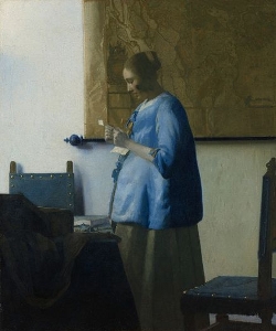
Woman in Blue Reading a Letter
(Brieflezende vrouw in het blauw)c. 1662–1665
Oil on canvas, 46.5 x 39 cm. (18 1/4 x 15 3/8 in.)
Rijksmuseum, Amsterdam
inv. C251

The textual material contained in the Essential Vermeer Interactive Catalogue would fill a hefty-sized book, and is enhanced by more than 1,000 corollary images. In order to use the catalogue most advantageously:
1. Scroll your mouse over the painting to a point of particular interest. Relative information and images will slide into the box located to the right of the painting. To fix and scroll the slide-in information, single click on area of interest. To release the slide-in information, single-click the "dismiss" buttton and continue exploring.
2. To access Special Topics and Fact Sheet information and accessory images, single-click any list item. To release slide-in information, click on any list item and continue exploring.
Who posed for this painting?
The fact that this young woman has often been identified with the artist's wife, Catharina Bolnes, finds no objective support, even though it is well known that artists of the time frequently employed family members as models. Gerrit ter Borch, one of the most accomplished and sought-after Dutch painters, portrayed his step-sister Gesina at least twenty times in the most delicate of modes, while Frans van Mieris and his wife repeatedly appear in portraits, genre pieces, and even as tronies from their marriage in 1657 onwards. The great Rembrandt cast members of his own family and intimate acquaintances as subjects for some of his most touching canvases.
Other than the obvious economic advantage, most painters would have found that working with family members eased tension and favored the complicated process of determining the exact pose and afterward holding it for long hours. Posing for such a demanding artist like Vermeer must have been hard business, especially during the long, gelid Dutch winters where only the household's kitchens were regularly equipped with a fireplace.
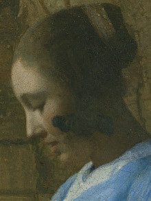
The blue morning jacket
Costume expert Marieke van Winkel believes that the blue garment, rarely depicted in Dutch painting, is to be identified as a beddejak (bed jacket), a garment with straight sleeves, usually blue or white satin, closed in the front with a row of bows. As implied by its name, the beddejak was a kind of casual attire worn—not maternity wear— in bed. Being made of satin, it was most likely reserved for the well-to-do.
The intimate nature of this garment would suggest that the young woman has just risen from her morning bed and reads her letter in the morning light. Infrared reflectography reveals that Vermeer altered the shape of the woman's jacket during the course of his work. Originally, it flared out as in the Woman Holding a Balance with fur trim.
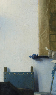
The map of the Netherlands on the background wall
Portrait of a Man in his Study
Gerrit ter Borch
c. 1668–1669
Guildhall Art Gallery, City of London
Large decorative wall maps adorn countless Dutch interior paintings of the 17th century. They are found in almost every conceivable environment, from the shop of the lowly shoemaker to the refined dwellings of the Netherlands' uppermost crust. However, one has the sensation that nearly all of Vermeer's colleagues exploited them as a handy way to enliven otherwise uneventful expanses of a wall rather than convey a specific iconographic message directly related specifically to the work. Certainly, no other painter in history ever lavished such attention on them and observed them with such respectful regard as Vermeer. Perhaps only in Vermeer's maps can we feel their material reality, their delicately undulated surfaces broken here and there by creases tenderly caressed by raking light.
Vermeer's map provides a perfect foil for the geometric severity of the composition; the sinuous topographical drawing in the present work seems to allude to the inner emotions of the young woman absorbed in her reading. Vermeer's awareness of the compositional importance of the map becomes evident from the X-radiograph, which shows that it originally extended a few centimeters to the left. Vermeer scholar Arthur K. Wheelock Jr. observes that the adjustment reduced the width of the wall to the left of the map so that it would be equal to the width of the wall to the right of the woman, rationalizing the composition.
Decorated wall maps were made for practical purposes, for prestige and, more banally, for home decoration. In Vermeer's day, wall maps were a cheap way of embellishing bare, whitewashed walls and manifesting national pride for the United Provinces, whose mercantile exuberance had permitted a minuscule patch of land to dominate a great part of world trade. Such maps were generally glued on heavy cloth and then hung on bare walls with the aid of wooden rods ("rollen") with balls at the extremes, distancing their fragile surfaces from the humid walls. The demand for maps was so strong that map publishers had begun to reissue older, and in some cases, outdated ones. Seventeenth-century catalogs employed the "suitable for framing" sales pitch, adding that some could be customized with decorative additions. Some were hand-painted. An extremely limited number of maps have survived compared to the amount described in inventories, catalogs and other sources. It is through Dutch painting that much of their beauty is known.
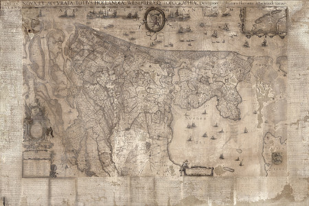
The large, monochromatic wall map that hangs behind the standing woman has been identified as a map of Holland and Friesland designed by Balthasar Florisz van Berkenrode in 1620 and printed by Balthasar Jansz Blaeu a few years later. The same map, somewhat colored, appears in the earlier Officer and Laughing Girl. The only surviving example of this map (monochromatic) is in the Westfries Museum, Hoorn.
The letter
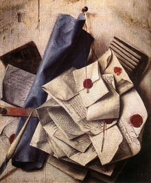
Quodlibet
Cornelis Norbertus Gysbrechts
1665
Oil on canvas, 41 x 34.5 cm.
Wallraf-Richartz Museum, Cologne
In Dutch painting, women reading letters are almost always associated with love, and artists found various means to portray both the air of expectation upon the arrival of a letter and the subsequent reaction to it.
Although Vermeer provides no clear-cut story for the letter in the present painting, it appears to have arrived unexpectedly because the finely dressed woman has interrupted her morning toilette to stop and read it. Her bent neck, parted lips and raised arms create a sense of expectancy that resonates throughout the composition. Gregor Weber points out that the folds in the paper indicate that she cannot be reading a letter she has just written. On the contrary, it is one she received some time before, and she has clearly taken it from her coffer, like the second one lying on the table. In this moment, the absent person has come very close to her once again, as if in a confidential conversation proceeding from the written word. It is natural to assume that the letter came from a man, and that it was a love letter, but none of this is made absolutely clear.
On the table lies a discarded piece of paper, which is either the letter's first or second page. Letters were usually not inserted in an envelope but were folded into thirds and sealed with wax because paper was still expensive.
Period paintings (see trompe-l'œil still lifes by Cornelis Gysbrechts on the left) usually show that letters were folded and either sealed or simply tied up with a cord. When in a hurry, a lady might use a ribbon from her headdress or garment, sometimes wrapped in a small piece of fine cloth. It is not known who invented the common envelope.
In the 17th century, organized postal systems were just beginning to emerge in many European countries. These systems were not as reliable or as widespread as today's networks, so wealthier individuals often relied on private messengers for delivering confidential or important correspondence. Additionally, inns and taverns sometimes acted as informal post offices, where travelers could pick up and leave messages. The Netherlands had domestic post routes connecting major cities. Posts would often leave at regular intervals, and postmasters in each town were responsible for organizing the relay of mail.

Interior with a Young Woman Receiving a Letter
Pieter de Hoogh
1669
Oil on panel, 57 x 53 cm.
Hamburger Kunsthalle, Hamburg
Interestingly, the cost of sending a letter was usually borne by the recipient rather than the sender. This practice encouraged people to be as concise as possible. As literacy rates began to rise during this period, various letter-writing manuals were published to guide correspondents in the art of written communication. These manuals often came with templates for different types of letters, ranging from business to love letters. They also imparted the social etiquette of letter-writing, thus serving as a reflection of the social hierarchies and customs of the age.
When it came to the physical aspects of a letter, due to the cost of paper, people often folded their letters into small rectangles or squares, essentially making the letter its own envelope. The recipient's address would be written in a blank space on the folded letter. To secure and authenticate these folded sheets, melted wax was usually dripped onto the fold and then stamped with a personal seal. Sometimes, for additional security or a personal touch, a ribbon or string might be tied around the letter.
The "Spanish" chairs

The Oyster Meal (detail)
Jan Steen
c. 1635–1636
Oil on panel, 102.8 x 133.9 cm
Mauritshuis, The Hague
The social history of the chair is as interesting as its history as an art and craft. The chair is not merely a physical support and an aesthetic object; it is also an indicator of social rank.
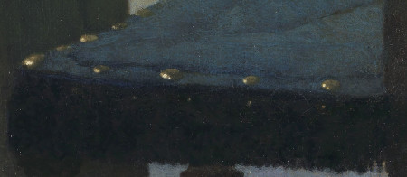
Perhaps the most popular form of seating in the time of Vermeer was the so-called Spanish chair, two of which are represented in this painting. Its basic model had evolved in Spain by the 15th century and was soon after adopted all over Europe. Normally, the legs of the chair are smooth, round in section and of slender dimensions. They are sometimes baluster-shaped (vase-shaped) or twisted. It was clearly a bourgeois piece of furniture and produced in considerable numbers. Perhaps the hand-carved lion-head finials were made by a sculptor.The Amsterdam chairmakers' guild treated the Spanish chairmakers as a separate group from 1600. The most durable upholsteries were made of leather and fixed to the chair's frame by large brass nails. Chairs with cloth upholstery were generally lined with decorative fringes, tassels and other ornaments.
Spanish chairs were made of many kinds of wood and in many styles. Among other precious gifts, in 1612 the city of Amsterdam presented the Sultan of Turkey with 14 Spanish chairs made of different exotic woods and upholstered in satin, velvet and gold. This indicates they were considered characteristic and desirable products.
There are about five or six different types of chairs in Vermeer's paintings. The two blue chairs in the present picture are different from other Spanish chairs in Vermeer's paintings, other than in their upholstery. The lion-head finials are more slanted than the oval ones, seen for example, in The Officer and Laughing Girl and The Duet by Jan Miense Molenaer (see detail).
The two blue chairs

The Duet (detail)
Jan Miense Molenaer
c. 1635–1636
Oil on panel, 42.2 x 51.4 cm.
Private collection (?)
The social history of the chair is as interesting as its history as an art and craft. The chair is not merely a physical support and an aesthetic object; it is also an indicator of social rank.
Perhaps the most popular form of seating in the time of Vermeer was the so-called Spanish chair, two of which are represented in this painting. Its basic model had evolved in Spain by the 15th century and was soon after adopted all over Europe. Normally, the legs of the chair are smooth, round in section and of slender dimensions. They are sometimes baluster-shaped (vase-shaped) or twisted. It was clearly a bourgeois piece of furniture and produced in considerable numbers. Perhaps the hand-carved lion-head finials were made by a sculptor.The Amsterdam chairmakers' guild treated the Spanish chairmakers as a separate group from 1600. The most durable upholsteries were made of leather and fixed to the chair's frame by large brass nails. Chairs with cloth upholstery were generally lined with decorative fringes, tassels and other ornaments.
Spanish chairs were made of many kinds of wood and in many styles. Among other precious gifts, in 1612 the city of Amsterdam presented the Sultan of Turkey with 14 Spanish chairs made of different exotic woods and upholstered in satin, velvet and gold. This indicates they were considered characteristic and desirable products.
There are about five or six different types of chairs in Vermeer's paintings. The two blue chairs in the present picture are different from other Spanish chairs in Vermeer's paintings, other than in their upholstery. The lion-head finials are more slanted than the oval ones, seen for example, in The Officer and Laughing Girl and The Duet by Jan Miense Molenaer (see detail).
The jewelry box
The still life on the table is perhaps one of Vermeer's most austere. It features a string of pearls, an unfolded piece of paper—perhaps an envelope or another page of the letter—a jewelry box and a scarf-like piece of cloth similar to scarves present in other compositions by Vermeer. Some parts of the still life, especially the box and scarf, were initially more clearly defined. The passage of time has degraded the jewelry box, making it not easily comparable to the other jewelry boxes in Vermeer's paintings.
In the 17th century, jewelry boxes, often referred to as "caskets" or "coffers," were more than mere containers for precious trinkets; they were symbols of status and wealth, which reflected the craftsmanship and artistic flair of the period.
Crafted primarily from wood, these boxes were often veneered with exotic materials like tortoiseshell, ebony or rare woods, and inlaid with precious metals such as silver or mother-of-pearl. The interiors were often lined with luxurious fabrics like velvet or silk, sometimes quilted or embroidered, to both protect the jewelry and add to the opulence of the box.
Apart from holding jewelry, these caskets also often housed other valuable items like letters, miniatures, and keepsakes, making them repositories of personal stories and memories. Locks were common features, ensuring the safety of the treasures inside and emphasizing the value of the box's contents.
Compositional layout and "negative" shapes
In painter's jargon, the shapes that represent real objects are called positive shapes, and the shapes that represent the areas between those objects are called negative shapes (or negative space). Inexperienced painters tend to only consider the impact of positive shapes. Advanced painters understand that negative shapes can be used to activate the composition and enhance its meaning.
In Vermeer's art, negative space receives a prominence that is uncommon among European painters. Instead of being mere afterthoughts, the observer senses that the negative spaces, each possessing its own unique shape and contour, play an active and subtly expressive role. This is especially clear in two compositions from the mid-1660s: Woman Holding a Water Pitcher and the present work. The interplay between positive and negative space was perhaps most skillfully utilized by Chinese and Japanese artists, called notan. This term is derived from the Japanese words "no" (dark) and "tan" (light), emphasizing the balance and harmony between these opposing forces. Japanese artists began to actively consider the values of negative shapes and spaces in their art quite early, with "notan" playing a crucial role in traditional Japanese aesthetics.
In this current work, Vermeer meticulously designed the compositional layout with great attention to the negative spaces created by the light-gray background wall. Each of these shapes has a simple yet distinct character, which serves to anchor the woman securely in her place and make the composition easier to comprehend. The delicate interplay of these two negative shapes, strengthened by the central positioning of the figure, imparts a sense of permanence and stability to the young woman's momentary gesture.
Compositional layout and "negative" shapes

In painter's jargon, the shapes that represent real objects are called positive shapes, and the shapes that represent the areas between those objects are called negative shapes (or negative space). Inexperienced painters tend to only consider the impact of positive shapes. Advanced painters understand that negative shapes can be used to activate the composition and enhance its meaning. When negative space is used abstractly, as in the case of the work of Vermeer, it can encourage viewers to use their imagination and see beyond the obvious. They can reinforce the overall composition's structure and rhythm, and can lead to a more harmonious and unified compostion by ensuring that "empty" space assumes a positive value and interacts with the main subjects.
In Vermeer's art, negative space receives a prominence that is uncommon among European painters. Instead of being mere afterthoughts, the observer senses that the negative spaces, each possessing its own unique shape and contour, play an active and subtly expressive role. This is especially clear in two compositions from the mid-1660s: Woman Holding a Water Pitcher and the present work. The interplay between positive and negative space was perhaps most skillfully utilized by Chinese and Japanese artists, called notan. This term is derived from the Japanese words "no" (dark) and "tan" (light), emphasizing the balance and harmony between these opposing forces. Japanese artists began to actively consider the values of negative shapes and spaces in their art quite early, with "notan" playing a crucial role in traditional Japanese aesthetics.
In this current work, Vermeer meticulously designed the compositional layout with great attention to the negative spaces created by the light-gray background wall. Each of these shapes has a simple yet distinct character, which serves to anchor the woman securely in her place and make the composition easier to comprehend. The delicate interplay of these two negative shapes, strengthened by the central positioning of the figure, imparts a sense of permanence and stability to the young woman's momentary gesture.
The draping scarf

Although most of the picture is discreetly conserved, the dark blue tablecloth and a scarf-like piece of cloth that drapes below the jewelry box can be discerned with some difficulty. This makeshift scarf (?) would seem to be the same type that appears briefly in other compositions by Vermeer, including The Love Letter (draped over the foreground chair), Art of Painting (hanging down from the still life) and Girl with a Pearl Earring (as the yellow part of the turban). Its meandering folds allow the painter to shape it in various ways, perhaps to alleviate the strict geometrical layout of the composition. Apart from its aesthetic value, it's challenging to understand what function it might have served in the narrative of the painting.
The gray skirt
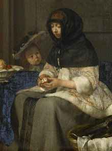
A Woman Peeling an Apple (detail)
Gerard ter Borch
c. 1660
Oil on canvas, 36.3 x 30.7 cm.
Kunsthistorisches Museum, Vienna
Although not evident in most reproductions, the presence of a few barely visible black stripes along the very front of the skirt suggests its similarity to garments depicted in Dutch genre painting. Being more neutral, the gray tone was both both practical and versatile since it would not readily show dirt or wear, making them suitable for daily activities.The same gray skirt appears, with its subtle decorative stripes, in Vermeer's Woman with a Pearl Necklace. A similar attire is showcased more prominently in several refined interior scenes painted by Gerard ter Borch, including Interior with a Woman Peeling an Apple. Judging by its thick folds, this garment was likely intended to shield women from the chilly Dutch winters while tending to their household duties
The tabletop still life
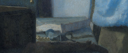
On the tabletop to the right of the jewelry box lies a few casually arranged objects: a piece of paper, likely, another page of the letter rather than an envelope, a pearl necklace and what may be the necklace's bluish ribbon.
In the 17th century, the art of letter writing came with its own set of intricate traditions. Letters weren't simply placed into envelopes; instead, they became their own vessels. This practice, known as "letter locking," was a meticulous method where the paper containing the message was folded in specific ways to secure its contents. This not only protected the information within but also indicated to the recipient if there had been any tampering during its transit. To further ensure the letter's privacy and to authenticate its sender, wax seals were often applied. These seals, bearing unique insignias or emblems, were impressed into the wax using signet rings or specialized stamps.
The concept of a commercially produced envelope as we know it today did not exist in the 17th century. Although some might have creatively wrapped their letters in a second sheet of paper, the standardized, commercially produced envelope was a novelty yet to be introduced. It wasn't until the 19th century that the modern envelope began to be widely used.
Unfortunately, this passage has suffered considerably. The six or seven pearls in the foreground were once echoed by another group of pearls behind the sheet of paper. In a recent restoration, however, it was discovered that the background pearls were not original. At a later date, someone had transformed a few dots of light paint on the tabletop into pearls, which were removed. The tabletop has a slightly greenish tinge when compared to the pure blue of the figure's morning jacket, but this area of the painting had not been investigated so it is not possible to know which pigments were used.
The blue tablecloth
The same deep-blue tablecloth appears in various compositions by Vermeer, sometimes gathered to one side of the still life, and other times meticulously spread over the table to prevent any creases. Vermeer might have originally intended for it to have a different color, as the illuminated portion seems slightly greenish in comparison to the pure blue of the young woman's morning jacket. Since green hues were often achieved by blending yellow and blue pigments, this greenish tinge could be due to the fading of one of these pigments. This effect can be observed in numerous Dutch still-life and landscape paintings, where blue vegetation is visible instead of the originally intended green. Certain commonly used yellow pigments, including the one called "weld," are known to be susceptible to fading. This fading process might explain the light blue shade of the landmasses on the map in Vermeer's Officer and Laughing Girl, the bluish appearance of vegetation in The Little Street, as well as the bluish hue of the laurel wreath and the large blue leaves in the decorative motif of the foreground tapestry in The Art of Painting.
special topics
- Violence in Vermeer's life
- "Ideal world" or "snapshot" of daily life?
- Is the young woman pregnant?
- "Jolly" Willem Buytewech & the origin of maps in painting
- The letter motif in painting
- Letter writing in the 17th century
- Danger lurks within the love letter
- The pitfalls of symbolic interpretation
- Ultramarine blue: the king of pigments
- An extraordinary composition
- Recent restoration
- Listen to period music
fact sheet
- Signature
- Date
- Provenance
- Exhibitions
- Technical description
- Images before and after the painting's 2012 restoration
- The painting with its frame
- How big is this picture?
- Download High-Resolution Image from WikiMedia
- Google Art Project Super-zoom image
- Historic timeline of the year(s) Vermeer created this painting
- Related artworks
Critical assessment
Vermeer's Woman in Blue Reading a Letter seems so harmonious in color, theme and mood that it is hard to imagine any other compositional solution. Indeed, as in others of his paintings, one has difficulty imagining Vermeer at work, as an artist who had to somehow compose and make tangible a concept he had conceived in his mind. Part of the problem in visualizing Vermeer's working procedure stems from the lack of available information. No drawings, prints or unfinished paintings-indeed, no records of commissions-offer clues to his intent or aspects of his working process.
Arthur K. Wheelock, Jr., Vermeer and the Art of Painting, 1995
The signature
No signature appears on this work.
(Click here to access a complete study of Vermeer's signatures.)
Dates
1662–1665
Albert Blankert, Vermeer: 1632–1675, 1975
c. 1663–1664
Arthur K. Wheelock Jr., The Public and the Private in the Age of Vermeer, London, 2000
c. 1663–1664
Walter Liedtke, Vermeer: The Complete Paintings, New York, 2008
c. 1662–1665
Wayne Franits, Vermeer, 2015
(Click here to access a complete study of the dates of Vermeer's paintings).
Technical report
The support is a fine, plain-weave linen with a thread count of 14.3 x 14.4 per cm². The support has been wax-resin lined and the original tacking edges have been removed. The dark gray ground contains chalk, umber and lead white. The paint layers extend to the edge of the trimmed canvas on all sides. Some areas, such as the chair and the woman's yellow skirt, have ocher underpainting.
The surface is pitted, primarily in the white mixtures, but also in the blue parts of the background and jacket. Some blanching is evident in the blue tablecloth. The paint surface is slightly abraded, particularly in the raised edges of the paint.
* Johannes Vermeer (exh. cat., National Gallery of Art and Royal Cabinet of Paintings Mauritshuis - Washington and The Hague, 1995, edited by Arthur K. Wheelock Jr.)

Provenance
- (?) Pieter van der Lip sale, 14 June, 1712, no. 22;
- Mozes de Chaves, Amsterdam (1759); De Chaves sale, Amsterdam, 30 November, 1772, no. 23;
- P. Lyonet sale, Amsterdam, 11 April, 1791, no. 181, to Fouquet;
- sale, Amsterdam (Ph. van der Schley), 14 August, 1793, no. 73;
- Herman ten Kate, Amsterdam (?1793–1800);
- Ten Kate sale, Amsterdam, 10 June, 1801, no. 118, to Taijs?;
- Lespinasse de Langeac sale, Paris (Paillet), 16 January, 1809, no. 85;
- Lapeyriè re sale, Paris, 19 April, 1825, no. 127, to Berthaud;
- [John Smith, London (after 1833–1839), sold to Van der Hoop];
- Adriaan van der Hoop, Amsterdam (1839–1854);
- Academy of Fine Arts, Amsterdam (1854–1885);
- city of Amsterdam, since 1885 on loan to the Rijksmuseum, Amsterdam (inv. C251).
Exhibitions
- London 1929
Exhibition of Dutch Art, 1450–1900
Royal Academy of Arts
141, no. 298 and ill. - London 1929
Dutch Art. An Illustrated Souvenir of the Exhibition of Dutch Art at Burlington House
Burlington House
87, no. 105 and ill., as "The Letter" - Amsterdam 1935
V ermeer tentoonstelling ter herdenking van de plechtige opening van het Rijksmuseum op 13 July, 1885
Rijksmuseum
30, no. 168 - Rotterdam July 9–October 9, 1935
Vermeer, oorsprong en invloed. Fabritius, de Hooch, de Witte
Museum Boijmans- van Beuningen
37, no. 86 and ill. 67 - Washington D.C. November 12, 1995–Febraury 11, 1996
Johannes Vermeer
National Galley
134–139, no. 9 and ill. - The Hague March 1–June 2, 1996
Johannes Vermeer
Mauritshuis
134–139, no. 9 and ill. - Kyoto June 25–October 16, 2011
Communication: Visualizing Human Connection in the Age of Vermeer
Municipal Museum of Art
128, no. 41 and ill. - Sendai October 27, 2011–Decembe 12r, 2011
Communication: Visualizing Human Connection in the Age of Vermeer
Miyagi Museum of Art
128, no. 41 and ill. - Tokyo December, 27–March 14, 2012
Communication: Visualizing Human Connection in the Age of Vermeer
The Bunkamura Museum of Art
128, no. 41 and ill. - Shangai October 1–October. 31, 2012
Woman in Blue Reading a Letter
China Art Palace - São Paulo December 12, 2012–February 10, 2013
Vermeer: Mulher de Azul Lendo uma Carta
Museu de Arte in São Paulo - Los Angeles February 16–March. 31, 2013
Johannes Vermeer's Woman in Blue Reading a Letter
J. Paul Getty Museum - Minneapolis (MN) January 16–May 3, 2015
Centennial Exhibition
Minneapolis Institute of Arts
no catalogue - San Diego CA May 14–September 11, 2015
The Private World of Vermeer
The Timken Museum
no catalogue - Washington D.C. September 19–December 1, 2015
Vermeer's Woman in Blue Reading a Letter from the Rijksmuseum
National Gallery of Art
no catalogue - Sydney November 11, 2017–February 18, 2018
Rembrandt and the Dutch Golden Age: Masterpieces from the Rijksmuseum
Art Gallery of New South Wales - Canberra November, 2020–March 14, 2021
Botticelli to Van Gogh: Masterpieces from the National Gallery
National Gallery of Australia, Canberra, Australia - Dresden June, 4–September 12, 2021
Vermeer: On Reflection
Gemäldegalerie Alte Meister, Dresden - Amsterdam February 10– June 4, 2023
VERMEER
Rijksmuseum
no. 15 and ill. -
Turin March 5–June 29, 2026
Vermeer. Donna in blu che legge una lettera—Incontro con il capolavoro
Palazzon Madama
(Click here to access a complete, sortable list of the exhibitions of Vermeer's paintings).
| Vermeer's life |
Vermeer's income in the 1660s was probably higher than in the 1670s. In the1660s, sales of paintings and especially his mother-in-law's (Maria Thins) substantial financial contributions together probably ranged from 850 to 1,500 guilders a year. A mason earned about 500 guilders. Vermeer is elected for the first time headsman of the Guild of Saint Luke in Delft at the age of 30 for a two year term. However, by this time many artists resident in Delft had left for the more prosperous Amsterdam and so his election may have had less significance than once believed. He was the youngest artist to become headmaster since the guild was organized in 1611. Many of the luxury items seen in Vermeer's interiors such as the virginal seen in The Music Lesson were economically out of reach of the artist. They may have been lent to him by affluent men of culture or clients such as Diego Duarte, a rich Antwerp banker, in whose important art collection was cited "a young lady playing a clavecin, with accessories, by Vermeer." The virginal seen in Vermeer's Music Lesson was built by Johannes Ruckers. These rare instruments were sold at about 300 guiders, about half the cost of Gerrit Dou, a Frans van Mieris. An averge Dutch house might cost 1,000 guilders. In Delft, hese instruments were owned by the official town musician Scholl. |
| Dutch painting |
Pieter Saendredam (b. 1597) dies in Haarlem. Despite its decline, Delft remained and important city of passage for artists passing from Haarlem, Utrecht and Amsterdam. It contained a number of fine art collections. Ferries parted many times a day to the nearby The Hague and Amsterdam was less than a days away on an inexpensive horse-towed barge. |
| European painting & architecture | André Le Nôtre designs park and gardens of Versailles Louis XIV begins to build palace of Versailles; he makes Charles Lebrun his chief artistic adviser. |
| Music | Composer Henry Lawes dies at London October 21 at age 66. |
| Literature | |
| Science & philosophy | |
| History |
New Amsterdam colonist John Bowne is arrested for permitting Quakers to hold meetings in his Flushing house, completed last year at what will become 37–01 Bowne Street, Queens (see Mathematician-physicist-philosopher-theologian Blaise Pascal dies at the Jansenist Port-Royal monastery in Paris August 19 at age 39. Publication of a world atlas in eleven parts by Joan Blaeu in Amsterdam. Remonstrance, 1657). Bowne is convicted of having violated Governor Peter Stuyvesant's ban on Quaker assemblies. He is jailed and banished, but when he reaches Holland and appeals to the Dutch West India Company, it acquits him of all charges, frees him, and rebukes Governor Stuyvesant, thereby establishing the right to free practice of religious worship. Blaise Pascal proposes the introduction of a public transport system in Paris. Coaches would travel along predetermined routes and take passengers for a small fee. The first coach goes into service during the following year. Founding of the Academia Leopoldina in Vienna The Royal Society receives charter from Charles II. Holland and France form an alliance against possible attack by England. |
| Vermeer's life |
In the early and mid-1660s Vermeer paints a series of extraordinary pictures of single women in the corner of a room absorbed in their activity. Even their most striking passages of observation are always subordinated to the impression made by the whole composition. A French diplomat and art connoisseur Balthasar de Monconys visits Vermeer in Delft. In his diary he notes that he was unable to see any paintings there and had to visit the house of a baker where he saw a painting with a single figure. De Monconys comes initially as a tourist, evidently unaware of Vermeer's presence. A few weeks later, he went to pay his respects in The Hague to Constantijn Huygens, an important art connoisseur and theorist of Dutch culture. De Monconys admired his art collection and described it in detail. However, one can only imagine how amazed Huygens must have been to hear that the Frenchman had been in Delft, without visiting Vermeer. It seems a reasonable assumption that Huygens urged de Monconys to meet with the Delft painter, given the Frenchman's predilection for fine art. Not long afterward, de Monconys did indeed visit with Vermeer at his house, and wrote the following account in his diary journal, which was published in 1665, the year of his death: "In Delft I saw the painter Verme(e)r who did not have any of his works: but we did see one at a baker's, for which six hundred livres had been paid, although it contained but a single figure, for which six pistoles would have been too high a price." Simply put, de Monconys thought the painting he saw was worth less than a tenth of the price mentioned. c. 1663 a son named Johannes, named after himself, is born to Vermeer. |
| Dutch painting |
Rembrandt depicts himself as a bit player in his painting The Raising of the Cross. Jan Steen paints The Drawing Lesson.
Adriaen van de Velde paints Cattle near a Building. Pieter de Hooch, who had moved away from Delft to Amsterdam to seek more patronage, returns to Delft at least once in this year. |
| European painting & architecture |
Bernini: Scala Regia, Vatican, Rome Building of Castle Nymphenburg, near Munich. Nicolas Poussin paints The Four Seasons. France's minister of finance Jean-Baptiste Colbert appoints painter Charles Le Brun director of the Gobelins, which will grow under Le Brun's direction from a small tapestry manufactory into a vast enterprise that supplies all of the royal houses. The Academy of Painting and Sculpture is reorganized, with Le Brun as its director. |
| Music |
Mar 7, Tomaso Antonio Vitali, composer, is born. Pascal: L'Equilibre des liqueurs (posth.) |
| Literature |
The Académie des inscriptions et belles-lettres (the Academy of the Humanities) is founded in Paris. John Milton marries Elizabeth Minshull. |
| Science & philosophy |
Isaac Newton discovers the binomial theorem. Physicist Otto von Guericke invents the first electric generator. It produces static electricity by applying friction against a revolving ball of sulfur, and Guericke will show in 1672 that the electricity can cause the surface of the sulfur ball to glow. |
| History |
Dutch forces hold the best pepper ports of India's Malabar Coast, giving them a virtual stranglehold on the spice trade once controlled by Portugal. A Third Navigation Act adopted by Parliament July 27 forbids English colonists to trade with other European countries. European goods bound for America must be unloaded at English ports and reshipped, even though English export duties and profits to middlemen may make prices prohibitive in America. |
| Vermeer's life |
In a death inventory of the English sculptor Jean Larson, who lived in the Hague, is listed "a head by Vermeer." Some critics believe it may have bee the Girl with a Pearl Earring. In the early to mid-1660s Vermeer refined all the qualities of his mature style. In his orderly designs, Vermeer gave new life to familiar patterns of contemporary genre painting by closely studying the subtleties of appearance. |
| Dutch painting |
Pieter de Hooch paints Young Woman Weighing Gold Jan Steen: paints The Christening Feast. Frans Hals, one of the most fashionable portraitists of his time and now in his late sixties, paints two of his most significant group portraits, the Regents and Regentesses of the Old Men's Alshouse at Haarlem. Owing to his dire poverty he will be given a small allowance by the town of Haarlem. |
| European painting & architecture |
Nicola Poussin paints Apollo and Daphne John Vanbrugh, Eng. architect and dramatist, is born. Christopher Wren: Sheldonian Theatre, Oxford. Francisco de Zurbaran, Spanish painter, dies. |
| Music |
The French horn becomes an orchestral instrument. Oratorio: Christmas Oratorio by Heinrich Schütz at Dresden. |
| Literature |
William Shakespeare - the second impression of the Third Folio, which added seven plays to the thirty-six of the First Folio and the Second: Pericles, Prince of Tyre and six works from the Shakespeare Apocrypha. Thomas Killigrew and the King's Company stage Killigrew's The Parson's Wedding with an all-female cast. Killigrew attempts a similar all-female production of his play Thomaso, though the project is never realized. |
| Science & philosophy |
Robert Hooke discovers the Great Red Spot (an extremely persistent storm) on Jupiter and uses it to determine the period of Jupiter's rotation, which is astonishingly less than ten hours despite Jupiter's great size. Giovanni Alfonso Borelli, calculates the orbit of a comet and finds that it is a parabola (not a circle, ellipse, or line as expected in various earlier theories). Descartes' Traité de l'homme et de la formation de foetus (treatise on man and the formation of the fetus), printed posthumously, describes animals as purely mechanical beings; that is, there is no "vital force" that makes animals different from other material objects. Christiaan Huygens proposes that the length of a pendulum with a period of one second should be the standard unit for length. |
| History |
Aug 29, Adriaen Pieck/Gerrit de Ferry patented a wooden firespout in Amsterdam. New Amsterdam handed over by Peter Stuyvesant to the English, who renames the city New York Amsterdam passes a regulation banning the sale of "rotten, spoiled, or defective spinach, cucumbers, and carrots, ears of corn, radishes, or other fruits [vegetables] because pride could not be taken in or from such things." Slavery is introduced into the Caribbean island of Montserrat and will not be abolished until 1834. The Black Death kills 24,000 in old Amsterdam while the English are taking Nieuw Amsterdam. The plague spreads to Brussels and throughout much of Flanders, and in December it kills two Frenchmen in London's Drury Lane. Men who put the dead into the deadcarts keep their pipes lit in the belief, now widespread, that tobacco smokers will somehow be spared. Samuel Pepys buys forks for his household, but most Englishmen continue to eat with their fingers and will continue to do so until early in the next century lest they be considered effete or, in the opinion of some clergymen, even sacrilegious. A man going out to dinner has for centuries brought his own spoon and knife, the spoon being folded into the pocket and the knife carried in a scabbard attached to the belt; more men now carry folding forks as well. The Kronenbourg Brewery founded in Alsace will continue into the 21st century to produce beer. |
| Vermeer's life | Pieter van Ruijven and his wife Maria Knuijt leave 500 guilders to Vermeer in their last will and testament. This kind of a bequest is very unusual and testifies a close relationship between Vermeer and Van Ruijven that went beyond the usual patron/painter one. It would seem that in his life-time the rich Delft burger had bought a sizable share of Vermeer's artistic output. |
| Dutch painting |
Rembrandt paints The Jewish Bride. Adriaen van Ostade paints The Physician in His Study. c. 1665 Gerrit Dou painted Woman at the Clavichord and a Self-Portrait in which he resembled Rembrandt. |
| European painting & architecture |
Bernini finishes high altar, Saint Peter's, Rome (begun 1656). Murillo: Rest on the Flight into Egypt. Nicolas Poussin, French painter, dies. Known as the founder of French Classicism, he spent most of his career in Rome which he reached at age 30 in 1624. His Greco-Romanism work includes The Death of Chione and The Abduction of the Sabine Women. Compagnie Saint-Gobain is founded by royal decree to make mirrors for France's Louis XIV. It will become Europe's largest glass-maker. Francesco Borromini completes Rome's Church of San Andrea delle Fratte. |
| Music |
Molière: Don Giovanni. Sep 22, Moliere's L'amour Medecin, premiered in Paris. |
| Literature |
Philosophical Transactions of the Royal Society begins publication. |
| Science & philosophy |
Giovanni Cassini determines rotations of Jupiter, Mars, and Venus. Peter Chamberlen, court physician to Charles 11, invents midwifery forceps Pierre de Fermat, French mathematician, dies. His equation xn + yn = zn is called Fermat's Last Theorem and remained unproven for many years. The history of its resolution and final proof by Andrew Wiles is told by Amir D. Aczel in his 1996 book Fermat's Last Theorem. Fermat's Enigma: The Epic Quest to Solve the World's Greatest Mathematical Problem by Simon Singh was published in 1997. In 1905 Paul Wolfskehl, a German mathematician, bequeathed a reward of 100,000 marks to whoever could find a proof to Fermat's "last theorem." It stumped mathematicians until 1993, when Andrew John Wiles made a breakthrough. Francis Grimaldi: Physicomathesis de lumine (posth.) explains diffraction of light. Isaac Newton experiments on gravitation; invents differential calculus. Robert Hooke's Micrographia, with illustrations of objects viewed through a microscope, is published. The book greatly influences both scientists and educated laypeople. In it, Hooke describes cells (viewed in sections of cork) for the first time. Fundamentally, it is the first book dealing with observations through a microscope, comparing light to waves in water. Mathematician Pierre de Fermat dies at Castres January 12 at age 63, having (with the late Blaise Pascal) founded the probability theory. His remains will be reburied in the family vault at Toulouse. |
| History |
English naval forces defeat a Dutch fleet off Lowestoft June 3 as a Second Anglo-Dutch war begins, 11 years after the end of the first such war. General George Monck, 1st duke of Albemarle, commands the English fleet, Charles II bestows a knighthood on Irish-born pirate Robert Holmes, 42, and promotes him to acting rear admiral, giving him command of the new third-rate battleship Defiance, but the Dutch block the entrance to the Thames in October. Feb 6, Anne Stuart, queen of England (1702–1714), is born. At least 68,000 Londoners died of the plague in this year.
The second war between England and the United Provinces breaks out. It will last until 1667 and devastate the art market. Mar 11, A new legal code was approved for the Dutch and English towns, guaranteeing religious observances unhindered. Nov 7, The London Gazette, the oldest surviving journal, is first published. Ceylon becomes important trade centre for the VOC |
Violence in Vermeer's life
Judging by the serenity that pervades Vermeer's painting from the early 1660s, one could never fathom the turmoil that beset the artist's family life during those years. In 1663, Willem Bolnes, the brother of Vermeer's wife Catharina, directed uncontrollable outbursts of violence toward the artist's family, just as he had done to his own family of origin. The situation deteriorated to the extent that his sister, Cornelia Thins, who was near death in 1661, chose to disinherit him. The family subsequently divided into two factions. On one side stood the solitary and hot-tempered Willem Bolnes, while on the other side stood Maria Thins, her daughter Catharina Bolnes and her son-in-law Vermeer. A few months prior, Willem had borrowed a sum of money from his mother, Maria Thins, albeit not without cost—interest was charged at a rate of 4 percent. This financial transaction might have contributed to his growing resentment.
On multiple occasions, Willem Bolnes caused uproarious disturbances in the household, to the point where a crowd gathered outside the door. He verbally abused his mother, labeling her an "old popish swine," a "she-devil," and employing other unsavory profanities that an eyewitness noted should be "passed over" due to their indecency. Vermeer's maid, Tanneke Everpoel, witnessed Bolnes brandishing a knife and attempting to harm his mother with it. Everpoel also attested that Maria Thins had suffered so much abuse from her son that she felt unsafe leaving her room and resorted to having her meals and drinks brought to her. Bolnes subjected Maria's daughter, the wife of Johannes Vermeer, to similar episodes of violence, "threatening to beat her on diverse occasions with a stick, notwithstanding the fact that she was pregnant to the last degree."
An "ideal world" or "snapshot" of daily life?
The Letter
Gerrit ter Borch
c. 1660–1662
Oil on canvas, 81.9 x 68.2 cm.
The Royal Collection, Buckingham Palace
For decades, art historians have challenged the longstanding notion that Dutch interior painters, such as Vermeer, merely captured direct representations of 17th-century daily life in the Netherlands. It's now clear that these interiors were "constructed" rather than simply observed. Instead of providing a candid snapshot of reality, these works present a meticulously curated glimpse of an idealized world. This manner of constructing compositions recalls the term mise en scène, a term borrowed from theater and film that has been adapted for use in the realm of visual arts, including painting. In theater and film, mise en scène encompasses the design and arrangement of everything that appears on the stage or screen, from costumes and sets to lighting and positioning of actors. Similarly, in visual arts, it relates to how artists arrange and organize the various elements within a painting or other visual medium.
Art historian Alison Kettering suggests that these intricate paintings not only reflected prevailing ideals concerning women's conduct but also played a role in shaping and establishing models to which the owners of these paintings aspired, which would have appealed to his patrons, Pieter van Ruijven and Maria de Knuijt.
We know now that Maria de Knuijt likely played a significantly larger role as a collector of Vermeer's art and may have even eventually influenced his shift of artistic direction. This change moved him from the "antique" mode of painting, history painting, to the more "modern" mode, or scenes depicting daily life, for which Vermeer is so highly renowned today.
The significance De Knuijt in Vermeer's career has come to the forefront relatively recently, thanks to archival research. One document reveals that she left 500 guilders to Vermeer, likely connected to the acquisition of paintings. Interestingly, Vermeer was the sole beneficiary outside of her family. Archival research has also shown that De Knuijt, who was nine years older than Vermeer, lived a few doors away from the inn/house where Vermeer grew up on Voldersgracht. She was approximately the same age as Vermeer's sister Geertruy, suggesting a possible friendship between the two girls.
In 17th-century Dutch society, women were primarily confined to domestic roles. As part of these roles, it was their responsibility to enhance their homes by adorning them with paintings of their choice. The revelation of Maria de Knuijt's role as a patron of the arts aligns with the broader trend of reevaluating women's contributions to art history, extending beyond their roles as artists.
In particular, Maria de Knuijt, the wife of Vermeer's patron Pieter van Ruijven, might have found the modest and dignified depictions of femininity that Vermeer portrayed particularly captivating. The support and encouragement from devoted and understanding patrons to explore domestic themes undoubtedly nourished Vermeer's inherent pursuit of perfection.
Is the young woman pregnant?
According to the Dutch costume expert Marieke de Winkel, pregnancy "was not a common subject in art and there are very few depictions of maternity wear (in a pendant of Marten Soolmans and Oopjen Coppit painted by Rembrandt in 1634, Oopjen appears visibly pregnant: she gave birth to her first child shortly after the picture was finished.). Even in religious paintings such as the Visitation, where the depictions of pregnant women are required, the bodies of the Virgin and Saint Elizabeth were usually completely concealed by draperies." De Winkel further argues that "to my knowledge there are no examples of pregnant women in Dutch portraiture, an interesting fact considering that many women were painted in their first year of marriage, a time when they could have been with child." Pregnancy was most likely not seen as aesthetically attractive.
Arthur K. Wheelock Jr. corroborated De Winkel's position: "Dutch fashions in the mid-17th century seemed to have encouraged a bulky silhouette. The impression of the short jacket worn over a thickly padded skirt in Vermeer's painting in particular may create just such an impression."
The letter-writing theme
Although his genius has never been questioned in modern times, Vermeer was not a particularly inventive painter. Lawrence Gowing, one of the most perceptive Vermeer critics and himself a painter, was the first to point out that it is hard to find a single theme of any boldness in his work that is not based on precedent, tagging him as a sort of artistic "late comer." who capitalized on the achievements of his predecessors. After decades of analysis and comparative study, it has become evident that the majority of his motifs, including the letter readers or writers, are, in fact, largely derivative.

Woman Tearing a Letter
Dirck Hals
1631
Oil on panel, 45 x 55 cm.
Mittelrheinisches Landesmuseum, Mainz
Dirck Hals, the brother of the famous portraitist Frans Hals, had already pioneered the letter-writing theme by 1631 in Woman Tearing a Letter, one year before Vermeer was born. This work already exhibits various motifs that would reappear in Vermeer's mature works, and with which his works are strongly identified. The girl is positioned near a partially opened window in the left-hand corner of a room, and a Spanish chair is set flush against the background wall, with a simple framed painting on the background wall.
Ter Borch's Woman Writing a Letter predates in composition, theme and mood Vermeer's own work by the same title by almost a decade. A comparison between De Hooch's The Goldweigher and Vermeer's Woman Holding a Balance provides an astounding example of the extent to which Vermeer was willing to appropriate thematic and compositional elements, practically verbatim, from his colleagues.
Borrowing successful motifs was standard procedure at the time when painters sold their works on the open, competitive market. Originality did not have the same importance as it does today.
The letter motif in Dutch painting

Cupid Presenting a Letter to a Maiden
Emblem from Jan Harmenz. Krul
Pampiere Wereld
(Amsterdam, 1644), vol. 2
Koninklijke Bibliotheek, The Hague
Seventeenth-century paintings of letter reading and letter writing evoke two separate worlds of time and space—the world of the writer or reader depicted by the artist on his canvas and the world of the absent person. These images are so captivating, especially when dealing with the love-letter theme, precisely because we will never know the contents of the letters. However, even if convention suggests that private letters were written by suitors or lovers, recent investigations of period letters written by women show that they deal with a much wider range of subjects than love. Most, in fact, were designed to strengthen social relationships or maintain friendships.
The present-day reader must take into account that although the Netherlands enjoyed the highest rate of literacy in Europe, not all who read were able to write. This was especially true for women, who generally received less formal education than boys and were prohibited from attending Latin schools. Marriage registries in Amsterdam, which had to be signed by both the bride and groom, reveal that one out of three men and two out of three women could not sign their own name. Even accounting for the fact that Amsterdam was a magnet for foreign workers, the statistics are nonetheless high by the standards of the day.
Letters, not only a practical means for communication of business matters, had also become an accepted art form in 17th-century Dutch literature despite classical and Christian ideals of poetry and prose. However, contemporary emblem books characterize letter writing, especially love letters, as a vain pastime and admonish the reader of the transitory nature of worldly existence.
Danger lurks within the love letter
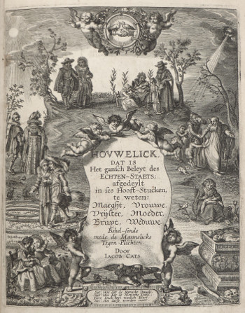
Houwelijck
"Virgin, Lover, Bride, Wife, Mother, Widow"
Jacob Cats
1652
By the time Vermeer approached his first letter-theme paintings, love letters became a widespread fashion in the Netherlands. Although the love-letter motif may seem innocuous, contemporary literature of jurisprudence had declared that litterae amatoriae were subject to legal inquiry. Lawyers could use them as evidence of either a promise of matrimony or if one of the writers was already married, infidelity.
Jacob Cats, the unchallenged master of Dutch moralistic literature, held a disapproving attitude towards females writing love letters in his Houwelijck (Marriage, 1652), a monumental written example of female conduct described through successive stages of a woman's life.
Cats describes how within the early months of marriage—the woman had to transform herself from vrijster (courtship girl) to vrouwe (housewife, house manager). Whether real Dutch women heeded Cats' warnings is unknown.
In the section called "Trouringh," a young female named Rosette engages in a dialogue with a slightly older, recently married woman named Sibille about the perils of composing love letters. In response to Rosette's query about expressing her feelings through writing, Sibille replies as follows:
To write to a young fellow
Is never becoming of a maid;
Your good name, oh demure creature,
Must not be committed to paper;
If someone even lets one word slip out
When the youth gather,
It flies like the wind
So that no one can find it again;
Yet it is not as enduring
As that which is written by the bold pen;
And there follows a quarrel,
As often arises between lovers,
So your letter' and its outrageous statements,
Is announced to the public
And there is no denying it,
The big letters are clearly visible,
And leaves you with the greatest regret,
You will then suffer reproaches;
Thus have you shamed honorable love;
Never write stupid letters.
Ultramarine blue: the king of pigments

The woman's satin garment is painted almost entirely with varying shades of ultramarine blue, white and small amounts of black in the deepest shadows. Vermeer employed blue more frequently than any other "strong" color. His use of the highest grade of natural ultramarine, the most brilliant and expensive blue pigment available during his time, attests to the significance he attributed to its optical quality. It's also plausible that the esteemed lineage of this "pigment of pigments" played a role.
Perhaps the satin dress of the Woman in Blue Reading a Letter best exemplifies the potency of blue. Throughout history, blue has represented celestial deities, signifying distance, the divine and the spiritual realm. This interpretation has ancient Egyptian origins and was embraced by later cultures. Psychologically, blue tends to evoke dreamlike states, inspiring yearnings, imparting a calming influence and prompting meditative introspection. Ultramarine blue is used almost obsessively in the current painting and even appears in the light gray mixtures of the wall and the round ball of the map hanger. Vermeer employed the same technique in the Woman Holding a Water Pitcher from the same period.
Natural ultramarine pigment (the coloring agent in paint) is created from the powdered form of the crushed semi-precious stone lapis lazuli. Following thorough purification through repeated washing, the powder is combined with a drying oil through manual grinding. Only stones of the highest quality could be processed solely through washing and grinding. For lower-quality stones, a labor-intensive process of extracting the mineral lazurite was necessary, as described by Cennini in his treatise around 1390. The finest varieties of lapis lazuli were imported from Afghanistan through Venice.
The pitfalls of symbolic interpretation
Although iconographic analyses of Vermeer's paintings have offered valuable insights into how the artist conveyed hidden meanings, a cautious approach is necessary when scrutinizing the details of his motifs.
On several occasions, Vermeer incorporated the exact same objects in various settings and activities. For instance, the map of the Netherlands seen in the current painting also appears illuminated by sunlight in the earlier Officer and Laughing Girl and obscured by darkness in the later Love Letter. Additionally, Vermeer painted over two large maps, one in Woman with a Pearl Necklace and the other in The Milkmaid. While the map of Holland in Officer and Laughing Girl has been linked to the courting soldier's attempt to "conquer" the young girl in a manner akin to a military campaign conquering territory, the same interpretation would be misguided if applied to the other paintings.
In reality, the presence of the same map in different contexts tends to undermine the notion of a singular symbolic purpose for each painting. In his influential study of Pieter de Hooch, an artist who greatly influenced Vermeer's choice of subjects, Peter Sutton posited that it is more likely the artist habitually referenced familiar sources, often prints, without overly concerning himself with their symbolic significance, as opposed to invoking multiple interpretations. No iconographic analysis has been put forth regarding De Hooch's ubiquitous maps. It's more probable that Vermeer employed his maps as compositional and decorative elements, much like numerous other Dutch interior painters of that era.
An extraordinary composition
The narrative of the current picture is straightforward, as it remains one of the few works by Vermeer that has resisted scholarly interpretation. It portrays a young woman in her morning attire, engrossed in reading the contents of a letter. Art historians are certain that it is a love letter.
The bell-shaped woman takes center stage in the painting, her poised posture heightening both the intensity of her emotions and her detachment from her surroundings. The substantial wall map behind her and the table to the lower-left enclose her within a rectangular pictorial realm. The chair to the lower right shields her from lateral intrusion, while the back of the chair emerging from behind the table envelops her from the left. The only indication of her thoughts is implied by the swirling patterns of the map that twirl around her. Extraneous anecdotal details that could divert the viewer's attention from the central theme are deliberately omitted. The minimal objects on the table constitute the most understated of still lifes in the artist's body of work.
However, achieving the composition's deceptively simple appearance required significant revisions and artistic liberties. Autoradiograph and x-ray images reveal that the woman initially wore a different style of jacket, presumably adorned with fur trim and flaring out like those seen in many other pictures by Vermeer. The edge of the map also once extended a few centimeters to the left. Considering the lighting arrangement and the limited distance of the figure from the rear wall, Vermeer eliminated a shadow that the woman would have cast on the background wall.
Listen to period music
![]() Unico Wilhelm van Wassenaer (1692–1766)
Unico Wilhelm van Wassenaer (1692–1766)
Concerto Armonico no. 3, Largo-Andante [1.34 MB]
http://www.amazon.com/Wassenaer-Concerti-Unico-Wilhelm-van/dp/B00006RHPO/ref=sr_1_2?ie=UTF8&s=music&qid=1255264489&sr=1-2

"Jolly" Willem Buytewech
Willem Pieterszoon Buytewech, the pioneer of the Dutch interior, was the originator of placing sizable wall maps on the background wall. His keen irony earned him the moniker "Gheestige Willem" (Jolly William). His genre pieces, more precisely classified as merry companies, depict opulent textiles, lavishly set tables and the immodest behavior of dandyish Dutch youths.
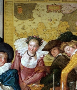
Merry Company (detail)
Willem Buytewech
1620–1622
Oil on canvas, 34.5 x 27 cm.
Museum of Fine Arts, Budapest
Art historians have speculated that the prominent position maps in Buytewech's paintings may have functioned as a foil for the brightly colored figures placed in front of them and, perhaps, to provide added depth to the scene. In one painting, it has been proposed that the elegantly dressed woman standing before a vibrant map represents Vrouw Wereld ( Lady World), the embodiment of all earthly desires. The map takes the place of her more traditional attribute, a globe or imperial orb atop her head. The vivid coloring on Buytewech's two maps mirrors the hues of original cartographic material from that era. The artist might have aimed to create a juxtaposition against the simple, light gray walls of a typical Dutch interior.
As noted by art historian James A. Welu, "Those unfamiliar with cartography of the 16th and 17th century may not recognize the geographical contents of Buytewech's two maps of Holland, for both are oriented with south at the top. At this time the designing of maps with north at the top was not yet a standardized practice; a map could be arranged with north at the left, right or bottom, according to the preference of the cartographer. Wall maps of this period were usually made up of a number of engraved sheets which for display purposes were mounted onto a linen backing, then hand-colored and given a coat of varnish.
Because of their size and exposure to light and climatic changes, wall maps were much more vulnerable than atlas or folio-size maps. The number of originals that survive from the 16th and 17th centuries is extremely low. In fact, catalogs, inventories and other documents from the period list numerous wall maps of which not a single original is known.
Recent restoration
In 2010, the Rijksmuseum conducted a comprehensive restoration of the current picture. The overall appearance was revitalized and the color of the woman's silk morning jacket is significantly more vibrant than the upholstery coverings of the two chairs on the right and left of the standing figure. This intense shade of blue adds depth to the figure, projecting it towards the viewer's eye and enhancing the sense of three-dimensional depth.
A row of small brass nail-heads running along the horizontal shadowed edge of the foreground chair was uncovered. The intriguing, brownish scarf-like object meandering in the deep shadow and draping off the front edge of the table now has a more substantial presence. It might be the same fabric that drapes from the table in The Art of Painting and over the foreground chair in the late Love Letter.
Minor retouching that had previously altered certain topographical features of the map has been eliminated.


