
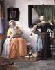
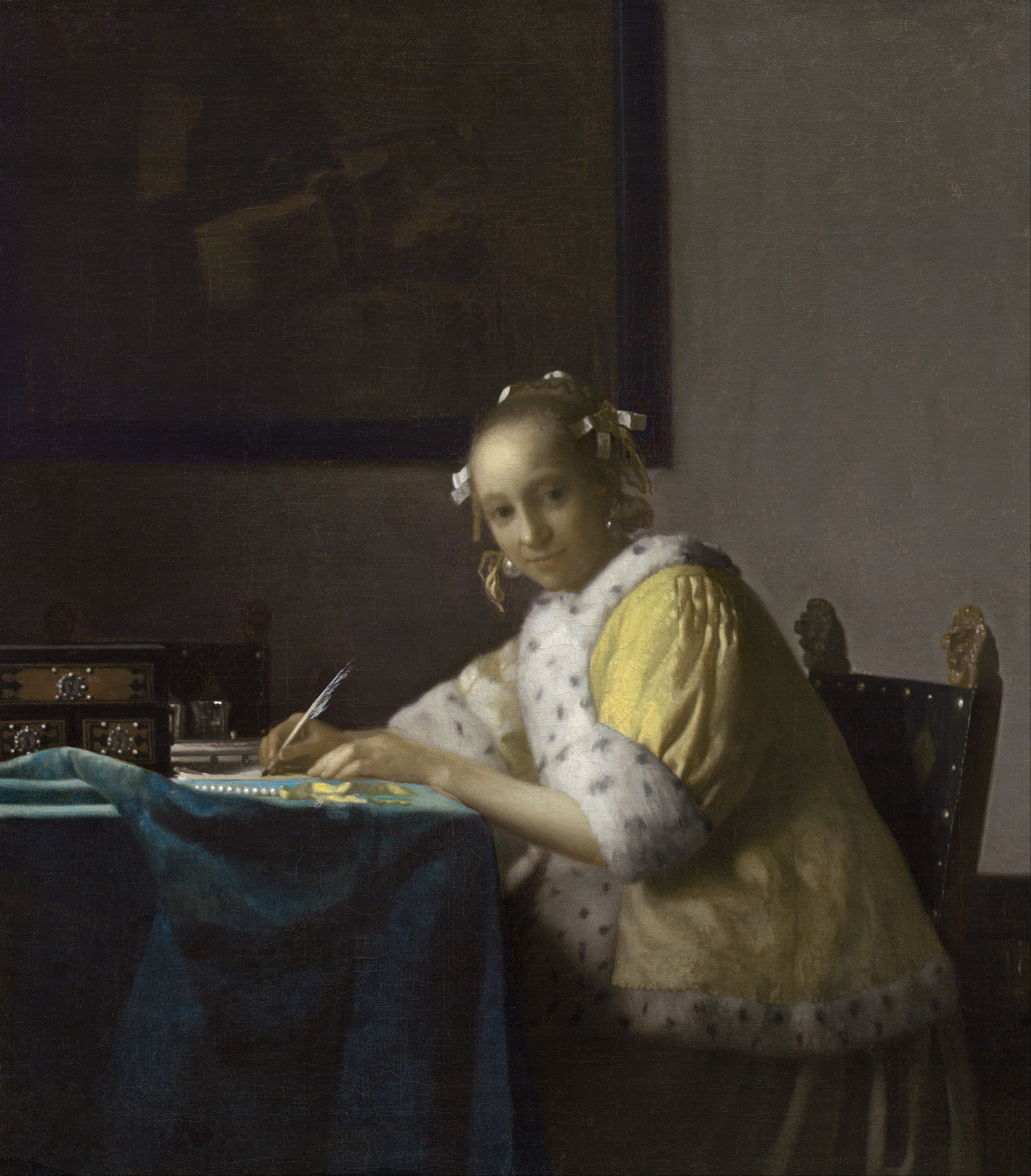
A Lady Writing
(Schrijvend meisje)c. 1662–1667
Oil on canvas, 45 x 39.9 cm. (17 3/4 x 15 3/4 in.)
National Gallery of Art, Washington D.C.
acc. no. 1962.10.1

The textual material contained in the Essential Vermeer Interactive Catalogue would fill a hefty-sized book, and is enhanced by more than 1,000 corollary images. In order to use the catalogue most advantageously:
1. Scroll your mouse over the painting to a point of particular interest. Relative information and images will slide into the box located to the right of the painting. To fix and scroll the slide-in information, single click on area of interest. To release the slide-in information, single-click the "dismiss" buttton and continue exploring.
2. To access Special Topics and Fact Sheet information and accessory images, single-click any list item. To release slide-in information, click on any list item and continue exploring.
The painting of the still life on the background wall
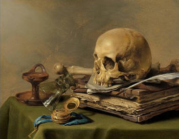
Vanitas Still Life
Pieter Claesz
1630
Oil on panel, 39.5 x 56 cm.
Mauritshuis, The Hague
The dim backdrop presents a still life painting featuring a foreshortened viol da gamba, painted by an unidentified artist. There is a strong likelihood that this depiction aligns with the piece cataloged in Vermeer's posthumous inventory of movable goods as a "bass viol with a skull," a composition that would have unquestionably fallen into the category of a memento mori or Vanitas work of art, in the binnekeucken (interior kitchen). While the bass viol is reasonably distinguishable, the presence of the skull eludes us, conceivably owing to the degradation of the picture-within-a-picture. Within the interior kitchen, a notation by a notary's clerk enumerates a variety of items including multiple paintings: a seascape, two "tronien" (faces) executed "in the Turkish fashion," and an additional pair of "tronien" attributed to Hoogstraten.
Although Vanitas compositions were prevalent during the era, it is conceivable that this particular work held deep significance for the artist and his family. Death had visited the Vermeer family on multiple occasions. The demise of Vermeer transformed Catharina into a widow, and together with Johannes, they endured the heartache of losing several young offspring—culminating in the tragic stillbirth of a child less than three years prior to the drafting of the inventory in June 1673. This recurring cycle of sorrow and loss undoubtedly left a profound mark on the lives of the Vermeers.
The term "memento mori," derived from Latin, translates to "Be mindful of death." This phrase can be further rendered as "Remember that you are mortal," "Remember you will die," "Remember that you must die," or "Remember your death." It designates a category of paintings that exhibit considerable diversity yet share a common objective—to serve as a reminder of human mortality.
In the present composition, scholars have construed the Vanitas motif as a cautionary reflection on the young woman's seemingly trivial and transient engagement: letter-writing. Esteemed critic Peter Sutton noted that associating letter writing with vanity and fleeting gratification was a prevalent theme in genre painting during that era. However, the self-aware smile portrayed by the young letter writer and the composed ambiance that permeates this scene appear incongruent with such a didactic interpretation.
The "Spanish" chair
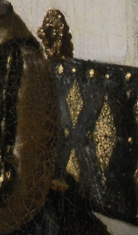
Officer and Laughing Girl (detail)
Johannes Vermeer
c. 1657–1660
Oil on canvas, 50.5 x 46 cm.
Frick Collection, New York
Vermeer's 35 (?) paintings features two distinct types of Spanish chairs adorned with lion-head finials. One variation presents five gilt lozenge patterns on black leather upholstery, accompanied by characteristic oval-shaped lion-head finials. The other variant features blue upholstery and with more slender finials. An equivalent chair with a lozenge design makes its appearance in the preceding painting Officer and Laughing Girl (left detail) and Girl Reading a Letter at an Open Window. Several scholars have given symbolic significance to the lion-head motif. One ventured so far as to interpret them as harboring "latent expressions of male aggression." In light of Freud's memorable adage, "Sometimes a cigar is just a cigar," it is plausible that occasionally, a chair is precisely that—a chair. This perspective gains ground, especially considering the frequent recurrence of such chair depictions within Dutch interior art.
In any event, the probate inventory of Vermeer's abode documented nine red Spanish leather chairs ("negen roo spaensleere stoelen") situated within the Great Hall. These chairs enjoyed enormous popularity within the Dutch Republic during the 17th century. The term "Spanish" denoted the design rather than their origin. From the context, it can be deduced that the reference to "red" by the notary's clerk pertained to the wood's hue rather than the color of the leather. Vermeer incorporated Spanish' chairs in approximately a quarter of his paintings. These chairs exhibit a distinctive design on their backrests, featuring twin finials with lion heads clutching rings in their mouths. They are upholstered in black leather, featuring an embossed gilt pattern comprising five lozenges.
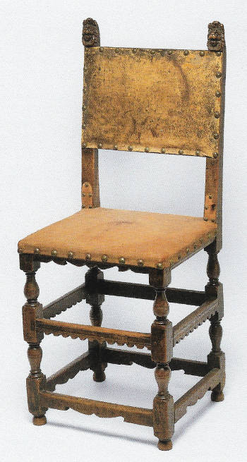
A cadre of experts subscribes to the notion that the telltale pointillés—sequin-like dots of luminous paint adorning the intricately sculpted lion-head finials—can be traced to camera obscura vision. Yet, even this hypothesis faces its share of dissenters. Walter Liedtke took a cautious stance, warning against an excessive emphasis on the camera obscura in deciphering Vermeer's artistic methods and goals. He contended that the presence of optical effects akin to those evoked by the camera obscura "does not necessarily imply that the artist must have employed a camera obscura." He writes, "Vermeer possessed extraordinary visual acuity, a talent that encompassed his profound fascination with light's behavior and his capacity to recall images akin to how one might remember dialogue. Whether he initially encountered something within his surroundings, through an optical device, or in the work of another painter remains a complex question. Once observed, the effect seamlessly integrated into the artist's arsenal, subsequently evolving into a hallmark of his style that he could effortlessly replicate or adapt at his discretion. This aspect was the result of learned skills. The remainder of his mastery, the essence of genius, defies explanation."
The blue tablecloth
A comparable blue cloth can be observed in other Vermeer works such as Woman Holding a Balance, Woman with a Pearl Necklace and other instances where it's meticulously draped in mountainous folds. In this particular painting, the folds exhibit a more subdued nature, seamlessly aligning with the tranquil ambiance of the scene. These folds gently catch incoming light which softly resonates against the pale lemon-yellow ribbon of the pearl string, resulting in one of the most evocative chromatic expressions within the artist's oeuvre.
Is this painting a portrait?
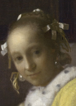
Various writers have proposed that the turned head of the young woman indicates that the painting was intended as a portrait. Moreover, Vermeer seems to have taken more care to individualize the woman than usual. Her head is set in the middle of the canvas and the composition is arranged to reinforce the face as the psychological center. More than one writer has suggested that the model may have been Vermeer's wife Catharina Bolnes, although there is no objective evidence to back up such a claim.
The young lady's hairstyle with braided chignon and ribbons tied in bows formed like stars was popular in the third quarter of the 17th century, particularly after the early 1660s. This information helps experts date the painting to the mid-1660s since, like many works by Vermeer, this canvas is signed but not dated.
The braided chignon, a prominent element of the hairstyles of the period, involved twisting and coiling the hair at the back of the head to form a bun or knot. This was a versatile style that could vary in size and placement, allowing for both a more demure and understated look or a more extravagant and eye-catching appearance. The addition of ribbon added a touch of elegance and whimsy to the overall look. Ribbons were often used not only for decoration but also to secure and hold the hair in place.
The ebony jewelry box

The ebony box, adorned with decorative panels and studded nail heads, and the metal writing set situated just behind it, can also be observed in Vermeer's later painting Mistress and Maid. Similar objects graced the interiors of various genre scenes during that period. Sometimes described as a jewel casket, it is perhaps more likely to be a writing box, used to store writing supplies or a secret cache of letters and other precious items. The coffer’s design suggests it is of Indo-Portuguese origin, produced in the Goan region and imported into Europe by Dutch or Portuguese traders.
According to Vermeer expert Lisa Vergara, artists such as Vermeer and Gerrit ter Borch, among others of their time, fashioned their compositions using an assortment of costumes and props they had at their disposal. In the Netherlands, writing sets typically comprised a plate hosting two small cup-like vessels, each topped with a lid: one intended for holding ink and the other for "blotting sand" or pounce (later resembling a salt shaker), alongside a quiver designed for storing quills. More sophisticated variations of these sets featured one or two drawers, providing storage space for writing implements like quills, pen-knives, signets and sealing wax.
The quill pen
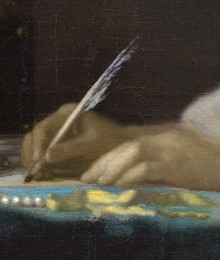
X-ray images of the current painting reveal adjustments in both the orientation of the quill pen and the contour of the hand that holds it. The letter’s creased folds and lines of writing, and the horizontal angle at which the woman holds her quill (rather than the vertical position more customary for writing), suggest that she is reviewing or revising a letter already written.
Dating back to around 700 A.D., the quill pen stood as the primary writing tool until the 19th century when it was succeeded by the dip pen and subsequently the fountain pen. Quills required frequent sharpening, utilizing a dedicated "pen-knife," and had a lifespan of merely a week. This is why artworks depicting lawyers or scholars in their studios often showcase quill pens resting upon desks. Crafted from hand-cut goose feathers, quill pens delivered sharp strokes and greater flexibility compared to steel pens.

A Scholar Sharpening his Quill (detail)
Gerrit Dou
1633
Oil on panel, 25.5 x 20.5 cm.
Leiden Collection, New York
The sturdiest quills hailed from the primary flight feathers of birds taken during the spring season. Writers favored feathers from the left wing due to their curvature away from the hand gripping the pen. While goose feathers were the most common choice, rarer and pricier swan feathers were deemed a premium option. Depending on feather availability, strength and the desired penmanship style, other feathers like those from crows, eagles, owls, hawks and turkeys were also employed in quill pen creation. Calligraphers even examined ancient manuscripts to discern how frequently a scribe had to sharpen their quill.
Modifying the quill's structure involved subjecting it to hot sand, bolstering the feather's barrel and enhancing its flexibility. Once cooled, the nib could be shaped. Often, the barbs of the feather were removed to provide a more secure grip for the writer. The quill's shaft acted as an ink reservoir, with ink flowing to the tip through capillary action.
The paper quality varied, with premium paper crafted from wood, hemp and linen, while rougher versions were produced using rags from old clothing.
The string of pearls

This string of pearls with a lemon yellow ribbon is almost identical to that which can be seen lying on the table in Vermeer's Woman Holding a Balance. If carefully observed, the outer edge of each pearl has barely been delimited. Only the globular forms of the thick impasto highlights, called pointillés, tell us exactly where each pearl is located. The lack of a definite contour suggests the pearl's transparency while the roundness of the pointillés inform us of their reflective quality and their spherical form. Throughout his career, Vermeer experimented with various techniques to render the particular luminosity of pearls.
The white-washed walls
Interior with a Merry Company
Joost Cornelisz. Droochsloot
1645 Oil on canvas, 98.5 x 127.9 cm.
Centraal Museum, Utrecht
Perhaps the ordinary white-washed walls in Vermeer's paintings suggest meaning that is not apparent to the modern viewer. The art historian H. Rodney Nevitt pointed out that a 17th-century Dutchman who was returning from a long period of travel once remarked that he was happy to be at home once again within the comforting white-washed walls. Evidently, at the time such walls were uncommon outside the Netherlands.
The stark uneven walls present one of the most challenging pictorial problems in Vermeer's oeuvre. Observing similar renderings by Vermeer's contemporaries, the spectator cannot help but note the various tones of gray pigment used. Instead, in Vermeer's renderings, these same or similar tones appear inseparable from the play of light as it rakes across the uneven surface of the plastered surface—paint seems to disappear.
In this painting, the palette for the wall was simple as it is effective: finely modulated mixtures of white lead, umber and black. This simple formula for painting white objects was widely known.
What do the white-washed walls mean?
Interior with a Merry Company
Joost Cornelisz. Droochsloot
1645 Oil on canvas, 98.5 x 127.9 cm.
Centraal Museum, Utrecht
Perhaps the ordinary white-washed walls in Vermeer's paintings suggest underlying meaning of Dutch identity which is not apparent to the modern viewer. The art historian H. Rodney Nevitt pointed out a 17th-century Dutchman who was returning from a long period of travel once remarked that he was happy to be at home once again within the comforting white-washed walls which, evidently, at the time were uncommon outside the Netherlands.
The stark uneven walls present one of the most challenging pictorial problems in Vermeer's oeuvre. Observing similar renderings by Vermeer's contemporaries, the spectator cannot help but note the various tones of gray pigment used. Instead, in Vermeer's renderings, these same or similar tones appear inseparable from the play of light as it rakes across the uneven surface of the plastered surface—paint seems to disappear.
In this painting the palette for the wall was simple as it is effective: finely modulated mixtures of white lead, umber and black. This simple formula for painting white objects was widely known.
The fur-trimmed yellow morning jacket

Many art historians and writers of the past believed that the candid fur trim of Vermeer's yellow jackets was made from ermine (taken from the animal called the stoat). However, Dutch costume expert Marieke de Winkel discovered that even in the inventories of the wealthiest women ermine was never mentioned. It is more likely that the trim was actually made of the more humble cat, squirrel or mouse. Whatever may be the case, by painting the faux spots on the trim the artist probably aspired to convey an atmosphere of refined luxury, and perhaps virtue, where true ermine would have been at home.
In Europe, ermine furs were a symbol of royalty and purity. The ceremonial robes of members of the British House of Lords are trimmed with ermine. A Renaissance legend had it that an ermine would die before allowing its pure white coat to be besmirched. When it was being chased by hunters, it would supposedly turn around and give itself up to the hunters rather than risk soiling itself.
Catharina's yellow morning jacket must have been cherished by the artist since it appears five times in his oeuvre, each time painted with unsurpassed delicacy. In Vermeer's death inventory of 1676 a "yellow satin mantle with white fur trimmings" was found in the "groote zael" (great hall) of the artist's home, which likely belonged to his wife. Notable is the fact that in the present painting the distribution of the black spots on the trim just below the figure's neck appear to correspond reasonably well to those of the Mistress and Maid (see comparison left) and the Woman with a Pearl Necklace. Such adherence to reality is astounding in the light of the fact that no one, perhaps even Vermeer's wife, would have know if the spots were painted correctly or not.
The gray gown

Interior with a Lady Peeling an Apple
Gerrit ter Borch
1660s
Oil on canvas on panel, 36.3 × 30.7 cm.
Kunsthistorisches Museum, Vienna
The elegant lady wears a mid-tone gray full-length gown which, judging by its thick folds, appears to be crafted from relatively heavy material. A similar garment or a garment of the same style is featured in Vermeer's Woman with a Pearl Necklace. In the latter artwork, a few thin black strips of material run vertically along the front of the gown. This same style of clothing is evident in Gerrit ter Borch's Interior with a Lady Peeling an Apple, curiously paired with a fur-trimmed yellow jacket similar to the one present in Vermeer's work.
special topics
- Portrayals of the "new woman"
- The "noblest emotions and desires"
- Were Vermeer's compositions really balanced?
- Letters: shaping commerce, minds and hearts
- Vermeer's pearls
- Vermeer and the "scholar portrait"
- Vermeer's "still lifes"
- Dutch light
- An unidentified object
- Lead-tin yellow: the queen of colors
- Evoking form and space with paint
- Listen to period music
The signature

Center left on frame of picture on back wall: IVMEER (IVM in ligature).
(Click here to access a complete study of Vermeer's signatures.)
Dates
c. 1666
Albert Blankert, Vermeer: 1632–1675, 1975
c. 1665–1666
Arthur K. Wheelock Jr., The Public and the Private in the Age of Vermeer, London, 2000
c. 1665–1667
Walter Liedtke, Vermeer: The Complete Paintings, New York, 2008
c. 1662–1665
Wayne Franits, Vermeer, 2015
(Click here to access a complete study of the dates of Vermeer's paintings).
Technical report
The ground appears to be a single layer of a warm, light ocher color, containing chalk, (plant?) black, red and yellow iron oxide (perhaps burnt sienna and yellow ocher) and lead white.
The brushwork of the final paint layers is very thin, except in the lighter tones. Thicker paint has been used only in the form of rounded dots for the highlights. Two preparations of lead-tin yellow were used in the yellow jacket: one coarsely ground, and the other more finely ground and paler, used for the highlights on the shoulder pleats. X-radiography and infrared reflectography indicate that Vermeer made an alteration to the angle of the quill and to some of the fingers holding it.
* Johannes Vermeer (exh. cat., National Gallery of Art and Royal Cabinet of Paintings Mauritshuis - Washington and The Hague, 1995, edited by Arthur K. Wheelock Jr.)

Provenance
- (?) Pieter Claesz. van Ruijven, Delft (d. 1674); (?) his widow, Maria de Knuijt, Delft (d. 1681);
- (?) their daughter, Magdalena van Ruijven, Delft (d. 1682);
- (?) her widower, Jacob Abrahamsz Dissius (d. 1695);
- Dissius sale, Amsterdam, 16 May, 1696, no. 35;
- J. van Buren, The Hague;
- Van Buren sale, The Hague, 7 November, 1808, no. 22;
- Cornelis Jan Luchtmans, Rotterdam (1808–1816);
- Luchtmans sale, Rotterdam, 20 April, 1816, no. 90;
- F. Kamermans, Rotterdam, by 1819;
- Kamermans sale, Rotterdam, 3 October, 1825, no. 70 (to Lelie);
- Hendrik Reydon et al. sale, Amsterdam, 5 April, 1827, no. 26;
- François-Xavier, comte de Robiano, Brussels (1827–1837);
- De Robiano sale, Brussels, 1 May, 1837, no. 436 (to J. Héris for the following);
- Ludovic, comte de Robiano, Brussels (1837–d.1887);
- Heirs De Robiano, Brussels (1888–1906);
- [J. & A. Le Roy, Brussels, 1907];
- J. Pierpont Morgan, New York (1907–d.1913, from G.S. Hellman);
- his son, J. P. Morgan, Jr., New York (1913–1940);
- Sir Harry Oakes, Nassau, Bahamas (1940–1943);
- Lady Eunice Oakes, Nassau, Bahamas (1943–1946);
- [M. Knoedler & Co., New York, 1946];
- Horace Havemeyer, New York (1946–1956);
- his sons, Harry Waldron Havemeyer and Horace Havemeyer, Jr., New York (1956–1962);
- National Gallery of Art, Washington, DC, Gift of Harry Waldron Havemeyer and Horace Havemeyer, Jr., in memory of their father, Horace Havemeyer (acc. no. 1962.10.1).
Exhibitions
- Brussels 1873
Exposition de tableaux et dessins d'anciens maitres organisée par la société néerlandaise de bienfaisance à Bruxelles
Musées Royaux
76, no. 264 - New York 1908 (1908 and 1909–1913)
Loan to display with the permanent collection
The Metropolitan Museum of Art - New York September 25–October 9, 1909
The Hudson-Fulton Celebration
The Metropolitan Museum of Art
137, no. 136 - Rotterdam July 9–October 9, 1935
Vermeer, oorsprong en invloed: Fabritius, de Hooch, de Witte
Museum Boijmans Van Beuningen
37, no. 86a - New York April, 1939–October, 1940
Masterpieces of Art. European Paintings and Sculpture from 1300–1800
New York World's Fair
195, no. 399, pl. 72 - New York 1940
Loan Exhibition of Allied Art for Allied Aid for the Benefit of the Red Cross War Relief Fund
M. Knoedler & Co.
no. 6 - New York 1941
Loan Exhibition in Honor of Royal Cortizzos and His 50 Years of Criticism in the New York Herald Tribune
M. Knoedler & Co.
18–19, no. 17 - New York 1942
Paintings by the Great Dutch Masters of the Seventeenth Century
Duveen Galleries
89 and 159, no. 68, ill. - Raleigh (NC) 1943
An Exhibition of Paintings by Living Masters of the Past
Baltimore Museum of Art, The North Carolina State Art Society Gallery
unnumbered catalogue and ill. - New York 1946
Loan Exhibition: 24 Masterpieces
M. Knoedler & Co.
no. 15, ill. - Paris 1976
Chefs-d'oeuvre des Musées des Etats-Unis de Giorgione à Picasso
Musée Marmottan
no. 18 and ill. - Leningrad 1976
Zapadnoevropeiskaia i Amerikanskaia zhivopis is muzeev ssha (West European and American Painting from the Museums of USA)
State Hermitage Museum
unpaginated and unnumbered catalogue - Moscow 1976
Zapadnoevropeiskaia i Amerikanskaia zhivopis is muzeev ssha (West European and American Painting from the Museums of USA)
State Pushkin Museum
unpaginated and unnumbered catalogue - Kiev 1976
Zapadnoevropeiskaia i Amerikanskaia zhivopis is muzeev ssha (West European and American Painting from the Museums of USA)
State Museum
unpaginated and unnumbered catalogue - Minsk 1976
Zapadnoevropeiskaia i Amerikanskaia zhivopis is muzeev ssha (West European and American Painting from the Museums of USA)
State Museum
unpaginated and unnumbered catalogue - Tokyo 1987
Space in European Art: Council of Europe Exhibition in Japan
National Museum of Western Art
no. 86 - Leningrad 1989
Masterpieces of Western European Painting of the XVIth-XXth Centuries from the Museums of the European Countries and USA
Hermitage Museum
no. 14 and ill. - San Francisco 1990–1991
Great Dutch Paintings from America, Mauritshuis, The Hague
M. H. de Young Memorial Museum
no. 67, color ill., as "A Girl Writing a Letter." - Frankfurt 1993–94
Leselust: Niederländische Malerei von Rembrandt bis Vermeer
Schirn Kunsthalle Frankfurt
no. 85 and ill. - Washington D.C November 12, 1995–February 11, 1996
Johannes Vermeer.
National Gallery of Art
156–159, no. 13 and ill. - The Hague March 1–June 2, 1996
Johannes Vermeer
Mauritshuis
156–159, no. 13 and ill. - Washington D.C. November 24, 1999–February 6, 2000
Johannes Vermeer: The Art of Painting
National Gallery of Art - Kyoto January 30-April 4, 1999
Masterpieces from the National Gallery of Art, Washington
Kyoto Municipal Museum of Art
no. 83 and ill. - Tokyo 1999
Masterpieces from the National Gallery of Art, Washington
Metropolitan Art Museum Metropolitan Art Museum
no. 83 and ill. - Newark October 17, 2001–January 20, 2002
Art and Home: Dutch Interiors in the Age of Rembrandt
Newark Museum
no. 108, fig. 108 (shown only in Denver) - Denver March 2–May 26, 2002
Art and Home: Dutch Interiors in the Age of Rembrandt
Denver Art Museum
no. 108, fig. 108 - Dublin October 1–December 31, 2003
Love Letters: Dutch Genre painting in the Age of Vermeer
National Gallery of Ireland
no. 38, fig. 55 and ill. 181 - Rotterdam October 23, 2004–January 9, 2005
Senses and Sins: Dutch Painters of Daily Life in the Seventeenth Century
Museum Boijmans Van Beuningen
no. 69 and ill. - FrankfurtFebruary 10–May 1, 2005
Senses and Sins: Dutch Painters of Daily Life in the Seventeenth Century
Städelsches Kunstinstitut und Städtische Galerie
no. 69 and ill. - Pasadena November 7, 2008–February 16, 2009
Vermeer's A Lady Writing from the National Gallery of Art
Norton Simon Museum - Kyoto 25 June–16 October, 2011
Communication: Visualizing Human Connection in the Age of Vermeer
Municipal Museum of Art
no. 42 and ill. - Sendai October 27, 2011–December 12, 2011
Communication: Visualizing Human Connection in the Age of Vermeer
Miyagi Museum of Art
no. 42 and ill. - Tokyo December 23–March 14, 2012
Communication: Visualizing Human Connection in the Age of Vermeer
The Bunkamura Museum of Art
no. 42 and ill. - Boston October 11, 2015–January 18, 2016
Class Distinctions: Dutch Painting in the Age of Rembrandt and Vermeer
Museum of Fine Arts
137, 151–52, 170, cat. no. 31 and ill. - Kansas City February 4–May 29, 2016
Reflecting Class in the Age of Rembrandt and Vermeer.
The Nelson-Atkins Museum of Art - Norfolk November 1-December 18, 2016
A Lady Writing
Chrysler Museum of Art - Paris February 22–May 22, 2017
Vermeer and the Masters of Genre Painting: Inspiration and Rivalry
Musée du Louvre - Dublin June 1–September 17, 2017
Vermeer and the Masters of Genre Painting: Inspiration and Rivalry
Musée du Louvre - Washington D.C. October 22, 2017–January 21, 2018
Vermeer and the Masters of Genre Painting: Inspiration and Rivalry
Musée du Louvre - Tokyo October 5, 2018 –February 3, 2019
Making the Difference : Vermeer and Dutch Art
Ueno Royal Museum - Washington D. C. October 8, 2022–January 8, 2023
Vermeer's Secrets
National Gallery of Art - Amsterdam February 10– June 4, 2023
VERMEER
Rijksmuseum
no. 22 and ill.
(Click here to access a complete, sortable list of the exhibitions of Vermeer's paintings).
Portrayals of a "new woman"
Curiosity (detail)
Gerrit ter Borch
c. 1660
Oil on canvas, 76 x 62 cm.
Metropolitan Museum of Art, New York
Art historian Mariët Westermann noted that during the 17th century there was a sudden and unprecedented increase in first-person statements in the Dutch Republic. Diaries, journals, soul-searching poems, self-portraits, not the least, private letters, that "reading and writing have in common the capacity of independent thought associated with not only men but for the first time with the women who pose in Vermeer's painting. This mental ability is figured not merely by the theme of writing or reading by averted gazes." However, it was not Vermeer who pioneered this way of representing the Dutch woman but Gerrit ter Borch in a series of nuanced interiors where women began to receive the same intellectual and psychological regard that was hitherto afforded only to the male figure in the visual arts." Nonetheless, Vermeer's elegant letter writer cannot be taken as the norm because, as Ann Jensen Adams pointed out, "a substantial proportion of 17th-century men and women were literate to some degree but fewer were able to compose a formal letter or craft letters in a fine hand."
Critics have often noted that women in Vermeer's paintings cannot be considered beauties in the conventional sense of the word. Their beauty derives from the way they are painted and from their elegant context. Lisa Vergara wrote that "the qualities that we attribute to Vermeer's work as a whole apply equally to the women they picture: paintings and personages share dignity, equilibrium, an exceptional vivid presence and abstract purity. The figures range from girlish to maternal yet all are youthful with high curved foreheads, features that evenly balance the individual and the classical, and simple believable postures. Their costuming—its coloring, shapes and associations—contributes so much to bodily construction and expression that the absence of nudes from Vermeer's oeuvre hardly seems surprising."
The "noblest emotions & desires"
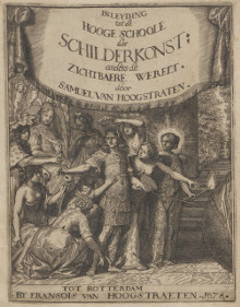
A page from
Inleyding tot de Hooge
Schoole der Schilderkonst
Samuel van Hoogstraten
Rotterdam, 1678
To understand the artistic climate in which Vermeer worked, it is useful to consult prevalent art theory. During those times, it went without being questioned that history, and the painting of human figures were the highest forms of art.
Samuel Van Hoogstraten, who introduced the doctrine of the hierarchy of subjects to Dutch art theory in his Inleiding tot de Hooge Schoole der Schilderkunst, wrote that the highest level (the third in his scheme) of painting was to show the noblest emotions and desires of rational human beings. In regards to portraiture: "Indeed, those portrait painters who create accurate resemblances, and imitate eyes, noses and mouths all skillfully, I would not wish to place...above the first grade unless they make their faces overflow with the quality of the intellectual soul."
Vermeer's pearls
This young woman seems to be wearing a glass "drop earring" which has been varnished to look like an immense pearl. Such earrings were fashionable in Holland, with many examples seen in paintings by Van Mieris, Metsu and Ter Borch. Artificial pearls were invented by M. Jacquin in France around this time, thin spheres of glass filled with l'essence d'orient, a preparation made of white wax and silvery scales of a river fish called ablette, or bleak. Cultured pearls were also coming in from Venice.
Pearls are linked with vanity but also with virginity—a wide enough iconographic spectrum. In the 17th century, pearls were an important status symbol. In 1660, English diarist Samuel Pepys paid 4 1/2 pounds for a pearl necklace, and in 1666 he paid 80 pounds for another, which at the time amounted to about 45 and 800 guilders respectively (an average Dutch house might cost 1,000 guilders). At about the same time, the traveling French art connoisseur Balthasar de Monconys had been shown a single-figure painting by Vermeer, reputedly purchased for 600 guilders, a price he considered outrageous.
The largest known pearl with a perfect skin or "orient" had a circumference of 4 1/2 inches.
In the 17th century Netherlands, pearls held a significant and layered symbolism within the context of art, fashion, and society. With their lustrous sheen and rarity, pearls became synonymous with wealth and status. When portrayed in portraits, pearls often indicated the sitter's wealth, social standing, or the family's prosperity. But beyond mere opulence, pearls had deeper connotations.
The pure, unblemished surface of a pearl symbolized innocence, purity, and virtue. In portraits of women, especially brides or young women, pearls underscored their chastity and moral integrity. This symbolism was rooted in ancient traditions and religious contexts where pearls represented purity and were sometimes associated with the Virgin Mary.
Furthermore, in a more universal context, the pearl's origin story itself — born from a grain of sand transformed within the confines of an oyster — made it a symbol of transformation, patience, and the idea that beauty and value can emerge from adversity.
However, there was also a cautionary aspect to the portrayal of pearls in Dutch art. Given the Dutch Republic's emphasis on humility, frugality, and the dangers of vanity, pearls could also serve as a reminder of the transient nature of material wealth. In still life paintings, amidst symbols of vanitas such as skulls, wilting flowers, and timepieces, pearls reminded viewers of the fleeting nature of life and the superficiality of earthly riches.
Vermeer & the "scholar portrait"
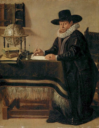
Portrait of Johan van
Beverwijck (1594–1647) in his Study
Jan Olis
c.1640
Oil on panel, 25.7 x 20.5 cm.
Mauritshuis, The Hague
While the intimate mood of this work is indeed impressive, its compositional origin is not derived from conventional portraiture. Vermeer expert Walter Liedtke highlighted that Vermeer, "with his gift for creative synthesis, saw that a newly fashionable type of genre picture, evidently introduced by Gerrit ter Borch, could be modified expressively by adopting an arrangement familiar from Dutch and Flemish 'scholar portraits,' such as Rubens' Caspar Gevartius, Van Dyck's Lucas van Uffel and Rembrandt's Portrait of a Scholar. This type was well-known through prints and had been treated on a small scale by several Dutch painters, as exemplified in Jan Olis's Portrait of Johan van Beverwijck in his Studio, dating back to about 1640."
Dutch and Flemish paintings of scholars, often referred to as "scholar portraits" or "learned portraits," were a popular genre in the 17th century. These paintings depicted individuals who were educated, intellectual and often associated with the world of learning, scholarship and science. Such portraits aimed to convey the sitter's erudition, expertise and engagement in intellectual pursuits. In these portraits, scholars were typically shown in a contemplative or studious pose, often seated at a desk or surrounded by books, scientific instruments, maps or globes, which symbolized their dedication to knowledge and their contributions to various academic fields.
Vermeer's "still lifes"
While not a single still life painted by Vermeer is known, the informal still life grouping within the present work is considered one of the artist's most refined passages. Vermeer appears to have relegated his concerns about still life painting to the recess of the background wall in the form of a dark Vanitas. This anonymous work, barely discernible today, very likely belonged to his mother-in-law Maria Thins. Most historians would concur that Vermeer would have never included such a sizable element in his composition in an arbitrary manner, even though the symbolic interpretations proposed by art historians thus far are not unanimous.
Vermeer might have altogether shunned the still life genre. According to Samuel van Hoogstraten, a painter and art theoretician who codified the hierarchical status of subject matter in painting, still life occupied the lowest tier. He demeaned still-life painters as "the foot soldiers in the army of art." While still life might be admirable from a technical perspective, Van Hoogstraten believed it did not demand the artist to engage their imagination in the manner that history paintings or paintings of figures did.
Despite theoretical warnings, still life paintings significantly outnumbered history paintings, which Van Hoogstraten positioned at the uppermost tier. He claimed that history paintings revealed "the noblest actions and intentions of rational beings."
Lead-tin yellow: the queen of colors
A Young Woman playing a Harpsichord
to a Young Man (detail)
Jan Steen
c. 1659
Oil on oak, 42.3 x 33 cm.
National Gallery, London
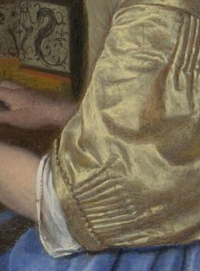
Natural ultramarine blue may be considered the king of Vermeer's palette, while lead-tin yellow could justly be called its queen. All the yellow morning jackets were painted with lead-tin yellow, and it served as an admixture to modify the color of other paints. Lead-tin yellow, a thick and grainy paint, applied well with excellent hiding power. It was one of the most common bright pigments, relatively inexpensive to produce.
Lead-tin yellow held various names in the past. Italian manuscripts referred to a color known as giallolino, identical to lead-tin yellow. The present name, lead-tin yellow, is self-explanatory, originating from heating a mixture of red lead and tin dioxide at temperatures ranging from about 650°C to 800°C. Lower temperatures produced warmer yellow hues, while higher temperatures resulted in more lemon-colored tones. This pigment exhibited a fine and uniform particle size, offering strong opaque color, particularly suitable for meticulous paintings. In the Netherlands, it found favor among flower painters as the base color for yellow flowers. Due to its high lead content, lead-tin yellow is highly toxic. Its gradual disappearance after 1750 lacks a satisfactory explanation.
Conservator Melanie Gifford from the National Gallery discovered that two distinct preparations of lead-tin yellow were employed in the yellow jacket of A Lady Writing. Vermeer appears to have initially created the strong highlights with a coarser variant of lead-tin yellow, subsequently refining the modeling and chiaroscuro with a finer one. Gifford highlights Vermeer's technique of "texturing the underpaint using granular pigments and bold brushwork. These textured underpaint passages persisted in the final image, drawing the viewer's attention. The lightest sections indeed capture the most light in the painting."
Vermeer blended lead-tin yellow with various shades of blue to achieve delicately nuanced greens. The green trompe l'œil curtain in Girl Reading a Letter at an Open Window resulted from combining lead-tin yellow and azurite. This same combination emerges in the green shutter of The Little Street.
Evoking form & space with paint
When compared to the wide range of paints available today in any art supply store, the 17th-century Dutch painter had to make do with a paltry few. Especially scarce were the so-called "strong colors" or bright colors. Even the finest paints of those times cannot compare in brilliance to the modern cadmium reds or yellows, not to mention the dazzling array of artificially manufactured greens and violets introduced towards the end of the 19th century.
To expand the visual effects of their paintings and enhance color intensity, 17th-century artists like Vermeer learned to exploit not only contrast in tone and color temperature but also the natural consistency, coarseness and transparency of paint. Brushwork played a vital role as well in creating the illusion of form and space.
Painters understood that different paint consistencies evoke distinct spatial qualities. Heavy impasto seems to advance toward the viewer, becoming more tangible, while thin, transparent paint tends to recede, evoking atmosphere rather than substance. As a result, the bright passages of a painting, which generally corresponded to its most crucial parts, were executed in thick, coarse impasto. Conversely, shadowed areas were painted with thin layers to capture the intangible nature of shadows. By juxtaposing areas of impasto with thin paint, the picture's surface becomes more dynamic than if painted with a continuous layer of uniform paint.
Such juxtaposition is evident in Lady Writing. The yellow satin sleeves are built up with a coarse yet pure lead-tin yellow. The brushwork defining the fabric's tucks and folds is clearly visible. The combined effect of impasto paint and the brush's irregularities creates a sparkling effect that naturally draws the eye, enhancing the garment's material presence. In contrast, the deep gray of the background wall is painted with unmodulated paint, so thin that the brown underlayer occasionally peeks through.
Listen to period music
![]() Unico Wilhelm van Wassenaer (1692–1766)
Unico Wilhelm van Wassenaer (1692–1766)
Concerto Armonico no. 2, Andante [920 KB]
http://www.amazon.com/Wassenaer-Concerti-Unico-Wilhelm-van/dp/B00006RHPO/ref=sr_1_2?ie=UTF8&s=music&qid=1255264489&sr=1-2
Dutch light

The play of light on a Delft antique shop window
Although the dim illumination of the present picture reminds us of the difficulties faced by the painter who worked there, with respect, for example, to southern European artists who enjoyed sunlight nearly all year around.
Perhaps, it is precisely because light was such a scarce commodity in the Netherlands that Dutch painters devoted so much of their talents to rendering its innumerable activities. Certainly, of all its practitioners, Vermeer was the Dutch artist who made light itself one of the principal subjects of his art.
Dutch weather was, and still is, characterized by heavy rain, intermittent drizzle and cloudy skies much of the year. Even on the sunniest days, rapidly passing clouds can dramatically change indoors light within minutes, if not seconds. While the fickleness of northern light probably affected the activities or humors of the working population to some degree, it must conditioned the painter more deeply. By force, the Dutch artist was constrained to develop his powers of observation and visual memory beyond those of his southern counterparts.
Daylight hours vary between the Netherlands and Italy due to their latitudinal differences. The Netherlands, being farther north, has shorter daylight hours in winter (around 7-8 hours) and longer hours in summer (around 16-17 hours). Italy, located farther south, has relatively longer daylight hours throughout the year, with around 9-10 hours in winter and 15-16 hours in summer. These differences result from Earth's tilt and orbit around the sun.
Were Vermeer's compositions really balanced ?
Vermeer writers have recurrently singled out Vermeer's works for their compositional refineries and exquisite aesthetic balance. In a recent paper, the art historian Paul Taylor argued that the concept of aesthetic balance, which is a fundamental precept of 20th-century pictorial art, was simply not available to the 17th-century Dutch artist. Taylor's objection rests on the fact that "contemporary art theoretical texts written in Dutch provide no evidence that 17th-century Dutch and Flemish artists tried to achieve an overall balance of design." "In fact, I do not know of any use of the idea of compositional balance in any art theoretical text in any language before the 19th century: the earliest instance of the concept's employment that I have been able to find is in the work of John Ruskin."
How then, did Vermeer organize his compositions if not according to aesthetic criteria? Taylor argues that Gérard de Lairesse, an accomplished history painter and most influential art writer of the time, maintained that composition, or ordinantie, "was not a matter of patiently balancing the different shapes and contours of a scene until they pleased the eye. Composition was first and foremost the attempt to tell a story clearly and logically." Particularly relevant to Vermeer's essential mode on organizing the appearance of his interiors was de Lairesse's warning that the meaning and emotional power of a painting would be swamped by the extraneous details.
Another concept which de Lairesse associated with composition was "probability," in Dutch, waarschynelykheid. "Probability is the most important thing to bear in mind when composing a picture." He adds that "one must make it evident not only in the general disposition, but also in each particular object, and attentively reject things which are in conflict with it." There is however, no mention in de Lairesse's text of what is commonly referred conceived as formal compositional balance, or design, which involves the appropriate distribution and balance of light and dark masses in in size, shape and position.
An unidentified object

Art historians have scrutinized Vermeer's paintings for decades, meticulously examining every millimeter, in the quest for hidden details that might illuminate his work. Surprisingly, no one has hitherto taken note of the patch of wall to the right of the lady's chair, which terminates conspicuously high on the picture plane, beyond where the wall would naturally meet the floor. This anomaly likely implies the presence of an object flush against the wall, an object yet unidentified. Until recently, even the finest digital images failed to divulge any detail in this area, presenting merely a uniform expanse of dark paint. However, with the advent of ultra-high-resolution digital cameras, the painting has been re-photographed, revealing a new level of clarity. Upon close examination, the supposedly vacant space discloses faint but discernible brushstrokes, deliberately applied. These strokes seem to intimate the decorative features of an object, perhaps a box or storage chest. It stands to reason that Vermeer aimed to depict an object familiar to his contemporaries, but one that has since faded from our comprehension over time.
Letters: shaping commerce, minds and hearts
During the 17th century in the Netherlands, letter writing held immense significance and played a pivotal role in shaping communication, culture and society, bolstered by a remarkable surge in economic, artistic and cultural developments within the Dutch Republic. Amidst this backdrop, the act of letter writing emerged as a powerful and multifaceted medium that influenced various aspects of daily life.

A Lady Receiving a Letter
Gabriel Metsu
c. 1658
Oil on wood panel, 25.7 x 24.4 cm.
Timken Museum of Art, San Diego
Letter writing served as a vital connection between individuals separated by geographical distances. It provided a means for people to maintain bonds with family, friends, and acquaintances, bridging the gap created by physical space. In an era devoid of instant communication, letters became the threads that linked hearts and minds. Letters became tools for conducting business affairs, enabling merchants and traders to communicate orders, negotiate deals and stay informed about market trends.
Beyond commerce, the 17th-century Netherlands was a fertile ground for cultural and intellectual growth. Letters became conduits for the exchange of ideas, fostering creative innovation, scientific inquiry, and philosophical discourse. Intellectuals, artists, and thinkers engaged in written correspondence to share thoughts, engage in debates, and collaborate on diverse projects. As literacy rates increased, more individuals were able to engage in both writing and reading letters.
The significance of letter writing led to the emergence of manuals and guides designed to teach the art of composing effective letters. This democratization of letter writing transcended social classes, enabling diverse segments of society to participate in the practice. These resources provided templates, advice on writing style, and guidelines for observing proper etiquette in correspondence. As a result, individuals became adept at crafting meaningful and impactful letters.
The act of letter writing in this era involved the careful process of handwriting on paper using quills and ink. Letters typically followed a structured format, comprising a formal opening, the main body of the letter, and a closing sentiment. Once written, letters were often folded and sealed with wax or a signet ring before being sent on their way.
Just as e-mail now dominates written communication, in the 17th century the writing of personal letters became widespread and fashionable. Although letters had long existed, the notion that they could convey private feelings and emotions suddenly captured the popular imagination and transformed personal communication. Leading painters like Gerard ter Borch, Gabriel Metsu, Frans van Mieris, Pieter de Hooch and, of course, Vermeer made the letter a central feature of theirscenes of everyday life, defining the subject and creating images that would influence generations of painters to come.


