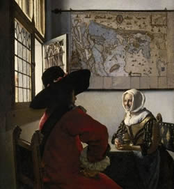
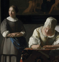
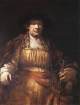
Officer and Laughing Girl
(De Soldaat en het Lachende Meisje)c. 1655–1660
Oil on canvas, 50.5 x 46 cm. (19 7/8 x 18 1/8 in.)
Frick Collection, New York
acc. no. 11.1.127

The textual material contained in the Essential Vermeer Interactive Catalogue would fill a hefty-sized book, and is enhanced by more than 1,000 corollary images. In order to use the catalogue most advantageously:
1. Scroll your mouse over the painting to a point of particular interest. Relative information and images will slide into the box located to the right of the painting. To fix and scroll the slide-in information, single click on area of interest. To release the slide-in information, single-click the "dismiss" buttton and continue exploring.
2. To access Special Topics and Fact Sheet information and accessory images, single-click any list item. To release slide-in information, click on any list item and continue exploring.
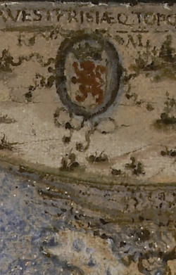
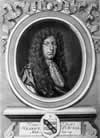
The map of Holland

A portrait of Willem J. Blaeu
by Jeremias Falck
Engraving
This map of Holland and West Friesland was designed by Balthasar Florisz. van Berckenrode in 1620. He provided twelve copies to the States General for 144 pounds. Due to financial difficulties, Van Berckenrode later sold the rights and the copperplates to Willem Jansz. Blaeu, who led a prominent publishing house in Amsterdam that specialized in maps. The map doesn't have a date, but it was likely printed between 1621, when Blaeu acquired the plates and the privilege to publish it, and 1629, when the privilege ended. Only one example is known to exist, located at the West Fries Museum in Hoorn, which confirms the accuracy of Vermeer's depiction. No copies from the initial state are known to have survived.
Critics often note that while the current map is colored, the two other versions in Vermeer's body of work, The Love Letter and Woman in Blue Reading a Letter, are in monochrome brown. The latter displays some of the same creases as the present painting, leading us to believe they are one and the same.
As mapmakers promoted that their maps could be custom printed and hand-colored, it's unclear which of the two versions was the original. Interestingly, the land areas, not the sea, are painted in light blue, further disorienting the viewer due to its non-traditional orientation. It's possible that the blue regions were once covered with a transparent yellow glaze, giving them a green hue typical of land areas. This technique of applying yellow over blue was common among Dutch painters and was particularly used by those painting still lifes for leaf depictions. Vermeer employed this method in the leafy greenery of Little Street. The color now appears blue because the yellow glaze, which deteriorates over time, has faded, revealing the blue underlayer.
The open window

Girl Reading a Letter at an Open Window (detail)
Johannes Vermeer
c. 1657–1659
Oil on canvas, 83 x 64.5 cm.
Gemäldegalerie Alte Meister, Dresden
In general, the windows in Vermeer's paintings conform to a pattern typical of Delft houses of the period. Each window is divided into four lights. There are two side-hung casements in the lower half of the frame and two fixed lights in the upper half. Almost all the casements feature decorative patterns—some plain, some intricate—formed by the shapes of their leaded panes. Philip Steadman, the London architect and Vermeer/camera obscura specialist, distinguishes three basic window patterns, which he dubs: the "lozenge" type, the "hourglass" type and the "squares and circles" type.
The lozenge design can be found in works like Officer and Laughing Girl, Girl Reading a Letter at an Open Window and The Milkmaid. The lozenges are situated in the topmost of five rows of rectangular panes. The casements are almost flush with the wall, not recessed to create a sill like other window types. There's a short distance from the window frame to the far wall of the room due to similarities in its overall design and positioning. The Milkmaid and the Officer and Laughing Girl, the variations of color and unevenness of the glass panes are registered with the singular attention. In his later interiors, Vermeer treated the windows more as abstract patterns, accentuating their geometric properties.
In the 17th century, the uneven or wavy appearance of glass panes in windows, as depicted in the present work, was a common characteristic due to the manufacturing techniques of the time. The primary method for producing window glass then was the "crown glass" process. Here's how it worked:
Molten glass was first blown into a large bubble. This bubble was then transformed into a flat disc by spinning it while it was still hot, creating a thick lump or "bullion" at the center. As the disc cooled and solidified, the outer edges were thinner, with the thickness increasing as one moved towards the center. Once cooled, the disc was cut into smaller panes. This method inherently resulted in uneven thickness.
As of yet, no one has identified the object(s) reflected in the window of Officer and Laughing Girl, with certainty. Gregor Weber posits a that in the closed section of the casement window, Vermeer subtly introduces a glimpse of the outside world. According to Weber, the artist uses a whitish tone to depict a cloud-covered sky and incorporates reddish tones below to represent the roof and facade of the building opposite. What makes this observation particularly intriguing is that no other painting by Vermeer provides or even hints at such a detailed view of the external world from an interior setting. On the other hand, Tim Jenison hypothesized that the reflection may, in fact, be precisely identified as the facade of the New Church on Market Place, in the center of Delft as seen from the first story of Mechelen, where Vermeer is may possibly have painted the scene. The reflection, if accurately represented by Vermeer, could offer valuable clues about the location and viewpoint of the room in which he painted. Still, without concrete evidence, this remains one of the many mysteries surrounding Vermeer's work.
Who is the young girl?
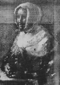
It is possible that the young girl who smiles at the officer was Vermeer's wife, Catharina Bolnes, although there is no proof in regards. Many critics believe that she had posed for other of her husband's compositions. Her luminous face, her unabashed smile and glittering yellow satin bodice neutralize the austere presence of the cavalier.
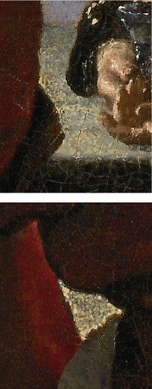
As can be seen from an x-radiograph (IRR) of the girl's bust, the figure had originally worn a linen nightrail (nachthalsdoek) over her shoulders, which, like her headscarf was an item often worn while in bed or informally during the day. According to arthur K. Wheelock Jr., this would have obscured the striking yellow color of her dress, which so effectively contrasts the red in the officer's coat. Another change made by Vermeer, was in the depiction of her headgear. Initially, he painted her wearing a cap that only covered her hair. However, by expanding the size of the headscarf and positioning it forward to encircle her face, the trajectory of her gaze is greatly intensified. This alteration likely aimed to amplify the depth of the connection between her and the officer.
Gesture
Although Vermeer employed gesture with great finesse to reveal the psychological state of his subjects in a subtle manner, the differences in the way his subjects' hands are positioned provide further insights. The relaxed openness of the young girl's sun-bathed hand contrasts markedly with the officer's, which curls back into deep shadow.
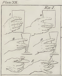
In her other hand, the young girl holds a drinking glass half full of alight white wine. Wine, more expensive than beer, was a symbol of social refinement. Gérard de Lairesse's manual for painters illustrates how an artist might convey a sitter's social status by the way they grip their glasses. Position No. 5, similar to the gesture in Vermeer's Girl with a Wine Glass, is the most dignified. De Lairesse wrote, "A prince holds it skillfully and cautiously below on the foot." The way the young girl holds her glass in this painting emphasizes the dazzling effects of sunlight over anatomical precision.

The young girl clutches what appears to be a Berkemeyer, a type of drinking glass with a wide, cylindrical stem and a funnel-shaped bowl. This shape is thought to have evolved from a wooden cup, with the prunts on the stem resembling gnarled branches or rough bark, serving as reminders of wooden beakers. The prunts provided a better grip, essential since forks were not yet ubiquitous, often leaving diners with greasy, slippery hands. In a piece titled "Sermon on Glassmaking," a contemporary Lutheran priest noted: "Nowadays one adds buttons, prunts and rings to glasses to fortify them. This design aids the drunken and clumsy in holding them." The Roemer, which gained popularity at the end of the 16th century, differs from the Berkemeyer due to the convex shape of its bowl. Berkemeyer glasses, initially crafted in Germany, are still produced there. They were made from "forest glass," named for being made in forested regions with ample wood fuel for furnaces. The greenish tint of this glass results from iron compound contamination.
The satin jacket
The Music Lesson (detail)
Johannes Vermeer
c. 1662–1665
Oil on canvas, 73.3 x 64.5 cm.
The Royal Collection, The Windsor Castle
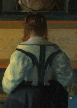
The laughing young girl wears a stylish satin jacket that appears in four other works by Vermeer as well. Only a few examples of these bodices remain. The bodice fits snugly around the bust, cinching the waist and lifting the bosom to create an hourglass silhouette. It was likely internally boned or worn over a stay. Vermeer's fondness for this garment is evident in the number of times he depicted it and the meticulous care he gave to its portrayal, each time subtly different that the last.
In the Netherlands, this garment was sometimes referred to as a schort or a wacht. However, some Vermeer literature mistakenly calls it a caraco or a pet en l'air, both of which describe a later and somewhat different type of garment. The Hessisches Landesmuseum Darmstadt houses a unique collection of well-preserved doublets and bodices from Cologne. While men donned international styles, Cologne women were influenced by Netherlandish fashions. These styles were popular until the latter half of the 17th century when French fashion began to prevail. In Vermeer's depiction, the top portion of the jacket was originally obscured by a large white collar.

Though not visible in most reproductions, the girl dons a blue apron over a deep olive-colored gown obscured by the shadow from the table. Blue aprons were commonplace in Dutch paintings. The color blue was preferred as it concealed stains more effectively than lighter shades. One could interpret the working apron to suggest the officer's unannounced visit while the girl was attending to her morning tasks. Her posture and facial expression indicate that while the cavalier's visit may not have been expected, it is certainly appreciated.
Negative space
Lady Writing a Letter with her Maid (detail)
Johannes Vermeer
c. 1670–1671
Oil on canvas, 71.1 x 58.4 cm.
National Gallery of Ireland, Dublin
Vermeer's astute use of so-called "negative space" exemplifies his pioneering approach to storytelling through purely visual means. By manipulating the voids and the spaces between objects, he imparted an added layer of depth and meaning to his scenes.
During the Dutch Golden Age, art was flourishing with detailed still lifes, vast landscapes and intimate domestic scenes. Most artists of the time focused on the rendering of objects, ensuring that every facet of the image was clearly recognizable and filled with with intricate detail. The goal was often to display technical prowess and mirror reality as closely as possible. The spaces between objects were not contemplated in their own right but considered inconsequential leftovers.
In contrast, Vermeer recognized that the absence of detail in certain areas between objects could be as expressive, if not more so, than the presence of detail. This idea was revolutionary. By allowing parts of his canvas to remain bare or minimally detailed, he created tension, balance and focus.
In the present composition, a large wedge-shaped area of white-washed wall divides the officer and laughing girl, even though one senses that the descending diagonal contours of the figures' arms appear that they will eventually touch. The seemingly simple inclusion of a careful shaped white-washed wall between them is more than just a backdrop. While the wall keeps them apart, their body language speaks of an underlying bond or attraction. The tension between separation and attraction, emphasized by the use of negative space and positive spaces, ensures the painting's narrative isn't static but rather filled with potential.
When Vermeer revisits this compositional strategy in Lady Writing a Letter with her Maid, it's clear that this wasn't a coincidental choice but rather a deliberate technique to convey unspoken dynamics between characters. In this later work, the space divides not just two individuals but two different worlds—the introspective world of the letter-writing lady and the watchful, external world of her maid. The recurring motif of using spatial divisions to hint at psychological and emotional barriers is testament to Vermeer's deep understanding of human relationships and and, above all, his ability to translate them into pure, universal pictorial terms.
Form, color, texture and expression
Vermeer, a "pure" painter, often employs contrasting forms, colors and textures to enhance the narrative of his paintings. However, he is as much a master of gesture as he is of paint, brush and canvas. In this particular piece, an underlying tension between the soldier and the seated young girl is palpable, as if an uncertain spark is exchanged between them.
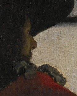
While the viewer might perceive the officer as being close to the young girl, his true intentions and emotions remain hidden. His back is turned to us, placing his figure in shadow, allowing only a fraction of his face to be seen, a passage that offers no insight into his character. One hand is concealed, while the other is partially curled, possibly indicating emotional reservation. The vibrant red of his military jacket is muted by the encompassing shadow, and the bold outline of his pitch-black felt hat adds an almost foreboding presence to the scene.
In stark contrast, the young girl exudes an infectious sense of hope and optimism. Illuminated by the morning sun, her smiling face becomes the focal point of the piece. Her demeanor is so effervescent that it overshadows the officer's apparent detachment. The gesture of her upturned open hand signifies her willingness and eagerness to connect. The luminosity of her white linen headgear and the gleaming yellow of her morning jacket stand in vivid opposition to the soldier's subdued garments.
The military man
The Procuress (detail)
Johannes Vermeer
1656
Oil on canvas, 143 x 130 cm.
Gemäldegalerie Alte Meister, Dresden
The red color of the military uniforms, such as the one worn by Vermeer's soldier, had a practical function. In times of war, the colors and signs were essential for survival. Soldiers could be more easily identified and avoid an attack by their own troops in the tangle of a battle. This was especially true in the Netherlands since there was no single centralized army but a series of local militias that banded together when necessary. As Vermeer expert Arthur K. Wheelock Jr. observed, the bold red color of the officer's jacket may have been chosen because of this color's association with passion and power, although the Delft militia, in fact, wore red. Had it been green or beige, the mood of the painting would have been entirely different. The soldier in Vermeer's Procuress also wears a red uniform.
The fact that militia members appear in so many Dutch paintings depicting gluttony, gaming, drunken carousing and overall poor behavior (and in later pictures amorous situations such as in the present work) rather than in the heat of battle, might be explained by the perception that both abroad and at home, the Dutch were not always viewed as well-suited for military life. Even militia officers regularly complained about a lack of discipline, insufficient armaments, disorderly weapons exercises and the ease with which one could obtain exemption from duty.
The black sash around the visitor's shoulder suggests he is likely an officer. But more than his social identity, the viewer is captured by his psychological presence. Vermeer, like many Dutch painters of the time, used his officer as a device called repoussoir: the placement of a large figure—curtains were also frequently used—in the immediate foreground to enhance the illusion of depth. Caravaggio became famous for his paintings of ordinary people or even religious subjects in repoussoir compositions. Gerrit Van Honthorst, a renowned painter from Utrecht who had traveled to Italy to study Caravaggio's revolutionary works, consistently used repoussoir in his compositions. One such work of art is The Procuress, which Vermeer must have been familiar with.
The "Spanish" chair

The Glass of Wine (detail)
Johannes Vermeer
c. 1658–1661
Oil on canvas, 65 x 77 cm.
Staatliche Museen Preußischer Kulturbesitz,
Gemäldegalerie, Berlin
This so-called Spanish chair presents two finials with lion heads with rings through the muzzles. The laughing girl is also seated on such a chair. Vermeer took great care in their rendering, particularly the heads of the hand-carved lions. Various writers have attributed psychological connotations to the lions. Lawrence Welscher opined that the "roaring lions heads carved into the chair posts signal potential violence." In the same interpretive vein, the wall maps signify the incessant shifting of national boundaries achieved at the cost of many lives.
Others, perhaps less prone to interpretive flights, might prefer to think that Vermeer, like thousands of fellow Dutchmen, found these types of chairs beautiful in themselves and that their beauty was a sufficient reason to paint them. Moreover, the ornate finials presented a technical challenge and a way to embellish the otherwise austere interiors he chose to paint, or even as as a nod to the aesthetic tastes of his contemporaries and the masterful craftsmanship that went into producing such furniture. Regardless, the lion-head finial is one of Vermeer's favorite motifs.
A few examples of Spanish chairs can be found in the Rijksmuseum in Amsterdam and the Prinsenhof Museum in Delft, Vermeer's birthplace. The same chair is represented other times in Vermeer's scenes. In the Woman with a Lute, it appears with a large piece of drapery heaped up in front of it. The different lighting scheme in The Glass of Wine (detail left) lets us observe the finely carved finials.
The fancy felt hat
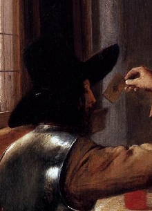
Soldiers Playing Cards (detail)
Pieter de Hooch
1657–1658
Oil on canvas, 51 x 46 cm.
Private collection
Vermeer's cavalier sports a fine felt hat made of beaver pelt. This kind of wide-brimmed hat could be made of wool or other materials. Felt made from beaver hair produced a superior hat that held its form and was more weather resistant. Such a hat could not be afforded by everyone. Vermeer undoubtedly owned one or more hats, but they were not mentioned in the 1676 probate inventory of his home.
Hats played a role in social ceremonies, both indoors and outdoors. Although a gentleman's hat was normally kept on his head, a few ceremonies required him to take it off, such as during prayer, the first time when offering food or when an esteemed person toasted to someone's health. Thus, Vermeer's dashing soldier who keeps his hat on during his visit is not being disrespectful.
As historian Timothy Brook noted, during the 17th century, beaver pelts imported from the New World were at the center of a lucrative web of trade since the beaver population of Europe had been largely depleted. The beaver-rich New World territory, eventually named New Netherlands, came under the jurisdiction of the Dutch West India Company in 1621, as part of the conditions of the Company's charter.
Beaver pelts were first sent to Russia, where they were valued for their shiny outer fur. Russian customers would eventually sell the furs back into the trade. Once they were worn, dirty and sufficiently greasy, they could be properly felted and converted into felt hats and resold. Hatters used mercury to mat the beaver fur's dense, warm undercoat. Exposure to this toxic chemical, however, caused severe mental disorders and is the source of the expression, "mad as a hatter." By 1660, the brim had become so wide that the corners were turned up, forming the tricorner.
Most of the information above was drawn from Timothy Brook's Vermeer's Hat: The Seventeenth Century and the Dawn of the Global World, published in 2009.
The young girl's chair
Like that of the officer, the young girl's chair is was called a Spanish chair, a type of chair manufactured in great numbers throughout Europe, although its fundamental form and upholstery seem to have originated in Spain. Similar chairs, clearly a bourgeois piece of furniture, can be seen in numerous well-appointed Dutch interior scenes and are a standard fixture in Vermeer's paintings as well. Spanish chairs were made from various kinds of wood and in different sizes, some decorated soberly, others more lavishly ornamented. Normally, rather small, the chair legs were of slender dimensions and sometimes baluster-shaped (vase-shaped) or twisted. In an engraving by Abraham Bosse, a whole row of such chairs is lined up against a wall. The fine proportions of these chairs were made more impressive by exquisite upholstery in gilt leather or fabric bordered with fringes. The lion-head finials of Vermeer's chair were probably carved separately by a specialized artisan.
Vermeer, the 17th-century Dutch painter, is celebrated for his masterful treatment of light and meticulous attention to detail. One of the innovative techniques he employed was the use of pointillés (French for "tiny dots"), minute dots of light colored paint. When these dots were placed next to each other or near contrasting colors, they would create the optical illusion of a shimmering or glittering surface, emulating the way light reflects off certain materials. This technique can be observed in many of Vermeer's paintings. For instance, in The Milkmaid, you can see it on the crust of the bread, adding a unrivaled sensation of luminosity and texture. In any case, critics have long debated whether pointillés are indicative of the artist's purported use of the camera obscura as an aid in his painting.
While not directly related, the pointillés technique can be seen as a forerunner to the Pointillism movement of the late 19th century, led by artists like Georges Seurat. Pointillism relied on the placement of individual colored dots to create images and relied on the viewer's eye to optically mix them, producing a shimmering effect.
A blue apron
Woman Reading a Letter (detail)
Gabriel Metsu
c. 1664–1666
Oil on panel, 52.5 x 40.2 cm.
National Gallery of Ireland, Dublin
Although not evident in many reproductions of the painting, the young girl dons a blue apron over a gray petticoat. The color of the apron, visible in various depictions of maids by Vermeer and in countless other Dutch genre interior paintings, was chosen to hide stains. The girl's choice of this practical garment suggests that the officer might have arrived without prior notice. Alternatively, rather than being an ardent suitor as many critics believe, he might have been someone familiar to the young girl.
The green tablecloth
The green color of the tablecloth contrasts sharply with the officer's red jacket, not only in brightness but also in hue. This is because green is the complementary color of red; complementary colors appear more vibrant when placed next to each other. To further enhance the perceived luminosity of the tabletop, Vermeer used thick dabs of paint that rise from the painting's surface, mimicking the sparkle of daylight in a pointillist manner.
Instead of relying on a single green pigment, Vermeer likely mixed yellow and blue to achieve the unique green of the tablecloth. Few green pigments were available to painters of his time, and none seem to correspond to the green in question. Verdigris, produced by applying acetic acid to copper, yields a vivid green with a somewhat metallic sheen. Another pigment, earth green, although occasionally useful, is too muted for this context. The paint's texture is characteristic of lead-tin yellow, a pigment valued not just for its distinctive shade but also for its textural properties. This delicate, lemony hue has ancient origins but was gradually supplanted by Naples yellow in the eighteenth century. Due to its excellent coverage, lead-tin yellow mixes well with blues, resulting in nuanced greens like the trompe l'oeil curtain in Vermeer's Girl Reading a Letter at an Open Window. Dutch still-life painters frequently employed lead-tin yellow to capture the hue and inherent texture of lemons.
special topics
- Map making in the Netherlands
- Observation and the "inferiority" of northern painting
- Vermeer's debt to Pieter de Hooch
- The soldier's and girl's encounter
- The camera obscura
- The myth of Dutch light
- Gerrit van Honthorst: Vermeer's inspiration?
- The white walls in Vermeer's paintings
- "Guardroom" paintings: military life
- Problems in interpretations: what does the map signify?
- Listen to period music
The signature
No signature appears on this work.
(Click here to access a complete study of Vermeer's signatures.)
Dates
c. 1658
Albert Blankert, Vermeer: 1632–1675, 1975
c. 1658–1660
Arthur K. Wheelock Jr., The Public and the Private in the Age of Vermeer, London, 2000
c. 1657
Walter Liedtke, Vermeer: The Complete Paintings, New York, 2008
c. 1657
Wayne Franits, Vermeer, 2015
(Click here to access a complete study of the dates of Vermeer's paintings).

Provenance
- (?) Pieter Claesz. van Ruijven, Delft (d. 1674); (?) his widow, Maria de Knuijt, Delft (d. 1681);
- (?) their daughter, Magdalena van Ruijven, Delft (d. 1682);
- (?) her widower, Jacob Abrahamsz Dissius (d. 1695);
- Dissius sale, Amsterdam, 16 May, 1696, no. 11;
- Charles Scarisbrick sale, London (Christie's), 10 May, 1861, no. 89, as by De Hooch, to Lee Mainwaring, said to have been purchased in an unidentified London sale by Double;
- Léopold Double, Paris (Double sale, Paris [Pillet], 30 May, 1881, no. 16 to Gauchey for Demidoff);
- Prince Demidoff di San Donato, Villa di Pratolino, near Florence;
- Samuel S. Joseph, London (1891); Mrs Samuel S. Joseph (1900);
- [Knoedler, New York, 1911]; Henry Clay Frick, New York (d. 1911);
- The Frick Collection, New York (acc. no. 11.1.127).
Exhibitions
- Paris 1886
Exposition rétrospective tableaux anciens empruntés aux galeries particulières
Palais des Champs-Elysées
36, no. 107 -
London 1891
Winter Exhibition
Royal Academy of Arts
15, no. 52, as "Interior," lent by Samuel S. Joseph, Esq. -
London 1900
Exhibition of Pictures by Dutch Masters of Seventeenth Century
Burlington Fine Arts Club
25, no. 18 as "Le Soldat et la Fillette Qui Rit," lent by Mrs. Joseph -
New York January 11–27, 1912
Exhibition of Old Masters for the Benefit of The Artists' Funds and Artists' Aid Societies
M. Knoedler & Co.
54 and ill. - New York June 3–November 2, 2008
Frick's Vermeers Reunited
Frick Collection
no catalogue - The Hague September 29, 2022–January 15, 2023
Manhattan Masters: Frick Collection, New York City - Amsterdam February 10– June 4, 2023
VERMEER
Rijksmuseum
no. 7 and ill.
(Click here to access a complete, sortable list of the exhibitions of Vermeer's paintings).
Map-making in the Netherlands
The ties between cartography and art stretch back to the origins of the field itself. The art of painting has consistently been evident in maps, which have long been viewed as amalgamations of scientific and artistic prowess. A prime example of this marriage between maps as scientific instruments and cultural objects can be observed in the Netherlands during the 17th century, a period when the Dutch dominated global cartographic production.
Dutch mapmakers of this era typically possessed a diverse set of talents: they were not only surveyors and cartographers but also landscape painters and engravers. Conversely, several 17th-century Dutch painters, including Frans Hals, Vermeer, Gerrit ter Borch, Pieter de Hooch, Jan Steen, Jacob Ochtervelt, Nicholaes Maes and others, incorporated genuine maps into their paintings and adorned their depicted interiors with maps, often for symbolic or allegorical purposes.
In the Dutch and wider European traditions, maps were commonly used as wall hangings, even in modest households. Furthermore, globes and other cartographic items were frequently showcased for their inherent aesthetic appeal. Many maps served as visual compendiums of the period's knowledge, influence and esteem. While some of this representation was religious, the majority was secular.
Observation & the "inferiority" of Northern painting

A cover of the Lives of the Most Excellent
Painters, Sculptors, and Architects by Giorgio Vasari
first published in 1550
Although Netherlandish painting is universally admired today, it faced criticism in the past. Michelangelo once criticized Northern painters because, although they painted "trees and grass" with great skill, they lacked prowess in creating grand compositions. For instance, the great Italian found Dürer's work lackluster. He also had little regard for Flemish painting, noting that their works were crafted "expressly to deceive the outer vision ... and all this, although it may appear good to some eyes, is done truly without reason or art, without symmetry or proportion and without attention to selection or rejection."
Leonardo da Vinci, discussing the mechanical means of reproducing natural effects (a technique Dutch painters were adept at), cautioned artists against over-relying on such methods. He believed they would "always remain deficient in crafting and composing stories, which is the true purpose of the art." Later, Sir Joshua Reynolds, in his Discourses, recognized the "mechanical expertise" of the Dutch school but lamented the often "common" application of such talents.
This perspective mirrors the foundational theories of grand European art, which took root in Italy. Although mimesis, or the precise imitation of nature, was a pivotal aspect of Renaissance painting theory, it wasn't deemed a standalone objective. Vasari, whose Vite (Lives) of the Italian painters left a lasting impact on European art theory, perceived representational skills as tools that primarily served a larger societal role; to bring to life a holy or uplifting tale, in essence, a powerful narrative. The merit of a painting was judged by the quality of the concept it portrayed.
In her influential work The Art of Describing, Svetlana Alpers posits that modern audiences remain bound by this tradition, which significantly influenced art education in European academies. She particularly critiques the inclination to employ methods, initially conceived by Erwin Panofsky (and further developed by Eddy de Jongh concerning Dutch art), to interpret images rooted in the classical tradition, seeking covert meanings via emblem books. Alpers contends that this skewed focus has overshadowed the defining characteristic of 17th-century Dutch art: the ability to investigate and comprehend the world visually. This approach was a pivotal means of self-expression and visual experience, a primary form of self-awareness wherein significance isn't "read" but "observed."
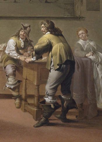
Vermeer's debt to Pieter de Hooch

Soldiers Playing Cards
Pieter de Hooch
1657–1658
Oil on canvas, 51 x 46 cm.
Private collection
Comparisons between the works of Pieter de Hooch and Vermeer are inevitable. In the years when De Hooch was active in Delft, there is little doubt that in such a small city, they would have known each other. Both were members of the Guild of St. Luke, the trade association that protected the rights of artists and artisans in Delft. Clearly, they were familiar with each other's work, but the exact nature of their relationship remains speculative. It was initially believed that De Hooch, who was three years Vermeer's senior, had been influenced by his more famous colleague. However, it's more plausible that De Hooch was the true pioneer between the two, introducing a new type of genre painting marked by unmatched spatial organization and naturalism. De Hooch's skillful incorporation of figures within a logically structured space illuminated with natural light was a technique Vermeer would later adopt and refine after a brief period of "incubation."
As Peter Sutton observed, almost none of Vermeer's radiant small-scale works can be proven to have been created before the 1650s, the years when De Hooch achieved his artistic prime. Furthermore, Vermeer's only dated painting from the 1650s, The Procuress from 1656, is a vibrant bordello scene following the style of the Utrecht Caravaggisti. The painting's dark and compressed space bears no resemblance to his subsequent pieces and is stylistically distinct from De Hooch's interiors from the same period.
De Hooch might have also served as a direct inspiration for some of Vermeer's most esteemed works, such as Woman Holding a Balance and The Love Letter.
The encounter
Despite the fact that the composition of Officer and Laughing Girl is engineered with remarkable precision, just what meaning the painter intended to convey is uncertain. Most Vermeer scholars read into the scene no more than an honorable woman being courted by a gallant figure, which the extraordinarily brilliant light and intense coloring of the scene seem to confirm. But in Dutch paintings, judgments of identity based solely on appearance can be deceptive. Some historians note that the girl's open hand and smile could be interpreted as a request for remuneration for anticipated illicit activities. Such an interpretive conflict is even apparent in the few mid-17th-century images that do depict a blatant offer of a coin.

Parable of the Prodigal Son
Johan Baeck
1637
Oil on canvas, 122.5 x 184.5 cm.
Kunsthistorisches Museum, Vienna
As art historian Roberta J. Pokphanh observes, the "conflation of possible prostitutes with female figures who might also be construed as honorable single young women reflect, in some measure, the social reality of the time. Where in previous times, towns in Europe had set regulations on the dress of prostitutes and the location of brothels, which rendered them easier to identify, in the 17th-century Netherlands, the profession came to be dominated by poor single women. These women worked out of a variety of locations, including many small-scale brothels, which made it more difficult to readily distinguish prostitutes."
What significance does the map of the Netherlands have? Does it betray the soldier's desire for territorial "conquest," as various writers have suggested, or is it merely a symbol of the goodness associated with the Dutch homeland? The cultural distance that separates us from the 17th century prevents us from understanding these few clues, even though Vermeer's picture remains one of his most uncomplicated works of art. It has been recently argued that the ambiguity of mid-17th-century Dutch genre interiors was intentionally calculated, so that the eventual purchaser could interpret the painting according to his own tastes or interests.
The camera obscura

Drawing of a portable camera obscura
As long ago as 1891, when eyes had not yet grown accustomed to the camera's way of seeing, photographer J. Pennell was struck by the disproportionate dimensions of the officer and the girl. As a photographer, Pennell knew that this kind of distortion was imposed by a camera on objects closest to its lens. Pennell suggested that Vermeer had used some sort of optical device as an aid to his painting. This aid, called the camera obscura, was widely known in Vermeer's time. The "objective" picture that it creates may have appealed to artists of the age of observation. Other than offering a unique way to study the behavior of light, its image could, at least in theory, be traced, thereby offering a shortcut to perspective construction.
Since the camera obscura leaves no physical trace, it has been a matter of speculation whether it was indeed employed by Vermeer. The fact that no camera obscura was listed in the inventory of movable goods made after the artist's death cannot prove he did not have one. Once the camera was taken apart, the only recognizable component would have been its lens, so small that it could be easily overlooked by the inventory clerk.
However, even the most staunch detractors admit that in Vermeer's paintings, we do find clear traces of phenomena typical of the camera's image.
The fact that no historical evidence has ever surfaced regarding Vermeer's use of the camera obscura should not be considered an anomaly. The 17th century has handed down numerous mentions of the camera's marvelous workings but none that unequivocally testifies that any Dutch painter actually employed it for painting. And it is not out of the question that linking one's art to the camera was looked down upon. The only tie between a known individual painter and the camera obscura seems to suggest just that. While Constantijn Huygens had enthusiastically recommended the camera to Dutch painters, he recounts that Johannes Torretius, a rare, enigmatic Dutch painter, had feigned ignorance about the camera obscura, which Huygens had suspected was the source of the "convincing quality" of his art.
If Vermeer did use the camera, it cannot be ruled out that he preferred not to be associated with it.
Gerrit van Honthorst: Vermeer's inspiration?
One of the two Dutch paintings most often associated with Vermeer's Officer and Laughing Girl is Gerrit van Honthorst's Procuress. Van Honthorst was a successful artist from Utrecht, and in his own time, his reputation rivaled and perhaps surpassed those of both Rembrandt and Frans Hals. The figural arrangement of the composition, which represents a bordello scene, is very similar to Vermeer's. A young soldier dressed in red, with his back to the viewer, sits on the left-hand side of the picture, immersed in shadow. A young woman looks at him directly with an unguarded smile across a table covered with a green cloth.
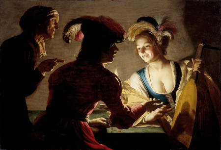
The Procuress
Gerrit van Honthorst
1625
Oil on panel, 71 x 104 cm.
Centraal Museum, Utrecht
It is hard to believe that Vermeer was not inspired by Van Honthorst's canvas, or by a copy or derivative work. However, while Van Honthorst explores the sensual potentials of artificial candlelight, Vermeer registers with almost scientific objectivity the cool morning light as it plays gaily upon the scene. Gone is the lute, which, in the context of Van Honthorst's scene, would have certainly had an erotic undertone. And gone is the elderly procuress who calls attention to the purse gripped by the soldier's hand. Vermeer's ability to invest new and more universal meaning into hackneyed themes was a characteristic of his genius.
The white walls in Vermeer's paintings
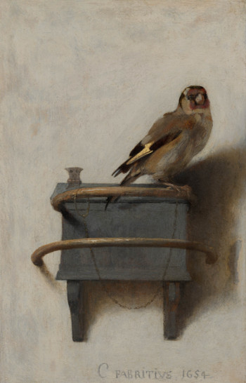
The Goldfinch
Carel Fabritius
1654
Oil on panel, 33.5 x 22.8 cm.
Mauritshuis, The Hague
Perhaps the single most overlooked feature of Vermeer's compositions is the superb rendering of the stark, whitewashed walls, which are always set parallel to the picture plane. It is impossible for the non-painter to grasp the skill necessary to evoke both their flatness and subdued luminosity with nothing more than shades of drab gray paint. The painter must not only describe the slight irregularities that give each wall its own character and naturalness; he must also be able to capture the gradual weakening of light as it flows from left to right. Moreover, he must give the proper color to the shadows projected by the larger props and architectural features.
Even the walls of the best Dutch interior painters seem drab and lifeless compared to the nuanced liveliness of Vermeer's walls. Many experts have been quick to connect Carl Fabrius' Goldfinch as a possible starting point for the walls of Vermeer's interiors, but only Pieter de Hooch and the obscure Jacobus Vrel seemed so enthralled by the optical presence of a mundane white wall.
In the present painting, the observer can almost feel the sting of the chilly morning air as it enters through the wide-open window. Many who see Vermeer's paintings from life for the first time are surprised that they are much cooler in tone than those of his colleagues, a fact which is rarely apparent in reproductions.
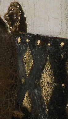
Painters, including Vermeer, used Dutch lead white as the principal component of the gray mixtures for the walls. Various combinations of black and dull brown earth colors, principally raw umber, were used to tone down the white and create shadows of varying depth and hue. The introduction of ultramarine blue pigment into the wall's deep shadows in Officer and Laughing Girl produces a sense of sparkling morning light that has no precedent in European painting.
Dutch "guardroom" paintings: military life
A Bordello Scene (detail)
Jacob Duck
c. 1600–1667
Oil on panel, 41.3 x 54 cm.
Private collection
Whatever the true narrative of the present work may be, there can be no doubt that the looming male figure with his sash and swagger represents a military officer, perhaps of the Delft Civic Guard.
Like almost every one of his compositions, in Officer and Laughing Girl, Vermeer relied heavily on pictorial precedents. However, he always filtered his borrowings through his own personality and artistic vision, producing works of surprising uniqueness. The present picture draws from one of the most popular and commercialized genres in Dutch painting: the kortegaard, or guardroom scene, pioneered by Willem Duyster and Pieter Codde in the 1620s, some fifty years before Vermeer addressed the motif.

Two Men playing Tric-trac, with a Woman Scoring
Willem Duyster
c. 1625–1630
Oil on panel, 41 x 67.6 cm.
National Gallery, London
Military life was a topical theme in the Dutch Republic in the first half of the 17th century, especially after 1621 when the Twelve-Year Truce with Spain expired and hostilities were renewed. Although much of the actual fighting in these years was confined to the southern border and the eastern provinces, all of Holland's major cities housed garrisons of troops. Dutch soldiers were associated with an assortment of unwholesome activities. Prostitutes were among the most frequent visitors to painted guardroom scenes, just as they had been in real life when they trailed behind traveling armies in times of war.
Even though the Dutch faced the specter of warfare for much of their existence, surprisingly scarce attention was paid to armed conflict in painting. Violence, bloodshed or pictorial remembrances of victory or military defeat were exceptionally rare. Curiously, in Dutch 17th-century painting, we find thousands upon thousands of paintings of soldiers' non-military activities. They depict soldiers in taverns, stables or tents, often attended by tavern hostesses, prostitutes or camp followers. Some show figures fighting over plunder, perusing their booty or taking hostages, while others portray the quieter side of military life, with men merely smoking, drinking or playing a game of cards or tric-trac, a popular board game that was very common in France and Holland.

A Guardroom Interior with a Seated Woman Amongst Plunder
Jacob Duck
Mid-1630s
Oil on panel, 43 x 34 cm.
Private collection
Initially, these less-than-heroic military men were portrayed in realistic settings such as barns or environments that recall the spaces in which soldiers were garrisoned. Decades later, their bad manners were spruced up and they found their way into well-appointed interiors, politely engaged in activities such as letter reading, letter writing or delicate social interaction with attractive, well-to-do women. The particularity of the initial low-life scenes is that both Duyster and Codde censored common foot soldiers and concentrated on fashionably dressed gentlemen who most likely were meant to represent officers (true military uniforms did not yet exist).
In any case, Dutch soldiers were associated with an assortment of unwholesome activities. Prostitutes were among the most frequent visitors to painted guardroom scenes, just as they had been in real life when they trailed behind traveling armies in times of war.
When Vermeer took on the theme, the guardroom genre had been largely domesticated, with Gerrit ter Borch raising it to hitherto unachievable heights of poetry and realism. Setting aside the typical foibles of military men, he represented them as human beings, sounding the psychological realms of displacement and loneliness. No doubt, other than being fascinating subject matter, the guardroom scene offered painters ample opportunities to display their skills in rendering colorful garments. Metal armatures, as well, allowed them to demonstrate their prowess in the depiction of shiny metals, which was one of the points of attraction of the still life.
Problems in interpretations: what does the map signify?
The analysis of Vermeer's scenes should be approached with caution since we cannot be certain to what extent he intended to incorporate hidden symbolic or moralizing content.
Faced with a lack of hard evidence, art historians have attempted to explain the relationship between the map of Holland and the quiet drama that unfolds before it. Speculating that the young woman is a tidied-up courtesan, Leonard Slatkes proposed that the map refers to her "worldly" nature. Arthur K. Wheelock Jr. advanced another hypothesis, more or less opposite: "The carefully integrated relationship between the figures and the map in this sunlit interior expresses not only an unmistakable pride in the land but also the communion between the people who live there and enjoy the fruits of peace. Indeed, the girl, so visually bound to the map of Holland, guarded, as it were, by a lion peering over her back and protected by a strong military presence, might be seen as a distant reflection of the Dutch Maiden, the allegorical symbol of the Netherlands."

Nor is it out of the question that the scene represents a low-key, ritualized courtship. Consequently, the connection between the map and the intimate tête-à-tête could be that the progress of love requires no less strategic planning than did wars waged between armies. This interpretation would also account for the looming presence of the officer and the somewhat aggressive air he projects.
In fact, even if the elaborately illustrated map in this picture was made for interior decoration, one of the original functions of cartographic maps was to plan battles more effectively. As with their dominance in the field of map-making, the Dutch were justly proud of their military prowess, having been able to wage a successful war of independence against Spain, one of the most powerful nations in Europe.

In any case, any Dutchman of the time would have associated the map of Holland with the vast commercial reach of its growing maritime empire. According to historian Timothy Brook, the officer's felt hat (commonly made of beaver hair) is indirectly connected to Samuel Champlain and his efforts by alliance and conquest to control the beaver pelt trade in the New World. Since Delft was one of the Dutch East India Company's headquarters, Vermeer must have been aware of the global expanse of his country through the constant influx of exotic products from all over the globe.
Listen to period music
![]() John Dowland
John Dowland
My Lord Chamberlain his Gaillard [836 KB]
from: Greensleeves. Tänze, Lieder und Fantasien der Renaissance
http://www.amazon.de/Greensleeves-T%C3%A4nze-Lieder-Fantasien-Renaissance/dp/B0000249OA
The myth of Dutch light
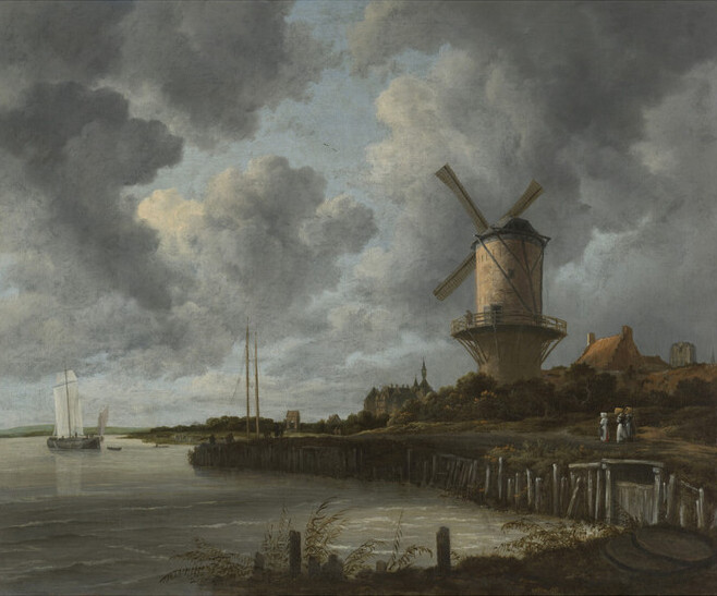
The Mill at Wijk-bij-Duurstede
Jacob van Ruisdael
c. 1670
Oil on canvas, 83 x 101 cm.
Rijksmuseum, Amsterdam
Even though the majority of the surface of Officer and Laughing Girl is painted with dark tones, in no other interior has Vermeer captured the character of the mythical Dutch light.
What is Dutch light? Is it different from light anywhere else in the world? Has it really had a significant impact on art and science? Many often argue that the actual quality of the light in the Netherlands differs enormously from that found in other parts of the world. They claim it increases the luminescence of landscapes and that 17th-century Dutch landscape painters responded to it more than to the topographical features of the countryside itself. The notion ultimately became so prevalent and widespread that it served as the foundation for an entire Dutch aesthetic movement, dubbed the Culture of Observation.
The myth itself began circulating in the 19th century. In the 1850s, the Netherlands became popular with painters and writers. Monet, Manet, Liebermann, Whistler, Boudin, Fromentin, Mirbeau and the Goncourt brothers all came to see Holland's famous 17th-century paintings and the typical Dutch countryside for themselves. From the diaries and journals of American, German, French and British writers, painters and photographers, it seems almost as if the Dutch countryside was discovered through 17th-century paintings, as if the landscapes and the light were the inventions of artists.

View of Naarden
Jacob van Ruisdael
c. 1647
Oil on canvas, 34,8x 67 cm.
Museo Thyssen-Bornemisza, Madrid
The German painter Max Liebermann wrote that "the mists that rise from the water and shroud the world in a translucent veil give that country its extraordinarily picturesque quality ... everything is bathed in light and air." The Goncourt brothers described Holland in their famous journal as "a country lying at anchor," where light shimmers as if it were filtered through "a carafe of salt water," and in the sky, the constant presence of "Ruisdael's swollen, leaden clouds." The contemporary German artist Joseph Beuys suggested that the Dutch light lost its extraordinary radiance after the reclamation of large parts of the Zuiderzee in the mid-1950s, bringing to an end a unique visual culture.


