Vermeer, as many painters of his time, employed a very limited palette. The only substantial difference in his palette in respects to those of his contemporaries was the extensive use of natural ultramarine (pure lapis lazuli) rather than the much cheaper azurite.
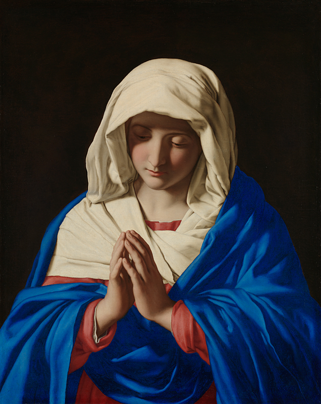
Fig. 1The Virgin in Prayer
Sassoferrato
c. 1640–1650
Oil on canvas, 73 × 57.7 cm.
National Gallery, London
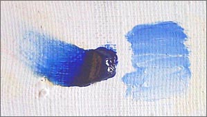
Natural ultramarine is made of the powder of the crushed semi-precious stone lapis lazuli which, after being thoroughly purified by repeated washings, is bonded to a drying oil through hand mulling. The exact proportions between pigment (powdered lapis lazuli) and vehicle (natural drying oil) and correct amount of hand mulling necessary to produce the highest quality paint can be only acquired by experience. Even when the process is mastered the resulting paint has a very fastidious stringy quality which makes it difficult to brush out evenly. However, mixed with white this defect is less noticeable. The final product is a very deep transparent blue. Set aside other pigments on the artist's palette, it is one of the darkest, only black is darker. Mixed with lead white, it maintains its radiant purity and brilliance even in the palest shades. The superior cost, complicated preparation and poor brushing qualities of natural ultramarine are offset by the exceptional brilliance and purity of the final product (fig. 1). Genuine ultramarine made of lapis lazuli is no longer produced and has been replaced by synthetically produced ultramarine blue.Natural ultramarine consists of large particles of blue lazurite combined with accessory minerals, such as calcite and silica (seen as transparent edges or particles in the photomicrograph). Synthetic ultramarine offers a more intense blue compared to its natural counterpart. This is attributed to the smaller and more uniform particle size in the synthetic variant, which allows for a more consistent diffusion of light. Remarkably stable, its color remains unaffected by light and, when used in oil or fresco. However, exposure to weak acid causes the pigment to bleach rapidly, releasing hydrogen sulfide in the process. Interestingly, adding even a modest amount of zinc oxide, particularly to the reddish variants of ultramarine, markedly reduces the intensity of the color, demonstrating the pigment’s sensitivity to chemical alterations. George O'Hanlon, "Ultramarine Blue Pigment And Oil Paint: A Comprehensive Guide For Artists," Natural Pigments, January 13, 2024, accessed January 18, 2024, URL: https://www.naturalpigments.eu/artist-materials/ultramarine-blue-color-notes?variation.
Most painters used natural ultramarine economically in thin glazes over an opaque underpainting rather than in body color. At times, it was used as an underpaint beneath a copper-green glaze. Small quantities of finely milled ultramarine, likely ultramarine ash, were employed to enhance the brightness of white paint.
For their blue paints, the most highly paid Dutch artists such as Vermeer, Gerrit ter Borch and Gerrit Dou, relied primarily on costly ultramarine. "Other artists, however, made strategic choices. At the same time, the use of ultramarine, even a little, was a wise investment that signalled a work of art produced for an exclusive market."E. Melanie Gifford and Lisha Deming Glinsman, "Collective Style and Personal Manner: Materials and Techniques of High-Life Genre Painting," in Adriaan E. Waiboer, Arthur K. Wheelock, and Blaise Ducos, Vermeer and the Masters of Genre Painting, (New Haven: Yale University Press in association with the National Gallery of Ireland, 2017) 72.
Natural Ultramarine in Vermeer's Painting
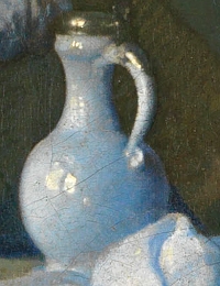
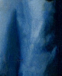
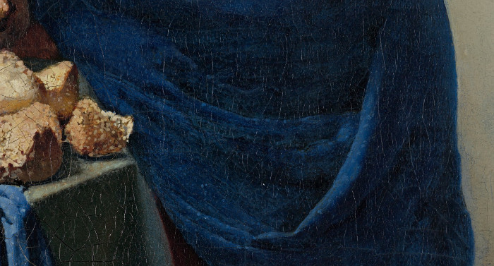
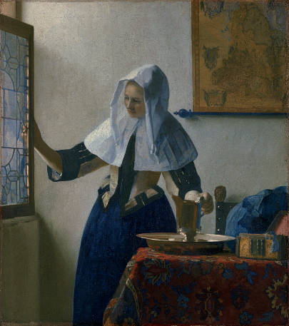
The use of natural ultramarine in Vermeer's painting could easily constitute a study in itself. Although genuine ultramarine can be found in almost every painting by Vermeer, it is truly surprising to what extent Vermeer actually employed the pigment. Not only is it found in blue colored objects themselves but upon close inspection traces can be found in the shaded portions of white drapery, ceramic jugs (fig. 2), black marble tiles, green foliage, white washed walls and even in the shadows of the brilliant orange gown in The Glass of Wine. A fine example of genuine ultramarine can be seen in the satin gown of Woman in Blue Reading a Letter(fig. 3), although it is now less brilliant today due to aging of the varnish. The gem-like depth of the wrap (fig. 4) in The Milkmaidis another. In this case, the excellent state of conservation of the painting allows us to appreciate in full the chromatic brilliance of pure lapis lazuli.
Fig. 4The Milkmaid (detail)
Johannes Vermeer
c. 1658–1661
Oil on canvas, 45.5 x 41 cm.
Rijksmuseum, Amsterdam
"In The Music Lesson, ultramarine was used for the shadow in the flesh tones of the male figure. It is also found combined in mixtures to produce a range of other colors: for example ultramarine has been mixed with red lake to form an array of purples such as the leaded lights, tablecloth pattern, man's sash and for shading the wall on the left. Most extraordinary, however is that the costly mineral blue pigment was used to produce the mixed brown of the ceiling beams, with the likely aim of achieving an integrated coloristic harmony."Helen Howard, David Peggie, and Rachel Billinge, "Pigments," Vermeer's Palette, National Gallery, .
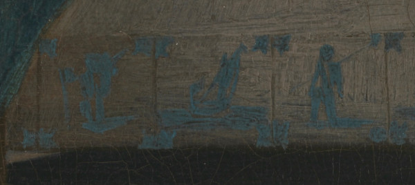
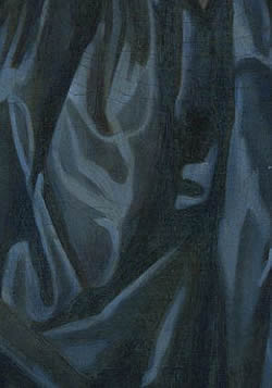
The ultramarine-containing paint used by Vermeer has sometimes blanched with time resulting in a generally paler color than it would have been originally in a number of areas, for example in the design of the tiles in The Lady Seated at a Virginal(fig. 5). The darkening of the binding medium and additional components present in the paint layers of the curtain and tablecloth in The Guitar Player make it difficult to be sure whether a dark purple-blue or blue-green color was originally intended for these fields of color.Helen Howard, David Peggie, and Rachel Billinge, "Pigments," Vermeer's Palette, National Gallery.
Vermeer's copious use of natural ultramarine seems to have reached an almost obsessive degree unless we understand just how perceptive was the artist's eye. Vermeer realized early in his career that the admixture of genuine ultramarine with tones of gray, usually composed of lead white, bone black and raw umber in varying proportions, lends them a characteristic luminosity produced by intense daylight which cannot be produced otherwise. This technique is to found only in Vermeer's paintings. Mixtures of blue in the shadows was to be employed many years later by the French impressionists to suggest the effect of full daylight.
Fig. 6Young Woman with a Water Pitcher
c. 1662–1665
Oil on canvas
45.7 x 40.6 cm. (18 x 16 in.)
Metropolitan Museum of Art, New York
Another example of Vermeer's extensive use of natural ultramarine can be found in Young Woman with a Water Pitcher(fig. 6) Obviously, it was used to paint the folded blue drapery on the table, in a more or less conventional way. It was also used in the window to render the incoming daylight which passes through the glass pains. Vermeer applied delicate opaque and semi-transparent layers of natural ultramarine mixed with white lead in varying proportions over the warm tone of the canvas preparation which in places can still be observed in order to register the varying degrees of intensity of light as it plays on and through the surface of the uneven glass. Observed with care, we can see that even the lead molding has been painted with lapis lazuli, this time Vermeer brushed genuine ultramarine mixed with only a very small quantity of white over the darker underpainting. The contrast between the bluish overtone of the glass and the warm toned sunlight portion of the window frame is absolutely natural. The head dress worn by the young woman was first modeled in shades of white and neutral gray. Once dry, Vermeer superimposed the pale shades of genuine ultramarine to render the candid transparency of the starched cloth inundated by sunlight. Natural ultramarine is even found in the light gray paint of the background wall.
Shadows of white objects are particularly difficult to integrate into the overall tonality of a painting. Dutch painters invariably used mixtures of black or raw umber to render the shadows of white objects and to deepen tones of local color as well. While this technique maintains a chromatic unity within the painting, it fails to suggest the freshness of natural daylight that Vermeer strove to capture.
Recent examination of the Lady Seated at a VirginalHelen Howard, David Peggie, and Rachel Billinge, "Pigments," Vermeer's Palette, National Gallery, https://www.nationalgallery.org.uk/research/about-research/the-meaning-of-making/vermeer-and-technique/vermeer-s-palette. has revealed that Vermeer combined precious ultramarine with the rather mundane green earth, a flat green pigment, to form a range of blue-greens for the lady's dress (fig. 7). Mixtures of ultramarine and green earth were also applied over an underpaint of green earth combined with black for the patterned curtain in this painting.
Comprehensive Resources on Vermeer's Painting Techniques