The number of pigments available to the seventeenth-century Dutch painter were few indeed when compared to those available to the modern artist. While the current catalogue of one of the most respected color producers (Rembrandt) displays more than a hundred pigments, about only 20 pigments have been detected in Vermeer's oeuvre.This examination of Vermeer's pigments is principally based on Herman Kühn, "A Study of the Pigments and Grounds Used by Jan Vermeer," Reports and Studies in the History of Art (1968): 154–202. Because only a limited number of paint samples were taken, and only from the outer edge of the canvas, the study provides partial knowledge of the pigments Vermeer used and his methods of employing them. Results of other studies conducted recently have been incorporated into this study. Of these few pigments only ten seemed to have been used in a more or less systematic way.
In Vermeer's time, each pigment was different in regards to permanence, workability, drying time, and means of production. Moreover, many pigments were not mutually compatible and had to be used separately or in a particular manner. The following study examines the history and origin of each pigment and how they were employed by Vermeer and his contemporaries.
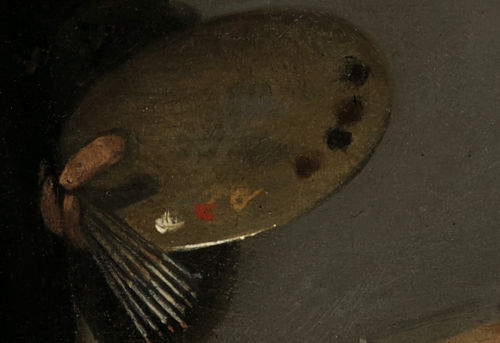
Colors were commonly laid out along the edge of the palette, often in rows or a semi-circular pattern. This arrangement kept the central area free for mixing paints. The pigments were usually organized from light to dark or arranged according to the color spectrum. For example, an artist might start with whites and yellows, proceed through reds and browns, and end with blues and blacks.
This systematic layout allowed painters to quickly locate and mix colors, maintaining efficiency and consistency in their work (fig. 1). While there was no strict standardization, and individual preferences varied, the orderly placement of pigments was a common practice among artists of that era. Contemporary painting manuals and treatises sometimes provided guidance on palette arrangement, reflecting its importance in the artistic process. Sometimes seventeenth-century portrait painters prepared their palettes with pre-mixed gradations of flesh tones (fig. 2) . This practice was common among artists who sought to achieve subtle variations in skin tones in their portraits. Pre-mixing flesh tones was not only a matter of convenience but also a reflection of the meticulous preparation that characterized the working methods of many master painters of the period. It allowed them to work more fluidly and responsively, making adjustments on the canvas with greater control over the final outcome.
Anonymous pupil of Rembrandt van Rijn
Rembrandt van Rijn
Oil on panel, 64.5x 53 cm.
Kremer Collection

Anonymous pupil of Rembrandt van Rijn
Rembrandt van Rijn
Oil on panel, 64.5x 53 cm.
Kremer Collection
Vermeer's Principal Pigments
A significant lacuna in the seventeenth-century painter's palette was the lack of the so-called "strong colors." Only a handful of bright, stable and workable colors existed. Mixing to create new tints did not significantly alleviate the problem. When pigments are physically mixed amongst themselves, the new color is inevitably less brilliant than either one of the original components and, more importantly, in the case of some older pigments, they were not even compatible.
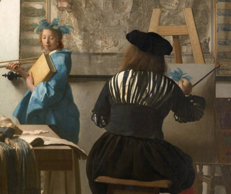
Johannes Vermeer
c. 1662–1668
Oil on canvas, 120 x 100 cm.
Kunsthistorisches Museum, Vienna
A detail of Vermeer's Art of Painting which represents an idealized painter at work portraying the muse of the arts, Clio.
One thorn in the side of the seventeenth-century painter was the chronic shortage of strong, opaque yellows and reds which could be to model form with a certain ease. The exceptionally brilliant red and yellow cadmiums, now obligatory paints in any contemporary painter's studio, had not been commercialized until the 1840s. For centuries the only strong opaque red adapted for modeling was vermilion. Vermilion is a very opaque pigment with excellent handling properties but nonetheless, it possesses a fiery, orange undertone and must be glazed to protect it from degrading. Strong yellows, in particular, were scarce and the only brilliant green was the problematic verdigris. In order to overcome the lack of suitable purple pigments and to economize, artists had learned to first model form in tones of ultramarine and white and then glaze over the dried layer of red madder obtaining a lively purple tint.
Moreover, strong colors were not always readily available on the erratic marketplace and had to be used with utmost economy. For example, natural ultramarine, the most precious of all blues for the artist, had become so expensive that painters usually used it as a glaze over a monochrome underpainting. Vermeer used natural ultramarine in just this way.
Economic considerations played a decisive role of the artist's working procedures. If the complete range of pigments, each already ground in oil, had to be available for use at all times, large amounts of painting would have to be thrown away unused. Metal tubes were employed only in the mid-nineteenth century. Excess paint which had not been used during a single painting session was kept temporarily in pig's bladders or the whole palette could be emerged in water over night to prevent contact with oxygen which induces drying.
It is extremely unlikely that Vermeer had on his palette in any given work session all the pigments that were available to him. Painters were known to use specific palettes set out each day according the passage to be painted. The wooden palette above represents the seven principal pigments which Vermeer commonly employed.

- lead white
- yellow ochre
- vermillion
- madder lake
- green earth
- raw umber
- ivory or charcoal black
The Materiality of Color
:
"Mining for Color: New Blues, Yellows, and Translucent Paint"
in Early Science and Medicine (Volume 20: Issue 4-6)
by Barbara H. Berrie
Online Publication Date: 07 Dec 2015 - https://brill.com/view/journals/esm/20/4-6/article-p308_2.xml?lang=en
Written descriptions of artists’ materials and practice give only parts of the picture. Sources may include colors and prices, but are often imprecise in terminology and silent on the manner of use.Inventories of color-sellers stores are helpful in judging the range available at a specific time and place but only seldom identify who used the supplies or how they were employed. Treatises written for painters describe the core palette, and often include some information on how to prepare supports and use pigments, but often they only allude to practice and technique. Trade accounts and bills of lading attest to the worldwide trade in precious materials for art-making, such as colors and resins that were imported from afar, but the local, the quotidian and the secret are more difficult to learn about, though equally important. Although the guild structure would appear to have inhibited artistic exploration through regulations and requirements for workshop output, even the strictest rules did not, in the end, inhibit the use of novel materials. Personal style and individuality flourished and paved a path for others to follow and actual practice – demonstrated by close observation and chemical analysis – was diverse and even idiosyncratic.The ways paint and color were handled showed even greater variety. Oil painting allowed colors to be mixed on the canvas and blended while wet, so artists could use gentle gradations in tone to create chiaroscuro and the effect of sfumato. Translucent paints could be prepared, and colors adjusted using thin glazes or ‘veils’ of color to build rich tones and subtle shading. In the sixteenth century, artists explored and exploited the full potential for creating color and texture through the use of different pigments and brushwork, employing impasted strokes and scumbles of opaque color in addition to glazes. Even the most adventurous artists were, however, limited by what was available to them. Thus our knowledge of trade in materials, practice and innovation in color-making provides an underlying context for the interpretation of novelty in painting practice.
Almost all of the materials used for painting, whether natural or synthetic, required some kind of processing from the raw state; methods for preparing certain colorants involved many steps, which cumulatively contributed to their cost. The rarity and expense of some meant that the production of certain colors was limited in scale and their use was restricted to special decorative purposes. Some were employed for medicines and luxury items such as perfumes and cosmetics, while others could only be differentiated from painters’ colors based on the scale of production and in particular the purity of the product.
Newly developed means of sourcing minerals provided abundant supplies of certain elements necessary to the color-making process. Mining and the production of particular metals in combination with technological advances in manufacturing opened opportunities to add new colorants and thereby improved paint-making. Two pigments, smalt and Naples yellow, coming to painters via the ceramic and glass industries, became established on oil painters’ palettes in the mid-sixteenth century. Smalt is a potassium-containing (potash) glass that is colored deep blue owing to the presence of cobalt. Naples yellow, an oxide of lead and antimony, is a warm, rich, quite stable and rather intense yellow. A very different material, mineral oil (or naphtha) was mined from sources that were found in the sixteenth century.Using it as a diluent allowed artists to spread paint thinly, to use the translucency of oil paints to make gradations in hue to blend thinner glazes of paint, and make clear varnishes. The relationship between availability of new ores and the look of paintings solicits further investigation.
Pigment resources
- Abel, A. G. "Pigments for Paints." In Paint and Surface Coatings. Cambridge: Woodhead, 1999.
- Bomford, David. Art in the Making: Impressionism. London: National Gallery, 1990.
- Brill, Thomas B. Light: Its Interactions with Art and Antiquities. New York: Springer, 1980.
- Brock, Thomas, Michael Groteklaes, and Peter Mischke. European Coatings Handbook. Hannover: Vincentz, 2000.
- Callen, Anthea. The Art of Impressionism: Painting Technique and the Making of Modernity. New Haven: Yale University Press, 2000.
- Gettens, Rutherford John, and George Leslie Stout. Painting Materials: A Short Encyclopedia. New York: D. Van Nostrand, 1947.
- Gunther, P., P. Hauser, and V. Radtke. "Effect of Pigment Particle Size on Application Properties." Review of Progress in Coloration and Related Topics 19 (1989): 41–47.
- Johnston-Feller, Ruth. Color Science in the Examination of Museum Objects: Nondestructive Procedures. Los Angeles: Getty Conservation Institute, 2001.
- Jones, Thomas S. Iron Oxide Pigments (In Two Parts), 1. Fine-Particle Iron Oxides for Pigment, Electronic, and Chemical Use. Washington, DC: U.S. Department of the Interior, Bureau of Mines, 1978.
- Lewis, A. "Colorants: Organic and Inorganic Pigments.” In Color for Science, Art and Technology, edited by K. Nassau, 129–. Amsterdam: Elsevier Science, 1998.
- Lynch, Alban J., and Chester Rowland. The History of Grinding. Littleton, CO: Society for Mining, Metallurgy, and Exploration, 2005.
- Muller, Bodo, and Ulrich Poth. "Influence of Pigments on the Properties of Coatings." In Coatings Formulation. Hannover: Vincentz Network, 2006.
- Patton, Temple C. Paint Flow and Pigment Dispersion: A Rheological Approach to Coating and Ink Technology. New York: Wiley, 1979.
- Rawle, Alan. "The Importance of Particle Sizing to the Coatings Industry, Part 1: Particle Size Measurement." Advances in Colour Science and Technology 5, no. 1 (2002): 1–12.
- Taft, W. Stanley, and James W. Mayer. The Science of Paintings. New York: Springer, 2000.