Charcoal black, also known as vine black, is derived from carbonized organic materials like wood or grapevines. The production process entails heating the selected material in a controlled environment with limited oxygen to inhibit complete combustion. The resulting charcoal is cooled, finely crushed into a powder, and then purified to eliminate any residual impurities.
The fineness of the ground charcoal powder plays a crucial role in determining the smoothness of the resulting paint. This powder is combined with various binders such as gum arabic, oil, or acrylic, depending on the desired painting medium—whether it be oil, watercolor, or acrylic. Charcoal black is notable for its matte finish and high opacity. While it may not be as intense or durable as other black pigments like ivory or bone black, it is often favored for its softer texture and lack of a bluish undertone.
In terms of drying characteristics, charcoal black typically dries quickly, particularly when used in oil-based mediums. The drying time, however, can fluctuate depending on the binder and medium employed. The pigment dries to an ultra-matte finish, distinguishing it from other blacks like ivory or lamp black, which have a slight sheen. Its high opacity ensures excellent coverage.
Regarding its brushing characteristics, charcoal black generally offers a smooth application, especially when finely ground. The pigment load—the amount of pigment in the paint—can influence its handling properties. A higher pigment load will produce a more vibrant color but may make the paint more difficult to spread thinly. The pigment's versatility allows it to be compatible with a range of colors and techniques, from layering to blending.
Charcoal black has a softer consistency compared to other black pigments, facilitating easier blending. This softness, however, may make it less ideal for techniques requiring sharp lines or high contrast. Its tinting strength is lower than that of other blacks like lamp black or ivory black, requiring more pigment to achieve the same level of darkness when mixed with other colors. The pigment also exhibits a slightly warm undertone, affecting its interactions with other colors.
While charcoal black is generally non-toxic, caution is advised to prevent inhalation of its powdered form. Its lightfastness and chemical stability make it a reliable choice for artworks meant to stand the test of time. However, the specific characteristics of charcoal black can vary depending on its source and manufacturing process, so artists should be mindful of its interactions with other pigments and its drying time, especially in oil paintings.
Historically, charcoal black has been a staple in the artist's palette, dating back to ancient civilizations. It offers excellent coverage and can be used either as a standalone color, blended with other hues to create a wide range of shades, or mixed with white to produce varying grays. Its non-toxic nature makes it a safe option, although care should be taken to avoid inhaling the powder.
In contemporary painting, the use of black to darken pure colors is generally avoided as it can result in a muddy appearance. However, historical masters did not shy away from using it to tone down other pigments, even in flesh tones. Black pigments were often mixed with red and yellow, including red and yellow lakes, to create a spectrum of useful browns. These mixtures yield shades that are cleaner and less chalky compared to those made from raw umber. Artists like Vermeer appear to have employed these mixtures to create browns in multiple works.
Today's painters generally avoid using black to darken pure colors since the mixture tends to appear somewhat dirty. The Great Masters however did not exclude it for toning down other pigments even flesh mixtures. Black pigments were combined with red and yellow (including red and yellow lakes) to create a variety of useful browns. The resulting shades are immediately distinguishable from shades of raw umber because they appear cleaner and less chalky. Vermeer seems to have used these mixtures to make browns in more than one work.
Charcoal Black in Vermeer's Painting
With one single exception, The Music Lesson, charcoal black was found in all of Vermeer's paintings containing black pigments. When viewed microscopically, charcoal black reveals opaque, splintery, or fibrous particles, in which one can often still recognize the cell structure of the wood from which the charcoal was made. In addition to their main charcoal component, black and bluish-black colors often contain ultramarine (The Love Letter, Woman with a Lute, The Art of Painting, and The Allegory of Faith). The dark blue colors in The Love Letter, Woman with a Lute, and Mistress and Maid contain, in addition to their main ultramarine component, certain small amounts of charcoal black. Charcoal black was also found in gray-black as well as in light gray and gray-blue colors, sometimes with a small admixture of ultramarine. In The Music Lesson, bone black was found as the main component in a bluish-black color, as an admixture to ultramarine in a dark blue color, and as a component of gray color shades.
Vermeer also used charcoal black to dimish the chromatic intensity of natural ultramarine in the deeper shadows of the blue tablecloth which appears in a few of his works. Charcoal produces a bluish black, whereas bone black is brownish. Sometimes he mixed them together. He may have been aiming for a specific color.
However, one of the most nuanced applications of charcoal black can be seen in the background walls which appear in his interiors. Artists of the period often used black, frequently combined with umber, to render the shadows of white objects. However, The walls in Vermeer's paintings exude a pearl-like luminosity unseen in similar depictions of white-washed walls of artists working within the same genre such as Gabriel Metsu or Pieter de Hooch.
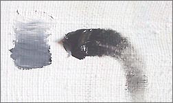
In Vermeer's most accomplished works, the viewer is not given the impression of observing lighter and darker shades of gray pigment but instead, a perfectly white wall which receives more or less light (fig. 1). Charcoal black was used to tone down the lighter areas o fthe wall, which was painted with a thick layer of white lead. In the deeper shadows, umber dominates over black in the dark gray mixture as excessive amounts of black lends a sullen quality to the shadowst.
A detail of Vermeer's Woman with a Pearl Necklace in which charcoal black was most likely used mixed with white-lead to create the various shades of the background wall.
Comprehensive Resources on Vermeer's Painting Techniques