Woman in Blue Reading a Letter
c. 1662–1665Oil on canvas
46.5 x 39 cm. (18 1/4 x 15 3/8 in.)
Rijksmuseum, Amsterdam
Ige Verslype
"The restoration of Woman in Blue Reading a Letter by Johannes Vermeer" - The Rijksmuseum Bulletin<https://bulletin.rijksmuseum.nl/article/view/9694/10207>
2001, p. 13
The 2010-2011 Restoration
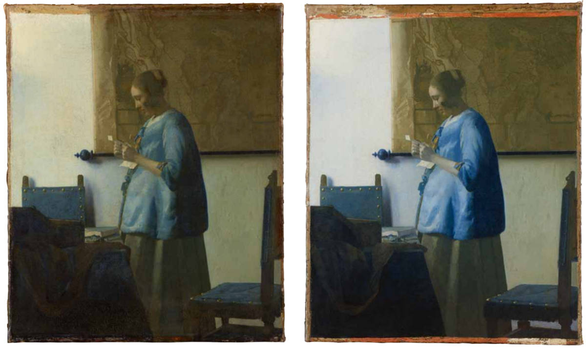
After several tests, the varnish was removed with an organic solvent to ensure minimal mechanical contact with the fragile paint surface. The removal of the yellowed varnish revealed the intense blue hues and detailed paint surface. The shift in colour was quite dramatic, particularly in the shadowed area of the figure’s blue jacket. While the blue of the chairs appeared to be the same as the blue of the jacket before the old varnish was removed, after its removal it became quite apparent that Vermeer had used two different shades (fig. 1).
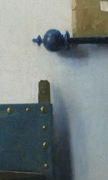
Once the varnish had been removed, it was also possible to remove the retouches and overpaints along the edges of the picture—exposing the bright orange filler material from a previous restoration—and some of the overpaints covering the damage at the bottom. Overpaint and overfill covering original paint along the large loss at the bottom, which could not be removed with solvents, were removed mechanically with a scalpel under the microscope. At least six different filler materials could be discerned in and around the large damage, evidence of several previous restorations. Where it was not covering original paint, old inert filler was left and used as a base for retouching. With the removal of the old restorations in the lower right corner came a surprising discovery: small painted brass nails in the chair– delicate details painted by Vermeer that had been covered for decades – were revealed. It also became apparent that the area of the wall below the chair was originally a vibrant purplish blue, and that it had been painted over in the greenish-grey colour of the wall above the chair at a later date. The removal of a thin brown overpaint covering the brown cloth laid over the table revealed the original rounded folds with slightly different hues. The four yellow dots of paint on top of the table and the small stroke of yellow paint above the letter extended over cracks in the paint layer, indicating that they were not original. They were easily removed with solvent and it became apparent that, with the exception of the third dot of yellow, which had been applied directly on top of the light blue tabletop, they had been covering dots of original white paint. The dots of yellow paint must have been added at some time to transform the small dots of original white paint into a string of pearls.
Once the painting was cleaned, the old loss at the bottom was clearly visible, and it also became obvious to what extent the numerous tiny holes interfered with the legibility of the painting. These small holes needed to be concealed, and it was decided to do so with a gouache paint, as this material has a certain "body" that also acts as a filler. Because the holes were so small, this part of the inpainting was done under the microscope. The large loss at the bottom was filled and subsequently covered with gouache paint. To imitate the structure of the original paint surface on top of the filler material, a silicone mould was made of the original paint surface elsewhere in the painting and pressed into an acrylic binder applied on top of the gouache base. Several seventeenth-century Spanish chairs were studied, as was Vermeer’s depiction of them in other paintings, in order to under-stand their construction. With this knowledge, and the fragments of original paint that were previously covered with overpaint, the chair leg in Woman in Blue Reading a Letter was reconstructed as Vermeer intended it—wide at the bottom and narrower at the top.
Before the final inpainting was carried out, a stable synthetic varnish was brush applied to saturate the colours. The application of this varnish served to level out the uneven surface of the painting caused by the tiny holes and blisters to some extent. The final inpainting was done with a stable synthetic resin and loose pigments in order to achieve optimal concealment of the damage and restore the legibility of the image. A final natural varnish layer was then brushed on to the surface to fully saturate the colours, to seal off all retouches and to even out any differences in gloss.

The compositional refinements in Vermeer's paintings are so exquisite that it is difficult to understand how he achieved them. His mastery or perspective does not account for the sensitive arrangements of his figures or for the subtle proportions he established between pictorial elements. Perhaps he worked with a compass and ruler, as did Pieter Saendredam (1597–1665), or perhaps he developed a mathematical system for determining the relationships of compositional elements. Whatever the system, it succeeded because of the artist's unique sensitivity to structure as a vehicle for his artistic aims.
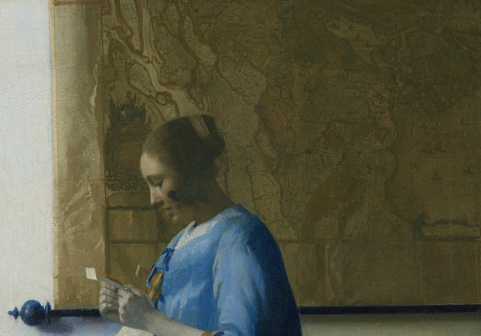
In no other painting did Vermeer create such an intricate counterpoint between the structural framework of the setting and the emotional content of the scene. A mere description of the subject—a young woman dressed in a blue jacket reading a letter in the privacy of her home—in no way prepares the viewer for the poignancy of this image, for while the woman betrays no outward emotion, the intensity of her feelings is conveyed by the context Vermeer creates for her. Her form almost fully visible between the table and chair in the immediate foreground. These structural elements, as well as the chair against the wall behind the table, appear to lock her in space. Likewise, the woman's hands are held fast visually by the horizontal of the black bar behind them. While Vermeer uses this geometric framework to restrict any sense of physical movement, he alludes to her emotional intensity through the meandering ocher patterns of the map behind her.
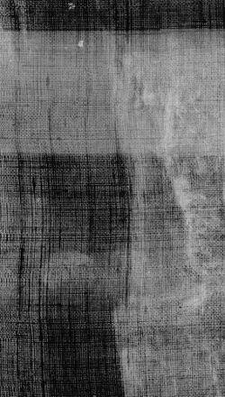
Vermeer's design sensitivity, however, is not limited to the placement of objects in his composition, but also extends to the patterns of shapes between objects. The asymmetrical balance of the three broadly rectangular areas of white wall is crucial to establishing the sense of quiet permanence. Vermeer's awareness of their compositional importance is evident from the x-radiograph, where it is clear that he extended the map several centimeters to the left. This adjustment reduced the width of the wall to the left of the map so that it would be equal to the width of the wall to the right of the woman. The x-radiograph (fig. 2) also reveals that Vermeer altered the shape of the woman's jacket. In the original conception it flared out, just as in the Woman Holding a Balance. Infrared reflectography also reveals that the jacket originally had a fur trim. The changes gave the woman a more statuesque profile and at the same time strengthened the rectangular shapes of the white wall on either side of the woman.
Johannes Vermeer
c. 1662–1665
Oil on canvas, 46.5 x 39 cm.
Rijksmuseum, Amsterdam
Johannes Vermeer
c. 1662–1665
Oil on canvas, 46.5 x 39 cm.
Rijksmuseum, Amsterdam
Vermeer was equally sensitive to the optical effects or light and color. The blue tonalities of the woman's jacket, the chair, and the table coverings are calming, restful color as are the ochers of the dress and map. Light comes from two sources, creating both primary and softly diffused secondary shadows on the wall next to the chair behind the table. With his awareness light's optical qualities, Vermeer gives the shadows a bluish cats (fig. 3). He infuses light into the woman's form by diffusing the contour at the back of her jacket, he also manipulates the flow of light quite arbitrarily for compositional reasons. For example, while the chair and the map cast shadows, the woman, who appears to stand quite close to the wall, does not. Vermeer thus separates her from the temporal framework of the room, and in the process, enhances the sense of permanence that so pervades the scene.
This use of color, light, and perspective to reinforce the emotional impact of a scene is characteristic of his work throughout his career. In Officer and Laughing Girl from the late 1650s, for example, Vermeer intensified the relationship between the two figures through the vivid red and yellow of their clothing, the dramatic foreshortening of the window, and the sparkling effects of light, flickering off the woman's striped sleeves and the map. Indeed, it is interesting to compare the map in these two paintings, for they are one and the same: a map of Holland and West Friesland (fig. 4) designed by Balthasar Florisz van Berckenrode in 1620 and published by Willem Jansz Blaeu a few years later. In his earlier painting Vermeer used colors to differentiate land and water and clearly articulated topographical features, but in Woman in Blue Reading a Letter the map (fig. 5) is larger in scale, monochromatic, and has a less defined topographical character. While certain of these differences are related to his own stylistic evolution, the willingness to modify shape, size, and color of objects for compositional reasons is a constant phenomenon in his oeuvre.
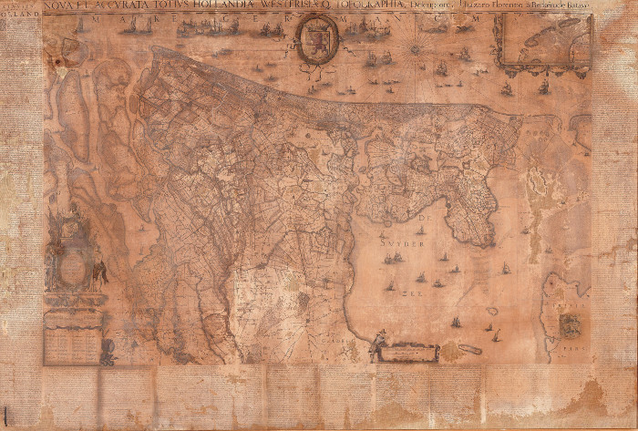
Designed by Balthasar Florisz. van Berckenrode in 1620
Published later by Willem Jansz. Blaeu
Hoorn, Westfries Museum
Johannes Vermeer
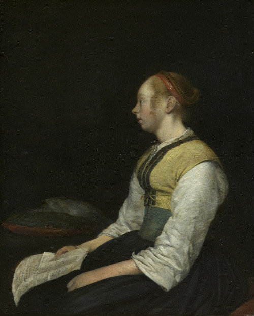
The reflective mood of this work, of course, is related to the subject: the reading of a letter. In Dutch art depictions of women reading letters almost always have love associations, and artists found various means to portray both the air of expectation at the arrival of a letter and the subsequential reaction to the written word. Often, as with Gerrit ter Borch's (1617–1681) portrayal of a young peasant (fig. 6) reflecting on the contents of a letter, the emotional consequences are evident in the figure's posture and expression. Vermeer's Girl Reading a Letter at an Open Window, c. 1657, focuses on the woman's response to the letter by painting her reflection in the leaded glass window. Although the self-contained character of Vermeer's Woman in Woman in Blue Reading a Letter provides no hint about the letter's content, the bend of the woman's neck, the parted lips, and the drawn-up arms infuse her with a sense of expectancy.
c. 1650
Oil on wood, 28 cm x 33 cm.
Rijksmuseum, Amsterdam
Although Vermeer provides little context for the letter, it appears to have come unexpectedly, since she has interrupted her toilet to stop and read it. Her pearls lie unattended on the table, with another sheet of the letter partially covering them. Significant, undoubtedly, is the map, which may allude to an absent loved one, as does perhaps the empty chair in the foreground. The woman's shape is also suggestive. It is decidedly matronly, perhaps as a result of fashion, but more likely, because she is pregnant. Vermeer, however, remains entirely circumspect about the circumstances of the woman's life, allowing each viewer to ponder the image anew in his or her own way.
The Map of the Netherlands
Peter C. Sutton
Love Letters: Dutch Genre Paintings in the Age of VermeerSingapore, 2003, pp. 22–23
Vermeer brought the letter subject to classical perfection, transmuting the merely incidental and anecdotal into timelessly memorable images-poised, opalescent, and so sublimely balanced as to seem inevitable. Once again his world of letters is a feminine one, with women standing in the light reading letters alone with such hushed expectation that they seem to hold their breath or calmly looking out at us with disarming candor as they compose. Here, too, we encounter the silent but essential and sometimes charged dialogue between the lady and her maidservant as letters come and go, creating subtle dramas that linger unresolved within a world governed by codes of domestic conduct. As with de Hooch's interiors, the organization of the space and the distribution of the light are essential components of these narratives. But whereas de Hooch's account of the upper-middle-class world that supported the new fashion for letters is prosaic in the best sense of the word naturalistic, expository, and compellingly descriptive, Vermeer elevates the subject to a more sublime and generalized realm, a resonant and poetic world, the evocation and analysis of which has inspired generations of wordsmiths.

Woman in Blue Reading a Letter is the only of Vermeer's interiors framed entirely against the rear wall of the room. This enhances the sensation of a moment suspended in vision; yet it also underscores the capacity of the painting to accomplish itself as a world-to establish gravity, depth, and with them a stable sense of space and time-without reference to the room's physical coordinates. (The wall resembles the open sky of A View of Delft more than the walls of Vermeer's other interiors.) We take our bearings here ontologically. Her own presence provides balance and stability, becomes a still point about which the image of a coherent, free-standing world can gravitate. The forms of that world reciprocate by protectively enclosing her in "an orderly coolness that nothing will disturb (Gowing, Vermeer, p. 35)."