Origin, History and Characteristics
(Grünspan, vert-de-gris, verderame)
Verdigris, a copper-based green pigment, has been produced through various methods since antiquity. Historically, one common technique involved exposing copper to acetic acid vapors. For instance, Pliny the Elder described suspending copper plates over fermenting grape vapors, allowing the acetic acid to react with the metal and form a green patina, which was then scraped off and ground into pigment.
During the Middle Ages, another method entailed burying copper strips attached to wooden blocks in dung after treating them with acetic acid. The warm, moist environment facilitated the formation of verdigris, which was later collected and processed.
In eighteenth-century Montpellier, France, a notable production technique involved stacking copper plates in clay pots filled with distilled wine. The acidic content of the wine induced the development of verdigris crystals on the copper surfaces, which were periodica lly harvested.These traditional methods highlight the diverse approaches to synthesizing verdigris, reflecting its historical significance and the evolving practices in pigment production.
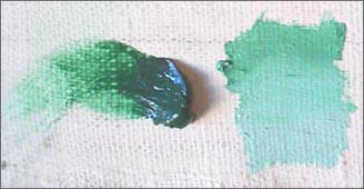
Verdigris has been historically significant in painting due to its vibrant hue and unique properties. It was widely used in medieval and early modern art, valued for its brilliant green color that could range from a bluish to a yellowish green depending on its preparation and the binder used. Verdigris was commonly derived by exposing copper to acetic acid, often in the form of vinegar, under controlled conditions.
While verdigris offered a striking color, it presented certain challenges for painters. It is chemically unstable and highly reactive, which often led to discoloration or degradation over time. In oil painting, verdigris could cause the paint to darken or even turn brown due to its sensitivity to moisture and its tendency to react with sulfur-containing compounds. Despite these drawbacks, its strong tinting strength and transparency made it a favored pigment for glazing techniques, where it could create luminous effects when layered over lighter tones.
Green glazes of verdigris were commonly used in oil paintings of the fifteenth to seventeenth centuries (fig. 1) for the depiction of saturated green colours of drapery and foliage. Today, these glazes are often covered with a brown layer and sometimes the whole glaze has become brown. Verdigris was consistency mixed with the same pigments; lead white, lead-tin-yellow and yellow ochre. Leonardo da Vinci had was not in favor of the use of verdigris in oil painting given that the pigment has a certain tendency to fade. He wrote around 1492:
The green colour made of rust of copper, Green made of copper, even when this colour is mixed with oil, loses its beauty like smoke if it is not quickly varnished. It not only goes up in smoke, but if it is washed with a sponge dipped in simple, ordinary water, the verdigris will disappear from the panel on which it has been painted, especially in humid weather. This comes about because verdigris is made from salt, which dissolves easily in rainy weather, and especially when it is bathed and washed with the sponge…
"In his encyclopedia of 1694, Pomet noted that French unrefined verdigris was mainly exported to Holland. After Pekstokk had refined it into a purer product it was re-exported to France. Thus Pomet claimed that all the distilled verdigris on sale in Paris actually came from either Holland or Lyon.
Although verdigris was sometimes recommended as a drier in red lakes as well as blacks, De Mayerne’s sources note that this green pigment would muddy the colour of a red lake; instead they suggested using white copperas (zinc sulphate).
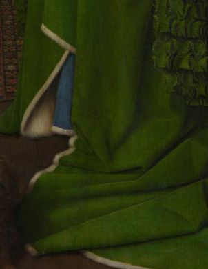
(detail of the green robe glazed with verdigris)
Jan van Eyck
1434
Oil on oak, 82.2 x 60 cm.
National Gallery, London
"Yet, until well into the seventeenth century, it appears that artists seldom purchased this remarkably pure ready-to-use distilled verdigris. A price-list of pigments purchased by painters in the De Mayerne manuscript only mentions 'ordinary' verdigris and not the distilled pigment. Inventories of four seventeenth-century Dutch shops specializing in the sale of artists' materials suggest that there can hardly have been any demand for distilled verdigris from painters. These shops had increasingly taken over the sale of pigments from the apothecaries."M.H. van Eikema Hommes, "Verdigris Glazes in Historical Oil Paintings: Instructions and Techniques," in Discoloration in Renaissance and Baroque Oil Paintings. Instructions for Painters, Theoretical, Concepts, and Scientific Data (dissertation, 2002), 85.
In seventeenth-century Holland, verdigris was not among the most expensive pigments, such as ultramarine and high quality red lake, which ran into several guilders an ounce, but among the mid-price pigments, which included indigo and yellow lake.M.H. van Eikema Hommes, "Verdigris Glazes in Historical Oil Paintings: Instructions and Techniques," in Discoloration in Renaissance and Baroque Oil Paintings. Instructions for Painters, Theoretical, Concepts, and Scientific Data (dissertation, 2002), 86.
In modern times, verdigris has largely fallen out of use due to its instability and the availability of more stable green pigments, such as chromium oxide green or phthalo green. Nonetheless, its historical significance and its impact on the visual character of many historical artworks remain a subject of interest for art historians and conservation scientists.
Verdigris in Vermeer's Painting
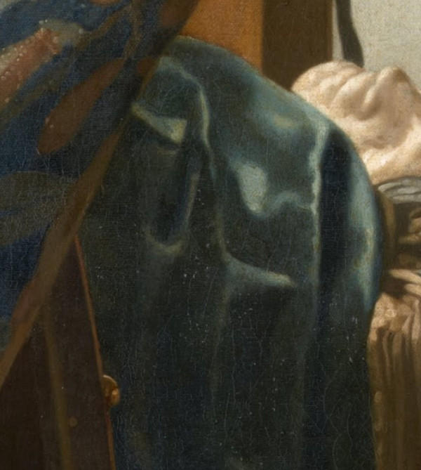
Verdigris has been found in various painting by Vermeer, once over a layer of natural ultramarine of the tablecloth of Maid and Mistress, which was orinally meant to have a green color, and again under a layer of brilliant blue paint of jacket of Woman in Blue Reading a Letter. Ige Verslype, who restored the latter work in 2010–2011, hypothesized that the underlying layer of verdigris was meant to intensify the upper layer of ultramarine of the woman's blue jacket. The conservator Robert Wald reported that the cloth (fig. 2) which drapes over the front of the massive table in the foreground of Vermeer's The Art of Painting was underpainted in virdigris and then glazed with a semi-transparent layer of ultramarine blue, giving its present teal color.
Verdigris, the blue-green copper acetate pigment long familiar to early modern painters, played a far more nuanced role in Vermeer’s work than previously assumed. Traditionally, artists prepared verdigris by exposing copper plates to vinegar or the acidic residue of wine, producing a pigment that dissolved readily in oil and formed an intensely transparent green glaze. Its brilliance came with a drawback: it tended to dry quickly and to brown with age, which is why many seventeenth-century greens now appear muted. Even so, painters valued it for the depth and luminosity it could impart to draperies, foliage, and decorative fabrics. Vermeer employed verdigris in this conventional way at times, as in The Milkmaid, where he brushed a thin copper glaze over a green underpaint on the sleeve, allowing the light to flicker across the surface with a soft emerald sheen.
What distinguishes Vermeer, however, is his recurring use of verdigris not as a final glaze but as an underlayer beneath blue passages of paint. This procedure, so far unknown among his contemporaries, inverts the expected order of layering. Technical examinations of several paintings—among them The Art of Painting, Woman in Blue Reading a Letter, Mistress and Maid, The Milkmaid, Girl Interrupted at her Music, and The Geographer—have revealed translucent green glazes lying directly beneath surface layers rich in ultramarine. These buried green strata were never intended to be fully concealed. Instead, Vermeer allowed them to modulate the overlying blue, subtly shifting its hue toward a cool green and lending it a velvety depth that ultramarine alone could not achieve. When light passes through the blue layer and reflects from the green glaze below, the result is a restrained but unmistakable prismatic glow, visible today in the seating upholstery of Woman in Blue Reading a Letter or the table coverings in several interior scenes.
The reasons for this unusual practice are likely multiple. Because ultramarine was extraordinarily costly, a preparatory layer of verdigris may have allowed Vermeer to control the optical behavior of the final surface while reserving the highest-quality blue for the uppermost strokes. Verdigris also dries rapidly, which could help stabilize the underlying paint structure before the slower-drying ultramarine mixtures were applied. Yet these practical considerations alone cannot account for the selective and deliberate placement of the green underlayers. Their presence aligns closely with passages where Vermeer sought an especially refined play of light across textiles, suggesting a conscious aesthetic intention. In several cases, the semi-transparent green is brushed over the initial monochrome mapping of light and dark, allowing the modeling to remain visible while altering the chromatic temperature of the scene.
This recurring use of verdigris beneath blue has become one of the most striking findings of recent technical research on Vermeer. It reveals an artist who was not merely a careful handler of rare pigments, but an experimental painter exploiting the chemical and optical properties of his materials to create subtle effects of atmosphere and luminosity. Far from being a simple green of convenience, verdigris served Vermeer as a structural, chromatic, and expressive tool—an unseen foundation that shapes the blues that today define so many of his most admired works.
c. 1662–1668
Oil on canvas, 120 x 100 cm.
Kunsthistorisches Museum, Vienna
Verdigris as a Drier
Verdigris entered Vermeer’s practice in a more utilitarian role, one that remains invisible to the eye but is nonetheless important for understanding his working methods. Copper compounds were known in the seventeenth century to accelerate the drying of oil paint, and small quantities of verdigris were sometimes added to mixtures that otherwise remained tacky for too long—especially paints containing black pigments, which dry notoriously slowly. Contemporary technical writings, such as the notes of Theodore de Mayerne, recommend precisely this use, and modern analyses show that Dutch painters of refined interior scenes, including Nicolaes Maes (1634–1693), Frans van Mieris (1635–1681), and Gerrit Dou (1613–1675), occasionally adopted the same approach.
In Vermeer’s case, trace amounts of copper have been detected in places where no green pigment would have been expected on visual grounds. These tiny deposits—dispersed, irregular, and without any visible green tonality—indicate the addition of verdigris as a siccative rather than as a colourant. The practice appears in both early and later works. The background of Girl with a Pearl Earring, for example, contains a green glaze composed of indigo, weld, and a copper-based drier, the verdigris strengthening the drying rate of an otherwise slow combination of organic colorants. Small copper signals also appear in selected passages of Lady Seated at a Virginal, where the warm brown shading in the viol was built up from layers rich in red and yellow lakes; here too, verdigris seems to have been mixed subtly into the paint to ensure an even, timely cure.
Aanalysis of Woman Holding a Balance shows that the underpaint layer of the tablecloth contained copper-based additives, likely verdigris, which accelerated the drying of slow-curing pigments.E. Melanie Gifford, Dina Anchin, Alexandra Libby, Marjorie E. Wieseman, Kathryn A. Dooley, Lisha Deming Glinsman, John K. Delaney, "First Steps in Vermeer’s Creative Process: New Findings from the National Gallery of Art," Journal of Historians of Netherlandish Art 14:2 (Summer 2022) This allowed Vermeer to move quickly through the preparatory stages without waiting for the paint to dry completely, enabling him to proceed with subsequent layers efficiently. The evidence comes from advanced imaging techniques such as XRF copper maps, which highlight areas of the painting rich in copper. These maps show that copper was concentrated in the underpaint but largely absent from the final layers. Microscopic analysis of paint samples confirmed that the copper in the underpaint was evenly dispersed, typical of verdigris used as a drier, rather than present as distinct particles of pigment. This deliberate addition of copper-containing material to the underpaint stage suggests that Vermeer tailored his materials to meet specific functional needs.Annelies van Loon, Francesca Gabrieli, Anna Krekeler, Ige Verslype and Frederik Vanmeert, "From Palette to Perfection Vermeer’s Distinctive Use of Blue and Green Pigments," in Closer to Vermeer: New Research on the Painter and His Art, ed. Anna Krekeler, Francesca Gabrieli, Annelies van Loon, and Ige Verslype (Amsterdam: Rijksmuseum / Veurne: Hannibal Books, 2025).
These additions were minute—far too little to shift the hue of the paint—but chemically significant. They suggest that Vermeer worked with an awareness of the practical behaviour of his materials and adjusted them to suit the rhythm of his painting. Unlike the boldly applied verdigris glazes that shape the appearance of textiles, the drier-based use leaves no aesthetic trace; its presence is known only through spectroscopy and microscopy. Yet it reinforces a broader picture of Vermeer as a technician of considerable sensitivity, someone who not only manipulated pigment for optical effect but also fine-tuned the drying properties of his palette to maintain control over the surface and structure of his paintings.Annelies van Loon, Francesca Gabrieli, Anna Krekeler, Ige Verslype and Frederik Vanmeert, "From Palette to Perfection Vermeer’s Distinctive Use of Blue and Green Pigments," in Closer to Vermeer: New Research on the Painter and His Art, ed. Anna Krekeler, Francesca Gabrieli, Annelies van Loon, and Ige Verslype (Amsterdam: Rijksmuseum / Veurne: Hannibal Books, 2025).
Vermeer’s technique also had aesthetic implications. The quickly applied underpaint, visible in the textured brushstrokes beneath the smooth surface, contributed to the final composition's depth and subtlety. By using less drier in the final paint, he ensured that these layers dried more slowly, allowing him to work wet-on-wet and achieve a refined, leveled finish. This careful balance between the quick-drying underpaint and the slow-drying final layers underscores Vermeer’s thoughtful approach to both the practical and artistic challenges of his craft.Annelies van Loon, Francesca Gabrieli, Anna Krekeler, Ige Verslype and Frederik Vanmeert, "From Palette to Perfection Vermeer’s Distinctive Use of Blue and Green Pigments," in Closer to Vermeer: New Research on the Painter and His Art, ed. Anna Krekeler, Francesca Gabrieli, Annelies van Loon, and Ige Verslype (Amsterdam: Rijksmuseum / Veurne: Hannibal Books, 2025).